Animal Crossing: New Horizons — The best K.K. Slider album art for real-world bands

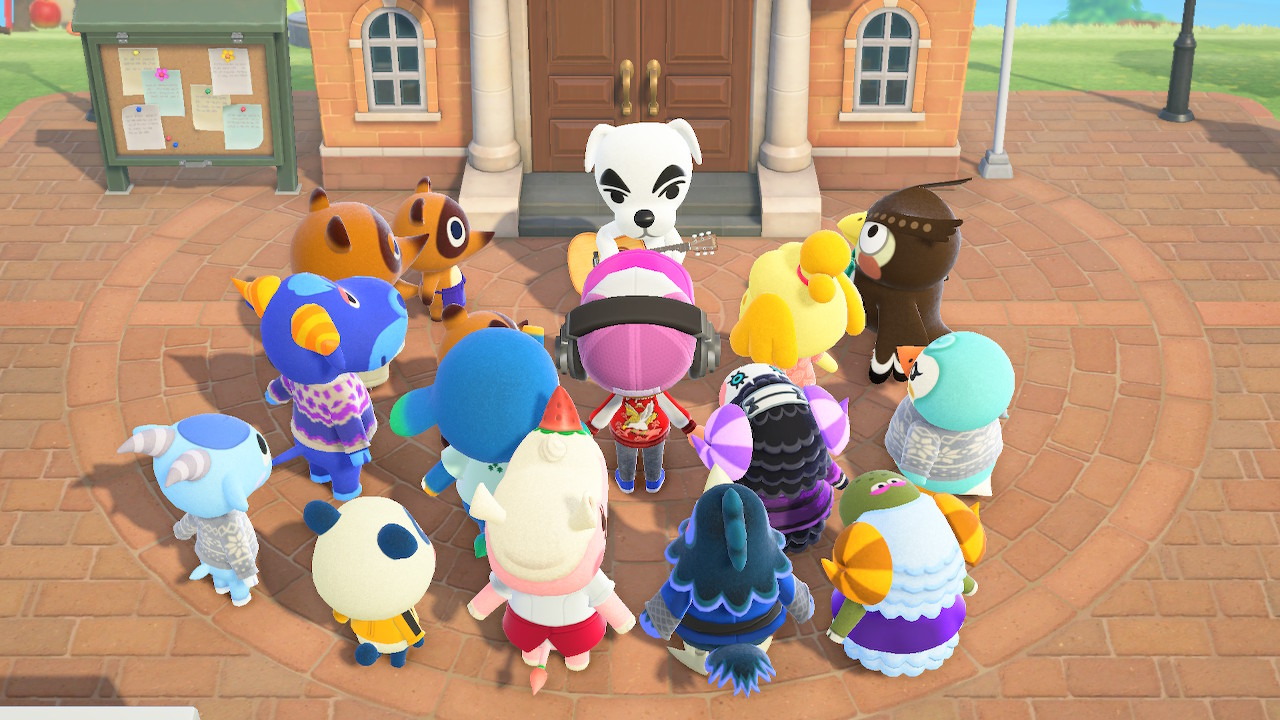
The famous musician K.K. Slider has always been one of the most popular Animal Crossing characters of all time. Thanks to the release of Animal Crossing: New Horizons, his fame has soared to even greater heights. To show their love for K.K. Slider, many of his superfans have taken iconic real-world album artworks and redesigned them so that they look like something K.K. might release himself. While the idea sounds silly, the results are actually quite awesome, and we think you should have a look. Here's a collection of our favorite fan-made K.K. Slider album arts that are based on real bands!

The joyful game the world needs
Animal Crossing: New Horizons is a joy-filled life simulator where you develop an island paradise and become best friends with your animal neighbors, and eventually, K.K. Slider will visit you!
Gorillaz — Demon Days
K.K. Slider and his gang are ready to FEEL GOOD.
(Based on the tag started by @ajemtattoo where you draw a K.K. album based on a real group! Amazing concept!)#AnimalCrossingNewHorizons #kkslider #ACNH pic.twitter.com/GsJOMQYpUrK.K. Slider and his gang are ready to FEEL GOOD.
(Based on the tag started by @ajemtattoo where you draw a K.K. album based on a real group! Amazing concept!)#AnimalCrossingNewHorizons #kkslider #ACNH pic.twitter.com/GsJOMQYpUr— ZeTrystan 🦈 (@ZeTrystan) April 21, 2020April 21, 2020
This artwork by @SnailSyrup is stellar in terms of how accurately it recreates the original album art with popular Animal Crossing characters. Tom Nook, K.K. Slider, Isabelle, and Brewster were all perfect choices to mirror the Gorillaz characters 2-D, Murdoc Niccals, Noodle, and Russel Hobbs. On top of that, the usage of color perfectly matches the original artwork too.
David Bowie — Aladdin Sane
k.k. slider, david bow-wowie mashup pic.twitter.com/zT08HwFx1Wk.k. slider, david bow-wowie mashup pic.twitter.com/zT08HwFx1W— mari (@kakimari) April 21, 2020April 21, 2020
@Kakimari's K.K. Slider rendition of David Bowie's Aladdin Sane artwork is on point. I particularly like how detailed K.K.'s hair is, and also how the artist was able to capture the mood of the original artwork even though K.K.'s dog body no doubt complicated things.
Linkin Park — Hybrid Theory
"What was the last album I even bought.. Oh.. "
K.K. Hybrid !!!!#ACNH #kkslider #kkslideralbumredraw pic.twitter.com/3EQNXKYzZx"What was the last album I even bought.. Oh.. "
K.K. Hybrid !!!!#ACNH #kkslider #kkslideralbumredraw pic.twitter.com/3EQNXKYzZx— Shattered-Earth (@Shattered_Earth) April 22, 2020April 22, 2020
While K.K. being the flag bearer is undoubtedly an impressive look, I think the best part of @Shattered_Earth's redesign of Hybrid Theory is K.K.'s name at the top. I would never have imagined how cool his name looks styled like Linkin Park's original logo were it not for this clever fan art, and I'm glad @Shattered_Earth came up with the idea.
Fleetwood Mac — Rumors
I wanted to hop on that K.K. Slider album cover trend. I absolutely love Fleetwood Mac ;v; pic.twitter.com/zysFRBlMagI wanted to hop on that K.K. Slider album cover trend. I absolutely love Fleetwood Mac ;v; pic.twitter.com/zysFRBlMag— Bread IRL BLM (@Komoroshi) April 20, 2020April 20, 2020
The coolest thing about @Komoroshi's piece here is that the style of the K.K. version looks so different compared to the original. Yet, the tone and feel of the original are still conveyed in the redesign since the characters have the same clothes, facial expressions, and poses. Also, K.K. Slider and Isabelle are simply adorable together. That alone makes this album art fantastic.
System of a Down — Hypnotize
Hopped on the KK Slider Album cover wagon with my favorite band! :) #ACNH #AnimalCrossingNewHorizons pic.twitter.com/tGAmRdhUhiHopped on the KK Slider Album cover wagon with my favorite band! :) #ACNH #AnimalCrossingNewHorizons pic.twitter.com/tGAmRdhUhi— KZLN 🌱 Available for work (@kazolin_) April 21, 2020April 21, 2020
We all know that Pietro is a sweet and kind villager, but guess what? He's also a hardcore metalhead, too...at least, that's what this rad piece by @kazolin_ makes me believe. I don't care what Nintendo says, Pietro headbangs to System of a Down. It's canon now; I don't make the rules.
Panic! At The Disco — Pray for the Wicked
I've really enjoyed that K.K. Slider trend.. and wanted to try my hand at it 👀💦 #kkslider #kkslideralbumredraw pic.twitter.com/G5k6NJR5jyI've really enjoyed that K.K. Slider trend.. and wanted to try my hand at it 👀💦 #kkslider #kkslideralbumredraw pic.twitter.com/G5k6NJR5jy— 🍒✨𝐅 𝐮 𝐮 𝐛 𝐮 𝐥 𝐨 𝐮 𝐬✨🍒 (@Fuudibles) April 22, 2020April 22, 2020
This artwork by @SoulFuud may not change a whole lot compared to the original album cover in terms of style, but sometimes all you need are some small changes. K.K. matches the pose and expression of the person in the original piece perfectly here, and I love how @SoulFuud managed to recapture the watercolor aesthetic that the original art had.
Master your iPhone in minutes
iMore offers spot-on advice and guidance from our team of experts, with decades of Apple device experience to lean on. Learn more with iMore!
Nirvana — Nevermind
K.K. Slider NEVERSLIDE#ACNH #kkslider #kkslideralbumredraw pic.twitter.com/tfR4j3BcbUK.K. Slider NEVERSLIDE#ACNH #kkslider #kkslideralbumredraw pic.twitter.com/tfR4j3BcbU— Son of a Glitch (@AStartShow) April 22, 2020April 22, 2020
Everything about this redesign of the Nevermind cover is perfect. K.K.'s mouth is open just like the baby's, and the fact that he's chasing a Bell bag on a hook instead of a dollar bill is hilarious. The redesigned logo is cool, too, and the fact that he's holding his guitar is the icing on the cake.
My Chemical Romance — Three Cheers For Sweet Revenge
i saw the #kkslider album challenge and had a vision pic.twitter.com/fg6vLfQii3i saw the #kkslider album challenge and had a vision pic.twitter.com/fg6vLfQii3— carmico 🌙☁️✨ (@carmiico) April 20, 2020April 20, 2020
@Carmiico's recreation of Three Cheers For Sweet Revenge is superb. It cleverly renames the album "Three Cheers For Sweet Bells" and also deviates from the standard "K.K. Slider" norm, instead of replacing My Chemical Romance with "My Khemical Slider." The shading and facial expressions perfectly match the original art, too.
Grimes — Art Angels
K.K. Slider album cover
Art Angels - Grimes pic.twitter.com/uGT5ODLhLXK.K. Slider album cover
Art Angels - Grimes pic.twitter.com/uGT5ODLhLX— Cornie (@theCornelia_) April 21, 2020April 21, 2020
This piece by @theCornelia uses vivid color to great effect, accurately recreating the bright and colorful vibe of the original artwork. The use of both K.K. and Reese is perfect as well, as they look incredibly similar to the people found on the real album's cover.
Tame Impala — Currents
K.K. Slider - Kurrents
(Not sure if Currents has been done but there he is 🐶) pic.twitter.com/fEVRq92FtdK.K. Slider - Kurrents
(Not sure if Currents has been done but there he is 🐶) pic.twitter.com/fEVRq92Ftd— Mayelo (@Mayelopup) April 21, 2020April 21, 2020
This art from @Mayelopup trades the ball found in the original piece with K.K. Slider's head. This looks really cool, especially since the waves of black and white around K.K. almost looks like flowing hair. It's also worth noting that the style K.K. is drawn in is more human-like than many other pieces of art, which makes it feel unique.
Your thoughts
Which of these album covers is your favorite? Have you seen any that you think deserve to be on the list? Let us know.

