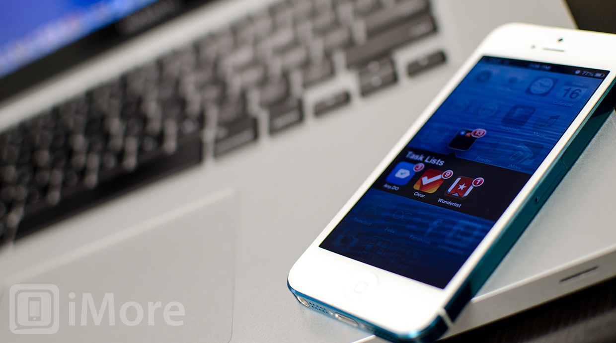
Since the iPhone is on-the-go as much as you are, task list apps are a natural way to stay organized. If you don't need a full on task-manager like OmniFocus, Todo, or Things, simpler task list apps are a perfect way to make sure things are getting done on time, every time. Any.DO, Clear, and Wunderlist are three of our favorite task-list apps, but which one is the best for you?
Any.DO vs. Clear vs. Wunderlist: User interface and design
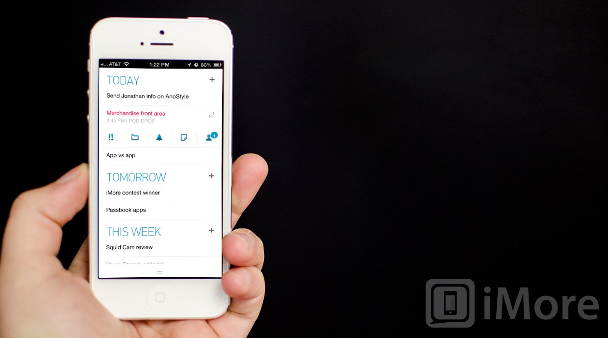
Any.DO has a super clean interface that it means to allow you to add and organize tasks quickly and easily. There are two main views that Any.DO allows you to toggle between - date and folder based. The date based view will combine all your different lists to show you what needs to get done today, tomorrow, this week, and later. It will pull them according to how you added tasks to Any.DO.
Once logging into Any.DO, the default date based list view appear and you can immediately start adding tasks. Each section had a plus sign next to it that allows you to add a task quickly. To access other views, there is a pull up located along the bottom of the screen. Flick it upwards and you can switch between date and folder view as well as view a list of completed tasks. Folder view will automatically sort all your tasks by folder groupings instead of time.
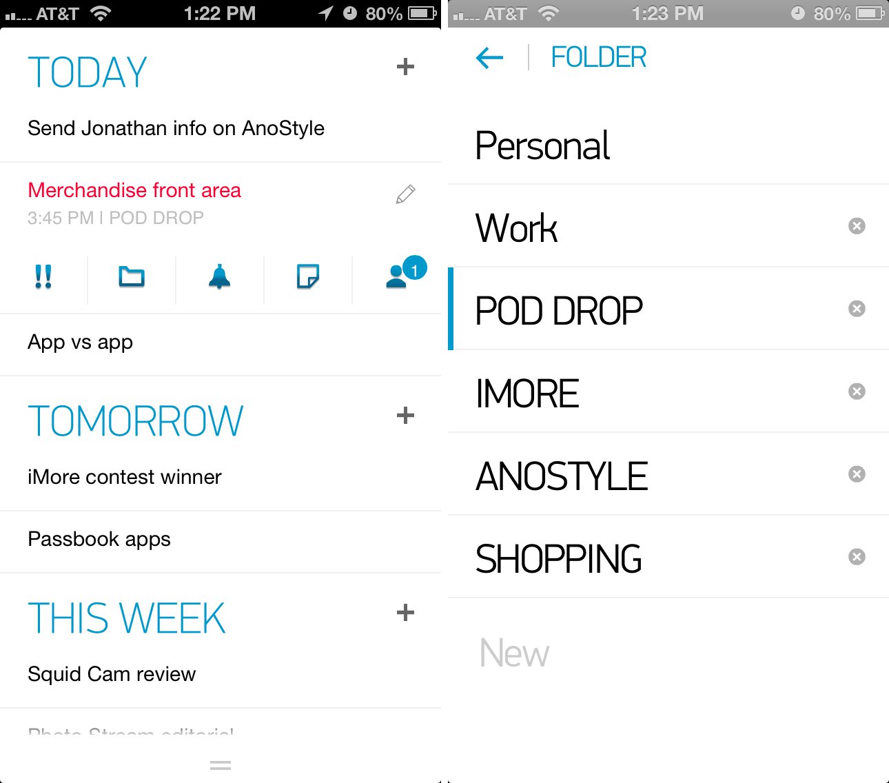
Tapping on any task in Any.DO will give you a list of options that you can apply to that task. You can mark a task as important, drop it into a folder, set a reminder, add notes to it, or share it with a contact.
Any.DO's settings can be access by pulling up the bottom menu and choosing the gear icon in the lower right hand corner. From here you can edit your folders, use the Any.DO moment feature, change between a dark and a light theme, control what the badge count does, change the language, and change the speech input language. There isn't much to configure but the options you may need to change are easily accessible right within the main app settings.
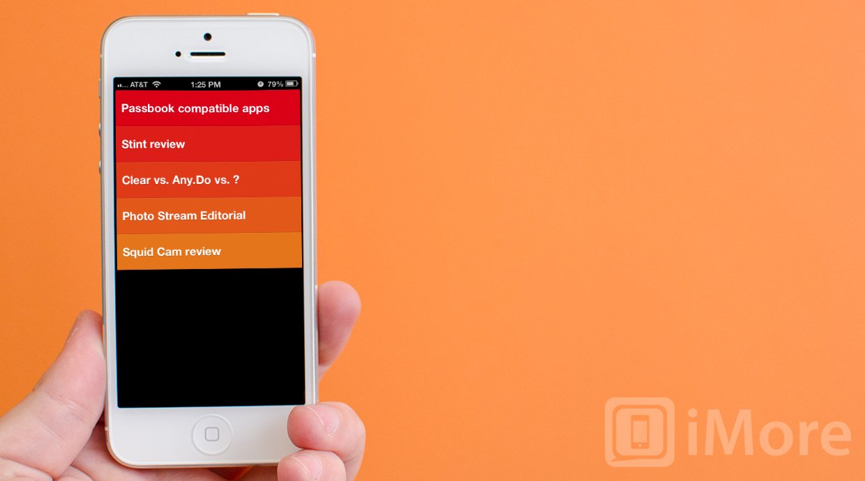
Clear is a gesture based app that aims to make adding tasks lightning fast. Upon first launching clear you'll be given a brief tutorial on the gestures that are supported. You can also change the color theme of Clear to your liking as there are tons to choose from.
The main screen of clear will show your lists. Inside each list you will find your tasks. Since Clear is gesture and layer driven, you use gestures to move up or down levels. If you're on the main list screen, tapping on the list will expand it. Tapping on a list item will allow you to edit it. Tapping anywhere else on the screen brings up a space to add a new task. To move back up a level, simply swipe downwards over the list or pinch your fingers together to collapse it.
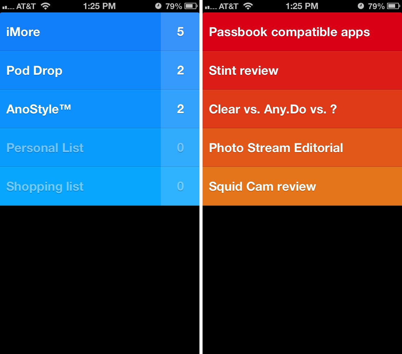
While on the main list screen, swiping down or pinching will bring you up one more level. From here you can access your lists, themes, and view more tips and tricks. The settings panel of Clear can also be accessed within the app. Here you can control badge count for all tasks or just active lists as well as turning on and off features such as iCloud sync, sounds, and vibration.
Wunderlist's interface is set up to show you lists somewhat in the form of inboxes. You can tap the pencil in the upper right hand corner to edit current lists or tap in the box above your lists in order to quickly create a new one. Tapping the edit pencil also allows you to reorder lists any way you'd like. If you want your work list above your home list, you can simply drag it in that position.
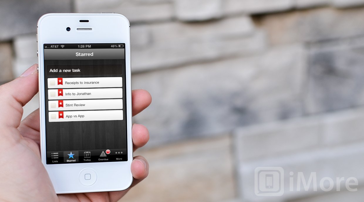
The main navigation of Wunderlist runs across the bottom of the app and consists of lists, starred items, due today, overdue, and more. More is where you can find app settings as well as other ways to sort your lists. Similar to Any.DO, Wunderlist allows you to view tasks that are associated with time. You can choose to view all tasks, tasks that are already completed, ones due tomorrow, in the next 7 days, later, and ones that have no due date.
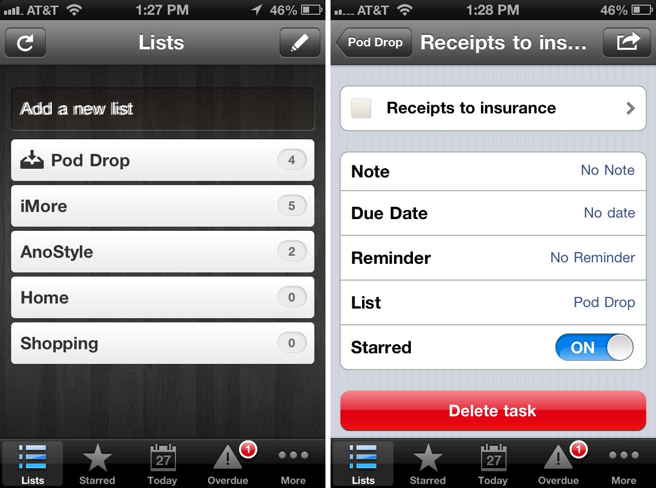
Wunderlist allows you to star tasks that are important and they'll filter into the starred section. You can easily star any task by simply tapping on the star next to the task name. It'll automatically filter into that section of the app. To mark a task as done, just check it off by tapping on the check mark box next to its name.
There isn't a ton of customization with Wunderlist but settings does allow you to change the background image, date format, language, and set up sending tasks by email.
While Any.DO, Clear, and Wunderlist all have simple to navigate and easy to understand designs, Any.DO has most logical user interface and it's by far the easiest to use. Once you get to understand Clear and become used to the gestures, it's just as user friendly but doesn't have nearly as many options when it comes to interface as what Any.DO offers, which makes it a nice compromise.
Any.DO vs. Clear vs. Wunderlist: Creating lists and tasks
To create a list or task in Any.DO you can either manually enter it or just pull down to use the voice input feature. This is something that's unique to Any.DO and adds a lot of value for users who quickly need to input something without interrupting their workflow. Swipe down from the main screen and tap on the microphone icon. Say what you need the app to add and then tap the checkmark to input it.
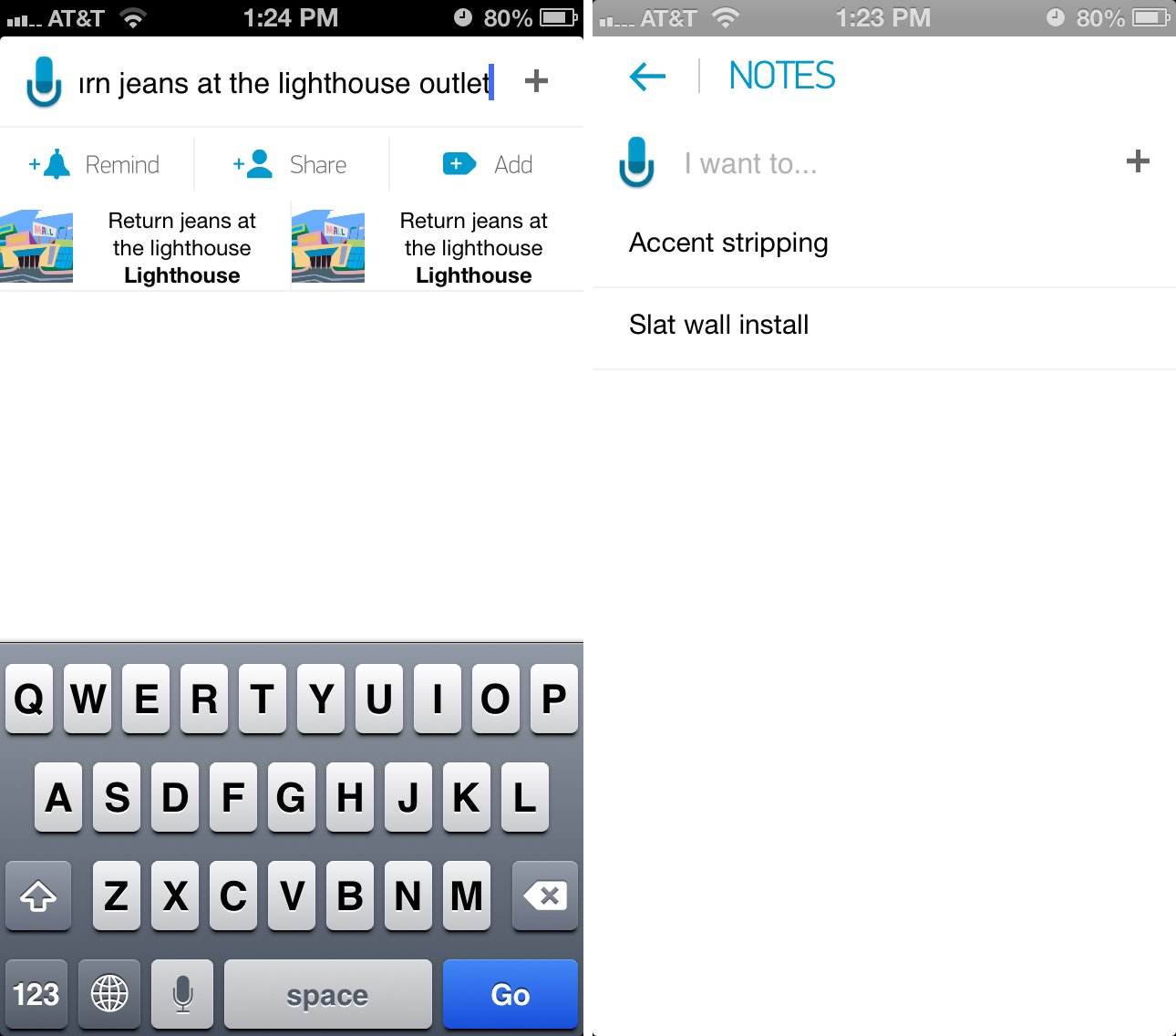
Any.DO will try and autocomplete tasks you are inputting by offering suggestions. They're based on places around you and on tasks you've previously entered into the app. It makes adding tasks a lot less painful than manually typing them.
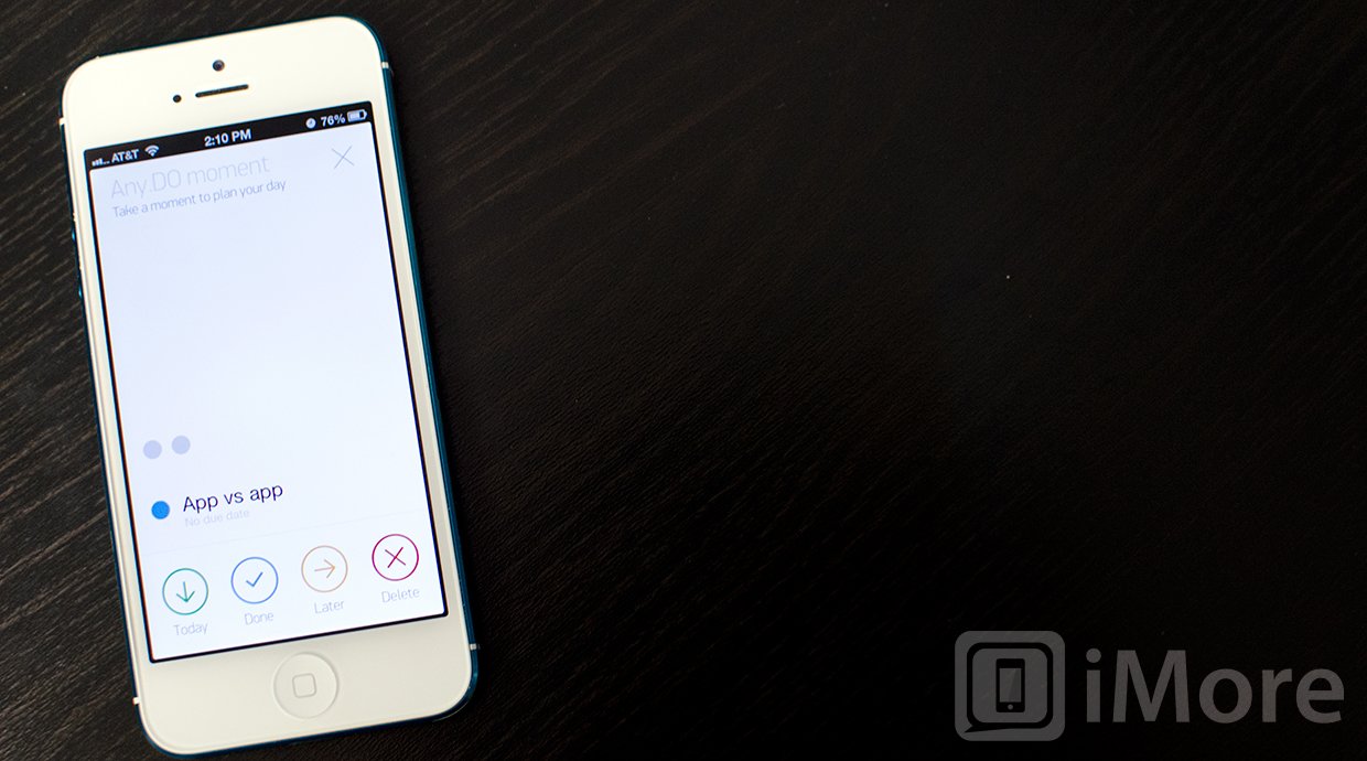
Sorting tasks in Any.DO is easy and can be done within just a few taps. A swipe up from the bottom of the screen lets you order tasks by time or by folder. If you want to see a quick view of what you have to do you can tap into settings and view Any.DO moment which gives you a glimpse of what you need to do today. You can then quickly set reminders for things you have do or move them to a later time. It's a great feature but something that's rather hidden in settings. It'd be nice to see this feature pulled into the main menu for quicker access.
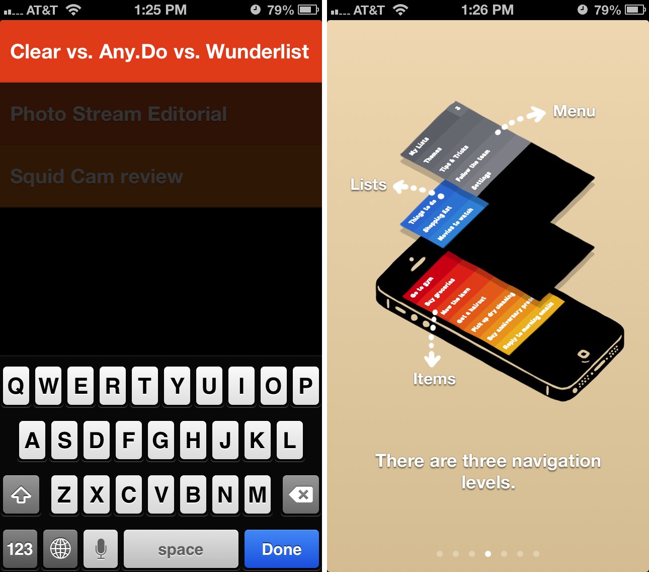
Clear uses multiple layers within the app and each layer houses lists and tasks. Tapping anywhere on the screen inside of a list brings up a slot to enter a new task. Just type in data and hit return on your keyboard and it adds it to your task list. From there you can pinch to close lists or swipe upwards in order to close a list and view your main list. Swiping upwards one more time brings you to the main menu that houses settings and themes.
To mark a task as done you can swipe to the right and it will be marked as complete. Swiping to the left on a task will delete it from your list. You'll notice that completed tasks will show up at the bottom with a line through them. To clear them from your list completely you can pull up on the task list and release and it will clear away old tasks that were marked as complete. While Clear doesn't have very many options for organizing and sorting, if you're looking for a simple task list that just works, it does that wonderfully and beautifully.
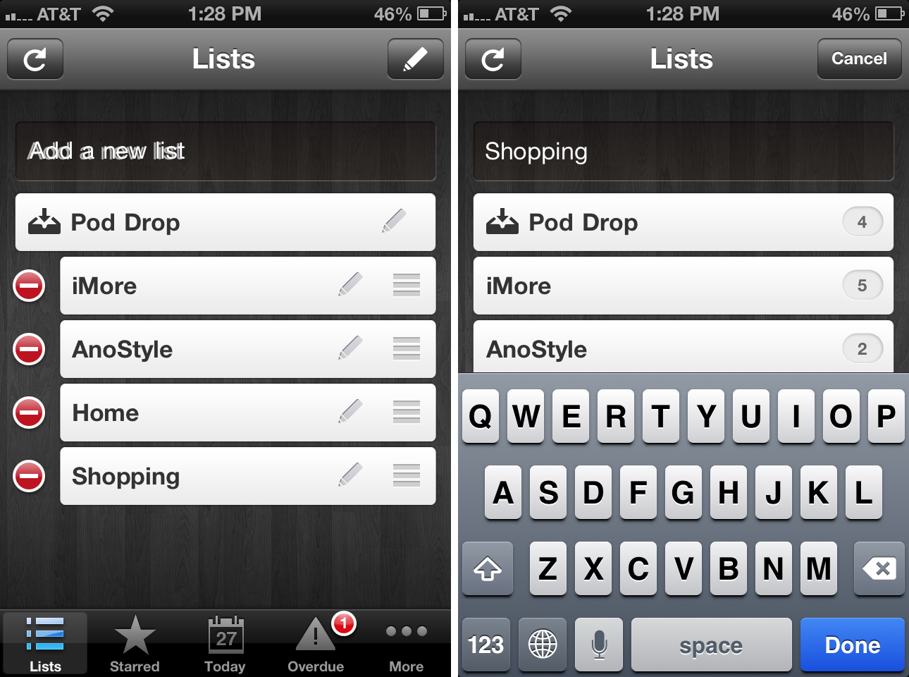
Wunderlist is a nice compromise between Any.DO and Clear. Task entry is simply and only ever a few clicks away. When on the main task list screen you can quickly add a new list or tap into any existing list and start typing a task into the task box above your list.
Aside from adding general tasks to lists the starred section easily shows you important tasks as a simple glance. When in settings you can view all options for time based tasks and how you want to view them. While Any.DO makes this feature apparent in their main menu, Wunderlist has chosen to put it in settings. I'm not sure this makes sense to me and many users may not think to open settings in order to sort tasks. While it's a wonderful feature to have, it should be presented in a way that makes it easier for users to find.
If you need to create lists, tasks, and organize them quickly and efficiently, Any.DO is a happy medium between Wunderlist and Clear that allows you to organize just as fast as you enter. While Clear allows for the quickest entry, Any.DO's navigation will make more sense to many.
Any.DO vs. Clear vs. Wunderlist: Task reminders and notifications
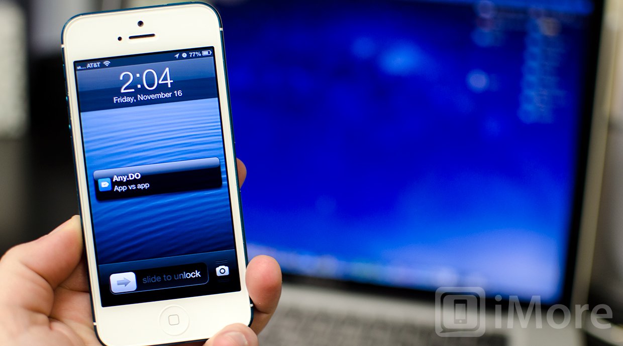
Any.DO, Clear, and Wunderlist all offer push notifications for reminders. What is really comes down to is how customizable they are. Any.DO by default will show a badge for any tasks that are due today. You can easily change this in settings to cater to certain lists or any tasks you'd like the badge to represent. Any.DO will also send you push notifications for any task you've set a reminder for. To set a reminder you can tap on the task name and then choose the reminder icon and set a time you'd like to be reminded. It's easy to access from any task and fast, which is what most users want.
Clear allows you to change badges in two forms, for the last active list or for all tasks. This means that you can have badges represent all the tasks currently listed in Clear or you can choose to have it only represent the last list you accessed before you closed out the app. There is no option to configure only certain lists or tasks due today since clear doesn't allow you to set times for tasks. This also means there are no push notifications inside Clear. You'll see a badge but that's it.
Wunderlist by default will show a badge for any tasks that are overdue. To my knowledge there isn't a way to change this within settings. As far as notifications go, you can set reminders for any task you'd like. After creating a task you can tap into it and choose a due date or set a reminder. Wunderlist will then send you a push notification at the designated time you specified.
If you need push notifications that are customizable as well as a badge count that's just as flexible, Any.DO is the only option since Clear lacks push notification support and Wunderlist doesn't allow you to customize badge counts.
Any.DO vs. Clear vs. Wunderlist: Syncing lists and tasks
Any.DO uses its own native sync option. You can either create an account by signing up for an Any.DO account or by signing in with Facebook. Once you've set up an account, there is nothing to configure, it just works. Any device you've got Any.DO installed on will sync seamlessly.
Clear now supports iCloud and once it's enabled within settings, all your tasks will automatically sync between iPhone, iPad, Mac, or any other device you've got Clear set up on.
Wunderlist supports native syncing through their own login service. Just like Any.DO, once you've signed in there's absolutely nothing to configure. If you sign into your Wunderlist account on the web or on any other device that Wunderlist supports, your items will be there.
As far as syncing services are concerned, all three clients have excellent syncing support and no matter which you choose, you'll have no issues accessing your data across several devices. Tie.
Any.DO vs. Clear vs. Wunderlist: Cross-platform support
Any.DO has support for iPhone, Android, and a Chrome browser extension with a native web version coming soon. I've been using the Chrome extension for a few days now and haven't had any problems. The only think I did notice is that syncing runs behind a few minutes but other than that, it works seamlessly with the iPhone app. There currently isn't a native iPad version so if you need iPad support, Any.DO may not be your best option.
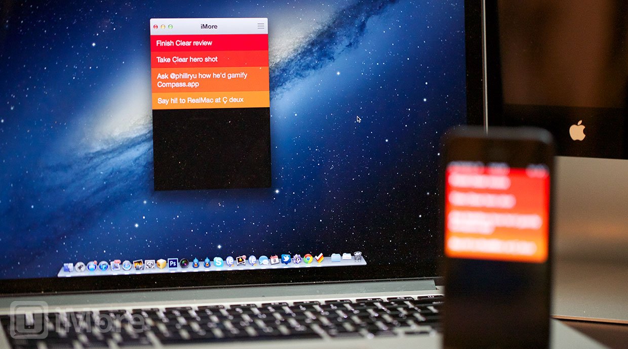
Clear is available in the App Store for iPhone and in the Mac App Store. There isn't any native iPad or Android support so when it comes to syncing across platforms or to the iPad, it carries about the same support as Any.DO but instead of browser extensions, there is a native app for Mac users.
Wunderlist has been around for quite some time and supports quite a few platforms including iPhone, iPad, Android, Mac, and PC. If you have a tendency to jump between platforms and need a task list system that can go with you, Wunderlist is it and has the best support of all three options.
Any.DO vs. Clear vs. Wunderlist: Pricing
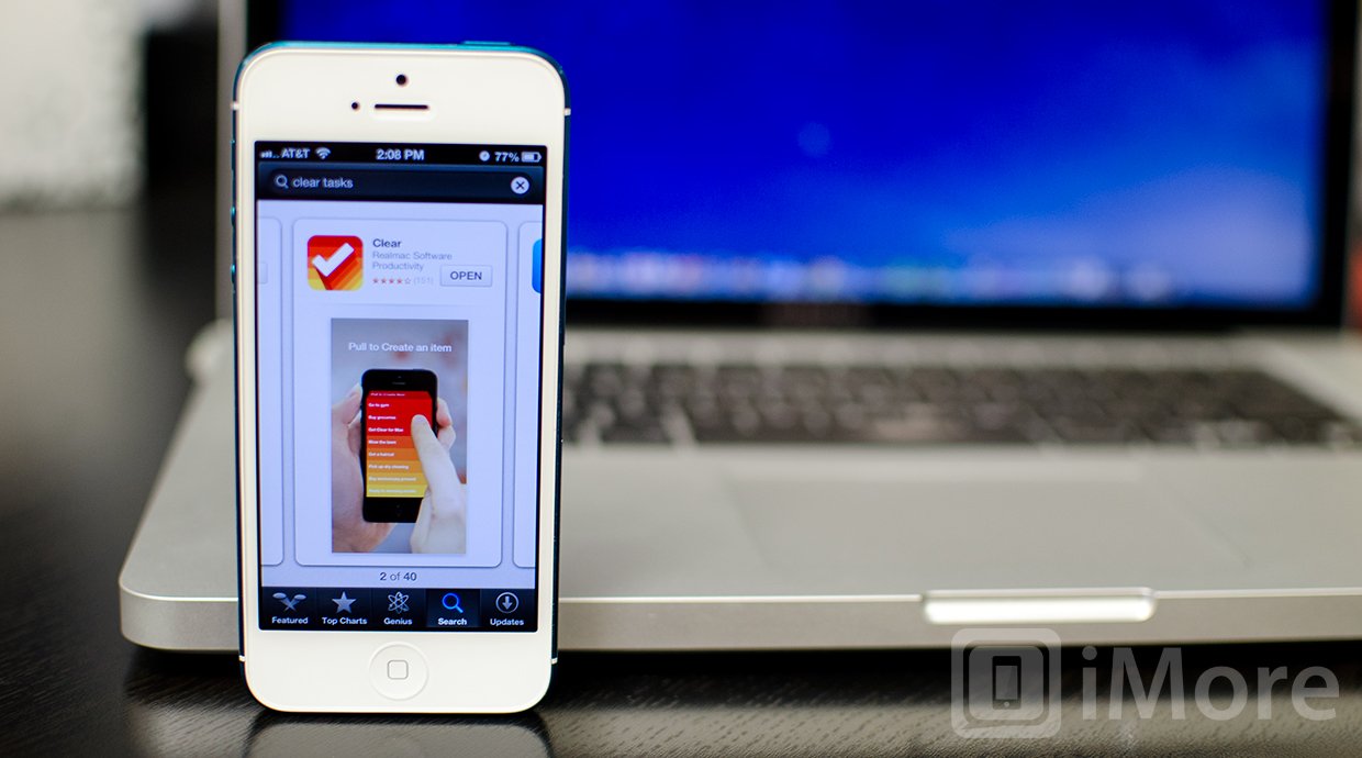
Any.DO is available for free in both the App Store for iPhone and the Android Marketplace. The browser extension for Chrome is also free. Wunderlist is also a free option across all platforms and with the list of support you have, you really can't beat it.
Clear is the only option that is a paid option. The iPhone version of Clear is currently available in the App Store for $1.99 while its Mac counterpart will run you $9.99 in the Mac App Store. If you love gestures and want an app that takes full advantage of them, Clear is it and it's well worth the price if you need a quick and efficient task manager.
If price is a deciding factor, Wunderlist has the best support and with a free price tag, there's no competition.
Any.DO vs. Clear vs. Wunderlist: The bottom line
Any.DO, Clear, and Wunderlist all have great options when it comes to syncing and work well to keep you organized and on task. It comes down to how you need to organize your tasks and whether or not notifications matter to you.
While Wunderlist has the best cross-platform support, the interface is not as simple as either Clear or Any.DO. It also feels dated as it hasn't seen a complete app overhaul since iOS 4. I'd only recommend Wunderlist over Clear and Any.DO if you really need that cross-platform support.
For most, it will come down to choosing between Clear and Any.DO. If push notifications and organizing lists by time are must haves for you, look no further any Any.DO. It'll do everything you need and probably more. If you prefer a native Mac app and a beautiful simplistic interface that's gesture driven, Clear is where it's at.
Any.DO - Free - Download Now
Clear - $1.99 - Download Now
Wunderlist - Free - Download Now
iMore senior editor from 2011 to 2015.
