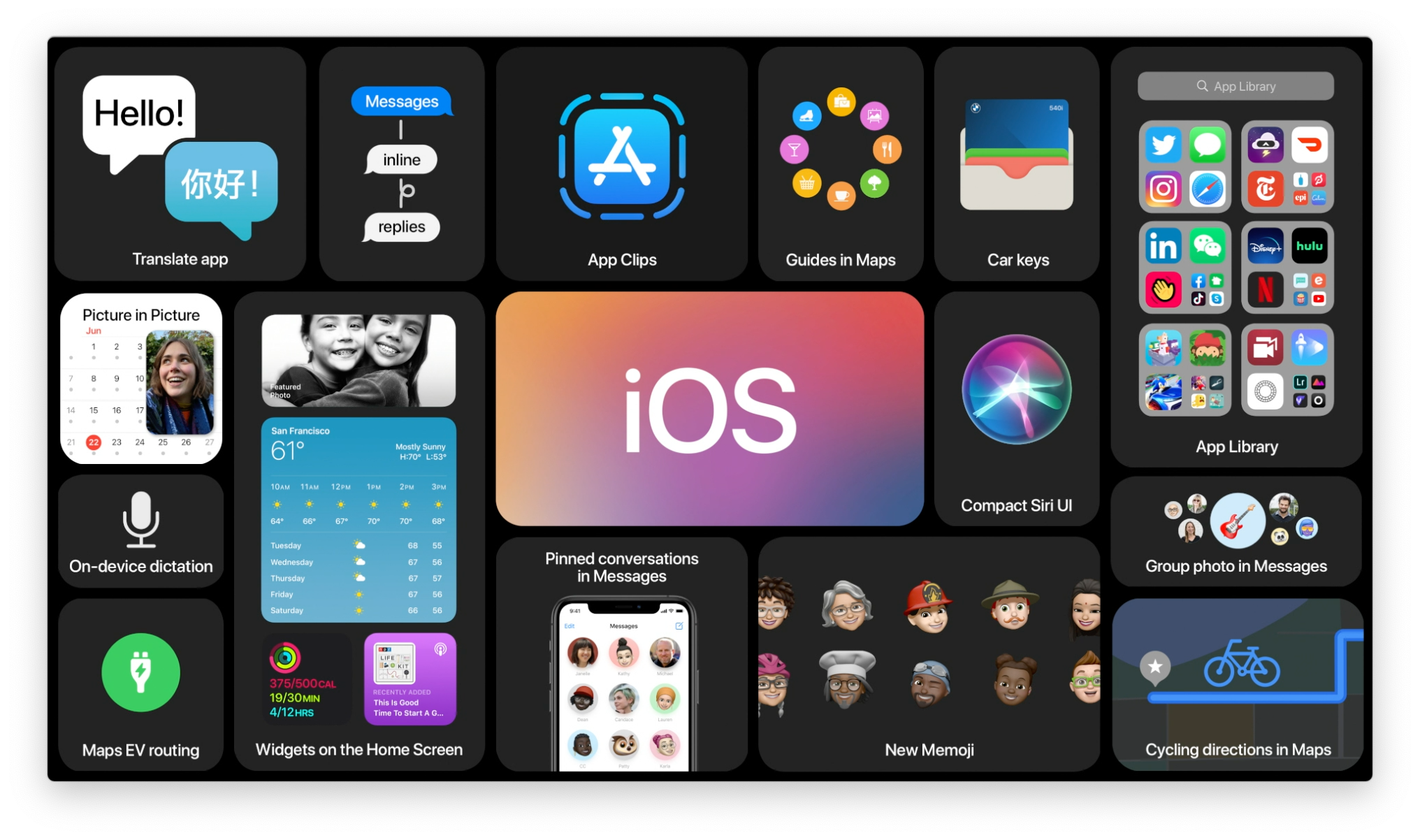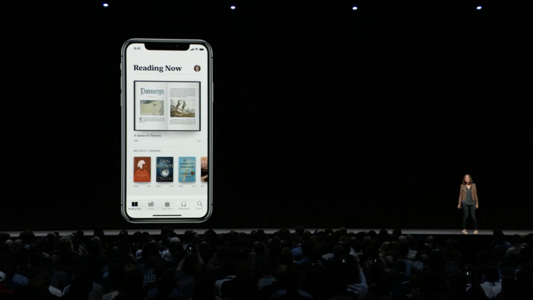
iOS 12 brings a bunch of refinements and speed to your iPhone and iPad, but that's not all: There are a number of core apps getting huge facelifts and functionality improvements, too. One of these apps is Apple's ebook reader and store, iBooks, which bears the moniker "Apple Books" in iOS 12.
While the ebook-reading experience itself has stayed largely the same in iOS 12, Apple Books has completely rethought the design, book management, purchase, and organizational aspects. The new Book Store app is available in 51 countries (and free books in 155 more); here's everything new in Apple Books on iOS 12.
The look and feel of Apple Books
Apple Books has an entirely new design for managing, purchasing, and searching for your books. Most notable is the banishment of the translucent shelf — and, in fact, all shelf-based metaphor.
Instead, the app takes its cue from the App Store's bright-colors-on-solid-backgrounds design, offering a pure white background to hold your book covers in large, laterally-scrolling columns. And, like the book-reading experience itself, you'll even get an automatic "dark mode" when you move into lower light conditions; the white background dims to black, switching the headings and text to whites and grays.
The lateral columns give the appearance of shelves without ever calling them directly into play, instead relying on more-defined book shapes underneath an array of high-quality book covers. One of my big sadnesses with ebooks was always their lack of cover display; in Apple Books, the covers are allowed to shine and take center stage.
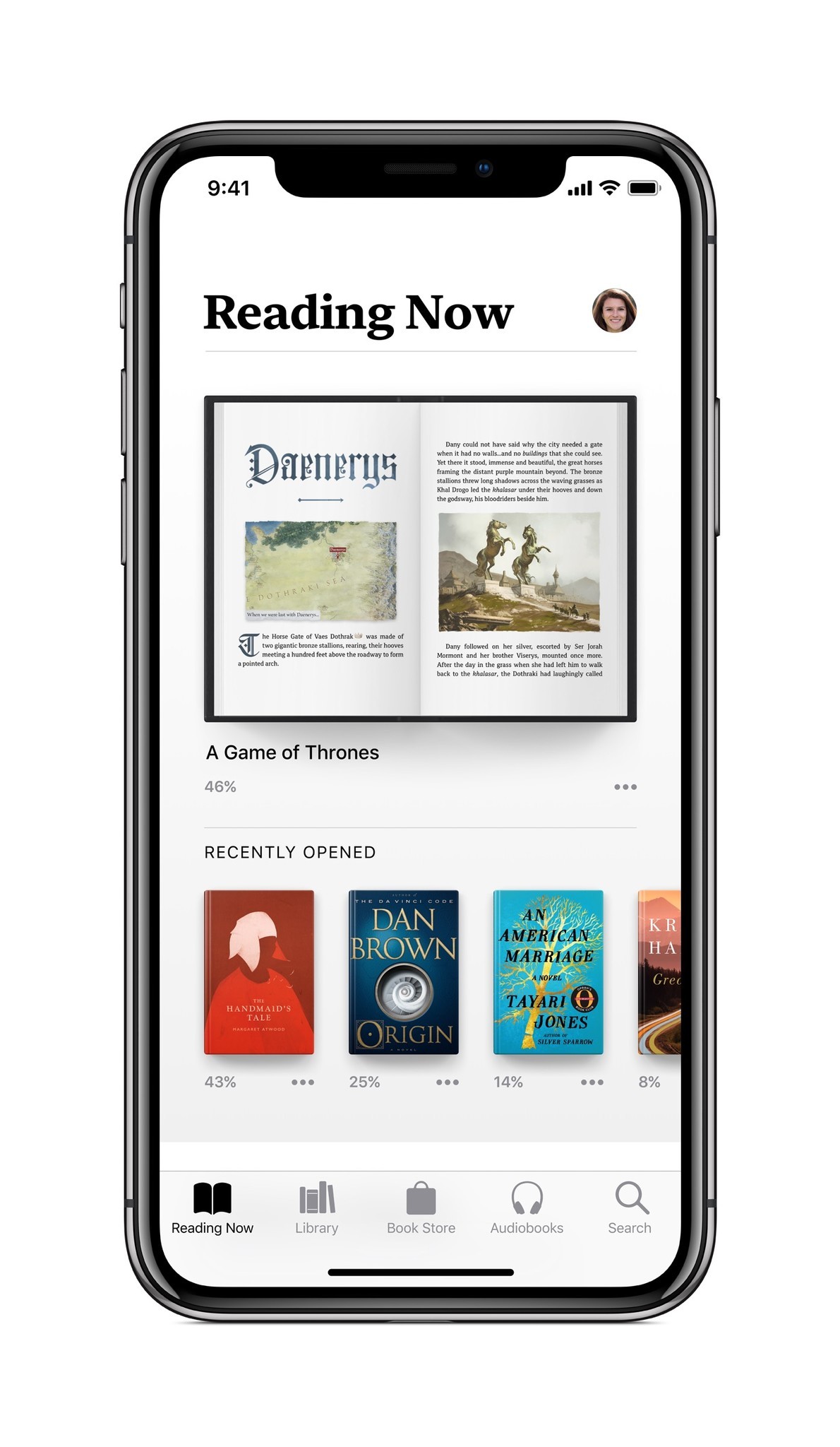
They're big and beautiful in your Reading Now tab, which features your current book and books you'd like to read, along with some customized For You suggestions (yes, like Music and the App Store, you'll soon be getting customized suggestions for your ebook and audiobook consumption). They're even bigger inside the Book Store and its individual store pages — and especially so on the iPad Pro.
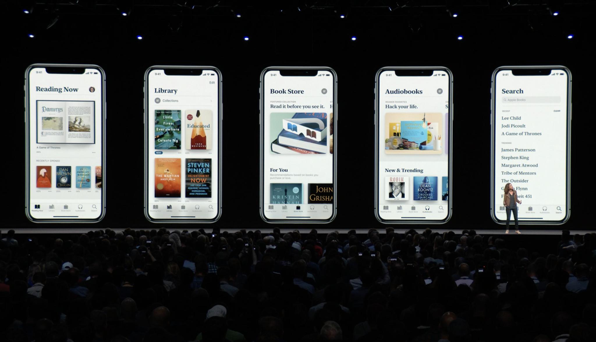
But perhaps the most notable change to Apple Books is its font: All headings and small headings in the app use a new serif-based font called "SF Serif" alongside the existing sans-serif San Francisco text for the main body.
Master your iPhone in minutes
iMore offers spot-on advice and guidance from our team of experts, with decades of Apple device experience to lean on. Learn more with iMore!
The font is (unsurprisingly) a gorgeous addition to the app, and makes Apple Books feel distinct in its character next to the App Store. When paired with the app's flat black-and-white highlighting scheme, it feels especially literary; Apple's beautiful color artwork and existing book covers make the experience even better.
Eddy Cue, Apple's senior vice president of Internet Software & Services, had this to say about the app:
"Apple Books will inspire a love of reading — it puts a world of books and audiobooks right at your fingertips, whether you want to dive into your favorite story for a couple of minutes or a few hours…This is our biggest books redesign ever, and we hope this beautiful app inspires both customers and authors alike.
On the organizational side, Apple has done away with every bottom tab from iBooks save for Search; the iOS 12 app instead puts the emphasis on what you're currently reading (and want to read) in the Reading Now tab. The Library tab gives you a more-thorough picture of your full ebook collection, while the new Book Store and Audiobooks tabs provide a much better browsing and buying experience for each item. Even the existing Search tab provides a better experience, offering full local library and store search in one.
The Reading Now tab
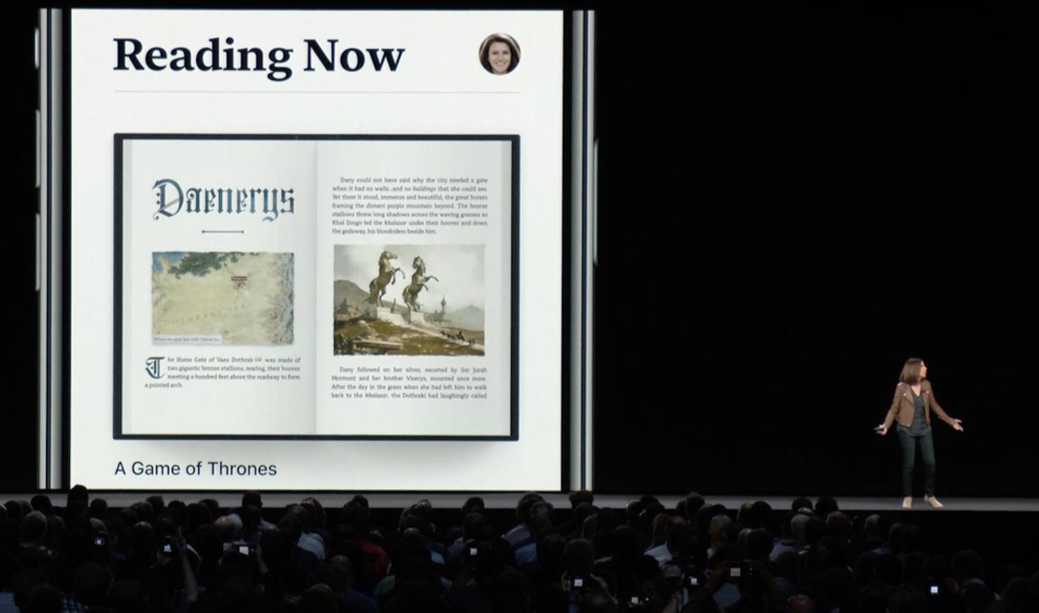
Apple's new Reading Now tab takes a bit from just about every ebook reader and social book experience in its design. The result is a screen that easily highlights your current read, recent books you've purchased, books you're looking forward to picking up, For You recommendations, and a personalized collection recommendation for further perusal.
As with the App Store, you have easy access to your Apple ID account from this tab from your profile picture, where you can access book updates, download books or audiobooks from family members, manage your hidden purchases, redeem codes, view account settings, or sign out of your account.
The reading experience
Reading Now's chief highlight is, naturally, the book you're currently reading. If you've opened it in the last 24 hours, you'll see the book splayed open to your current page; if not, the book cover will display prominently. Beneath that image, you'll see the title of the book, the percentage of it that you've read, and a new More button.
As with Apple's other service-based apps, the More button hides all sorts of goodies for further interacting with your books. You can…
- Quickly go to the Apple Book Store link for that item
- Remove it from your device or hide it (or, if it's in the Reading Now slot, remove it as your current read)
- Add it to Apple's new Want to Read collection or a different custom collection
- Mark it as finished (if, say, you finished it elsewhere, or Apple's sync service hasn't updated)
- Share the book link with friends and family
- Rate and review it on the store
- Use the Love or Dislike buttons, which helps Apple further customize your For You books section
Tapping on your open book will bring you into Apple's ebook reader itself, largely unchanged from iOS 11. You'll still have access to multiple fonts, a scrolling book experience, dark and light themes, bookmarks, and more.
Want to Read
Below the main Reading Now highlight, Apple Books offers a new side-scrolling collection called Want to Read. By default, all the unfinished books in your library will pop up in here, but you can adjust that easily by removing books through the More button (or viewing the full list and removing multiples).
Want to Read (like its partner collection, Finished Books) doesn't particularly care whether you've purchased a book or not: You can add any book from your collection or the Book Store to this list, allowing it to function as a combination Wish List and to-read schedule.
The full list itself (like the rest of the app) prioritizes big, beautiful covers next to the title, author, store rating, blurb, and Read (or Buy) button. There's also a small counter that shows you how many books you've added to your Want to Read list, and all books have the black More button to access more details.
Suggested reads
As part of the new Apple Books redesign, Apple is bringing For You over from its music platform to the reading experience: in the Reading Now and Book Store tabs, you'll now have a custom For You collection that recommends books you might like based on things you've purchased from the store or where you've used the Love/Dislike buttons. (Unfortunately, as with Apple's other services, For You may not be available in all countries.) The app may also occasionally display collections like You Might Like or Complete the Series, based off the current book you've been reading.
But the main suggestion list is For You; the side-scroller features large, fully-illustrated book covers, and you can tap on any to get the full Book Store pop-up page. If you instead choose to See All, you'll get a full For You sub-page that features multiple collections for your tastes.
On the For You page, users will get a weekly "Top 5" list that updates every Tuesday with side-scrolling book covers and a short blurb below them; below that, the app displays a collection of other books from authors you've enjoyed, books you might like based on past purchases, and suggested authors.
Your new Library
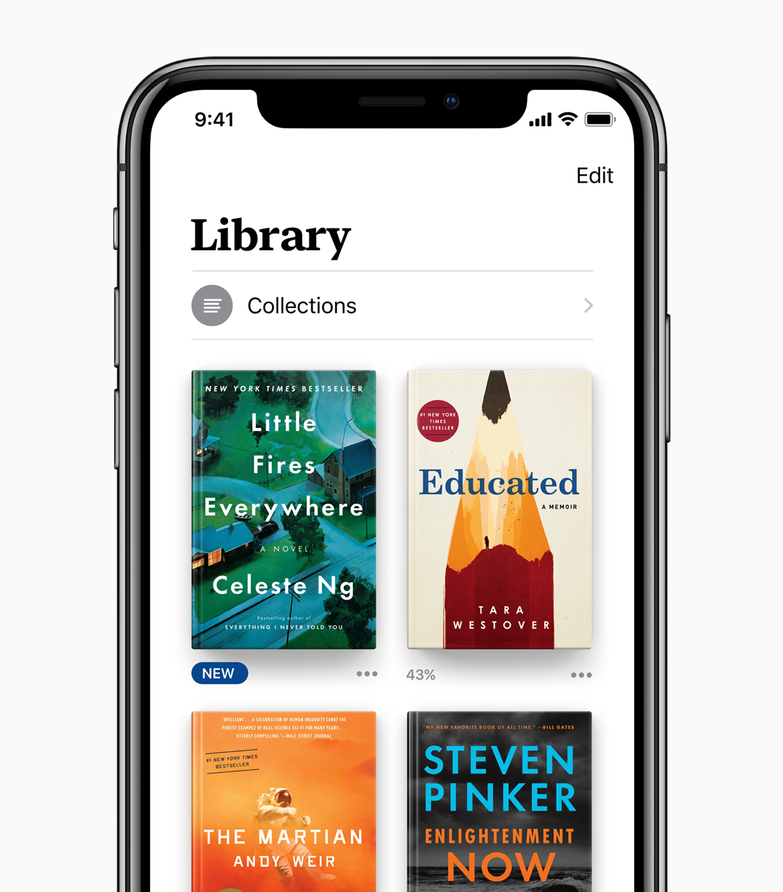
The Reading Now tab isn't the only place you can go to check out your current collection of ebooks and audiobooks: The revamped Library tab offers a full overview of all the books you own and have uploaded to the app, including any sub-collections you may have made in earlier versions of the app.
Collections and the Finished Timeline
Collections take a much bigger focus in iOS 12, as they've become a much more sensible way to organize your books: In addition to the aforementioned Want to Read and Finished collections, Apple has put together four smart collections that auto-populate with books you add: Books, Audiobooks, PDFs, and Downloaded (locally to your device). Below that, you can add and organize any custom collections you prefer.
Most of Apple's organized collections display the books in question in rows of covers (or lists, if you prefer list mode), but Finished has its own special look. Instead of a straight list, it displays your past reads as a chronological timeline. Better still, if you've finished books in past Books app iterations, you'll get those older dates reflected in your timeline, letting you have a pre-populated reading timeline back to 2010.
Like Want to Read, you can add any book to the Finished collection — whether you've purchased it or not — allowing you to keep a running tally and timeline of all your reads whether you've read them in Books or elsewhere. You can also rate books directly from this screen, and even write reviews.
Organizing your Library
With iOS 12, you have a few more options for viewing your Library outside of collections: You can use List view to get a scrolling list of all your books or use the new Sort tool to sort titles by most recent download, title, author, or manual positioning. (To search your library, you'll wander over to the Search tab — one of the only tabs that survived the iBooks to Apple Books overhaul.)
New titles you've never opened will display a dark blue "NEW" banner, while books you've purchased but not downloaded will display the now-familiar iCloud logo.
As in the past, you'll be able to add purchased ebooks and audiobooks, non-DRM ebooks and audiobooks, and PDFs. Purchased titles can be removed locally from the device or hidden from your library, while manually-added books and PDFs can be removed locally or permanently removed from iCloud. You'll also be able to rename PDFs (in case your original uploaded file name isn't to your liking).
A brand-new Book Store
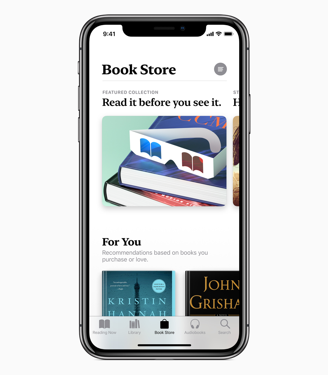
While the overall look and feel of Apple Books feels dramatically different, nowhere is that clearer than in the new Book Store: Apple fully embraces side-scrolling collections, black and white highlights, and its serif headers in this tab, along with smart pop-overs for viewing individual books.
Viewing books in the store
When you tap on a cover in the Book Store or follow a book link from anywhere else in the store, you'll get a pop-over (on iPhone) that displays the cover, title in SF Serif (along with the series and numbering, if applicable), subtitle if available, and author.
Below that, users will see black-highlighted user ratings, a Gift icon, More button, and large "Read" or "Buy" button (depending on whether you've purchased that title). There are also black-outlined Want to Read and Sample buttons that will add the book to your list and deliver a free sample, respectively.
Below that main section, the Book Store has split the publisher description into its own highlight, and offers a side-scrolling view of the book's genre, release date, length, publisher, seller, language, and file size — it's one of the prettiest ways I've seen to display this sort of information, and doesn't feel clustered or cramped.
Users also get highlighted customer reviews (again, in a side scroll), other books in the series (if applicable), more books and audiobooks by the author, other books customers have purchased, the top books in this genre, the book's version history, and any specific requirements (i.e. if it's an iBooks Author title).
Browsing the Store
In prior versions of iOS, the Book Store felt cluttered, cramped, and confusing — too many tabs and scrolling, without any sense of core organization. Apple is attempting to remedy this in iOS 12, bringing the App Store's simplistic redesign to Books.
Most every section has been brought over from iOS 11: You'll still have New & Trending books and audiobooks, Top Charts, Staff Picks, Special Offers, and Genres, along with the new For You section. But they've been reorganized in a way that maximizes art and cover space, using side-scrolling and targeted design to keep the eye from being completely overwhelmed.
You won't have as much information density available as in prior versions of the Book Store, but the information itself is still all there — just designed in a way to make it a bit easier on both the eyes and brain.
The Audiobooks Store
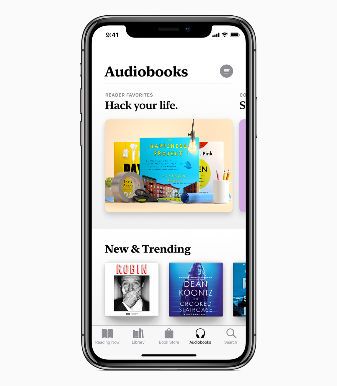
Audiobooks is moving from being a sub-tab of the Store to its own separate tab in iOS 12, using the same design as its book counterpart to highlight its audiobook titles.
But it's not just a straight copy from one side of the store to the other: The Audiobooks store has its own separate collections and staff picks, including a whole sub-section on Great Narrators; the collection highlights women narrators, full-cast dramatizations, celebrity narration, books read by the author, and highlighted narrators.
For lovers of audiobooks, this prominence in iOS 12 is likely to please — though I know some will still lament the lack of an Audible-like subscription service. (Audiobooks are one of the few places in the Apple ecosystem where you can still expect to pay upwards of $30 for a single title.)
A revamped Search experience
While the Search tab remains in iOS 12, it hasn't been ignored: It takes the Music app's integrated library search and applies it to your books collections. When you search for a title in the Apple Books app in iOS 12, it'll automatically search across both your local library and the full Books and Audiobooks Store, and present the appropriate results in side-scrolling collections.
The search screen itself presents a list of your recent searches (easily clearable) and trending books, both in the SF Serif font; you can tap on any of the trends or recent searches to go back to that search screen.
Apple Books is available now in iOS 12
That about does it for my overview of the changes to Apple's ebook experience in iOS 12; you can read more about Apple Books on Apple's website, and if you have any questions, you can drop us a line below and we'll try and get them answered. I'm pretty excited about this revamp (as you might have guessed, given all the words I've just put down about it).
In the meantime: What most excites you about Apple Books? Let us know in the comments.
Originally written June 2018. Updated and republished to reflect the official release of iOS 12 and Apple Books.

iMore.com is your source for all things Apple, and the IM Staff author represents our collective hivemind, for those occasions when the whole team speaks with one voice to bring you important updates about the site, editorial policies, awards, promotions and more.
The iMore team of Apple enthusiasts and experts shows you how to get the most out of your tech life by using Apple products and the apps, services, and devices they connect with to their fullest. iMore is a mainstay in the Apple community for good reason. Every single iMore writer and editor takes their job seriously, and we prioritize accuracy and editorial independence in everything we do, never receiving compensation for coverage and never pulling punches.
As well as our amazing group of regular contributors, the iMore staff team currently consists of: Gerald Lynch — Editor-in-Chief Stephen Warwick — News Editor Daryl Baxter — Features Editor John-Anthony Disotto — How To Editor Tammy Rogers — Senior Staff Writer James Bentley — Staff Writer
