Apple can fix iOS 15's Safari by looking to Maps for direction

iMore offers spot-on advice and guidance from our team of experts, with decades of Apple device experience to lean on. Learn more with iMore!
You are now subscribed
Your newsletter sign-up was successful
It's fair to say I have my issues with Safari in macOS Monterey, but the same app in iOS 15 isn't much better. By moving the address bar to the bottom of the screen, Apple has not only disoriented everyone but generally broken navigation in the process. But that can all be fixed — and Matt Birchler's already done the work.
All you need to do is look to the Maps app for direction. Yes, that's a pun.
As Matt points out, the problems with Safari in iOS 15 are many and not-so-varied. The main issues for me are the way the address bar disappears when you scroll and the fact it gets in the way of website navigation too often. I can absolutely see where Apple's engineers were going here and I don't blame them for it. They wanted an address bar that got out of the way of the content, but it's a little too much to be easy to use. But it needn't be because Maps already has this all figured out.
Article continues belowOver to Matt.
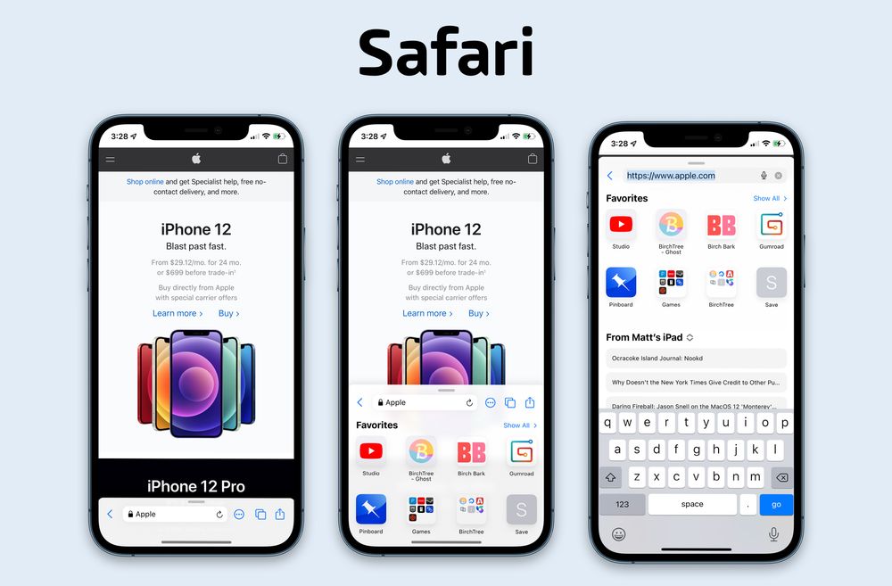
Apple's own Maps app has a similar UI where they've moved the search field and bookmarks to the bottom of the UI, while letting the content (the map) occupy most of the screen. The search bar is always visible, a small swipe up reveals your favorites, and a full swipe up brings up the full functionality of that app's "start page".Is this as adventurous as the new Safari UI? Nope, but it sure didn't spark the frustration that Safari has caused either.
And that, right there, is the key. If seemingly everyone in my Twitter timeline is shouting about the current iOS 15 beta 2 design — if you're reading this after release and it's fixed, yippee! — then there's a problem. Nobody complained about the change in Maps.
So how do you fix Safari? You CMD+C and CMD+V the Maps interface. That's how.

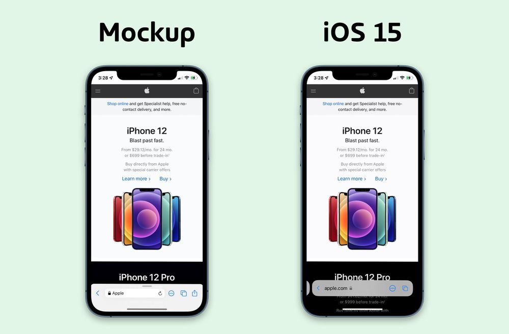
Looks pretty great, right? It still wouldn't be the best iPhone app out there, but it would be usable.
iMore offers spot-on advice and guidance from our team of experts, with decades of Apple device experience to lean on. Learn more with iMore!
Sure, there are still problems. Some elements that we'd like to get to more easily are buried and anyone used to tapping the top of the screen to enter a new URL or search will still do that. But that's a muscle memory thing and I wouldn't want Apple to avoid changes on that account. This concept could still be worked on and creases ironed out, too. But I already like it after looking at one screenshot. I already hated the iOS 15 implementation of Safari from a similar number.

Again, this was a quick mock up, and I'm sure there are things that could be improved if I spent more time with it and gave it to testers. The point of this exercise was to take a UI that appears to solve similar problems and see how it worked in Safari. I think it looks pretty good on the surface, and given how the UI was pretty universally celebrated when it came to Maps a few years back, I think there's something to be learned from it.
Again, this is the thing. I think this is the kind of issue that crops up when you have individual teams working on different apps. I suspect, although I don't know for sure, that the team working on Safari isn't the same team that works on Maps. In fact, I'm pretty sure of it. The lack of cross-pollination is what has caused a simple UI change to be overlooked. Hopefully someone reads this and takes the hint.
Then we just need Apple to do macOS Monterey, too!

Oliver Haslam has written about Apple and the wider technology business for more than a decade with bylines on How-To Geek, PC Mag, iDownloadBlog, and many more. He has also been published in print for Macworld, including cover stories. At iMore, Oliver is involved in daily news coverage and, not being short of opinions, has been known to 'explain' those thoughts in more detail, too.
Having grown up using PCs and spending far too much money on graphics card and flashy RAM, Oliver switched to the Mac with a G5 iMac and hasn't looked back. Since then he's seen the growth of the smartphone world, backed by iPhone, and new product categories come and go. Current expertise includes iOS, macOS, streaming services, and pretty much anything that has a battery or plugs into a wall. Oliver also covers mobile gaming for iMore, with Apple Arcade a particular focus. He's been gaming since the Atari 2600 days and still struggles to comprehend the fact he can play console quality titles on his pocket computer.
