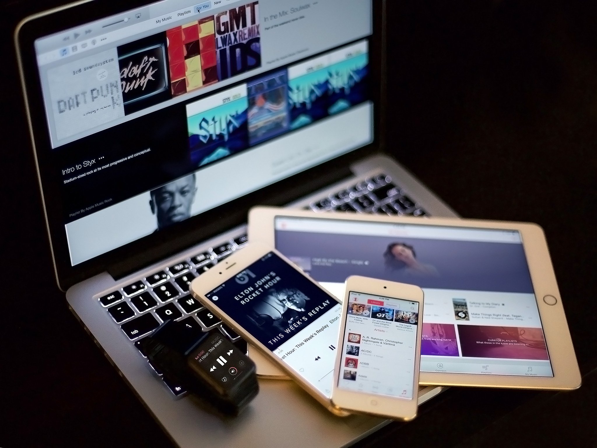
Apple Music: Our 7 biggest wants and wishes for version 2.0

I've used Apple Music almost every day since its launch last June. I started because we were writing a book on the subject, but I genuinely like the service: Its custom-curated playlists are excellent, and even though it relies too much on drum-and-bass tracks, I often turn on Beats 1 in the car before I even consider flipping on terrestrial radio. I'm even listening to an Apple Music playlist — Best of French House, Vol 2, for those curious — as I type this.
But the service isn't without its problems — issues largely tied to the way you listen to music, via Apple's often-clunky iOS and Mac apps. And on the heels of a Bloomberg report suggesting that those very same apps might see an overhaul this June, we decided to put together our top wants and wishes for Apple Music 2.0. (Special thanks to all of you on Twitter who replied to my tweet on the matter.)
First things first: Fix the interface
The Music app and iTunes both badly need a interface overhaul. Rumor has it Music was originally much simpler, and iTunes is apparently always on the cusp of new and better redesign. Right now, though, there's a lot of stuff crammed in each app — and poor iTunes has to deal with video, podcasts, and other media, too. Apple has also focused on big, beautiful album art rather than maximum amount of information on-screen, which reduces what users can see and interact with at any one time.
The iPod was simple: Five buttons and a clickwheel. Click to go forward, menu to go back. Today's Music app has lost much of that simplicity, sending new users down endless nooks and crannies, leading to confusion and general uninterest in the app and service.
I don't think the interface is hopeless, however — just over-cluttered. And with a few simple fixes, users might find a whole lot more to like.
Shrink the album art, increase the touch targets
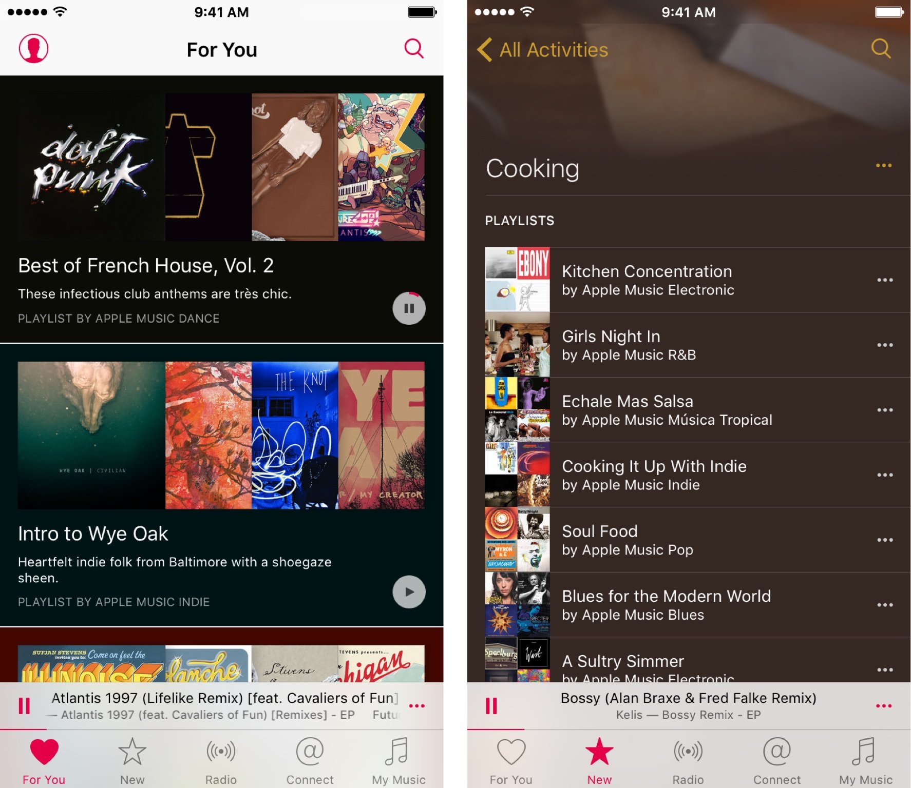
Apple Music's best section, and the one that most easily sells users on the service, is For You: It takes your artist and album likes and gives you a list of playlists and new/old artists alike that you might love.
But the way the Music app is currently laid out, you can really only see two playlists at a time (or four albums) on the screen — and that's if you're rocking an iPhone 6s. On an SE, the experience is even worse.
Master your iPhone in minutes
iMore offers spot-on advice and guidance from our team of experts, with decades of Apple device experience to lean on. Learn more with iMore!
As much as I like album art, there's no reason to make these covers so prominent. I care about two things when browsing this section: The title of the playlist, and the play button.

Funny enough, there are actually sections of Apple Music that do this right: Apple's Editor and Activity playlists display their content in easily-readable lists with small thumbnails; tap on one to view the playlist, and tap on the album art or first song to begin playing. I want that interface style in For You — this will make it easier to find playlists and artists that really matter.
Rethink the "•••"
At its core, the More button ("•••") is not a bad idea: It reduces the number of buttons on the screen, making screens easier to read. But so many different options have been hidden under those three ellipses in so many different circumstances. The latest Apple Music update simplified this menu somewhat so it wasn't just a never-ending list of menu options, but the icon-based pop-up isn't great, either. To the average user, "Play Next" and "Add to Up Next" are indistinguishable — yet they both get options in the More menu.
You can also tap the album art to get to the full album a song is from, but you can't do the same with playlists. (In fact, if you start playing a playlist and leave that screen, there's no way to get back to that playlist without remembering its exact name or re-finding it in For You.)
I don't have a good proposal for a More button redesign — maybe incorporate swipe gestures a la Mail for more-obscure options that most people don't need, or realize some use cases simply can't be carrier forward? — but one thing's for sure: it needs a change.
Change the tabs interface
For You makes sense as its own tab. But New and Radio can conceivably be one tab: Rename it Explore, as some have suggested, put Beats 1 in the top carousel, and put other streaming stations below. And while I wouldn't mind if Connect faded into the background, if Apple still wants the underlying framework there, your Connect feed could live as a tab under Explore, too.
This would simplify the Music app's tabs to For You, Explore, and My Music: One is your custom-curated music suggestion area, one for exploring Apple Music's library and radio options (or, if you're Apple Music-less, it can be a direct link to Beats 1 and the iTunes Store), and the last focuses on your library.
This also allows for the return of the Playlist tab (which previously you could only access if you disabled Connect) alongside My Music. Playlists having such prominent billing could also address a longtime complaint from some folks who wish to have their local libraries and Apple Music collections separate, by offering smart playlists that contain "All Apple Music" and "Liked Songs".
Improve For You
As I mentioned from the start, For You is one of my favorite Apple Music features, and a big selling point for the service. But there are some small improvements that would elevate the service even further.
Give me a personalized playlist
Last year, Spotify launched Discover Weekly, which uses an algorithm to create a playlist of new music and artists you already know and love for your week ahead. It's brilliant, it's often spot-on in its music choices, and if Apple isn't working on something similar but better, the company should be.
Show me new releases from my favorite artists
Right now, For You suggests an assortment of albums in-between its playlist recommendations, ranging from artists you love to artists you might like. I'd love to see more awareness on the app's part: Have Radiohead songs in your personal music library? I want to see a play button for "Burn the Witch" at the top of my suggestions. Did a new album from an artist I love just drop, but it's not available on streaming? I want to see it anyway, along with a link to either buy it on iTunes or add it to a Streaming Notifications playlist ("Notify me when this artist/album is available on Apple Music...").
Because I listened to...
I currently have no idea why Apple Music suggests the albums it does. Sometimes, I take chances on them, but by and large, I stick with the playlists, and find new artists from those compilations. I might be more likely to tap on a new album, however, if the app aligns it with music I've been listening to: "Because you like Tegan and Sara, try Best Coast."
Add more Beats stations
Beats 1 is by far one of my favorite radio experiments, and their DJs are smart, witty folks with great taste. But taste is subjective, and while I don't mind being exposed to new hip-hop tracks, there are some folks who would prefer a Beats station with different genres. I trust Apple Music's playlist curators in other genres; time to hire some Beats DJs for alternative, classical music, country, kids, and international stations. (I would be fascinated to turn into a Beats K-Pop station, for instance.)
Kill Connect (or make it better)
Sorry, Apple: Ping 2.0 just isn't working. I like the concept of Connect — getting alerts from bands you love about in-progress songs, or playlist curators on their next compilation — but the Connect tab is confusing, it's difficult to figure out how to follow people, and weirder still to try and follow what's going on.
Until the company has the staff and the drive to make Connect the top music discovery social network it can be, it doesn't deserve to be a central spotlight inside the Music app or iTunes. It can still exist under the hood — you can follow artists, and have new audio or video from them pop up under the Explore tab — but it doesn't need its own section.
And while we're at it, if you're shooting for a social network, make it social: Let me follow my friends' musical tastes — heck, if I like them enough, maybe even suggest albums or playlists they've listened to recently in For You. And please, let us subscribe to their published playlists so that they auto-update when changes are made.
Improve search and play
Apple Music's search and discovery features aren't bad, but they need to be better. It still drives me crazy that you can't build smart playlists in the Music app, or even use Boolean searches — they would obliviate a lot of complaints about currently being unable to sort your tracks in any meaningful way.
There's also an issue with history: Currently, there is a history button in the search field, but it just tracks your search history; you can only find your listening history by tapping the Up Next button in Now Playing, and it only keeps track of individual songs — not the playlists they come from.
This is especially annoying if you've selected a playlist in For You or from New, explored elsewhere in the Music app, and want to get back to the playlist — unless you remember where you first found it, or its exact name, you're out of luck finding it again.
Give Siri more to do
Using Siri with Apple Music is perhaps the easiest way to actually interact with the company's subscription service right now: Siri understands a lot of Apple Music-related commands, including finding music more or less like whatever's currently playing, liking or disliking songs, and selecting playlists.
It's on that last bit where I'd like to see Siri improve in version two, however. Currently, if you know the exact name of a playlist, you can request it; unfortunately, ask Siri to play "songs for driving," and the assistant will try to find the closest playlist that matches that title. If that turns up with nothing, Siri will attempt to play the first track that includes "driving" in the title.
In an ideal world, I'd love this to work like asking Siri for "nearby gas stations" when you're navigating: Query driving songs, and Siri will pull up the top ten or fifteen activity-based playlists, then ask you if you'd like to listen to the first one, or something else. If something else, she moves on to the next item.
Improve offline access
Many things have changed since the iPod made it possible to take songs in your pocket on a cross-country flight. Wanting to listen to music while offline or otherwise without an Internet connection has not. Unfortunately, the Music app makes this exceedingly difficult due to iOS's need to cache-clear: You can add things to your library, and even save them offline, but getting them to stay that way sometimes feels like an exercise in futility. I've frequently downloaded multiple albums before a flight, only to find that three of the thirty songs don't work, or other songs I thought I'd downloaded had been cache-cleared before my trip.
The old Beats Music app actually had a pretty elegant solution to cache-clearing: Since it was already downloading bits from songs when you streamed them, it automatically saved the last 30 songs you listened to in addition to whatever you'd designated as your "offline library"; if you turned off data, you'd always have those 30 songs available to you, even if you'd forgotten to save anything else.
I'd personally love for that feature to return in Apple Music, but over that, I'd take my offline music just staying offline. I understand that iOS wants to automatically free up space to make my experience better, but there's a happy medium here: If you're going to dump my cache of offline music, maybe at least give me a pop-up warning? "Your phone has fewer than 30 percent storage remaining. Would you like to clear some of your saved music to make room?"
This would also help with Apple Music's other major data problem: The service is a big, giant cellular hog, especially when you use it in the car. I've frequently killed two-thirds of my data for the month streaming during trips — even if it's just streaming the same two or three albums I'd listen to normally.
What would you change?
I've made my list; what do you want, iMore readers? More separation between your music and Apple Music? Student plans? Better iCloud Music Library matching? Let us know below.
Serenity was formerly the Managing Editor at iMore, and now works for Apple. She's been talking, writing about, and tinkering with Apple products since she was old enough to double-click. In her spare time, she sketches, sings, and in her secret superhero life, plays roller derby. Follow her on Twitter @settern.

