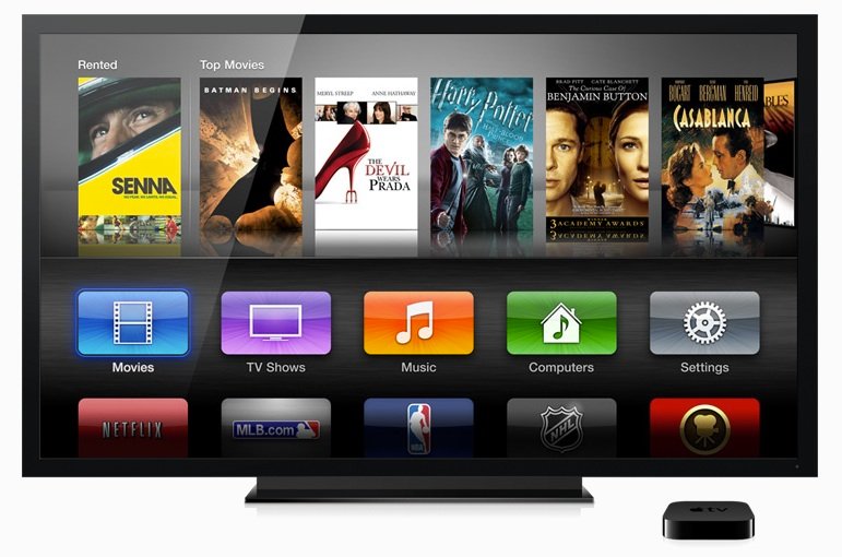
New Apple TV interface design reportedly old, vetoed by Steve Jobs 5 years ago

The new Apple TV user interface designs, which debuted alongside the new 1080p Apple TV, are actually 5 years old and were originally tossed out by the late Steve Jobs, who didn't like them. This according to Michael Margolis on Twitter, who claims to have "implemented much of the AppleTV 2.0 UI years ago".
The comment was made in response to Aral Balkan, who asked, "Wtf happened, Apple, did a rainbow throw up at one infinite loop while having sex with a designer from Samsung?" Margolis added, "The new home page UI makes me cry."
Thanks, though most of the product is the same. I also don't like the top-bar-navigation on the app store UI.Fun fact - those new designs were tossed out 5 years ago because SJ didn't like them. Now there is nobody to say "no" to bad design.
Margolis closed out the exchange by saying, as far as he knew, "that whole team has left/been replaced".
Seth Weintraub from 9to5Mac checked into Margolis on LinkedIn, and found him listed as both former Senior Software Engineer at Apple, and Professional Hobbyist, AppleTV. He's currently listed as iPhone Software Connoisseur at Massive Health.
The new Apple TV user interface has been somewhat controversial, with some liking it and believing it hints at a future where apps can run on the Apple TV as they do on other iOS devices like the iPhone and iPad. Others feel the icons are inelegant and poorly organized.
However, citing the lack of Steve Jobs being there to say "no" to bad design is somewhat specious. Some of the user interface decisions made by Jobs were just as controversial, including pinstripes and brushed metal on OS X, the new iTunes icon, and the skeumorphic trend on iOS involving plush leather, green felt, and various shades of linen.
Update: It occurs to me that 5 years ago was iOS 1 (iPhone OS 1), which consisted of a Home screen interface with nothing but a collection of static, unorganized, unorganizable icons. The ability to move and organize apps on the Home screen wasn't added until iOS 1.1 in January of 2008 when Apple created Web Clips (web app icons on the Home screen). Jobs obviously okayed the iPhone UI, and later evolutions thereof. Since you can't directly interact with the Apple TV like you can the iPhone and iPad UI, however, it's not quite the same.
Master your iPhone in minutes
iMore offers spot-on advice and guidance from our team of experts, with decades of Apple device experience to lean on. Learn more with iMore!
Personally, I'd prefer some hierarchical organization -- News, Sports, Videos, etc. instead of just all the icons (some rather less than appealing to l
If you've tried out the new Apple TV software, what do you think of it? Designed fine, or design crime?

Rene Ritchie is one of the most respected Apple analysts in the business, reaching a combined audience of over 40 million readers a month. His YouTube channel, Vector, has over 90 thousand subscribers and 14 million views and his podcasts, including Debug, have been downloaded over 20 million times. He also regularly co-hosts MacBreak Weekly for the TWiT network and co-hosted CES Live! and Talk Mobile. Based in Montreal, Rene is a former director of product marketing, web developer, and graphic designer. He's authored several books and appeared on numerous television and radio segments to discuss Apple and the technology industry. When not working, he likes to cook, grapple, and spend time with his friends and family.
