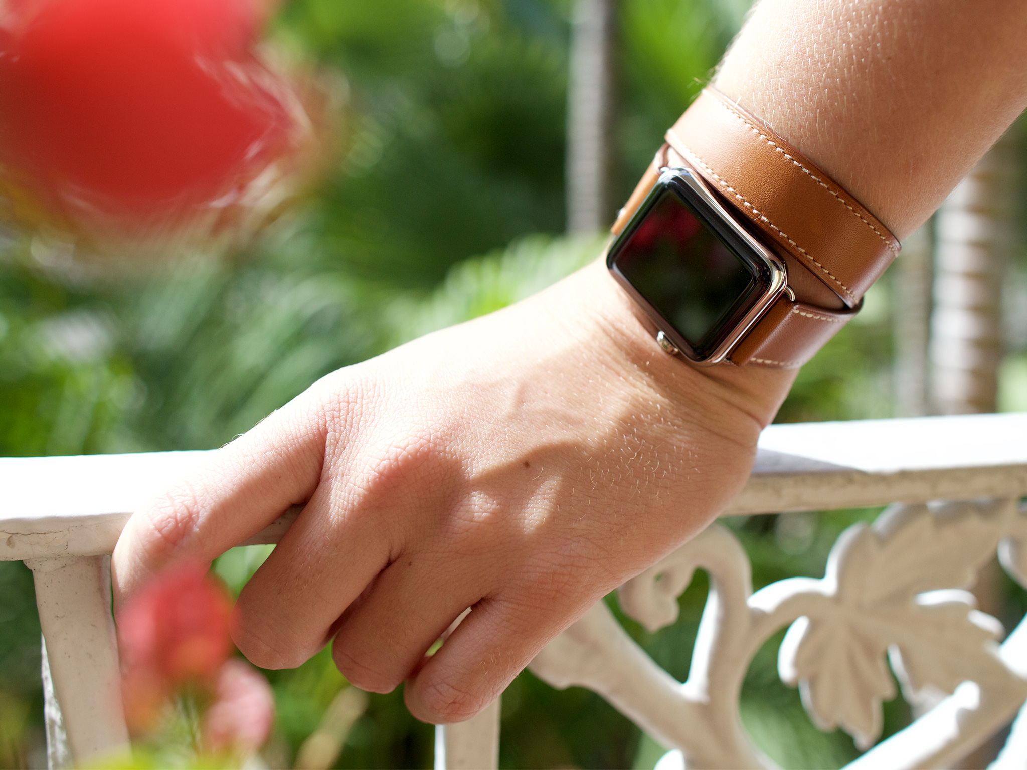
We've seen it countless times: A starship reaches orbit, then launches a smaller ship. Enterprise. Executor. Galactica. They're meant for the bigger jobs, the longer jobs, the harder jobs. But the small jobs — the brief yet important ones — are better left to something lighter and more agile. So too, the iPhone and the Apple Watch.
The Apple Watch, however, isn't just a smaller, lighter, more wearable iPhone. With the iPhone, Apple sought to emphasize the mobile computer. With the Apple Watch, the company has chosen to focus on the watch.
This reflects the reality of how we've traditionally worn technology on our wrists — from mechanical to digital, from chronograph to calculator. By incorporating all the benefits of modern mobile computing, including communications and control, tracking and payments, it gives us more: It gives us our dreams.
We've read and watched them since childhood. Dick Tracy. Michael Knight. James Bond. They've been in the pages of our comics, and on our TV sets and movie screens, tantalizing us with just exactly those features.
That makes the Apple Watch a unique challenge. To succeed it needs to balance both past and future, tradition and technology, expectations and power efficiency. It needs to satisfy both reality and our dreams. So, does it?
For people who want:
- Greater convenience
- Phenomenal build quality
- Early access to wearable computing
- A second screen for their iPhones
- A heart rate monitor and better health and fitness assistance
Not for people who want:
- One more device to manage
- Stand-alone GPS or cellular networking
- A cheap smartwatch or fitness tracker
- A second or third generation Apple Watch
Apple watch video review
Give us four minutes and we'll give you the Apple Watch.
Apple Watch packaging
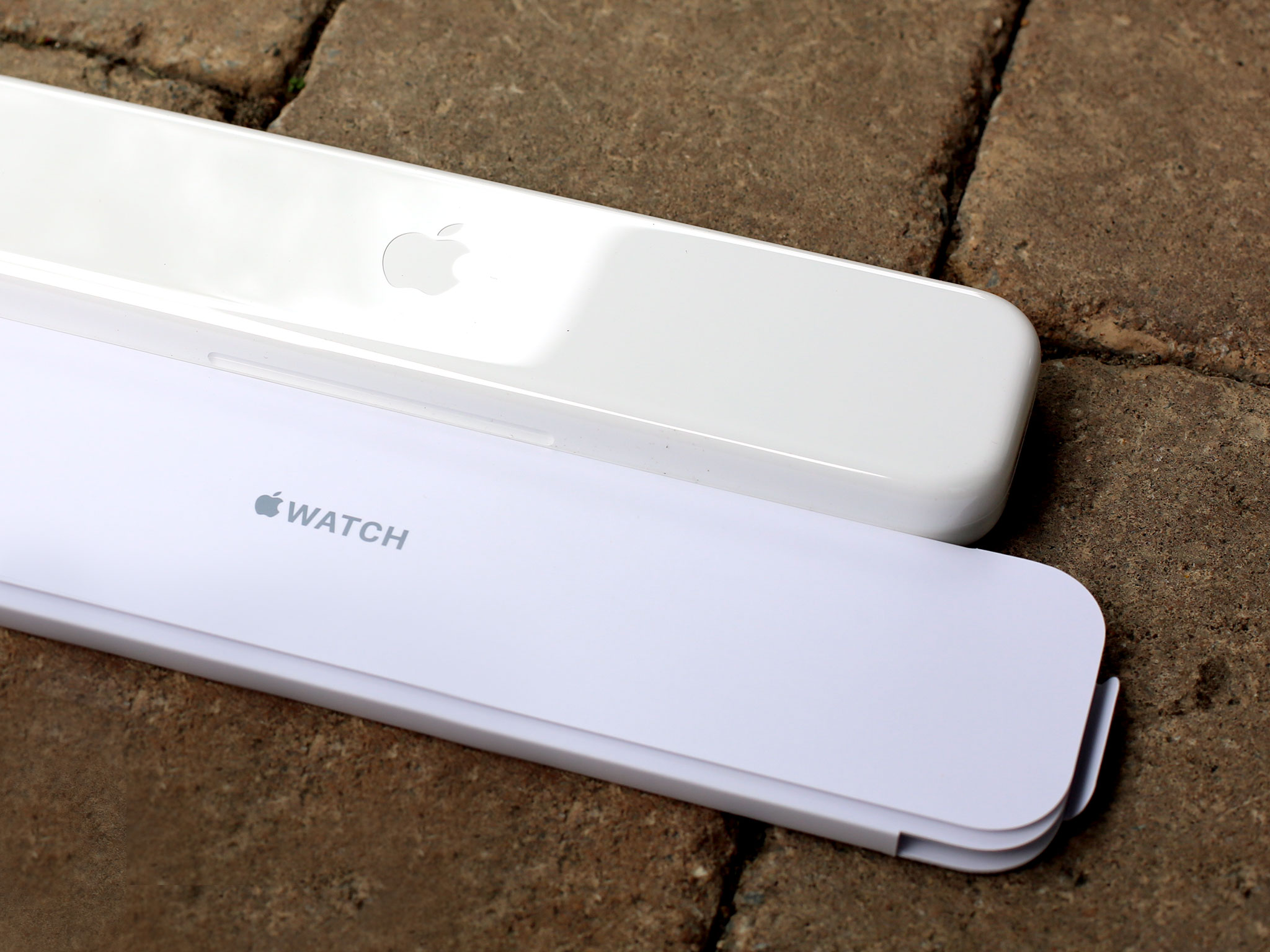
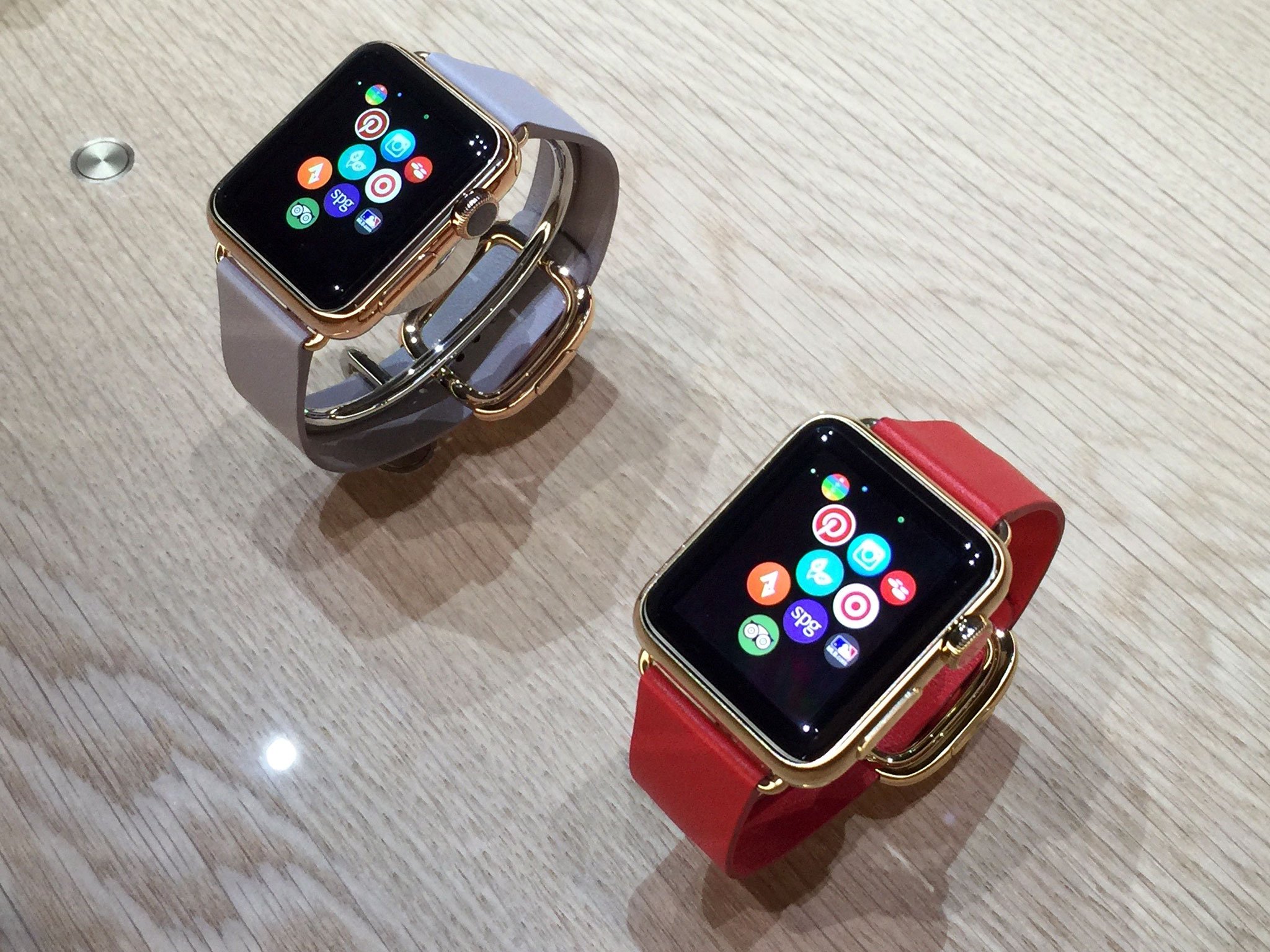
The different Apple Watch collections each come in different packaging. The Sport comes in a long rectangular box. The Watch comes in a white square with a white plastic rounded square container. And the Edition comes in a darker, more elaborate version of the same.
iMore offers spot-on advice and guidance from our team of experts, with decades of Apple device experience to lean on. Learn more with iMore!
Regardless of collection, all include the watch case, the paired band, a USB cable with a magnetic charger on the end, and an iPhone-style AC adapter.
Apple Watch design
The Apple Watch is the most impressive piece of industrial design to ever come out of 2 Infinite Loop. From materials to finish, digital crown to band swapping mechanism, Retina display to mics and speakers, heart rate sensor to inductive charger, the Watch takes myriad components and melds them into a singular and singularly impressive object.
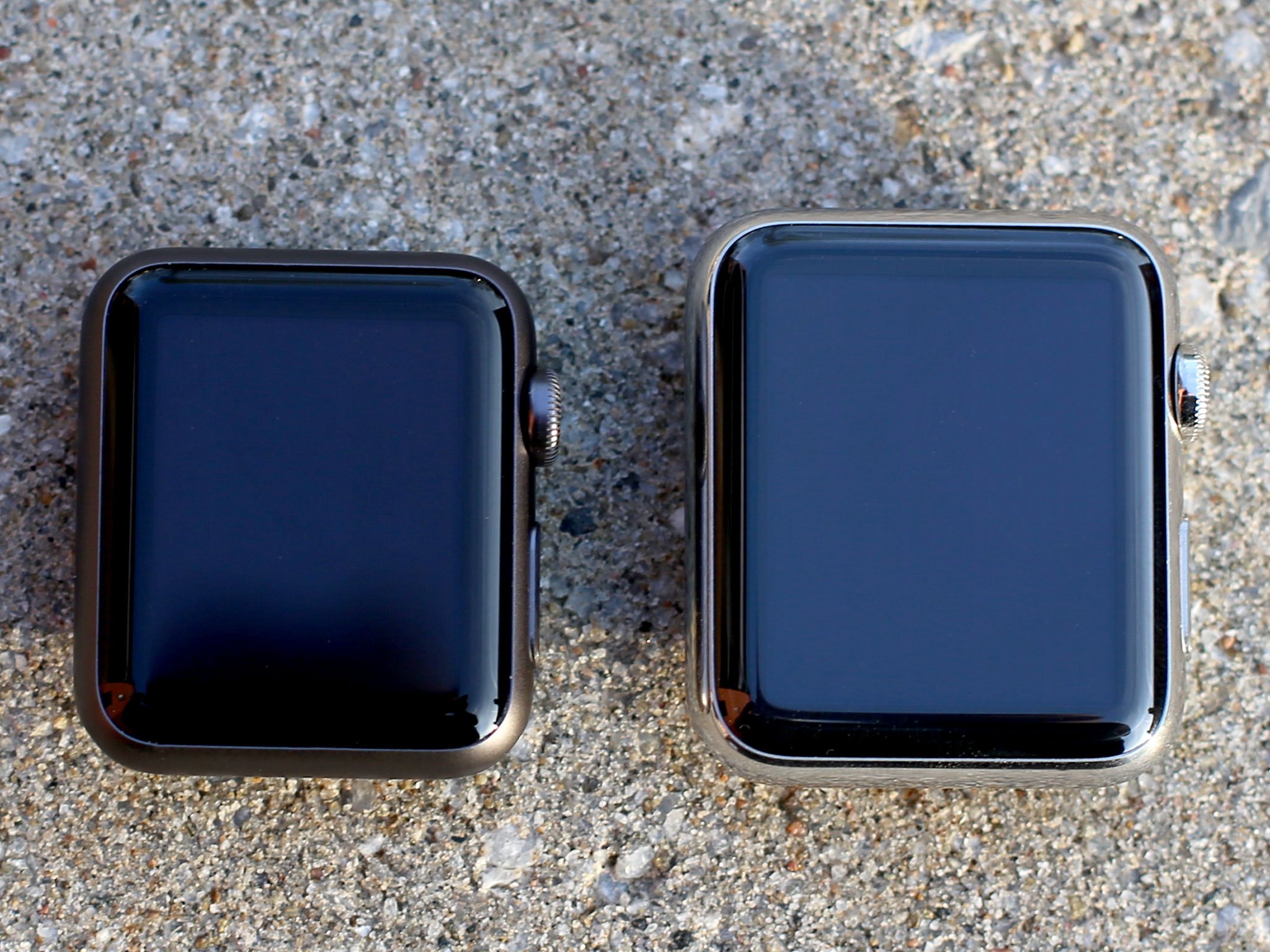
That makes sense, given how personal the watch project was to Apple's senior vice president of industrial design, Jony Ive, and Ive's longtime friend, collaborator, and now colleague, Marc Newson.
The design language of the original iPhone is evident; the Watch pursues the same blend of restraint and inevitability. Yet this time the technology doesn't just have to be in service of functionality — it has be in service of fashion.
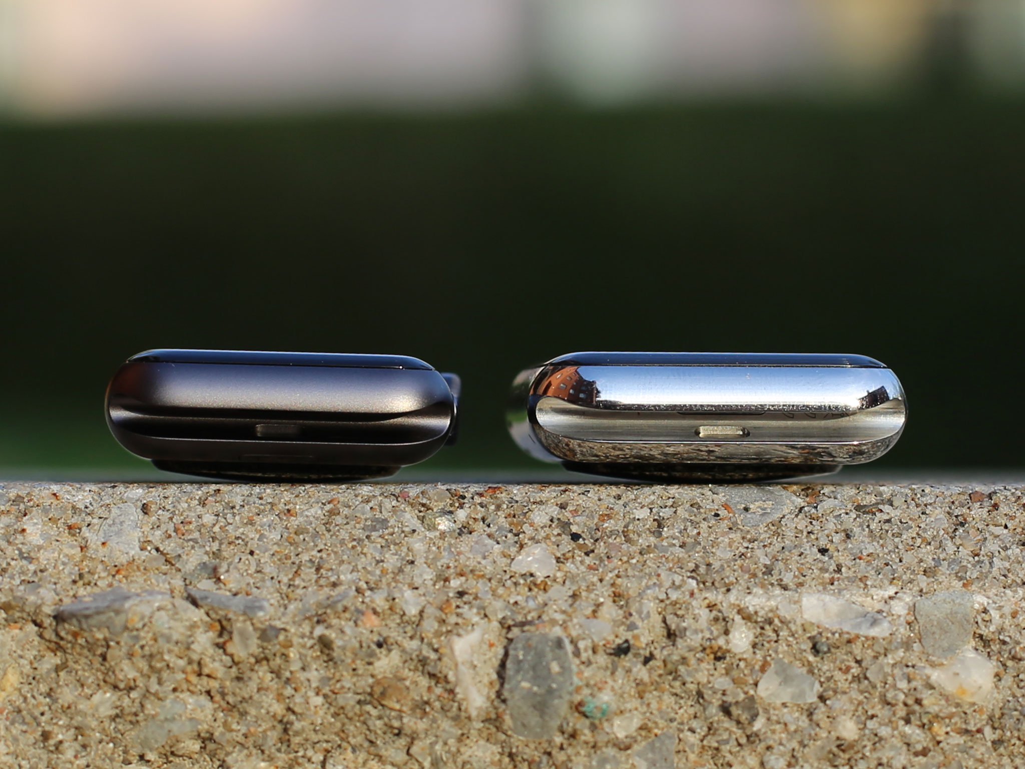
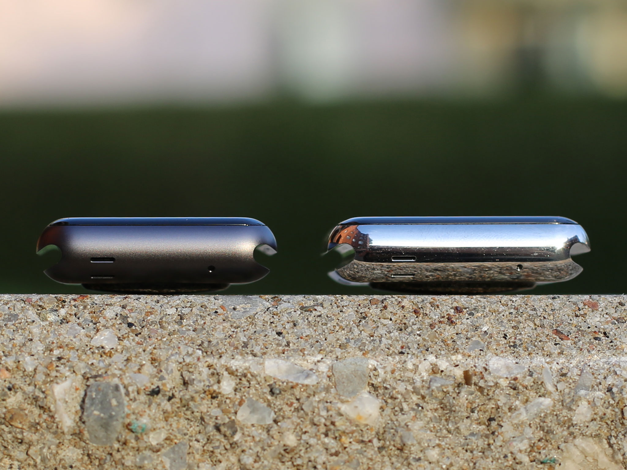
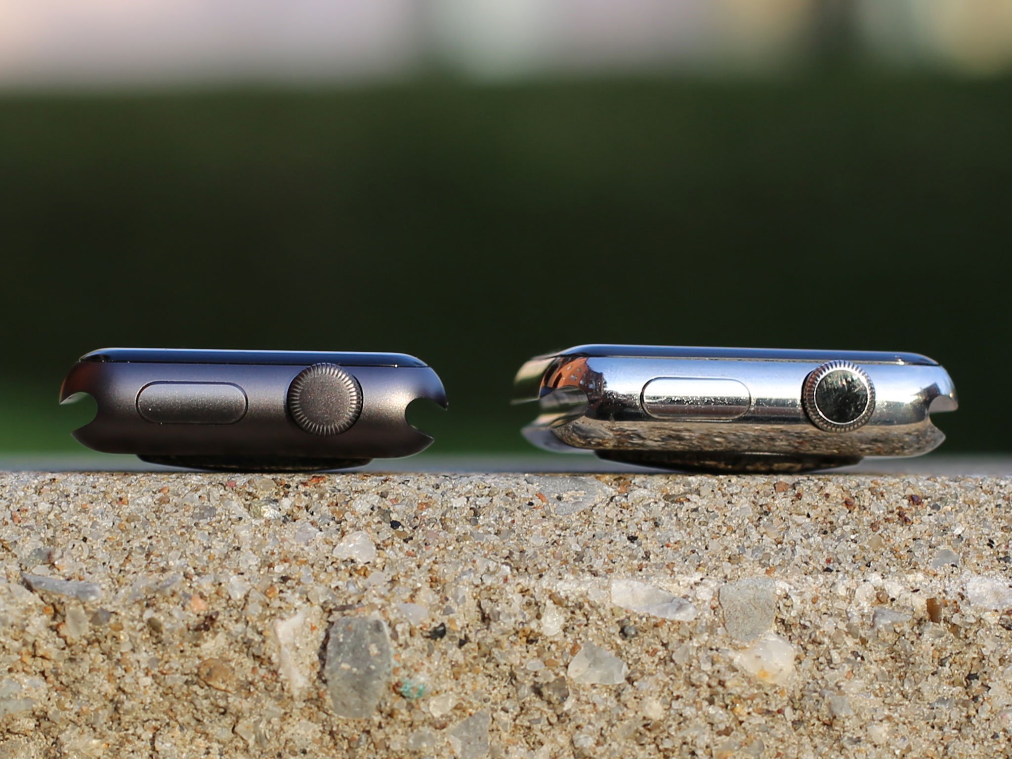
Materials
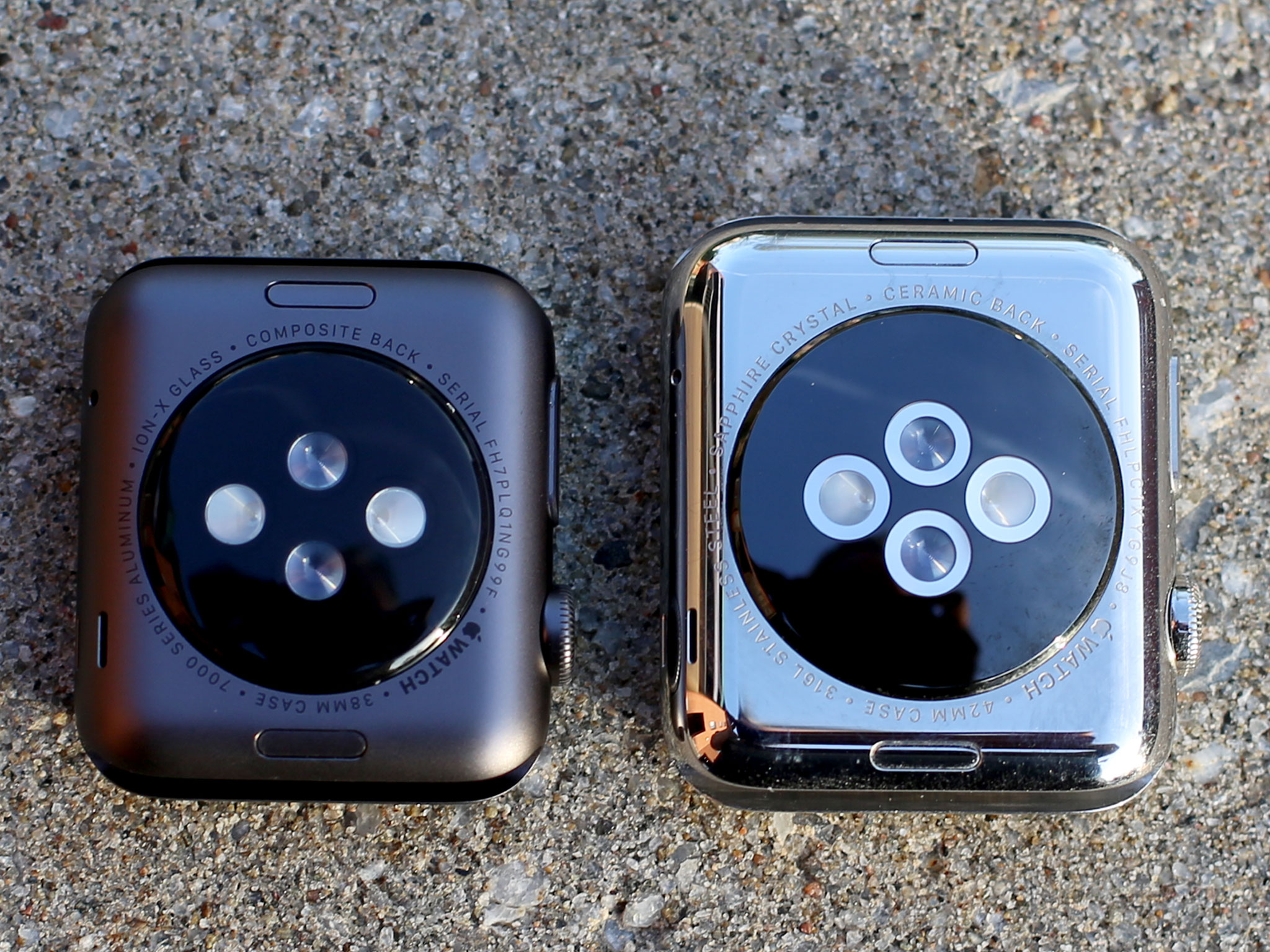
Apple is using three different materials for the cases: 7000-Series aluminum for the Sport, 316L stainless steel for the Watch, and 18-karat gold for the Edition. There are two finishes for each: silver and anodized space gray, silver and diamond-like coated space black, and yellow and rose gold respectively. The screens are Ion-X (ion exchange) glass for the Sport and sapphire for the Watch and Edition. The backs are a composite material for the Sport with hard-coated optical polymer sensor lenses, and zirconia ceramics for the Watch and Edition, with sapphire lenses.
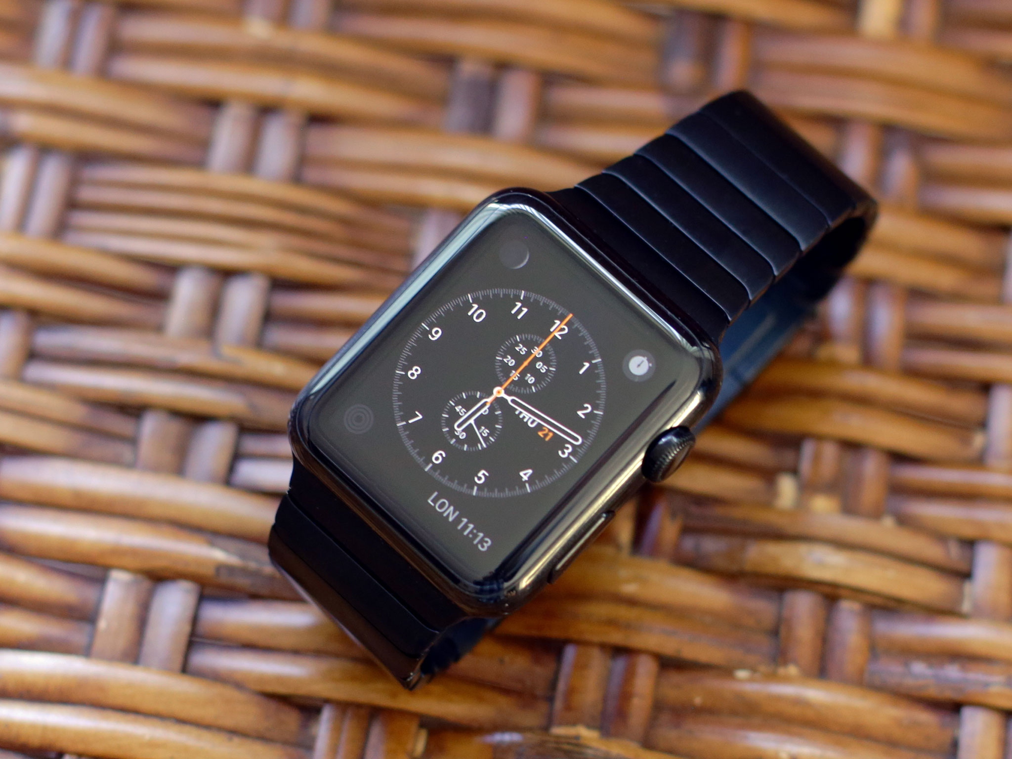
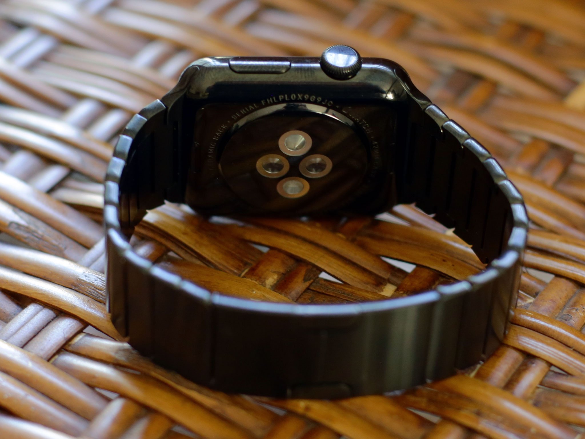
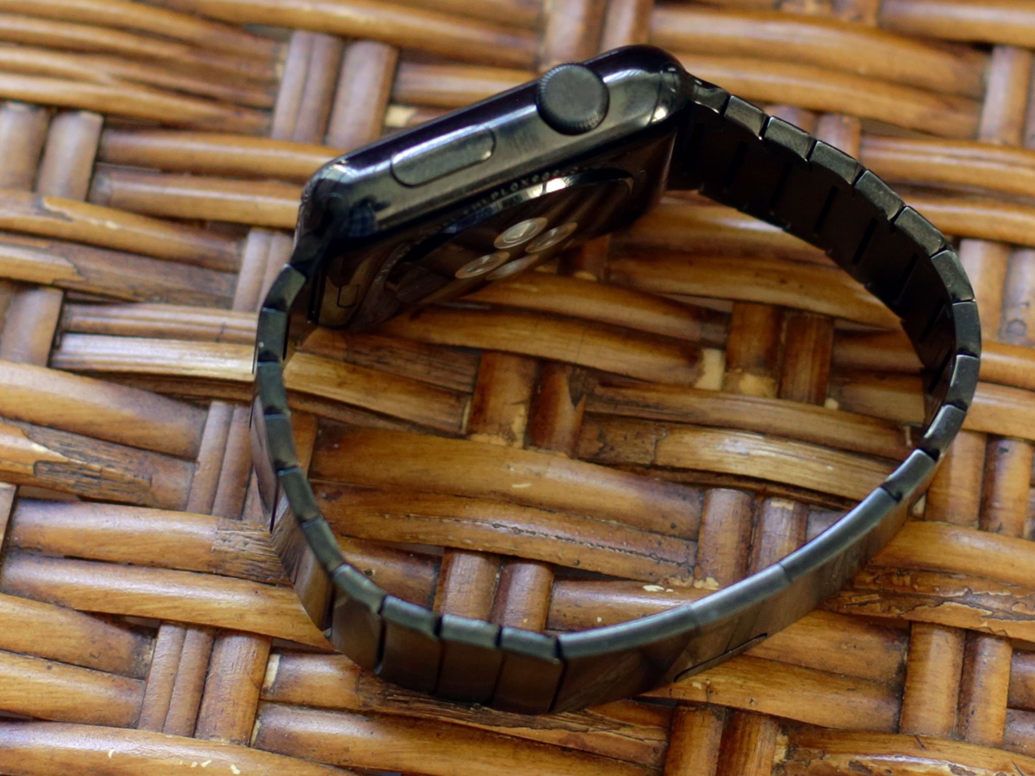
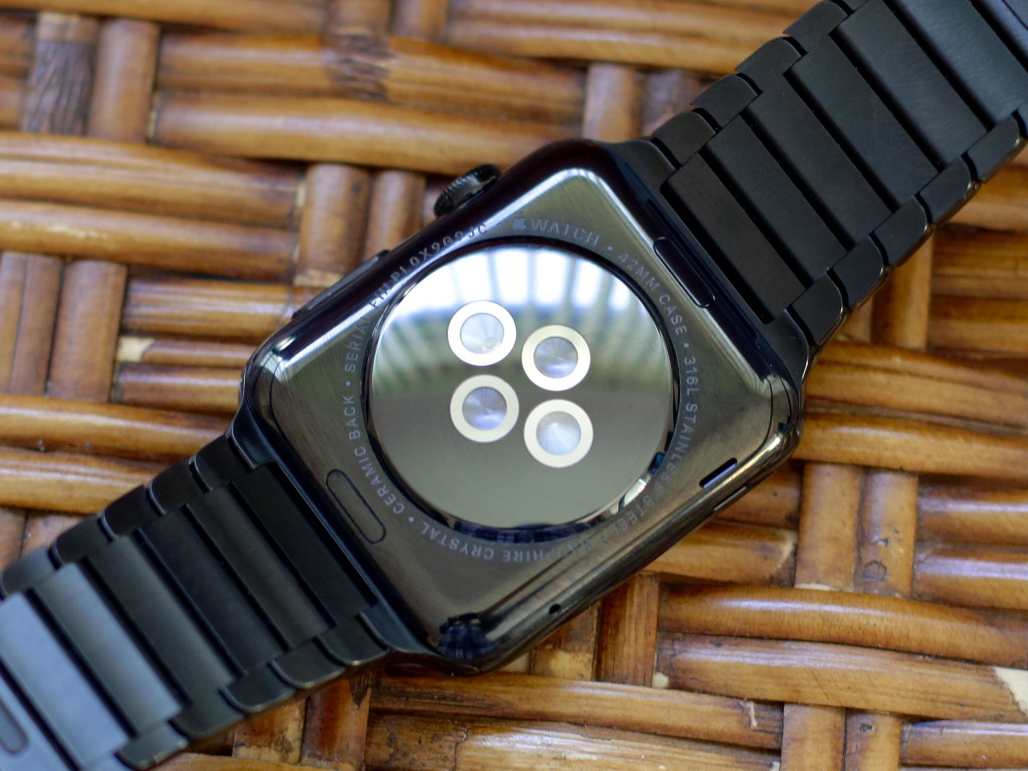
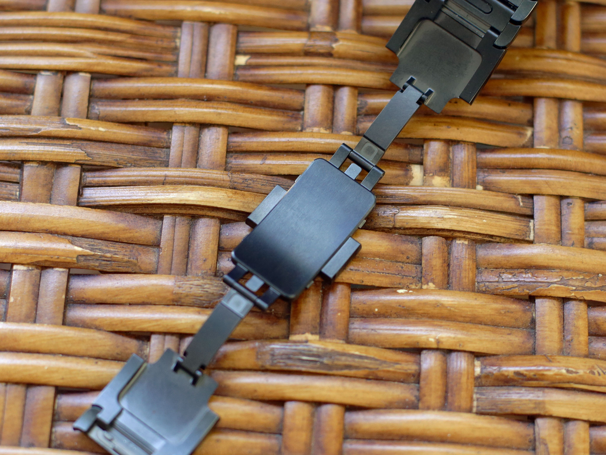
Apple's industrial design team are more than masters at working with composites, aluminum, stainless steel, and hardened glass — generations of iPods, iPhones, and iPads have have seen to that. These ceramics, golds, and sapphires may be new, but look to be every bit as well-handled.
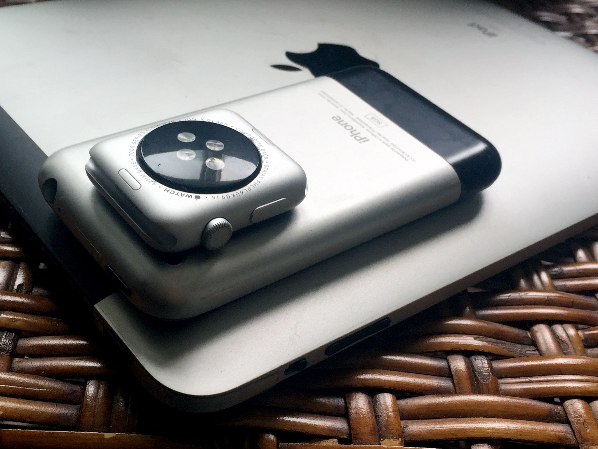
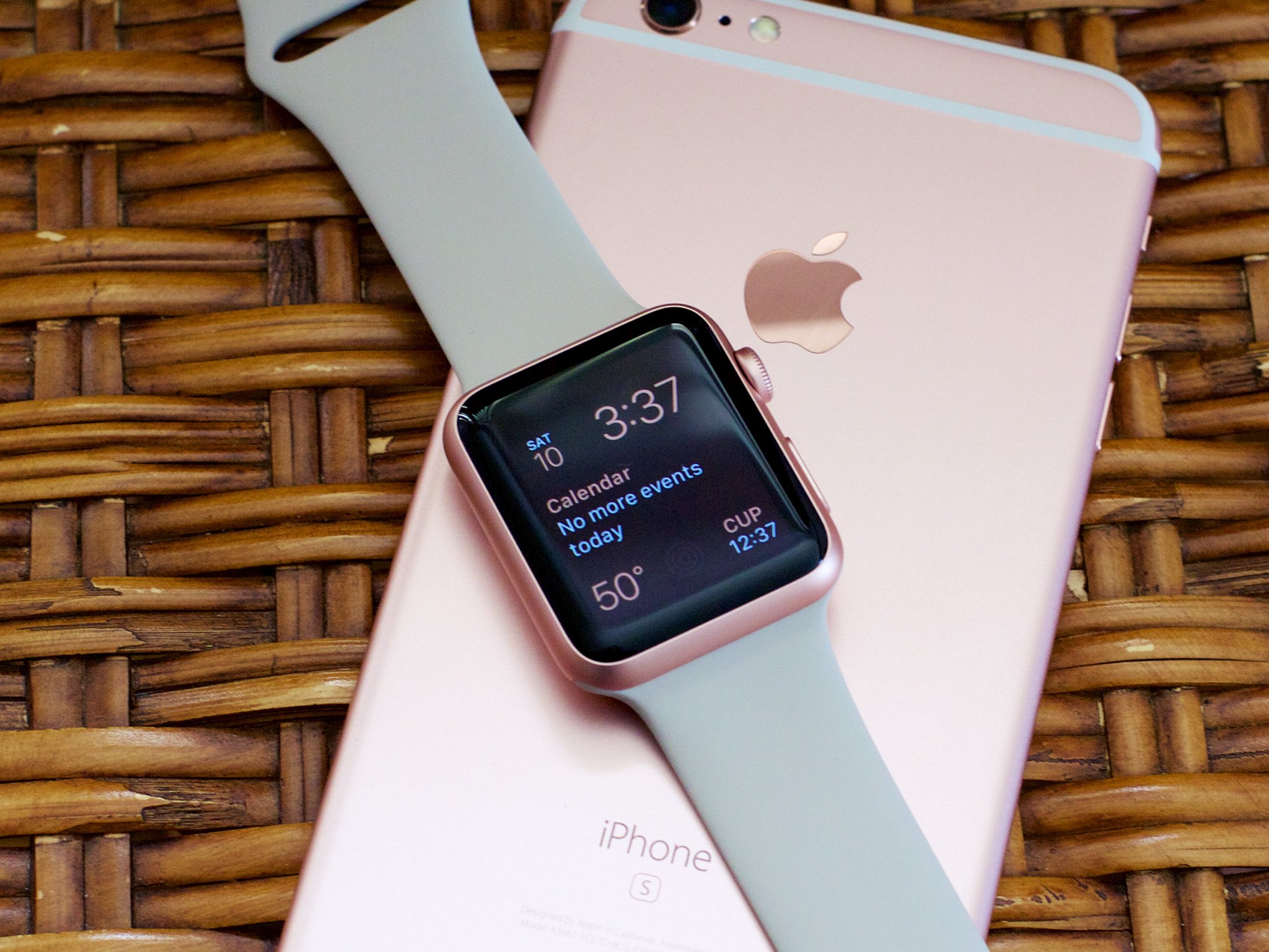
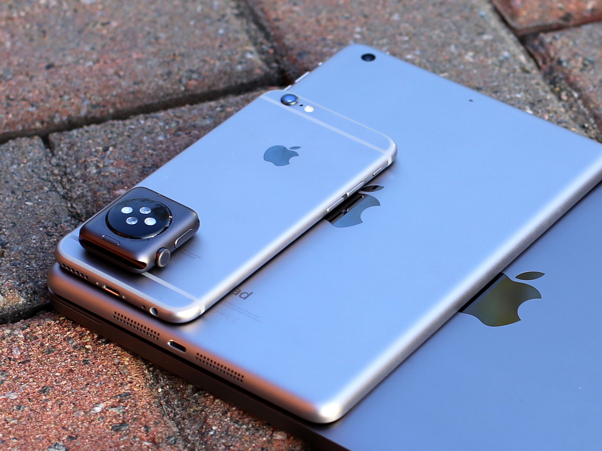
Seeing the glass curve down and almost melt away into the metal is impressive, as is the laser-ablated antenna groover, and the way the metal gives way to the Watch's inductive charger and sensor assembly on the bottom. There may be physical seams, but the execution looks and feels seamless, for both the 38mm and 42mm sizes.
Apple is measuring those sizes vertically, so neither is especially small or large by traditional watch standards. The difference might not sound like much, but 4mm is roughly 10 percent of the 38mm Watch's height.

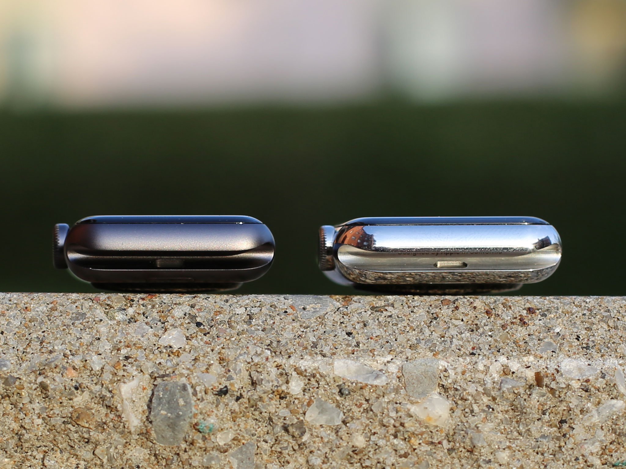
The depths are the same across the board: 10.5mm. That's not thin, but it's also not unprecedented in the watch world. If you frequently wear really tight fitting cuffs, you might notice a bulge, but I've not had any problem with any of the shirts or jackets I wear. The Apple Watch just disappears under the cuff.
Weights vary by not just size, but material: the Sport models weigh 25g and 30g; the Watch, 40g and 50g; and the Edition, 54g and 67g for rose gold and 55g and 69g for yellow gold.
Though the weight almost doubles from Sport to Edition, neither feels too light or too heavy. After a few minutes wearing them, whichever one you're wearing simply seems 'normal'.
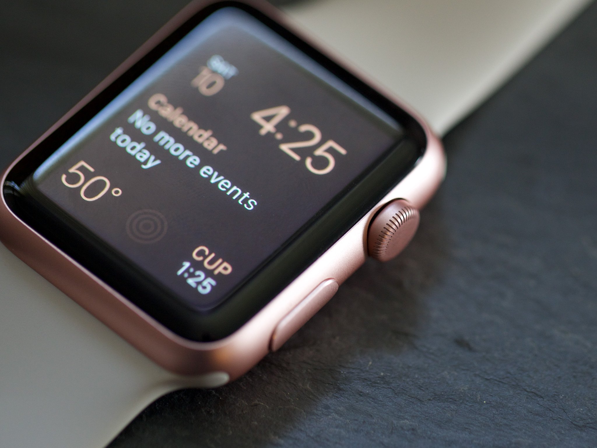
Update: Gold and rose gold Sport
On September 9, 2015, alongside a variety of new band options, Apple introduced two new anodized aluminum finishes for Apple Watch Sport: gold and rose gold.
Rather than imitating the existing 18K yellow and rose gold Apple Watch Editions, they've been made to perfectly match the gold iPhones 6 and iPhones 6s, and the new rose gold iPhones 6s.
The aluminum Watch is blasted by microscopic zirconia beads for a matte finish, while the stainless steel and golds are polished to a shine. The ceramics are polished with a grinding stone and the sapphire with diamond covered pellets.
Like any watch, scuffs and scratches are inevitable. And like any watch, you'll be able to treat them as and when they happen. I've had my steel and sapphire Apple Watch going on three weeks and it still looks as good as it did when I took it out the box.
OLED retina display
The Apple Watch's front is dominated by its Retina display. That's not unusual for a mobile device, but this Retina display is OLED (organic light-emitting diodes), and that's a first for Apple.

The 38mm Apple Watch has a display size of 340-by-272 pixels.The 42mm Apple Watch has a display size of 390-by-312 pixels.
Modern OLED has improved upon its ancestry to retain its traditional advantages and mitigate its disadvantages. With deep blacks and high power efficiency, it's a perfect match for a device that's designed to be viewed quickly.
The deep blacks and power efficiency are related: With Apple's traditional LCD (liquid crystal displays) technology, there's a single backlight that's either on or off. It doesn't matter if there's one subpixel or every subpixel active, the entire display is drawing power. That also means, even for unused areas, there's some light coming through; the resulting blacks look closer to very dark gray.
With OLED, the subpixels light themselves. So, if any part of the display isn't being used, it's also not being lit up. That both saves power and allows the unused areas to stay closer to true black.
The colors are bright and, in addition, the Watch appears to match the iPhone's calibration, making for an incredibly consistent experience.
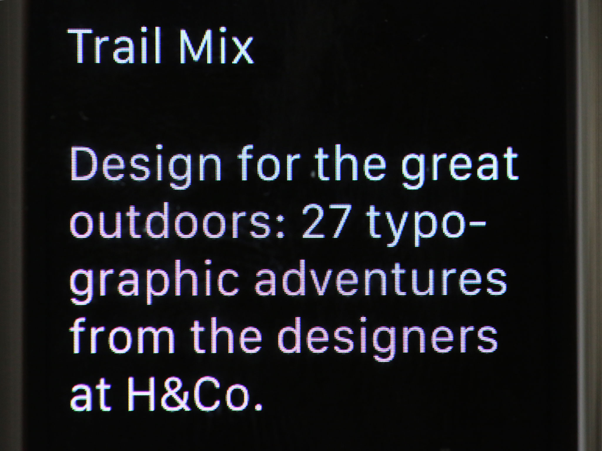
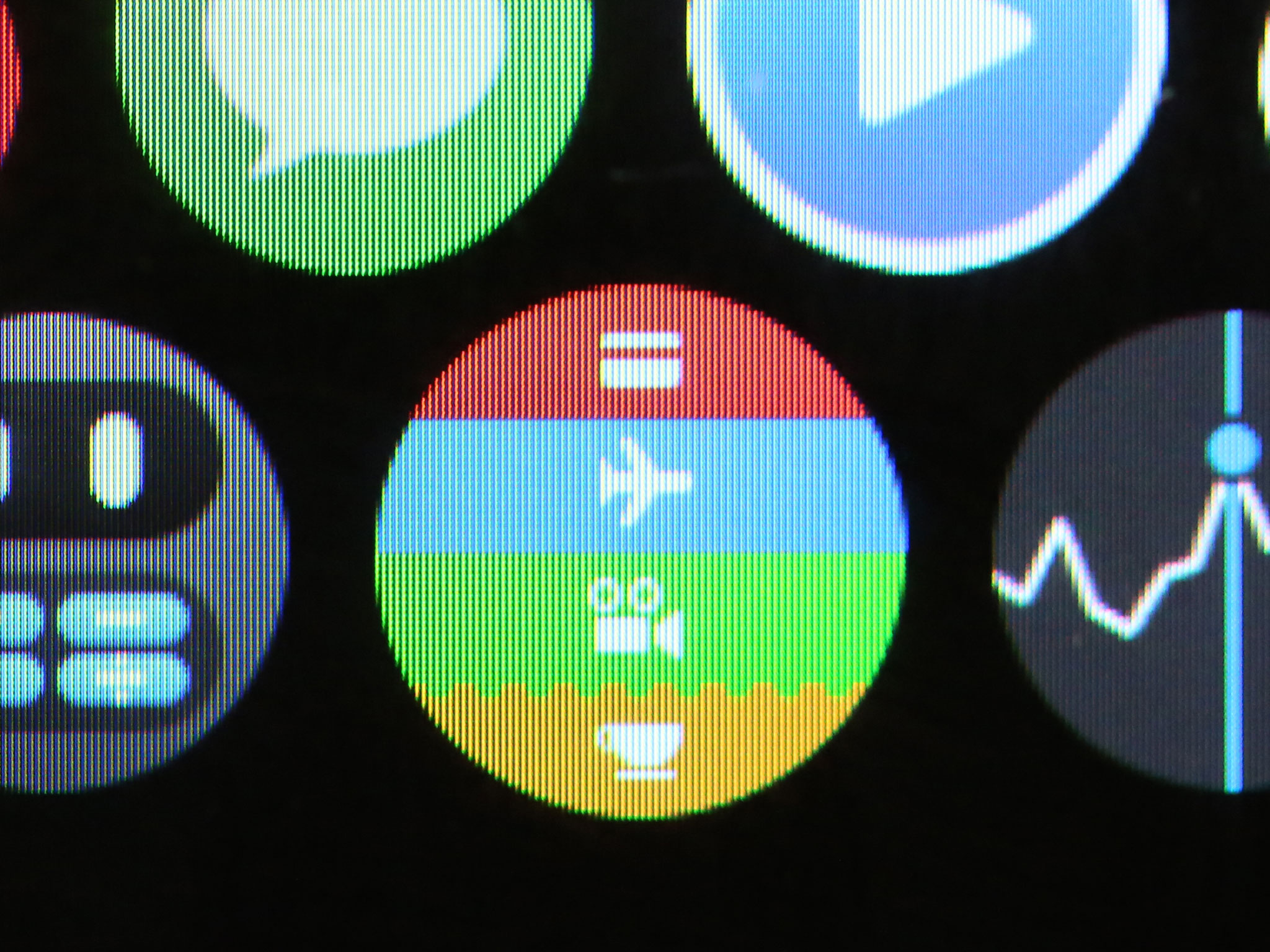
Both text and graphics look look crisp and clean, and have great viewing angles — though it's arguable how much that matters on as personal a device as a watch — and the screen remains legible in all but the brightest, most direct sunlight, even at low brightness settings.
The OLED display has matured so well, in fact, that it's hard to imagine we won't be seeing it on more and bigger products in the future.
Digital Crown and side button
There are two physical buttons you can use to interact with on the Apple Watch: the side button and the Digital Crown.
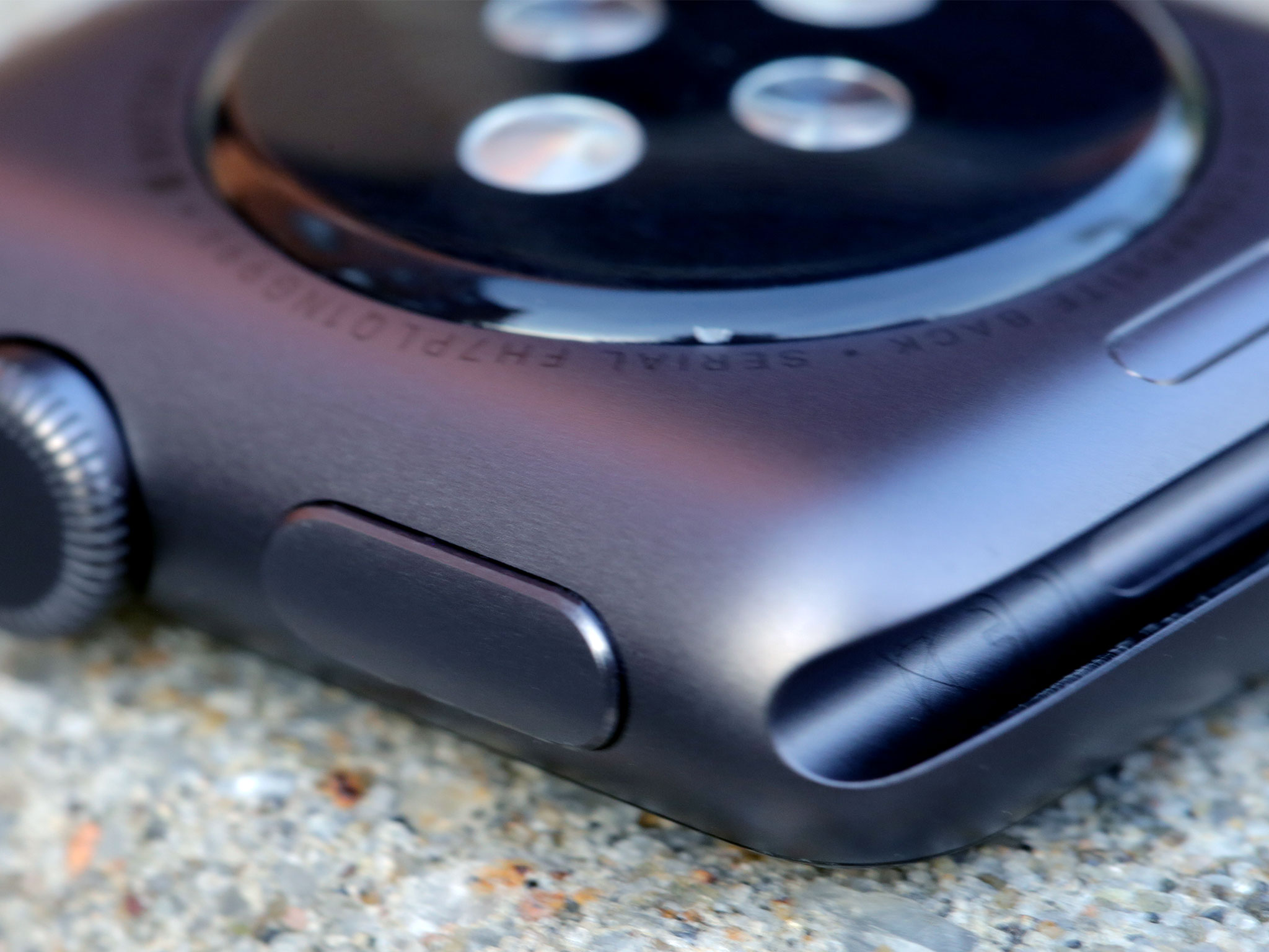
The side button is, as the name implies, on the side of the Watch. While it serves several functions, in practice it feels like the sleep/wake button on the iPhone — especially the newly relocated sleep/wake button on the iPhone 6 and iPhone 6 Plus.
Unlike on the iPhone's sleep/wake button, the side button is not an on/off switch: Press it once for the Watch's Friends interface; press it twice for Apple Pay (currently only available in the U.S.). Press and hold it for the the power off, power reserve, and lock device menu. Do that while you're in an app, and then press and hold it again, and you'll force quit the app.
That a single press of one of only two control buttons on the Apple Watch is devoted to Friends indicates that Apple believes communication — along with the fancy new Friends interface and Digital Touch system — are among the most important features on the Watch.
Depending on how highly you value your friends and how much you enjoy Digital Touch, you may agree or disagree with the choice. Regardless, you can't change it: If health and fitness is more important to you and you'd rather have workout or timer functionality a single hardware button press away, you're out of luck.
Perhaps Apple will make the side button configurable at some point, the way they did with the late mute/orientation lock switch on the iPad, and the way they have and still do the triple press for accessibility. But I'm not counting on it just yet.
Because a single press is assigned to Friends, and you can't use it to sleep the screen the way you can on the iPhone. To do that, as Serenity mentions in the roundtable below, cover the Watch with your hand and let the ambient light sensor do the sleeping for you.
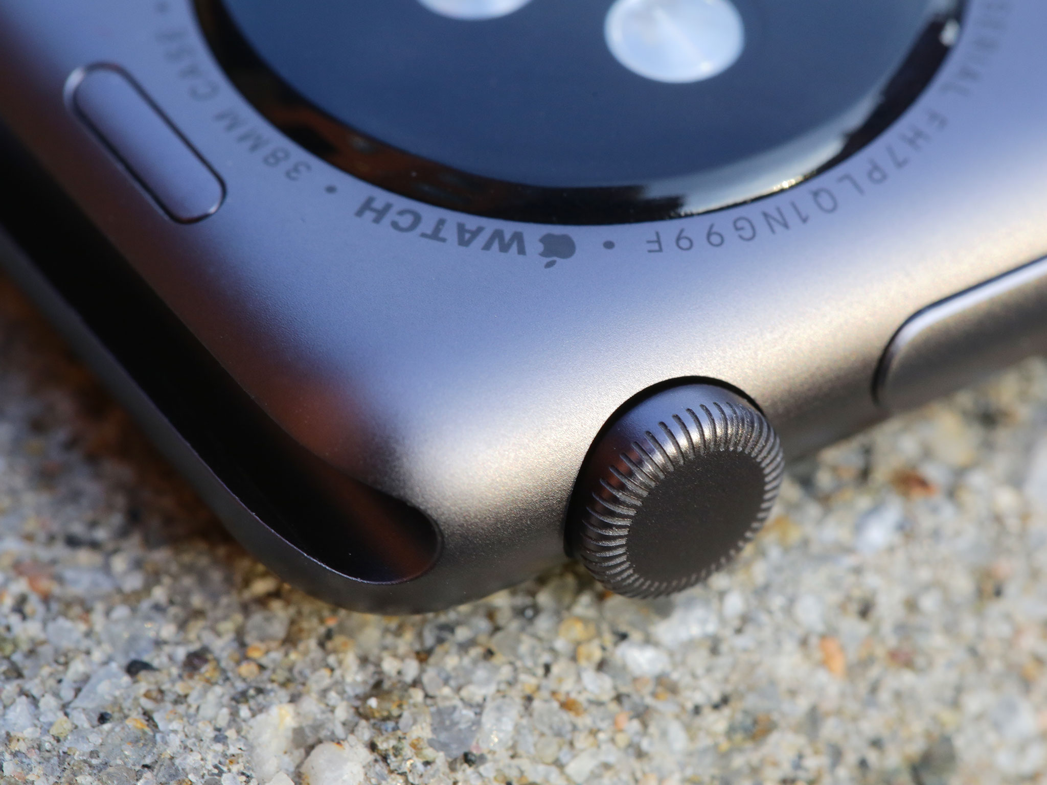
The Digital Crown is an entirely different animal.
On appearance alone, it looks like a traditional watch crown — the kind we've always used for winding and setting. It's not centered, but offset to counterbalance to the side button.
Press it once, and you go to the home screen — unless you're already on the home screen, then you either center up on the home screen or, if you're already centered, you go to the clock face. Press and hold and you get Siri, Apple's personal virtual assistant.
Press it twice and you switch between the the app you're currently using and the clock face. Press it three times, and, if you've set it up, you toggle the Zoom or VoiceOver accessibility on or off. You can also press the Digital Crown in conjunction with the side button to take a screenshot, or hold them both down to reboot.
In addition to pressing you can also turn the Digital Crown. That will zoom in or out, scroll up or down, or cycle through options. All while keeping your fingers off the tiny display so you can both navigate and view what it is you're navigating.
That sounds like a lot of functionality for one little crown, but for the most part it works. (Mainly because a lot of it is infrequently required.)
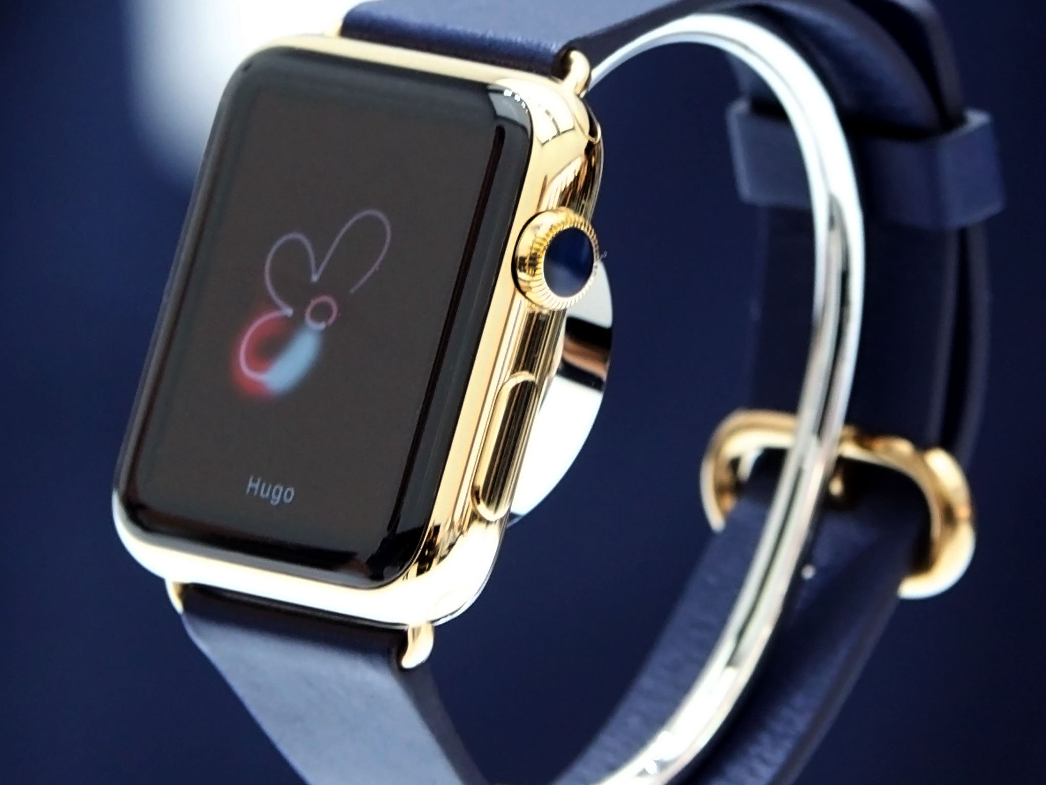
There are some collisions: With traditional watches, we've been trained to pull the crown to go into adjustment mode, turn it to make adjustments, and press it to exit adjustment mode. The Apple Watch can try and alter that training, but to do it consistently it needs to be consistent. Right now it's only mostly consistent.
You turn the Digital Crown to change an alarm time, for example, but setting the alarm requires a tap — if you press the Crown instead, the Watch will eject you back to the home screen. If you turn the Digital Crown to set a customization on the clock face, however, pressing it is indeed what you need to do to commit the setting.
There will always be exceptions in navigation, but they come at a cost.
There will always be exceptions in navigation, but they come at a cost. Both choices in those examples make sense within the context of the individual app — one has space for a "Set" button, while the other does not — but within the greater context of the overall interaction model, it adds to the cognitive load, creates the potential for confusion, and limits the chances either behavior will become truly instinctive.
If each evolution in computing has come with an evolution in human interface — keyboard to mouse, click-wheel to multitouch — then the Digital Crown has its work cut out for it.
The Digital Crown hardware is certainly solid. The mechanics are terrific, and the grooves on the stainless steel especially so: unlike the slightly rounder, laser-cut aluminum, the machined stainless steel catches the ridges of your fingers with what I imagine is Spider-Man-like stickiness.
I just have to remember to use it. I no longer have my iPod click-wheel training of old; years and years of iPhones and iPads have trained me to touch what I see and manipulate it directly. I've gotten more accustomed to the Digital Crown over the last three weeks, and I see and appreciate the value of not obstructing the display, but only time will tell if that rationale can win out over my instincts.
Inductive charging
On the rear plate of the Apple Watch, surrounded by a circle of text describing the product's logotype and serial number, as well as information on its size and materials, you'll find its inductive charging ring. A form of wireless charging, inductive charging works by converting electricity into electromagnetic energy, passing that energy to another object, then converting it back into electricity.
- Update: watchOS 2 and Nightstand mode
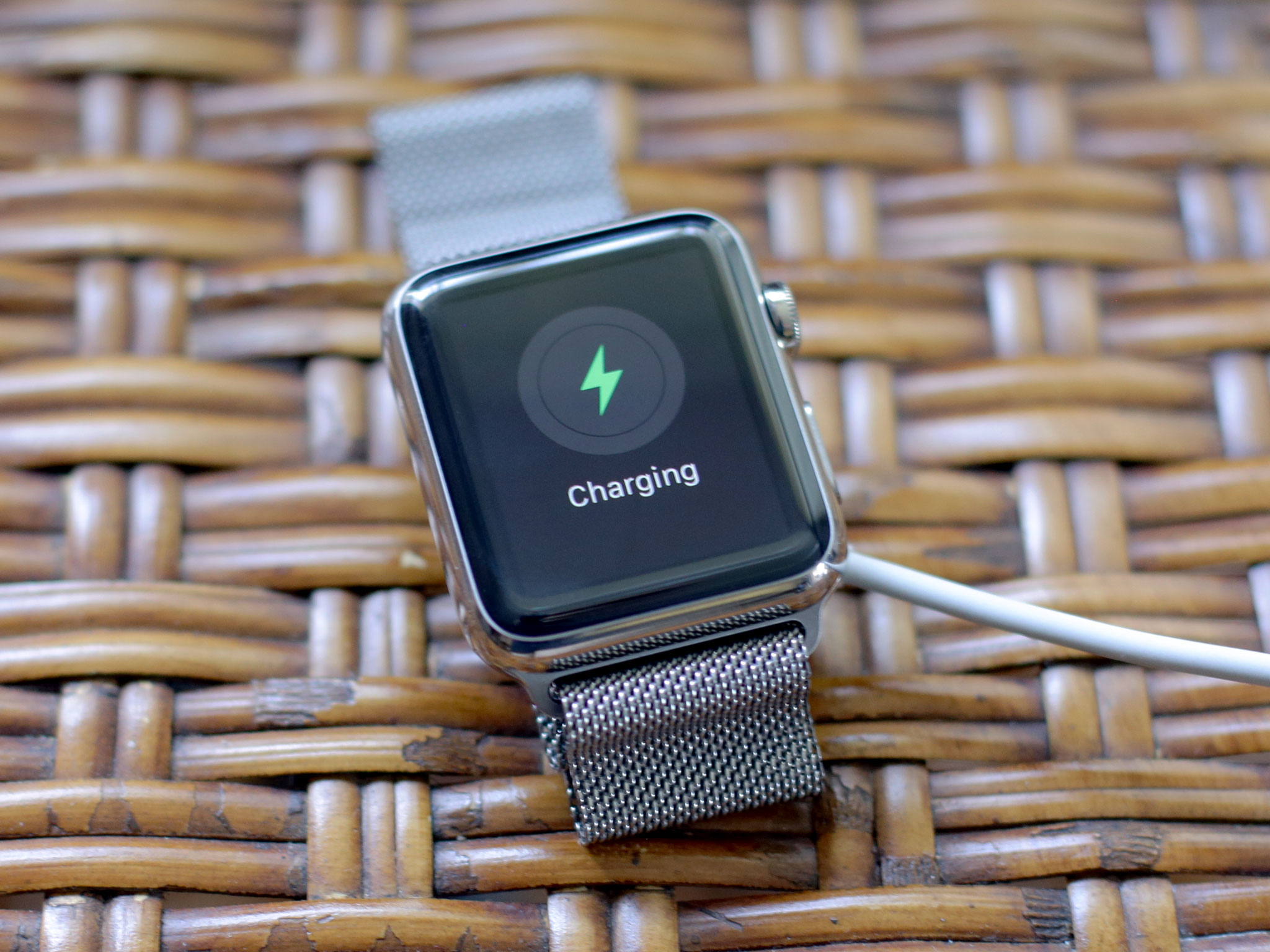
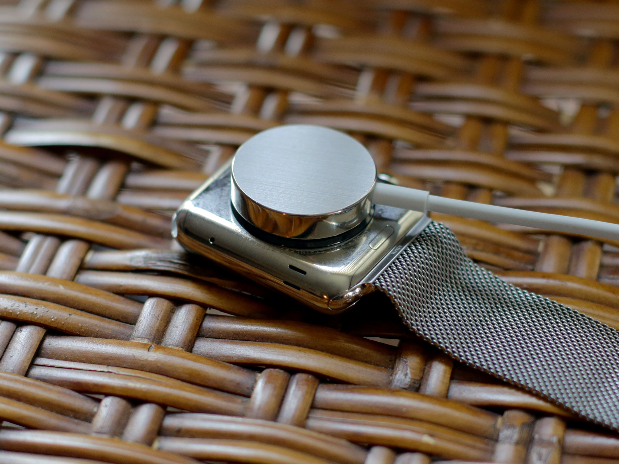
It's done through coils in both the charger and the device being charged. While it typically requires more power and more time than a wire, it has its advantages: there are no ports and plugs to line up.
Apple uses the same MagSafe nomenclature for the connection as they do for the MacBook Air and MacBook Pro laptops, but the larger size of the disk and surface area of case makes it even easier.
On the Watch, you simply bring the magnetic disk at the end of your USB charging cable to the rear of the watch case and let science do the rest. Because it's inductive, there are also no contacts exposed, which means no corrosion and physical wear-and-tear on the parts.
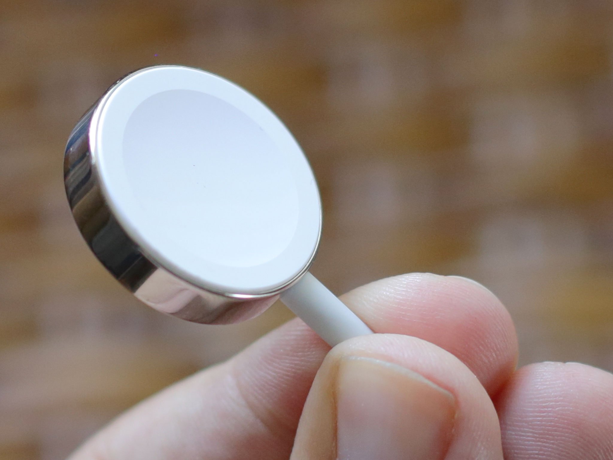
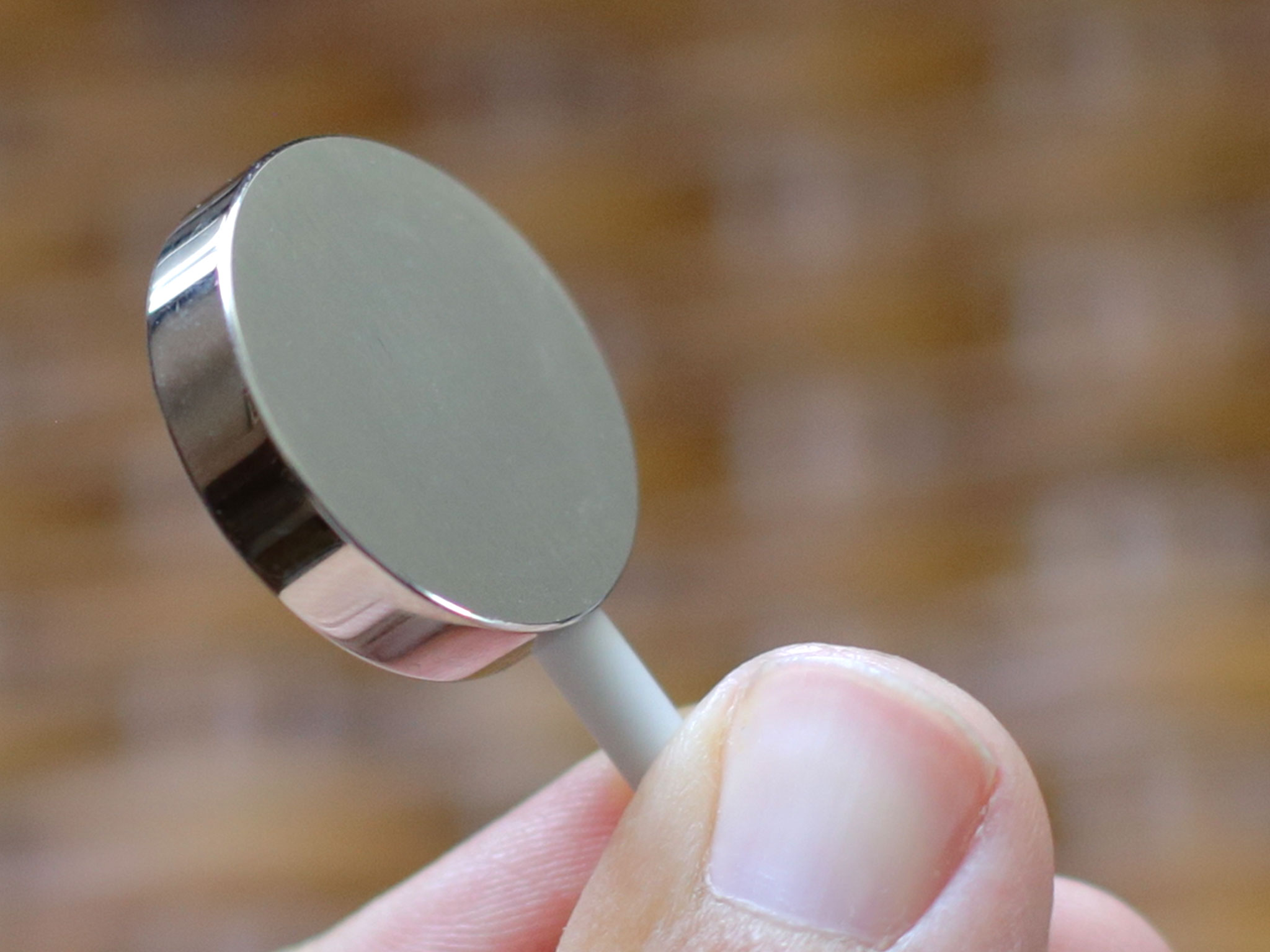
There are slight cosmetic differences between the chargers that come with the different Apple Watch collections: the Sport is encased in white plastic and the Watch, stainless steel. (The Edition has an exclusive charger built right into the box.) Apple also sells separate 3 foot and 6 foot chargers, also encased in stainless steel.
Overall the inductive chargers work really well. The magnets align with a satisfying snap, yet don't require significant force to pull apart. If anything, I'd enjoy an even stronger bond.
For people used to plugging an iPhone into a battery pack and shoving the whole thing into a pocket or purse as they walk around, magnetic chargers aren't quite so durable — your Watch and charger will likely separate at some point inside your bag and foil your plans.
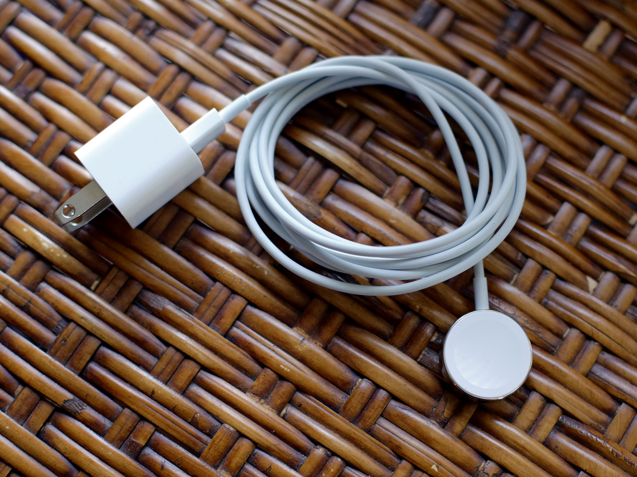
That said, the Watch isn't a phone: It typically won't need to be charged that way, and the charger's ease of use and convenience will be more important to most people most of the time.
Whether or not inductive charging is a compelling enough alternative for Apple on a phone scale — or beyond — remains to be seen. At watch scale, it was the right choice.
Heart rate sensor
The rear casing is also where you'll find the Watch's heart rate sensor. The sensor's four lenses are arranged in a diamond pattern; the top and bottom lenses are for the photodiodes, while the left and right are for the infrared and for the green LEDs.
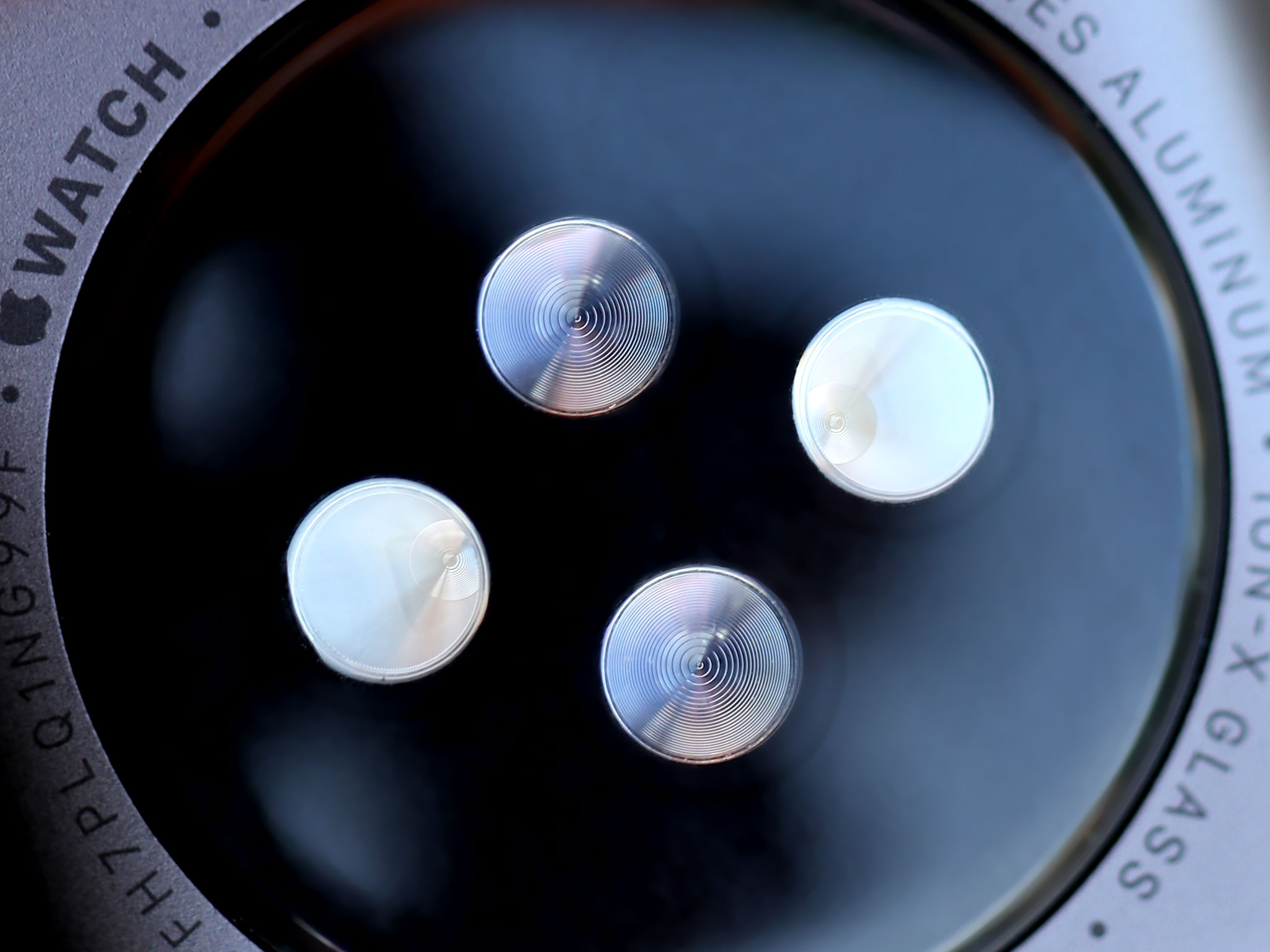
The heart rate sensor uses photoplethysmography, which employs beams of green and infrared light to measure the amount of blood flowing through your wrist. When your heart beats, the blood flow increases, and by measuring the intervals between the beats, the sensors can read your heart rate.
To save power, infrared is used for the regular readings that occur every ten minutes. When infrared isn't providing enough data, the sensor enables the green LEDs and ramps up intensity and frequency for a solid reading.
Optical heart rate sensors and tattoos
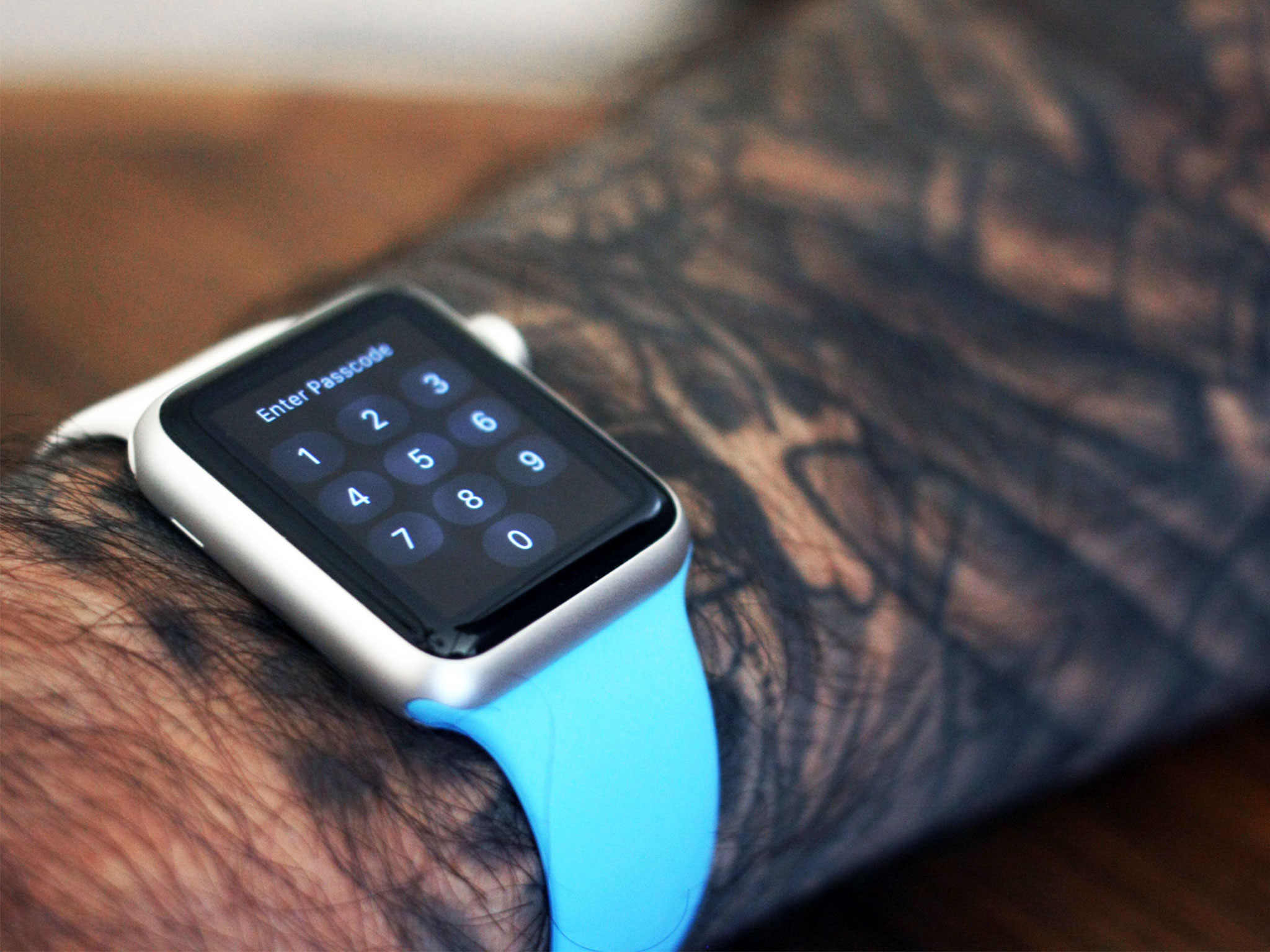
If you have tattoos covering your wrist, especially if they're dense and dark, the artificial pigment in your skin may interfere with the sensor's ability to read your heartbeat. We ran some tests, and here's what you need to know:
The sensor unit curves down beyond the metal of the case in order to ensure close skin contact and as accurate a reading as possible. When the Watch is on you don't feel or notice it at all. You're only reminded that it's there when your heart rate comes up on screen.
In addition to the heart rate monitor the Apple Watch includes an ambient light sensor as well as an accelerometer and gyroscope that let it understand its — and your — relative position in space over time.
Lugs and grooves
Two tiny buttons frame either side of the Watch's undercarriage: Press them, and the band lugs detach from case grooves, letting you separate them. It's ingenious.
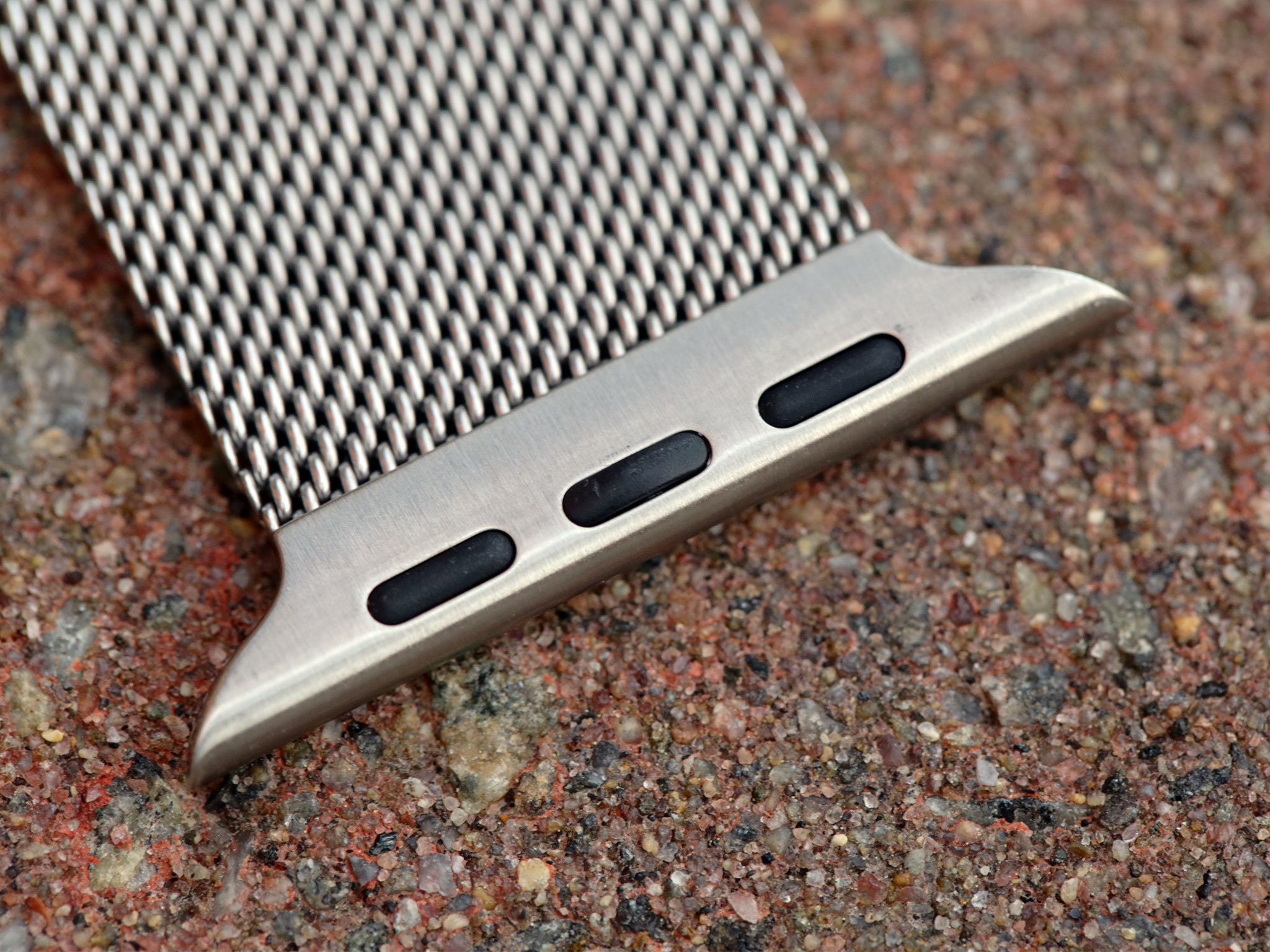
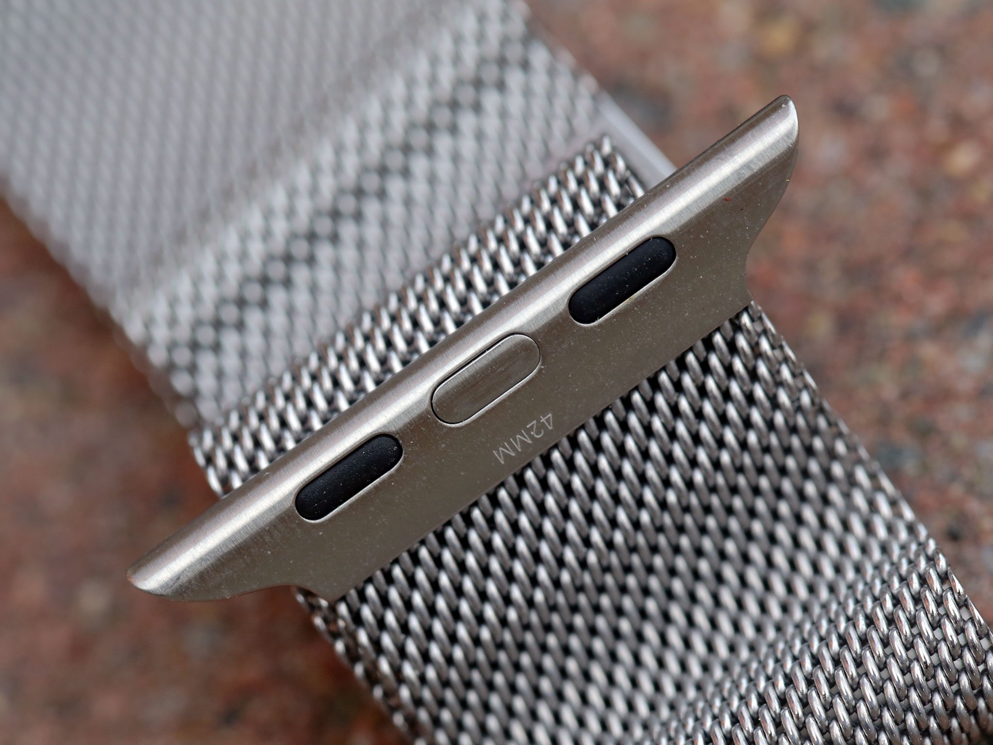
Unlike traditional watches, no pins or tools beyond your finger and nail are needed to change bands. That makes it practical — almost desirable — to change bands as often as you like.
There's an additional surprise hidden inside the two grooves: the company's "Assembled in China. Designed by Apple in California" signature, along with certification labels, the Watch's model number, and a Lightning-like port sealed away to prevent anyone but Apple from tampering with it.
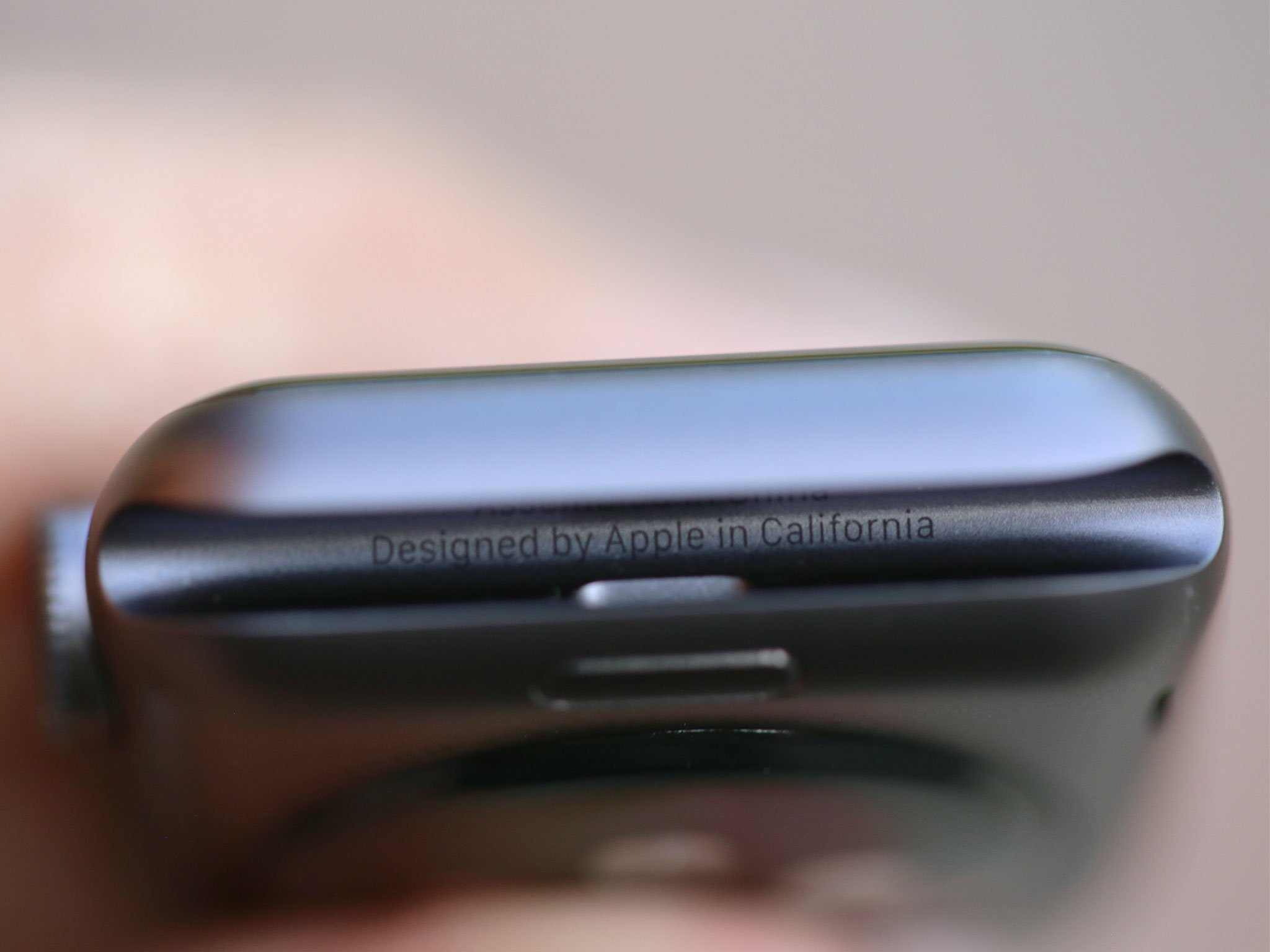
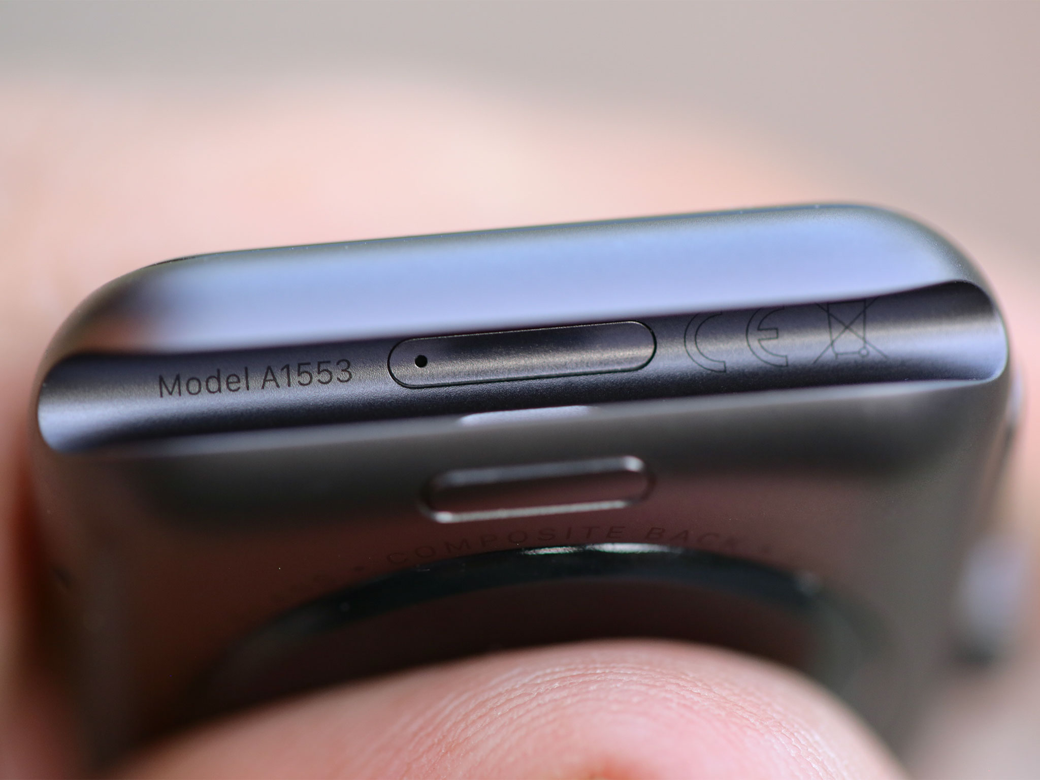
The ability to easily swap bands isn't vital to the Watch as a product, but is valuable to the wearer. Moreover, it highlights that while the watch is traditional, Apple's watch benefits both from the company's fresh eyes and relentless design consideration.
It's one of those things that make Apple products so appealing.
Water resistance
The Apple Watch is rated IPX7 under IEC standard 60529. That means it can withstand sweat, rain, splashes, and washing up; while not officially recommended, people have also showered with it and even submerged it in shallow water for short amounts of time.
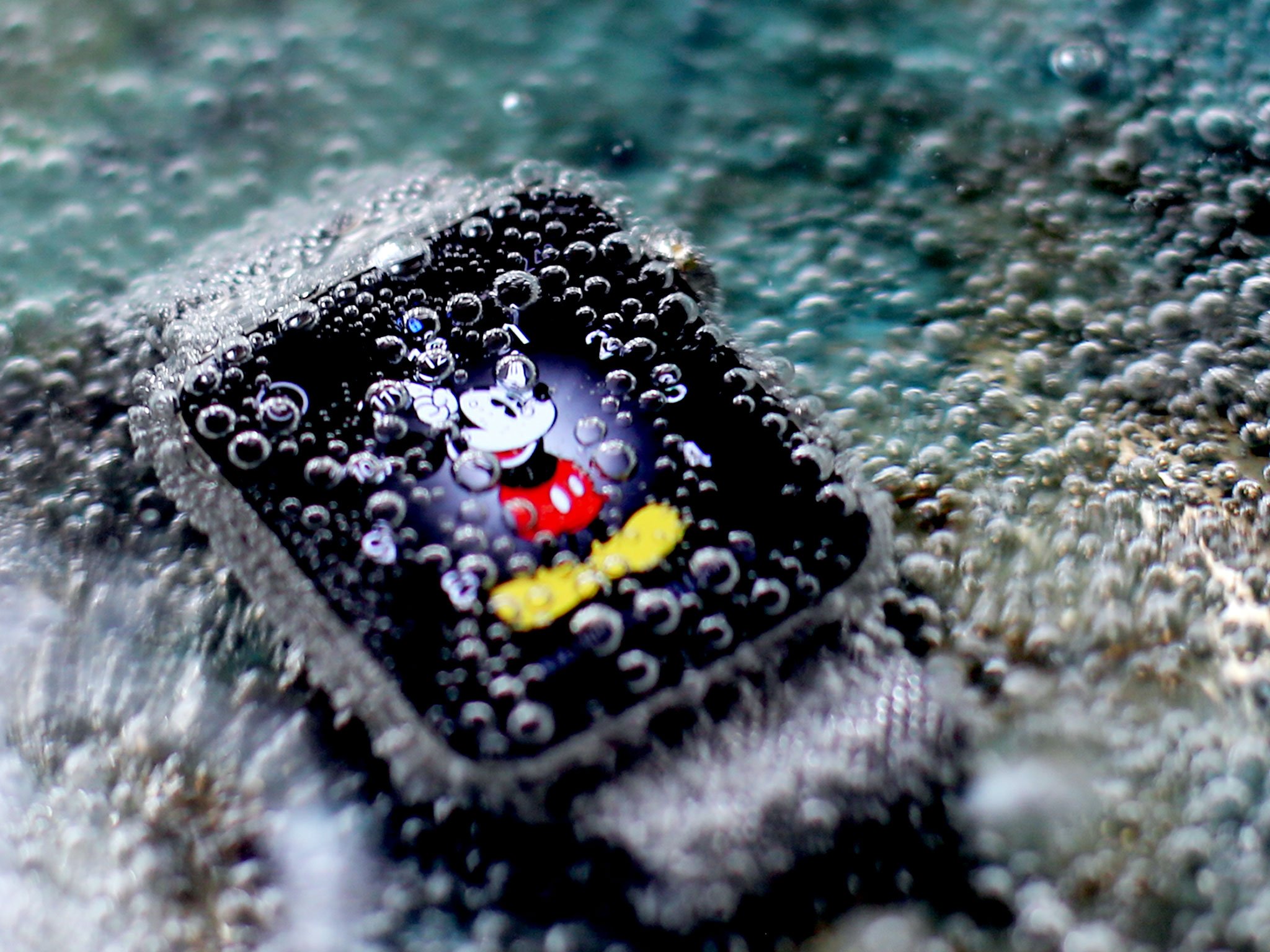
I've tried most of those things and my Apple Watch is just fine. It's absolutely not built for prolonged swimming or deep diving, but for all activities that involve brief, incidental contact with water, it should be just fine.
Apple Watch bands
Apple has been making accessories for a long, long time, including colorful cases for the iPhone and iPad. A case, however, is optional and sold separately. A watch band is integral and included with every Apple Watch. Moreover, each band has been designed for, and paired with, specific Watch cases and sizes to create what Apple refers to as "collections".
While Apple's accessories — and entire iPod lineups — have varied in color each year in an effort to be more fashionable, watch bands aren't for new products like mobile phones or music players. Apple can't make an effort to bring fashion to technology. They have to bring technology to fashion.
To meet that challenge, Apple has created a range of bands. Some are based on the classics; others that harken back to Apple industrial designer Marc Newson's work on the Ikepod line from the 1980s.
Sport bands
The Apple Watch Sport collection comes exclusively with fluoroelastomer bands — a fancy term for high-performance rubber — in white, black, pink, blue, and green. The weights vary depending on the color (starting at 47 grams for black all the way to 57 grams for white), because working with pigments is different than working with pixels.
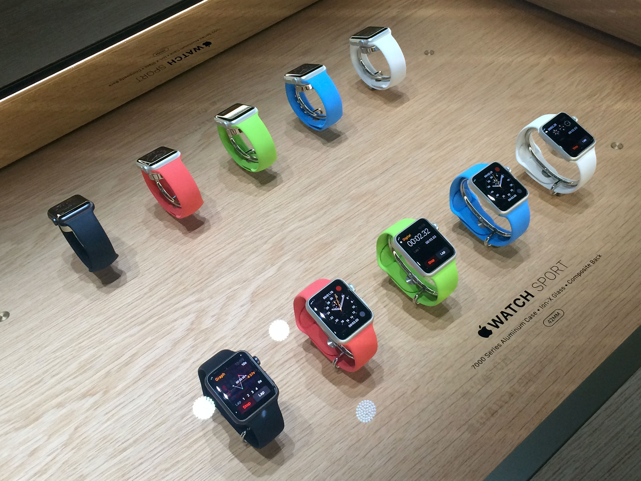
Apple has shown off additional sport band colors at fashion shows, including dark blue, red, and yellow, but there's no telling where, or if, the company will release them to the public. Since fashion is always changing, anything from seasonal to annual to occasional is possible.
I've tried on all the different sport band colors, but received a white sport band from Apple to test. Georgia, Ally, and Serenity all ordered and have been using white sport bands as well, though they've also tried on other colors, including and especially the blue.
The difference in weight isn't really noticeable, and the feel is quite consistent — smooth and silky. They're meant for exercising: for running and sweating in the gym or outside, going about your daily life, and, if you're up for living on the edge, even showering or dancing in the rain.
The bands may get wet under those conditions, but it was made to survive moisture, not absorb it. Some type of sweat or moisture-wicking band system would be interesting, true, but this isn't that.
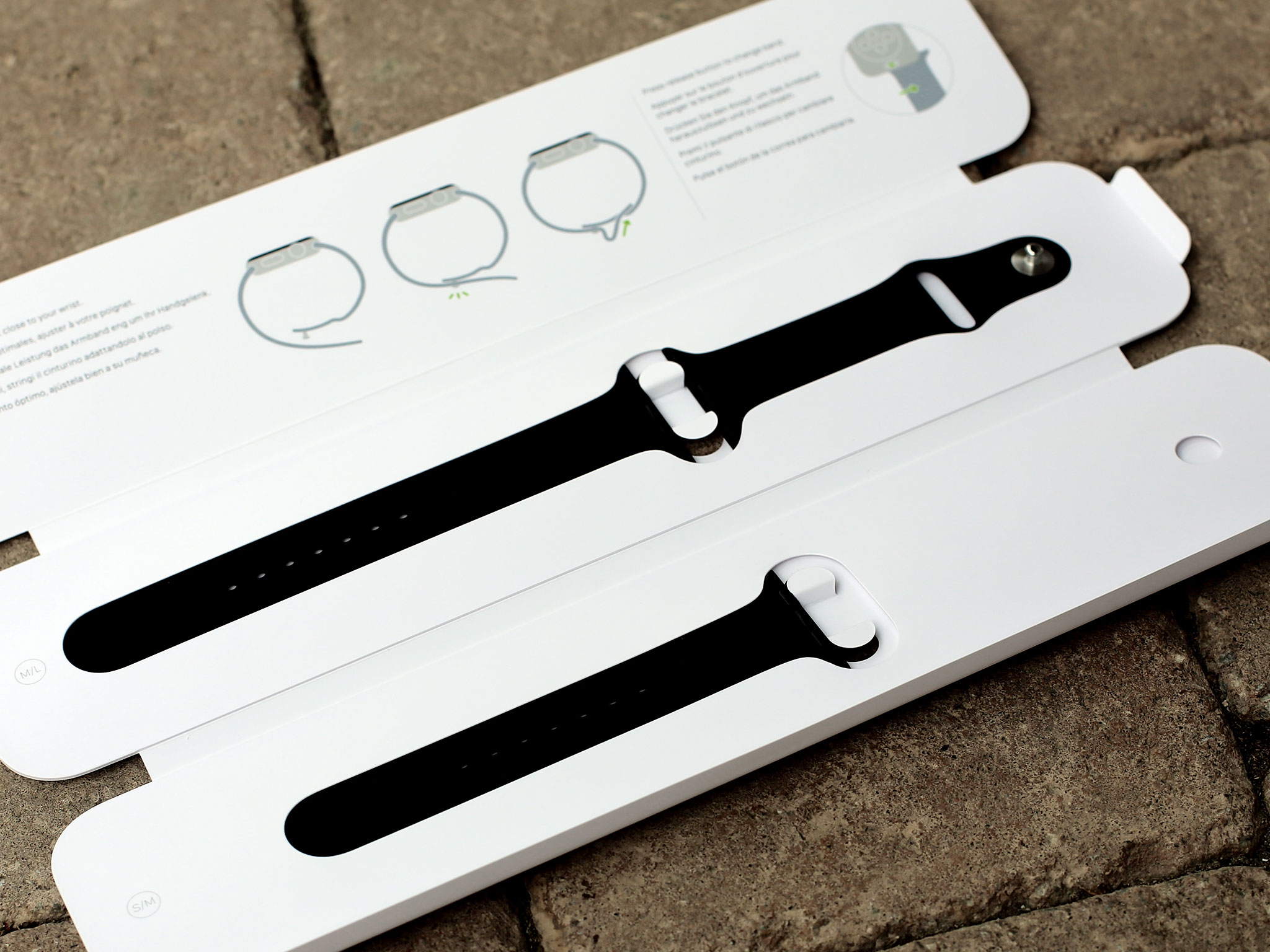
The pin and tuck system — a design Marc Newson has used before — works well. There are three parts to the band: the half with the pin, and short and long versions of the half with the tuck. It doesn't provide the near-infinite adjustability of the magnetic loops, but it's as good as any conventional watch band.
The sport band is the band most people are going to get, since it's the only option for the Sport collection and the baseline option for Watch and Edition collections. Because it's inexpensive and useful, however, it'll probably also be popular as a second band for anyone who opts for a different initial pairing.
In both cases, it's well-engineered and will suit any Watch owner well.
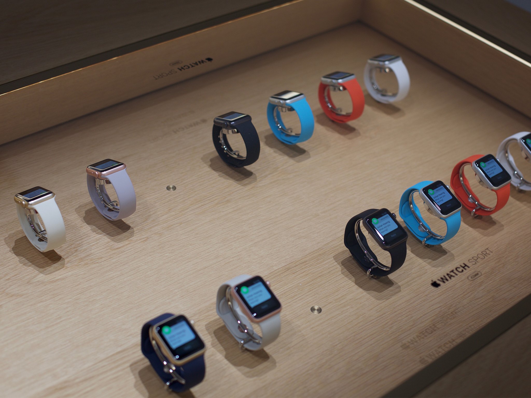
- Update: As of September 9, 2015, there are new sport band colors, including: lavender, antique white, stone, orange, midnight blue, and product red.
Watch bands
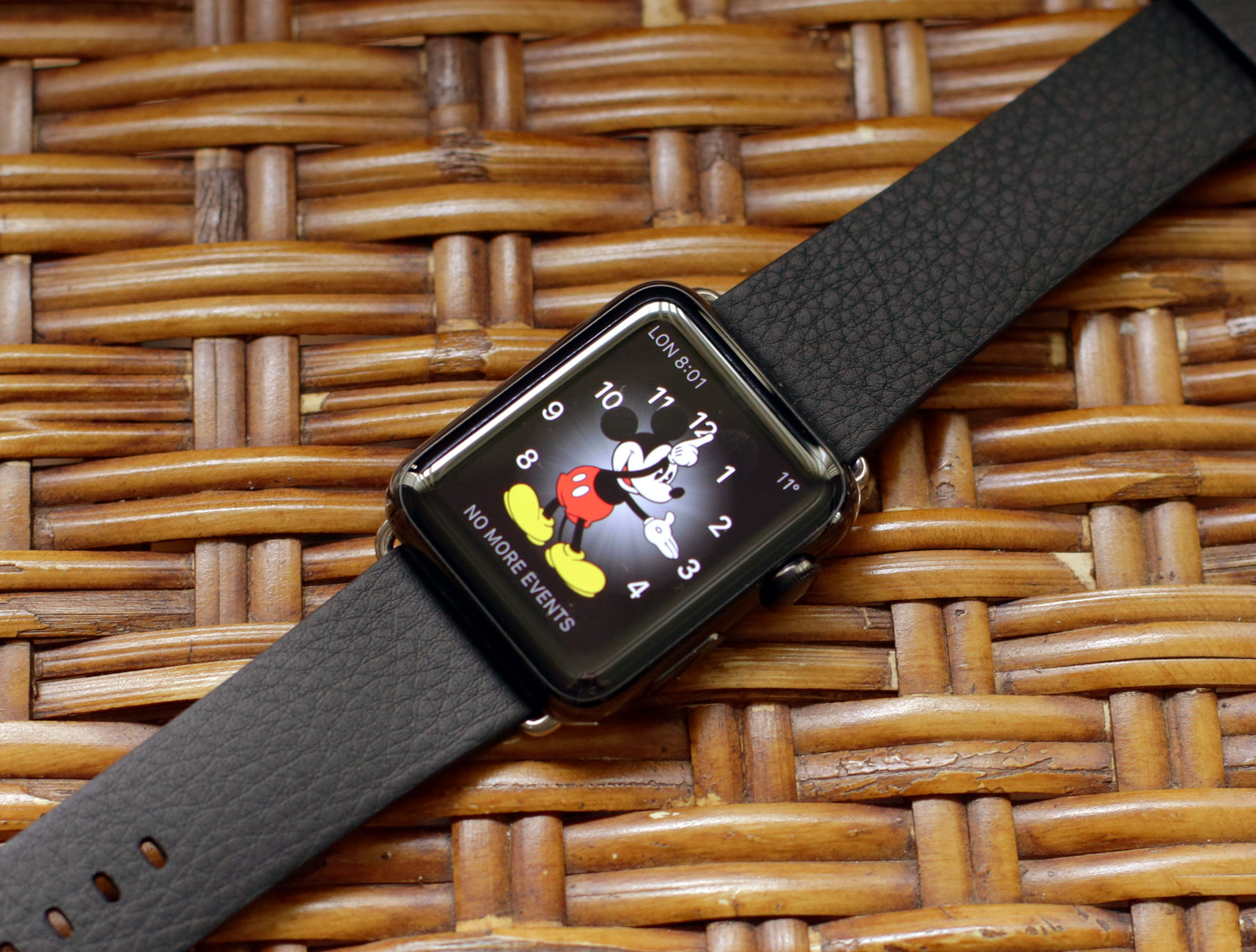
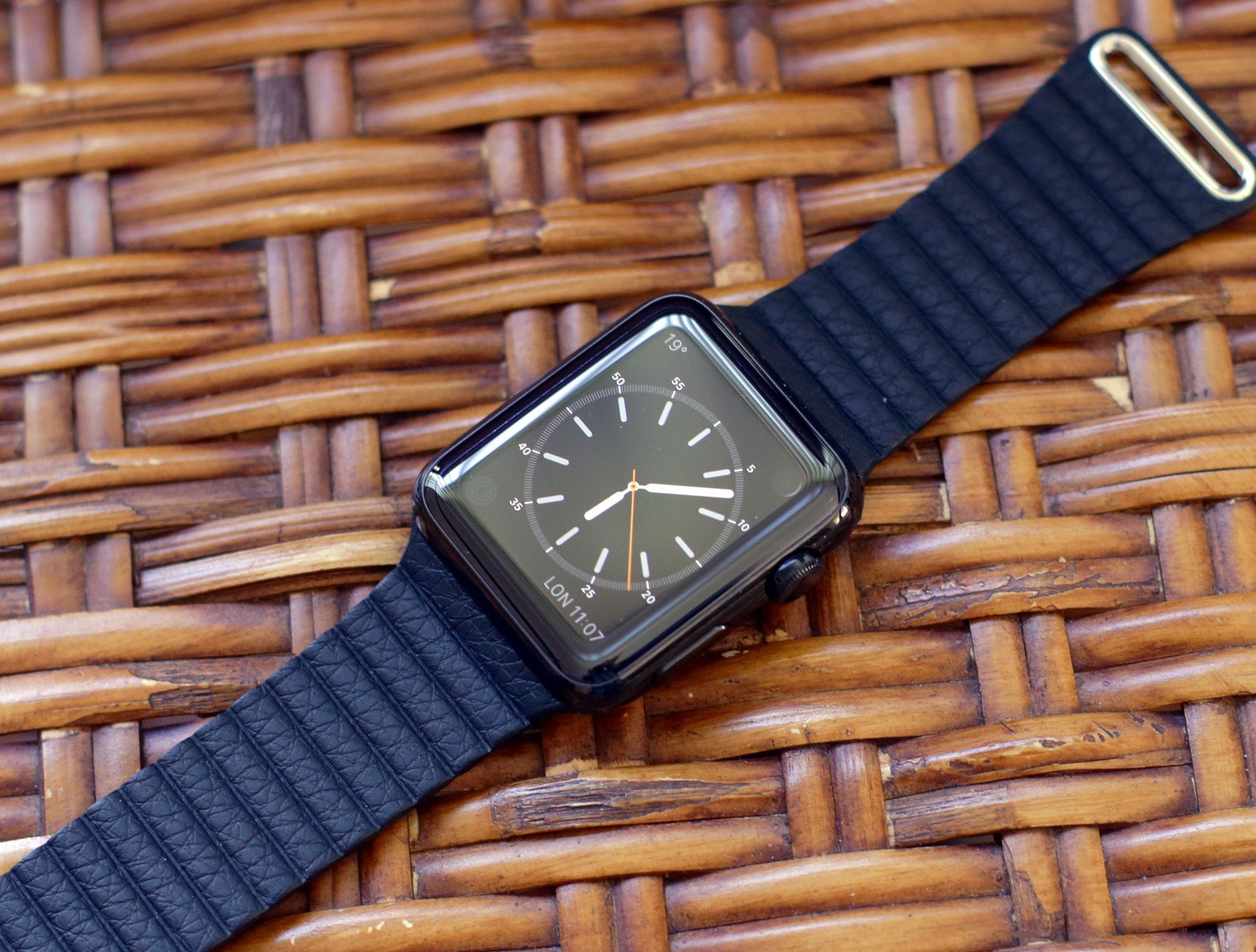
The Apple Watch collection has the largest number of band options. There are sport bands white and black; a classic buckle with black leather from ECCO tannery in the Netherlands; a magnetic loop with black, blue, stone, or brown Venezia leather from Arzignano, Italy; a modern buckle with black, blue, soft pink, or brown Granada leather from France, an inner Vectran weave, and a magnetic closure; a magnetic Milanese loop that weaves stainless steel, Italian-style, into mesh; and a link bracelet with release buttons that make for easy sizing.
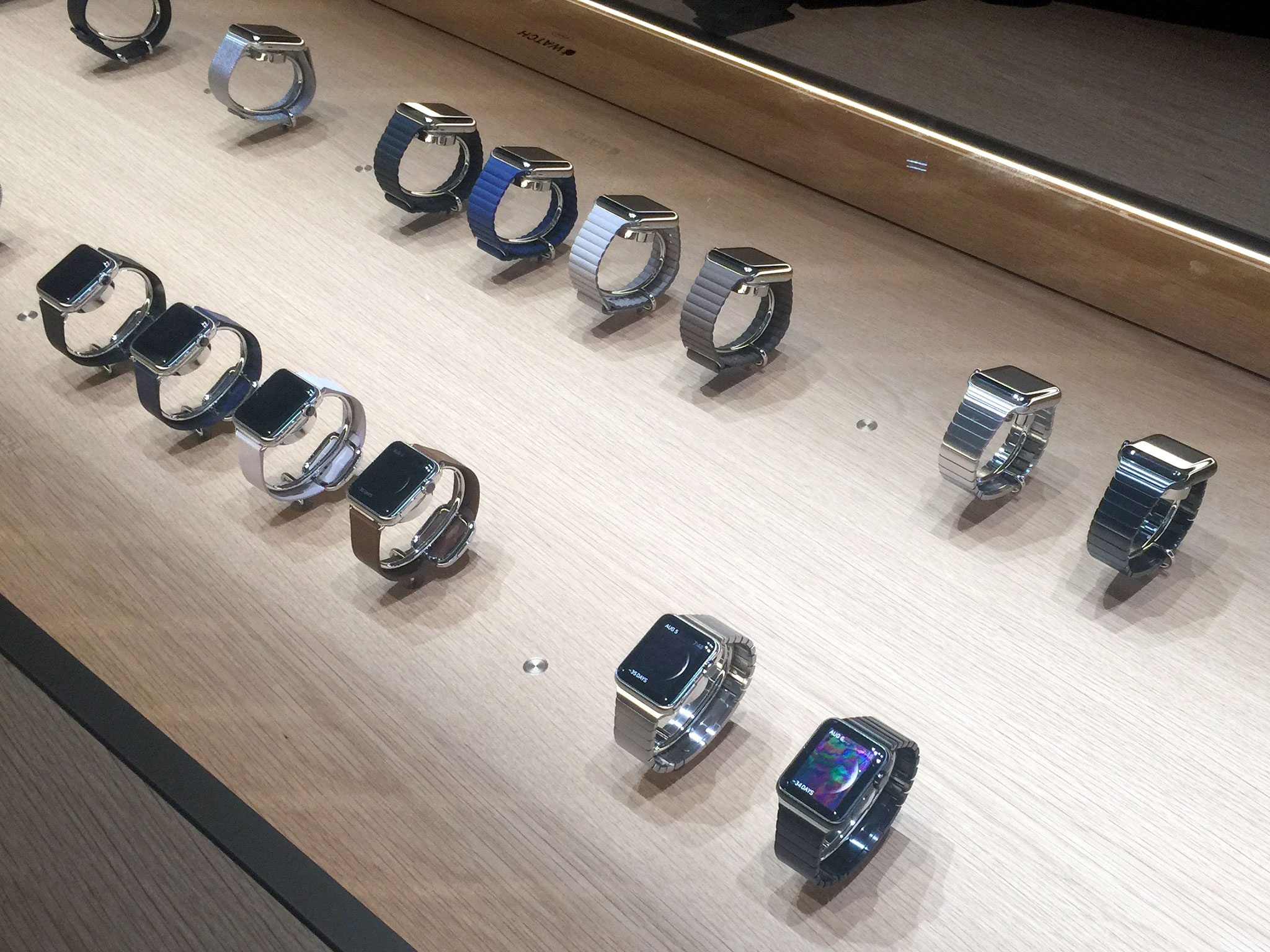
I've had the chance to try on all of the options, as have Georgia, Serenity, and Ally, but I've spent the most time with the Milanese loop Apple provided for testing.
The quality of the weave is remarkable. It feels like cloth made from metal. It also scales amazingly well from 38mm to 42mm size, and manages to look great, at least to my eyes, on both men and women in casual and formal settings alike. Because it's magnetic, it can also fit absolutely any wrist size in its range. I've joked about this before, but like the leather loops, it really is like Lululemon pants for your wrist.
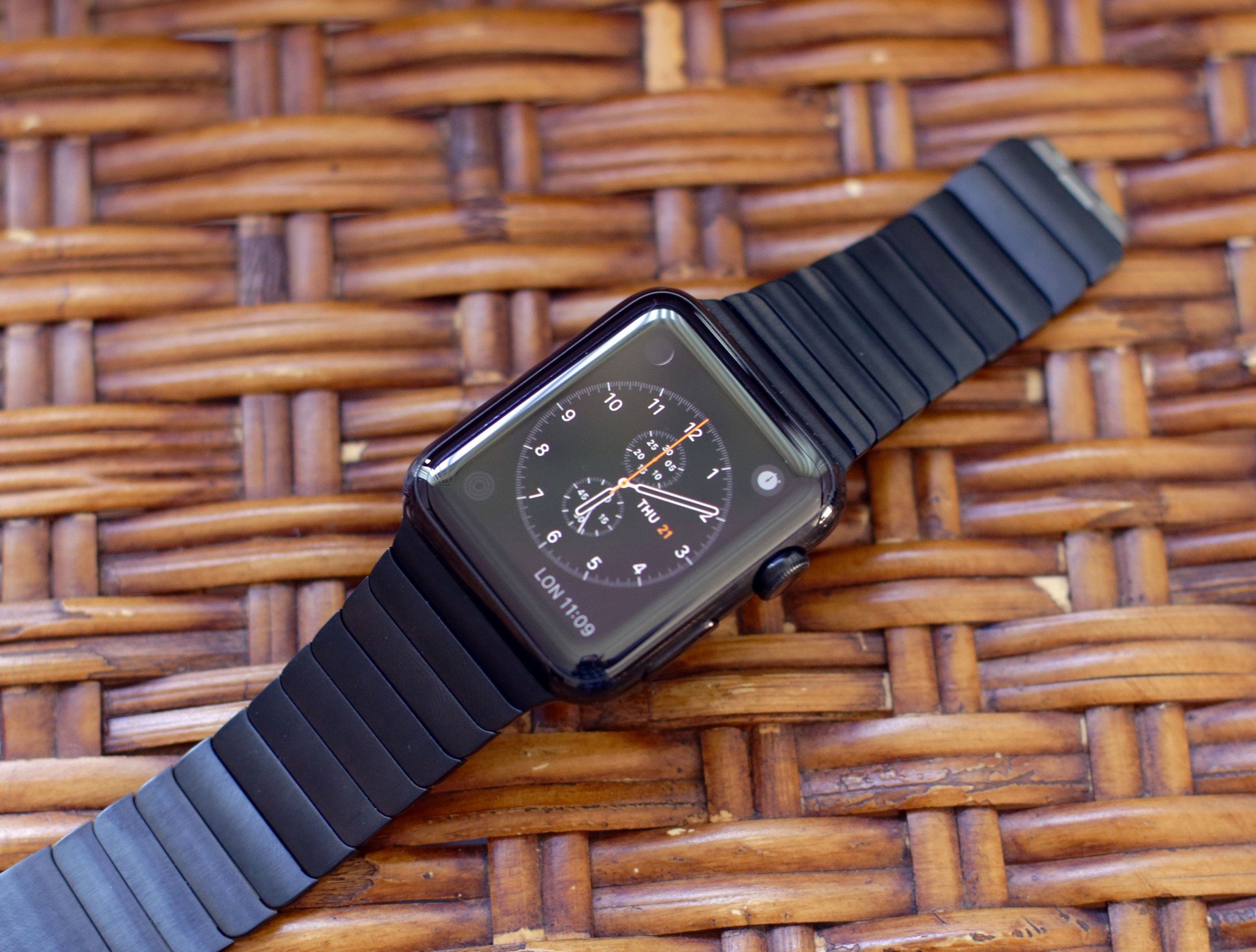
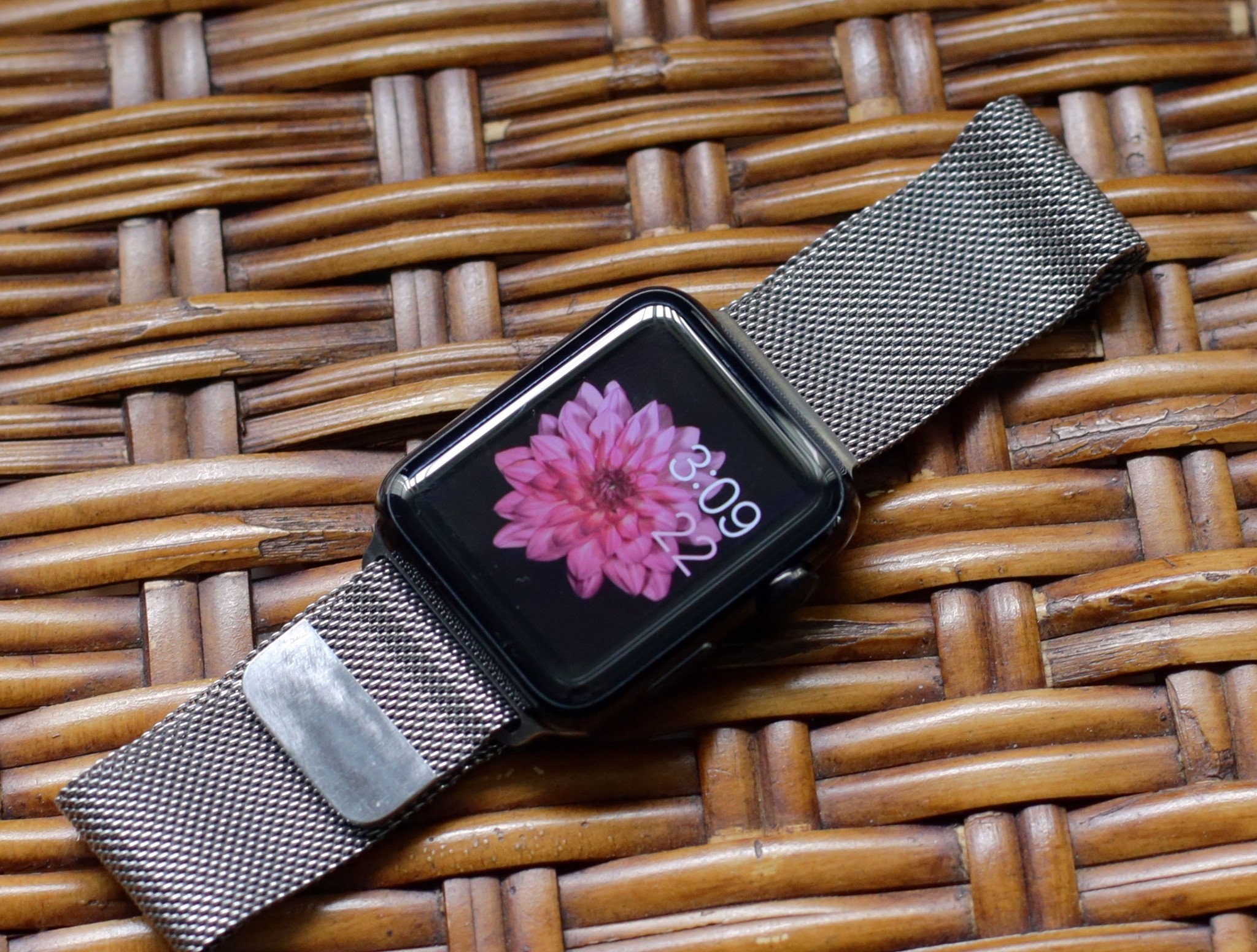
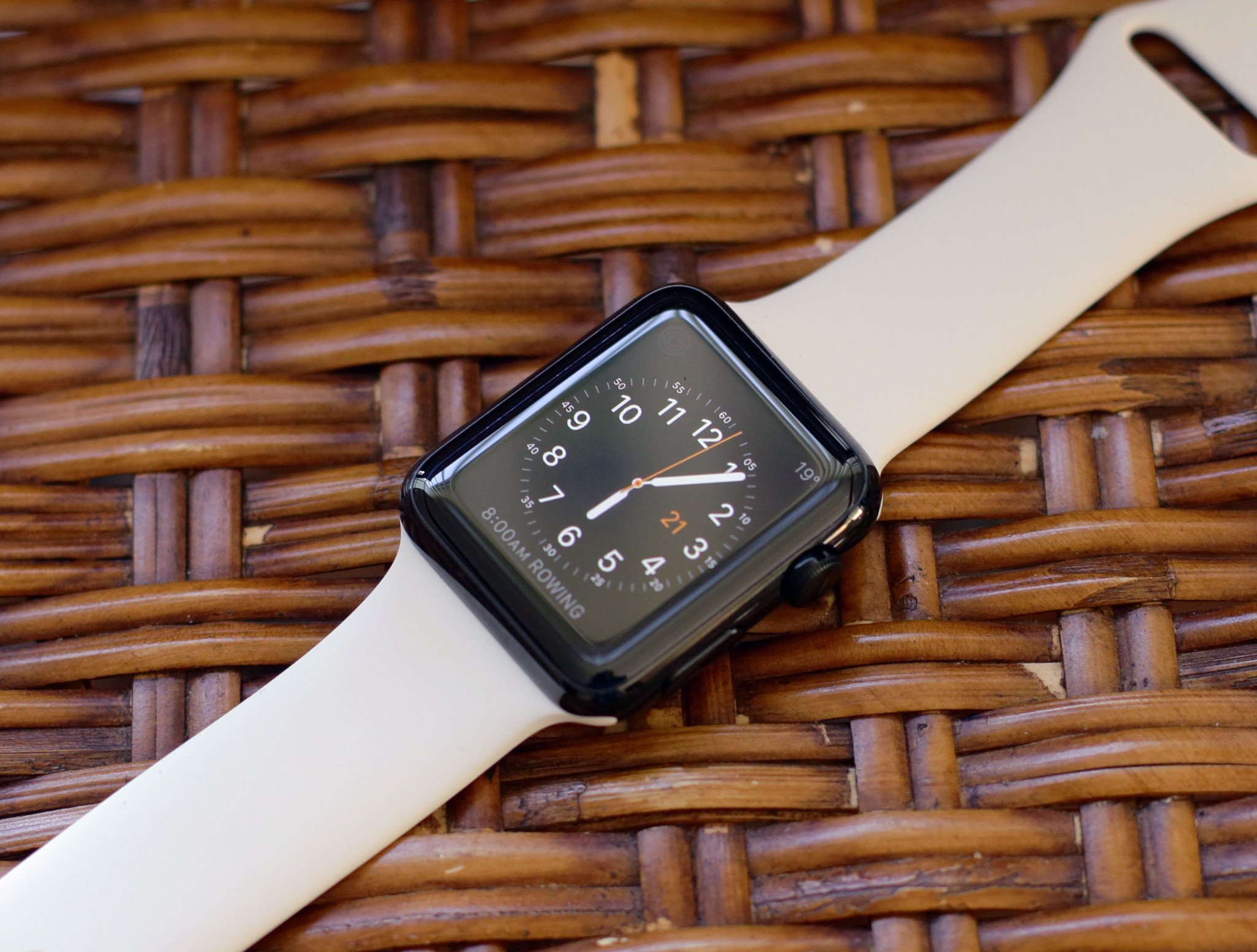
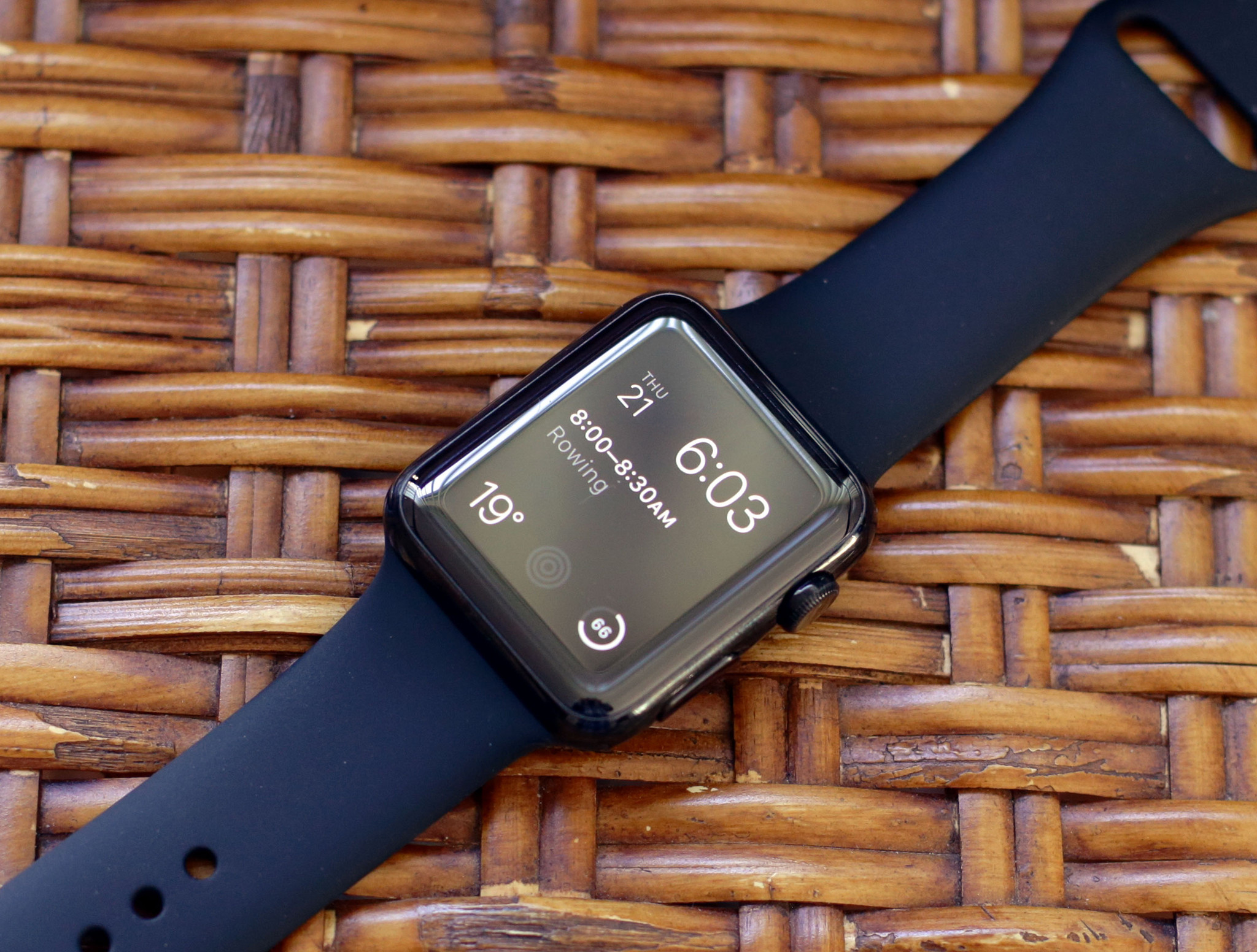
The magnetic end of the band has scuffed over the course of the last week, but no more so than any other stainless steel watch band I've ever owned — and, like any other stainless steel band I've ever owned, I have no doubt it can easily be polished back to a shine. I'm not sure I'll bother, honestly: I like the worn look. (I do wish there were a space black option to match the space black Apple Watch, but DLC coating a weave is likely beyond current manufacturing technology.)
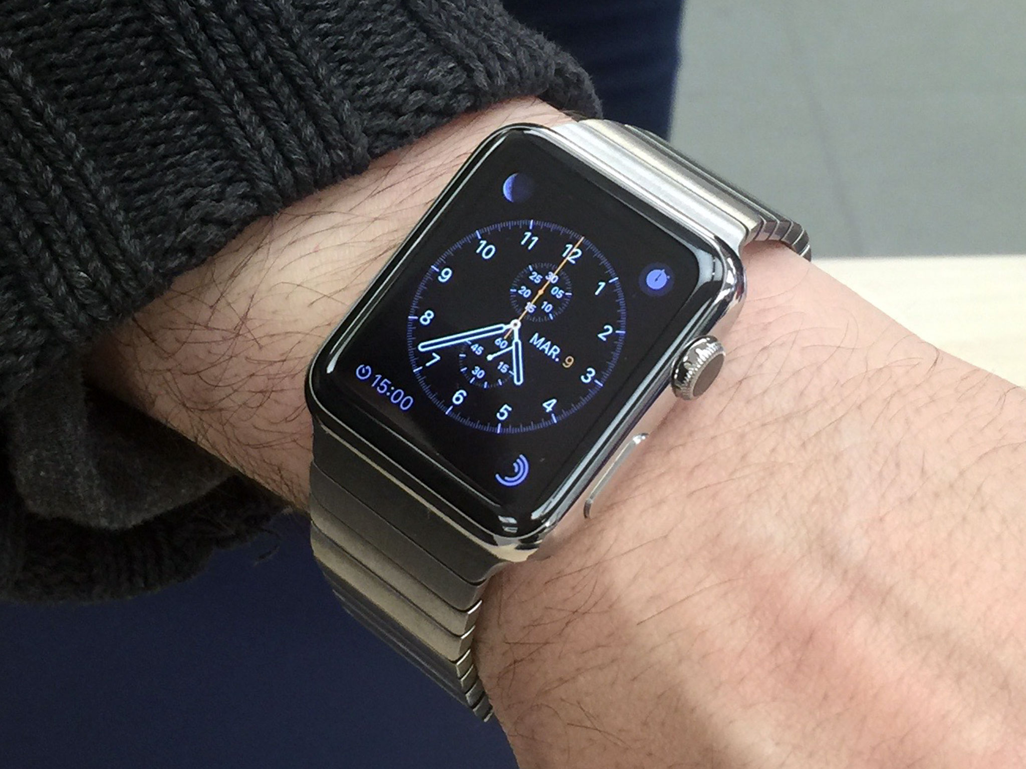
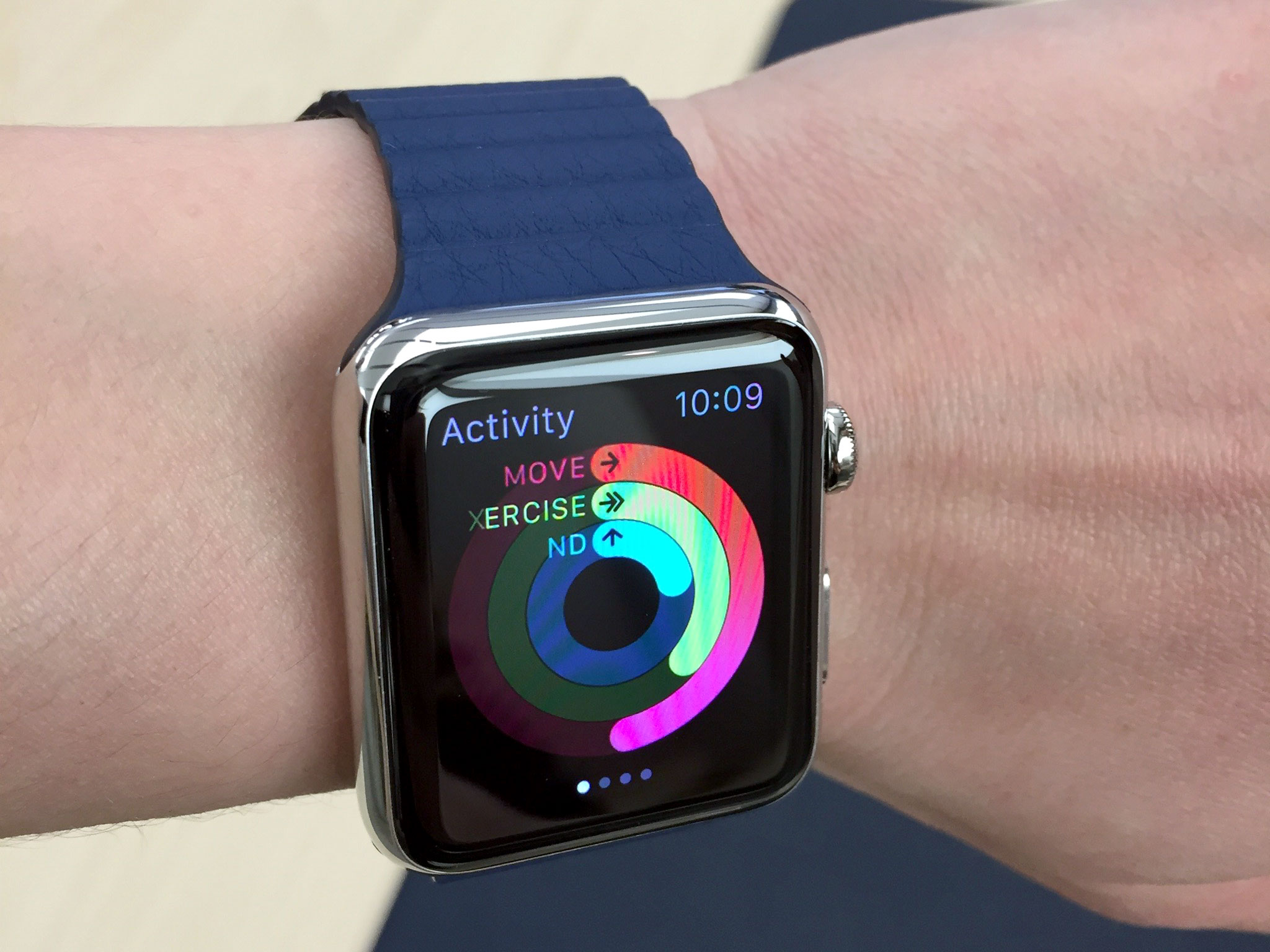
The modern buckles are also magnetic — the metal closure splits in two down the middle. They aren't infinitely adjustable like the loops, but they are incredibly easy to attach.
The Watch I ordered is coming with the Link Bracelet, which is heavy but iconic. Apple claims it takes 9 hours to make and hand-brush each one. Beyond the manufacturing, the system Apple has designed for sizing is every bit as ingenious as the band swapping mechanism itself. No jeweller or expensive tools required. Just press buttons, pop the extra links out, and get a custom fit.
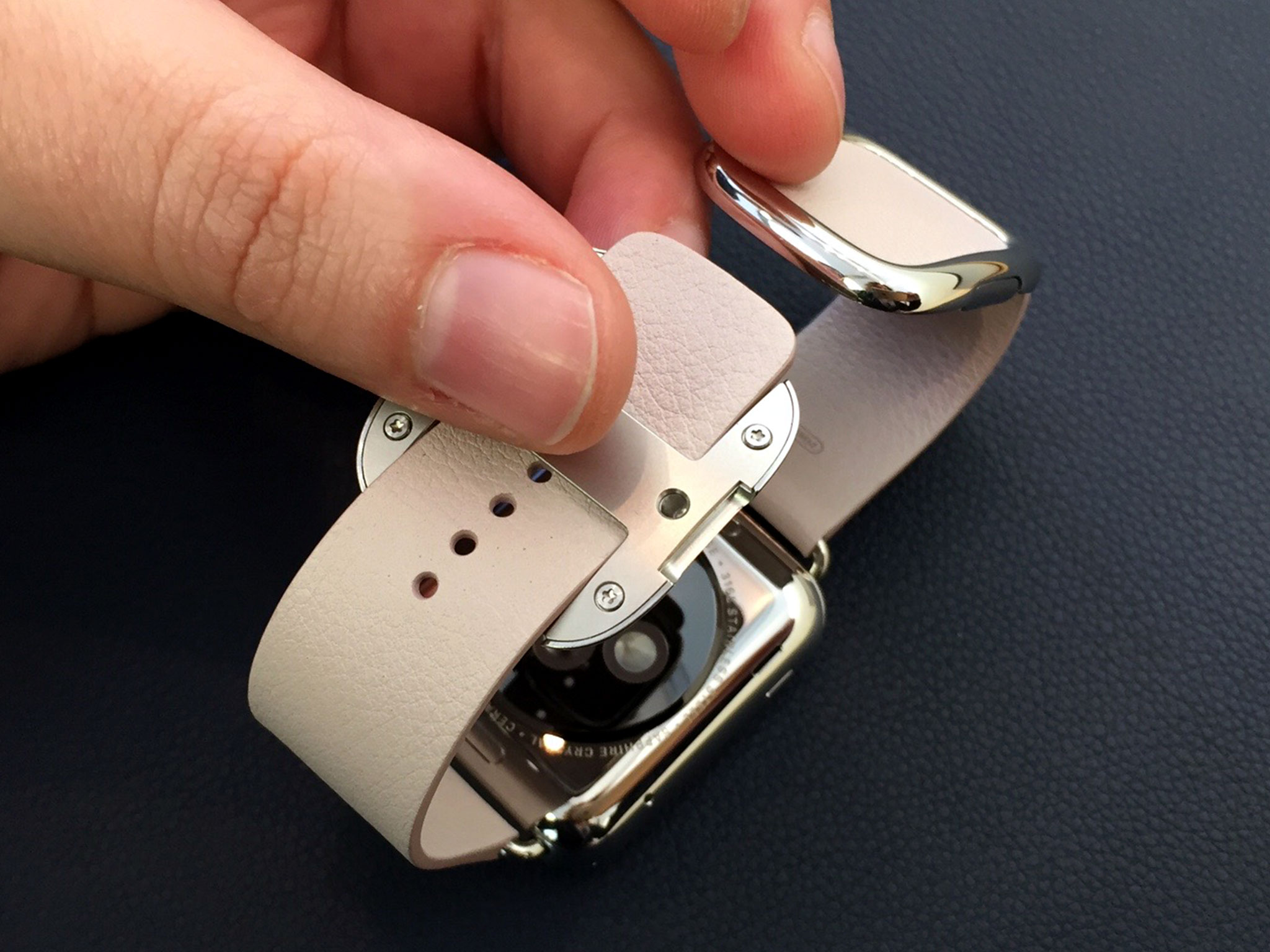
You can quibble about some of the color options and I'll quibble right along with you, but from a sheer design and engineering point of view, each and every one of them is fantastic.
Not only are they beautiful, but they're accessible. The loops and magnetics mean that everyone — even those with coordination and motor skills issues — can more easily secure them and hence, secure their Apple Watch. That's a remarkable benefit.
- Update: As of September 9, 2015, Apple Watch bands include two-tone black and saddle brown classic buckles, as well as a space black and black sport pairing.
<
div class="closeup bg-image" style="background-image: url('http://www.imore.com/sites/imore.com/files/field/image/2015/10/apple-watch-hermes-callout.jpg')">
<
div class="extra" markdown="1">
Update: Apple Watch Hermès
Apple Watch Hermès, which launched on October 5, 2015, is Apple's first foray into direct fashion partnerships for the Apple Watch. It brings together the stainless steel and sapphire crystal Apple hardware with the luxury leather of Hermès into a collection that's both old world and cutting edge.
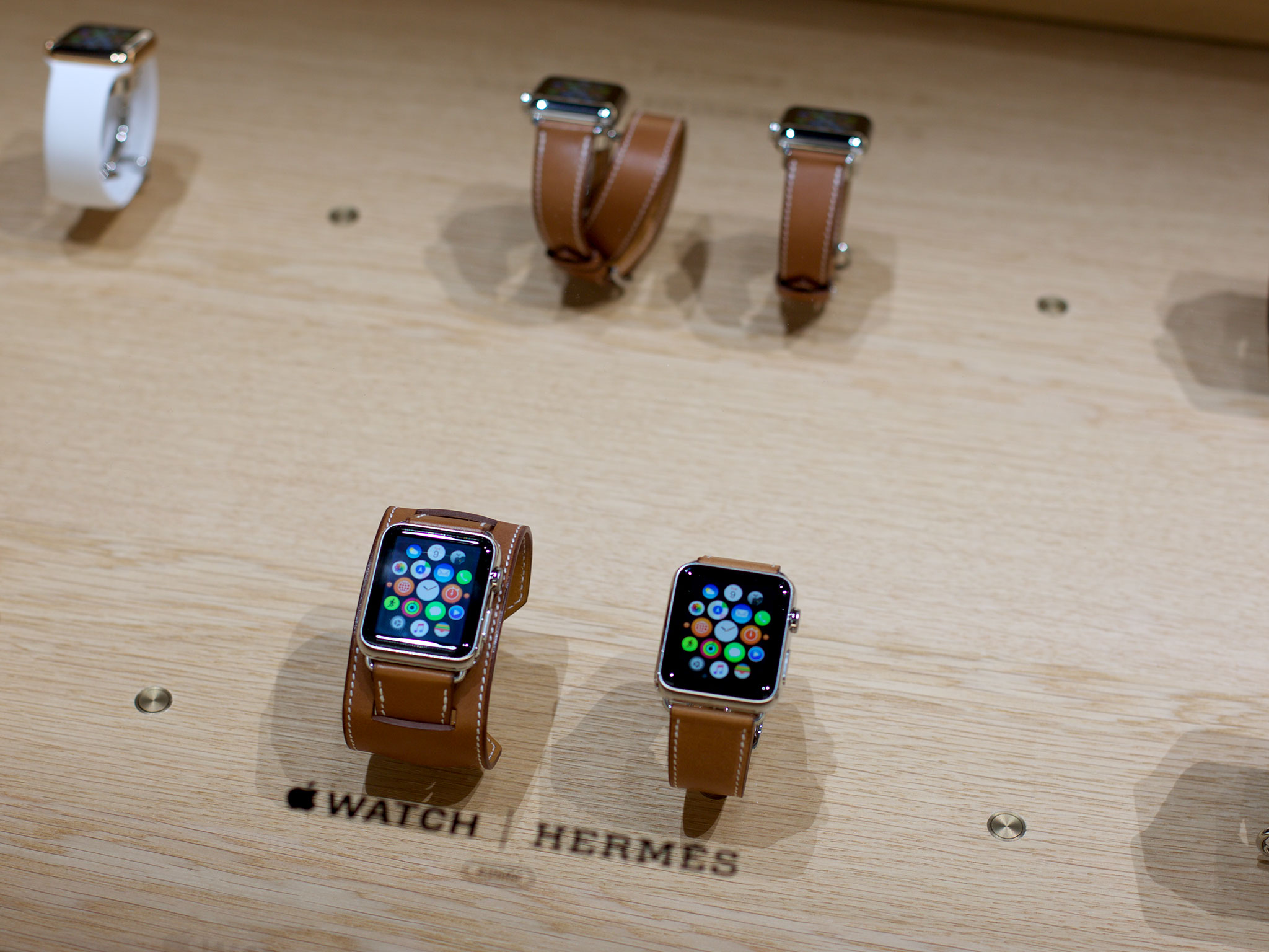
There are three bands in the Hermès collection. Single Tour comes in both 42mm and 38mm. The 42mm is offered in Fauvre (brown) and Noir (black) and the 38mm in Fauvre (brown), Noir (black), and Capucine (red). The Double Tour, which circles the wrist twice, in only available in 38mm, in Fauve (brown), Etain (gray), Capucine (red), and Bleu Jean (blue). The Cuff, a nod to Hermès' equestrian heritage, is only available in 42mm and only in Fauve (brown).
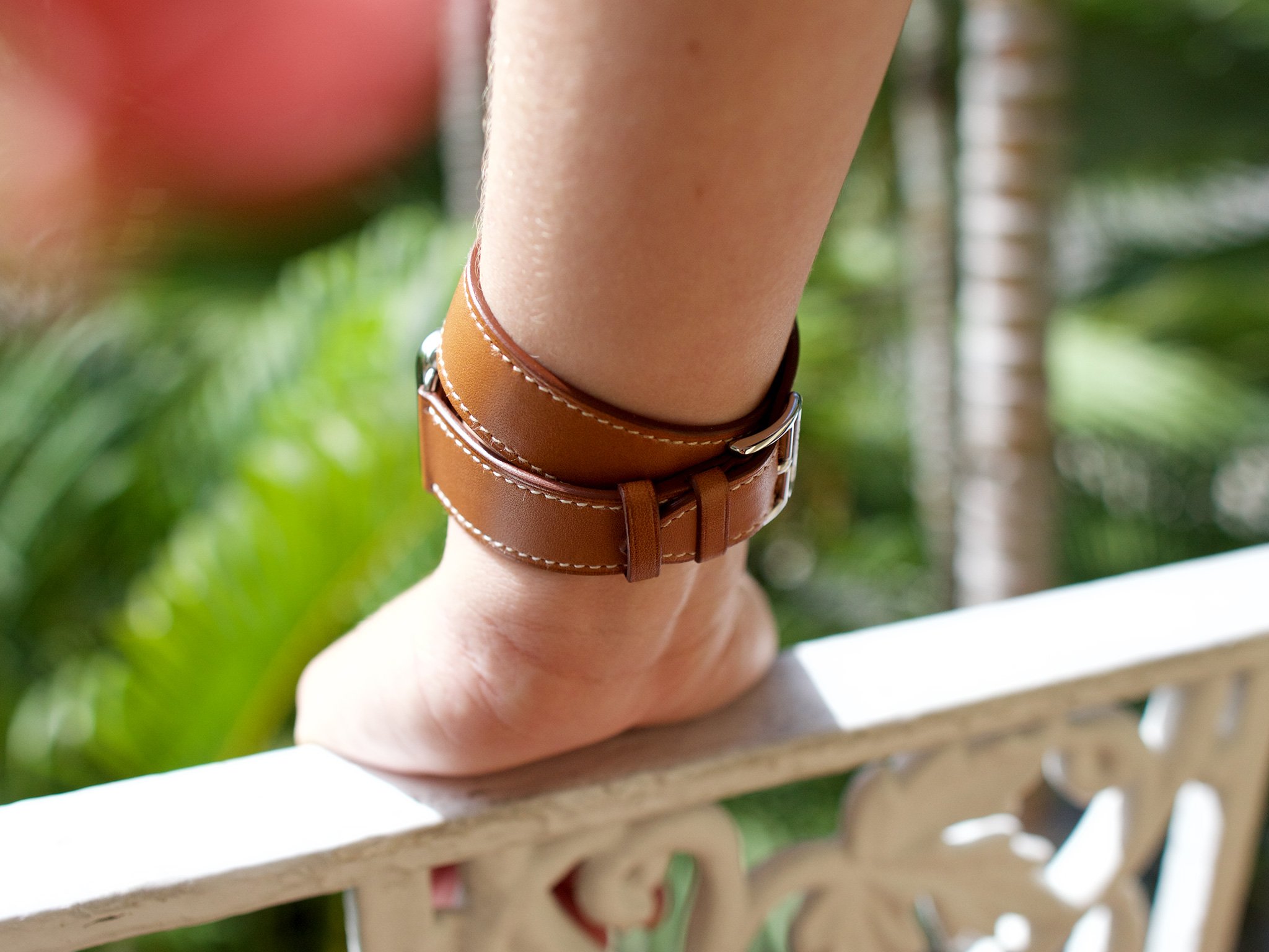
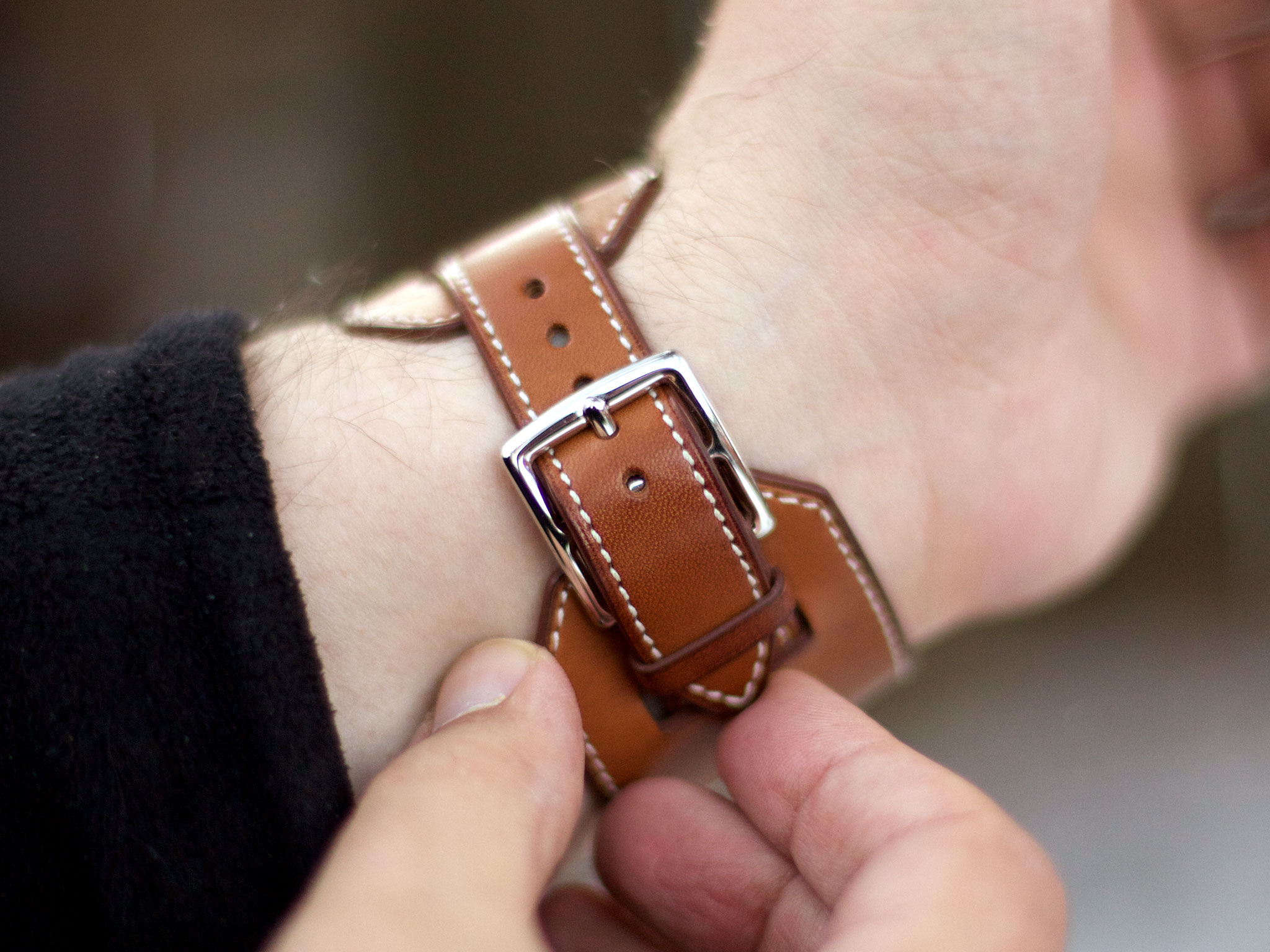
You currently can't buy the Apple Watch Hermès online, only at select Apple and Hermès retail outlets. You also can't but the bands separately, only with the Watch casing.
Edition bands
The Apple Watch Edition bands are similar to the Apple Watch bands, but they come with matching gold or rose gold pins or buckles. Unlike the Watch bands, you can't buy them separately, at least not yet, and there are no gold versions of the Milanese or link bracelet (though at least two celebrities have been sighted with the latter).
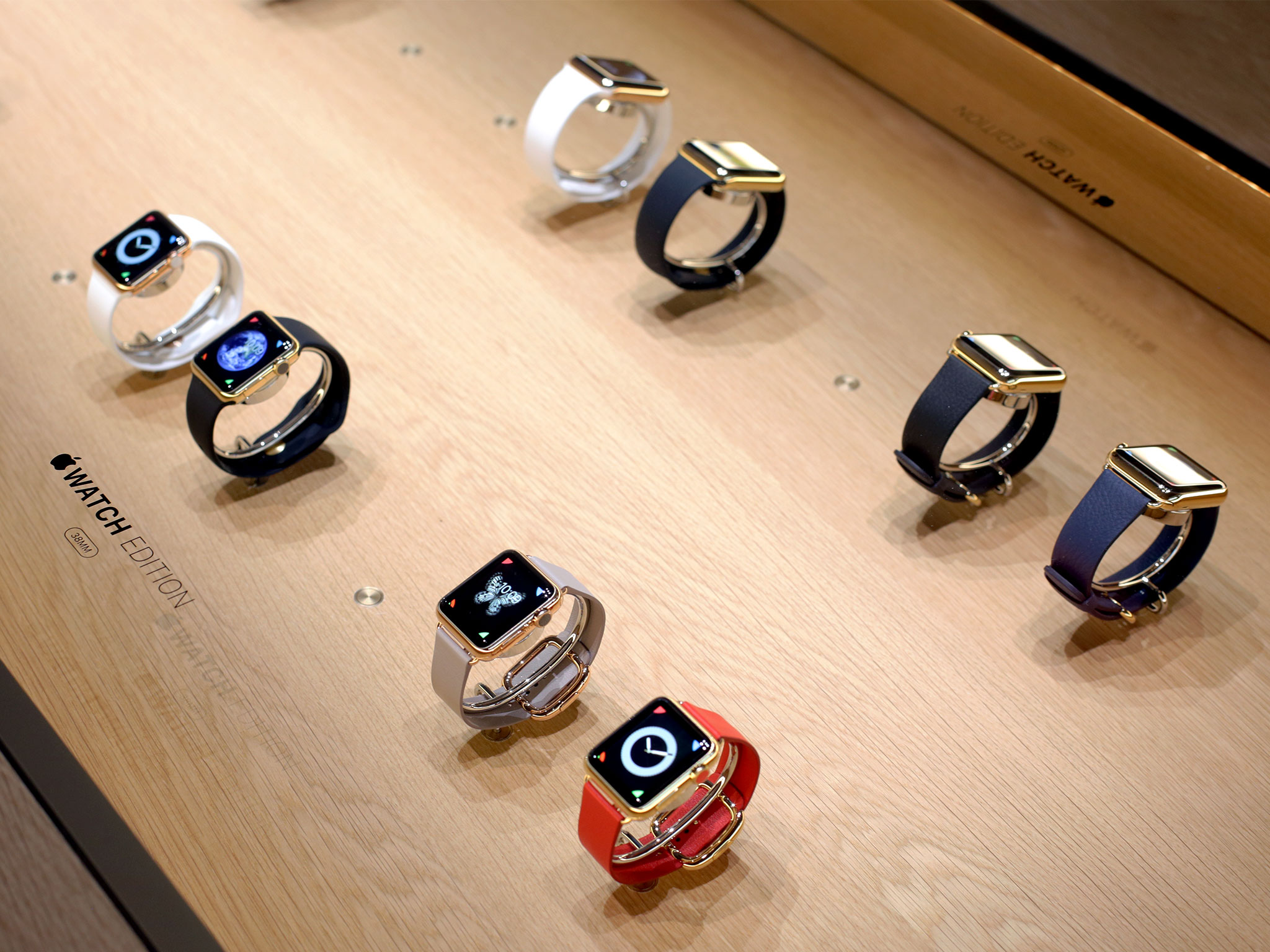
That means you have to get them paired as part of the collection. There are, however, some unique colors: in addition to white or black sport, there's also rose gray or bright red modern buckles, and black or midnight blue classic buckles.
- Update: As of September 9, 2015, there's a new 42mm 18K rose gold option with midnight blue classic buckle.
Multi-banding
All of the Sport and Watch bands can also be ordered separately — subject to availability — and used with any of the other Apple Watch, Sport, or Edition models. The only constraint, other than personal taste, is size: 38mm cases need to be paired with 38mm bands and 42mm cases with 42mm bands.
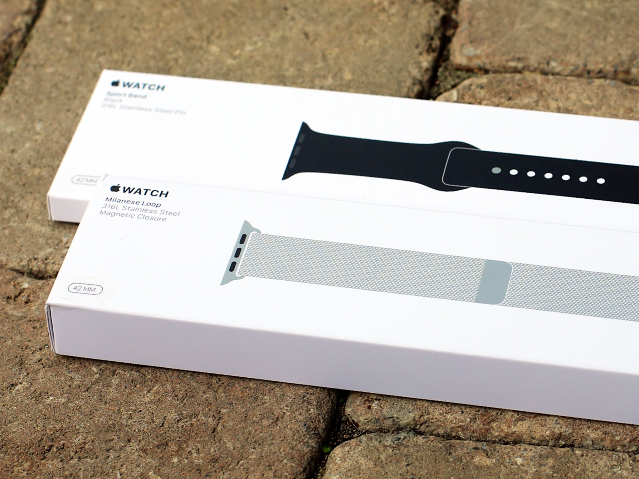
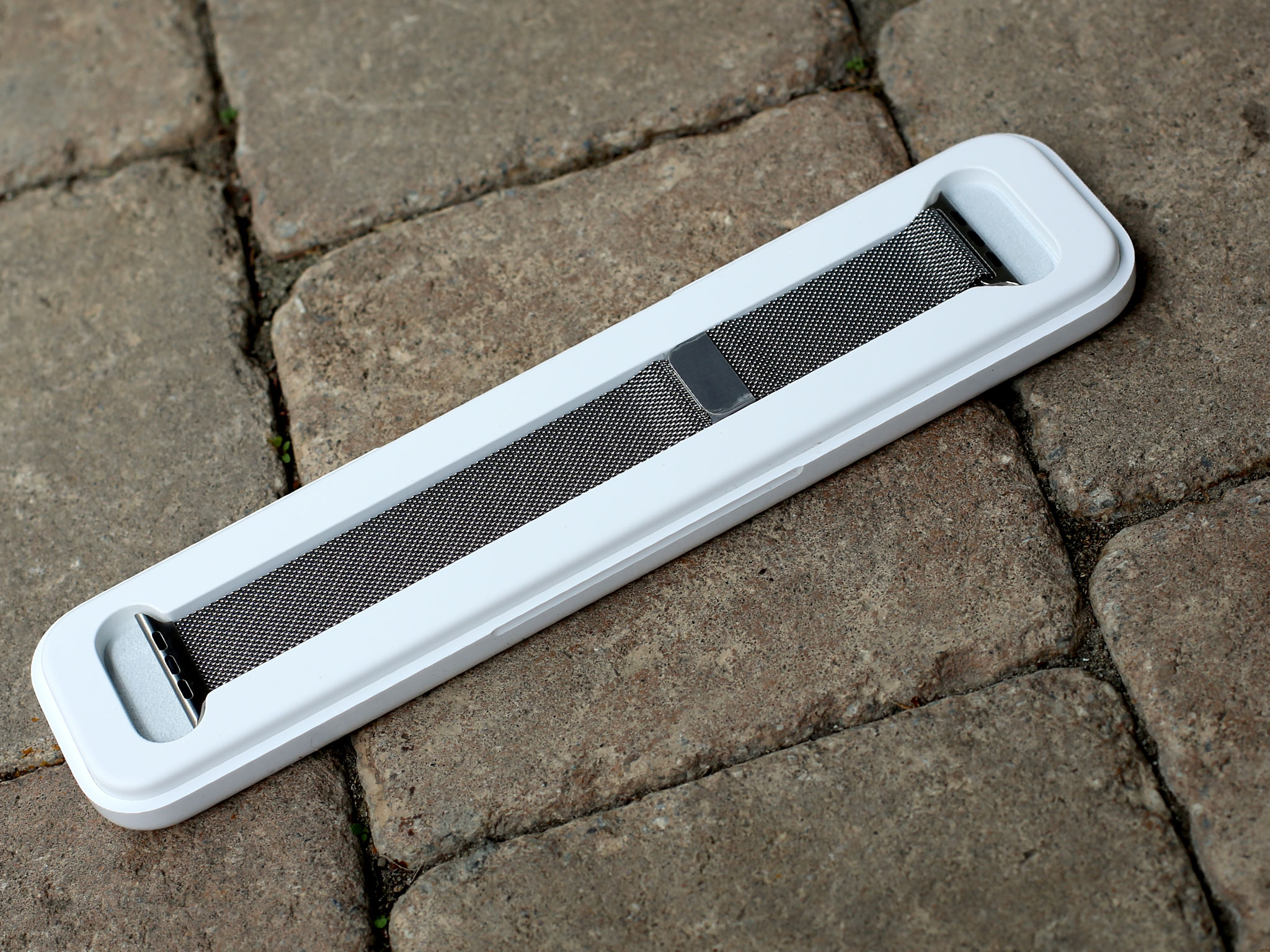
Third party bands will also be officially supported by Apple as part of the Made for Apple Watch program, though it'll likely take a while to ramp up.
I don't know if current generation bands will be compatible with future generation watch cases, though I certainly hope so. Being able to keep a band collection and upgrade the Watch atoms would be great.
I do know that, as much attention as the rest of the hardware and software gets, the bands deserve just as much. Not only do they allow for a wide range of personalization, they're doing to incumbent watch band manufacturers what the iPhone did to incumbent phone manufacturers — knocking them on their collective, complacent asses.
Apple Watch and watchOS
The Apple Watch runs watchOS. It's a variant of iOS, the company's iPhone and iPad operating system, and shares much in common with it. Under the hood, the backboard daemon handles background processes on both iOS and watchOS, while frontboard handles foreground processes. Whereas the iPhone and iPad have springboard to display their app launcher layer, watchOS has carousel, which takes better advantage of limited screen space and integrates the Digital Crown.
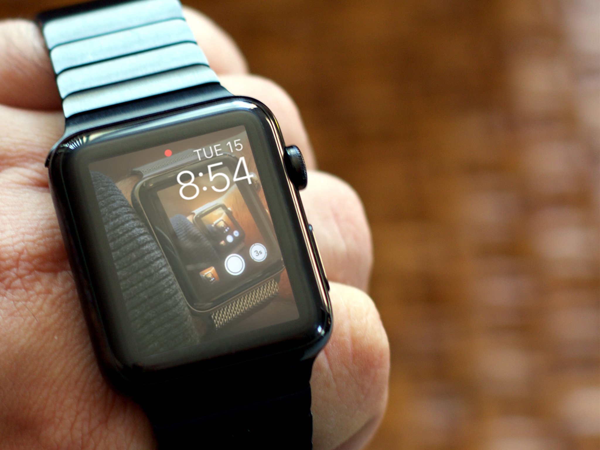
Update: watchOS 2
On September 21, 2015, Apple released watchOS 2. Only 5 months after the original version shipped, watchOS 2 is more of a rounding-out than a radical update. That includes photo and time-lapse clock faces, time travel, responding to mail, adding more friends, locking down activation, and more.
Though watchOS is technically a 1.0 version, much of it is analogous to iOS 8.2. The Watch's version of UIKit — the framework that handles interfaces — is peppered with unique features all its own, however; watchOS even has its own special frameworks which handle things like the clock faces.
While iOS and OS X have been unified under Apple's senior vice president of software engineering, Craig Federighi, the watchOS project has been led by vice president of technology, Kevin Lynch. That combination — shared roots yet space to grow — makes a profound amount of sense for something that's new and yet connected to what's come before.
It not only maximizes familiarity; it should also allow for great ideas, when created for either the Watch or the iPhone/iPad, to more quickly and easily cross over to the other(s). That's better for Apple, and for developers and customers.
Pairing and setup
iOS 8.2 added the Apple Watch app to the iPhone and you'll need that software version, or later, for pairing, setup, and ongoing management. All of that is handled by the My Watch tab.
It might seem awkward or outdated at first to set up your Watch using your iPhone — perhaps bringing back memories of tethering your iPhone to the Mac or Windows — but because the Apple Watch is paired with the iPhone, it at least sets proper expectations for the experience to come.
The Apple Watch app icon represents a side view of the Apple Watch itself. It's well rendered, and the thin gray loop on a black background does make it stand out on the Home screen. A lot. That's helpful for locking onto it quickly when you want to use it, but also strange and almost out of place when you don't.
The interface for the Apple Watch app is as bright-on-dark as the Apple Watch's itself. It's striking, even if it continues to tease those still holding out hope for a universal dark theme for iOS.
The pairing process is clever: you line up your iPhone's camera to your Apple Watch's screen... and you're paired.
The pairing process is clever: you line up your iPhone's camera to your Apple Watch's screen... and you're paired. The Apple Watch app then asks if you want to set it up for left or right handed use — a thoughtful move by the company. Log in to iCloud; choose whether you want to allow location services, Siri, and the sharing of anonymized diagnostic information; set up a 4-digit passcode or strong password; and decide whether you want unlocking your iPhone — including using Touch ID — to also unlock your Apple Watch.
Once that's done, you're given the option to automatically install all Apple Watch app extensions already available on your iPhone. Depending on how much data you move over, the initial sync might take a while. Once it's done, though, you're ready to go.
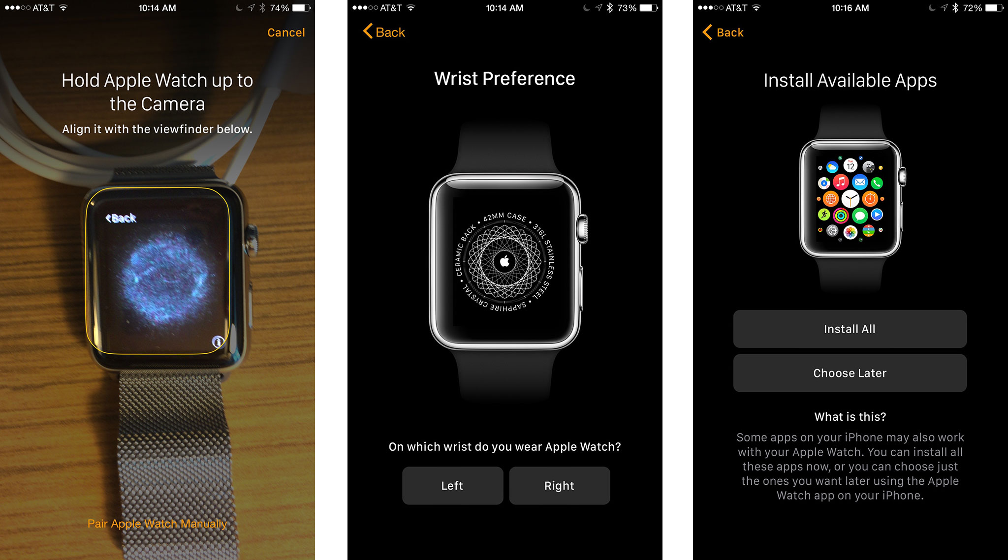
I went with the option to automatically install apps the first I paired. Later I went back and removed most of them. Now I only add apps and other options when and if I need them. The Watch, at least to me, feels best when it's lean.
Unfortunately, there's a lack of consistency between settings available on the Apple Watch for iPhone app and those available in the Settings app for the Apple Watch itself. In some cases that might make sense given the context — immediate availability vs. ease of use. In others, it feels random.
For example, I can set "reduce motion" on both, but "reduce transparency" only on the iPhone. I can set what happens "on wrist raise" — "show watch face" or "resume previous activity" — on both, but I can only toggle "on wrist raise" on or off on the Apple Watch.
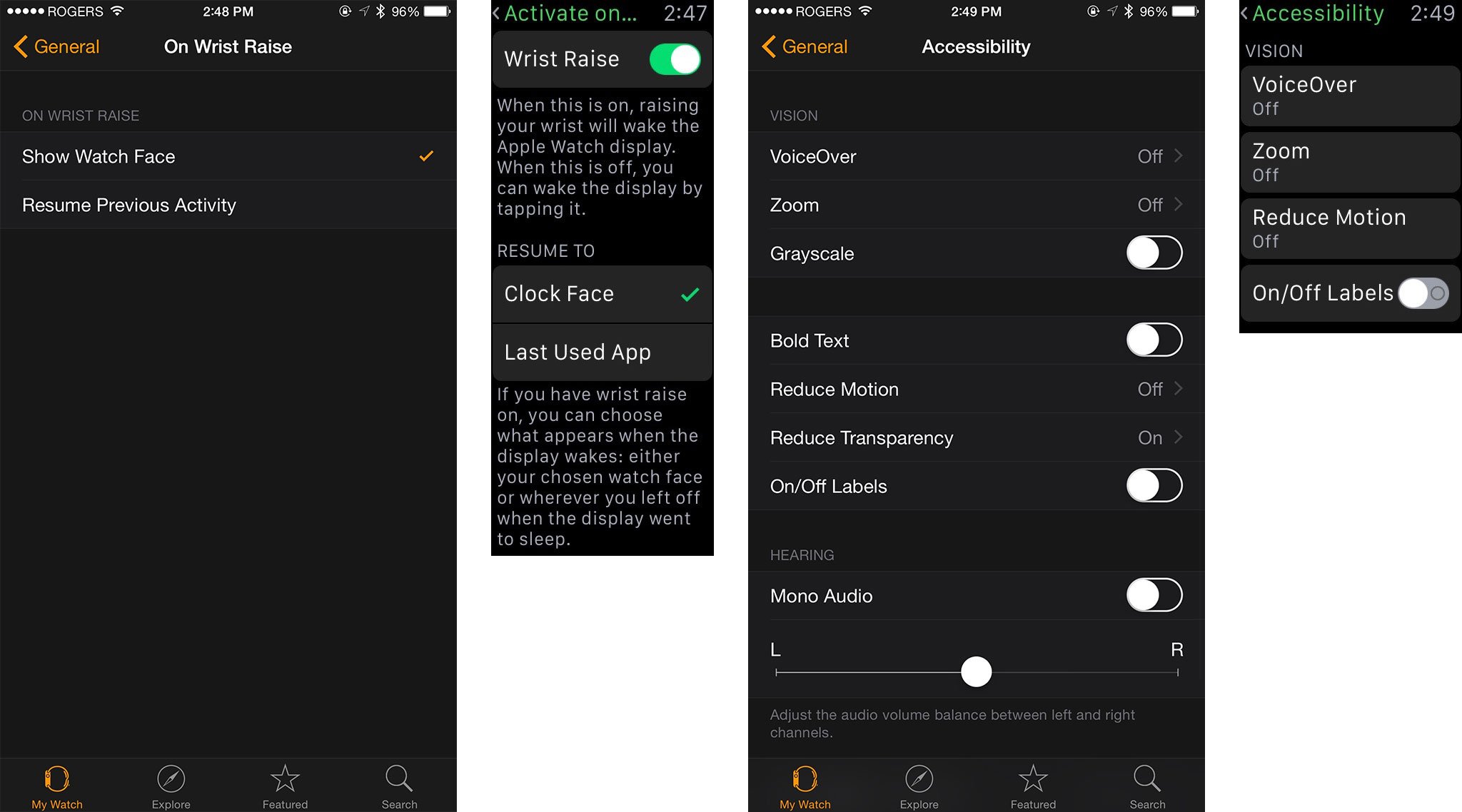
Trying to figure out where a setting is feels like trying to figure out which side really is up on a standard USB cable — more work than logic should allow.
Either way, I think it will take most people some time and experimentation to figure out exactly which settings make the most sense on the Apple Watch. That's to be expected. It's a new type of product.
Touch and Force Touch
In addition to the Digital Crown and side button, you're also meant to swipe, tap, long press, and otherwise interact with the Watch's capacitive screen, just like you do with the iPhone.
That said, the screen — especially the 38mm model — is so small that traditional multitouch gestures aren't going to work properly. So rather than toss them in as a compromised offering, Apple has excised them entirely. You can't pinch to zoom; instead, you need to use the Digital Crown.
There are certain events that require a two-finger tap or touch, like sending a heartbeat or using accessibility features. I'm not sure if those are actually detecting dual touch events or simply reading the surface area and shape being produced by a single touch event.
Either way, it doesn't mean Apple has abandoned interesting gestures entirely: Enter Force Touch.
Force Touch is new. It was announced alongside the Apple Watch back in September 2014, though it technically shipped first on the 13-inch MacBook Pro and new MacBook. While Force Touch for Mac is already being used to make multitouch multi-dimensional, Force Touch on the Apple Watch is currently focused on just one thing — a way to get additional options, similar to the secondary (right) mouse click on personal computers.
To Force Touch, you don't just tap the screen — you press down on it firmly. That triggers one and four contextual options. Some of those options include a glorious "Clear All" in Notification Center (can we get that for iOS, please?); flagging, marking as unread, or trashing email in Mail; or switching between analog, digital, graph, and hybrid mode in the Stopwatch.
It's in the "useful" category that Force Touch options excel.
It's not the number of options that matter, however; it's the utility. The options can't be vital, because burying them under Force Touch risks them being invisible to people who would absolutely need them. Yet they have to be important; otherwise, they're just adding clutter and complexity to the interface and should be pruned.
That leaves the "useful" category — and it's in that category where good Force Touch options excel.
This includes when there's no explicit Force Touch menu. For example, press firmly on an animated emoji, and you'll immediately cycle to another one of the available colors — yellow face to red, red heart to blue and then purple. (No alternatives for the hand, alas.)

Force Touch is also what you use to switch clock faces and access customization options. You could argue that changing the clock face is vital, but it's also such a primary part of the interface that discoverability there seems inevitable.
I'm not sure if there's some abomination of Fitts's Law that accounts for Force Touch being the largest target area when the distance is modified by my lack of coordination, excitement, or occaisional Hulk-like rage at the Internet, but I've trigged it enough by accident that I'm convinced if I hadn't known about it, I'd have discovered it fairly quickly on my own.
Especially because Apple makes it unmistakable when you trigger it.
Haptics and the Taptic Engine
Force Touch is what you do when you press into the screen. The Taptic Engine is what presses back. It creates a "haptic response" — which is a fancy way of saying physical feedback. In this case, the haptics are generated by an LRA (linear resonant actuator), akin to the one used in the iPhone 6 and iPhone 6 Plus, but different in kind from the ERM (eccentric rotating masses) used in almost all previous generation iPhone models.
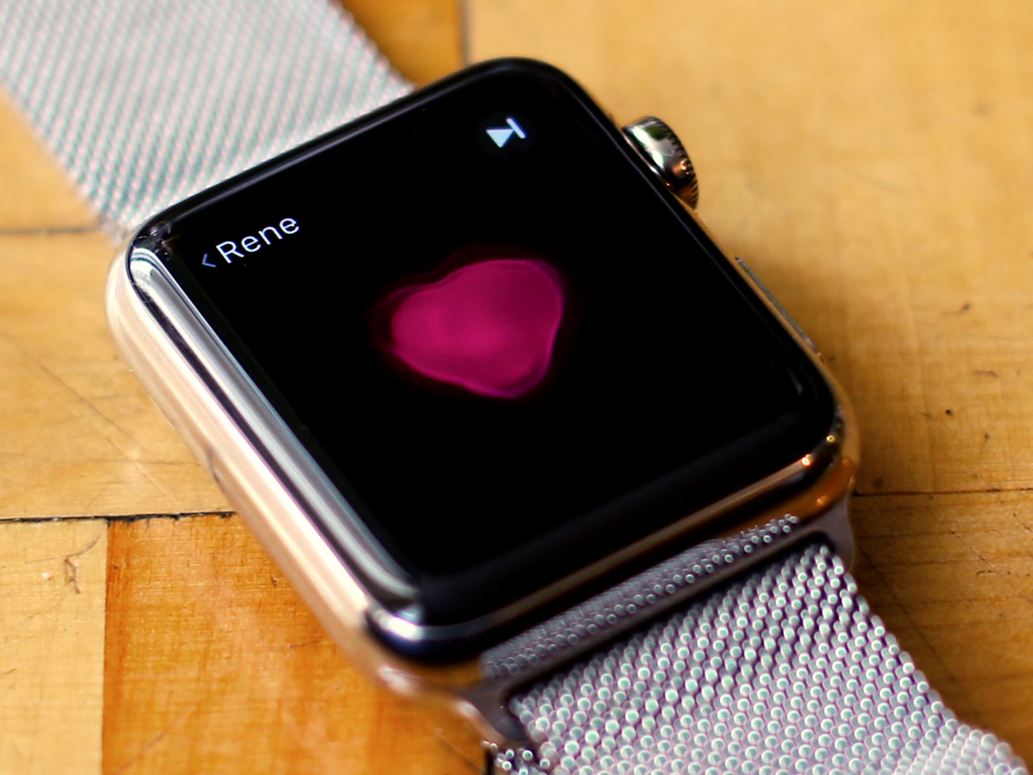
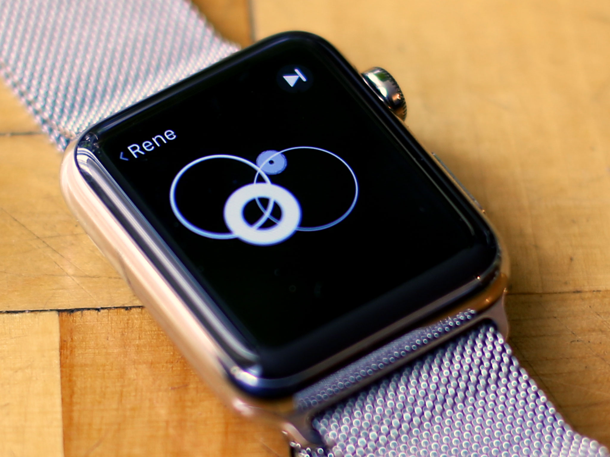
Rather than the audible buzzing that emanates from one corner of the iPhone, the Apple Watch haptics is creates a specific click-like sensation that feels like it's emanating from directly beneath your finger.
That's because the Taptic Engine uses horizontal movement to make your fingers perceive vertical movement. No, physics isn't a lie and your fingers aren't liars: It's just taking advantage of the limits of human proprioception and fooling our more-easily-foolable-than-we-thought brains.
The Apple Watch's version isn't identical to the feeling of a trackpad click the way it is on the new MacBook, but you'll still know it when you feel it. More importantly, you instantly know it was a Force Touch rather than a regular tap or long press.
While the MacBook enjoys a far wider range of Force Click commands than the Apple Watch, being in constant contact with your wrist allows the Apple Watch can use haptic feedback in far more ways than the MacBook.
The subtlety of the Taptic Engine makes all the difference.
By generating a variety of patterns and intensities, the Taptic Engine can provide a range of alerts and information. It's not always easy to tell them apart, especially at first, but they start to make sense over time. For navigation it's easiest — a long series of taps versus three shorter series of taps means turn right instead of left. That lets you know which way to turn next without having to look or even hear.
And, unlike phone or some other smartwatch vibrations, you won't disturb others either. In a quiet room, if you listen for it, you may be able to hear an Apple Watch tap, but under ordinary circumstances, it all but disappears into the background noise.
I've had many meals and drinks with people wearing Apple Watch and never knew when they got taps, nor did they know when I did.
That subtlety makes all the difference. It lets me keep haptics on when I'd instantly turn normal vibrations off.
Where this technology will go, on the Apple Watch and the MacBook, or on devices in between like the iPhone and iPad, is fascinating to consider. Especially considering Apple has, at least thus far, implemented it in a way that respects the unique characteristics of each device. That makes it one of the most exciting developments we've seen in years.
Siri
Siri is Apple's personal virtual assistant. As with the iPhone, Siri on the Apple Watch exists as a natural language, context-aware voice interface that can be invoked at any time to answer questions and act on commands. The smaller size and more constrained interactivity of the Apple Watch, however, makes Siri even more useful and important.
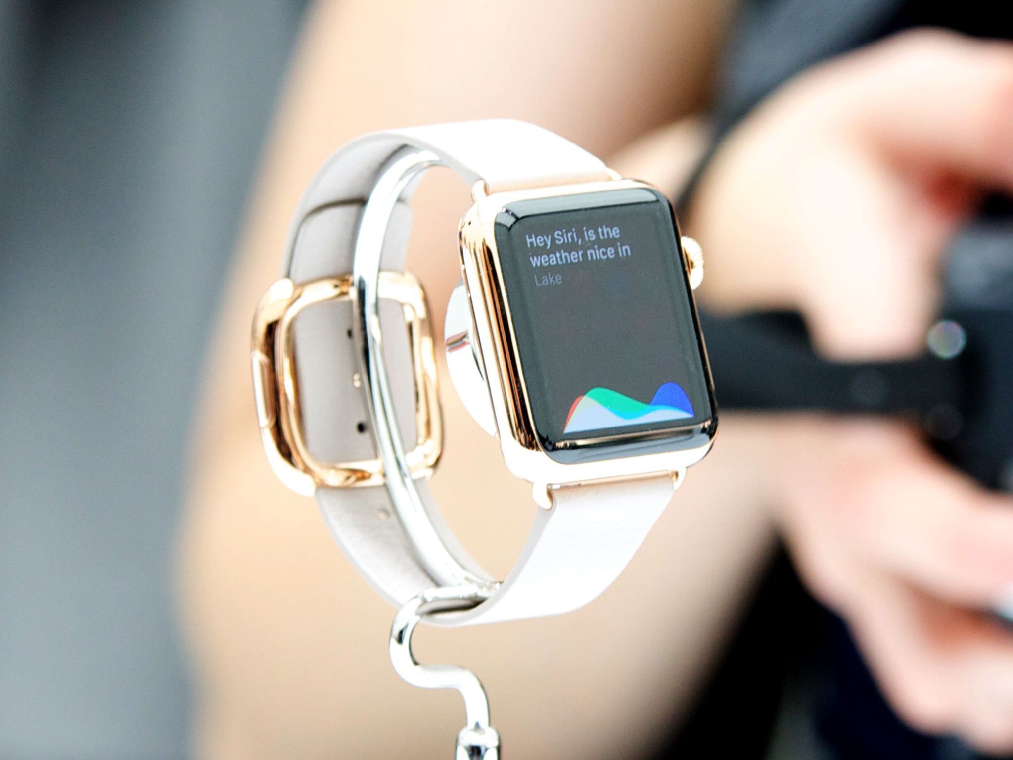
A large part of that is Apple's decision to enable the "Hey, Siri!" voice command for the Watch even when it's not plugged in. That means you don't have to hold down the Digital Crown to access Siri, you can simple raise your arm, turn your watch towards you, and speak.
On the Apple Watch, Siri can set alarms, set reminders, tell you about time around the world, set timers, send messages, create appointments and show you what's on your calendar, Make phone calls, tell you about the weather, find locations on maps, play music, find information about movies, answer questions using Wikipedia or Wolfram Alpha, show pictures using Bing, tell you about sports, tell you about stocks, and launch apps.
It works almost all the time for Serenity, but I've found that I need to speak within the first few seconds after the screen wakes up and lean towards the side with the mic for it to be that reliable for me.
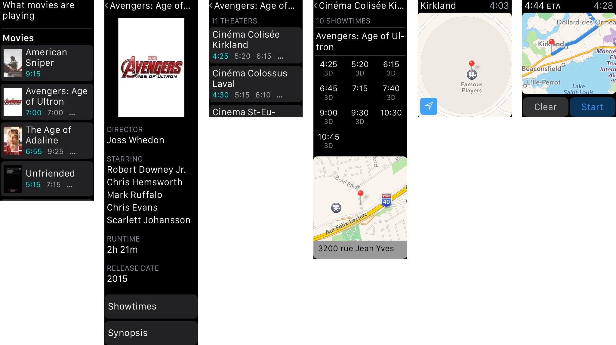
One of the things Siri on the Watch can't yet do is talk back. Responses, at least for now, are text only. The Apple Watch has a surprisingly decent speaker for its size, and it's already put to more than good use by VoiceOver, so this feels less like a deliberate omission and more like something that'll be coming as soon as possible.
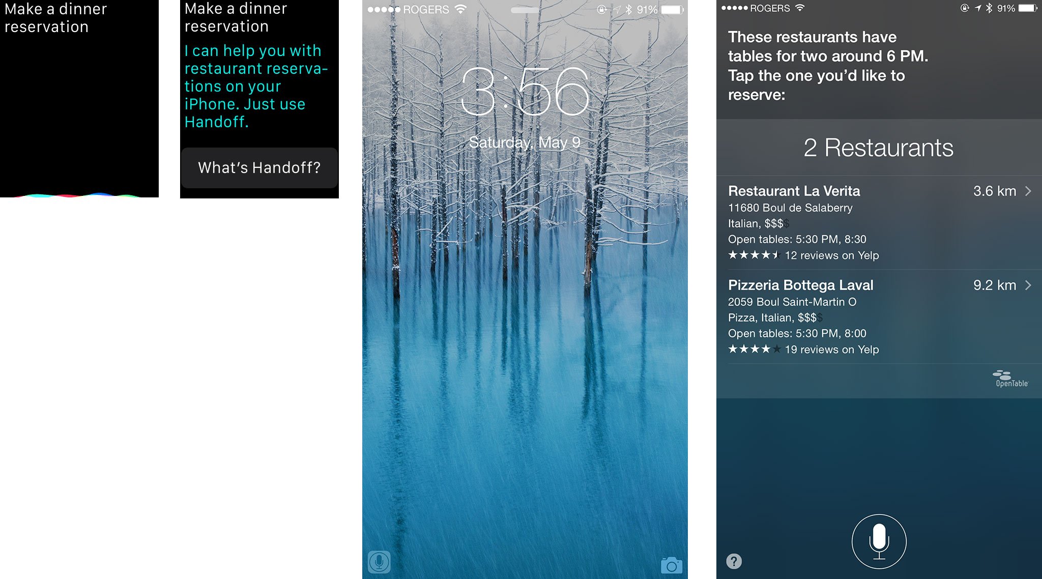
There are others things that Siri can't do on the Apple Watch that it can do on the iPhone. Some of them makes sense. Complex activities like booking a dinner reservation aren't well-suited to the Apple Watch. Simpler things, however, like taking a short note, would be welcome additions. Mail I'm not sure about. Messages feels like it's enough for the Watch, but responding to an email with a short bit of text, like a message, would be convenient.
The rest of the functionality is interesting: In addition to using "Hey, Siri!" for messages, you can choose to have the audio recording or the dictation text sent, which is great when the words you're using aren't common or easily transcribed.
Even though there's no Safari web browser on the Apple Watch, you can still ask questions that generate Wikipedia results. They're shown on cards, like on the iPhone, you just can't tap them to launch Safari and learn more.
As a workaround, Apple has brought Continuity's Handoff feature to Siri. You can start using Siri on your Apple Watch; from there, if you want or need to, you can pick up your iPhone, swipe the Siri icon on the lock screen, and keep right on going.
If all of this — buttons, touches, force touches, and Siri — sounds complicated, that's because it is. But the difference between complexity and sophistication is in the handling.
If all of this — buttons, touches, force touches, and Siri — sounds complicated, that's because it is.
Most people can use their Mac without ever launching Terminal, but Terminal is there for those who rely on it. Likewise, many people can use an iPhone without ever opening Notification Center or double pressing the home button for the app switcher. And many people will be able to use the Apple Watch without using all the button controls or combinations, or tapping through the home screen and deeply into apps.
If speaking out loud to Siri is inappropriate given the circumstances, or if Siri is somehow unavailable, you can still navigate your way through. You can press the Digital Crown, tap the Messages icon, press firmly to create a new message, tap (maybe a few times) to add a contact, add some default text or an emoji, and send it.
More likely, you'd just handoff your task to the iPhone and type it out there. Or, you'd just wait until you can say "Hey, Siri, send a message…"
Security and privacy
Apple hasn't released many specifics when it comes to the nuts and bolts of watchOS security and privacy. Since it's based on iOS 8.2, at least in part, my educated guess is that it's similar on a system-leve. Perhaps even better, since there's no browser and no HTML email directly available for exploits.
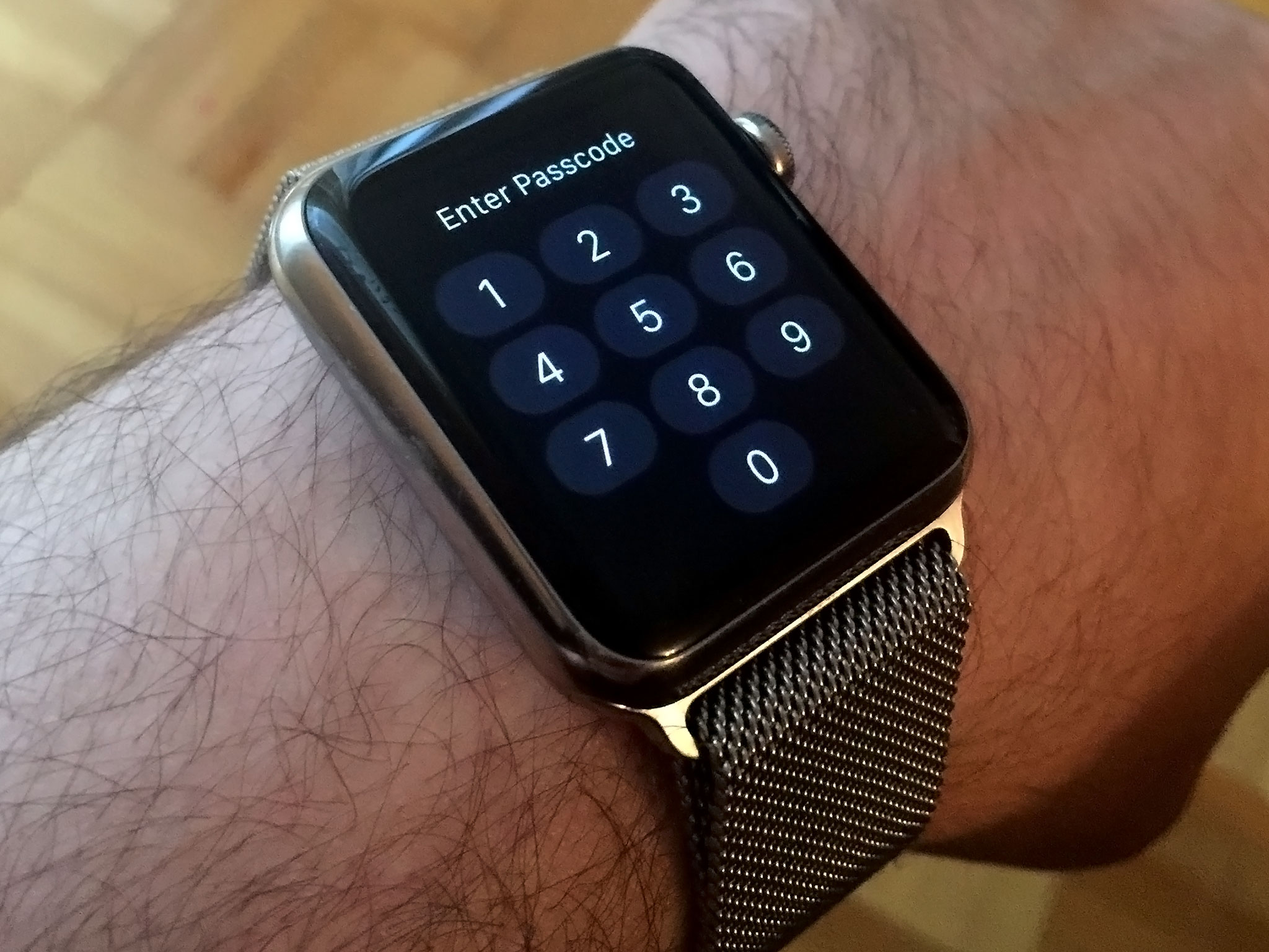
You can set a 4-digit passcode for the Apple Watch or a strong password. You can choose to let Touch ID on your iPhone unlock your Apple Watch or require entry of the passcode or password. You can also set it to erase all data after 10 failed passcode or password attempts. (And yes, if you get a passcode or password wrong, Apple Watch shakes its interface just like Apple's previous products — and adds a haptic "growl" to boot!)
Once you're authenticated, by default you stay authenticated for as long as the Apple Watch stays in contact with your wrist. That's smart. Bluetooth trusted devices have long had one deal-breaker failing — take the device and you take the trust. Not so with Apple Watch. Take it, and you get locked out.
You can disable wrist detection if you really want to, but you won't be able to use Apple Pay and some other features if you do. That's to keep your transactions and other data safe.
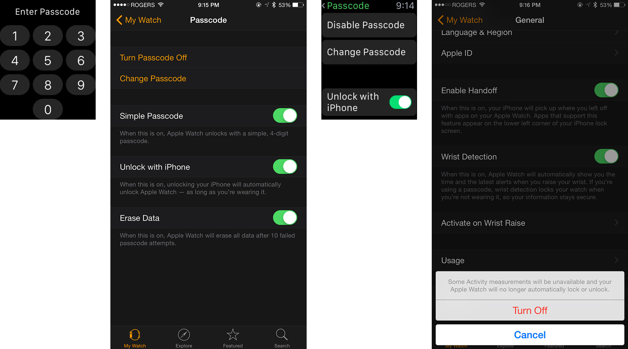
Because Apple won't sync Apple Pay for security reasons, the credit and debit cards you've set up on your iPhone won't automatically appear on your Apple Watch. You have to add them with the Apple Watch for iPhone app.
For enhanced privacy you can choose to require a tap before a notification transitions from the brief "short look" to the more verbose "long look". You can also turn off heart rate and motion tracking if either or both concerns you.
Overall I love what they've done. Siri made the mic smart, Touch ID made the home button smart, now wrist detection has made the back of the wearable smart. What Apple and developers will eventually be able to do with this chain is going to be very, very cool.
Accessibility
Apple has made accessibility a priority for years, no matter whether you're using a Mac, iPhone, or iPad. As such, it should come as no surprise that the Apple Watch has accessibility features built into its core.
watchOS's accessibility options include VoiceOver, Zoom, Greyscale, Bold Text, Reduce Motion, Reduce Transparency, On/Off labels, and Mono Audio. You can enable and customize VoiceOver, Zoom, Reduce Motion, and On/Off labels right from Settings on the Watch; the rest you can enable and customize using the Settings section of the Apple Watch for iPhone app.
Missing, as mentioned previously, is Siri's voice responses. You can still control a lot with Siri, you just can't hear receive audio feedback the way you can on the iPhone. There's also no hearing aid-specific support yet. Given Apple's history, however, my guess is both will be addressed in future updates, perhaps in new and watch-specific ways.
/>
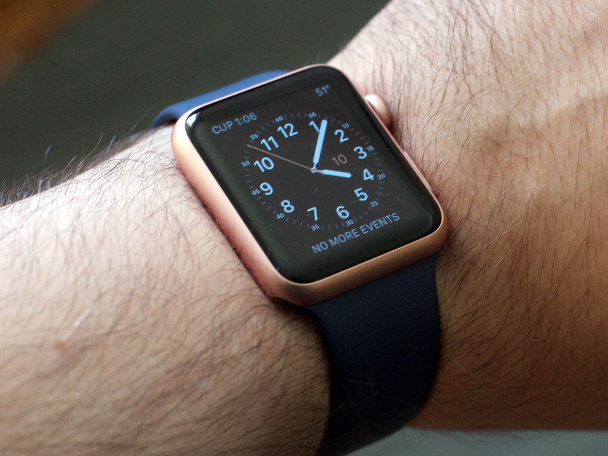
Accessibility and inclusivity make technology easier to use for everyone. By not only prioritizing it in the development process but also including it in keynotes and advertisements, Apple has helped to spread awareness and give real people a chance to live better lives.
I'm calling that out specifically because the accessibility community is incredibly engaged, and continuously reaffirming that people not only pay attention to, but pay for, this kind of support is the best way to keep it a priority.
Apple Watch apps
The iPhone launched in 2007 with a half a page of built-in apps and no App Store. The iPad launched in 2010 with close to a full page of built-in apps and an App Store with hundreds of tablet-optimized apps. The Apple Watch launched in 2015 with a screen of built-in apps and three-and-a-half thousand App Store app extensions.
That last part highlights just how much the concepts of interface, interactivity, and apps have changed over the last decade, and even over the last year.
It wasn't until iOS 8 that the iPhone got support for extensibility, a set of frameworks that enable the current app experience for the Apple Watch, and now look at it: a feature barely a year old has led to new and interesting ways for presenting and using wrist-optimized software.
Actionable notifications
When a notification comes in, you get a "short look" which shows you which app the notification is from, and a significant detail about it (i.e. the sender's name, if it's a message). If you keep your wrist raised — and haven't set it to wait for a confirmation tap — that short look will automatically expand into a "long look," giving you most if not all the information you need at a glance. What's more, you can most often act on the notification from that very screen.
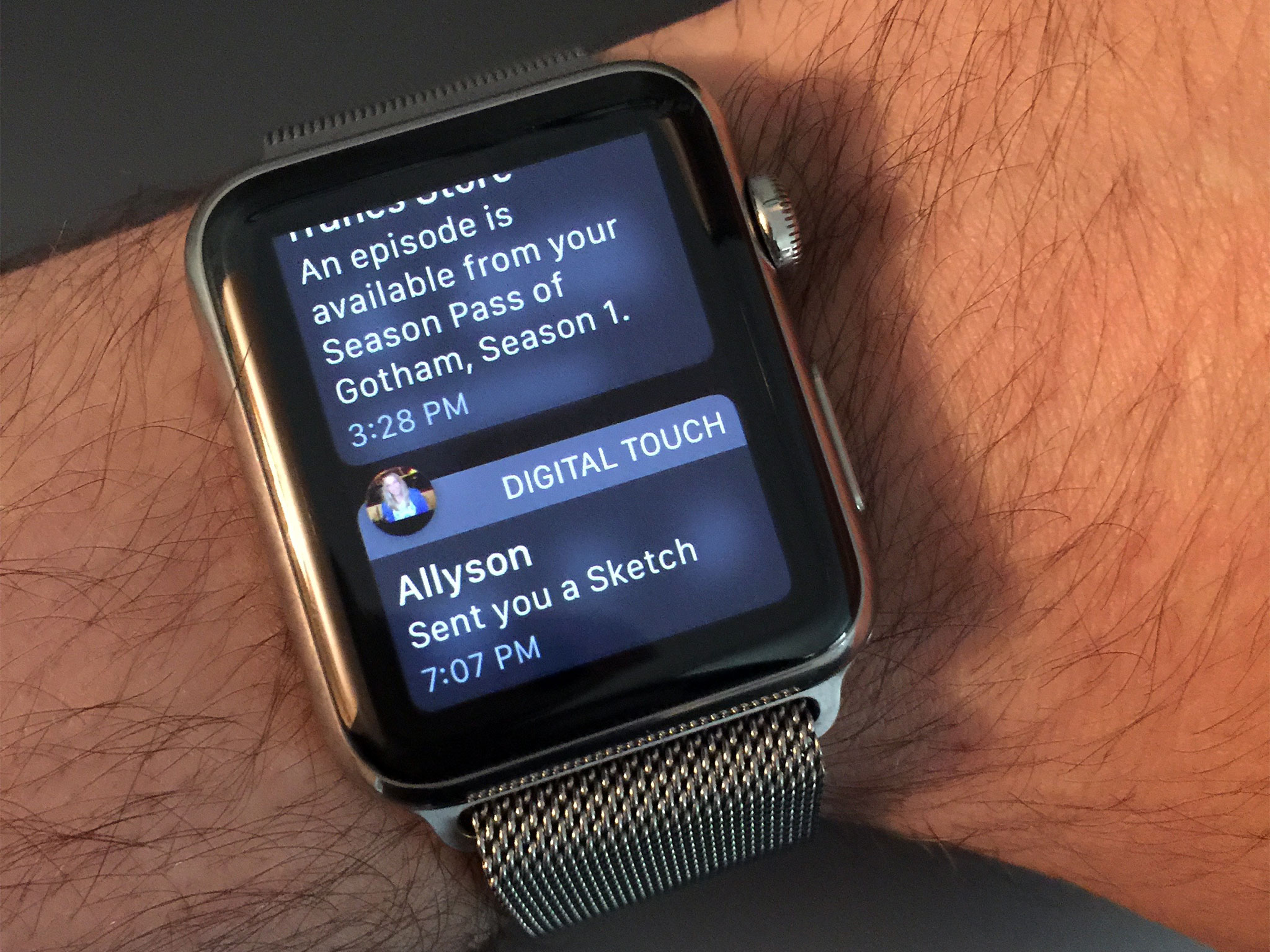
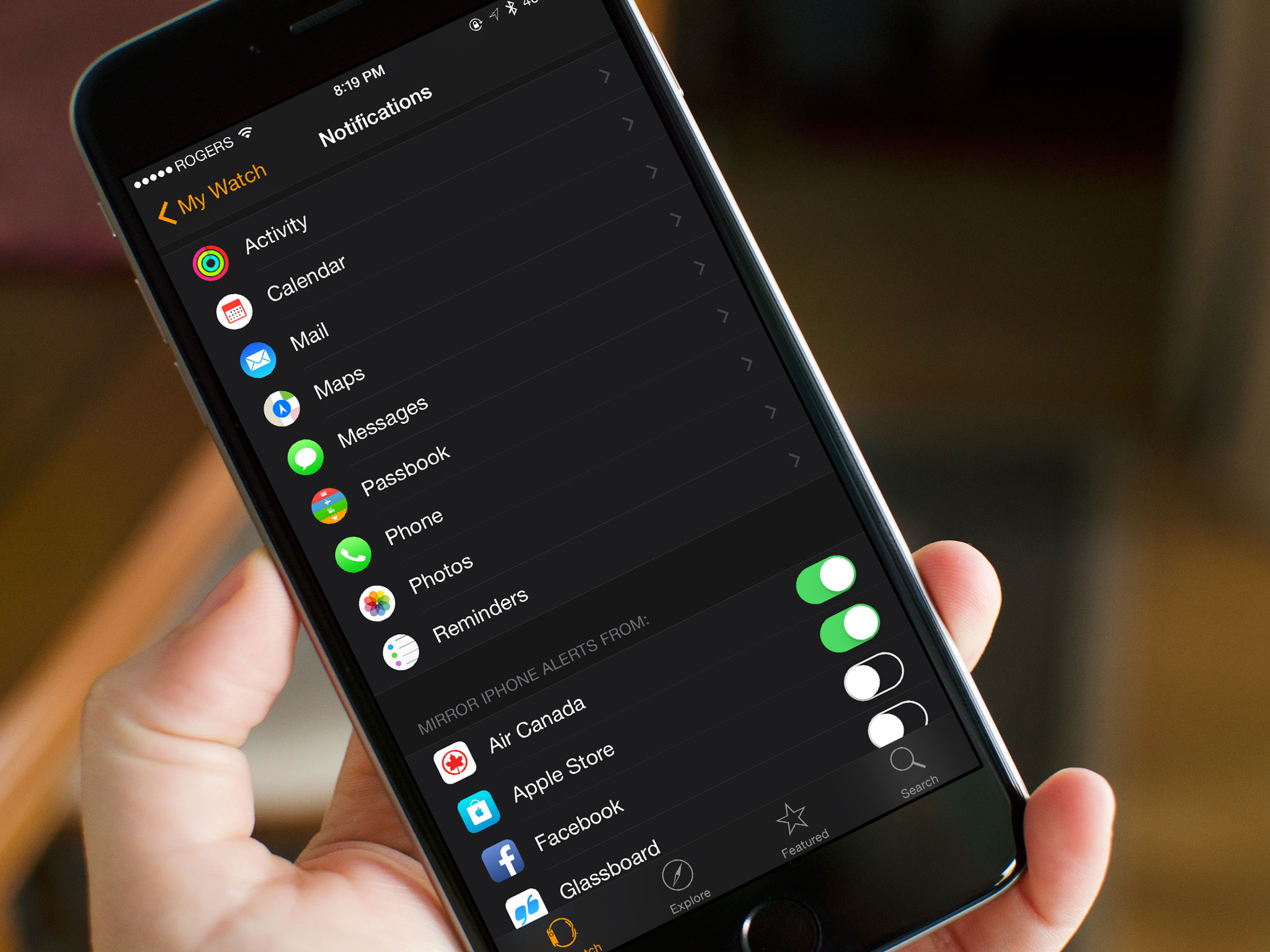
By default, the vast majority of notifications will mirror the settings from your iPhone, though you can customize many of Apple's built-in apps to prevent sounds, haptics, or reduce the amount of alerts you get.
I can restrict Mail notification to VIPs only, but no such filter exists for Messages.
I have most alerts turned off on my iPhone already, but for the Apple Watch, I want even less. The fact that I'm actually wearing it on my body demands an even higher level of urgency and discretion.
Unfortunately, though you can fiddle here and there, notifications don't really offer enough fine-grained filters and controls. I can restrict Mail notifications to VIPs only, for example, but no such filter exists for Messages: It's all or nothing. Likewise, there are no custom settings for App Store app notifications. They're either on or off. You can turn off haptics and sounds for third-party apps if you go through the Settings app on your iPhone, but it's an extra step, and not a very discoverable one.
That's something I hope Apple addresses sooner rather than later. The Watch is ideal for notifications — I just need to be able to set it up ideally.
Lack of filters aside, developers essentially get notifications "for free". As long as your iPhone is locked, notifications get forwarded to your Apple Watch. If you're using your iPhone, however, the notification stays there instead, keeping you from dual-buzzing devices. Would that notifications were that smart between all your Apple devices! This does happen (inconsistently) if you're using Messages on your Mac, but no other Mac-based notification works this way.
Developers can also customize the sash color of their notification to better match their app branding, and can choose how many buttons they want on the watch-specific notifications. These buttons appear at the bottom of the alert, and developers can set up to four. (Most apps shouldn't need that many.)

If you miss a notification on your Apple Watch, it goes into the Watch's version of Notification Center. An optional red dot on the clock face lets you know you have notifications pending. Swipe down to get the full stack: collated, ready, and waiting for you.
Notification Center is currently limited to the clock face because, unlike the iPhone, it's not activated by a swipe down from the bezel but by a swipe down from anywhere on the small screen. That gesture would collide with simple scrolling in any list-based app. I'd personally like to have access to Notification Center from anywhere, so hopefully that's something Apple can figure out.
A bigger problem, as Ally mentions in the roundtable below, is that notifications are full screen on the Apple Watch. That means any time one comes in, it takes over and completely interrupts whatever you're doing at the time. (If this happens while you're in the middle of a Digital Touch sketch — goodbye, artwork.)
Again, limited screen size forces constraints, but it'd be preferable to have some form of iPhone-style banner that can be more easily ignored or dismissed without as significant an interruption.

Overall, though, notifications on the Apple Watch are phenomenal. As I've said repeatedly, the killer watch app for me was always convenience — the ability to handle all those brief but frequent and important interactions in a more efficient way. And interactive notifications deliver that.
Glances
It's tempting to liken Glances to widgets on the iPhone. Those widgets, however, live in Notification Center and can be accessed from any screen, at any time. Glances live by themselves: You get to them by swiping up from the bottom of the screen, and you can only get to them from the clock face.
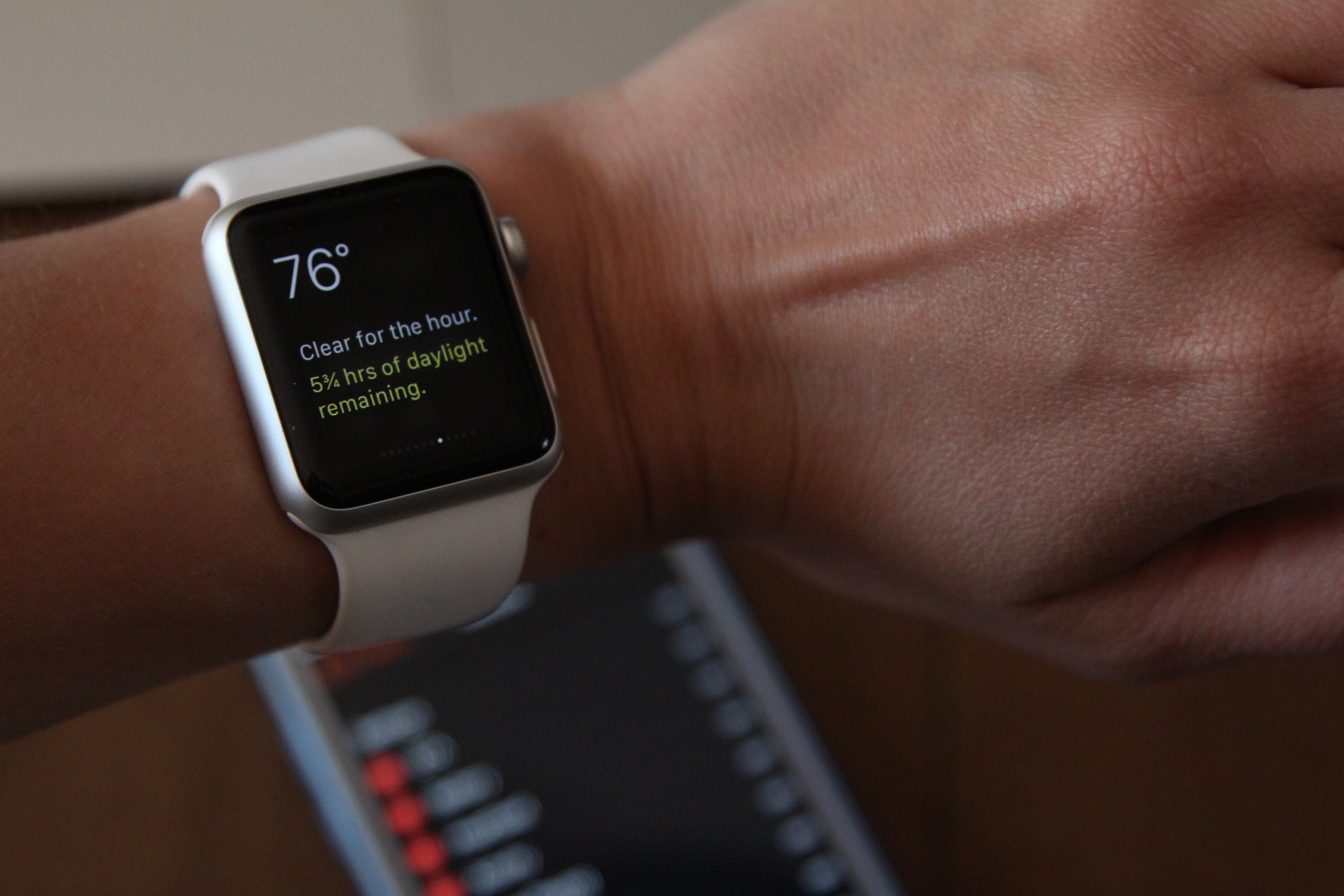
Where Apple's Settings, Music, and Battery Glances contain buttons, the company's other Glances, and all third-party Glances are currently read-only, and if tapped anywhere, send you to their associated app.
(When third-party Apple Watch apps have the option to go native in the future, hopefully that will also open up room for Glances to become more interactive, but we'll have to wait and see.)
Regardless, the Watch's current limitations on Glances makes them their own thing — it's why they're "Glances" and not "widgets".
You can add, remove, and rearrange Glances at any time using the Apple Watch app for iPhone. It's as simple as tapping a red icon to turn off an active Glance, a green icon to turn on an inactive glance, and dragging the grabber icon attached to any Glance to reorder it in the list.

Some Glances are incredibly useful: The Settings Glance almost doubles for iOS's Control Center, especially given its first-spot position in the Glances interface. It lets you know you're connected to your iPhone; you can toggle airplane mode, do not disturb, or mute; and if you can't find your iPhone, there's a button to make it ping. Loudly.
How valuable other Glances are for you will depend on how valuable you find their containing information. Personally, I've been relying on notifications — which provide timely information I probably need to know — far more than Glances, which provide persistent information I want to know.
Part of that might be that might be because, as with Notification Center on the watch, Glances can only be accessed from the clock face. Part may also be the lack of interactivity for Glances beyond the select Apple-built few. Part might just be the way my brain works. I have friends who, in contrast, want almost no notifications and instead live by their Glances.
Having the option for both lets the Apple Watch better serve a wider range of people and their preferences.
Built-in apps
There are currently two kinds of apps for the Apple Watch: the company's pre-installed native apps, and the app extensions available from the App Store.
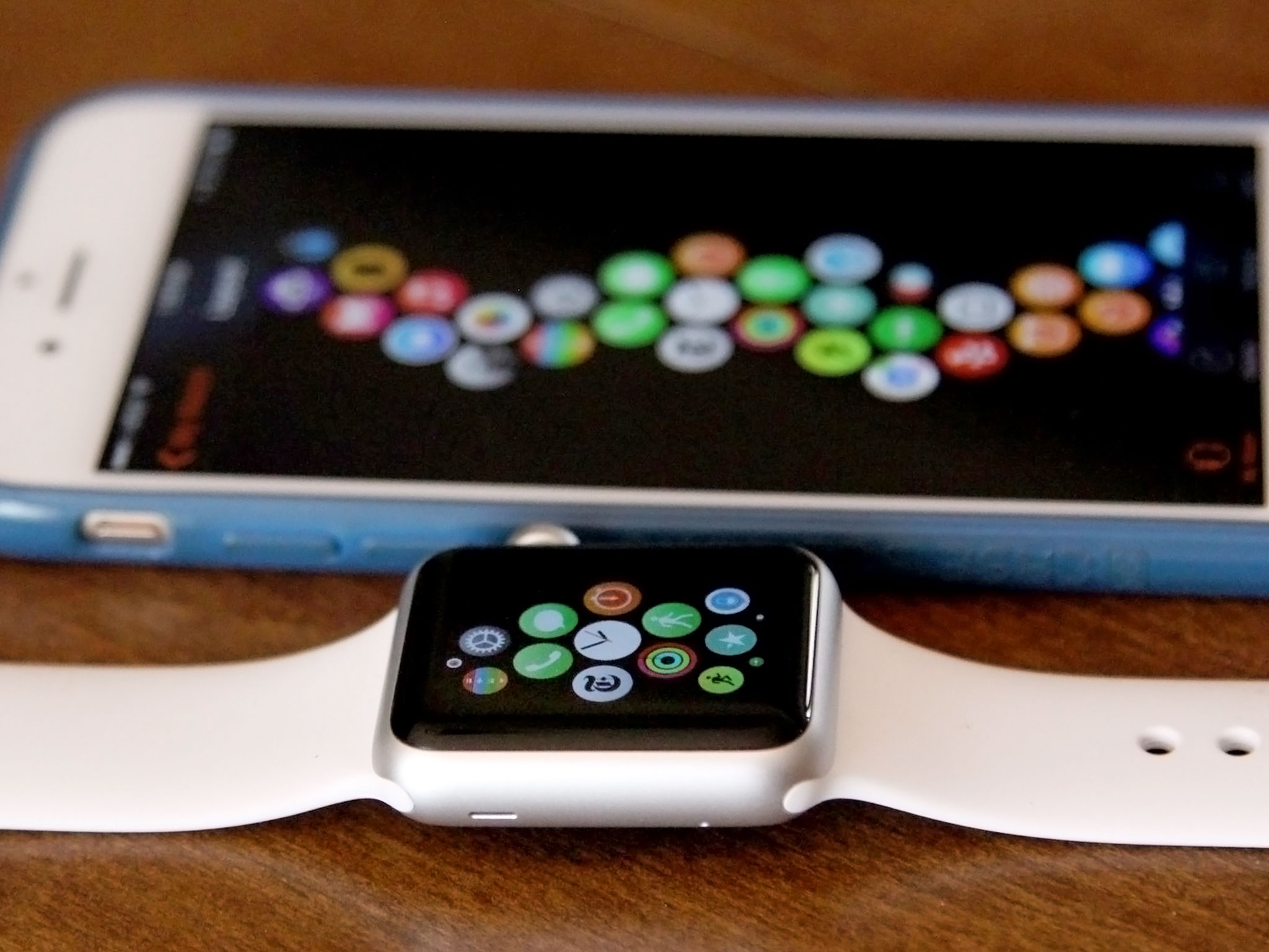
Native apps store both their logic and their interface on the watch itself: That means that they perform like an iPhone app — well, relative to the speed and power of the watch's hardware. In contrast, app extensions have their logic on the iPhone but present their interface on the watch: They perform more like web apps or Notification Center widgets, with updates and interactions subject to the speed and availability of the connection.
Apple's pre-installed apps include Clock, Messages, Phone, Mail, Calendar, Activity, Workout, Maps, Passbook, Music, Camera Remote, (Apple TV/iTunes) Remote, Weather, Stocks, Photos, Alarm, Stopwatch, Timer, World Clock, and Settings.
- Update: watchOS 2 and transit in Maps
There's no Safari browser, as mentioned previously, because it would be almost impossible to use on the Apple Watch's tiny screen. No Notes, which also as mentioned previously is irksome, especially for short dictation. And no Reminders, which feels like it would be beneficial.
There are a few other oddities as well. For example, Calendar has a month view, but only the current month. That means if you're near the end of the month, you can't look ahead a week. Hopefully swiping between months gets added in an update.
Any time apps need to update information, they have to connect to the iPhone.
Also, any time native apps need to update information, they have to connect to the iPhone, and the iPhone to the internet, and then back to the Apple Watch to do it. Most of the time there's sufficient cache and sufficiently good connection that any lag is minimal. For data-heavy apps that haven't been launched in a while, — looking at you, Weather — the app's loading screen can spin for a few lonely seconds or more before populating.
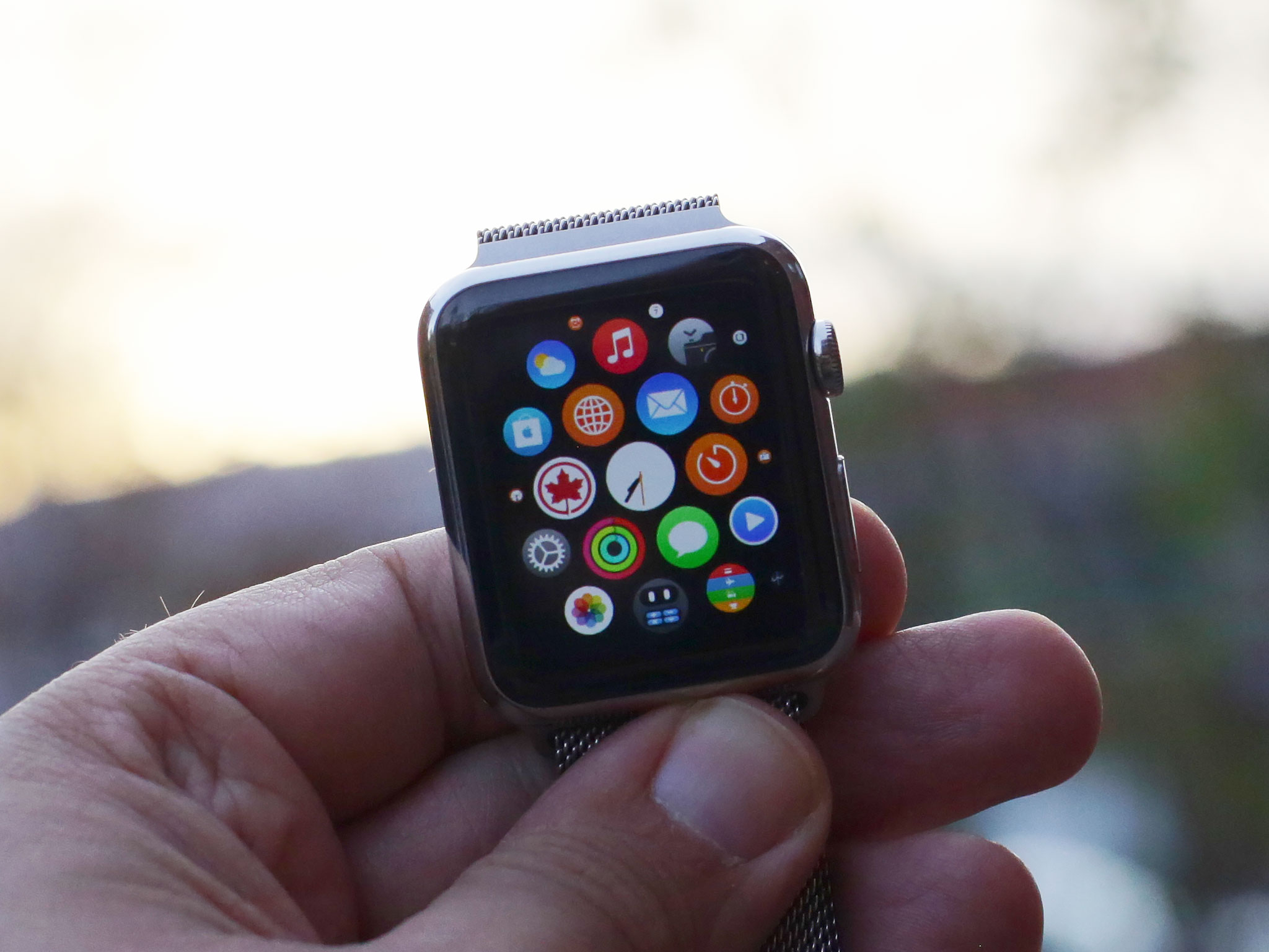
Instead of a grid, Apple Watch apps honeycomb your home screen. You can rearrange them by long pressing to enter jiggly mode, just like the iPhone. The Clock app has to remain in the center, but the rest can be stacked in far more creative ways than the iPhone currently allows. You can even use the Apple Watch for iPhone app to organize your apps — built-in and App Store alike — on the bigger screen.
Overall, Apple's native apps turned out better than I thought, and I use them more than I anticipated. They're limited, yes, but they're also useful when I don't have my iPhone within easy reach, and that's exactly what I need from them for now.
App Store apps
Since Apple Watch apps are currently non-native extensions, there's no App Store on the Watch itself and no way to download and install software directly. Instead, you download the container app to your iPhone, either through the regular App Store app or through dedicated Explore, Features, and Search tabs for the App Store for Apple Watch located in the Apple Watch for iPhone app.
- Update: watchOS2 and native apps
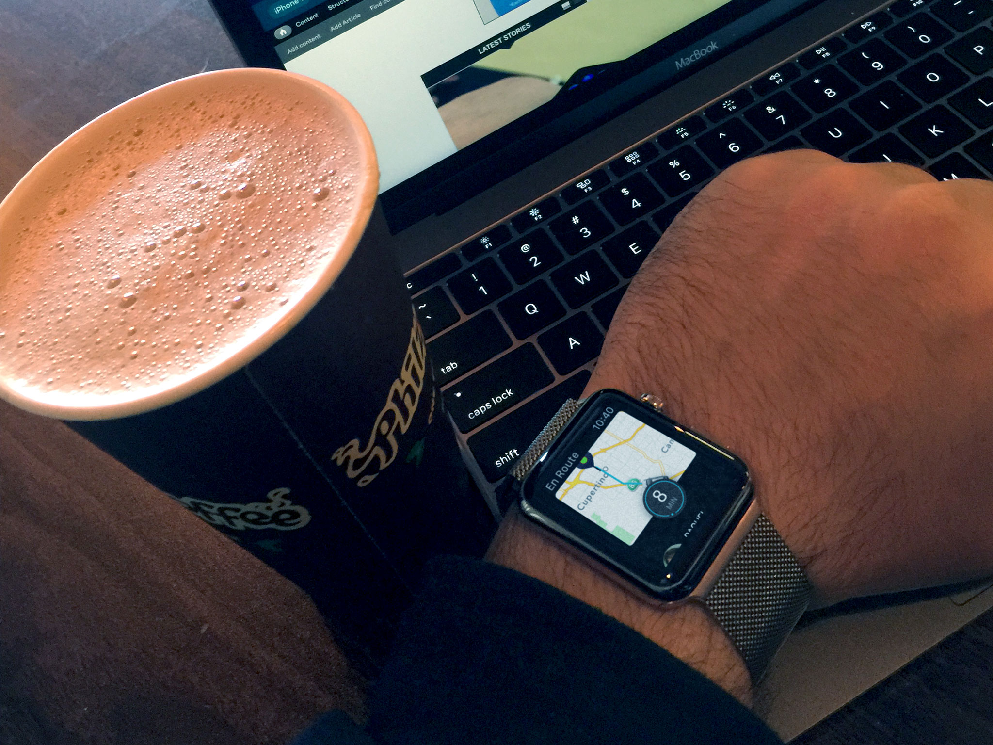
Once downloaded to your iPhone, to install the extension on your Apple Watch you go to the My Watch tab, scroll down, and toggle it "on." (If there's a Glance available for the container app as well, you can toggle that on at the same time.)
It typically takes a few seconds for the extension to sync over. Once that's done, the Apple Watch hosts the iPhone app's remote view, much like the Today View hosts a widget, and you're good to go.
The process is cumbersome, but it's also interim. When Apple first announced the Watch in 2014, they said native apps would be coming in 2015. App extensions weren't originally mentioned at all, so when the WatchKit developer frameworks went live, they were a bonus — and they still feel very much that way.
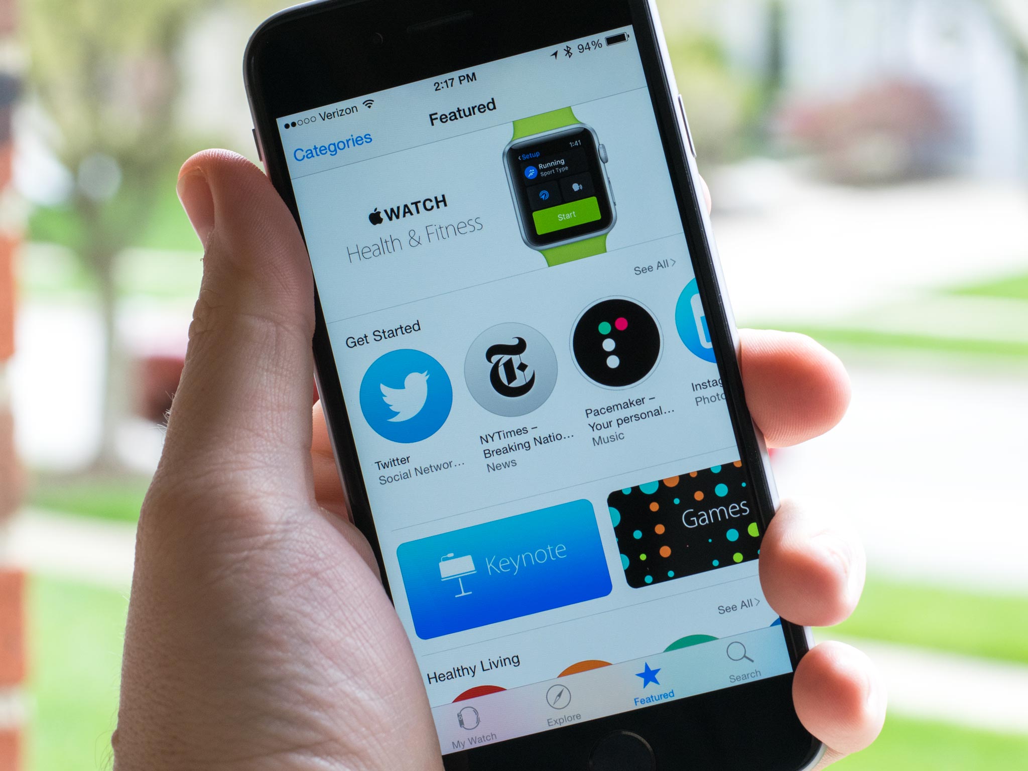
There were 3500 App Store app extensions available for the Apple Watch on launch day. That's an incredible number, even given the size of the App Store. Some are remarkable. Others feel like they need more time and more consideration for what it means to be worn, not just used.
Uber, Starwood Hotels, Calcbot, djay, Twitterrific, Procreate Pocket, Shazam, Pacemaker DJ, Transit, Deliveries, Overcast, Apple Store, and others all show the potential of wearable software.

Because they're all extensions, though, you still have to live with limitations. When they're not cached or when the connection feels off, they still take a while to spin up. A long while. When cached or well-connected, there can still be a delay, but a minor one.
App extensions also have other limitations, including the way they can be laid out, animated, and the kinds of interactions they can register and provide. For example, if their view is long than the screen, the system will let the Digital Crown scroll it, but it's utterly opaque to the app.
The bigger and more important limitation is the nature of wearable technology itself. Beyond the small display size, connectivity model, and power constraints, apps have seconds, not minutes or hours, to provide important information and vital interactions.
We're in a period of major transition right now. With extensibility, Apple hasn't only decoupled interface from apps — they've unbundled functionality, too.
What it means to be an app is evolving.
Where previously you had to hunt down an app to get something done, now that app's widget, share sheet, action, or extension is available where you already are: in another part of the system, in another app, or even on another device, dashboard, or screen.
WebKit has long been much more than Safari; similarly, UIKit is now much more than an in-app interface. What it means to be an app is evolving.
That's the feeling I get from Apple Watch app extensions right now. There's some pain, but there's even more potential.
Apple Watch performance and battery life
When Steve Jobs wanted the best, he got the best. That was true when it came to sushi for Caffe Macs, and it was true when it came to hiring chip designers for the hardware team. We first saw the results in 2010 when the company introduced the Apple A4 system-on-a-chip. We really saw them in 2012 with the introduction of the Swift custom CPU in the Apple A6, followed by the Cyclone and Typhoon in the Apple A7 and Apple A8. And wow did we see them in 2014 with the ridiculously powerful Apple A8X inside the iPad Air 2.
A lot of companies would sit on high-powered chips like that, figuring enough is enough, and money saved is money earned. Apple doesn't make money on the chipsets, though — they make it on the whole device. As a result, the hardware technology organization led by vice president Johny Srouji seems to be running as fast as they can, and they're not only leading the industry, they're shaking it up.
With the Apple Watch, the company isn't just doing a system-on-a-chip either, it's doing a whole computer-on-a-chip (referred to as an integrated computer or system in-package) with the Apple S1.
There's an ARM processor and PowerVR graphics core buried inside, as well 512 MB of RAM, a communications chip, sensors, controllers, and 8 GB of NAND Flash storage. The whole thing is sealed in resin, which Apple says is to protect it from not only the elements, but impact and wear.
It's still a wearable computer, but because of the team and technology the company has put together, Apple has been able to squeeze a tremendous amount of computer into the wearable.
The Apple S1 feels more powerful than it has any right to, but also feels like it's sometimes being pushed to the limits of that power.
And because it's Apple, they're using every bit of that performance, and then some, to drive the software. The result is that the Apple S1 feels more powerful than it has any right to, but also feels like it's sometimes being pushed to the limits of that power.
Scrolling is buttery smooth, as are transitions. And I have SpriteKit and OpenGL-powered animations being rendered on my wrist. That blows my mind. Apps, though, sometimes take 5… 10... seconds to load, especially if they haven't been launched in a while or have to wait for data to be transferred over Bluetooth or Wi-Fi from a paired iPhone.
Those constraints represent the cost of the choices Apple has made given the limits of the technology the company currently has to work with. Remove the color display and system animations, and experience would suffer but battery life would go up. Add GPS and OpenGL for third party apps, and the experience would improve but at the expense of battery life.
Power efficiency and performance are the prices we pay for any and all features on mobile — even more so on wearable — and balancing them is equal parts craft, compromise, and cunning.
Apple set battery life expectations at up to 48 hours of time display, 6.5 hours of audio playback, 6.5 hours of workout monitoring, and 3 hours of talk time. There's also a Power Reserve mode, designed to last up to 72 hours, that shuts down almost all processes except those required to keep and display time. (Since so much is shut down in service of maximizing battery life, however, you literally need to reboot the watch to start everything up again.)
Apple's sample use case offers 18 hours of battery life. For the first two days, when I was syncing and testing almost constantly, I didn't get anywhere near that. Over the last week and half, however, even while still testing and using it more than what I consider to be normal, I've easily seen those numbers.
I typically put on my Apple Watch between 7 am and 8 am and take it off between 1am and 2 am, and I've so far had 20 percent of battery life or more remaining each time. That's much better than I expected.
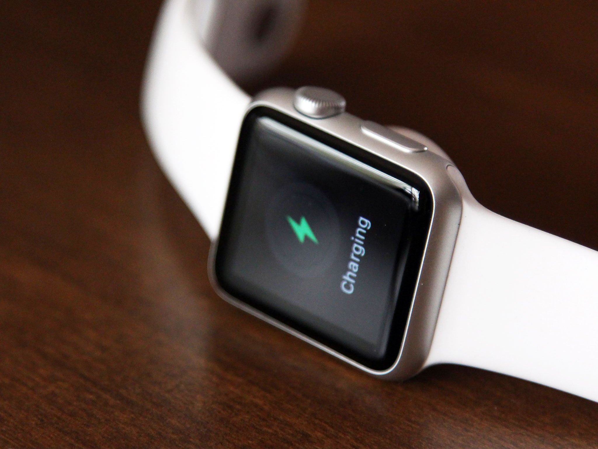
Once off, I charge it overnight. Apple claims you can charge the Watch to 80 percent in 1.5 hours and 100 percent in 2.5 hours. I've tried that a couple times, just to test it, and, and I've gotten within that range.
The impact on my iPhone's battery has been harder to measure. The initial set up and pairing, naturally, kept the radios busy. Since then, my iPhone has seemed fine. Obviously using Bluetooth and Wi-Fi for the Apple Watch will consume more power than not using them, but the difference day-to-day hasn't been noticeable.
The connection itself has also been good. I was worried about it at first, since it sounded a lot like Apple's Continuity system, which often uses Bluetooth LE for broadcasting and handshaking (with Apple's Push Notification service as backup), and Wi-Fi for fast data transfer. Though I've never had trouble with Continuity, others have, and with the Apple Watch, it's not a feature, it's a necessity. But so far, so stable.
Apple Watch seems to to stay on Bluetooth LE as much as possible, likely for power efficiency reasons, and then escalate to Wi-Fi only as and when needed. That includes when you're on a Wi-Fi network and go out of Bluetooth range, which greatly extends the usable range of your Apple Watch. (Though 802.11x doesn't yet seem to be supported, which means that particular feature won't be useful to people in academics, enterprise, or institutions until it's added.)
Because the data needed for watch interactions is typically small, the transfer between Apple Watch and iPhone is fast.
Because the data needed for the Watch is typically small, the transfer between Apple Watch and iPhone is fast. Take a screenshot on your Apple Watch, and by the time you go to your iPhone Photos app, it's almost always there and waiting. (Would that iCloud Photo Library synced that fast.)
If you do leave Bluetooth and Wi-Fi range, however, your watch won't just stop working. You can still access a music playlist you've synced over from your iPhone, use all the clock features, and do anything else that doesn't require an internet connection. In other words, think of it like being in Airplane Mode.
One day, the Apple Watch will have its own direct line to the internet and enough power to do more for longer. (It took the iPhone four years to go PC-free, after all.) Until then, Apple is making smart choices when it comes to balancing powerful chipsets and features with power efficiency. And the results speak for themselves.
Apple Watch accessories
Even though the Apple Watch is brand new, a plethora of accessories are already on the way. Apple is selling extra chargers and, subject to availability, extra bands. Apple has also introduced a Made for Apple Watch program for third-party bands. (Not that vendors needed it — third-party bands were announced and Kickstartered well before the Watch even shipped.
Charging stands are also popping up for pre-order and some are even shipping, either as solo units or as combo chargers for iPhone and Apple Watch.
It'll take time to see how successful the accessory market is for the Apple Watch. Given the Watch's emphasis on fashion, however, it's hard to imaging that by the holidays we won't be seeing bands and stands everywhere, and perhaps a lot more.
- See more Apple Watch accessories
Apple Watch and your life
The Apple Watch is a watch but it does more than any digital watch before it. Sure, it tells great time, but it also offers features to help you improve your health and fitness, make payments, control the electronics around you, stay in contact, and stay informed. Different features, or combinations of features, will appeal to different people with different needs and personal preferences. What's more important that what the Apple Watch does, however, is how well each of those things will work for you.
Timekeeping
Unlock an iPhone, and you go to the Home screen. Unlock an Apple Watch, and you stay on the clock face. You could say Apple's choice of name highlight the company's priority for the device, but on the iPhone the phone is just an app. A Dock app by default, sure, but one of four. On the Apple Watch, the watch is your primary experience.
Apple says straight out that the Apple Watch is "first and foremost an incredibly accurate timepiece". Yet the very next thing the company says is that it's also more — it has access to your data and so it doesn't just tell time but helps you be "more productive and efficient" with your time.
Accuracy comes via a connects to the internet, through the iPhone, that makes sure the Apple Watch keeping perfect time, all the time. To really hammer the point home, Apple made sure every Mickey Mouse taps every Mickey foot on every Apple Watch clock face at the same time everywhere.
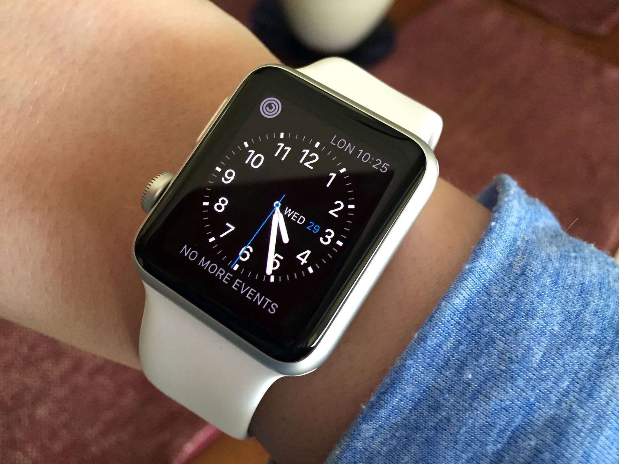
Mickey is just one of many clock face options: watchOS implements a clever clock face changing mechanic. Just press firmly on the face and you enter the switcher. Swipe across to see the different faces and tap on one to select it.
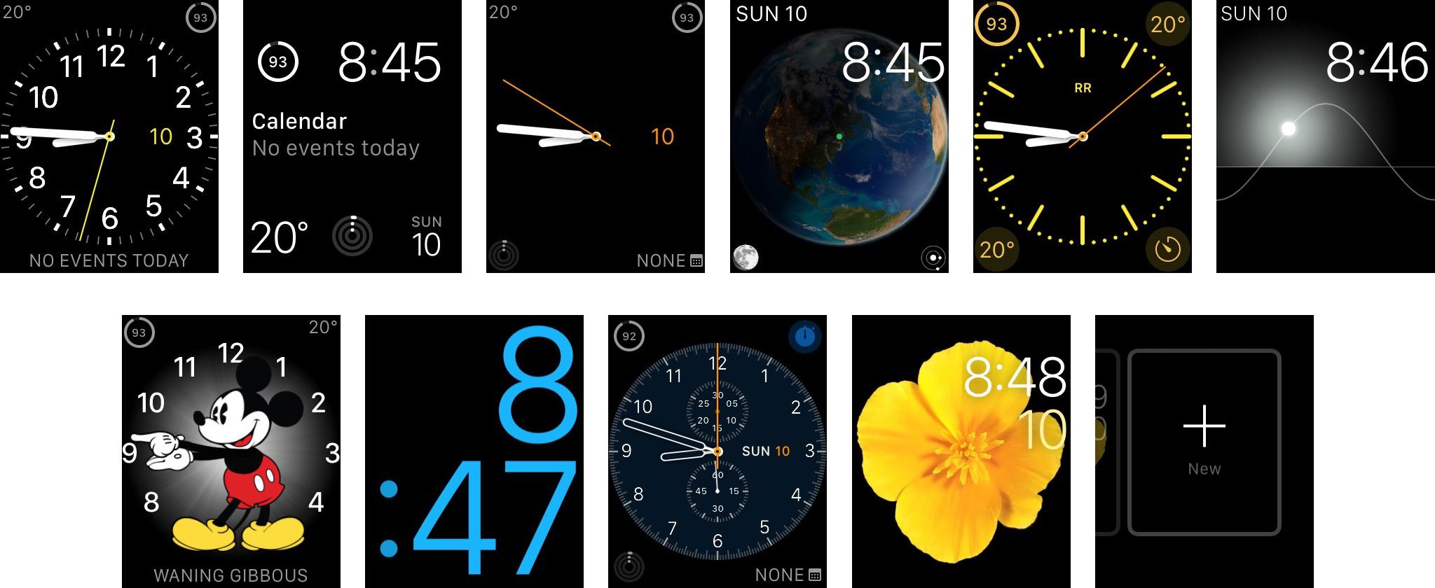
There's Chronograph for the classic timepiece look; Color for minimal but bright analog look; Utility, which is somewhere in-between; and Simple, which is just what the name implies. There's also Modular for digital display and maximum information; X-Large, which showcases the time in large, colorful numbers; Motion, which shows an animated butterfly, jellyfish, or flower; Solar, which tracks the sun across the sky; and Astronomy, which presents an array of planets, moons, and the Sun.
The butterfly, jellyfish, and flower were filmed with high speed cameras. Some of the others are reportedly animated with Apple's SpriteKit or OpenGL. The frame rates are all great, and the effect superb.
When Apple first showed off the watch, there was also a timelapse face and a custom photo face. Timelapse showed off animated landmarks like Big Ben over time, while Photo showed a picture of your choosing. But those two didn't make it into the release version, likely for the same reason Apple isn't offering custom or third-party faces: power conservation. The more pixels an OLED screen lights up, the more power it consumes. Timelapses and photos tend to light up a lot of pixels.
Custom faces would be nice to have in the future, but watchOS, for all its iOS ancestry, is still first-generation technology. Like with the original iPhone, the clock face system had to be built to ship. Expansion can come later, though we'll have to wait and see and whether that's through partner deals, like Apple TV, or through third-party App Store extensions.
While you can't get custom faces, you can customize most of the options Apple provides — every face but Astronomy and Solar. Customization options include level of detail on the watch — like quarter going from no visible hour or minute indicators to every visible hour and minute indicator — along with color and other complications.
While you can't get custom faces, you can customize most of the options Apple provides.
The term "complications" is a traditional watch phrase; such things usually provide extra functionality beyond basic timekeeping. In mechanical watches, complications literally made a watch's mechanics more complicated; that fact made it a great way to describe and treat these features. The Apple Watch's available complications include alarm, activity, battery life, calendar events, calendar date, monogram, phases of the moon, stocks, stopwatch, timer, weather, and world clock.
The number of complications available to you depends on the face, and a lot of the data available to a complication depends on what's set on your iPhone, like the order of stocks and cities.
You can also add multiple versions of the same face, each with different customizations. So, if you want one version of Modular with battery life, stocks, calendar, weather, calendar, and other complications that help you through your day; another with alarm, timer, and stopwatch for when you work out; and even a third with sunrise and set, phases of the moon, and the world clock set to GMT for ultimate time keeping.
You can delete a clock face when you're in switching mode by swiping up. If you accidentally delete a clock face you didn't intend to, you can add a new version back and re-customize it.
- Update: watchOS 2 and custom complications
- Update: watch OS 2 and Time Travel

When I want to keep a lot of information available, I go with the Modular face and the battery, events, weather, activity, and date complications. When I want something more formal, I go with the Chronograph. When I want something fun, I go for Solar or Motion.
Even with the limited number of faces at launch, customization allows for a wide range of options. X-Large aside, though, there's currently only one digital face without significant animation, and only one licensed character. Another simple digital face or two would be great to see. And hey, come on, Superman?
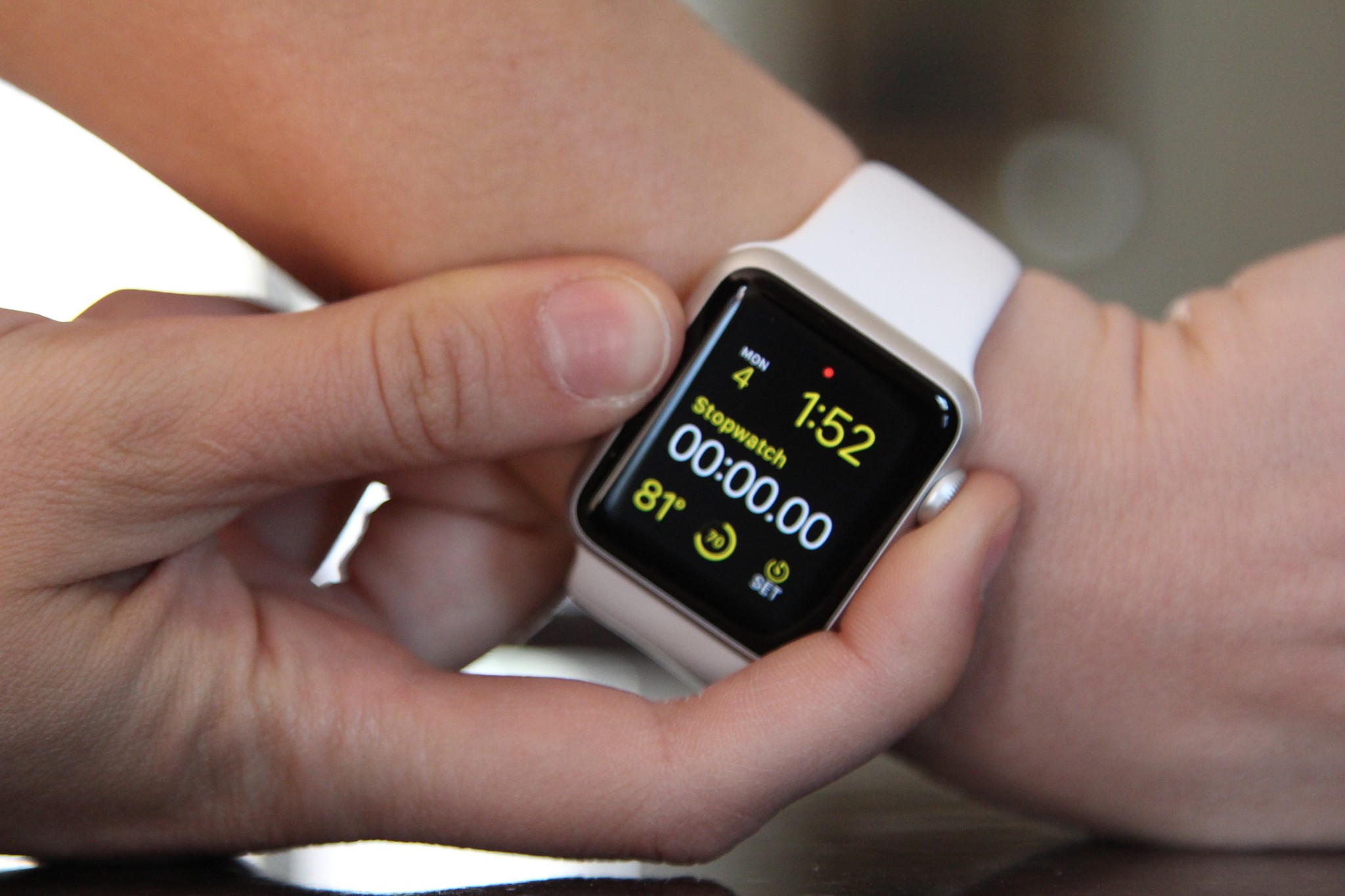
In addition to the watch, there are also ancillary a few time-keeping functions: Alarm, Timer, Stopwatch, and World Clock. On the iPhone, each is a tap in a unified Clock app, but on the Apple Watch, each gets its own app. Given the brevity and focus of watch interactions, it makes sense.
You can't mirror alarms or timers from your iPhone to your Apple Watch, but you can push notifications for them so you can snooze or dismiss them remotely.
On the watch itself, you can get to these apps via Siri; through complications, if you've set them up on your clock face; or from the Home screen. They all work pretty much as you'd expect — Alarm lets you set multiple alarms. Stopwatch lets you time things in analog, digital, graph, or hybrid modes. Timer lets you set countdowns in 12 or 24-hour modes. World Clock shows you the times for the cities you've set up on your iPhone.
They're all well-presented, with good use of color to draw the eye, and you can use the Digital Crown and Force Touch to help set them and get additional options.
There's not much more to them than that, and I'm not sure there needs to be. It's just the next stage in the evolution of digital watches.
Health and fitness
Once upon a time, people really did carry phones, personal digital assistants, and iPods. More recently, they've worn watches and fitness bands (and sometimes Bluetooth trusted devices and more). The iPhone did a great job converging all those niche products into one mainstream device. The Apple Watch seeks, in part, to do the same for wearables. That's why, in addition to keeping time, it can also help quantify your life.
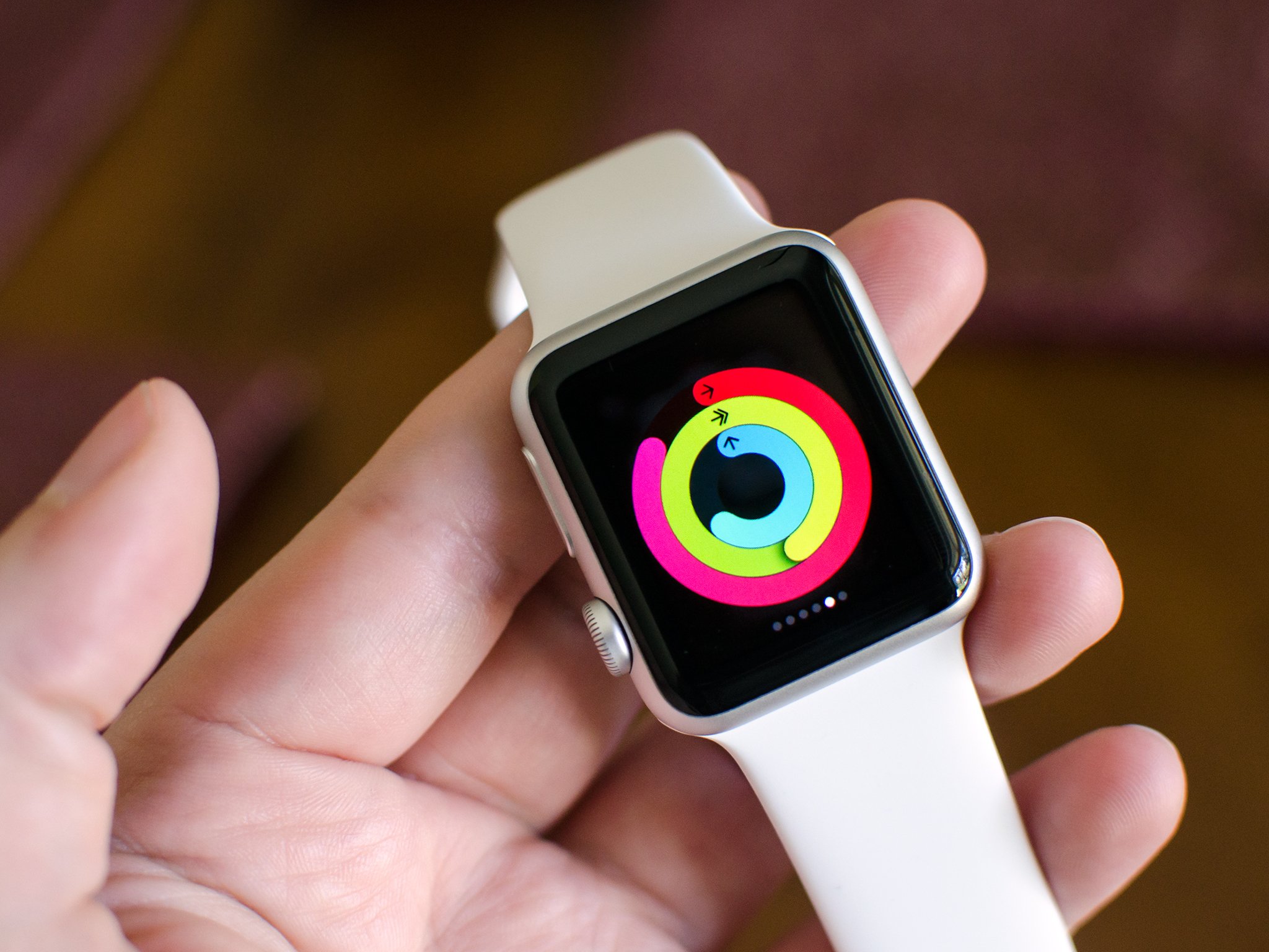
The Activity app is a great example of this. Our bodies don't just require food and water: They require motion. Without it, our muscles atrophy, we lose flexibility, and we develop chronic dysfunctions. In short, the less we do, the less we're able to do. It's a vicious cycle. That's what makes the motivation so important.
The interface consists primarily of three rings — Stand, Exercise, and Move.
Stand shows how many hours out of the day you've gotten up and moved around. Our legs evolved to lift us up off the ground. Sitting all day is like being in space, it deprives our legs of the resistance they need to defy gravity. So, 10 minutes before the hour, 12 hours a day, Stand will remind you to do just that.
It feels like "stand" should be named "move", "move" should be named "burn", and "exercise" should stay the way it is.
It's a little confusing, though. It's called stand but if you're at a standing desk, like I usually am, it'll still go off and tell you to "stand". What it really wants you to do is move around, but there's already a ring named move.
It feels like "stand" should be named "move", "move" should be named "burn", and "exercise" should stay the way it is.
That move ring tracks the active calories you've burned during the day. Pick a starting goal and each day the Apple Watch encourages you to meet it. Then, each week, the Apple Watch suggest a new goal based on how well you did the previous week. You can tweak it manually, of course, but the idea is that each goal is progressive yet attainable. That's the best way to improve.
The Exercise ring shows how much brisk activity you've engaged in. Brisk can be a fast-paced walk, a jog, or a run. 30 minutes is the goal. You can do it all at once as part of a dedicated workout, or a little bit at a time. Here, the amount of time doesn't change on a daily or weekly basis, but over time it'll likely require greater intensity to hit the "brisk" point and sustain for the 30 minutes. Again, it's a smart way to build cardio.
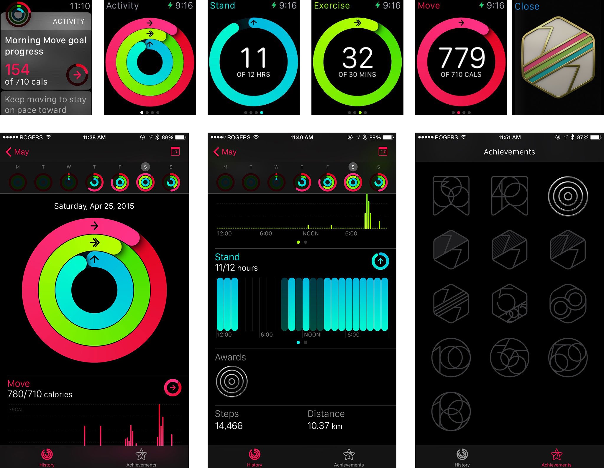
The more you do, the more each ring gets filled. Fill a ring completely and you've accomplished your goal for the day. There's a daily summary on your Watch and on the matching Activity for iPhone app, weekly, monthly, and yearly reports.
The biggest drawback is that there's no social integration, which means no challenges or leaderboards.
That creates accountability which encourages performance. It's not perfect, but it's better than any of the half-dozen fitness bands I've worn before.
The biggest drawback is that there's no social integration, which means no challenges or leaderboards. So, if you're not self-disciplined, you may not be as motivated as you would be in a group and with some competition. Hopefully Apple adds that in a future update.
For now, if you are self-motivated, it's a great tool to track your progress and help reach your goals.
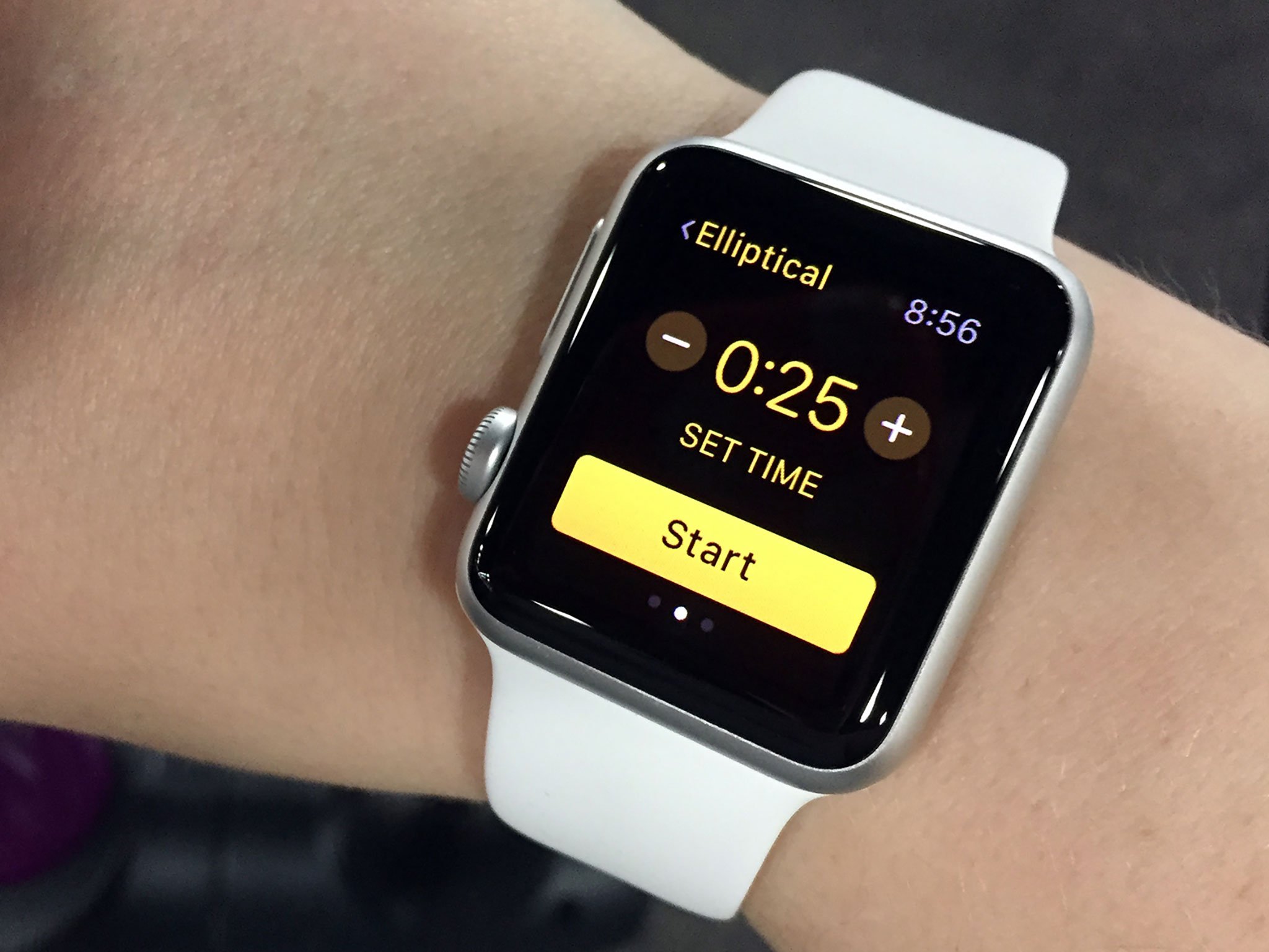
The Workout app provides real-time information on the cardio training you're doing, while you're doing it. Data includes elapsed time, distance, calories, pace, and speed. Better still, it's not just for jogging or running, but for outdoor equipment like cycling, indoor equipment like rowing and the elliptical, and more.
We've had some problems with added resistance to indoor equipment, but many fitness bands and devices simply don't track activity performed on exercise equipment at all, which either forces you to change activities that are otherwise beneficial, or leads to an incomplete picture of what you're doing. By using the accelerometer, gyroscope, and heart rate monitor, as well as extensive modeling performed at Apple's fitness labs, the Apple Watch tracks and provides detailed summaries on a vast range of workouts — with or without equipment, inside or outside — with fewer blind spots.
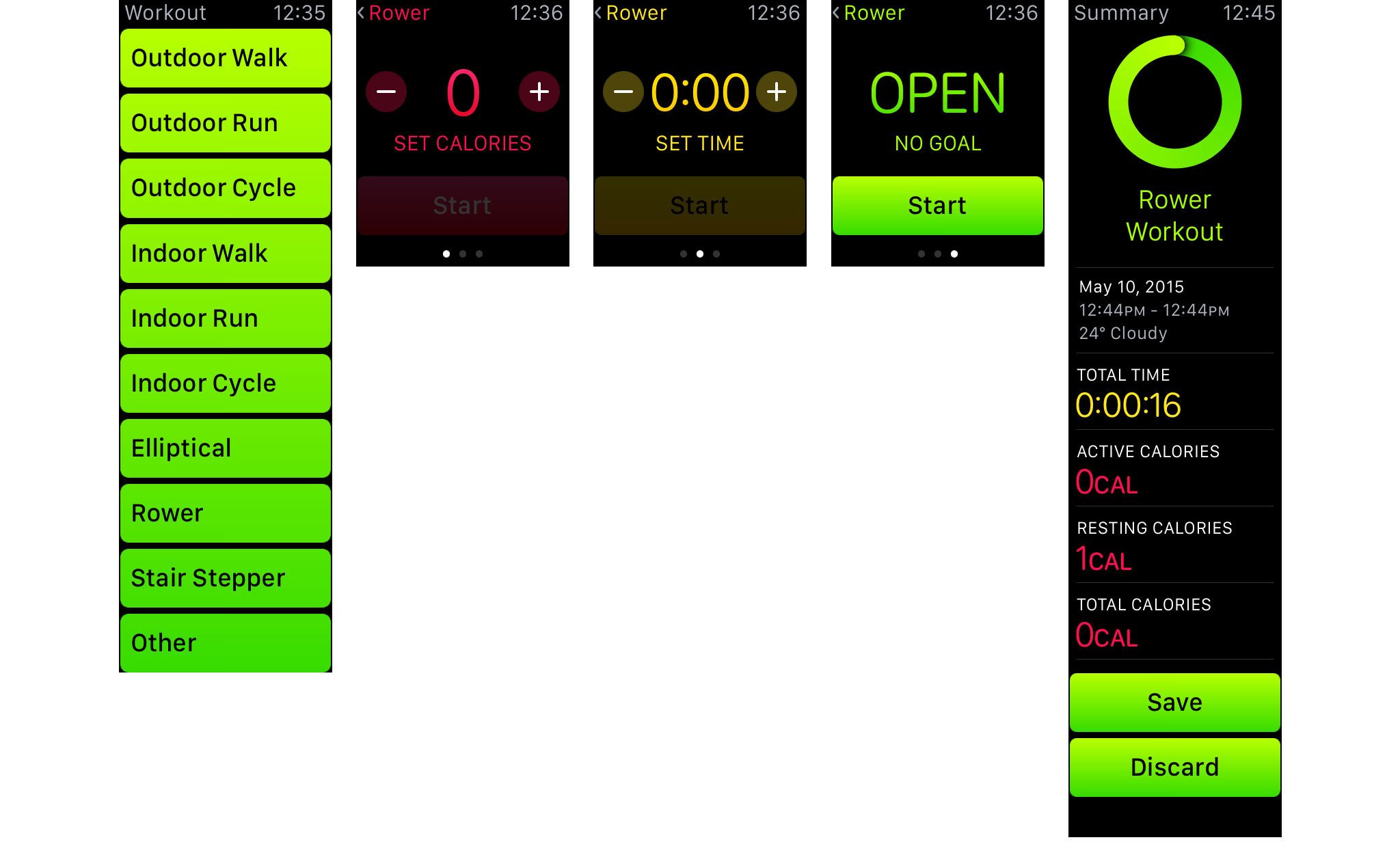
What's more, Workout will show you when you're halfway to a goal and when you've achieved it, as well as your last, best training session of each type. That's just the kind of right motivation, at the right time, that makes the difference.
Communications
Phone calls on the Apple Watch are every bit as magical as I imagined them to be — and quite a bit more clever.
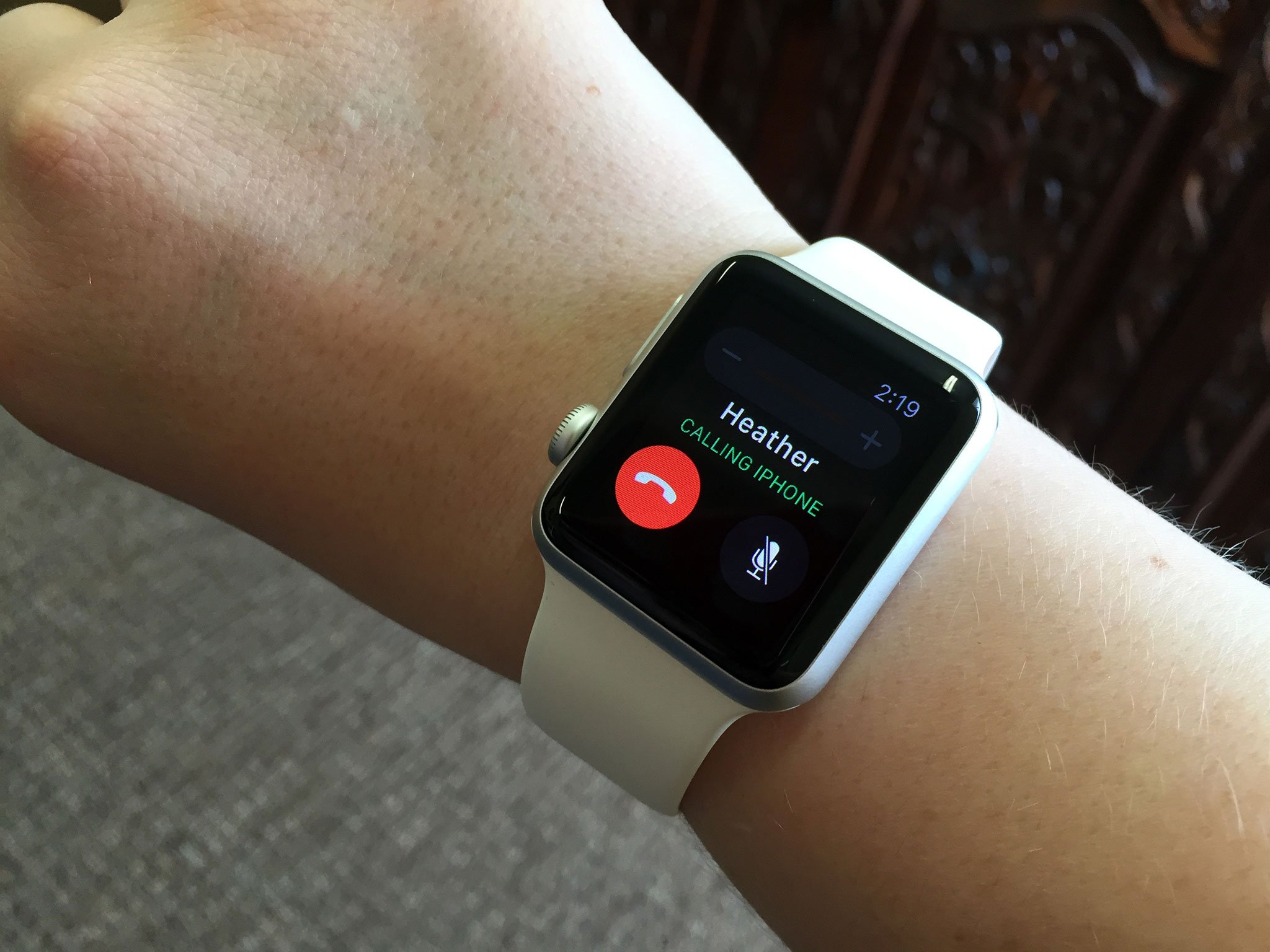
When a call comes in, you can tap to answer it on your Apple Watch and then just talk. Speaker quality is much better than the small size would lead you to believe, as is the watch's microphone quality. More than once, after telling people I was talking on my watch, they said they couldn't tell. They thought I was using my phone the whole time.
It's using call relay, similar to how Continuity works between iPhone and iPad or Mac, so it's subject to your Bluetooth and Wi-Fi connection as well as the carrier connection. I've had a slight hiss at times, and a few dropped words here and there, but no major problems with it.
That the Apple Watch can only relay phone calls and not FaceTime Audio calls feels like a strange omission. It could simply be that phone calls work for everyone, while FaceTime calls only work between Apple device owners, and so the former was necessary to support people out of the box and the latter will come in due time.
If you don't want to answer on your watch, you can scroll down and tap to answer on your iPhone instead. The caller will hear a hold tone while you go get your phone. If you can't find your phone, you also have the option of making it ping while you hold the call. If you start on your Apple Watch, expecting a very brief chat, but it starts to become more involved, you can swipe up on the Phone icon on your iPhone lock screen to transfer the call at any time. Alas, you can't transfer from your iPhone to your Apple Watch, at least not yet.
To place a call, you can just "Hey, Siri!", tap through from the Friends interface, or go to the Phone app and choose a Favorite, Recent, or Contact, all synced across from your iPhone.
It's an incredibly well thought out implementation. I love it and use it all the time.

The same is true for Messages. You can react to notifications, or use Siri, the Friends interface, or the Messages app to create new messages. To respond to a message, you can use a default text, dictate a reply, or send emoji. Default text is short and sweet — what's up, I'm on my way, thanks, can I call you later?, etc. You can swap the defaults for your own text in the Apple Watch for iPhone app.
Dictation works the same as on the iPhone, but you get the choice of sending an audio recording of what you said or the transcript generated by speech-to-text. The former is especially useful when saying something dictation didn't or couldn't get right. (Since the iPhone already has soundbites, this seems like a feature that's destined to be everywhere and soon.)
Emoji includes the regular character set. Well, regular as of iOS 8.2, which means we'll need an update to watchOS 1.1 (presumably based on iOS 8.3) to get the new diversity selections, new flags, and the ability to render the Spock hand.
But those emoji are all secondary to a new, animated emoji creator that's unique to the Apple Watch.
You start with a big, bright, 3D rendered smiley face. Turn the digital crown and the smiley goes through an incredible range of emotions from happy to elated to terrified to loving to seething to perplexed to… you get the idea. There are also animated hearts that sparkle, explode into smaller hearts, tear, and break, and hands that go thumbs up or down, high five and hang loose.

When I first saw them, I got an almost 1990s Yahoo! vibe. They're a stark contrast to the flatter layouts and more restrained designs we've seen from Apple since iOS 7. The happy faces have seen grown on me, and the hearts I've become accustomed to. The hands, however, are still creepy. I think the movement is perhaps too subtle and the renderings not cartoony enough, which makes them tend towards the uncanny.
You can Force Touch to change the color of the faces from yellow to red, and the hearts from red to blue to purple, which is a great touch. I'd love even more colors, though. (No color options for hands, as of yet.)
Mail is far more limited. You can read but not write, and Force Touch to mark as unread, to flag, or to trash. Since you can't edit on the Apple Watch, any errors in dictation wouldn't be fixable, and attaching audio files isn't as good a contextual fit as it is in Messages. I'd like to see more here but I'm not sure what or how. For now, the solution is to handoff back to the iPhone to answer any email that's important enough.
- Update: watchOS 2 and Mail replies
Also new is Digital Touch, which lets you share Taps, Sketches, or Heartbeats with anyone in your Friends circle. There are twelve slots you can fill, one for each hour on a clock face. It can auto-populate based on your iPhone favorites but you can also fill it any way you like using the Apple Watch for iPhone apps.

Press the side button to launch Friends then use the Digital Crown to select a contact. Tap on their face, and you get the option to call, message, or Digital Touch. The Digital Touch option is only shown if the friend also has an Apple Watch.
The Digital Touch canvas is blank but for the contact's name at the top left and a small colored dot at the top right.
Tap the screen to send a Tap. It can be anything from a single tap to the beat of your favorite song. Rings ripple and dissolve to animate the taps. The person you sent them too will not just see them but, thanks to the Taptic Engine, feel them on their wrist.
Swipe the screen to start a Sketch. The default color is the whatever the dot at the top right is showing. Tap the dot and you get the color swatches. Long press a color and you can replace a swatch with almost any other color you like. While you can switch colors, you can't use multiple colors on the same Sketch. If you try to switch mid-Sketch, it will either send or try to send and fail.
Sketching is incredibly fun. I've been sending Batman, Hulk, Bart Simpson, Cartman, and dragons to all my friends. A lot. You simply keep swiping to keep drawing and when you stop for more than a few seconds, it starts to dissolve. That's the visual indicator for it sending.
When you receive a Sketch, you get to see it re-drawn in real time. A play button takes the place of the colored dot, but sadly it doesn't let you pause. It just lets you skip. And when the Sketch is done, it dissolves forever. That's because they're meant to be ephemeral and exist only in the moment.
So too, the Heartbeat. Place two fingers on the canvas, wait a few moments, and you'll see an animated and feel heart beating beneath them. Lift your fingers, the Heartbeat will send, and then your friend will see it, and feel it.
If a Digital Touch comes in that's from someone who isn't in your Friends list, you'll be given the option to see it, and then to add or block the person. There are a couple rough spots here. First, Digital Touch seems only to key off the phone number associated to the Apple ID of the sender, and not the email address. So, if you have the email but not the phone number in your records, the sender isn't identified and you have no way of knowing who they are. There are probably privacy concerns over reconciling contact details, but it'd be great if Apple could figure something out here.
- Update: watchOS 2 and Friends groups
Also, if you try to add someone, and you already have 12 friends, you're told you need to remove one first in the Apple Watch for iPhone app. But because Digital Touch messages are ephemeral, you get no record of who sent it, so by the time you try to do that, you may not remember who it was you wanted to add, or if it was just a phone number without a name associated, you'll have no idea who to add.
Two members of my family, two of my best friends, three of my fellow iMore editors, at least two more of my Mobile Nations colleagues, and a dozen or more industry friends all ordered Apple Watches on launch day. I couldn't fit them all in on day one. And the idea that someone might send me a Digital Touch and I won't be able to respond feels rude to the point that it's stressful.
While that might sound like a tech reporter edge case, as more people get Apple Watches, it'll become a bigger problem. Being able to group friends and the switch between groups — family, work, team, etc. — might be one way to handle it. Alternatively, as Ally has suggested — give us a Digital Touch app so that we can send and respond to contacts beyond the limits of the Friends circle.
Either way, I hope it gets solved and sooner rather than later. Right now, I'm juggling between people, and responding with cartoons as fast as I can.
Twitter, Skype, Slack, and some other communications apps — with the notable exception of Facebook again, of course — offer extensions from the iPhone that let you read messages and sometimes respond to messages. They're all trying slightly different things, which is frustrating but exciting.
For now, they're great when quick convenience is more important than lengthy interaction. And that's how it should be.
Apple Pay and Passbook
Alas, Apple Pay has not yet made it beyond the borders of the United States, so I'll leave it to Serenity and Ally to review in the roundtable below. I have been using Passbook on the Apple Watch, however, and I've been really impressed with it.
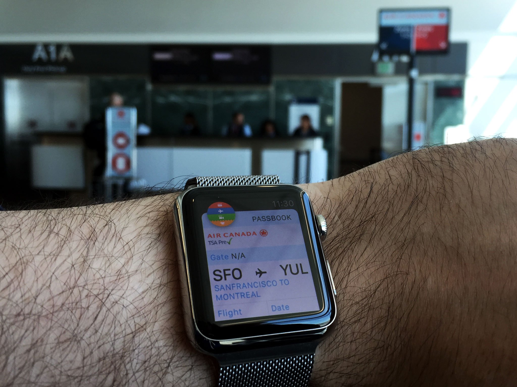
Passbook is where the iPhone collects all the tickets, coupons, boarding passes, loyalty cards, and more, all in one place, and then makes them easily accessible through location and time-based notifications. It works the same on the Apple Watch. Your passes sync over and, just like they've been available for years in your pocket or purse, they're now available on your wrist.
I've been using my Starbucks card on the Apple Watch to buy beverages and snacks, the Cineplex Odeon card to pick up my movie tickets, and I've flown using the Air Canada boarding passes.
Because it's right on your wrist, you don't have to dig out and fumble with you phone while also carrying food or drink, or dragging bags. With a little preparation, you just tap the watch a few times, and scroll down to the barcode. In a thoughtful touch, when you scroll down the barcode expands to full screen and blacks out the background to make it as legible to the scanner as possible. A couple of red beams later, and your refreshments are paid for, your tickets are printing out, you're ready to board, or you're otherwise good to go.
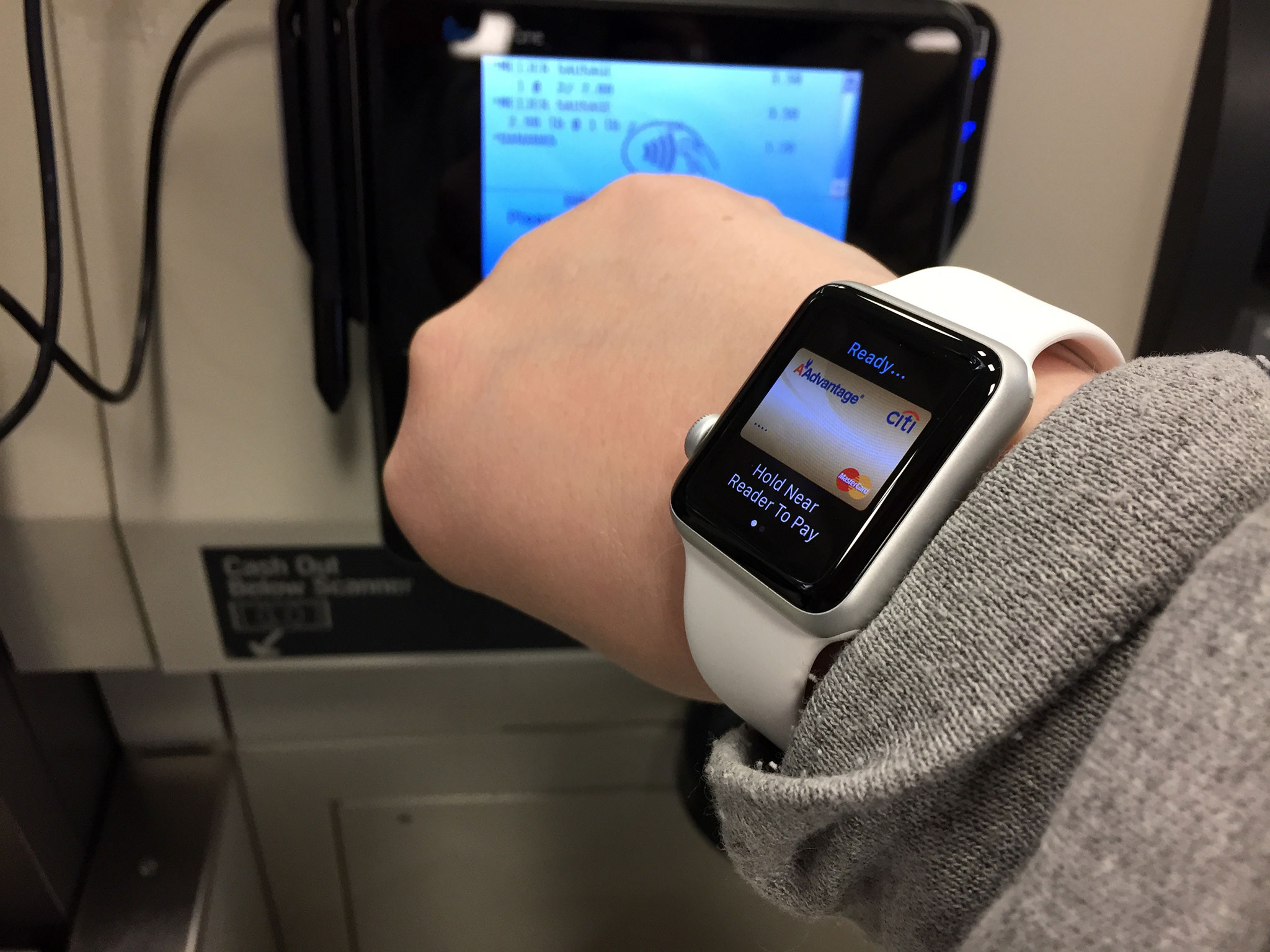
Apple Pay looks phenomenal for credit and debit transactions, and I look forward to getting and using it sometime in the future, but my wallet contains more than just those cards, and so my digital wallet needs to as well.
That's why Passbook on the Apple Watch gives me a lot of hope for the future of digital transactions, and for the day when I can really, functionally, leave the house without a stack of cards in my pocket. Because they're all on my wrist.
Remote control and home automation
The iPhone quickly became the go-to remote for many manufacturers who, even early on, decided they'd rather leave the hardware to Apple. Today you can control a wide range of equipment, appliances, and accessories from your iPhone; some of that is already moving up the chain to the Apple Watch.
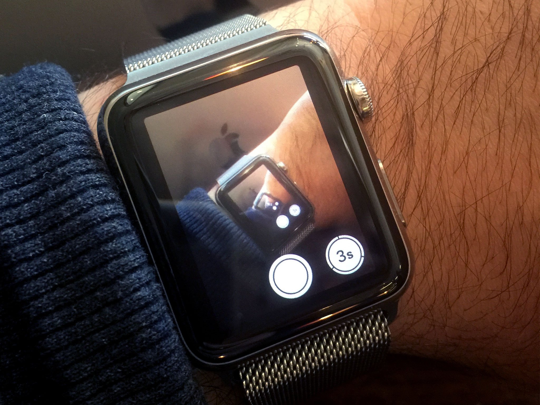
The Camera Remote app lets you see through — and shoot through — your iPhone's iSight camera. That means you can put your iPhone somewhere, see what it sees, and take the perfect picture, even from afar. That could be a selfie, a group shot with you in it, or a shot that would be impossible any other way. You can even take a timelapse.
I didn't expect it to work all that well, especially considering the rumored power and performance limitations of the Apple Watch's chipset. But it works very well indeed. The video from the iPhone viewfinder is clear and, while it stutters at times, it's always been usable. So much so, it's tempting at times to use it as a spy-cam to look around corners and into high cabinets. Or maybe into SPECTRE board rooms...
The Music app on the Apple Watch can also stream the contents of the Music app on your iPhone. That's in addition to playing any of the up to 2GB of local music you may have synced over.
- Update: watchOS 2 and Apple Music
The Now Playing glance can control any audio source playing on your iPhone. That includes the built-in Music and Podcasts apps, as well as Spotify, Overcast, Audible, and literally anything else the App Store has to offer.
The Apple Remote app lets you connect to any Apple TV you own, at home or at work, along with any iTunes library on your Mac or Windows PC. From there you can play all your available music, movies, and TV shows.
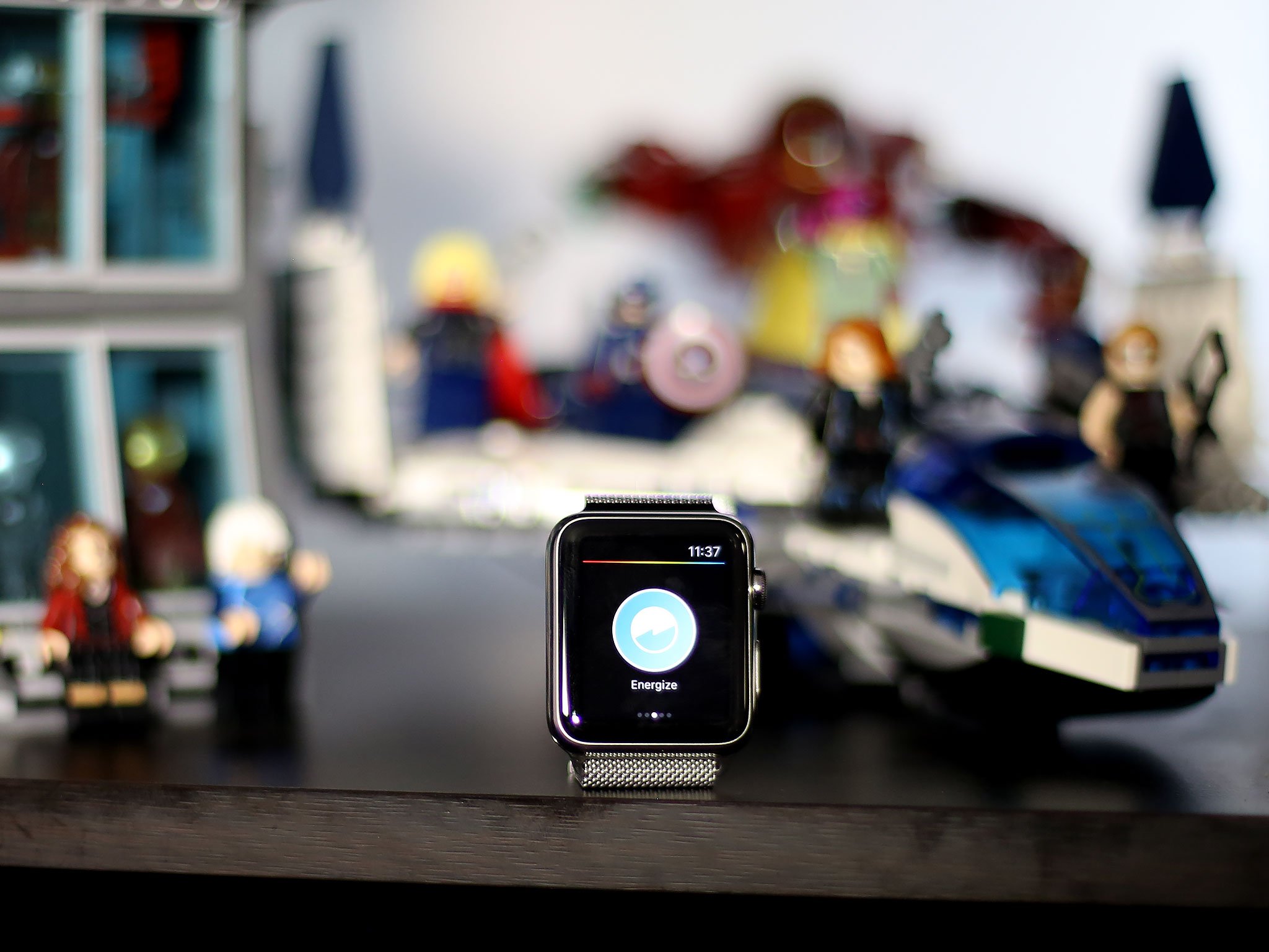
Beyond Apple content, there are several third-party app extensions that provide remote control functionality as well. They let you change LED lights, mix DJ equipment, start cars, and check into and access hotel rooms. Because they're app extensions, though, they take a while to load and they lack the kind of Siri control that makes the Apple Watch so convenient.
That should change later this year when accessories that support Apple's HomeKit come to our market in meaningful numbers. Although Apple announced its home automation framework almost a year ago, the first products to incorporate it were only shown off at CES this past January; it'll take until the holidays to see them really start to ship.

When they do, we should be able to use Siri on the Apple Watch to control any compatible accessory in our home. "Siri, crash the compound!", which will be my go-to, should lock my doors and turn off my lights.
Until that happens, though, our dreams of the ultimate remote control on our wrists will remain just that: dreams.
Apple Watch pricing and availability
The Apple Watch starts at US$349 for the 38mm Apple Watch Sport and tops out at $17,000 for the 38mm Apple Watch Edition with Modern Buckle. The Apple Watch Sport is well priced when you consider the build quality and the feature set. The Apple Watch Edition is priced for people who buy haut couture, fly in cabins, and stay at 6-star hotels.
You can order from Apple Online or try you luck in person at Galeries Lafayette in Paris, Isetan in Tokyo, Selfridges in London, Colette in Paris, Dover Street Market in London and Tokyo, Maxfield in Los Angeles, and The Corner in Berlin.
While the Apple Watch is technically available now in Australia, Canada, China, France, Germany, Hong Kong, Japan, U.K., and the U.S., though shipping will take several weeks or even months depending on the model you want. Right now, Apple simply isn't able to deliver enough to meet demand. Apple certainly wants to sell as many as they can, in as many places as they can, so that should change this summer as production catches up and additional countries roll out.
Apple Stores and AppleCare
Apple Retail is typically the best place to buy Apple products due to the store's emphasis on customer satisfaction, including on-site personal shopping help, Genius Bar technical support, free workshops, and inexpensive one to one training sessions. Since the Apple Watch is currently only available through Apple Online and the boutiques listed above, it complicates things, but only slightly.
While you have to order online for now, Apple Retail i still providing support and free workshops, and they're also providing a "try on" service to help you better decide if you want and Apple Watch, and if you do, which one.
You can make an appointment for a try on or just walk in. All Apple Watches are on display at all Apple Retail locations, though the Apple Watch Edition is only available for try on at the larger, more popular stores and flagships. Special iPad mini stations with embedded Apple Watches let you test the various features while providing additional information on them, and Apple Specialists will spend up to 15 minutes with you letting you try on the different cases and bands. The try on models are running a demo loop, but it includes all the interesting features including the haptics, so you can not only get a sense of how it looks, but how it feels.
I've been to the try ons at several stores and on several occasions, including with friends and family. They all enjoyed it and found it valuable in choosing which size, case, and band(s) they liked best.
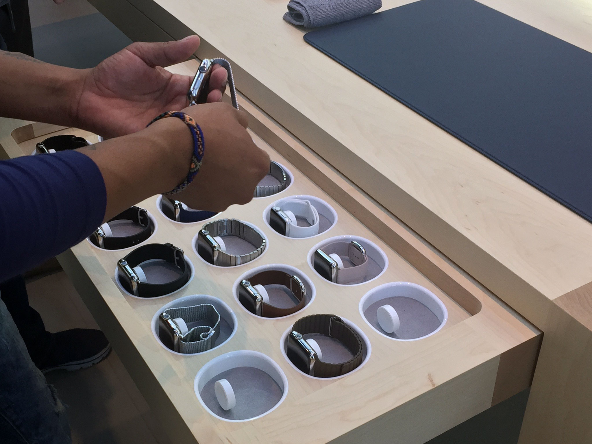
The Apple Watch comes with Apple's basic AppleCare warranty program, which includes 90 days of technical support and one year of hardware support. AppleCare+, the company's extended warranty program, covers two years of technical support and two yeas of hardware support, as well as up to two incidents of accidental damage, subject to a service fee.
AppleCare+ costs US$49 for the Apple Watch Sport, US$69 for the Apple Watch, and US$1500 for the Edition.
I've always gotten AppleCare+ for my iPhones and I got it for the Apple Watch I ordered as well. For me it's a reasonable price to pay for the stress relief that comes from knowing that if its stops working a year and half, or two years and a half in, I'm covered, and if I drop it and break the screen or otherwise damage it, the replacement cost is under a hundred dollars rather than hundreds of dollars or more.
When I buy a product, I very much believe I'm buying the company and the store behind it. The services they provide, and how well and conveniently they provide them, are as important to my buying decision as the features of the product. If something goes wrong with my purchase, whether I get a lemon or it gets hit by fireworks — don't ask! — knowing I can just make an appointment with a Genius Bar, or call AppleCare, and get it fixed almost immediately, is part of the value of Apple Stores and Apple Retail.
If you're not sure about AppleCare+, and you're planning to buy by credit card, check with your credit card company to see what additional warranty services they might provide.
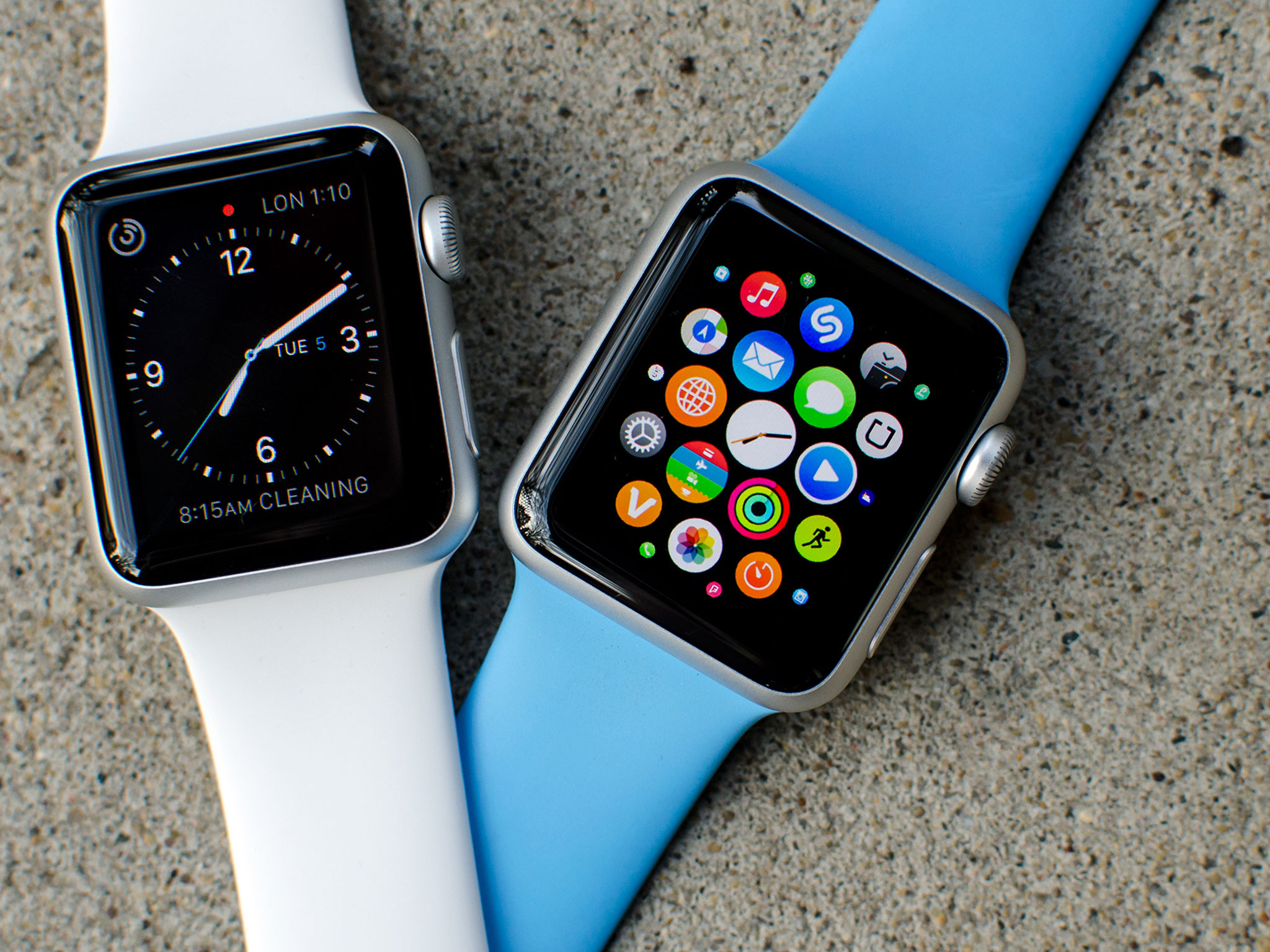
Apple Watch guide
The Apple Watch is a brand-new product, but it has long established roots both in time-keeping and technology. If you're not sure which Apple Watch to get, or you're not sure how to get started with the Apple Watch you just got, check out our guides.
Apple Watch bottom line
When I was a child, my father saved himself the drive downtown to use an IBM mainframe by bringing home an Apple II Plus. For years now I've saved myself trips back to my Mac by pocketing an iPhone. Now, I'm saving countless reaches for my iPhone by wearing an Apple Watch.
Apple Watch can't do everything my iPhone can do, nor my iPhone my Mac, nor that Apple II a mainframe, but it can do those brief, frequent things, in many cases, better and far more conveniently than my iPhone or Mac.
It can show me the time, it can show me messages, mail, and other notifications; it can take and make phone calls; it can control my music and TV and lights; it can pay for my coffee and scan me in at the movies; it can remind me to get up and move around and track and motivate me when I do; and it can do all of this while wrapped in some of the best hardware I've ever seen.
The Apple Watch, poetically, is a gizmo you can get wet and need to feed after midnight. But it's absolutely a first-generation gizmo. It needs to be constantly tethered to an iPhone, apps are just extensions, the interactivity model could use some refinement, features some rounding out, and it's proven incredibly hard for Apple to get enough of them to market in a timely manner.
Yet even now, in this first generation, the utility far exceeds the limitations. I may not need an Apple Watch, but I want one. I could wait for generation two or three but I'd lose a year or two in the waiting, and I'd lose being part of the discovery process that will get all of us to the inevitable future. I really don't want to miss out on that process.
From Apple II to Mac to iPhone and iPad, Apple has relentlessly pushed technology forward with the goal of making it even more personal and more accessible to more people.
The Apple Watch has absolutely succeeded in furthering those goals. Only time can tell by how much.
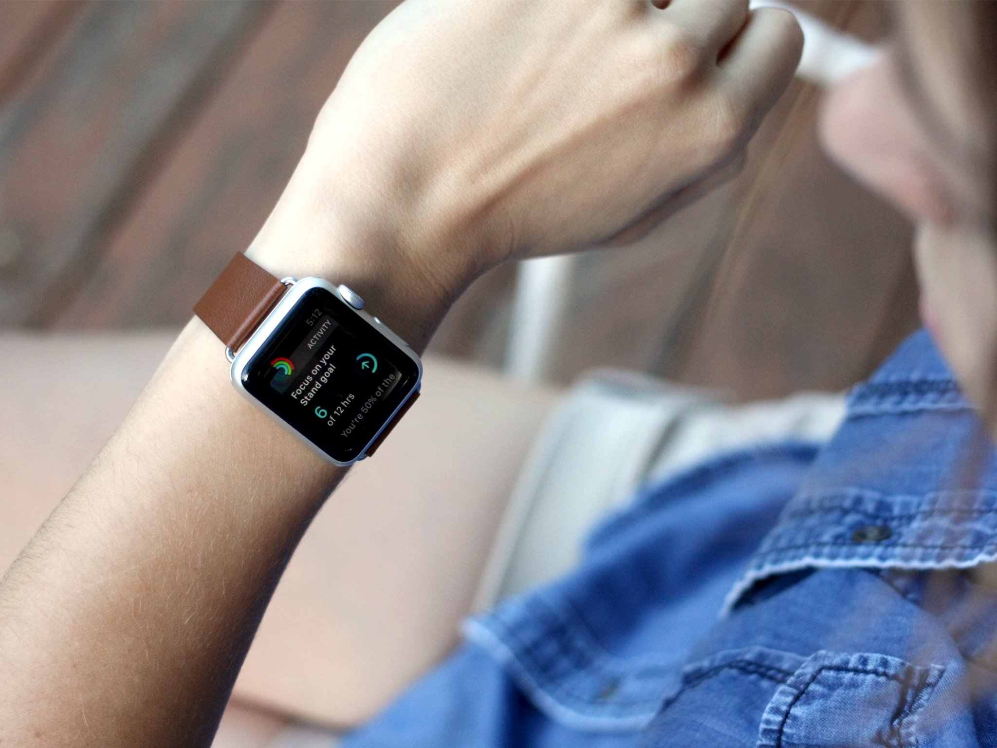
Apple Watch roundtable review
Since Apple Watch isn't just a new product for Apple but a new product category, we thought we needed to do something more. We needed to review it more. That means more opinions from more people, namely the rest of iMore's editorial staff. So, if you're looking for a second, third, or even fourth opinion on the Apple Watch, check it out!
- Read the Apple Watch roundtable review
Edited by Serenity Caldwell. Additional photography by Ally Kazmucha and Serenity Caldwell. Videography by Anthony Casella and Mark Guim.

Rene Ritchie is one of the most respected Apple analysts in the business, reaching a combined audience of over 40 million readers a month. His YouTube channel, Vector, has over 90 thousand subscribers and 14 million views and his podcasts, including Debug, have been downloaded over 20 million times. He also regularly co-hosts MacBreak Weekly for the TWiT network and co-hosted CES Live! and Talk Mobile. Based in Montreal, Rene is a former director of product marketing, web developer, and graphic designer. He's authored several books and appeared on numerous television and radio segments to discuss Apple and the technology industry. When not working, he likes to cook, grapple, and spend time with his friends and family.
