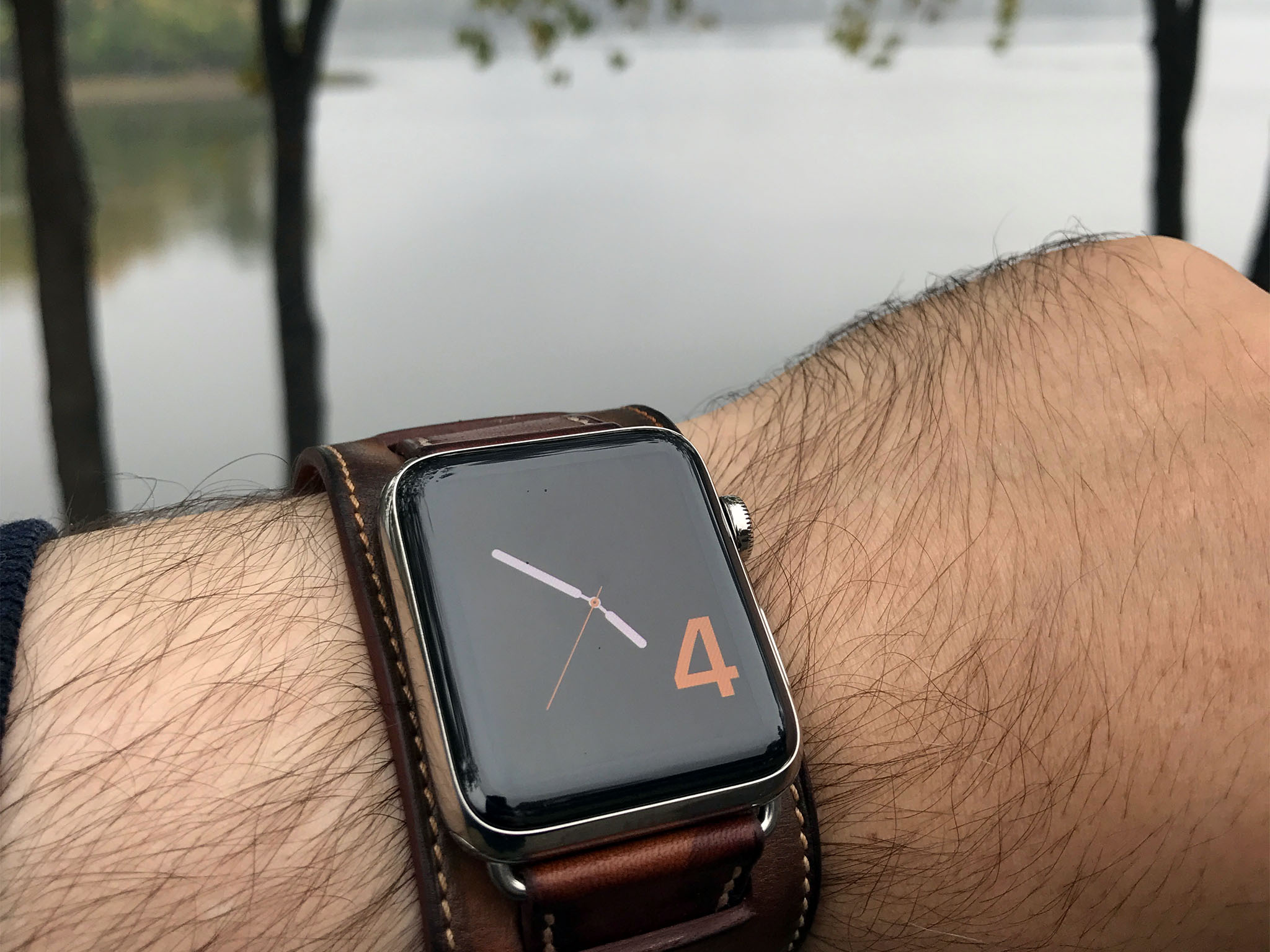
iPhone 3G or iPad 2? That's the question that's been rolling around in my mind since about a second after Apple announced the original Watch. Would the next generation hardware add missing features, like iPhone, or redefine the feature, like iPad?
I loved the original Watch, just like I loved the original iPhone and iPad, but Apple never nails a product the first time out. No matter what they think a product is, it's not until millions of customers get their hands on it and start using it that what the product really is is revealed.
With iPhone and iPad, Apple had the benefit of ten, arguably terrible, years of other smartphones and tablets to learn from, and it still took them a year to get to 3G and GPS, and to thinner, faster, and lighter. There were only a couple of years of smartwatches before Apple Watch, though, so instead of learning from the early adopters, Apple was part of them. And that… made things complicated.
Eighteen months later, how much has Apple learned about the Watch, and how much about it as a product has really been revealed?
Note: Apple announced the Watch Series 2 a month ago and I've spent all of the last three weeks with the 42 mm stainless steel version strapped to my wrist. My colleague, Serenity Caldwell, has already written our full watchOS 3 review and Apple Watch Series 2 review, so here I'm going to follow up with my personal experience and with performance specific to the 42 mm model.
watchOS 3
The popular narrative is that watchOS 3 is what the original hardware should have shipped with. It's fair, far as it goes, but getting from there to here is always a journey. Apple could have waited a few more years before launching the Watch, or they could have done exactly what they did — break with their typical model and experiment with a new product out in the open.
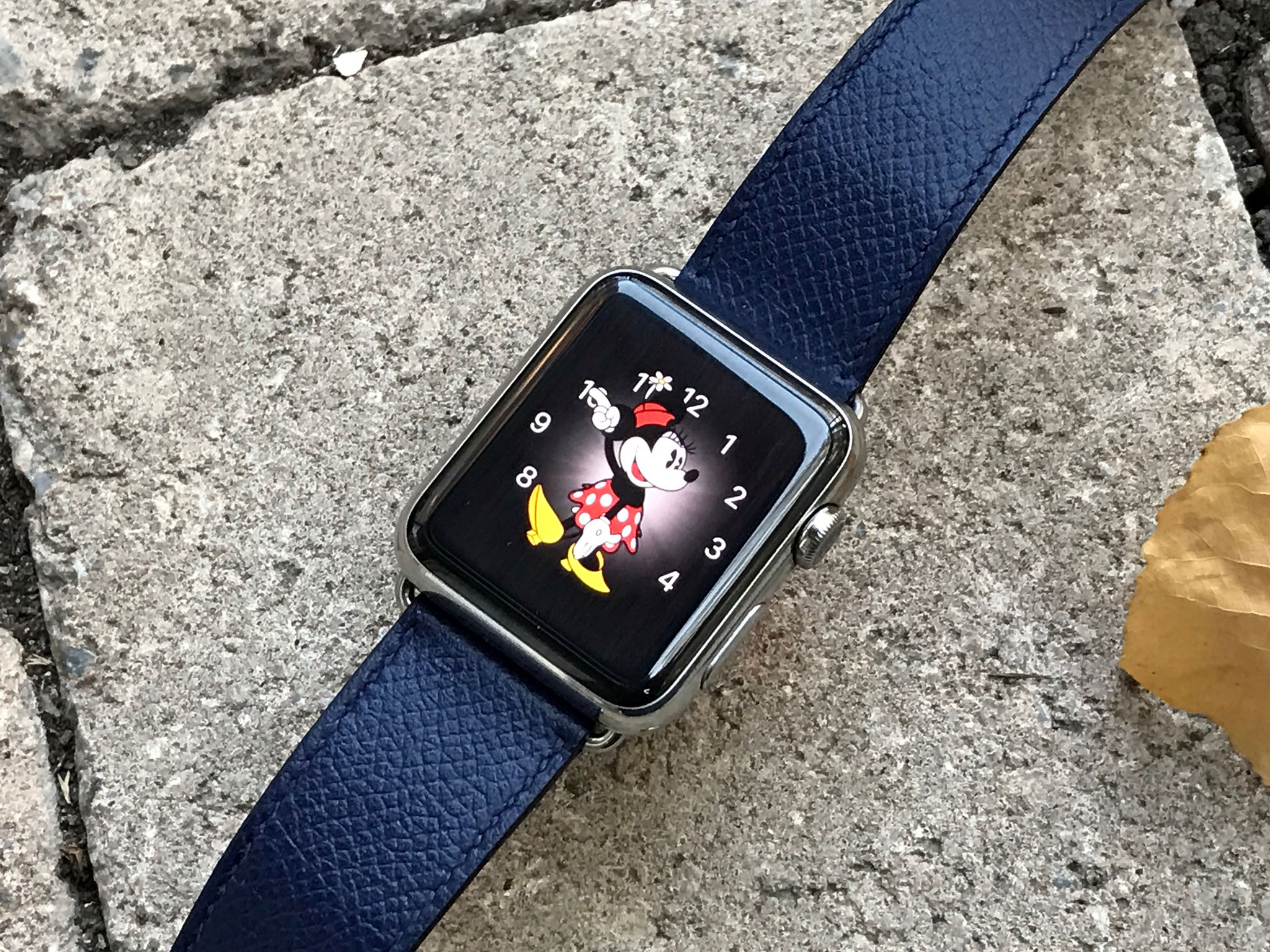
So, instead of Apple's usual, minimal delightful product, we got notifications and fitness tracking, mobile payments and remote control, time keeping and a new form of communications — surfaced in watch faces and banners, glances and apps. It let people find the functionality that was most useful to them, but ultimately didn't help them find it. Also, it was stone slow.
watchOS 3 fixes almost all of that. It's simpler, more coherent, and faster. Much faster. Even on the original Watch, Apple is spending some of its surplus power and memory budget to keep processes live and, in some cases, instantly responsive.
The Dock
Much of the newfound responsiveness is surfaced in a new Dock. It replaces glances with live views of recent and favorite apps. Press the side button, tap an app card, and it launches immediately. I use it for things like Authy, so I can pop up two-factor authentication whenever I need to enter it on my iPhone, iPad, or Mac, or Just Press Record so I can take quick audio notes. As performance solutions go, it's as brutish as it is brilliant. But it works.
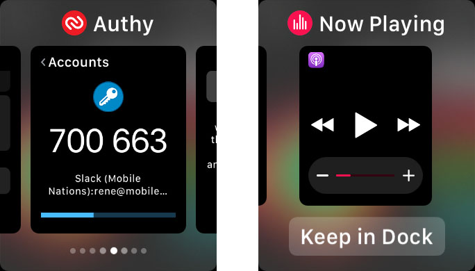
One glance did survive the purge: Control Center. It's not a glance so much anymore as an iOS-style panel. Swipe up from the watch face and it's there, newly expanded with battery percentage and water ejection. (More on those later.) It's a big improvement.
Since a single press of the side button now calls up the dock, what happened to Digital Touch? That new form of communications that enjoyed such a high profile at launch it previously owned the single side button, has been evicted. It now resides in the more contextually-appropriate Messages apps.
Yes, even as Apple was bringing it to iPhone and iPad with iOS 10, they were burying it on the Watch. Timing is hard.
Activity and Workout
Based on how Apple presented watchOS 3, the focus this year was firmly on fitness. It takes several forms, though. Time to roll, for example, can replace time to stand, for those in wheelchairs. There are also new Activity watch faces and new swimming workouts to go along with the new hardware's swim-proofing. More on both below.
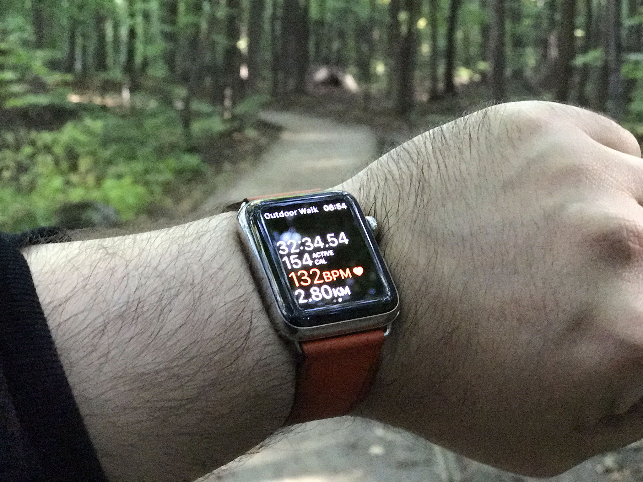
Workouts now shows distance, pace, active calories, heart rate, and elapsed time, all at a glance. And you can customize it and even label it, depending on what's most important to you. Surprising no one, I like it on default.
You can also pause and restart workouts now by pressing the digital crown and side button at the same time. It's much better than trying to do it on-screen, especially when you're moving fast — and sweating fast. It's also the same key combo used for screenshots. So, Apple disables that on update and you have to go back into settings in the Watch app to re-enable it. And yeah, that just means you'll screenshot every workout you pause and restart. Limited control options, when overloaded, lead to collisions, after all. (Apple Watch can automatically pause workouts when it detects you stopping, like at a traffic light, if you prefer.)
My favorite new fitness feature, though, is activity sharing. The first version of Apple Watch was great at encouraging you to meet your goals, but you had to be intrinsically motivated to make it work. When you share activity, though, you add extrinsic motivation. Now, it's not just about filling my rings, but seeing Serenity, Lory, Mikah, and my family and friends fill theirs as well.

Since it's integrated with Messages, we can even congratulate each other on achieving our goals. Or, more importantly, trash talk each other. Yes, the quick board predictive responses have been pre-populated with both positive and negative reinforcements.
If the alerts get to be annoying, you can mute them, but I like them. "Shazam!" is my favorite positive. I typically write my own negatives.
Watch faces
With watchOS 3 once again come new watch faces, including Activity ring faces that I adore. There's also a new, elegant Numerals face, and a new Minnie Mouse face to match the existing Mickey. Both now have sound effects if you tap them. Delightful.

Fingers crossed we either get more licensed faces, like Superman, or some form of greater app integration, like Nike+ now enjoys on the Nike+ Apple Watch. For now, I'm stuck with the Photos face, limited as it might be.
Time Travel, the watchOS 2 feature that let you use the digital crown to rotate backwards or forwards through your information timeline, has been buried, like Digital Touch. It's off by default now (except for the solar face), but you can re-enable it in settings in the Watch app if you want it back. I haven't yet found the need to do that, so Apple's choice here was likely for the best.
Speaking of which, the new way you can simply swipe between watch faces is terrific. It's much faster and more convenient than having to force touch to switch to edit mode before swiping. You just have to remember to swipe from off screen to on. Combined with the new and improved complications, it's made the watch face my primary app launcher. The old carousel "home screen" is still there, I just can't remember the last time I used it...
Watch apps
What watchOS 3 hasn't done for me, though, is revolutionize the watch apps themselves. I'm still not convinced I'll ever use apps on my watch the way I do on my phone, tablet, or computer. The latter are devices I use for minutes or hours at a time. Watch I use for seconds.
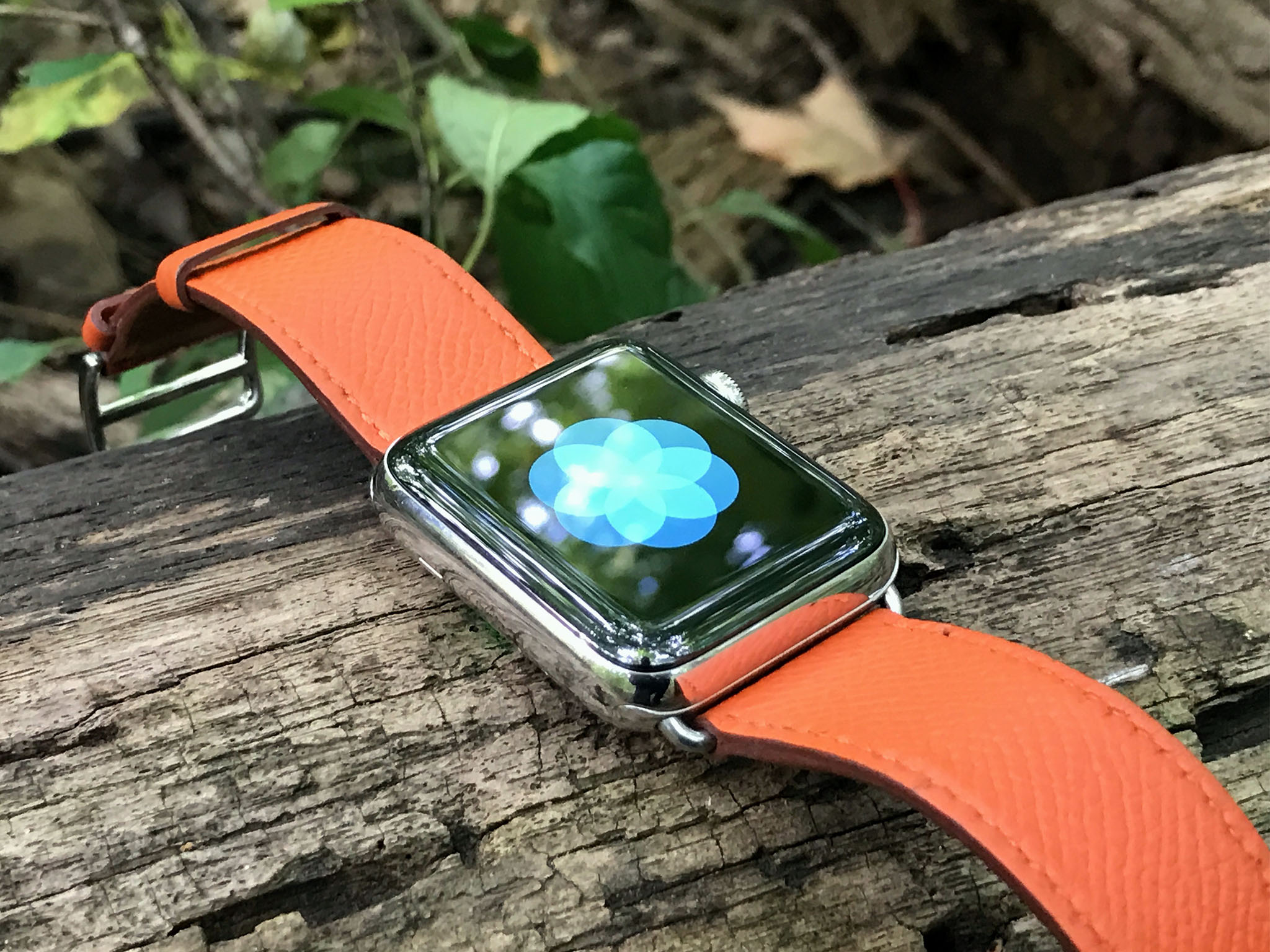
Even the new apps. One is Breathe. It's amazing and something I hope everyone uses to reduce stress and increase mindfulness. The other is is Home, and it brings the easy-to-use HomeKit toggles from the equally new iOS app to Apple Watch. All I need is Notes and I'll be happy. Well, for now.
Despite really liking the new apps, though, I don't actually use them. Breathe I use exclusively through the notifications. It works great, though I wish I had the option to integrate it into the rings. HomeKit I use exclusively through Siri.
Breathe might also work well in the Activity Rings, as might the new Bedtime mode on iOS 10. That would round out the base quantitative life metrics. Then again, do I really want to be stressed about how often I've stopped to de-stress?
The flip side of the Dock making in-memory apps much faster to launch is that out-of-memory apps still take a long time to launch. It'll take more power and better connectivity to really fix that, but it still shows how far the Watch has left to go. Or rather, it shows it might need to go in different direction.
Since Apple has done so much work over the last few years to decouple interface from logic and extend and continue features and activities through other apps and across devices, I'm not even sure I need "apps" in the traditional, binary blob sense of the word.

What I need are those notifications, complications, and views, when and as I need them. And watchOS 3 is a significant step forward in bringing me them to me.
Apple Watch Series 2
First go-around, there were collections: Apple Watch Sport, Apple Watch, and Apple Watch Edition. Sport was aluminum and came in silver and space gray first, then gold and rose gold later. Watch was stainless steel and came in silver and space black. Edition was gold and came in yellow and rose.
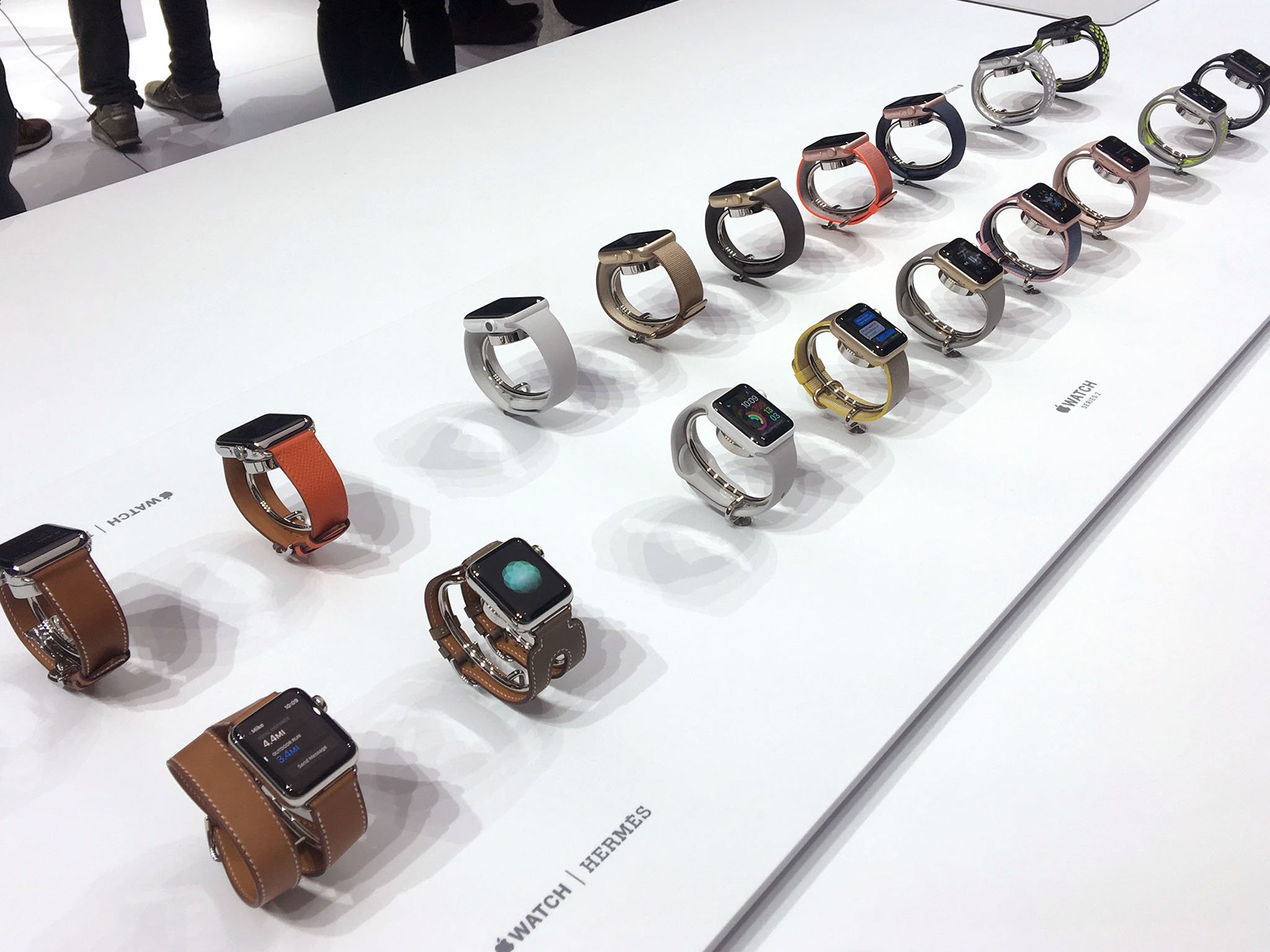
Now there's just Apple Watch, and you can get it in aluminum, stainless steel, or an all-new ceramic Edition. Same colors as before, though ceramic replaces yellow and rose gold with white. Hermés, which debuted a year ago, remains as a partner, and will soon be joined by a Nike+ version. (More on that when it launches.)
It's cleaner, clearer branding, and makes for a much more coherent product line. Including for those of us who write about it!
Design + Brightness
Apple Watch Series 2 looks almost identical to the original Apple Watch. If you were hoping for a circular watch, you'll get it once someone creates a circular computer interface that's as capable as a square one. And no one, including Apple, has done that yet.
So, just like peripheral vision and surround sound offer better information and experience than tunnel vision and mono sound, the ability to put everything from complications to text in corners offers better information and experience than cutting those corners off.
Besides, Steve Jobs and Leia Organa wore Apple Watch-shaped watches, so don't stress about it.
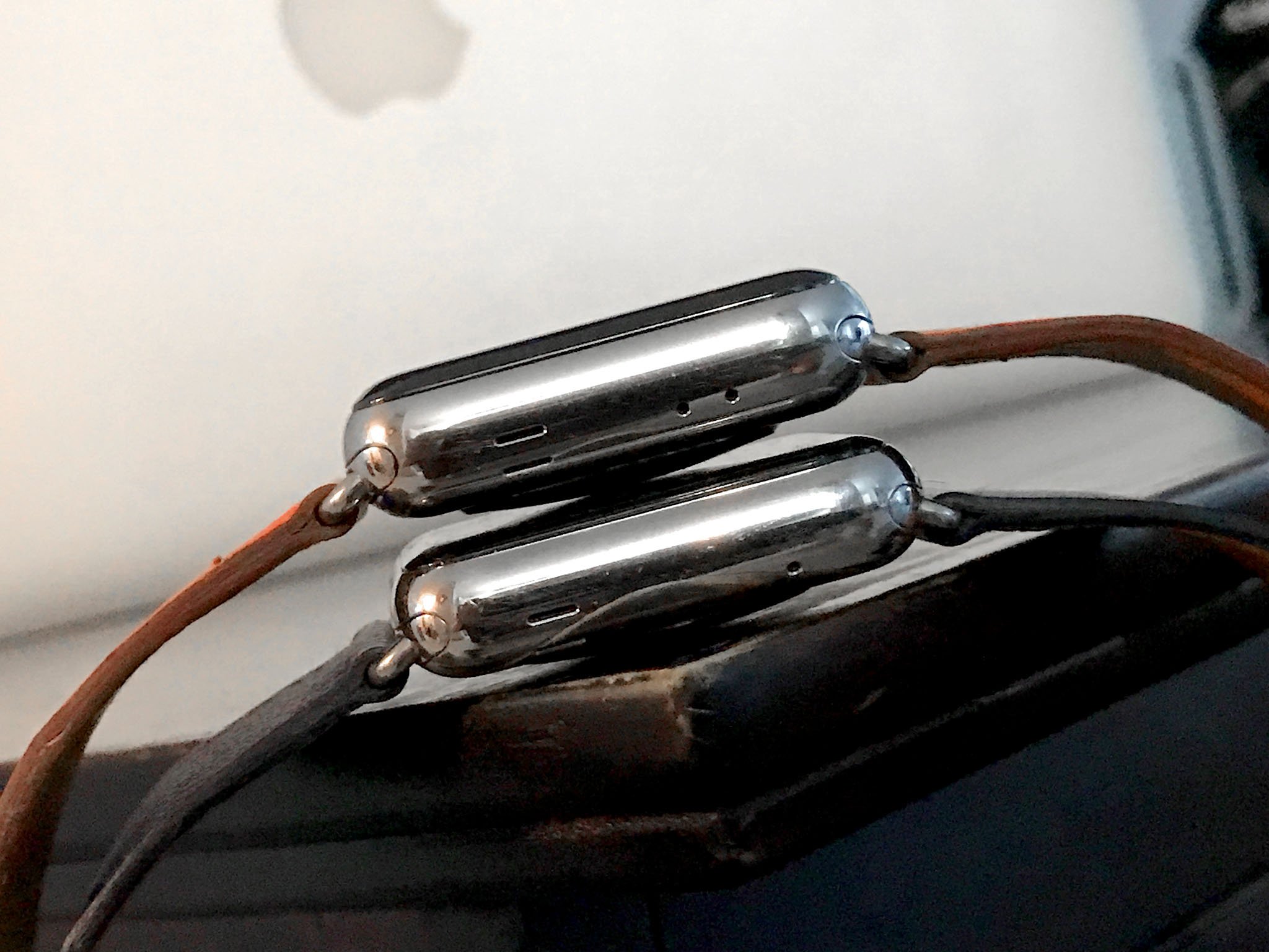
There are a few cosmetic changes from the original: Series 2 is thicker and it has a second hole next to the mic. The latter is a concession to the new "swim proofing", the former to the enhanced components inside.
The thickness hasn't bothered me in the least. For people with tight cuffs who were hoping for a slimmer Apple Watch, it's bad news, but for me, it's a nonissue.
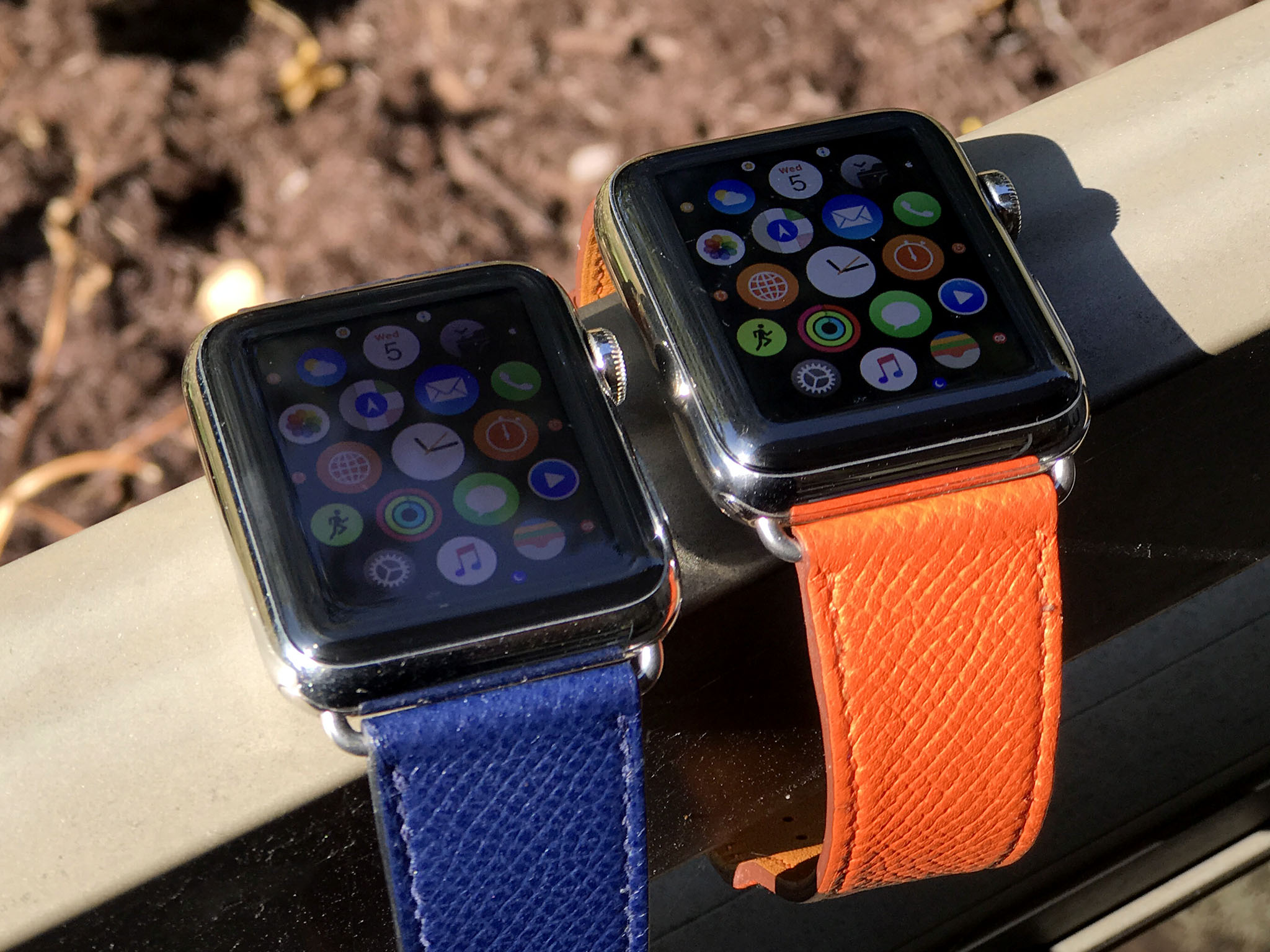
What's been great, though, is the new screen brightness. It's still OLED (organic light emitting diode), but it's 1000 nits compared to 450 on the original. I never had a real problem using the old screen, even on sunny days, but the new one is just BOOM. In my face.
Other than that, Series 2 has the same digital crown, same side button, and same quick-change groove-and-lug system for the bands. That last part is critically important, because if Apple had changed it, anyone with a substantial investment in existing Apple Watch bands — hi! — would have been apoplectic.
As is it, I've been using all my previous bands without problem, including sport, woven nylon, leather, loop, and Hermès, and they all work great.
Performance + GPS
watchOS 3, unsurprisingly, runs great, as well. Scratch that. On the original Apple Watch, it runs great. On Series 2, it flies.
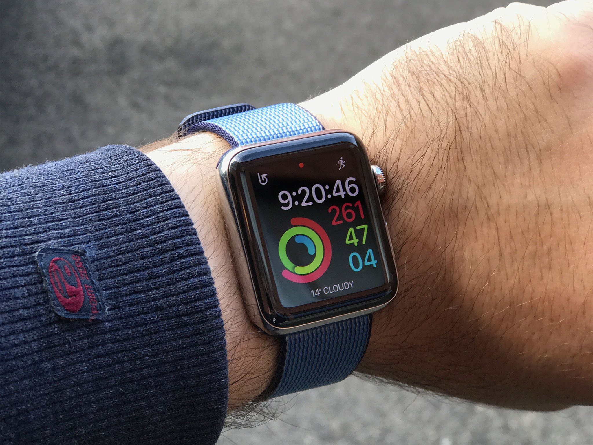
That's thanks to the new S2 system-in-package (SIP), which now includes a dual-core central processor and an amped up graphics processor. A fresh app launch is still count-the-spinner-wheel-seconds slow, but way better than before. And given how recent and favorite apps are now kept in memory, it's also rarer than before.
The S2 also includes GPS. It is assisted GPS in the most assisted sense of the word — it only fires when you're tracking an workout route and your iPhone isn't around to piggy-back on. As a result, power drain is minimal.
Combined with the new, bigger battery and more efficient processor, it's so minimal that I've done two workouts in a day and still been well over 50% by sundown.
The difference between the original and the Series 2 is ridiculous.
Swim-proofing
The original Apple Watch was water resistant. Though, famously, people showered and even swam with it, Apple's official stance was that it could survive rain, splashes, and accidental exposure. Apple Watch Series 2, on the other hand, is "swim proof". What does that mean?
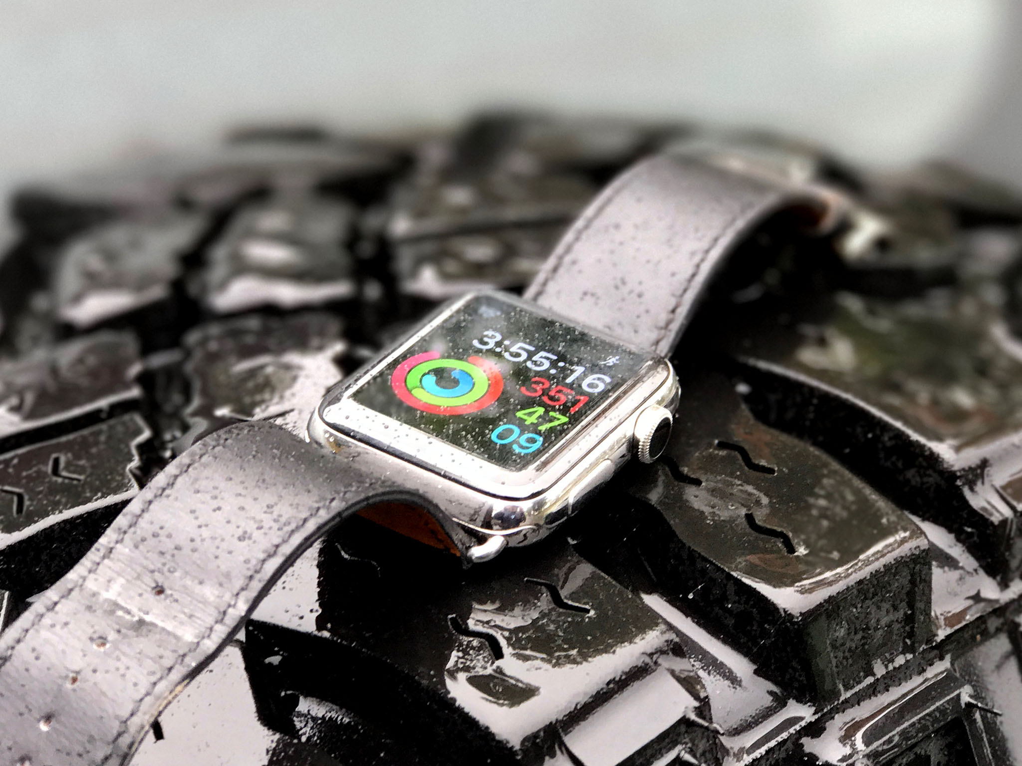
IP ratings are weird. While IP67, the original Apple Watch's certification, means something specific, the next category up, IP68, is entirely reliant on the manufacturer meeting their own standards. So, here's Apple's standard:
Apple Watch Series 2 has a water resistance rating of 50 meters under ISO standard 22810:2010. This means that it may be used for shallow-water activities like swimming in a pool or ocean. However, Apple Watch Series 2 should not be used for scuba diving, waterskiing, or other activities involving high-velocity water or submersion below shallow depth.
So, no shark hunting, but most types of water sports and fitness should be fine. I don't swim much, but I've dunked my Apple Watch Series 2 in fountains, lakes, rivers, pools, and seaways, and it's been fine.
Since the speaker can't be sealed or it wouldn't produce sound, Apple uses the sound it produces to expel the water from the speaker. It's super clever. Any sound will eventually expel the water, of course, but at the end of a water-based workout — or manually at any time — you can trigger a specific tone that spurts the water out.
Not enough that you can use it as a water pistol, sadly, but enough to make you wish it would.
Equally clever is how Apple handles route tracking in open water. For land-based workouts, my guess has always been that they simply strap science to Jay Blahnik while he runs or cycles Captain America "on your left"-style laps around Cupertino. For swimming, though, I'm guessing Aquaman.
That or, because GPS can't penetrate water, Apple waits for your arm to break the surface and then grabs a signal and infers the path. Given the motion, it also figures out the type of stroke and, for pools, when you spin for laps. (Aquaman almost seems easier.)
I haven't had a chance to try it yet, but I've spoken to several friends who have, and they all say that, while not perfect, it's close to 90%, which is more than enough to be useful. If and when I do get to try it myself, I'll update with how my experiences line up.
AirPods
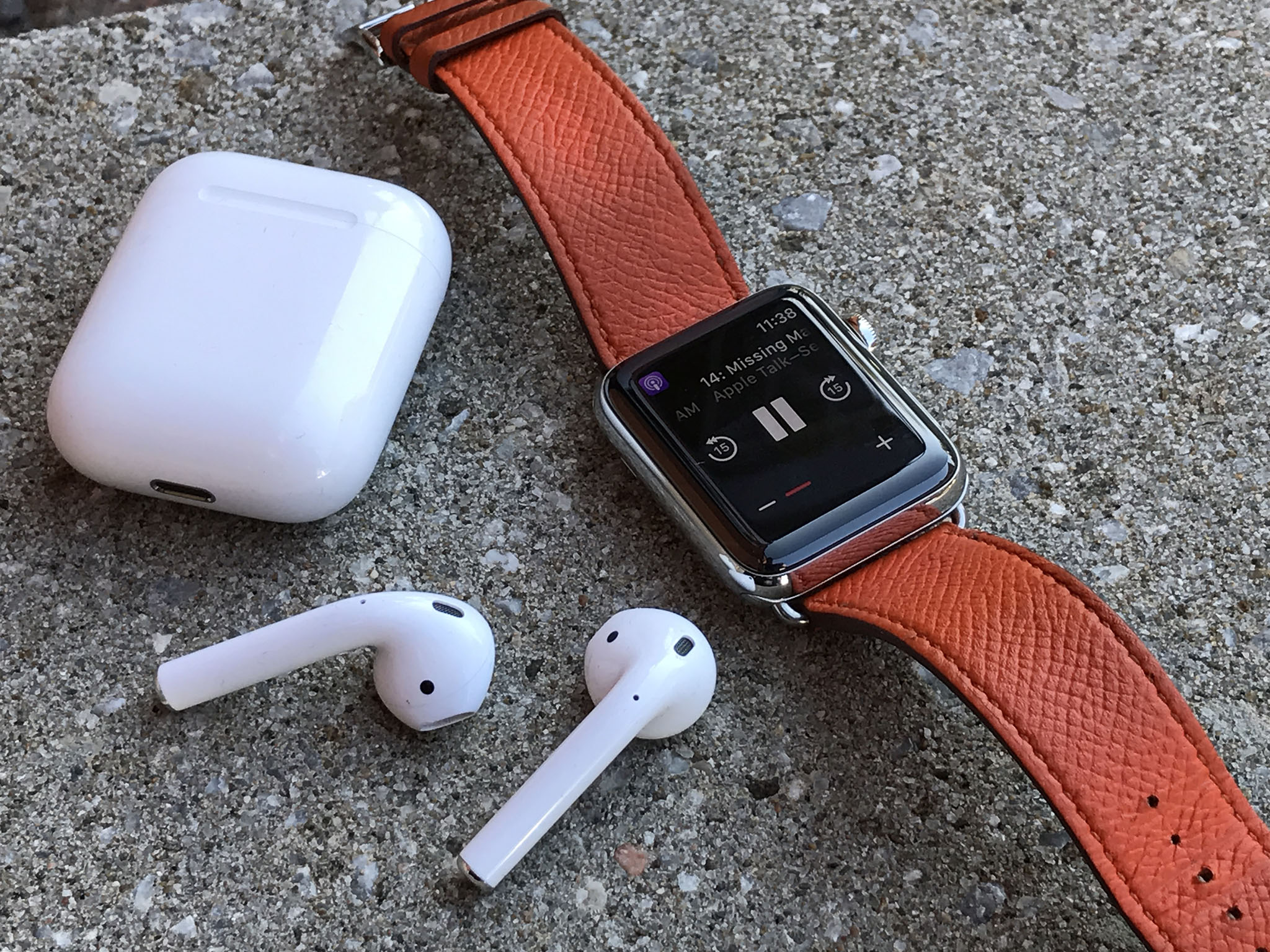
Apple Watch Series 2, like any Apple Watch running watchOS 3, is compatible with Apple's upcoming AirPods. They're a wireless version of EarPods that, thanks to the new W1 chip, pair automagically with iPhone and share that pairing just as automagically with Apple Watch.
You've been able to go for a run without an iPhone or corded headset for a while, but Apple Watch 2 and AirPods take the possible and make it delightful.
Read my Apple AirPods first impressions
Bottom line
Like iPad 2, Apple Watch Series 2 did indeed get faster. It didn't get thinner or lighter, though. Instead, like iPhone 3G, Apple used the second generation to fill out features, specifically GPS, and to boost brightness, battery life, and water resistance.
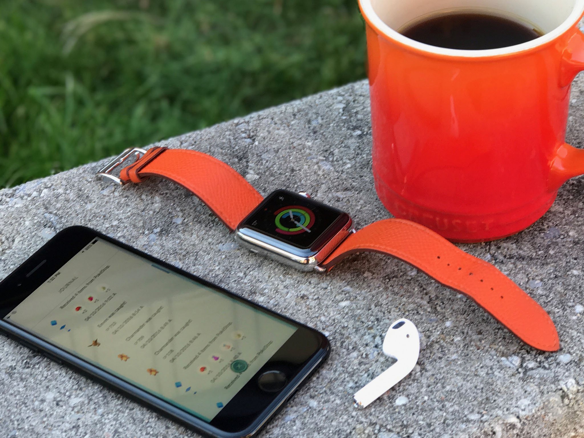
Most people with an original Apple Watch will get enough of an improvement out of watchOS 3 that they won't need to consider upgrading to Series 2. The exception is anyone who's been waiting for route tracking or water workouts. Then — take note, triathletes! — the upgrade is significant.
For anyone who hasn't yet gotten an Apple Watch, especially now that Google Wear and other competitors seem stalled or stagnant, Apple Watch Series 2 is a better starting point than ever. And, if you don't need GPS, or the extra brightness, battery life, or water resistance, Apple Watch Series 1 might be even better — it has the same amped-up performance, but at a lower price.
Apple Watch might still be a peripheral — the shuttlecraft to iPhone's starship — but it's one with slightly more independence, and considerably more coherence, than ever before.
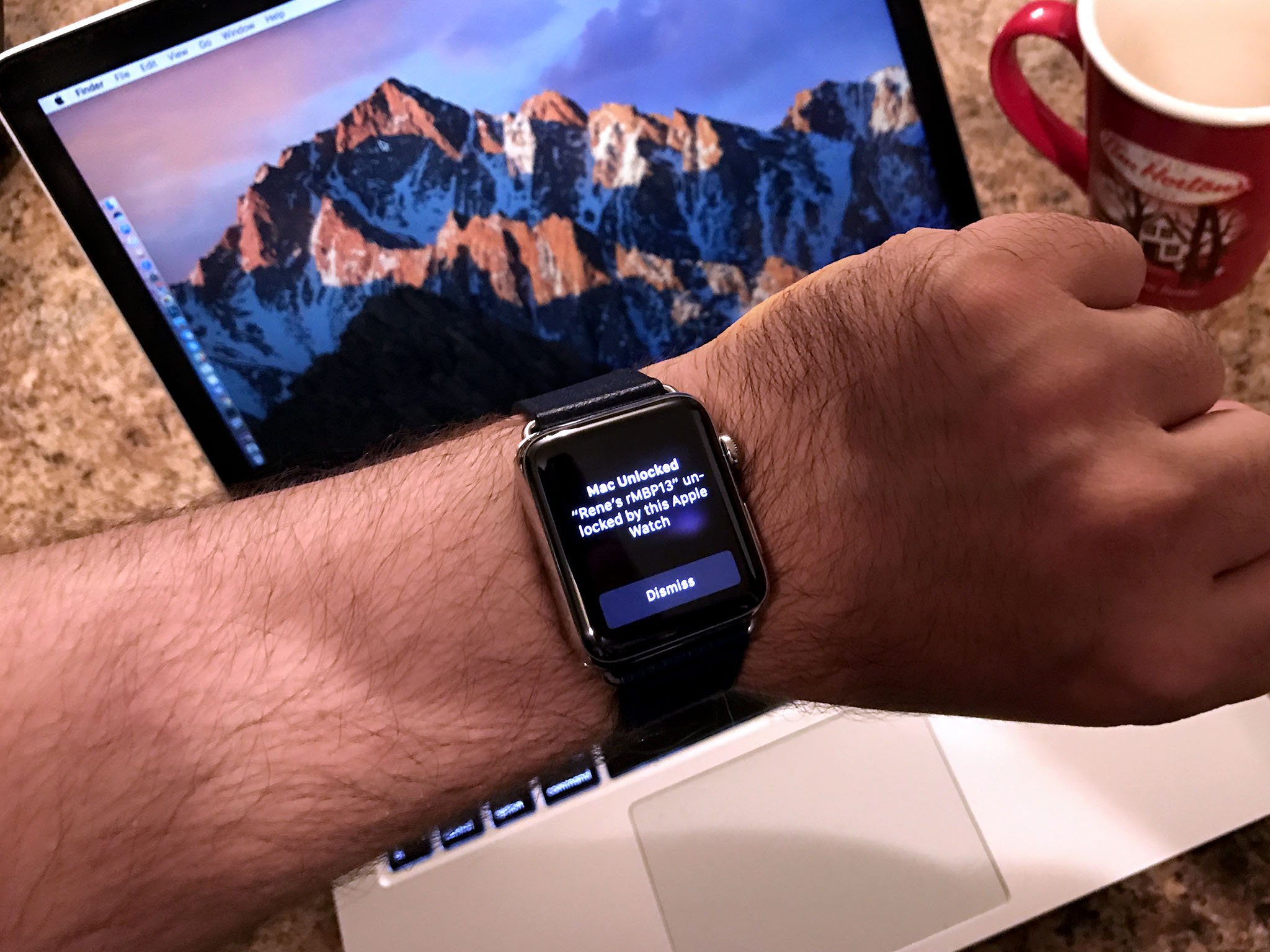
I'd still like to see how far Apple can take personal authentication and localized identity with Apple Watch. Tapping to purchase items with Apple Pay and using Auto Unlock — where your Apple Watch automagically logs you into your Mac — show the potential, as do apps like Aloft's door unlock. Now that I have a smart connected object on me, one that knows with reasonable certainty who I am, I'd love it to be used everywhere. (And as part of multi-factor authentication, for those who want additional security rather than convenience.)
Siri still needs to get better too. It now tells you when it can't answer immediately, but at some point the processor and connectivity have to get to the point where Siri does answer immediately, and makes everything from lookup to remote control as effortless as wearing the Watch itself has become.
Because that's the key for me now. Wearing Apple Watch is almost effortless and the benefits it gives me, considerable and growing. I haven't spent a day without my Apple Watch since the first one launched. The value I got from the convenience of the original has now been doubled by the fitness aspects of the Series 2.
Now, please excuse me, an Outdoor Walk awaits!

Rene Ritchie is one of the most respected Apple analysts in the business, reaching a combined audience of over 40 million readers a month. His YouTube channel, Vector, has over 90 thousand subscribers and 14 million views and his podcasts, including Debug, have been downloaded over 20 million times. He also regularly co-hosts MacBreak Weekly for the TWiT network and co-hosted CES Live! and Talk Mobile. Based in Montreal, Rene is a former director of product marketing, web developer, and graphic designer. He's authored several books and appeared on numerous television and radio segments to discuss Apple and the technology industry. When not working, he likes to cook, grapple, and spend time with his friends and family.
