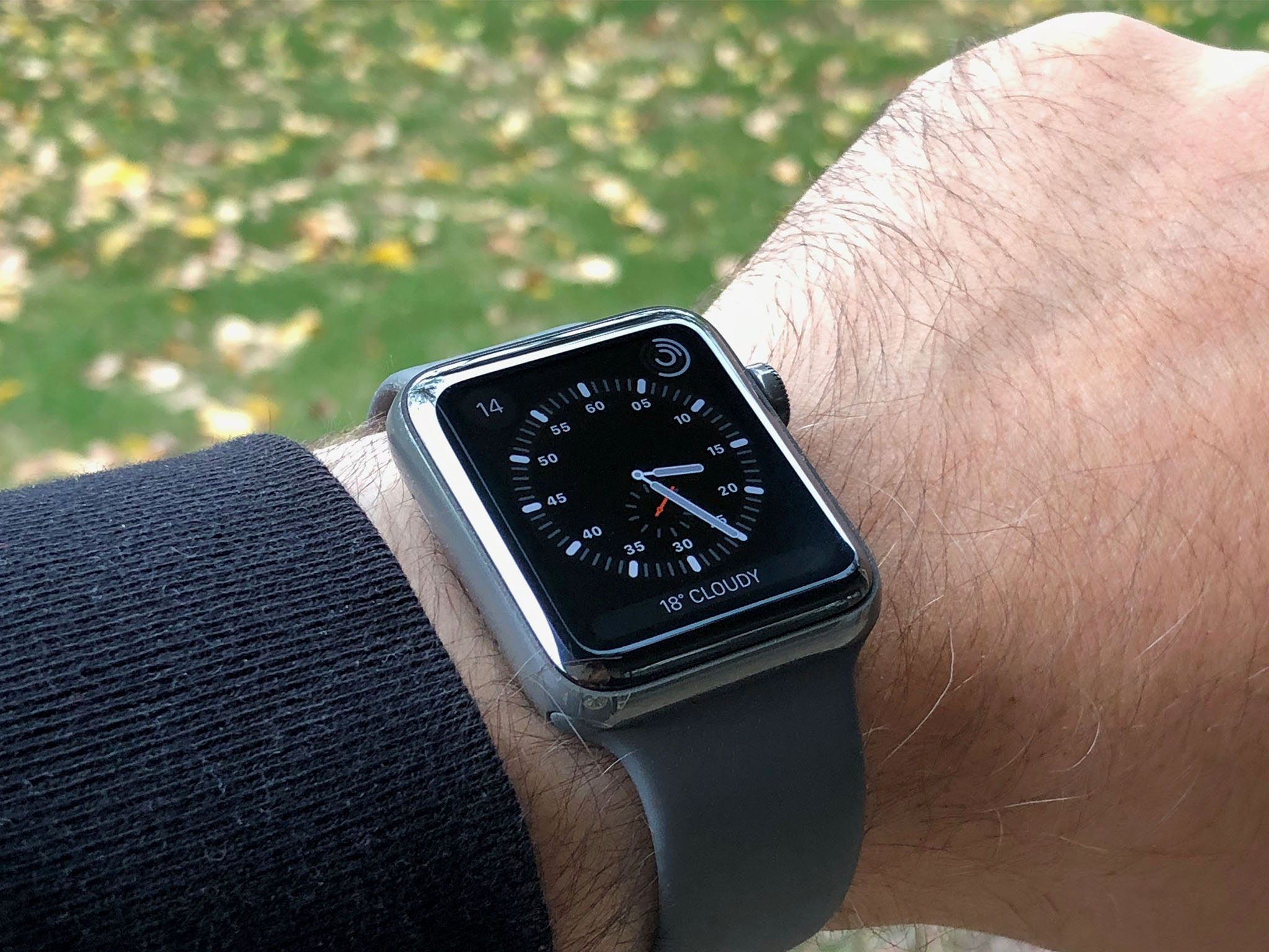
Last year, Apple Watch transitioned its Edition line from 18K yellow and rose gold to white ceramic. That took it from tens of thousands of dollars down to $1,299 for 38mm and $1,349 for 42mm. Still more than an iPhone X but much, much less than most ceramic watches.
Even though mechanical and computational watches have completely different value propositions, it does keep Apple Watch Edition at the very top end of Apple's offerings. In essence, it's for people who want an Apple Watch but also want it in ceramic.
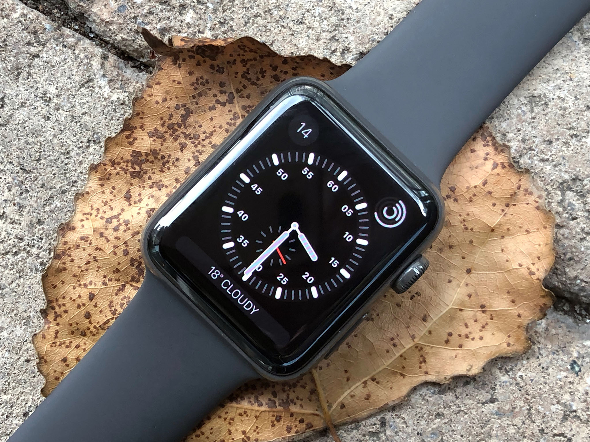
And this year, with Apple Watch Series 3, it's also for people who want it in space gray ceramic.
I had the Apple Watch Edition Series 2 in white ceramic and adored it. Now I have Apple Watch Edition Series 3 in the new space gray ceramic, and I've been wearing it since it launched and pairing it with as many bands as I could get my hands on.
Here's how it's been working — and looking.
Apple Watch Series 3 Edition Box
Apple has cut down on the packaging used for Watch, including ditching the inner plastic box for stainless steel models. Not so with Edition. All the bells, whistles, and the inner plastic box are still in place. That includes the watch itself, the gray sport band, the magnetic charger, the AC adapter, and the charging dock.
I love that Apple includes the charging dock. You're paying a premium for the Edition and including it makes you feel like you're getting a premium experience for your money.
There have been rumors of an iPhone Edition for some time and it's hard not to imagine what such a product, including a charging dock and perhaps AirPods, would be like.
Probably very much like this.
Apple Watch Series 3 Edition Casing
Apple Watch Edition Series 3 is almost identical in size and shape to Apple Watch Edition Series 2. The only difference, like with the other Apple Watch Series 3 lines, is an imperceptible increase in the depth of the sensor array at the bottom, roughly equivalent to the thickness of 2 sheets of paper. Given that Series 3 contains a more powerful processor, optional LTE networking, and maintains the same battery life, that's damn near miraculous.
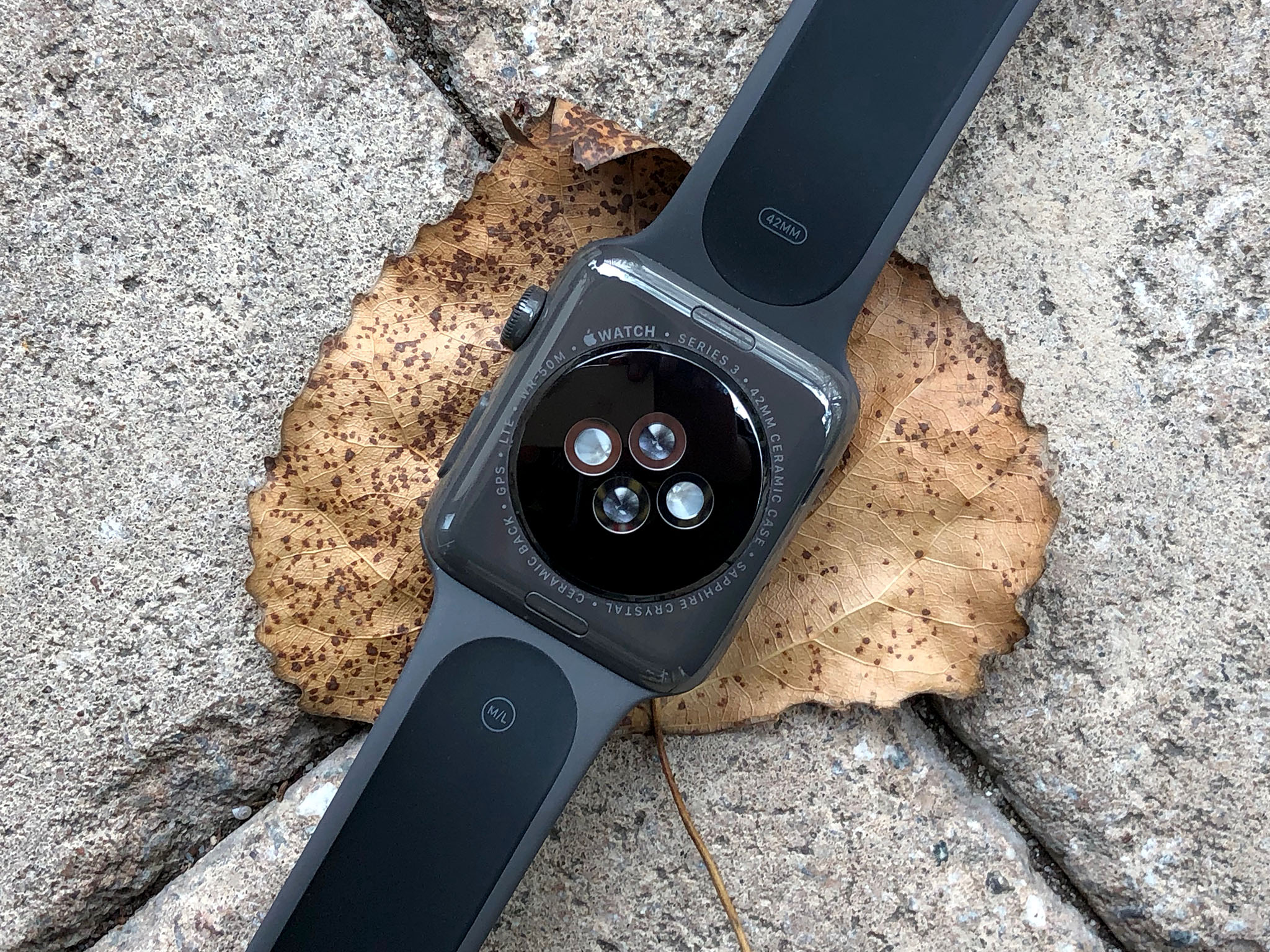
Nothing has changed as far as the ceramics itself. Apple still uses a high-strength zirconia powder combined with alumina to produce the original white and now the new space gray colors. It's compression molded and sintered with pressure and heat to turn the powder into a solid without liquefying it. That solid is then polished with a diamond "slurry" that makes it smooth and shiny. And it still takes days to make each ceramic case.
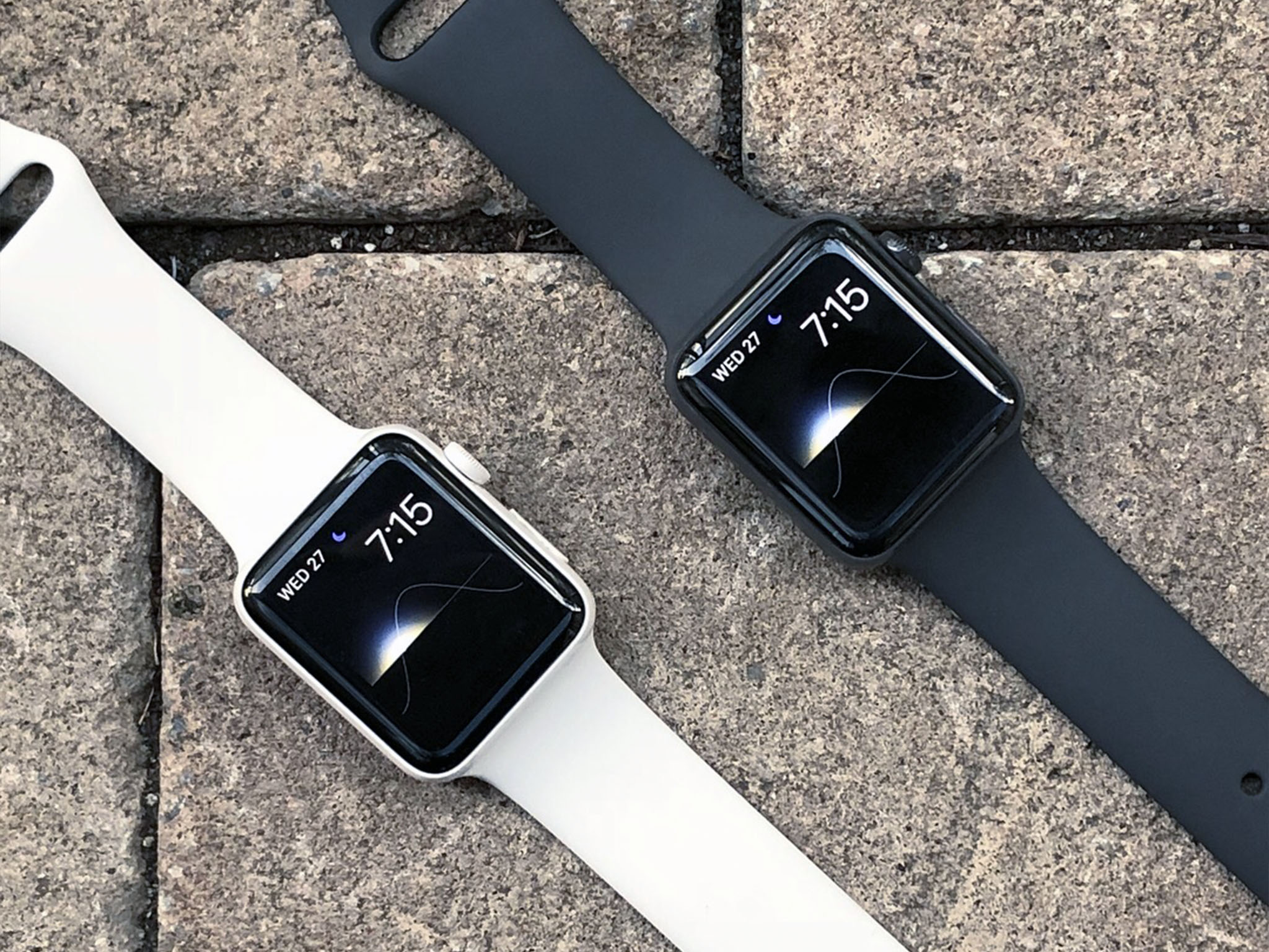
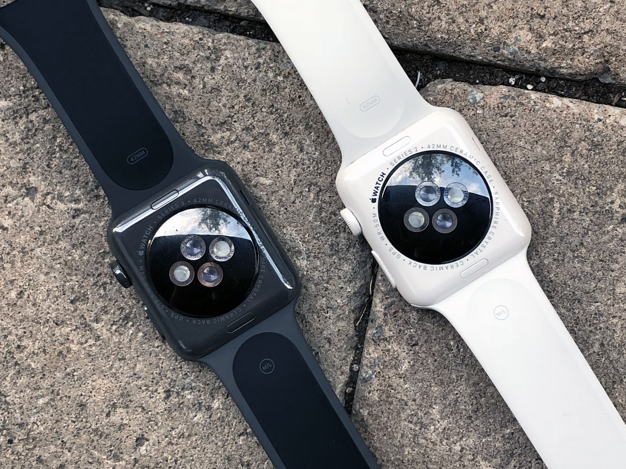
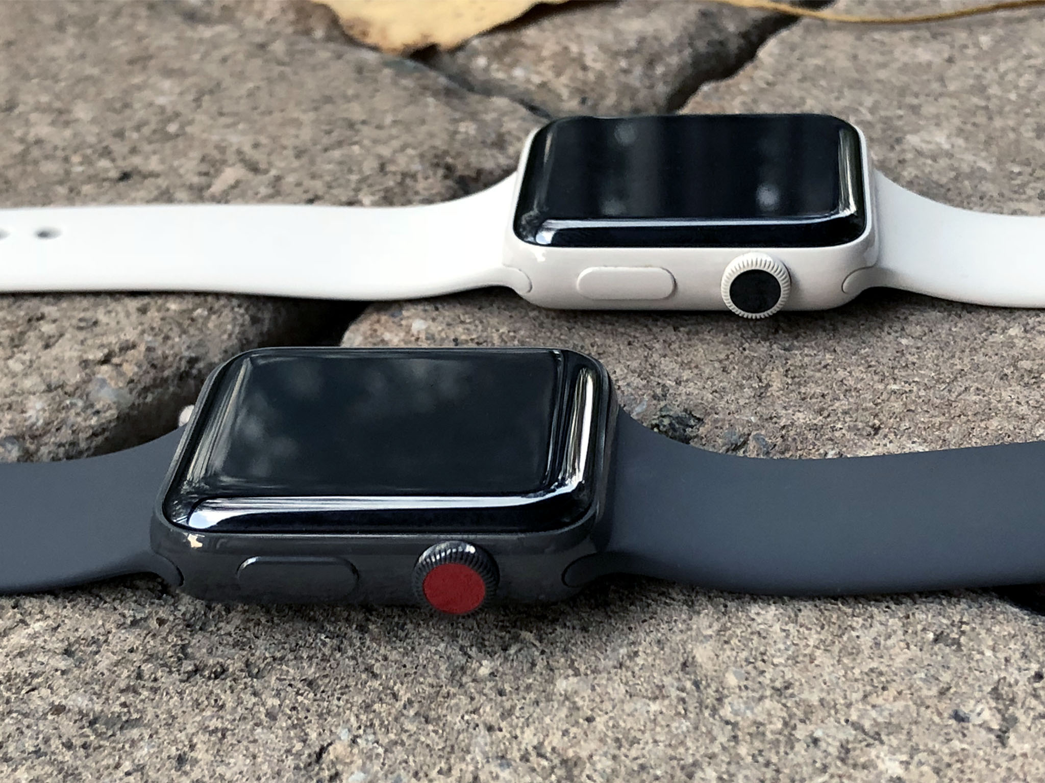
The space gray ceramic looks different than both the space gray aluminum and the space black stainless steel. It's not as dark as the space black and it's not as metallic as the aluminum. It's got a tone and a sheen all its own. The only way I can describe it is "stealth".
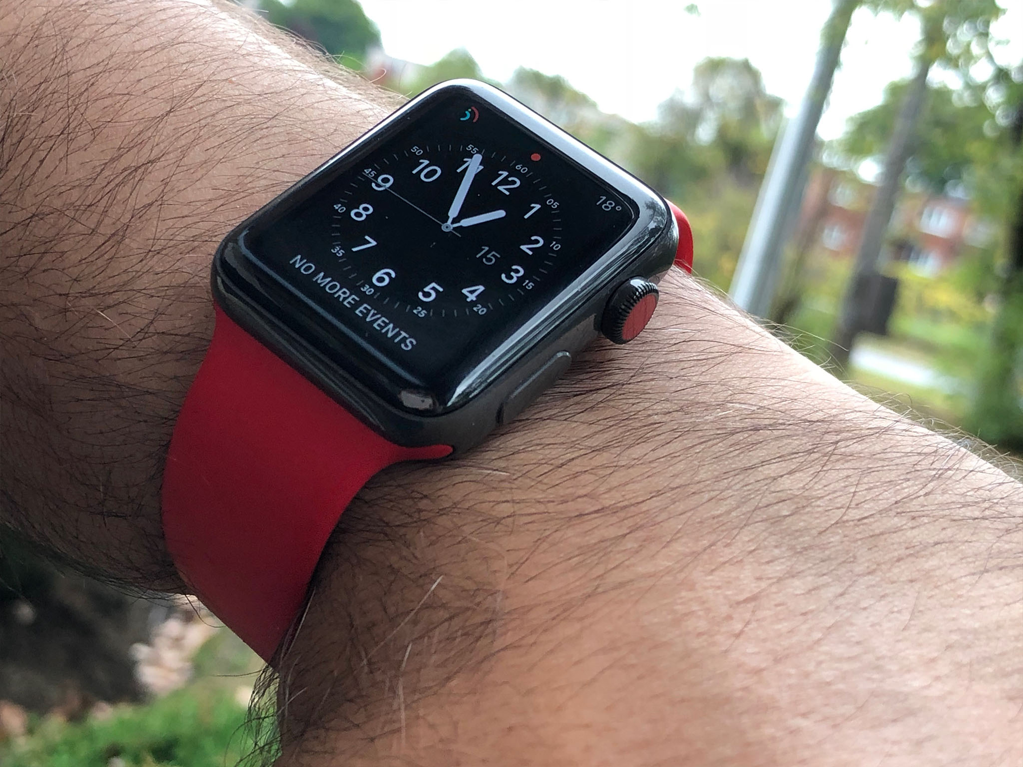
It's also got the red dot on the crown that identifies it as Series 3 with cellular networking. I'm not a huge fan of the dot. I know a lot of higher-end watches have a red-capped crown, including some by Apple designer and Jony Ive collaborator, Marc Newson, but it stands out to me a little too much.
I'm sure some people will appreciate broadcasting that they have a Series 3 to anyone who happens to see it or knows to look, and it's by no means overpowering, I'd simply prefer something that crowns a little more... casually.
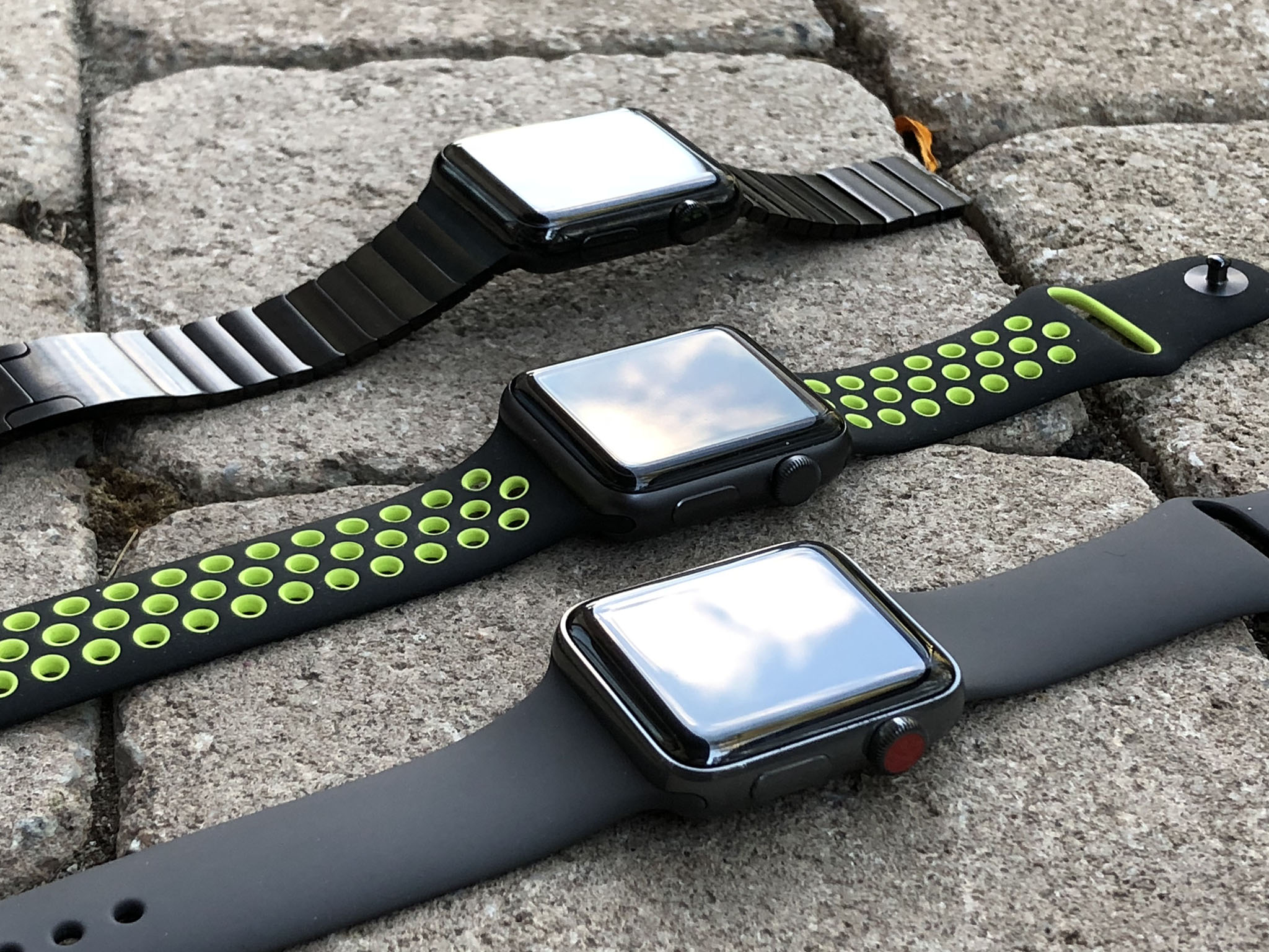
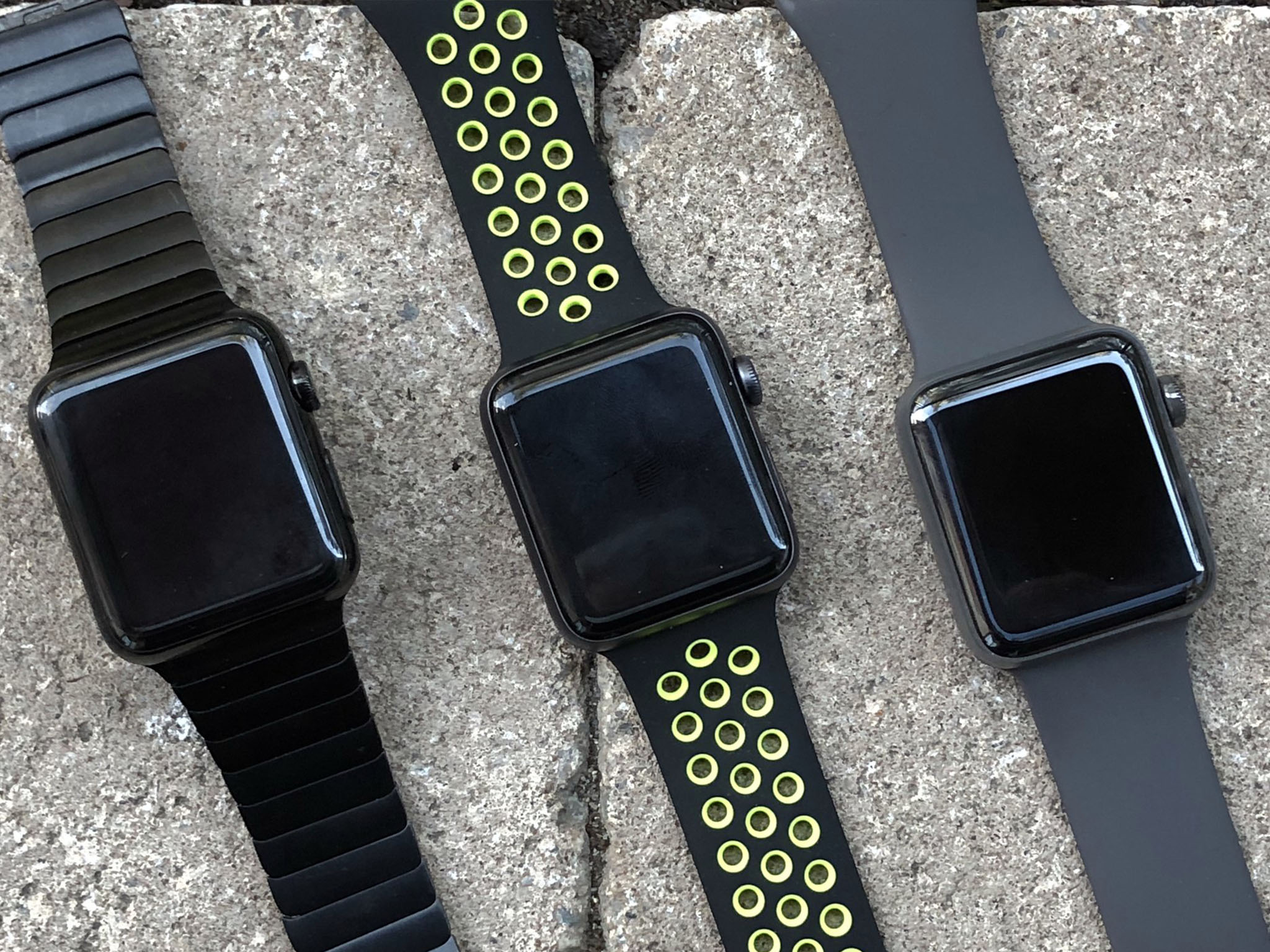
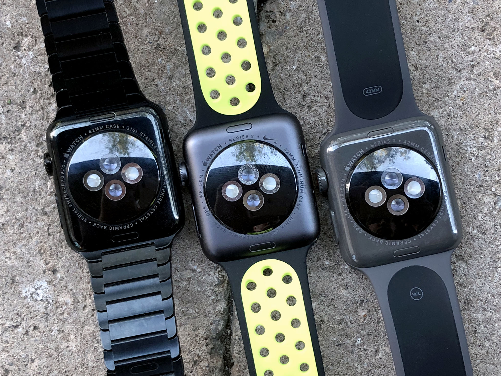
As to the cellular connectivity itself, I really dig it. I've left my iPhone at home and gone out for walks around town and extended hikes. I've even gone out for the day a couple times with just my Apple Watch Series 3 and AirPods, and it's been much better than I expected.
It does take a while after you leave iPhone range for cellular to kick in, and you have to leave your iPhone on and connected to maintain SMS relay capability. (That's why sliding your iPhone into Airplane Mode to test Watch connectivity will produce inconsistent results.) But, overall, I haven't had any issues.
Even in the middle of a nature preserve, I was able to take and make calls and respond to messages. Voice quality was as good as my phone, at least according to the people I was talking to. And that's remarkable given how small the mic is and how far away it is when you keep your arms down and don't bring it in Dick Tracey style.
It's even better with AirPods. It's almost like Apple new Series 3 was on the horizon when they released the tiny, sensor-filled, fully wireless headphones. With an Apple Watch Series 3 on your wrist and an AirPod in your ear (I prefer to use one at a time when I'm out and about), you feel like you're living in the future. It's like (audio) augmented reality.
During my tests, messages also came in and went out well. I often send emoji responses, but even using Scribble was great for short replies.
Apple Music support is coming soon, which is great. I prefer to listen to audiobooks and podcasts, though, so I really hope Apple adds support for those as well.
For many reasons, including display size, it's still isn't the same as having your iPhone with you, of course. Critically, there's no way to access the web. But it's not meant to be an iPhone replacement. At least not yet. (The future is always coming but it takes its sweet time arriving.) It's meant to an Apple Watch that lets you leave your iPhone at home when you're out exercising or having fun and don't want your iPhone with you.

Apple Watch Series 3 + watchOS 4
For more on Apple Watch Series 3 and watchOS 4, check out Serenity Caldwell's in-depth reviews:
Apple Watch Series 3 Edition watchOS 4
There's nothing unique to watchOS 4 on the ceramic Apple Watch Edition. Nothing like the custom watch face Hermès enjoys, at least. It would be great if Apple had a set of Edition faces but, for the second year in a row, the only difference on the inside is the material of the outside.
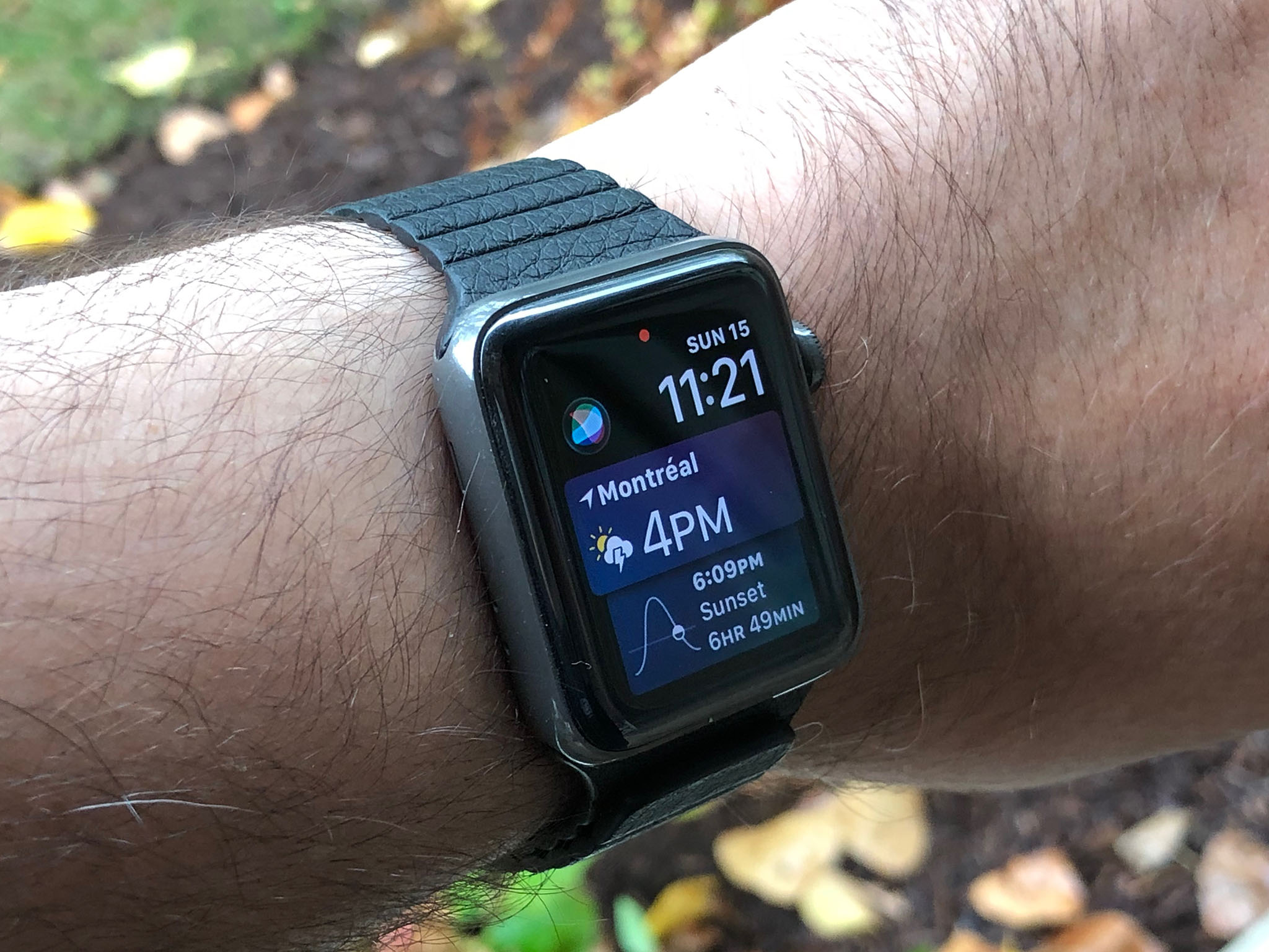
With watchOS 2 and watchOS 3, Apple course-corrected. The company simplified navigation and focus, buried less successful features, and doubled and then tripled down on health and fitness. watchOS 4 continues that focus but it revists some of the navigation. Namely, the digital crown is back.
There are new watch faces, including Disney's Toy Story, a fun kaleidoscope, and explorer, which is only available on cellular models. I like the look of cellular and have been using it a lot. It's like utility, only beefier.
There's also a Siri watch face that tries to predict and show useful information in an easy-to-scroll form. I love the idea but the implementation hasn't clicked for me yet. I don't think I use my Apple Watch in a way that fits with it. My ideal implementation of prescience on Apple Watch would be a standard face where the complications change to fit the needs of the moment.
I'm still wishing for more complications on the photo face as well. Absent custom faces, it's all I really need to get my creativity on.
And there are other things I continue missing as well. That I can't dictate into the Notes app through my Apple Watch yet is frustrating. That I can't stream podcasts or audiobooks, likewise. It's great that Apple Music is coming but music is the type of audio I listen to the least.
Carousel, the honeycomb Home screen of the original watchOS is still here but you can switch it out now for a more verbose list of apps. It lets you quickly scroll through everything on your Apple Watch until you spot what you want.
I still find the idea of apps on Apple Watch almost anachronistic and think the future will be less bundled binaries and more discrete features that pop up when and as needed. Let extensions be extensions, so to speak. Every year we seem to get half a diagonal step closer to that.
It's not just app selection that benefits from a new, digital crown-friendly vertical scroll either. The fast app switcher has itself been switched from horizontal to vertical. Wherever it makes sense, Apple has transitioned from horizontal swipes to vertical scrolls. It's authentic to the controls and to the concept of Watch. And I love it.
I also love that the new S3 system-in-package, the brains of Apple Watch Series 3, is powerful enough to give Siri not just a voice but much, much better responsiveness. It's great to hear Siri talk on the Watch, at least most of the time. (Once in a while you get such looks from bystanders...). It's even better to hear Siri talk so quickly after you ask something.
There's also enough smarts in the S3 to provide for enough machine learning that the "coaching" system is significantly better. Instead of mindless reminders to stand ten minutes before every hour, you now get told only when you need to be told, and you also get extra encouragement when you need it as well. That includes props for being ahead of the curve on filling your rings, and a gentle, wrist-mounted ass kicking when you're behind. It's so great.
So are the new heart rate features, including and especially the ones designed to detect abnormal spikes. Apple may well have aspirations in health devices and services far beyond what we've seen to date, but the company is delivering real, beneficial, in some cases life-saving technology through Apple Watch. And it's doing it today.
There's so much more to cover, make sure you read Serenity's complete watchOS 4 review.
Apple Watch Series 3 Edition Bands
Watch bands are the fastest way Apple has ever figured out to separate me from money. Every spring and every fall we get new collections with new colors and, once a year, we get new styles as well. I've learned to buy the ones I like on sight, since they often sell out and don't ever come back into stock. That also means some of the bands here are no longer available at retail, though similar colors might be. I'm including a wide assortment, though, so you can get a good idea of how the gray ceramic pairs with different colors and shades.
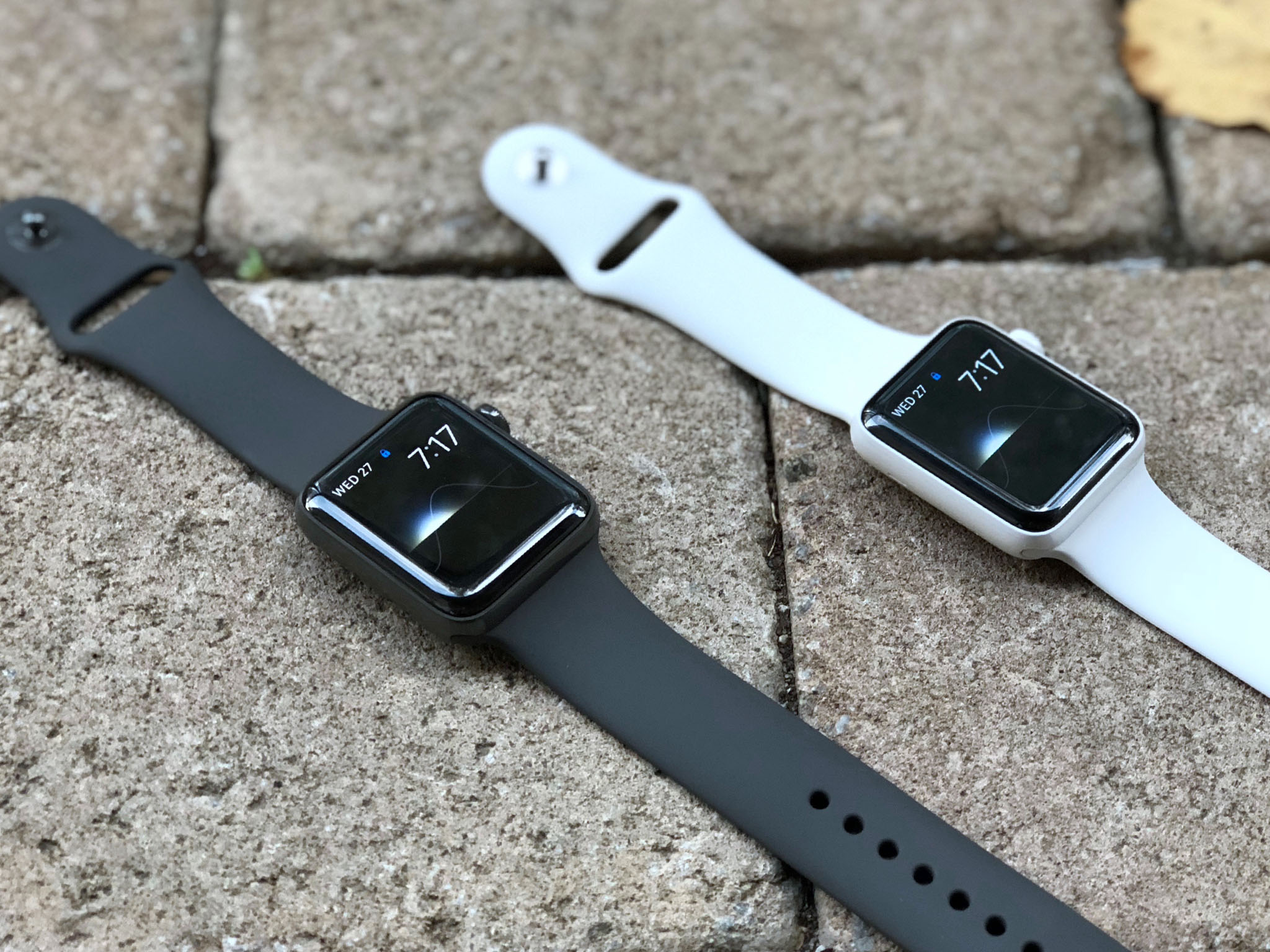
It's similar to the challenge I had pairing the space black steel Apple Watch. Where white, like stainless steel, can go with almost everything, gray is even fussier than black.
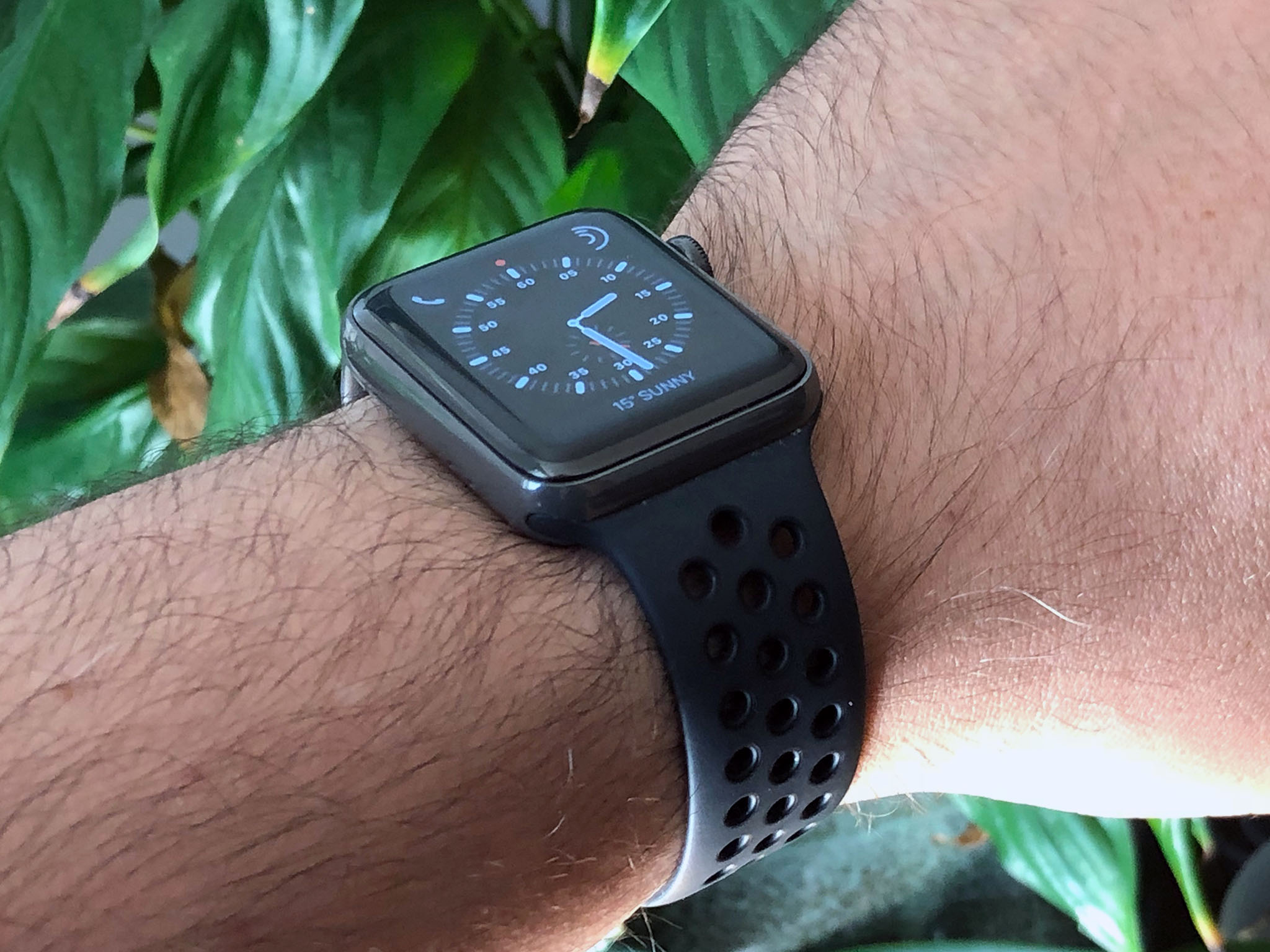
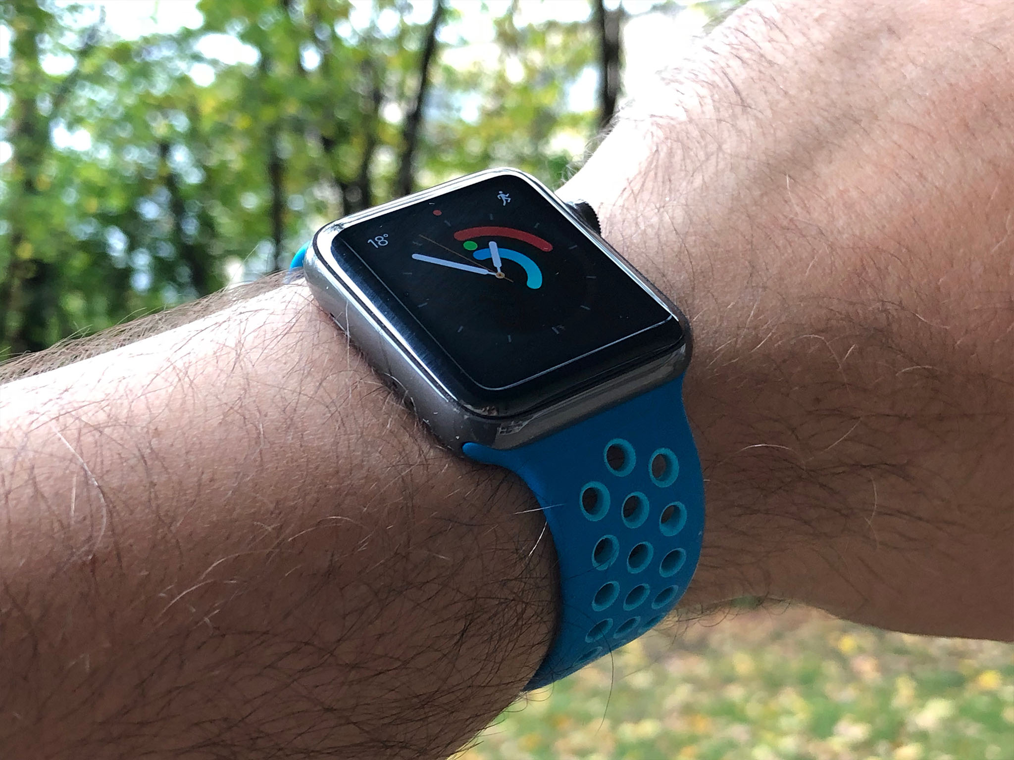
The gray sports band that comes with the space gray ceramic is perfectly serviceable. On some level I get why Apple includes sport bands with the ceramics — they're easy to color match and they're water resistant if you want to go for a swim or surf. But they lack panache, especially compared to the Hermès leather included in the other high-end lines. (Which also, by the way, come with an orange sport band for aquatic use.)
I'd still love a ceramic link bracelet, ideally with a single deployment, but the price point would almost certainly be high enough that it wouldn't come in the box. Maybe some custom Apple leather then, and with matching ceramic lugs.
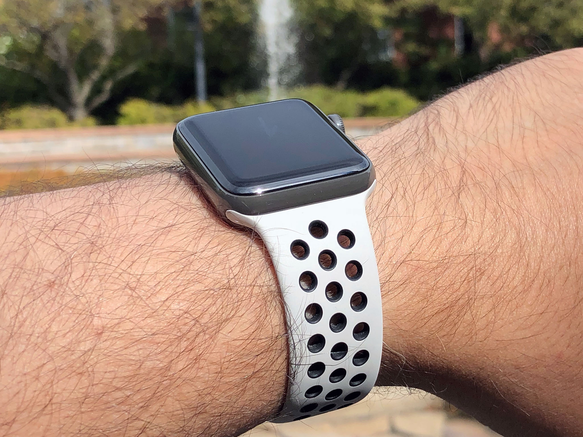
The gray ceramic looks fine with many of the other sport band colors. My favorite is the (Product) Red, which really sets off the red crown. I prefer the Nike variants, though. The anthracite and bone and other gray-tones all look good. The colors, if you managed to get your hands on them while they were available, really pop.
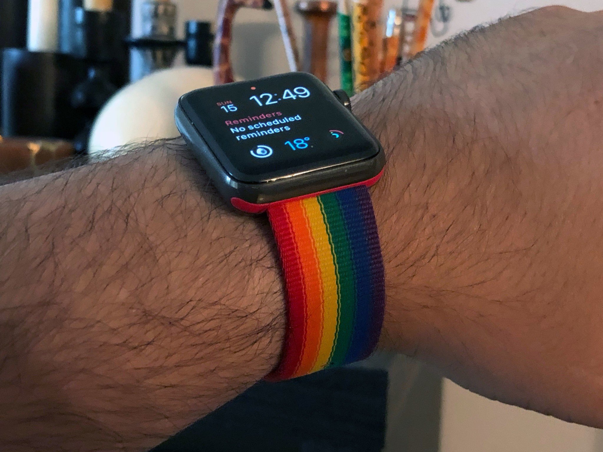
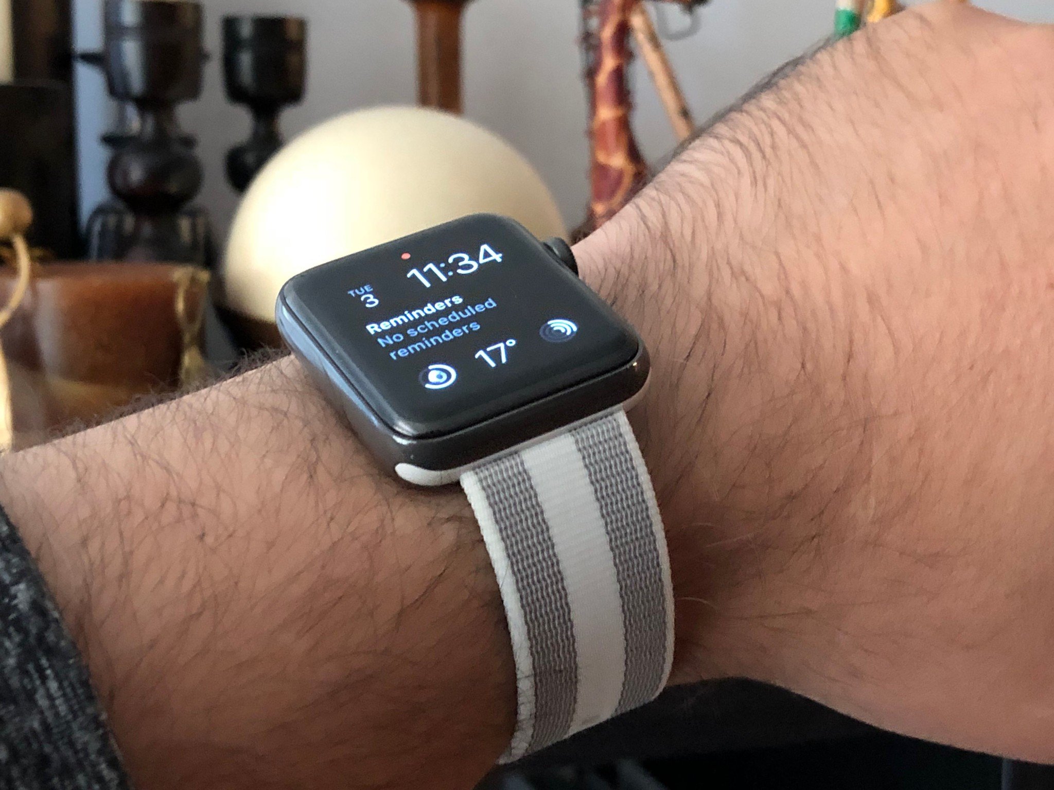
The Apple Pride woven nylon still looks great with any watch, the gray ceramic Edition included. The red lugs complement the red crown on the cellular models nicely but the colors are so vibrant you barely notice anyway. For a more subdued look, the new pearl color provides for some nice contrast. I haven't had a chance to try it yet, but I suspect the dark olive would also work well.
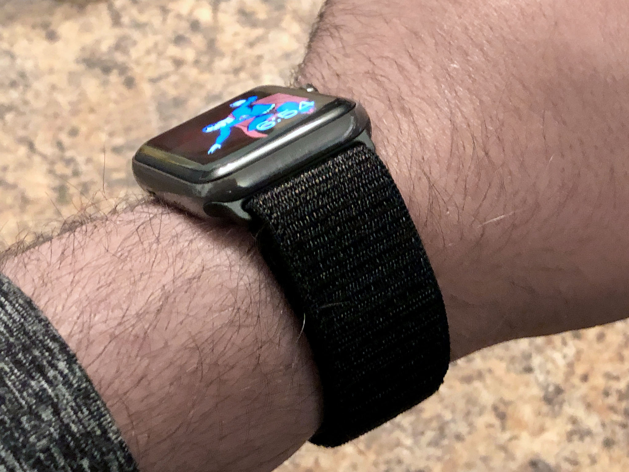
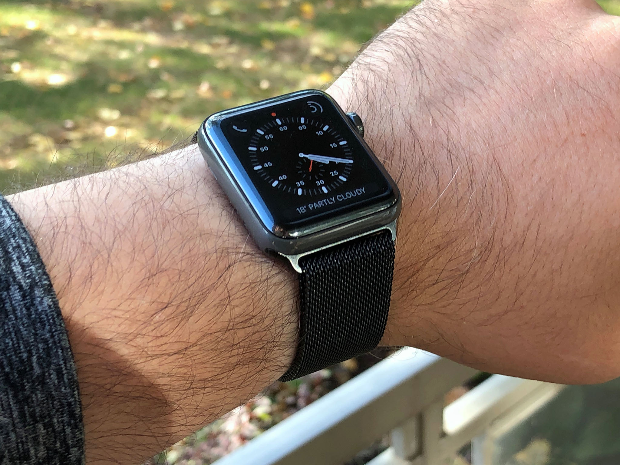

I've had a lot of fun with the loops. The new sports loop with its velcro-like closure has an almost pajama vibe to it. It's incredibly comfortable and adjustable. The black version looks classy enough, though, that it can go from a day in the gym to a night on the town with no problem at all.
It's a little darker than the ceramic but the variegated flecks in the weave lighten it enough that it really works. Same with the space black Milanese loop. That combo is one of my favorites.
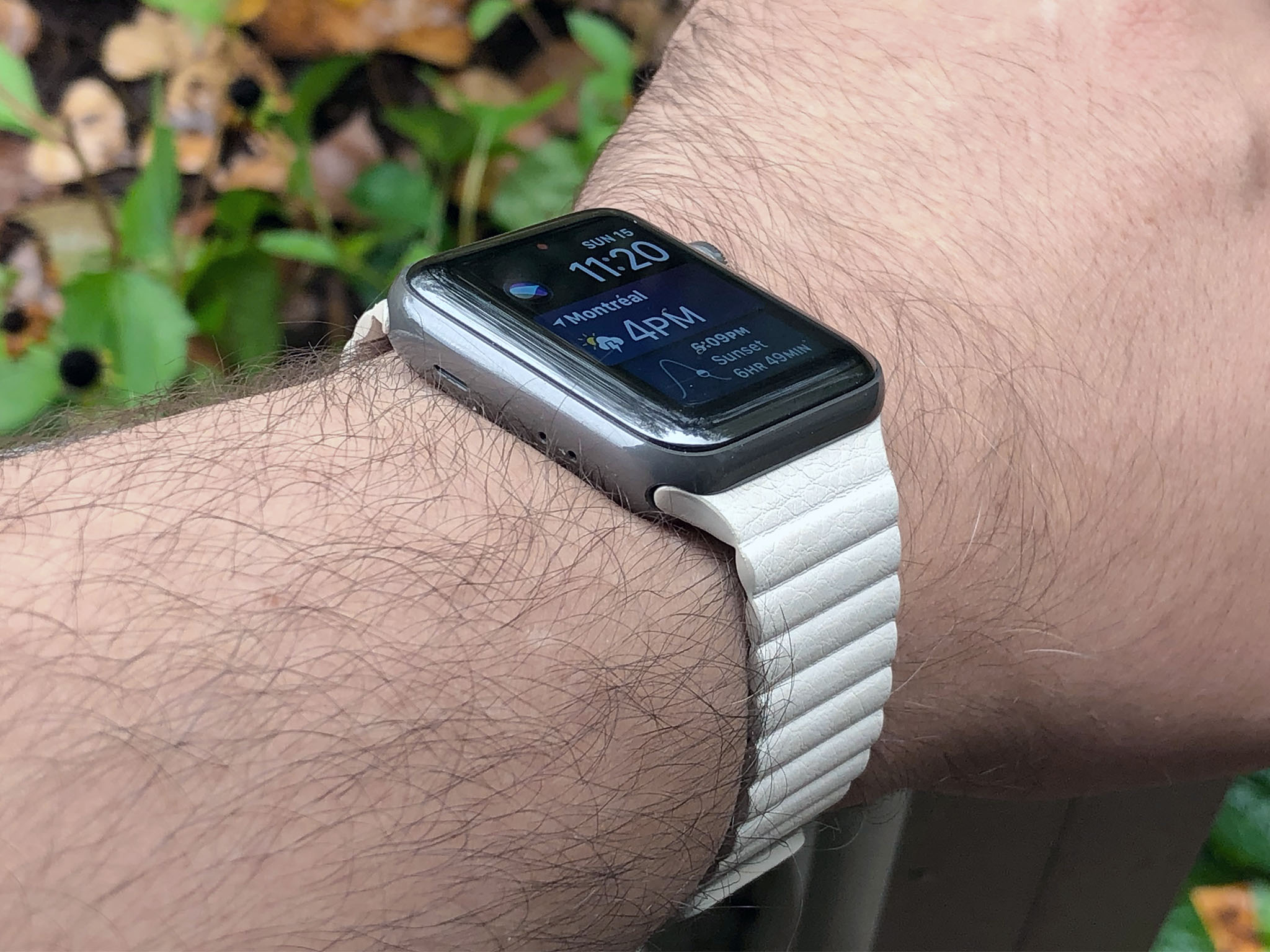
The leather loops are also good, especially because the lugs are unified. There's a new charcoal gray color I haven't had the chance to pick up yet, but the old black and white both work well. (And yeah, the ripped look is still all off-world excellent.)
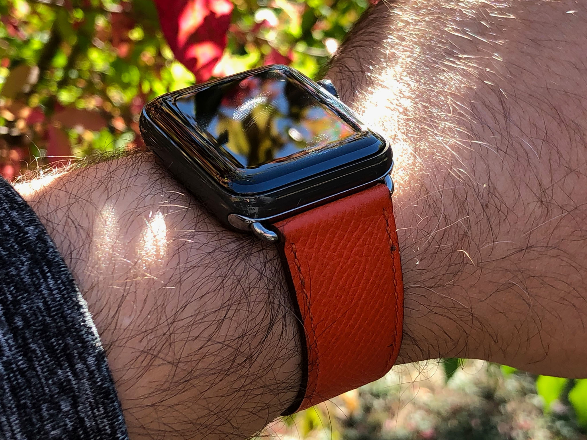
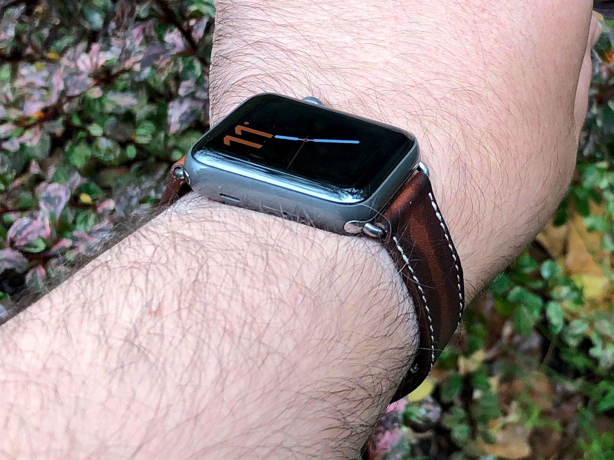
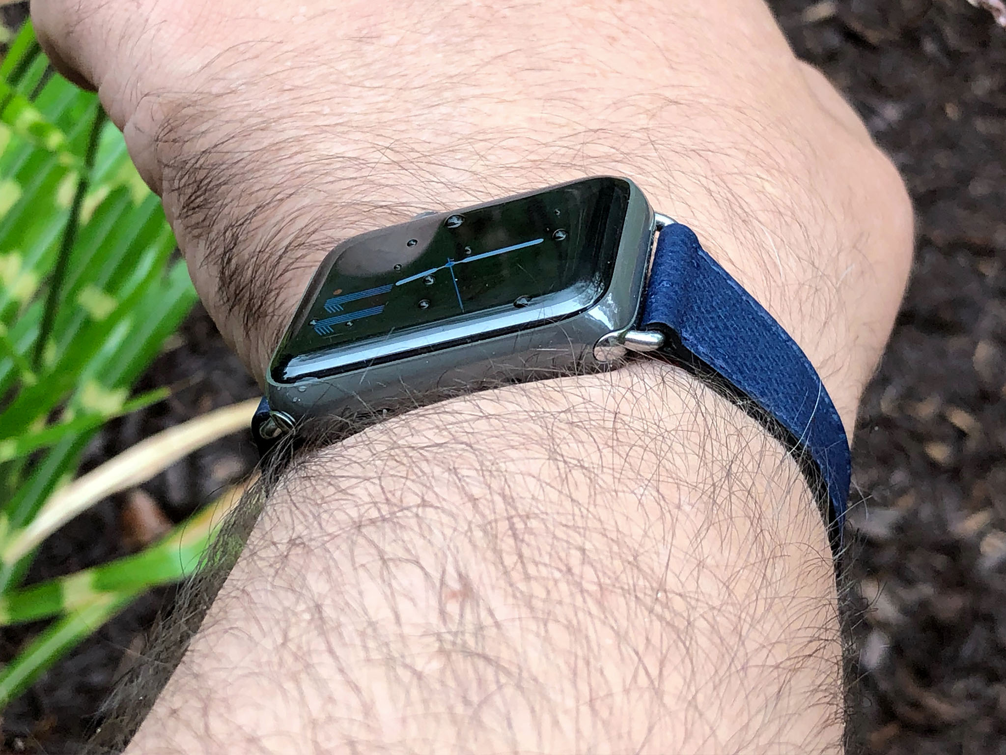
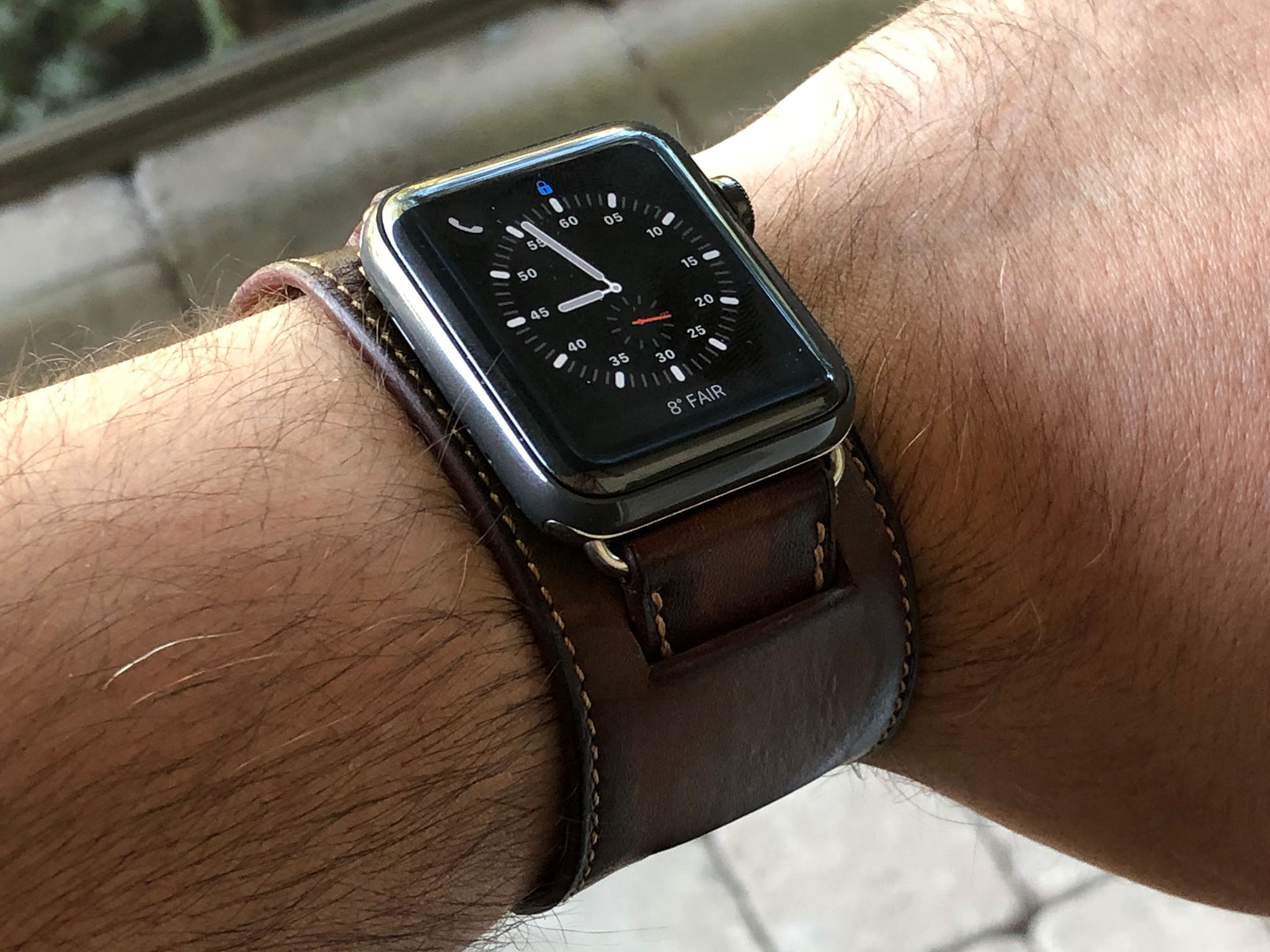
I have several of the Apple Classic Leather buckles but it's the Hermès leathers that remain my Kryptonite. The cuff remains one of my all-time favorites. I hope it returns to the lineup and in noir or a similarly dark shade next time. Likewise the single deployment. It has all the looks of the single tour but with the safety of a loop.
I like the way the single tour proper colors, including feu and sapphire, look as well. I might be fooling myself, but the stainless steel lug mismatch isn't quite as noticeable on the gray ceramic as it is the white or space black steel. I haven't tried the new burgundy single tour yet, but I don't think it would pop against the gray the way the feu does.
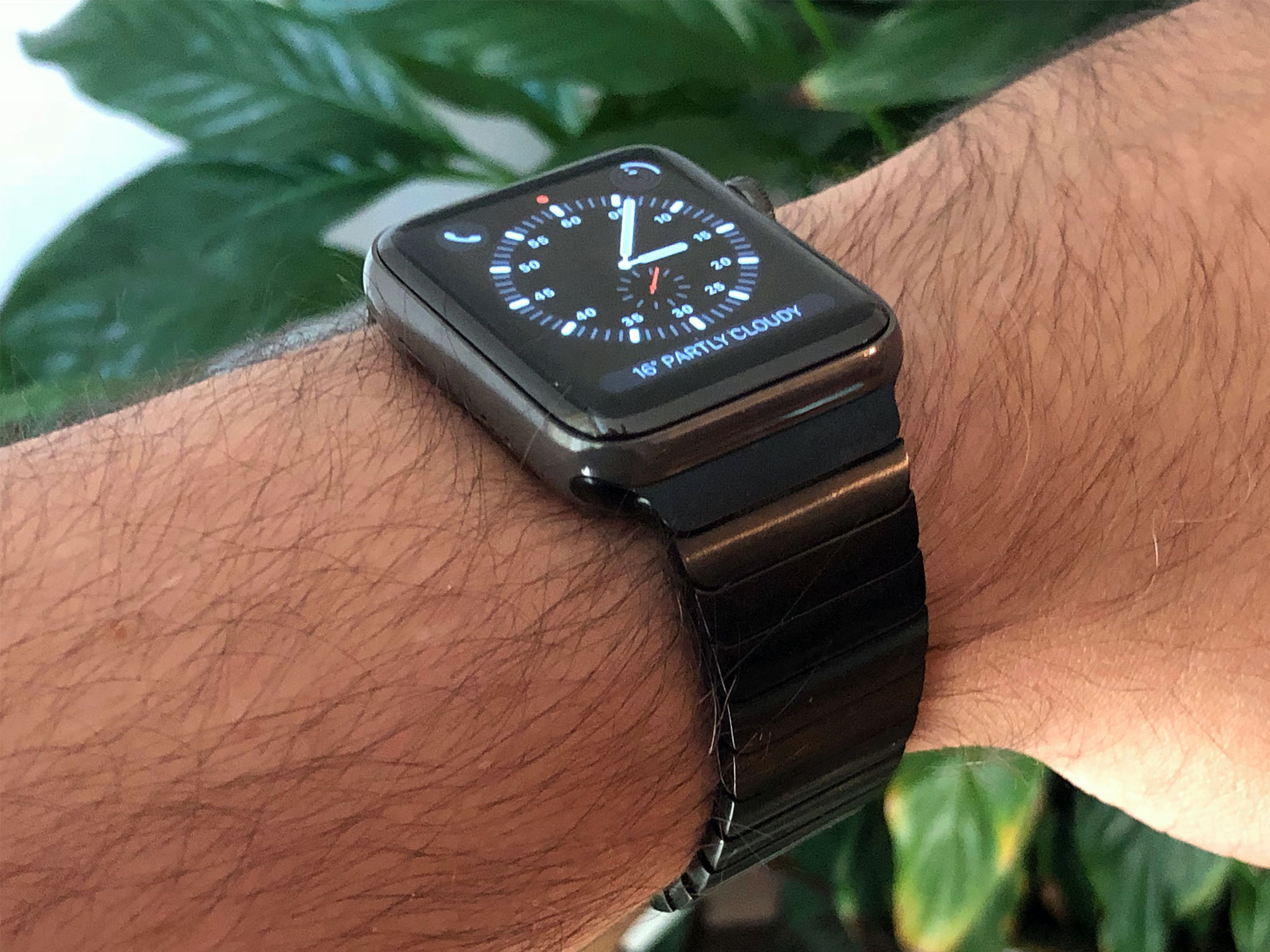
And yes, I've tried the space black steel link bracelet with the gray ceramic. How could I not? It was by far the first and most frequent request. It looks fine. It's a bit of a color and material mismatch, though, which is why I still hope Apple makes a ceramic link bracelet at some point.
Apple Watch Series 3 Edition Conclusion
When Apple Watch first launched it wasn't very independent. It was like a short-range shuttlecraft to starship iPhone. Now, three generations in, it has the LTE equivalent of warp nacelles and can venture ever further on its own. It's not a starship yet, but it's getting closer every year.
Edition has been especially interesting to follow because it started off so atypically. In 18K gold, it was something targeted at stars and jetsetters, grabbing attention from the fashion and watch industry but not the consumer market.
Reinvented, Edition is still a premium product. Beyond premium, perhaps. But back in the realm of affordable luxuriy that Apple targets so well.
The space gray ceramic Edition is a great addition to the line. It's every bit the miracle of materials and manufacturing the white ceramic version is, but far more understated. More stealth.
I personally prefer the white precisely because it is more flashy but you really can't go wrong with either. And, if you're going ceramic, it's terrific to have the choice.

Rene Ritchie is one of the most respected Apple analysts in the business, reaching a combined audience of over 40 million readers a month. His YouTube channel, Vector, has over 90 thousand subscribers and 14 million views and his podcasts, including Debug, have been downloaded over 20 million times. He also regularly co-hosts MacBreak Weekly for the TWiT network and co-hosted CES Live! and Talk Mobile. Based in Montreal, Rene is a former director of product marketing, web developer, and graphic designer. He's authored several books and appeared on numerous television and radio segments to discuss Apple and the technology industry. When not working, he likes to cook, grapple, and spend time with his friends and family.
