The Apple Watch and 'Reverse Crown'

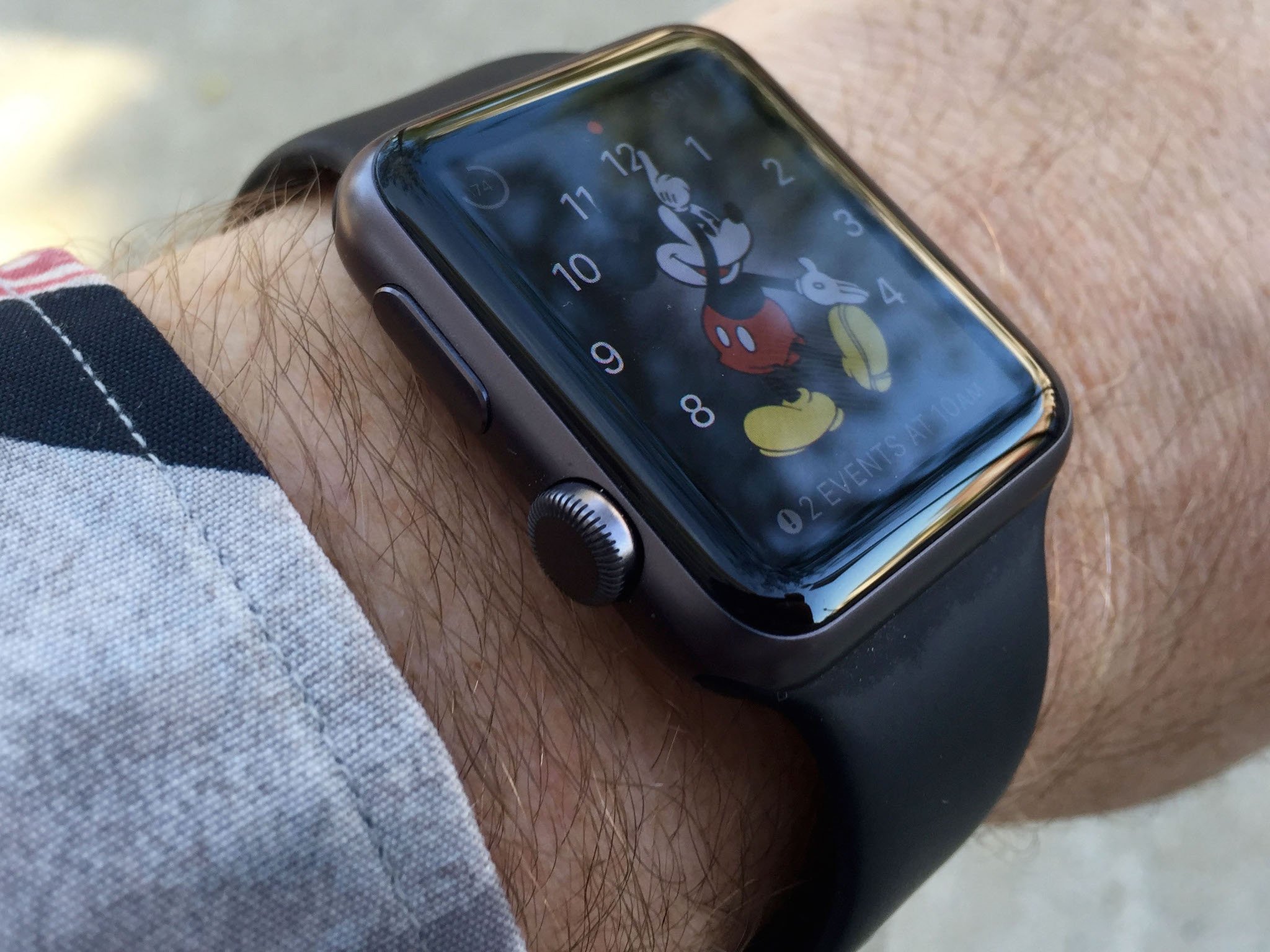
I was having dinner with my friend Rich when I noticed something interesting: His Apple Watch was on upside down. At least, it looked upside down. Out of the box, the Apple Watch is designed to work so the Digital Crown is positioned in the upper right hand corner. Rich's Apple Watch was oriented so the Digital Crown was in the lower left hand corner instead — an orientation practitioners call "reverse crown."
Rich wasn't wearing his Apple Watch upside down. He'd actually taken the band off the watch and put it back together oriented 180 degrees around. Rich explained to me that he'd read an entry about Apple Watch ergonomics on developer Craig Hockenberry's blog Furbo.org. What Hockenberry said made sense to Rich, so he'd tried it out.
Hockenberry experimented with his Apple Watch, and learned that by moving the Digital Crown to the lower left, his natural inclination was to use his thumb to scroll, rather than twisting the Digital Crown between his thumb and index finger. What's more, that index finger was now free, making it poised to conveniently tap and scroll on the Apple Watch display. This makes scrolling and tapping a faster experience. It makes operating Apple Watch apps faster.
Hockenberry noted that the Apple Watch's speaker and microphone are pointed at to his face now too. "It's easier to hear sounds and Siri recognition seems a little better," wrote Hockenberry.
I tried reverse crown and decided that I like it. It's quicker for me to open apps, scroll and take actions. I'm spending less time fiddling with the Apple Watch and more time using it for what I need, whether it's scrolling through music playlists or scanning my calendar for upcoming appointments.
Since I've begun wearing my Apple Watch this way, I've noticed another reason to go with it. I would occasionally activate Siri when I bent my hand and wrist at hard right angles. That doesn't happen anymore. Every so often I'd lift my watch to my wrist and discover some fragment of a frustrated discussion Siri was trying to have with me, or a piece of what it thought it was supposed to dictate to a message.
But the old rules don't apply anymore, at least not to the Apple Watch. Apple, for its part, figured out straight from the start that users could break the rules. Because Apple supports the orientation in the Apple Watch settings on the Apple Watch app on the iPhone. Under the General settings, pull up Watch Orientation, then specify "Digital Crown on the Left Side."
Master your iPhone in minutes
iMore offers spot-on advice and guidance from our team of experts, with decades of Apple device experience to lean on. Learn more with iMore!
There's one small downside to reverse crown, by the way: Some applications expect the digital crown in its standard upper-right corner location regardless of the watch's settings. Apple's own Calendar app, for example, shows you a scroll indicator, and positions it in the upper right hand corner regardless of how you have the Digital Crown positioned.
I'd argue that apps like Calendar should pay attention to the Watch Orientation setting, and render those scroll indicators and other UI elements specific to the Digital Crown where the crown actually is.
Bottom line: If you're turning hands or winding a mechanical motor, having the crown where you can pinch it between your index finger and thumb makes a lot of sense. It's precise. It's something that watch makers have done for a very long time, because it makes sense.
Apple has reinvented the crown for its smartwatch. It's turned the Digital Crown into an important interface that helps you navigate and activate the apps that make the Apple Watch such an incredibly useful device. Find the way that best suits your use, and if you're interested to try something different, give Reverse Crown a try. Let me know what you think!

