The original Apple Watch Edition launched in 2015, was crafted out of yellow or rose gold, and cost $10K and up. It was for people who stay in 6-star hotels, fly in cabins, wear couture—maybe only once—and would certainly buy something as trendy as an Apple Watch but only if it came in gold. It was also for the fashion and watch worlds, a substance to get attention beyond the silicon.
I had several opportunities to see it at and around Apple events and it was legit gorgeous. But a market used to affordable luxury doesn't like even the idea of luxury they can't afford: While the original Edition generated attention, it also generated more than a little resentment.
So, in late 2016, Apple replaced it with an all-new Edition. Gone was the gold and the gobsmacking price tag, and in its place a still pricey (starting at $1,249) but much more attainable ceramic white.
I didn't get one at launch but I managed to get my hands on one a couple of weeks ago. Since then, I've worn the new Apple Watch Edition Series 2 full-time, and here's my review.
The Watch
Apple Watch Edition Series 2 is different. Apple Watch Nike+ is a variant of the standard anodized aluminum Apple Watch Series 2. Apple Watch Hermès Series 2, a variant of the standard polished stainless steel. Apple Watch Edition Series 2, though, has a material all its own — ceramic.
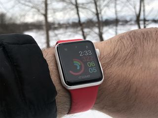
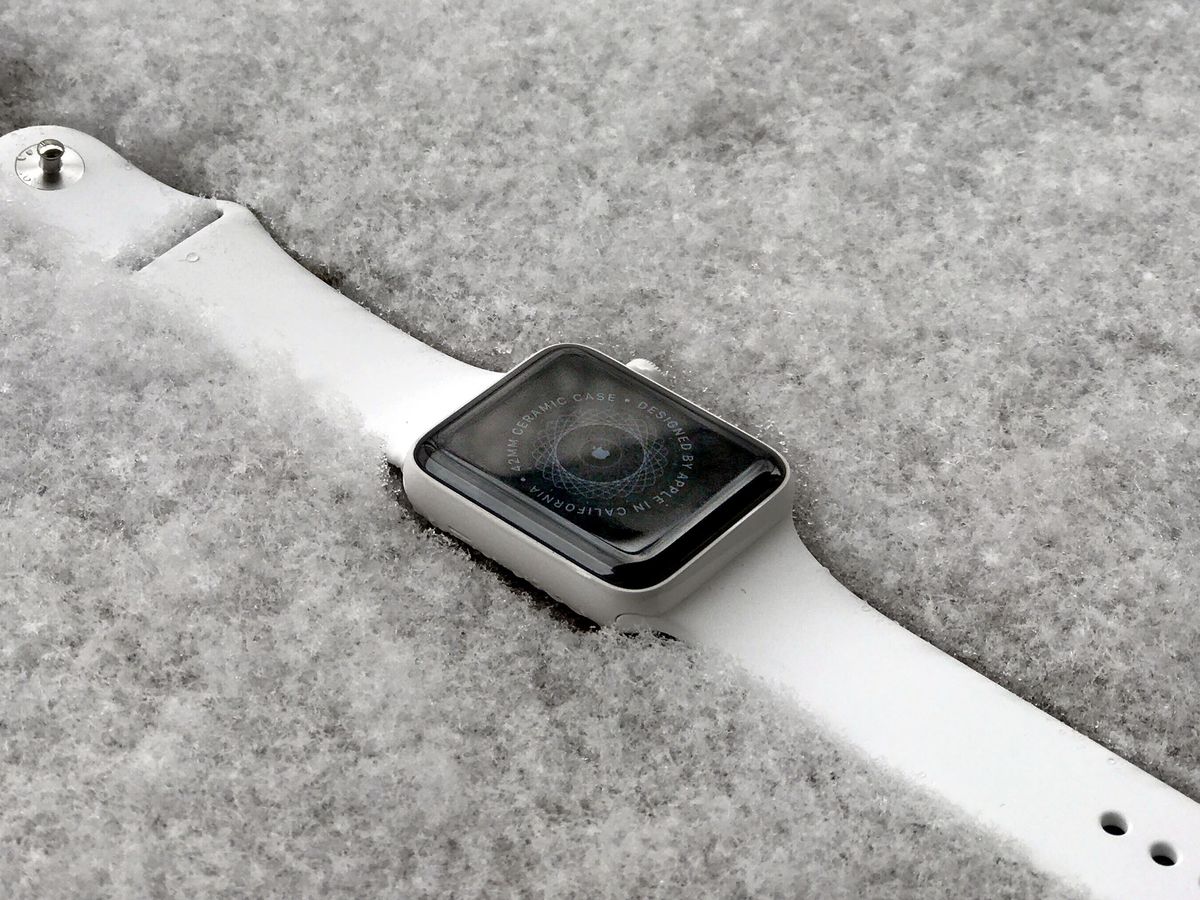
Ceramic isn't unusual for a watch. There have been ceramic watches for several decades, from IWC to Rado to Omega. Not many have been as fully ceramic as Apple Watch Edition, though, which uses it for pretty much everything on the casing that's not sapphire glass.
According to Apple, the company's particular blend of ceramic uses a high-strength zirconia powder combined with alumina to produce the desired white color. It's compression molded and "sintered" — a process that uses pressure and heat to turn a powder into a solid without liquefying it. That solid is then polished with — get this! — a diamond "slurry" that makes it smooth and shiny. The end result is perhaps the ultimate extension of the look that Jony Ive began with iPod: A perfect-seeming capsule of deep, rich white.
And it takes days to make, because of course it does.
Ceramic is incredibly hard. Harder even than stainless steel. Combined with the sapphire glass, the new Apple Watch Edition is the most scratch and scuff-proof product Apple's ever made.
There are different kinds of toughness, though. And, with ceramics, the worry has always been less about hardness and more about brittleness: The almost cliched image of a plate falling and shattering across the kitchen tiles.
As much as Apple's materials team worked to amplify the benefits of ceramics, though, they and the design team also worked to minimize the drawbacks. That involved both the precise type of ceramics Apple used, but also the design, and especially the curves, of the case itself.
I spoke with watchmaker Jon Edwards about the new Apple Watch Edition, and he said:
Apple's chosen a flavour of ceramic that is relatively robust, to help guard against breakage. In addition to this, though, the form of the case plays well to the ceramic's strength. If the design team had ceramic in its sights for the Apple Watch from day one, the form of the case is pure genius.In my experience working with ceramic watches, most damage tends to occur along sharp edges or where the ceramic is thin. The round curvature of the Apple Watch case will distribute the force of an impact and/or allow objects to easily glance off of its glassy, smooth surface. Edges that might pose a weakness are protected by the crown and strap.The subtle step in the case where is meets the sapphire crystal, I imagine, was introduced, in part, to offer an extra bit of protection for the sapphire, which would be more susceptible to cracking if impacted along its edge where it meets the ceramic case than the ceramic itself would be.
While tougher than metal, the ceramic is also slightly heavier weighing in at 45.6g compared to 28.2g for the aluminum and 41.9g for the steel. In practice, though, I don't notice it much. I've worn steel for most of the last eighteen months. Nike+ was breezy when I switched to it for a few weeks, but there's a substance to the steel — and now ceramic — that I enjoy.
The digital crown and side button are made the same way as the case and in the same color. Though the cap on the crown is black, matching the ceramics on the heart rate sensor. At first, I thought a white cap would have been better but the contrast, which also matches the darkness of the display, has grown on me.


So has the text on the back. It's not simply etched around the sensor the way it is on the metallic Watches, so you have to tilt it to see what it says. It uses a different process rumored to involve lasers and resins. The end result, though, pops. It looks like black ceramic embedded in white. Which is trippy.
That yin and yang, dark and light, bright and shadow, plays out at different scales across the casing and, depending on the band, the watch in general. It creates a look that's stunning but not overly fussy about it. It's obviously not metal, even at a glance, and that in itself stands out.
It's gorgeous on its own but also works as a canvas to set off whatever strap you pair it with.
Apple Watch Series 2 + watchOS 3
Previously, on iMore, Serenity Caldwell and I took a look at the aluminum and stainless steel Apple Watch Series 2, Apple Watch Series 1, Apple Watch Hermès Series 2, Apple Watch Nike+, and watchOS 3. Rather than recapitulate the standard hardware and software features, I invite you to check out:
- Apple Watch Series 2 review
- watchOS 3 review
- Apple Watch Series 2 + watch OS 3: Second opinion
- Apple Watch Hermès Series 2 review
- Apple Watch Nike+ review
The Bands
I may have an Apple Watch band problem. Or, an Apple Watch band solution, as I prefer to tell myself. Either way, I've bought a wide assortment of straps over the last eighteen months and I like to switch them up to suit the occasion and my mood.
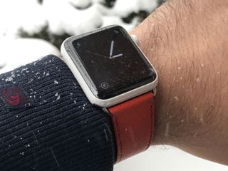
Apple Watch Edition Series 2 ships with a white fluoroelastomer sport band, which is underwhelming. I get that it's probably the only way to pair whites that are close to a perfect match, but the Edition brand, to me at least, demands something more in the box. The similarly priced Apple Watch Hermès, for example, comes with an orange fluoroelastomer sport band — but also Hermès leather.
The ideal, of course, would have been a white ceramic single deployment (deployant). It would have made the package much, much more expensive but as an option, I'd have taken it. Not only would it look stunning — several other watch makers have ceramic bands on the market, so image search away! — but it's safer as well. A band you don't have to fuss with to loop around your wrist is a watch you're a lot less likely to drop.
Hopefully, something like that is on Apple's roadmap.
Likewise, ceramic lugs. I love the way many of my straps look with Apple Watch Edition, but all the leathers have stainless steel lugs and I can never unsee the connection class. I'm wary of third-party lugs, especially in ceramic, so if Apple could start selling swappable lugs the way they sell replacement links for the bracelet, I'd be in band heaven.
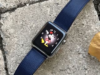
The leather loops don't have that problem, of course. Their lugs match the straps. I have the brown and midnight blue versions and both look great.
The sport bands are the same. I particularly love the red sport with the white ceramic. Because Canada. Woven Nylon makes for especially great pairings as well. The coffee and toasted caramel makes the white ceramic look like the froth atop a latte. I know some people with the full set and they color coordinate with their dress shirts to unsurprisingly terrific results. (Pro tip: The Numerals face has options to both color and pattern match the woven nylon bands.)


The black stainless steel Milanese loop is something else. It makes Apple Watch Edition look like a tux. Like Bond in a tux. It's just retro gadget high contrast cool in a barely contained way.
I'll stop there and point you to my Instagram if you want to see more. Lots more. Suffice it to say, bands and pairings is what makes Apple Watch not just so fashionable but so flexible and so personal.
And Apple Watch Edition in that deep, rich white really makes all the straps pop.
The Conclusion
When Apple first announced Watch Series 2, the Edition is the one I wanted to get. I like when Apple experiments with new materials and manufacturing processes. Some might care only so far as what it may or may not portent about future iPhones. But Apple ceramics make for an incredibly cool Watch right in the here and now.
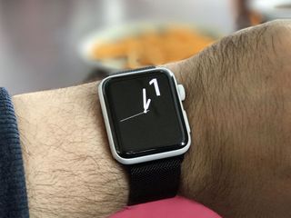
Because of the way it looks, I imagined Apple Watch Edition Series 2 would be lighter. Certainly lighter than the stainless steel I was used to. There's only a slight difference, though, and I barely notice it. Aluminum is much lighter than both, and much as I enjoy that freedom, I love this substance.
And I love how Apple continues to not only drive the computer to ever-more personal, ever-more portable places, but now the watch industry as well. There have been link bracelets for years but it took Apple to jumpstart making them easier to use, size, and swap. Likewise, there have been ceramic watches for decades, but Apple is applying their considerable resources to the material now, and in really clever, robust ways. It's the definition of raising all ships.
That said, I really hope, though, that Apple works out a way for us to have our casings and matching lugs too. As it currently stands, Apple Watch in polished stainless steel has the most, best pairings available to it. But the ceramic has a look so distinct I'm willing to accept a little clash around the edges, at least for now. You know, while I wait for the ceramic white deployant...
Yellow and rose 18 K gold were certainly extravagant but ultimately failed to resonate with Apple's existing market or really catch on with a new one. White ceramics is a better balance. It's exotic enough to sound enticing and look sensational, but broadly in line with the other high-end watches in Apple's collection, including Hermès.
In that sense, Apple Watch Edition Series 2 isn't just better affordable luxury, it's a much better bridge between Apple and the premium watch market. And that's who Apple's competing with now.

Rene Ritchie is one of the most respected Apple analysts in the business, reaching a combined audience of over 40 million readers a month. His YouTube channel, Vector, has over 90 thousand subscribers and 14 million views and his podcasts, including Debug, have been downloaded over 20 million times. He also regularly co-hosts MacBreak Weekly for the TWiT network and co-hosted CES Live! and Talk Mobile. Based in Montreal, Rene is a former director of product marketing, web developer, and graphic designer. He's authored several books and appeared on numerous television and radio segments to discuss Apple and the technology industry. When not working, he likes to cook, grapple, and spend time with his friends and family.
