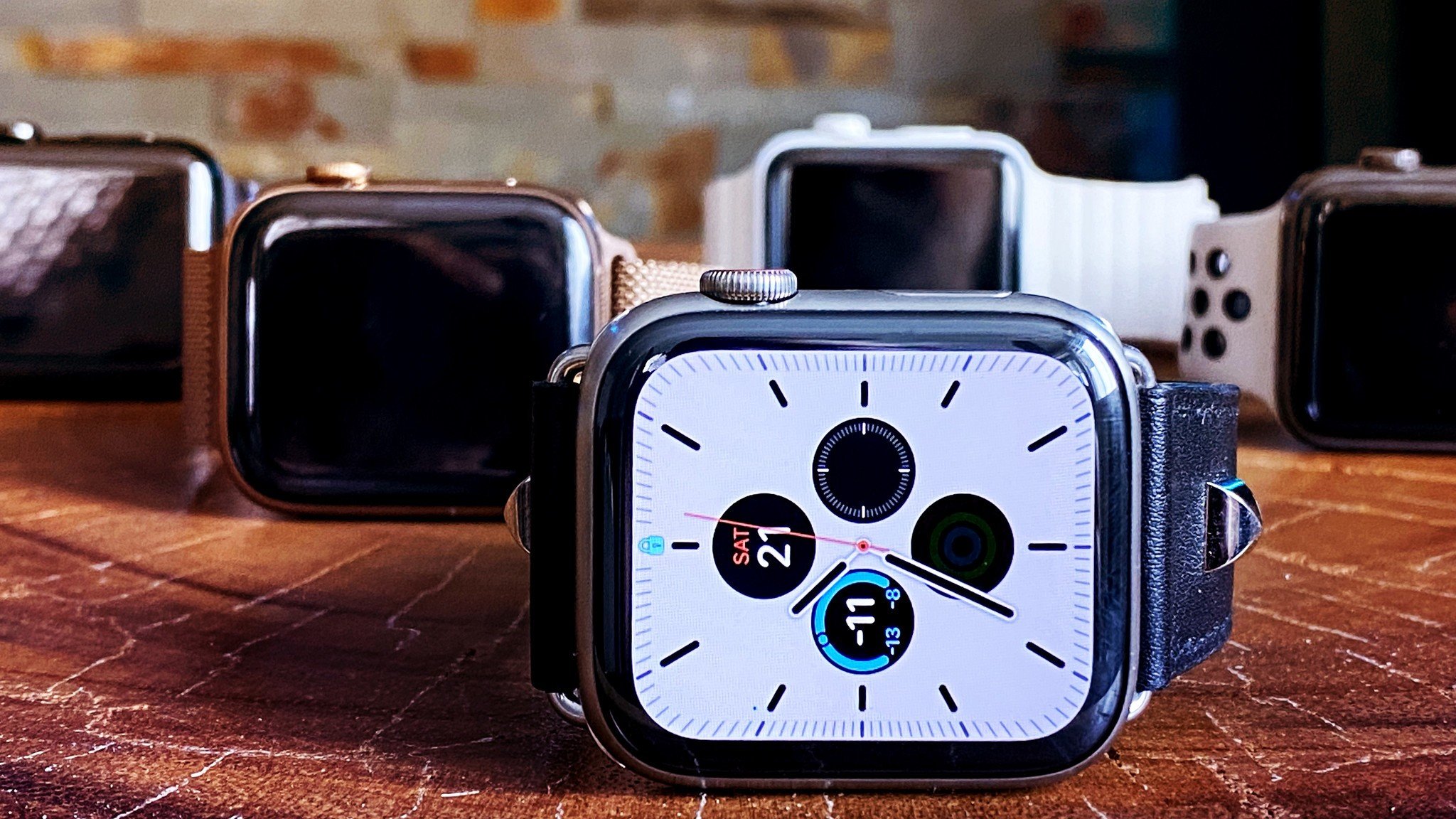
I've been using the Apple Watch Series 5 since just after Apple introduced it back in September of this year. In that time, I've used it awake and asleep, at home and while traveling, for movie tickets and boarding passes, to track physical activity and hydration, to control my home and stay in touch with the people I love, and to demonstrate its safety features probably more often than I should.
And, I've come to a few conclusions in that time.
I know, I know — conclusions are supposed to come at the end and not at the beginning, but just give this to me this one time!
It took Apple 5 years to nail the original iPhone concept. It would have been 4, but the new antenna system was better enough to push it to 5 for me.
I likewise, it took Apple 5 years to nail the original Watch concept. It also would have been 4, but the always-on display was, again, pivotal enough to push it for me.
In my Apple Watch Series 5 review, I said that the addition of always-on took it from being the best smartwatch in the world to being the best damn watch period. And, three months later, I stand by that. Absolutely. 100 percent.
But, it's also something more: Not just the best watch of the year, but the best gadget of the decade.
I know some of you will argue the iPad, and that's a really close second for me. But it's more of an escalation when it comes to ultra-personal computing, not a revelation. Same for the iPhone 4 or 4s. Others will argue Alexa or Tesla, but those are still limited and problematic in as many ways as they're miraculous. Still others, maybe AirPods, but I think those really have their most important decade ahead of them.
The Apple Watch was not only born smack dab in the middle of this decade, but constantly iterated and improved over the last five years with better performance, connectivity, edge-to-edgier display, and now… an always-on display. All of which are important. But more importantly. Most importantly. It does something no other piece of personal computing technology has done before, specifically, purposefully — it saves lives.
PCs, phones, tablets, all of them can and are used to save lives, of course, every day. But the Apple Watch was designed to save lives. It's a main area of focus, a primary function, an industry-leading technology-as-health-empowerment.
Not just heart-rate monitoring. Not just fall detection. Not just all the research projects. Not just ECG or International SOS. Not any one feature but all of them. All… by… design. Which, to me, makes it stand out above and beyond, even by and from the company that gave us the iPhone.
And that's why the Apple Watch, from inception to current culminating in the Series 5, is the gadget of the decade, and the most important device Apple has ever made.
But… that doesn't mean there aren't still aspects left for me to complain about. The opposite, in fact. Because that's what'll lead Apple Watch to get even better in the next decade.
Always On Display
Up until this September, the Apple Watch was unbelievable at just about everything… with the biggest, most glaring exception being… being a watch. But, like I said in my September review and my October update, the Series 5's always-on display has completely, utterly fixed that for me. With style.
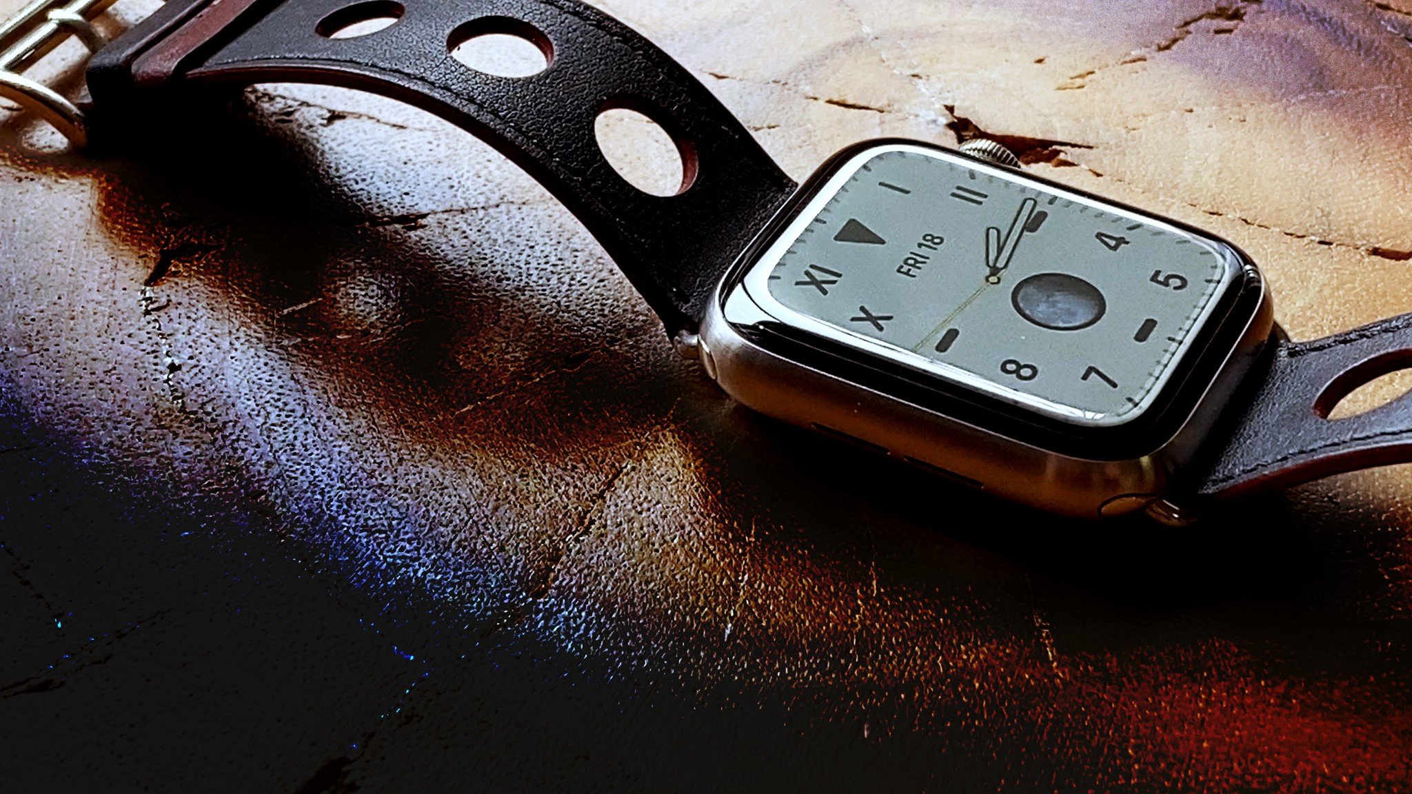
Where before I'd have to twist my wrist or tap the display just to see them time, an inconvenience at best, an embarrassment at worst, now I can just glance down, any where, any when, and find out immediately just when that any when actually is.
Over the last few months, I've spoken to doctors and other people in the services industry, athletes and people who work out at home or in classes, and all of them, to a one, have remarked at how transformative the always-on display has been for them.
It removes a tiny but frequent friction not in their workflows but in their lives.
Sure, those with traditional watches or other smartwatches that have had always-on displays for a while now will snicker and eye dash roll dot g i f so hard, but only until this cold, hard, reality five fingers it to their face:
Previously, everything else about the Apple Watch, from health and fitness to notifications and communications to remote control and content, was so damn great, users were willing to put up with the lack of always-on time just to keep using it.
Now we still have all that terrific Apple Watch stuff… and the best implementation of always-on display in the industry as well.
I covered the details in the original review, but the watch faces going from bright to dark and the refresh rate from 60hz to 1hz, means the experience stays consistent and your watch stays feeling like YOUR watch. There's a permanence to it, a beautiful illusion of a singular object like a traditional watch, but with all the computational advantages right behind it.
My only gripe remains where that experience does still get broken — notifications. You can see them, even in always-on mode. But when you tap on them, they don't pop up. The display brightens up, and then you have to tap on them again just to do what you originally wanted to do. In other words, you have to step out of low power mode before you can step into an action. That's two steps, which shatters that beautiful illusion just a bit.
I'm hoping Apple can figure out how to detect notification taps and piggyback the wake up with the popup, because then it would feel pretty damn near perfect.
I know some people complained about battery life with the always-on display as well, especially in the first few days and weeks following launch. I experienced that as well, but only for a day or two. Ever since, it's been just as good as the series 4 for me. It easily lasts until the end of the day, even with a couple of workouts in, and up to a day and a half, almost two days when I'm not working out.
And, honestly, I don't mind that. I'm old enough to remember Ma Bell hardline phones that plugged into the wall and never ran out of power. By comparison, modern smartphones have to be recharged every day or two but the functionality they provide makes the tradeoff more than worthwhile.
Same with the Watch for me. I had to wind some old watches, replace batteries every couple years on others, but even though I have to charge my Apple Watch every day or two, right alongside my phone, the functionality it provides is so far beyond any traditional watch or even week-long smartwatch, that the tradeoff is stratospherically more than worthwhile.
But, yeah, sure, the longer it gets at some point in the future, the better.
Also, I would still love to see a greater variety of digital faces and, of course, something that builds off the Photo face to let us make our own, more custom faces. Maybe even better than watch face apps, given the dependencies involved.
Otherwise, always-on so vastly improves my Apple Watch experience that I'd upgrade just for it, even if I didn't have to because of what I do.
I don't for a moment think that applies to everybody, maybe even many bodies. I have family members who are just fine without it. But, for me, someone who's been complaining loudly about the lack of it for as long as it's been lacking, and for anyone for whom unobtrusive time checking matters, always-on isn't just a nice to have. It's a must have.
Compass
I was snarky about Apple Watch Series 5 getting a compass when it was first announced. I'll admit that. It had been so long since the iPhone 3GS added it that I hadn't given it much if any thought. Not for years.
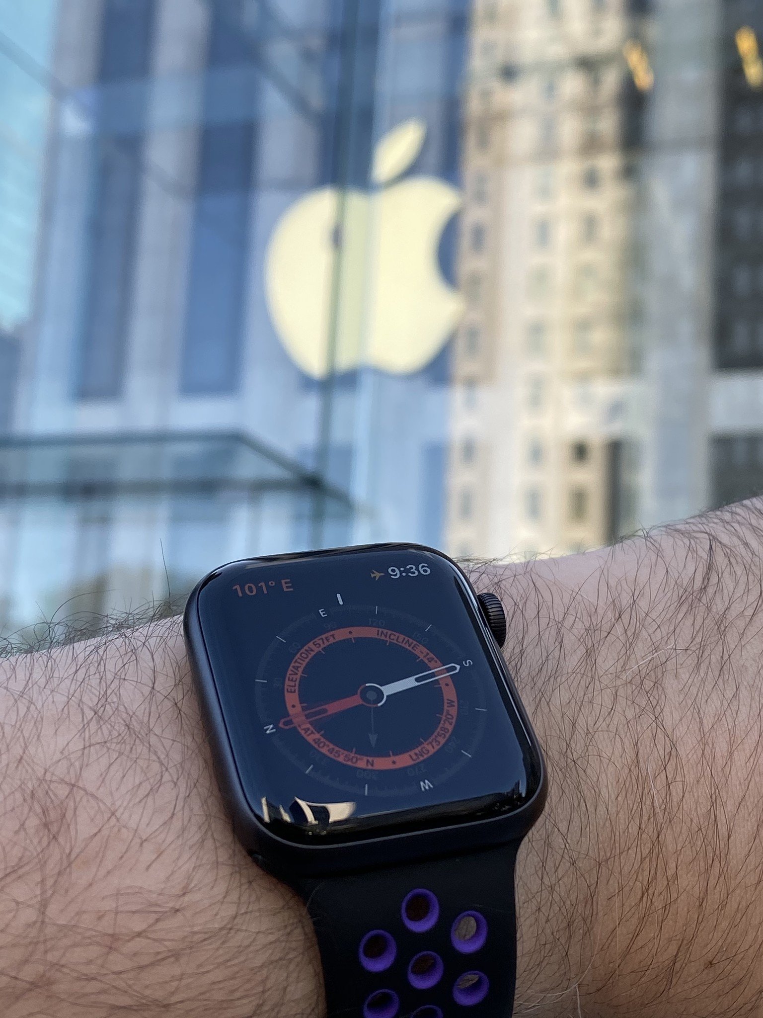
Now, I haven't used the standalone compass on the Watch for anything other than as a tech demo. Probably because I'm a mostly indoor human. You know, like an indoor pet. Not a wild one. The biggest hike I'll go on is a couple of hours in the nature preserve near my old house. If I did on of those iJustine or Settern hikes, I'm sure I'd have it on constantly just to get there and back again.
But, I really do like the way it manifests in the maps app for walking directions, which I use all the time while traveling. Also, I deeply, abidingly want the Apple Watch to become an independent device, separate from the iPhone the way the iPhone was made separate from the PC back with iOS 5.
And this gets us just one more step — or, I guess, one more step in the right direction — closer to that.
International SOS
Last year's Apple Watch Series 4, with fall detection and the ECG app, was a huge leap not just in personal technology but personal safety.
This year's international emergency calling is more of same…. but different. By making sure the new cellular radio has support for at least one band in almost every region, Apple is making sure the Watch can call for help, even if you have no iPhone with you and no active cell plan, in every one of those regions.
It means, if you're traveling, away from home, alone, lost, in danger, if something happens and you have an accident and can't find or reach your iPhone, you can still call for help.
It won't cover every possible situation every possible time but it will cover more than was possible ever before, and that's why I spent the beginning of this video saying just how important the Apple Watch's ever-increasing safety features really are.
Materials
The Apple Watch has proven to be something of a playground for Apple's material sciences team. Above and beyond the more typical aluminum and steel, they've gotten to experiment with gold, ceramics, and now, titanium.
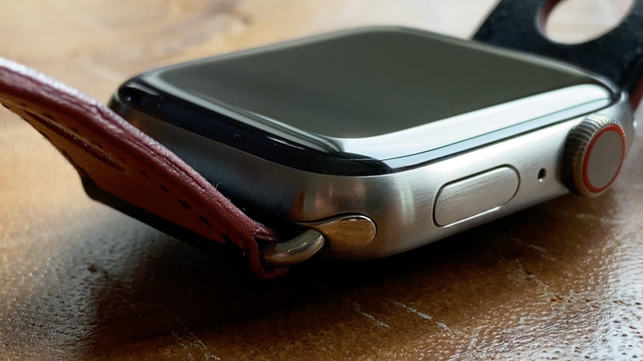
I've been wearing the brushed titanium Apple Watch series 5 for the last couple of months and it's held up perfectly. I don't know if it's the material itself, the brushed finish, or that special surface treatment Apple gave it, but I haven't been able to spot so much as a scratch on it.
I kind of miss not having gotten the ceramic this year, because I love the look. It really is the stormtrooper watch, as my in-universe agent, Dave Wiskus keeps telling me. I mean, just look at it. I don't know if it's the same great composition as my Series 3 white ceramic, but the material looks just as good to my eye, and the new design makes the overall watch look even better.
Now, I know some people will say paying extra simply for different and more expensive materials is insane given that the technology will probably be classified as vintage within 5 years and unusable within 7 to 10.
But watches have never been just about practicality. And some people spend money on far more frivolous and less useful things that don't even last that long, so I'll never judge. Though I would really love to see something similar to the iPhone upgrade program, but for Apple Watch. I don't know if there's enough of a secondary market yet to support it, like there is with the iPhone, but that Apple brought back the Series 3 for $199 makes me think we're getting there.
I will probably switch to the aluminum, by which I mean Nike version, and stick with it at some point.
But then, I say that every year.
watchOS
I haven't really thought that much about watchOS 6 over the last couple of months, and I mean that in the absolute best way possible. Apple devices really transcend when they nail the integration of hardware, software, and increasingly, services. With Apple Watch in particular though, watchOS has just come to feel like such a natural, singular part of the watch hardware, that I never really think about them as separate things any more.

Not in the in way both iOS 13 and macOS Catalina have forced me to think about them in relation to the iPhone, iPad, and Mac, this year in particular.
The noise feature is new and great, but it's just there on my watch face. I never have to even think about going to look for it.
And the on-device App Store is just the way it should work. Want app. Find app. Tap app. Have app. Done.
Sure, there still aren't a lot of apps, and some apps have been retired, but I think that's actually fine and proper by me.
I think Apple originally made a traditional-as-in-iPhone-style App Store for the Apple Watch just because, back then, that's what Apple did. Like, everything to them was a nail.
But, just like iPhone apps were often broken up to be smaller and more specific than Mac apps, Watches needed something even smaller and more hyper-specific, even than phones. So, the very best watch apps were even more broken up, into notification-based actions and informative complications.
If the Mac had suites and apps and the iPhone apps and tabs, the watch has tabs and buttons. If the apps disappeared and I just had the complications and notifications, I'd be fine, and I think that's entirely how it should be.
At least until we get even smaller voice-first AirPods quote-unquote apps in a few years. But I digress.
Fitness trends is something I really wanted to test out more, but travel and being under the weather in between completely harshened that mellow. I did spend a lot of time testing out more quantitative life apps.
I used a sleep tracker for the first time. As you may imagine, my sleep hygiene was non-existent at first. But, thanks to the app and some healthcare professionals in the family, I've gotten it back up to almost human levels. Mostly.
Same with hydration. I'm drinking more water more often than ever before.
I do have one request for watchOS 7 though — smart notification coalescence.
I said this back with Apple launched their push notification service but if we're not all very, very careful, notification quickly becomes interruption and information inevitably becomes distraction. That's why I have almost all notifications for almost all things turned off. But, for these, I need them on.
So, while I get the advantages of being told to stand up, to drink up, and to pay attention to a score of other things, I really want all those things to be coordinated.
Here's what I mean: The hydration app wants to tell me to get more water. So, it dispatches that to the central smart system. That system checks to see if I've already made my stand goal for the hour, if not, it cues a single notification telling me to stand up and get some water — at the same time. If I have unread messages, it also shows me those while I'm standing up and hydrating.
That way, I'm only interrupted 10 minutes before every hour, and not randomly throughout the hour.
Bundle it all into a next-gen assistant while you're at it, because that's really the job of a good hyper-personal assistant. Giving you that productivity boost.
No pressure.
More navigation links:
Apple
- Apple across the decade
- Rene Ritchie's product of the decade
- The iPad
- iPhone 4s
- Qi charging
- iPhone 5c
- iOS 8
- Apple Watch
- Pokémon Go
- Nintendo Switch
- iPad Pro
- iPhone 11 Pro
- Nintendo
- Top Google stories of the decade
- Google Home & Google Assistant
- Moto X
- Roku
- Chromecast & Google Cast
- HDR+
- Samsung Galaxy S7
- Alexa & Amazon Echo
- HTC One M7
- Robot Vacuums
- Google Cardboard
- Google Wifi
Microsoft

Rene Ritchie is one of the most respected Apple analysts in the business, reaching a combined audience of over 40 million readers a month. His YouTube channel, Vector, has over 90 thousand subscribers and 14 million views and his podcasts, including Debug, have been downloaded over 20 million times. He also regularly co-hosts MacBreak Weekly for the TWiT network and co-hosted CES Live! and Talk Mobile. Based in Montreal, Rene is a former director of product marketing, web developer, and graphic designer. He's authored several books and appeared on numerous television and radio segments to discuss Apple and the technology industry. When not working, he likes to cook, grapple, and spend time with his friends and family.
