Apple Watch Series 4 Preview: What's coming... and not

Next to a new iPhone - or three new iPhones — a new Apple Watch in September is about the safest bet in tech. Even now, approaching four versions in, the two products remain partners by necessity if not design. I've called the Watch a shuttlecraft to the iPhone's starship, and that's why it just makes sense that when Apple increments the pocket computer, the company increments the wrist computer as well. They're not just better together, though they inarguably are, the Watch still depends on the iPhone, and the iPhone, increasingly, is made more valuable by the Watch.
Don't want to read? Watch the video above and subscribe for more.
I've said it before — I've done a whole video on it before — but I think Apple Watch is the most important product Apple makes. Not iPhone. Not Mac. Apple Watch. Why? Because it saves lives in a way only a connected device always connected to our bodies can. And that makes me particularly excited about what comes next.
So, what will we see from Apple Watch Series 4 this year?
New design... ish
First, a new design. Kinda. No, not a new shape. Those who thought the event invitations were harbingers of a round Apple Watch casing — or… I dunno, donut shaped? — can be forgiven for not recognizing what it really was, since the Apple Park logo isn't exactly ubiquitous yet. But that's what that was. The one Ring of Apple's new campus where, next door at the Steve Jobs Theater, the event is again being held.
No, Apple is still all in on the rounded rectangle. Not only is a classic shape seen worn by the likes of Steve Jobs and Princess Leah, it's still better for information display than anything else. It's why the iPhone isn't a circle or the iMac a porthole.
In the shift from timepieces to computing appliances, watches adapted to the requirements of digital data display the same way phones did. Seen a banana-shaped handset from Apple or Google or Samsung lately? Same reason.
Master your iPhone in minutes
iMore offers spot-on advice and guidance from our team of experts, with decades of Apple device experience to lean on. Learn more with iMore!
Sure, some companies are still beating the round drum as a differentiator the way they used to beat Flash on mobile, but my guess, for full-on, display-centric, wrist-worn computing, it'll last only about as long.
A company, even Apple, could design a fully round interface for the Watch — or the phone or the desktop, mind you — but the laws of squared circles means it'll always come at a loss.
Also, anything that threatens the compatibility of existing bands, is still a non-starter. Thankfully so, because the day that happens you'll find me curled up outside the venue, clutching all by bands, sobbing in despair. Let''s just all remember that, ok?
No Watch for Android

Likewise, Apple Watch for Android. Sure, Apple brought the iPod to Windows, and bringing Watch to Android would open up the market. But Apple also took the iPhone post-PC. My guess is, rather than spend the time and effort to make Apple Watch compatible with Android, Apple would rather make Watch independent from iPhone. Then, it's not relying on either platform. It's its own platform, and it's open to everyone.
Edge-to-edge
So, what kind of redesign are we getting? The same kind the iPhone got last year and the same kind iPad, inversely, is getting this year: the deletion of the bezels.
Yes, we're all, finally, going to complete that big black ring that's been around all of our watches for a year. And, in so doing, the display is going to go a lot closer to edge-to-edge, just like it's done on iPhone X.
Unlike the next iPad, which sounds like it'll remove bezel to keep the screen size the same, Apple Watch sounds like it'll increase screen size to fill the existing casing. So, the watches themselves will remain the same size as today's 38mm and 42mm models, the displays will just be bigger inside them.
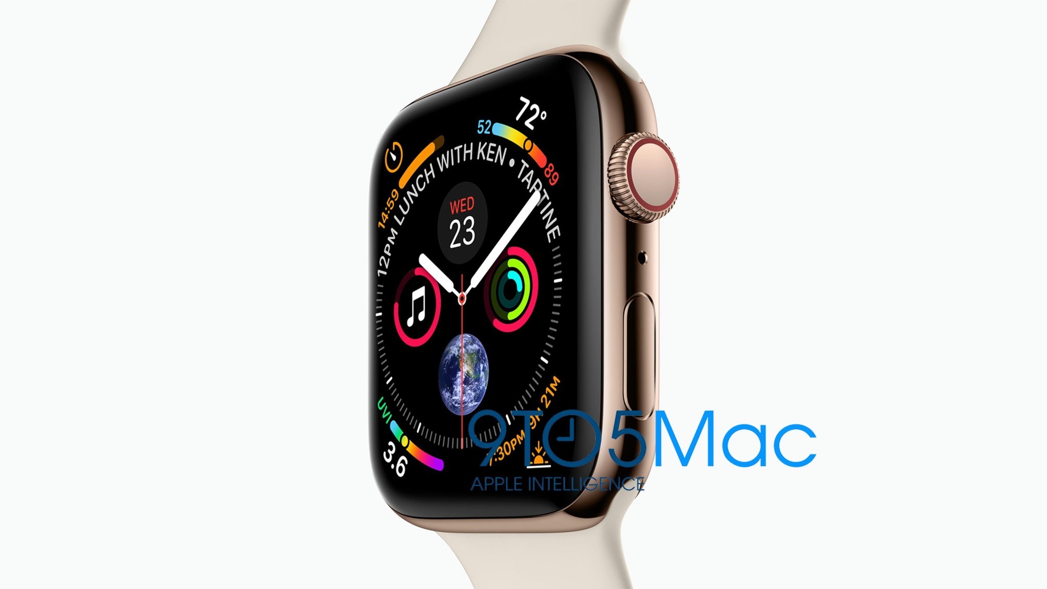
Based on a marketing image discovered by 9to5Mac, it looks like Apple will be making use of all that extra space with new super-complications. (That's just a name I'm making up to describe them.)
Spoiler Warning
Now, before I get into this next part, a quick word about spoilers and a note to bloggers, podcasters, and YouTubers who've suggested any leaks in advance of the September Event came from Apple itself. Stop. Just stop. There is no universe where Phil Schiller and Greg Jozwiac are anything but apoplectic that these images got out.
There is no amount of pre-show quote-unquote-buzz that a leaked product shot could generate ahead of a show that would make up for the millions of dollars of free marketing actually surprising everyone — especially the mainstream media — provides at the show itself.
Also, on spoilers in general, you have two choices: Avoid them the way you would a script leak for the Game of Thrones or Infinity Wars finales, or dive into them knowing that you're removing any chance for the presentation itself to surprise and delight you. Both are good. Both are fine. If you dive into them, though, and then claim the event was boring and lacking in surprise, then you're just being a jerk. That's on you.
Anyway, I'm going to try and give you a middle ground by pointing out just how many questions 9to5's image raises rather than answers.
Super-complicated

On the surface, it looks like Apple is taking a page from Edward Tufte's treatises on informational design. These super-complications not only provide glanceable data, but glanceable context.
The watch face, in addition to the hour, minute, and second hand, shows 9 other hybrid complications.
If you're not familiar with the term "complication" from the watch trade, it just means feature. Back when they had to add all these features mechanically, the process was literally made more complicated by every additional one they added.
They're hybrid or, as I said, super complications because they're doing more than one thing each.
The simple date is presented in context of the day, which is a classic. The fitness rings and music, which Apple has done before, show how close they are to completion. But taken to the next level, the timer is shown in context of the full time span, the current temperature in context of where it sits between the daily high and low. And so on. Its not just the position along a curve either — even the color provides additional data, like relative coolness or hotness.
Epitomizing just how much Apple is using the tiny-but-no-longer-quite-so-tiny space, the next appointments is displayed around the analog clock face. There's no way to tell from a single static image if the position changes depending on the time of the appointment, but just seeing it "on the clock" adds value.
And this is where the questions come in: Will the position change depending on the time of the next event? What other complications can go into and make use of these new complication slots? Will they be available on both sizes of Apple Watch or just the larger of the two? Will they be available on multiple new watch faces or just a few? Will they be open to third-party developers or will Apple spend a year working the kinks out and coming up with best practices first?
Most importantly for me, will there finally be enough complications — or super-complications — available on the photo face that I can essentially create the custom Superman watch I've been only scratching the surface of since the original?
What does the digital, presumably modular version of this watch face look like? Is it akin to a data dashboard that can get me through most of my work day at a glance? And how much will I really be able to take in at a glance? Will my brain be able to quickly sort and spot what I need, or will it prove overwhelming in use?
Either way, Carousel, which was the Watch version of the iPhone's Springboard app launcher, never really worked out. Watch face as launcher, which Apple's been working towards for several generations now, seems like a much better, more logical fit, and this looks like another level.
Thick or thin
Some people also think the 9to5 image shows a thinner Apple Watch. I'm hesitant to make any assumptions one way or another. Last year, the Watch stayed the same depth but the sensor array at the bottom got ever-so-slightly thicker. Like a millimeter, but still: thicker.
I know many want a thinner watch. In the watch world, the thickness determines how well it fits under the cuffs of your shirt and is super important. In the Apple Watch world, it directly correlates to the size of the battery as well, and in mobile, everything — everything — is paid for in battery.
Every reduction in size is paid for in battery life. Every addition of feature, also paid for in battery life.
And, as much as I'd like a thinner Apple Watch, right now I'd like an Apple Watch that spends any left-over battery budget on always-on time instead.
A bigger display will likely already cost some battery. Some of that might be mitigated by new efficiencies or geometries, but I'm not expecting any miracles unless and until I see them.
And more
There looks to be an extra microphone there, sandwiched between the crown and side button. Since watchOS 5 ditches the Hey Siri from Hey Siri and just lets you raise and speak, the better it can understand what you speak… the better.
And the crown looks to be going from a full-on red LTE dot to a more subdued red loop. I get the horological nod here, but it still sticks out to me. More interesting could be how, if at all, the Watch's LTE connectivity evolves and improves this year. Or, you know, if my carrier finally gets around to adding Watch to its service…
New health and fitness sensors to power new health and fitness features are also always possible as well, it's just a question of whether they're ready or not. Those are always making a splash in the media but getting working versions into products that ship in the tens of millions a year takes time.
That's just for Apple Watch Series 4. Will Apple Watch Series 1 stick around for another year at an even lower and more affordable entry-level price? Will it get replaced by a discounted Series 2? Will LTE become more mass market with a discounted Series 3? All of the above? We'll have to wait and see. Though, undeniably, the advent of the entry-level Apple Watch has done a lot to increase its market share, even if Apple Watch is pretty much the entire market already.
Fall fashions
As for new bands, there'll be a new Fall collection. Apple has made those fashionable and seasonal, and they rotate in new designs and new colors every year and every half or quarter. Much to my delight but my wallet's constant displeasure.
With the addition of nylon bands and loops, and leather cuffs and ralleys, it's getting harder to see what gaps Apple still has to fill, but that's what Jony Ive and Marc Newson are for.
Hardware aside, it's also going to be another big year for software with watchOS 5. As much as the new hardware features are cool, it's the software update that adds lasting value. Those bits breathe new life into even years-old atoms, and on a regular basis.
So, that's what I'm looking for in Apple Watch Series 4. Let me know what it'll take to get you to upgrade or strap one on for the first time.

Rene Ritchie is one of the most respected Apple analysts in the business, reaching a combined audience of over 40 million readers a month. His YouTube channel, Vector, has over 90 thousand subscribers and 14 million views and his podcasts, including Debug, have been downloaded over 20 million times. He also regularly co-hosts MacBreak Weekly for the TWiT network and co-hosted CES Live! and Talk Mobile. Based in Montreal, Rene is a former director of product marketing, web developer, and graphic designer. He's authored several books and appeared on numerous television and radio segments to discuss Apple and the technology industry. When not working, he likes to cook, grapple, and spend time with his friends and family.
