I've now been wearing and using Apple Watch Series 4 for about 2 weeks, since just after the September 12 event at the Steve Jobs theater. I did my initial, deep dive review after a week of fairly frenzied testing. I'm revisiting it now after a second week of somewhat more typical usage — travel, transactions, tracking workouts and tasks, keeping up to speed with my life and staying connected.
So, let's take a second look.
1. Gold is the new ceramic
I spent most of the last two weeks on a 44mm space gray Apple Watch Series 4. I've used the Sport, as they were previously known, and the Nike+, off an on since Series 0 and I've always liked them. They've always had the best price and the best taptic performance.
https://www.instagram.com/p/BoPwsx4AYDF/?taken-by=reneritchie
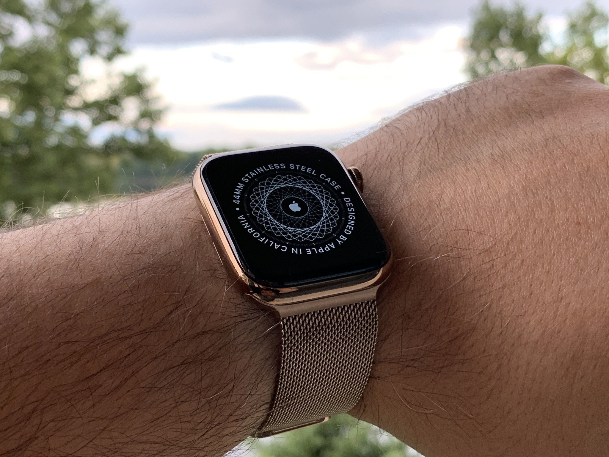
But I also love watches and that means loving materials so I've spent as much time, if not more, on the stainless steels and, more recently, the ceramic editions. But this year, absent editions, it's all about the new gold.
Now, this gold isn't the same as the aJust from everything I need to clean it now so maybe I'll do that afteroriginal gold. That was 18K yellow or rose. I never got into those. I get why Apple made them — it got them into fashion and watch-world conversations, and gained the mind-share no aluminum or steel casing ever would have. But they were ultimately so expensive and so niche that I also get why they almost immediately stopped. Impact, achieved.
When I first saw the new gold, I wasn't sure it'd be for me. I liked it but I wasn't sure I could pull it off. Now, after wearing it for a few days, I love it, and I think almost anyone could pull it off.
It's not yellow, it's not rose. It's deeper, with a finish that varies between blush and bronze depending on the light. The gold Milanese band is absolutely terrific, just as you'd expect. But it also looks great with various white, off-white, black, and off-black bands as well.
I also agree with John Gruber: The taptics on the steel this year feel better than ever, maybe even on par with the previously best-in-class aluminum.
If you really want to push steel into the more traditional edition price range, you can pair it with some of the Hermes bands. Yeah, the lugs are going the clash, just as they have since launch, but if that doesn't make your eyes bleed, a lot of the combos look terrific, especially the deep blues and blacks. Though, yeah, I'm waiting to try it with the new Indigo and Orange.
But here's the thing: You don't have to spend anywhere nearly that much. The gold steel looks phenomenal all on its own. And, yeah, if you don't care about sapphire screens and PVD protection, you can get the gold aluminum and it looks every bit as terrific this year.
2. When you move it moves
It took me a little while to figure this out but Apple has been tweaking the algorithm it uses to detect and credit you for the Move Ring.
See, here's the thing: I'm a fidgeter. I'm a fidget her. Whether I'm standing or sitting, I'm never static. At my standing desk, or just standing around, I'm constantly shifting weight and position, and even when I'm sitting it's the opposite of still. It got me in a lot of trouble in school but now it's getting me credit where credit's due for Activity.
You can't fidget your way into filling the Move Ring, of course, but it does help round out your results. So, if you, like me, have been noticing a little more red a lit more quickly, that's the reason why.
Also terrific is the auto-start and stop workouts. Previously, I'd forget to start or stop them all the damn time, and that meant I missed out on credit or got credit for such minimal amounts of activity my friends would see the sharing alert, shake their heads, and immediately send me back trash talk, sleepy head emoji, a pizza slice… you know, punishment for my lack of attention.
But now, when I head out without starting a workout, I get a tap and a gentle reminder to start the clock. confirm it, and it back-fills the credit to pretty much when I started. Same when I get back and head for water before I close out the workout. Gentle reminder to stop the clock.
I've needed to use it more than I'm comfortable to admit — luckily no brain gym tracking yet or I'd be nowhere near getting that award! — and it's made a huge difference.
Speaking of awards, there's a bug in the current version of watchOS that's causing a few of the special occasion awards not to show up. Apple's aware of it and working on a fix. So don't worry, they're not gone for good.
Overall, I both love and hate that my watch is now smarter than me.
3. It's complicated
When I first saw the new Infograph watch face I wasn't sure if it would be super-complicated in the best way or just over complicated in the worst. Turns out, I really like it. It's become a digital dash board for my day. I prefer the amount of complications on the analog Infograph but the glanceablity of the modular infograph, so I bounce between them a lot.
https://www.instagram.com/p/BoFRebMAd5P/?taken-by=reneritchie
I really wish there was an option for seconds on the modular like there is on the Activity Face. Sometimes I just really need precise time. I also wish Apple hadn't eradicated Time Travel from every face that isn't Solar. It renders the digital crown kind of useless on the default screen when, in a perfect world, spinning it would march the Calendar complication, if present, backwards or forwards through your day, so you could access your digitally assisted memory without having to tap through. I know it's tricky to figure out what should time travel and confusing for people who hit it by accident, but the off-by-default-there-if-you-want-it settings in watchOS 4 really felt like the best of all worlds.
I also miss not having the Messages or Mail complications available on Infograph. I get that they're still the old, simple versions and not the fancy new informationally dense hotness, but seeing if you had messages without having to pull down Notification Center, and being able to go to them in a tap, was super convenient.
I'm currently using a work-around in the form of a frequent contact Infograph face, which solves the easy access part if not the glanceable new messages part. So, here's hoping Apple has some hot, informationally dense, new versions of Messages and Mail coming to Infograph in the near future.
4. Connections are hard
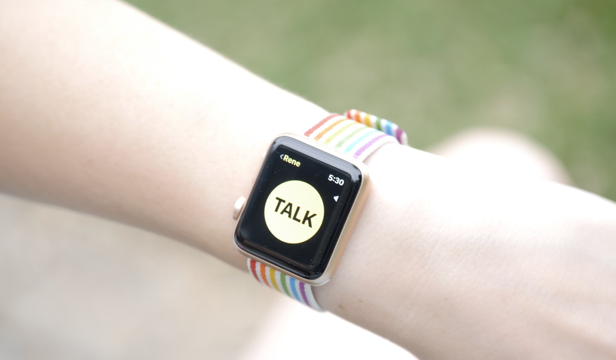
You know the old joke about a couple or family sitting in the same room but, instead of talking to each other, they're using the World of Warcraft or whatever in-game chat to communicate? Well, the new walkie-talkie feature in watchOS 5 is the opposite of that.

First, because you'll get wicked feedback if you try to use it while lounging on the same sofa, but more importantly, because it brings voice back to IM and in a way that's much more immediate than volleying pre-recordings back and forth.
Yeah, it's push to talk like your grandparents NexTel, but it's also a great way to send a quick but important message to a friend or family member without having to shout across rooms, up or down flights of stairs, or, impossibly, out windows, down streets, and across towns.
That's the only thing restraining my use right now. It can take some time to connect if you haven't used it very recently, and if it doesn't connect, it's impossible to tell why. Network error? Do not disturb or not online on the other end? Being able to yell out someone's watch is a lot of power to have as well, so I'm also kinda cautious about using and potentially abusing it.
When Walkie Talkie works, though, it's magic. And I kinda want to try it out at the Magic Kingdom…
Same with raise-to-siri. It ignores me just often enough that I've gone back to saying Heeeeeeey, which feels so watchOS 4.
To be continued...
While it still can't replace my iPhone, increasingly Apple Watch is replacing more and more of the brief, repetitive, but important tasks that were previously the exclusive domain of my iPhone. Checking the time, glancing at my next appointment or reminder, bossing around HomeKit or tapping to pay pretty much everywhere.
iPhone is still the most critical device in my life but Apple Watch is the one I now feel the deepest personal connection to. It's the one I feel naked when I'm not wearing, and the one I hesitate the most to trusting with the new betas every summer.
Apple Watch Series 4 has been likened to iPhone 4 in terms of the revelation of its redesign. Interestingly, that was also the last tethered version of the iPhone before iOS 5 took it to the iCloud. watchOS 5 is still further away, but looking at everything it can do, I can start to see that future.
It's already the closest thing we have to external cybernetics. A connected little artificially intelligent module on our wrist that securely, privately, learns all it can about us so it can help us be and become the best us.
I'll update again after a month or so. Meanwhile, let me know — how's Apple Watch Series 4 working for you?

Rene Ritchie is one of the most respected Apple analysts in the business, reaching a combined audience of over 40 million readers a month. His YouTube channel, Vector, has over 90 thousand subscribers and 14 million views and his podcasts, including Debug, have been downloaded over 20 million times. He also regularly co-hosts MacBreak Weekly for the TWiT network and co-hosted CES Live! and Talk Mobile. Based in Montreal, Rene is a former director of product marketing, web developer, and graphic designer. He's authored several books and appeared on numerous television and radio segments to discuss Apple and the technology industry. When not working, he likes to cook, grapple, and spend time with his friends and family.

