Apple execs Craig Federighi and Alan Dye discuss Dynamic Island in new interview
Discussing the new shift in iPhone usability.

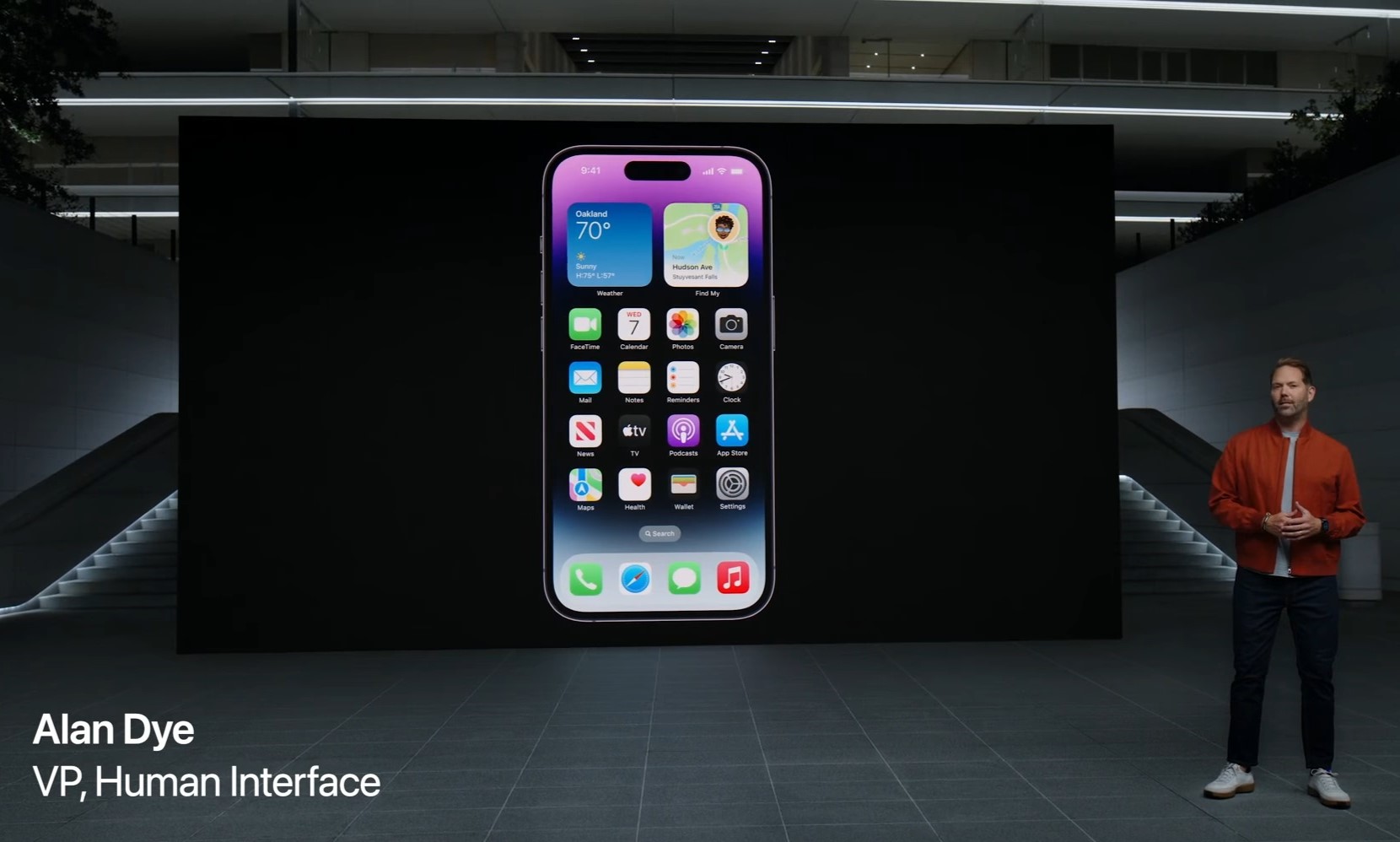
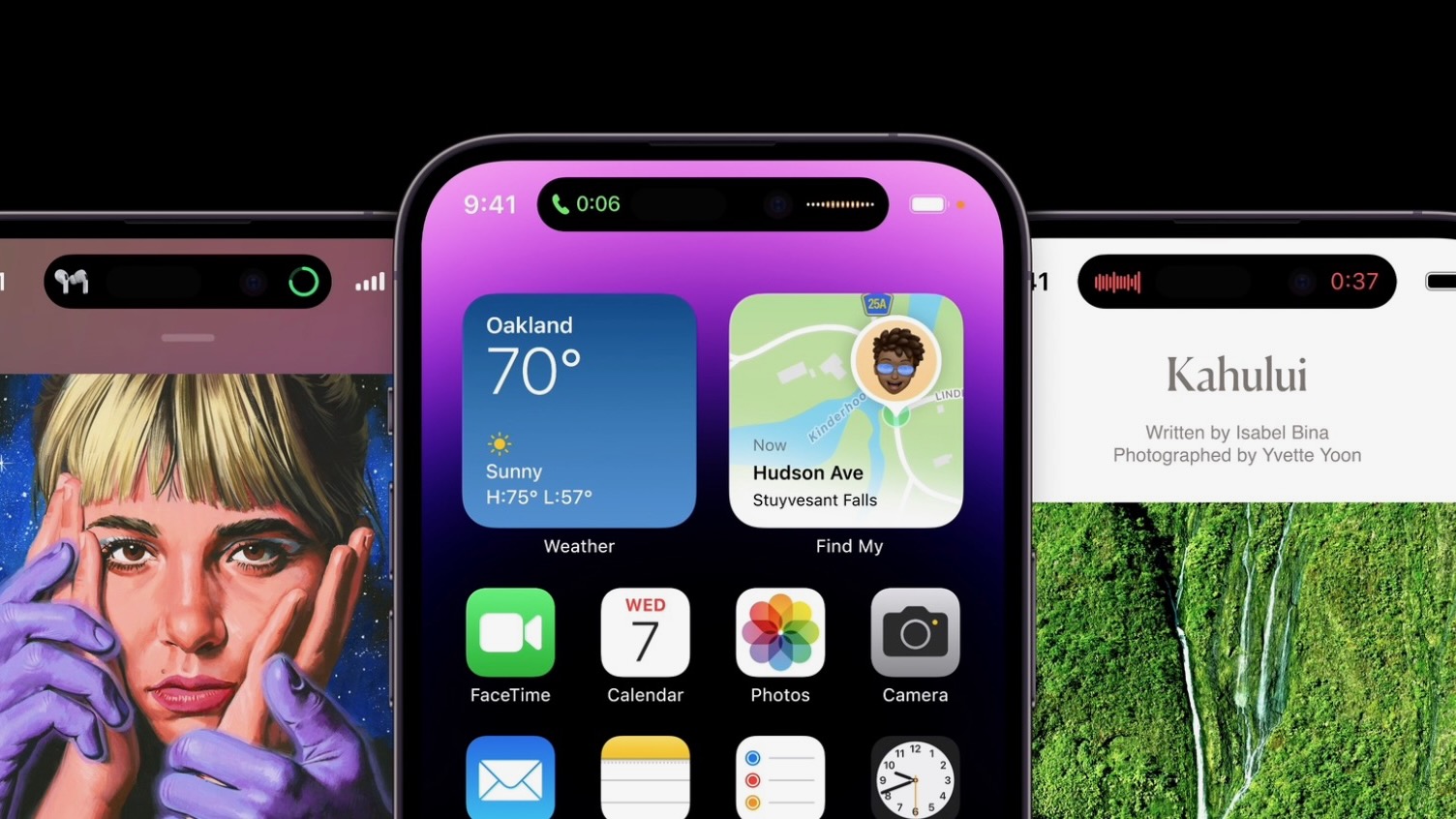
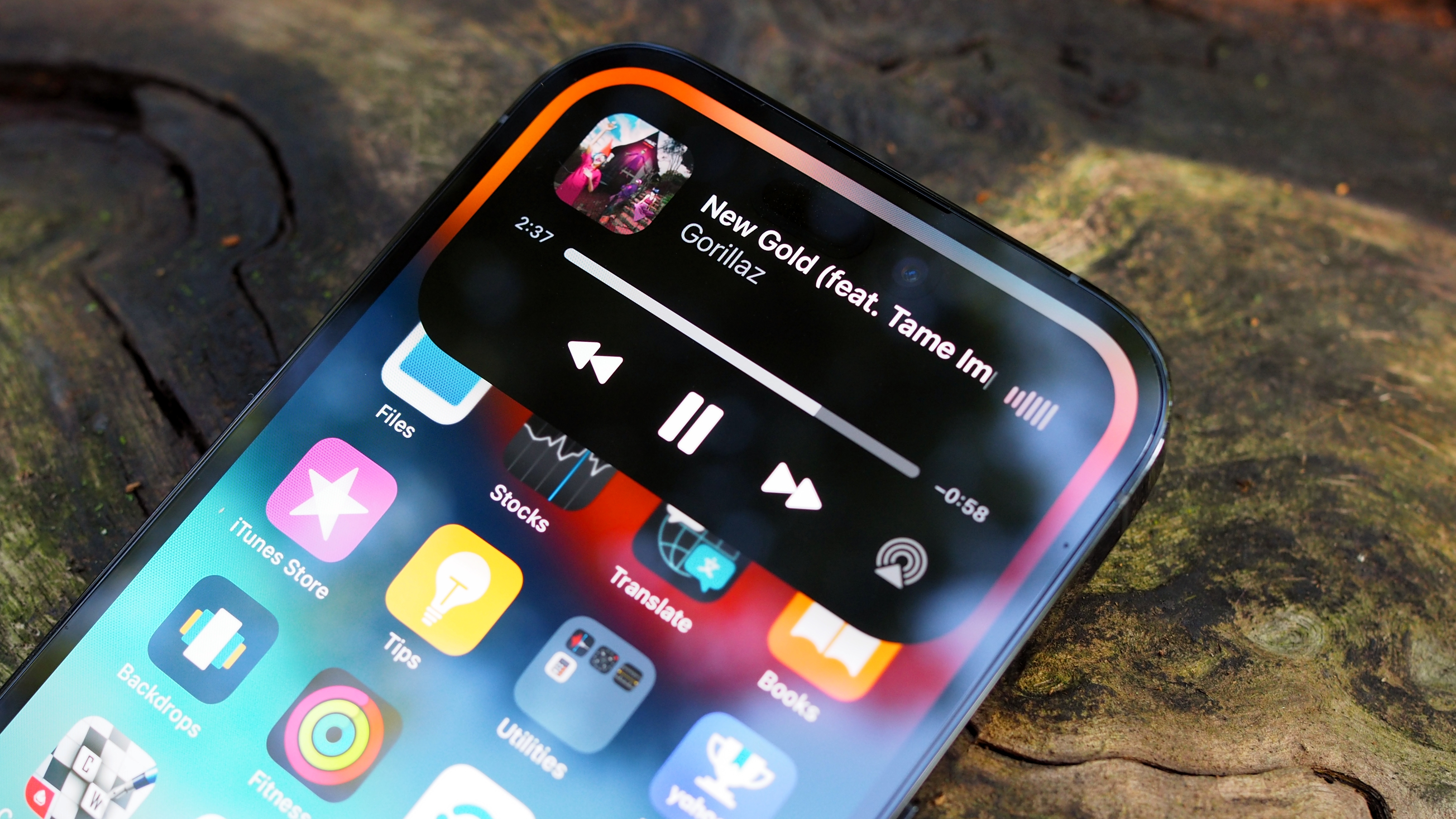
Apple's design changes always get a ton of attention, and the case is no different with the new Dynamic Island. Introduced with the iPhone 14 Pro series recently, Dynamic Island is a replacement for the notch. The new pill-shape cut-out comes with a whole interface built around it.
Apple's senior vice president of software engineering Craig Federighi, and vice president of human interface design, Alan Dye, recently discussed the development of Dynamic Island, in an interview with the Japanese magazine Axis. (Via MacRumors.)
Biggest change since the iPhone X, say Apple execs

Craig Federighi discussed how Dynamic Island is the biggest usability change to the iPhone since the iPhone X came out. He said, "This is probably the first major operation change in five years since the iPhone X came out. Various operations on the iPhone have been completely redesigned, such as how to switch between apps, etc. This new feature is also a change that greatly changes the appearance of the iPhone. It was an exciting challenge for us to have everything happening on our iPhone right now in one small, interactive place."
Whether you like it or not, one can say for certain that Dynamic Island is a feature that oozes the Apple flavor. Alan Dye echoed this sentiment, "At Apple, our hardware and software partners gather in the same studio to solve problems together for one purpose. We made it possible to display the inner workings in real time.I think it's a good example of Apple-like development."
Dye also confirmed that while it was difficult to determine who came up with the idea, Dynamic Island came from discussions that have spanned over several years. It seemed like the natural progression to them, explained Dye.

"If you think about it, the status bar is small, but it plays the role of providing important information that users always use. So there was talk of doing something more special in this area anyway, something very elegant and yet very useful." He added that the brakthrough moment was the realization that the Island could be bigger than the status bar area.
Frederighi said that Dynamic Island is like a new personality for the iPhone. Explaining that, he said, "At the Steve Jobs Theater (where the presentation was held), the moment this function was projected on the screen and the sensor area swelled to display the status, everyone at the venue held their breath and fell silent. I heard a voice of surprise. It was the same when we first saw this feature inside Apple. For me personally, it felt like the iPhone had a new, living identity. When you swipe up on an app, it absorbs it and the island bulges a bit. It's a very delicate animation effect, and although it's a bit different from anthropomorphic, I think it gave the iPhone a new, strong personality and vitality."
Master your iPhone in minutes
iMore offers spot-on advice and guidance from our team of experts, with decades of Apple device experience to lean on. Learn more with iMore!
Well, Apple sure seems to be happy with Dynamic Island, and it seems like more users may get to experience it if the reports about the feature coming to the main iPhone 15 lineup next year are true. For now, Apple has the feature available only on its best iPhones, the iPhone 14 Pro series.

Palash has been a technology and entertainment journalist since 2013. Starting with Android news and features, he has also worked as the news head for Wiki of Thrones, and a freelance writer for Windows Central, Observer, MakeUseOf, MySmartPrice, ThinkComputers, and others. He also worked as a writer and journalist for Android Authority, covering computing, before returning to freelancing all over town.
