Has Apple forgotten about the user experience?
Usability seems to be on the decline with Apple products.

Usability has been Apple's forte right from the beginning. The company has even used it as a selling point to market its products, with a bunch of its advertising pointing to how its products (and now services), "just work." However, a few of its recent choices seem to be pointing towards a shift away from usability.
Make no mistake, Apple has had a few anomalies on the way. A few exceptions to the rule, like the infamous charging solution for the Magic Mouse which goes against everything the company claims to stand for. However, of late, these exceptions have piled up to make a convoluted user experience look like the rule, rather than an exception. Has Apple lost the plot?
Exhibit A: Stage Manager

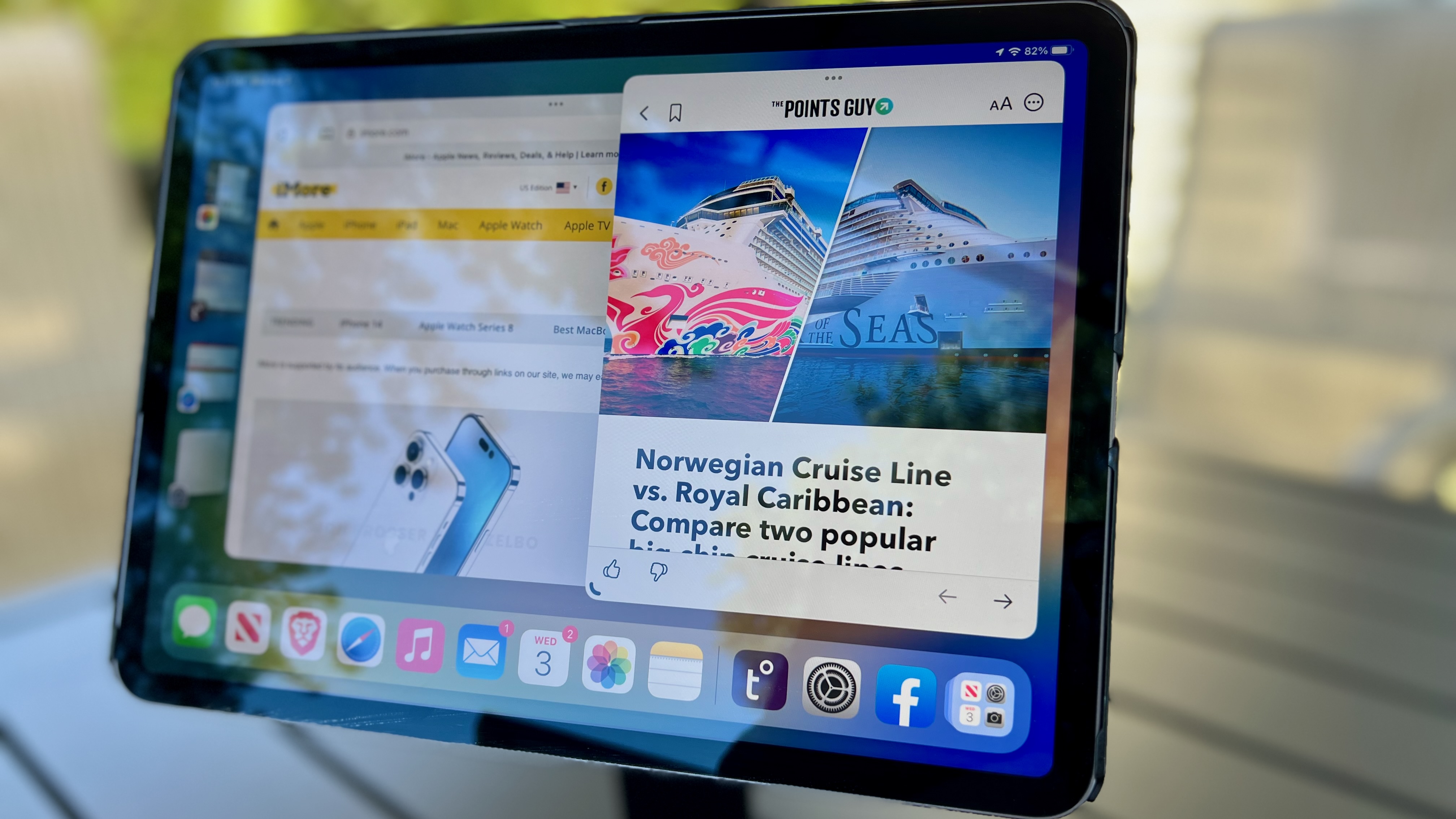
Stage Manager is a complicated solution to a simple problem. It's supposed to be a multitasking interface that helps make the iPad more of a desktop, but in reality, it isn't all that great. It tries to merge mobile multitasking and desktop multitasking but comes out not doing a good job at either. Earlier this year, I wrote about how Stage Manager loses out to Samsung DeX, and it is still true, especially when working with an external display.
On macOS, it feels like even more of a waste. Stage Manager gives very little incentive to move away from the classic desktop interface — which would actually be useful on the bigger iPads if multitasking was really the priority. Currently, Stage Manager is just a master of none and absolutely fails to enhance the iPad (or Mac) experience.
Apple has a history of enforcing innovations and making users realize that their way is a better way to do things, but Stage Manager doesn't fit the bill. Apple's software is generally solid from a usability point of view, and for now, Stage Manager is an anomaly.
Exhibit B: iPad and the USB-C to Lightning dongle

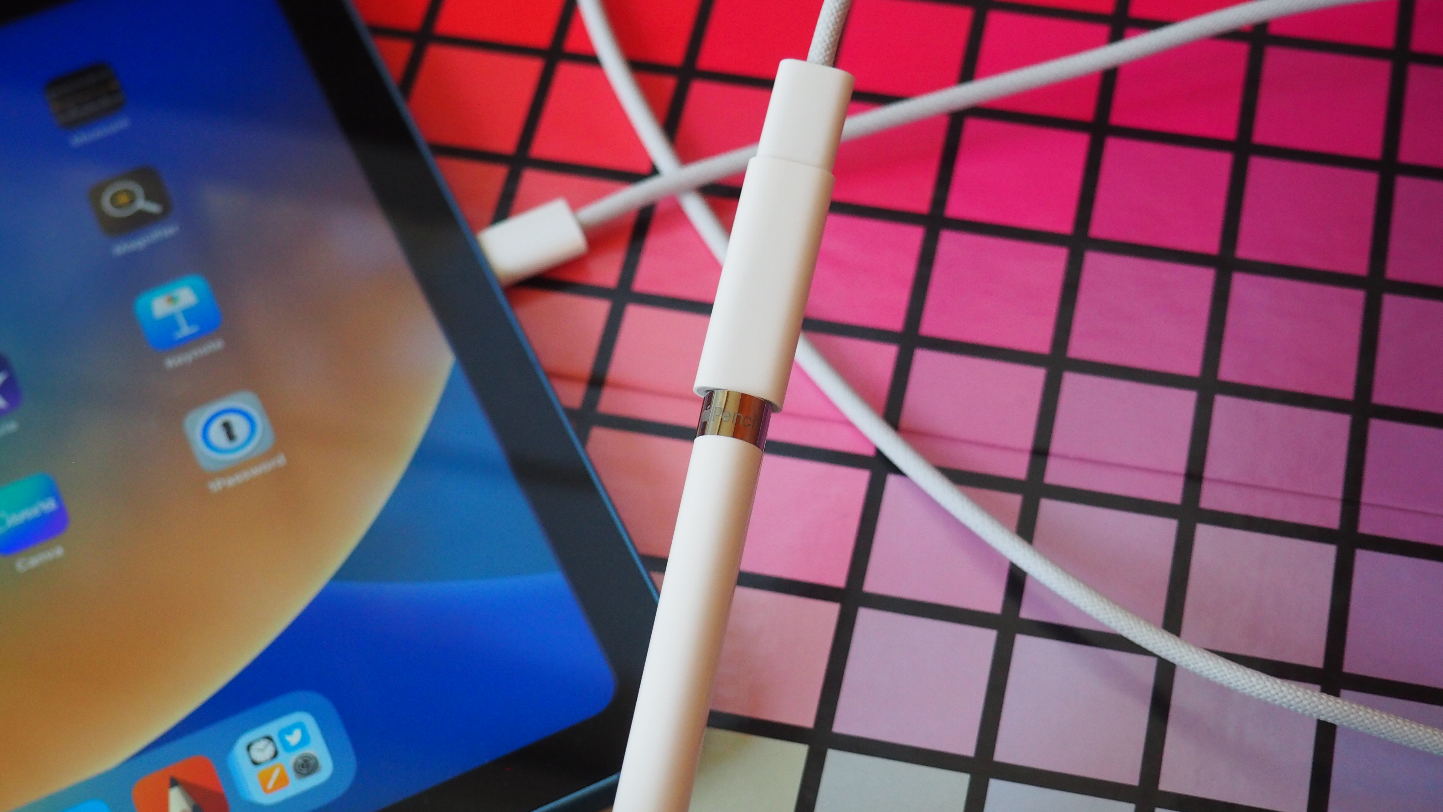
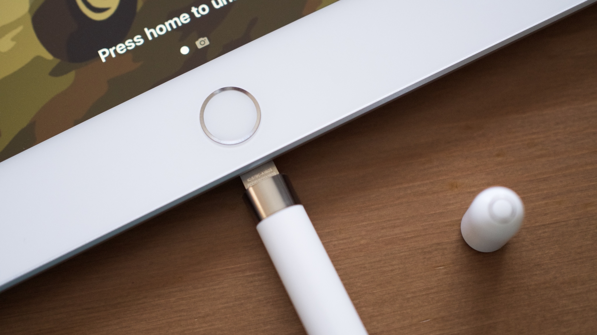
If you think the Magic Mouse charging apparatus was the peak of convoluted charging design, you would be right, but Apple has managed a close second this year. The new iPad costs $449, supports only the first-gen Apple Pencil, and since it's USB-C, it gets a USB-C to Lightning female adapter cable to charge the Pencil. It would have just been simpler to make the iPad compatible with the second-gen Pencil and give the Pencil a price cut, given how it's quite an aged product at this point.
But it looks like the company's need to differentiate the base iPad, now costlier than ever, from the iPad Air has resulted in this nightmare charging solution. The first-gen Apple Pencil was a bit of a weird one to charge, to begin with, but this method makes it even less usable.
Master your iPhone in minutes
iMore offers spot-on advice and guidance from our team of experts, with decades of Apple device experience to lean on. Learn more with iMore!
Exhibit C: Apple's gambling app advertising blunder

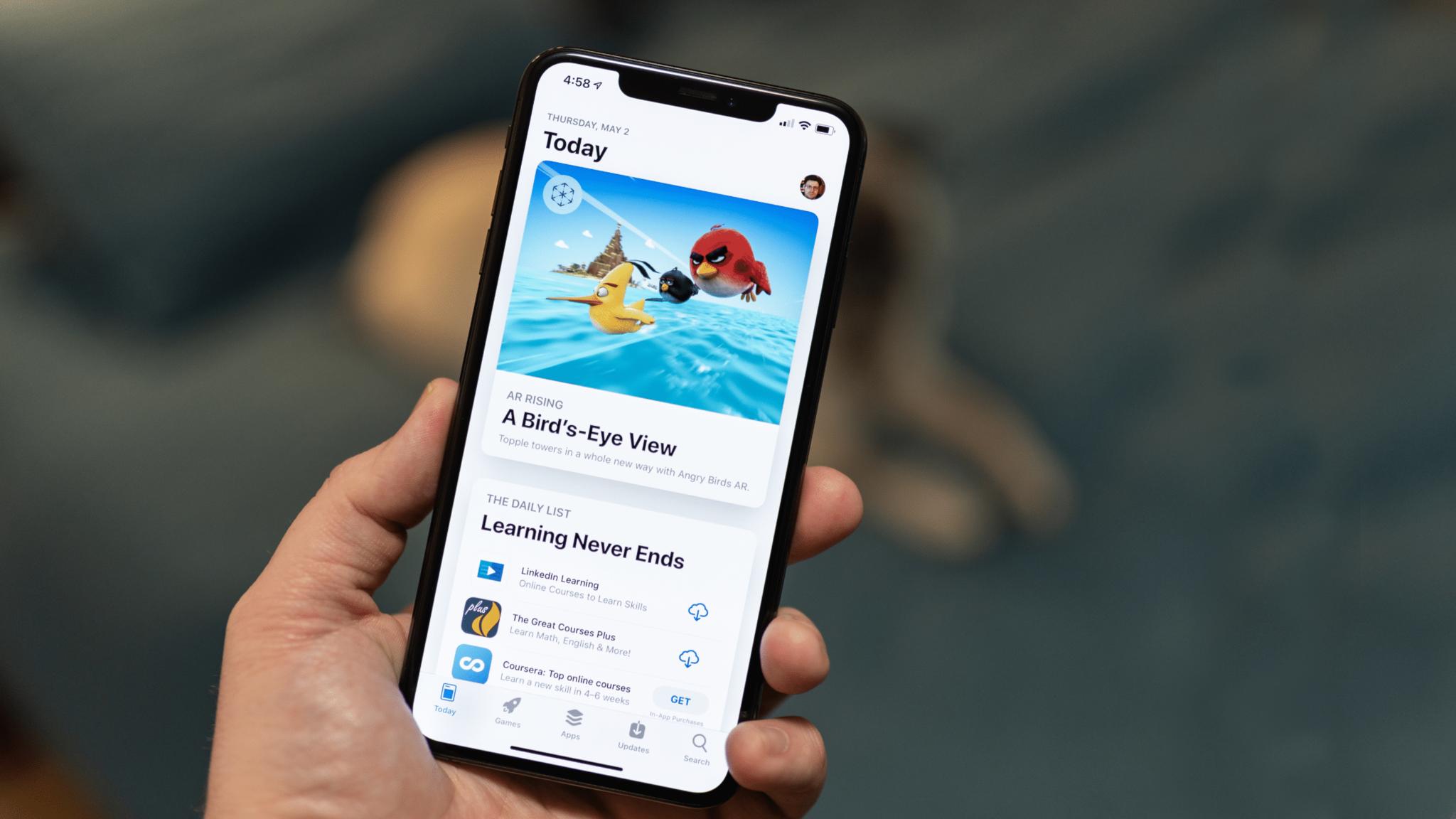
Apple has had a tough stand on privacy and advertising, and we have appreciated the company for it. However, recently, the company has been pushing to expand its advertising, starting with new spots for ads in the App Store, which doesn't seem all that necessary given the company has posted record revenue once again this quarter.
The specific blunder with this implementation came when the App Store started displaying ads for gambling apps on therapy app pages. This particularly insensitive placement seems like something that should have been caught in testing like we would expect specifically from Apple. Instead, there was a ton of backlash when users noticed this, and Apple has since then paused gambling ads, for now.
A series of bad decisions, or just a whole new strategy?

Apple excels at a lot of things, like Apple Silicon, for example, at which it is doing consistently well. As such, it is easy to dismiss these blunders as just a series of bad decisions. However, this trend is a worrisome one as the once easy-to-understand Apple product strategy is getting more complicated. As I recently discussed, Apple's iPad strategy is a confusing mess right now. The iPhone strategy seems fine, but we never know what the next year holds. The Mac strategy is being carried by the company's excellent silicon, which has even made notch-haters like me somewhat accept a MacBook with a notch.
The real problem is that more of such decisions could easily make Apple a tougher pick for the average user that is already overwhelmed by choice. Apple abandoning its best-performing $330 price bracket for the iPad is an example of this, but the company can only add so many more dongles and bad advertisements before its products start to lose the "it just works" charm that makes them so appealing.

Palash has been a technology and entertainment journalist since 2013. Starting with Android news and features, he has also worked as the news head for Wiki of Thrones, and a freelance writer for Windows Central, Observer, MakeUseOf, MySmartPrice, ThinkComputers, and others. He also worked as a writer and journalist for Android Authority, covering computing, before returning to freelancing all over town.
