Windows 11 features we'd like to see on macOS 14
Through the looking glass...

With WWDC 2023 almost a month away, we’re starting to wonder what the next macOS update will entail - from new features to refinements.
The Mac’s operating system has seen a big overhaul in recent years, with macOS Big Sur in 2020 bringing a new look, Control Center, and more. However, it’s lagged behind iOS and iPadOS recently, with no redesigned widgets or a new lock screen you can use on a Mac.
If you cross over to the dark side, however, Windows 11 has been getting a bunch of updates almost every month, with the ability to manage photos on your iPhone and its divided Taskbar seeing plenty of improvements.
With this in mind, we decided to look at Microsoft’s operating system and see what features could pass over to macOS 14, from its look and feel, to certain apps.
Better use of widgets

John-Anthony Disotto — How to Editor
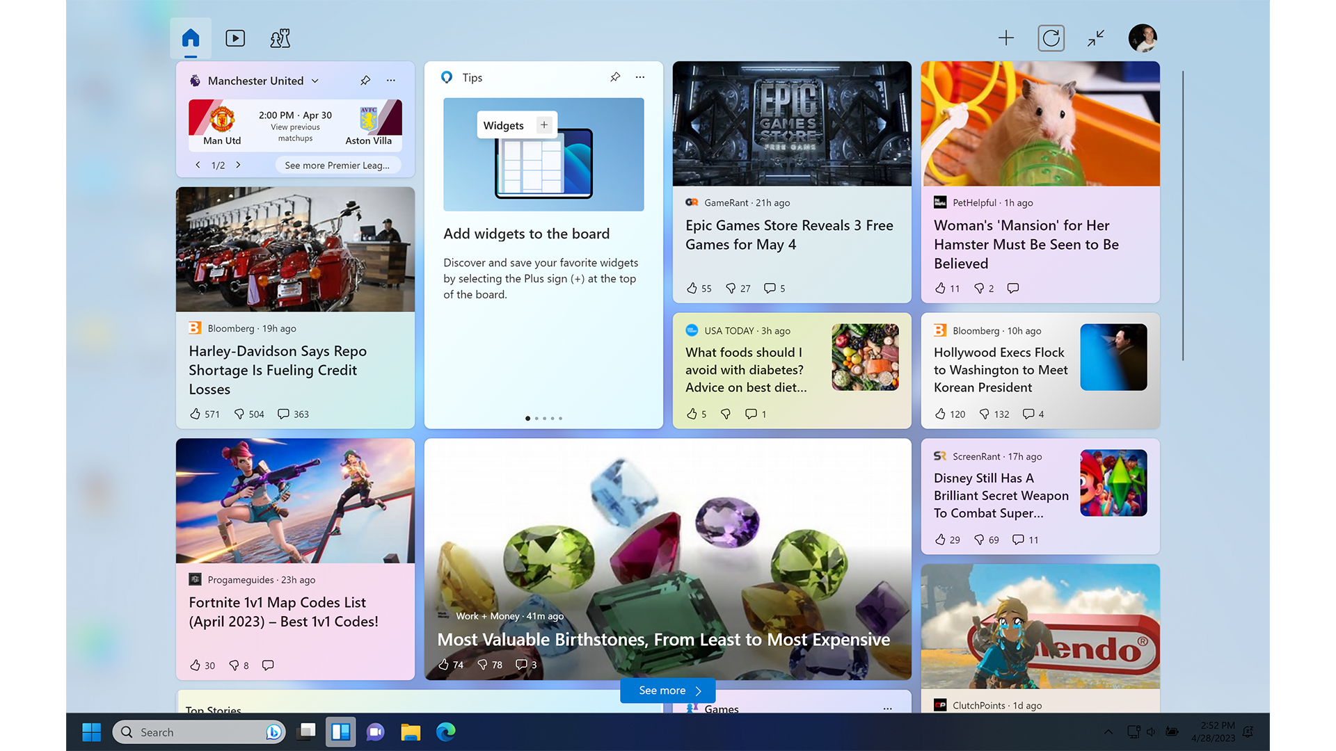
Apple reinvented widgets in iOS 16 by allowing users to place widgets on the Lock Screen where they’re glanceable and useful daily. macOS, on the other hand, is stuck in the past, using a widget menu that no one actually accesses, making the Mac miss out on the benefits of the tidbits of information.
In Windows 11, widgets are incorporated into a widgets board in your computer's taskbar. This is a way more accessible and intuitive use of widgets and something that Apple could definitely learn from with the launch of macOS 14.
Master your iPhone in minutes
iMore offers spot-on advice and guidance from our team of experts, with decades of Apple device experience to lean on. Learn more with iMore!
I want to use widgets on my Mac more, but at the moment, it’s just cumbersome and a total afterthought. Let me access widgets easily from my dock akin to Windows 11, or even better, let widgets sit on the desktop.
Bring the dock in line with the taskbar

Tammy Rogers — Staff Writer
I love the dock at the bottom of my screen. I love how I can make it disappear and then reveal itself when I pan my mouse to the bottom of the screen. The Dock is useful, and in recent versions of macOS, its become far more intuitive.
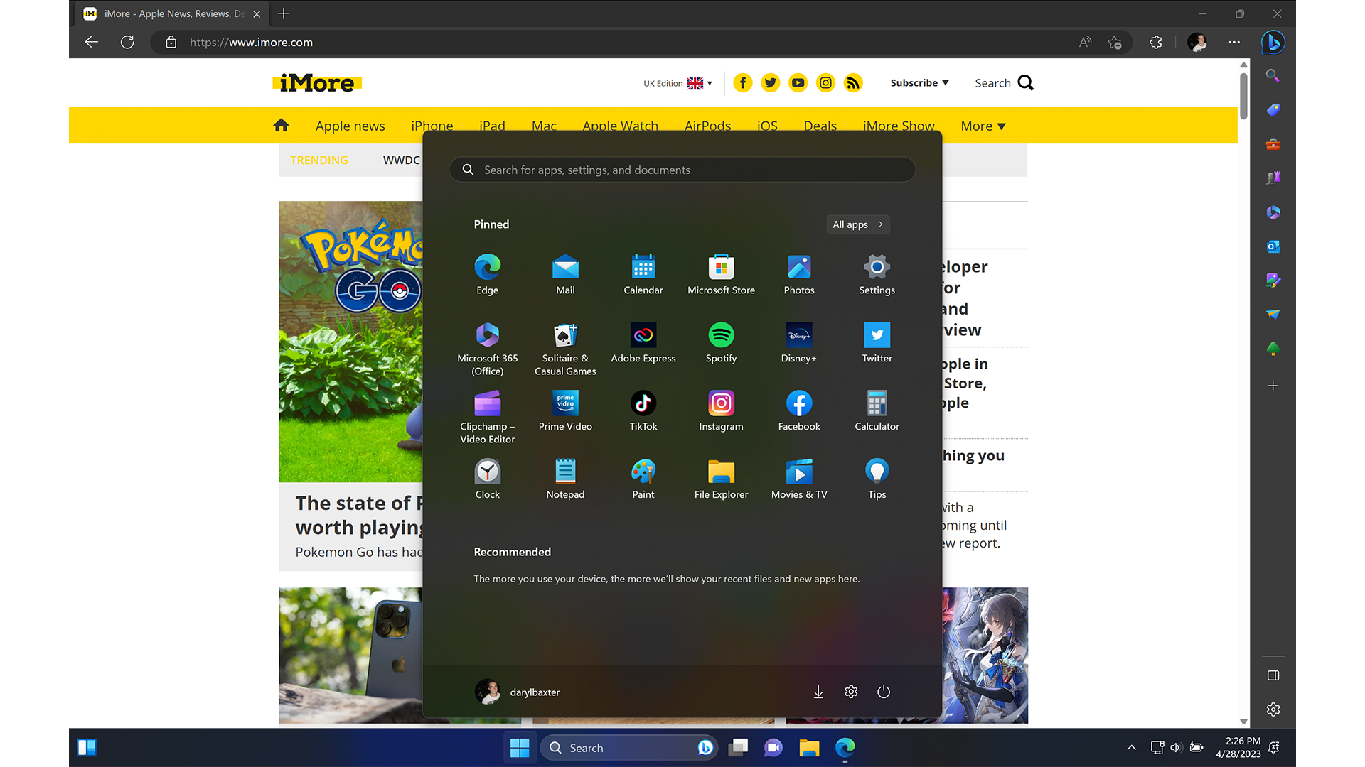
But it never quite reaches the lofty heights of the taskbar in Windows. The taskbar lets you see small previews of each window when you scroll over it, giving you more of an idea of what each window is. It lets you quit apps with fewer clicks too, and it does it all in a user-friendly manner.
The taskbar is not as pretty as the Dock, however, and that’s where some of the taskbar features could come in brilliantly with macOS. As attractive as it is, make the Dock as useful as the taskbar, and only then will macOS truly be the better OS in my eyes.
Snap layouts

Stephen Warwick — News Editor
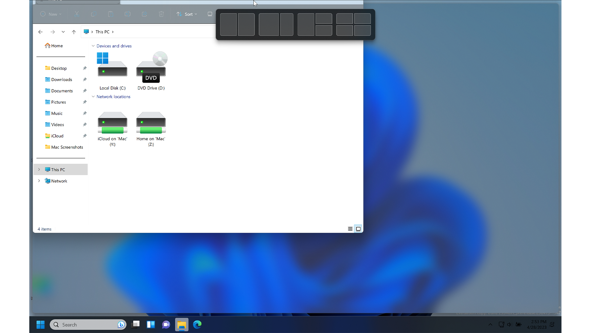
For as long as I’ve used both macOS and Windows, the appalling windows management of macOS has been the bane of my existence. It is so unintuitive and clumsy, and Stage Manager was even worse. On the other hand, Windows has always shone in terms of quickly dragging, dropping and resizing windows. The behavior is what I would describe as “expected.”
Compare that with macOS, where even minimizing a full-screen window is a pain, and it seems impossible to use more than one window at a time in any configuration except side-by-side. It’s a recipe for a headache.
Windows 11 has even better Snap layouts compared to Windows 10, giving users default options for layouts so that they can set up windows however they wish. It’s probably the solution Stage Manager should have been, and I need it for macOS to deliver a vastly improved experience.
Better Customization

Daryl Baxter — Features Editor
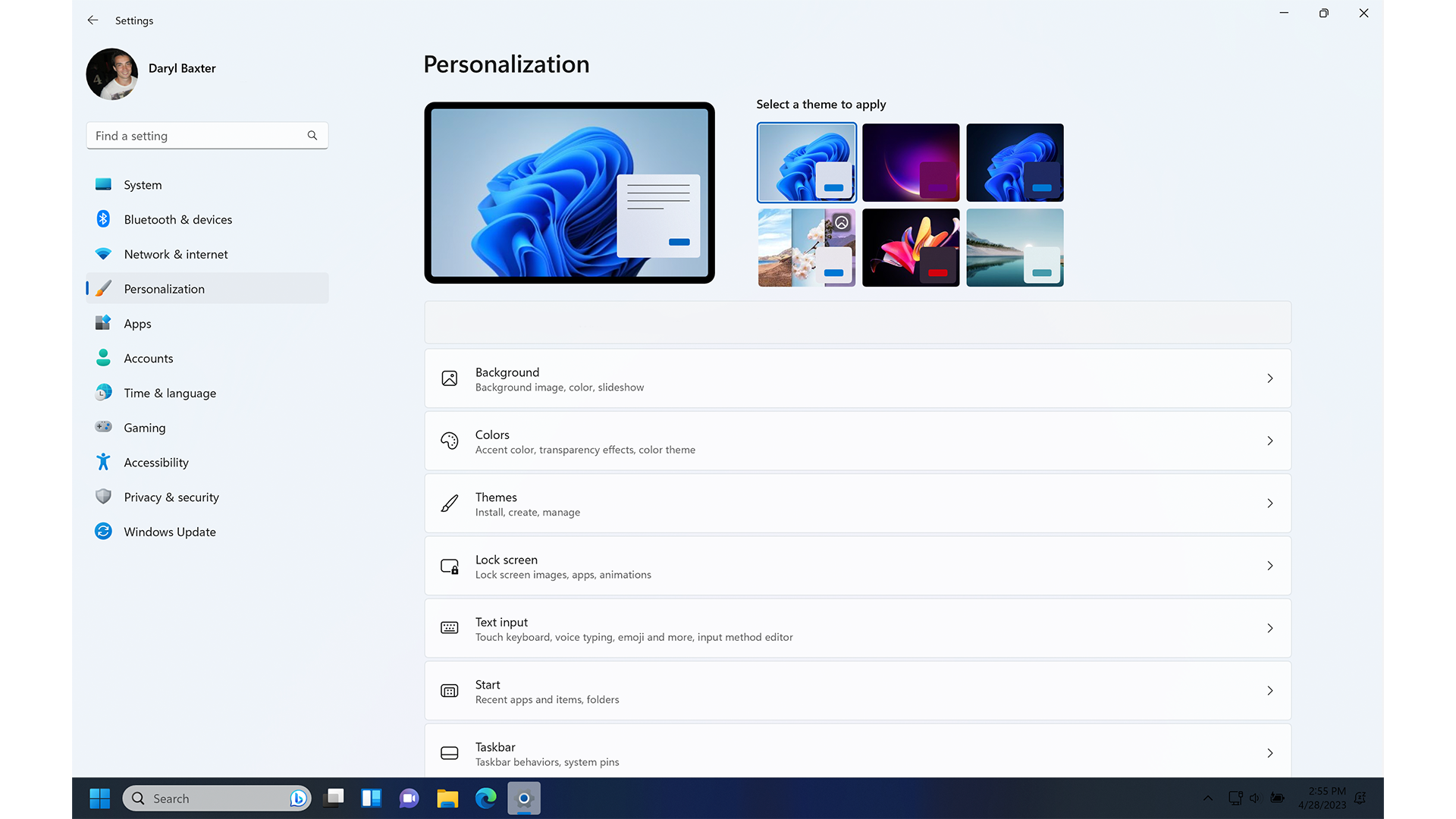
Back when I had a Gaming PC running Windows 11, I was constantly going into its personalization settings, where I would change the colors of the Taskbar and the windows. It was easy to do, and for the times when I wanted to go further with customization, Windows had no problem with this.
RetroBar enabled me to time-travel the Start Menu back to a Windows XP look and even as far back as Windows 95. But apart from how well it worked on my PC at the time, it was also very easy to get up and running in under 5 minutes.
I’d love to see the same effort to macOS. We’re already seeing hints of this with the redesigned lock screen, first introduced in iOS 16, where you can pick from many fonts and the entire color spectrum. So let’s see something similar come to macOS - better personalization options from Apple, accessible from the Settings app. Apple could also make it easier for developers to offer apps that go beyond this, similar to RetroBar.
To have the ability to use the dock from Mac OS X 10.4 Tiger or the ‘Aqua’ theme that debuted with Mac OS X back in 2000, would be a fun aspect to use on our M2 Pro MacBooks all these years later.
It’s time for macOS to shine
Back in 2006, Apple made a big deal of how Windows Vista, Microsoft’s newest update at the time, was copying features from Mac OS X, and preceded to show exactly what they thought had been stolen.
Admittedly, that advert has not aged well, as we’re at a point where we’re wondering what Apple can take inspiration from in Windows 11, as macOS feels like it’s fallen by the wayside compared to Apple’s other products.
After a couple of years of arguably minor updates, it’s time to see another big update to macOS, to set it up for the Apple silicon future. Yet again, the operating system has trailed behind iOS and even iPadOS in some features, such as widgets.
But we at iMore are feeling enthused for WWDC when it comes to macOS 14 - if there’s more customization and the return of widgets, there could be a happy team on June 5.

iMore.com is your source for all things Apple, and the IM Staff author represents our collective hivemind, for those occasions when the whole team speaks with one voice to bring you important updates about the site, editorial policies, awards, promotions and more.
The iMore team of Apple enthusiasts and experts shows you how to get the most out of your tech life by using Apple products and the apps, services, and devices they connect with to their fullest. iMore is a mainstay in the Apple community for good reason. Every single iMore writer and editor takes their job seriously, and we prioritize accuracy and editorial independence in everything we do, never receiving compensation for coverage and never pulling punches.
As well as our amazing group of regular contributors, the iMore staff team currently consists of: Gerald Lynch — Editor-in-Chief Stephen Warwick — News Editor Daryl Baxter — Features Editor John-Anthony Disotto — How To Editor Tammy Rogers — Senior Staff Writer James Bentley — Staff Writer
- John-Anthony DisottoHow To Editor
- Tammy RogersSenior Staff Writer
- Stephen WarwickNews Editor
- Gerald LynchEditor in Chief
- Daryl BaxterFeatures Editor
