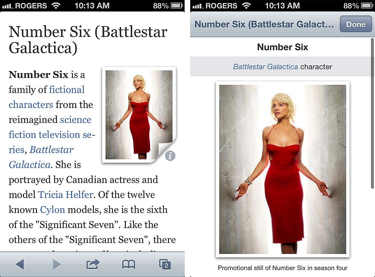
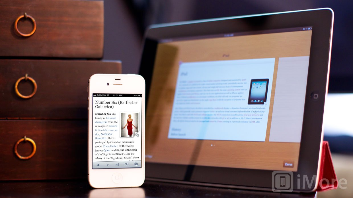
Articles is an Apple Design Award winning Wikipedia reader from Sophiestication Software with one simple, elegant goal in mind -- to present all the information you want in a fast, fluid, feature-rich format. Articles 2.3 takes all of that makes it equally available for iPhone and iPod touch, and iPad. That's right, Articles 2.3 is now a universal app.
But lets back up a minute. If you're new to the idea of Wikipedia Readers, you may be wondering why you need one. Wikipedia is free on the web, right? Why spend even a couple bucks to wrap it in an app. The answer is interface. You can do far more, far more easily, with a native app than you can do with a web page. There's a reason Facebook finally re-did their app with a native interface -- performance and power. And it's the same reason Articles works so wonderfully with Wikipedia. If you prefer the Facebook app to Facebook.com, or a Twitter app to Twitter.com, you'll prefer Articles to Wikipedia.com. It really is that much better.

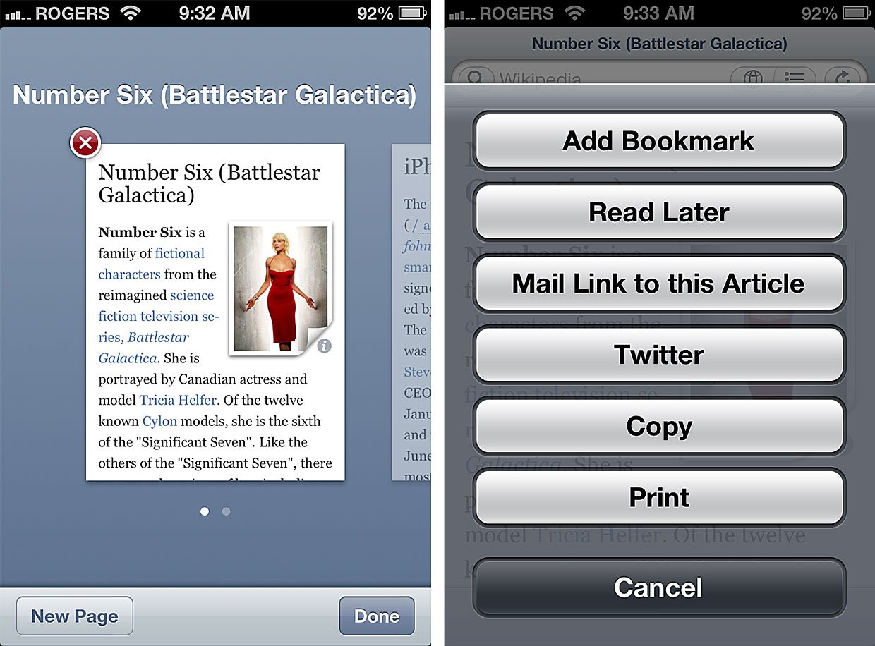
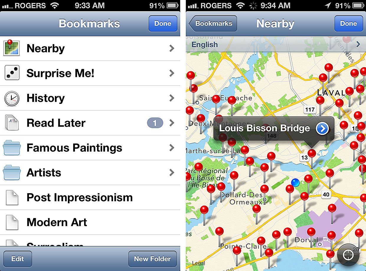
Everything that made the original Articles great remains in Articles 2.3 -- delightful design, intuitive interface, smart shortcuts, and the same thumbnail switcher for managing multiple pages that Safari enjoys on iPhone and Mac. Searching for titles or text, showing local points of interest on the map, and the random "shake" for serendipitous subjects all remain as useful today and when they were introduced.
New in Articles 2.3, aside from the aforementioned universal app status for the iPad interface, is read later support. Rather than offload to a service like Instapaper, Pocket, or Readability, Articles takes another cue from Safari an incorporates its own reading list into the app. That's both good and bad. It's good in that, if all you use is Articles, you don't have to create an InstaPockAbility account just to save articles. It's bad in that, if you have an existing InstaPockAbility account, especially if you're a power InstaPockAbility user, it's inconvenient not to have all your stuff in that central repository for your unified later reading pleasure.

Speaking of reading pleasure, simply consuming Wikipedia content via Articles continues to be an outstanding experience. Text flows well, pictures are handled smartly, and tapping and holding links brings up all the extra controls you'd expect. You can even pinch to "zoom" -- make the font size smaller or larger. There's no way to change typefaces, but I'm of two minds on this. On one hand, foundries are finally figuring out how to license some truly amazing type to app developers (check out recent versions of Instapaper). On the other hand, absolute consistency of font makes it almost invisible -- it gets completely out of the way so you don't even think about it. You just read the words.
You can also now share a Wikipedia article you're reading via iOS 5 Twitter integration. Just tap the action button, tap Twitter, and up pops a tweet sheet ready for you to add a pithy comment to and post.
And if you're a Launch Center Pro geek, Articles 2.3 also adds support for iOS URL schemes so you can add all sorts of clever queries to your actions.

The good
- Fast, fluid interface
- Excellent reading experience
- Provides features not available via the web
- Universal app
The bad
- Doesn't integrate with popular third-party read later services.
- No font selection
The bottom line
I read Wikipedia. I don't have time to read books (I'm too busy writing) and the current affairs nature of web sites can be exhausting. So, really late at night, when I'm finally finished working for the day, I read Wikipedia. And I read it in Articles.
Wikipedia.com is fine for a quick Google search but it's not a great reading experience, especially on a mobile device. Articles is.
I like that I can pull down to lock orientation without having to stop, pull up the fast app switcher widget, and make a global change. I like that I can quickly go back through just my Wikipedia history to find something in an article I read recently. I like that I can keep multiple pages upon and quickly tab through them, separate from Safari, which would otherwise obliterate them with other sites I visit during the day. I like all the little shortcuts, so carefully and deliberately thought out, that I don't even have to think about any more, just use as second nature.
If you read Wikipedia, you need a Wikipedia reader, and if you need a Wikipedia reader, you need Articles. It was one of the first, and remains one of the best ways to read Wikpedia not only on the iPhone and iPad, but to read it period.
$1.99 - Download now

Rene Ritchie is one of the most respected Apple analysts in the business, reaching a combined audience of over 40 million readers a month. His YouTube channel, Vector, has over 90 thousand subscribers and 14 million views and his podcasts, including Debug, have been downloaded over 20 million times. He also regularly co-hosts MacBreak Weekly for the TWiT network and co-hosted CES Live! and Talk Mobile. Based in Montreal, Rene is a former director of product marketing, web developer, and graphic designer. He's authored several books and appeared on numerous television and radio segments to discuss Apple and the technology industry. When not working, he likes to cook, grapple, and spend time with his friends and family.

