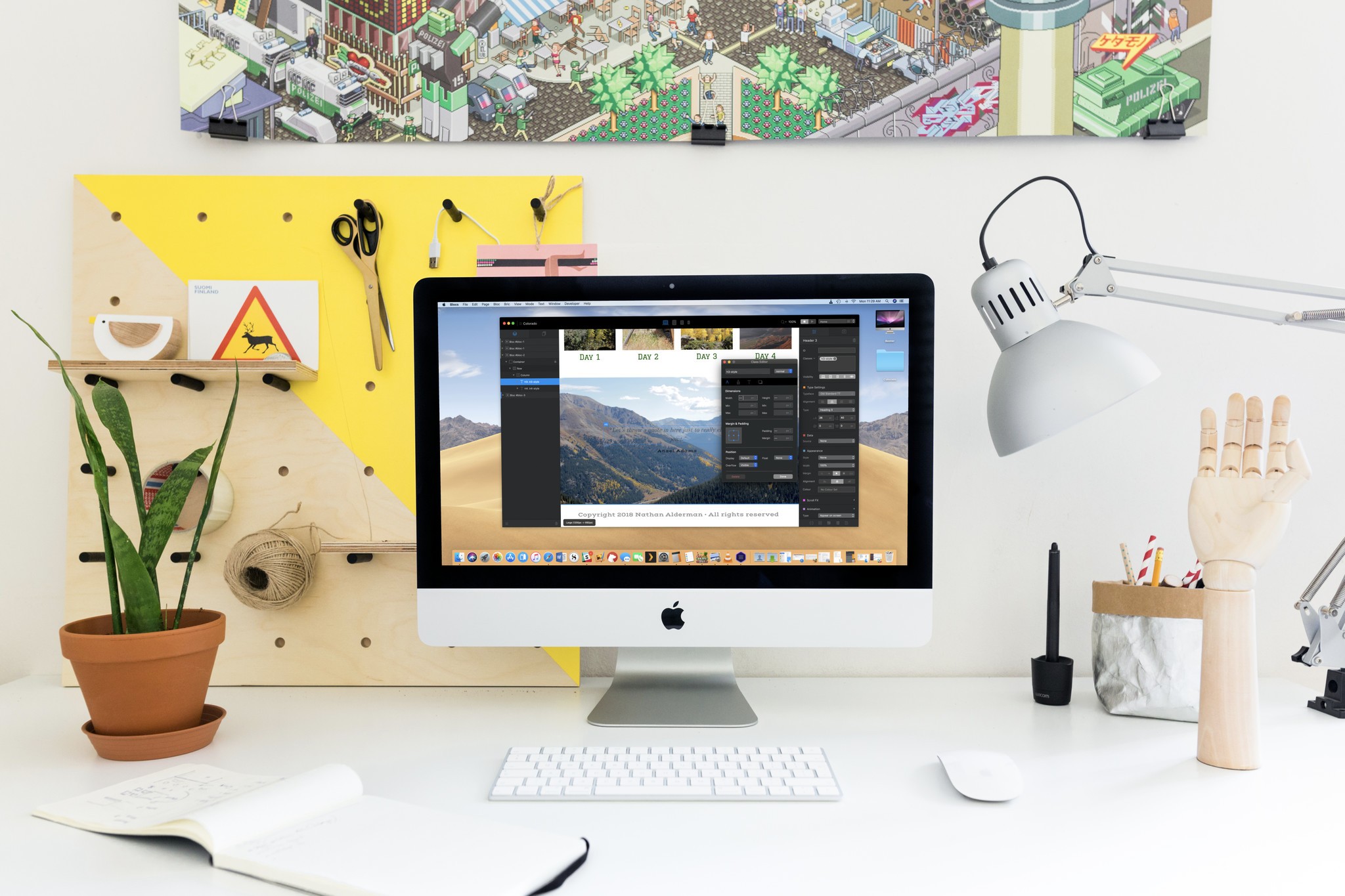
With every new version, Cazoobi's Blocs gets closer and closer to becoming the graphic web design app of my dreams – a tool that balances drag-and-drop simplicity with the full power and flexibility of coding by hand. The new Blocs 3 may not quite reach that high bar, but it gets amazingly close.

○ Lego-like assembly of prefab Blocs and Brics makes designing modern, mobile-friendly, responsible websites a snap
○ Refined interface adds greater control with fewer obstacles
○ Freehand tools provide easier customization of readymade elements
What hasn't changed in Blocs 3
In 2014, Norm Sheeran watched his 7-year-old nephew assemble structures in Minecraft and wondered why Web design couldn't be that simple, too. That inspiration led him to Blocs, where prewritten chunks of HTML and CSS code stack up like Legos to quickly create robust, responsive websites.
In Blocs, large slabs of structure (empty columns, a space for a photo with accompanying headline and caption text, a photo gallery, etc.) are known as blocs, and individual page elements (headers, paragraphs, images, forms, etc.) are brics. The program offers large readymade libraries of each to assemble on a blank canvas. And under-the-hood coding ensures that the sites you build will look good – sometimes after a little bit of tinkering – at various screen sizes, or breakpoints.
A sophisticated but intuitive class editor tweaks each element's CSS styling and can specify different versions of those styles for different breakpoints so that an element that looks great on a huge monitor can vanish to avoid cluttering up a tiny phone screen. An asset manager keeps all your site's images and associated files in easy reach. Global swatches deploy the same palette of colors across multiple site elements. And a simple menu manager controls what is and isn't included in your site's automatically generated navigation bar.
Blocs is pitched mostly at everyday folks who just want a nice-looking modern site to share their ideas or goods on the Web. But while Blocs' creations won't push the envelope of daring, innovative web design, the app is far more than just HTML with training wheels.
In the four years and two successive versions since its creation, Blocs has quietly accumulated pro-friendly features without significantly steepening its learning curve. It now builds in support for various free and paid content management systems, including Pulse, October, Cushy, and Surreal, letting users drop in fields and elements that can work seamlessly with those systems' databases. You can also easily add analytics code or additional JavaScript or CSS files to individual pages or your entire site.
What's new in Blocs 3
… for everyone
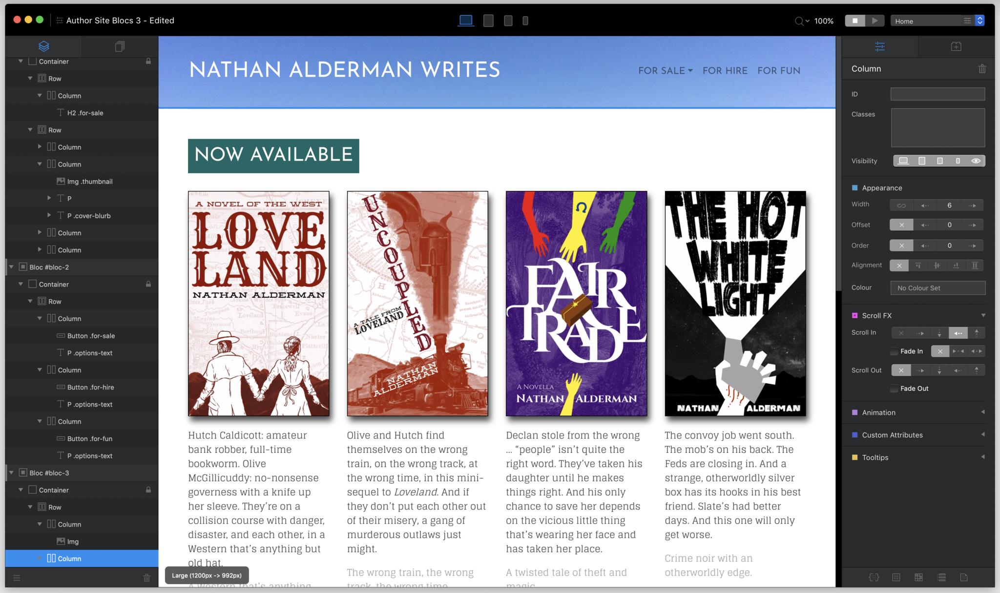
Blocs 3 gives the entire program a welcome facelift, refining an already sleek interface to be even more user-friendly, and making style tweaks and adjustments even more intuitive.
The left side of Blocs 3's window now lists every element on your page hierarchically, showing you a clear structure of your page's underlying code. It's much easier to select individual elements on the page this way – and to see when you've accidentally crufted up your code, as I realized I'd done with some poorly placed <span> tags. You can even reorder elements on the page just by moving them up and down in the list.
Blocs 3 moves its Inspector pane, where you can customize aspects of a selected element, to the right of the screen, where it now shares space with the searchable bric library.
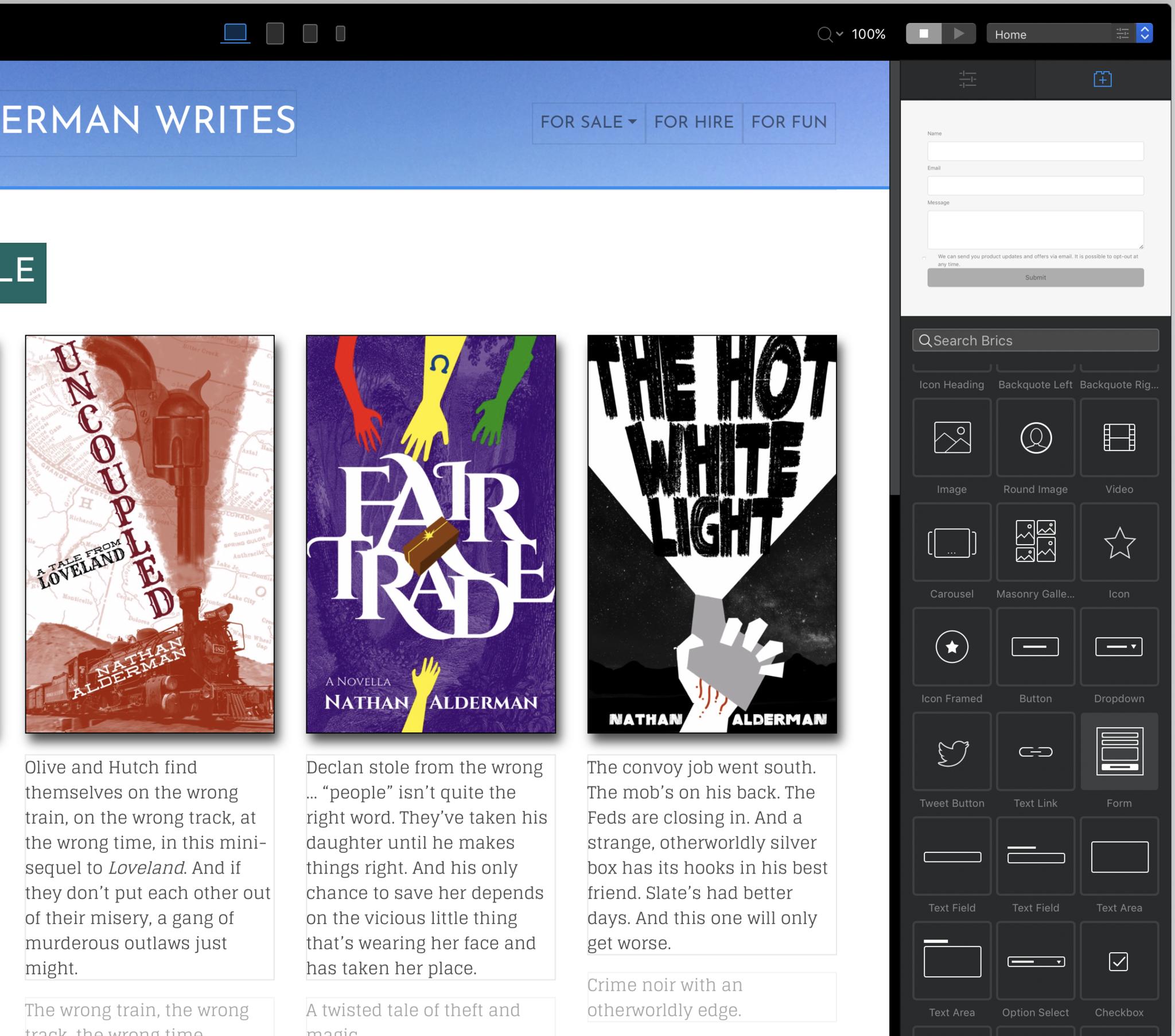
In previous versions, you had to switch to a separate mode to drop in new brics, and the list of brics blotted out the entire screen, with only icons and small text labels to tell you which was which. Now the page you're working on remains in view, brics are more clearly labeled, and a live preview of how each element will look on the page helps eliminate any lingering confusion.
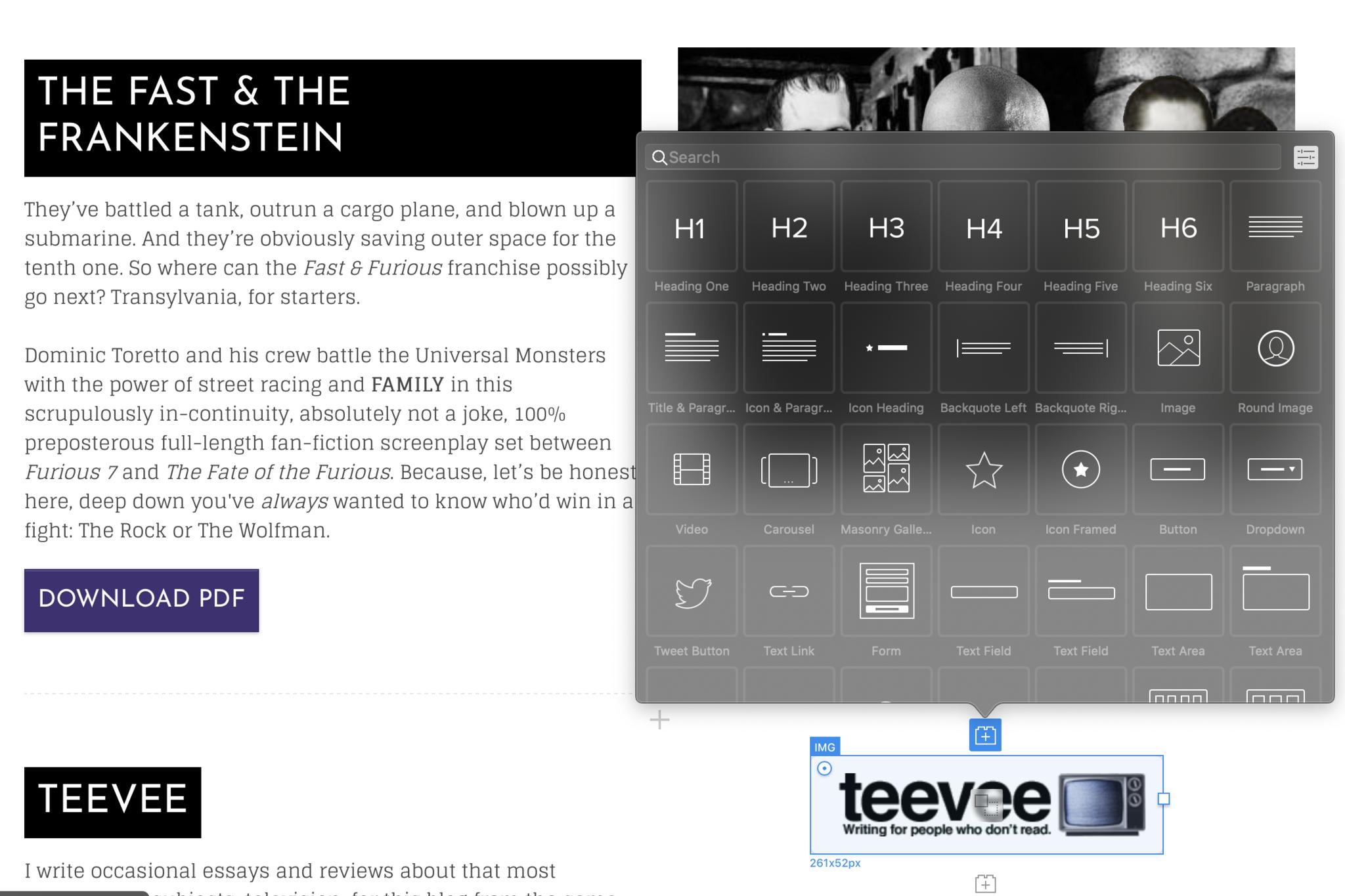
You can also now add brics by selecting any element, then looking for the cute little Lego-brick icon just above or below it. This opens a pop-up menu — you can customize how many rows it displays, depending on your screen real estate – with icons, labels, and a search bar. Again, this works much better than switching to an entirely different mode and losing sight of your page in the process.
Placing brics on the page can still be a little erratic; a blue line usually indicates where the new object will appear relative to others, but not always, and it's sometimes tough to position your cursor right where you need the element to go. But Blocs 3 still performs better at this than its predecessors, and it's easier to reposition elements once they're placed.
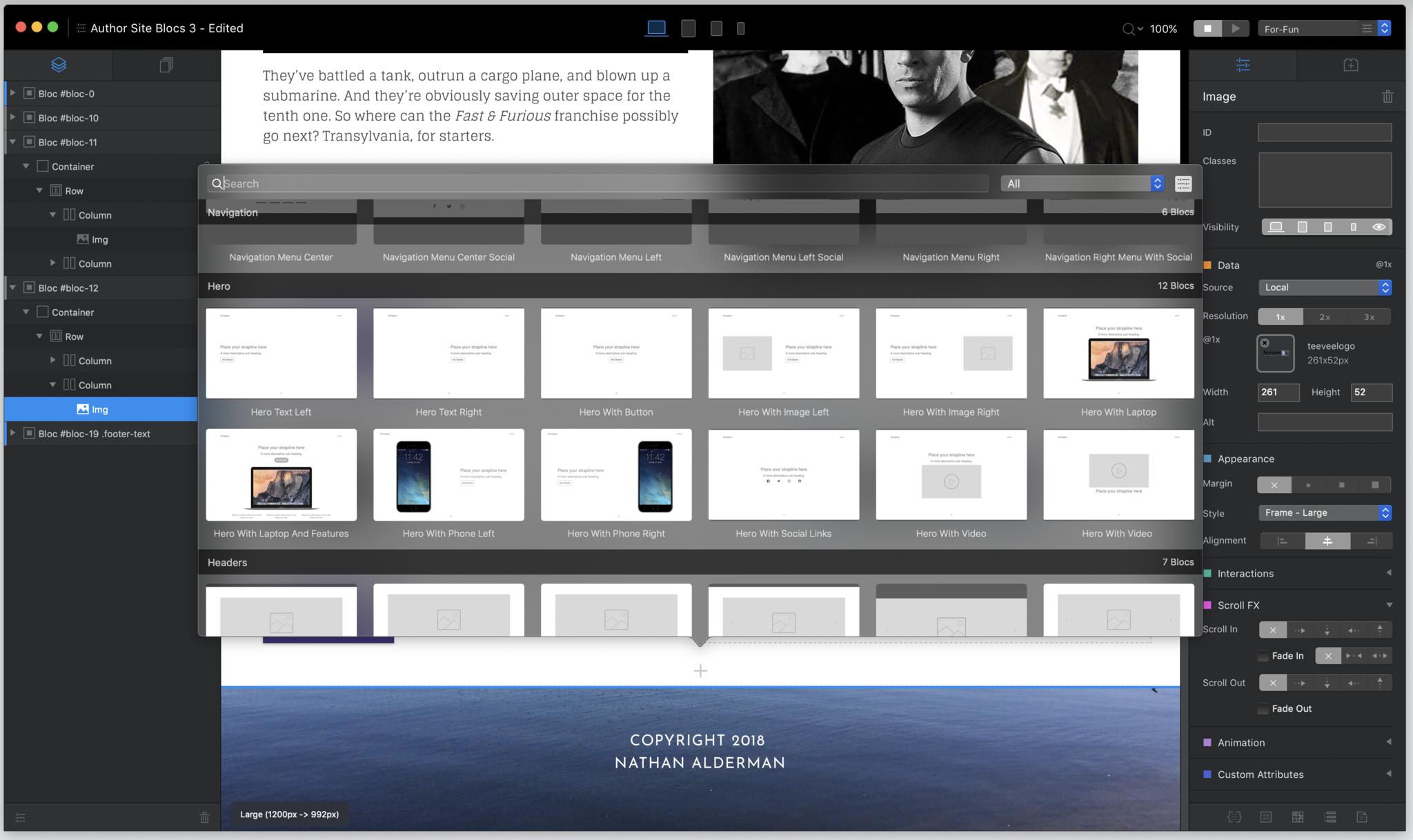
Blocs 3 has similarly refreshed the process of adding whole new blocs. Rather than making you scroll through rows of abstract icons, thumbnails now show you exactly what each bloc will look like, with a search bar and the ability to quickly narrow your selection by category. Again, this makes adding new chunks of code much faster and more convenient.
Once you've got elements on the page, Blocs's new Freehand technology gives you more power to adjust how they look. You can now drag and move buttons on the side of a selected element to alter CSS properties such as its width, margin, or border radius by hand. To record these adjustments, Blocs creates a custom class for that element, rewriting the CSS code as you change things. Better yet, you can later go into that custom class to rename it, fine-tune its styling, or even copy it to apply to other elements on the page.
For designers who crave structure, Blocs 3 now offers page guides, toggled with the G key, to help you plan out your page. If all these new features prove confusing, just consult the pop-over keyboard shortcut guide now located under the Help menu.
Finally, and perhaps most amusingly, Blocs 3 gets its Mojave mojo working by adding … not a dark mode, because it's always had a dark interface, but a light mode, just in case you miss that familiar Macintosh bright gray.
… for amateur site-builders
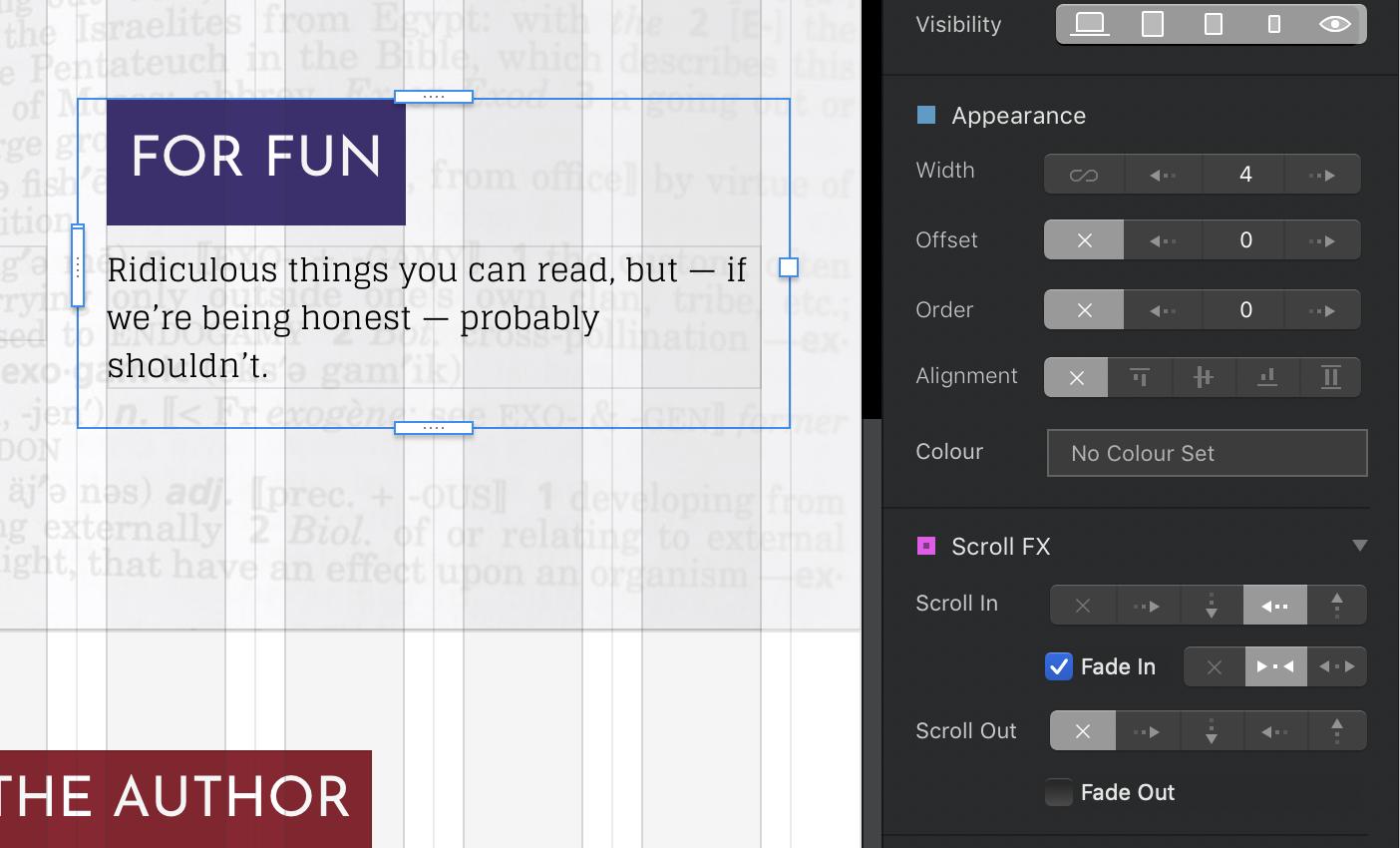
For those who just want to point and click their way to coolness, Blocs 3's ScrollFX may be its best new feature. You know how product pages on Apple's site have all kinds of impressive fade-ins and animations, with text and images appearing as you scroll? The ScrollFX controls in the Inspector pane make that wizardry absurdly easy. Just select an element, choose how it will scroll in or out, and whether and how it will fade in. Soon you, too, can be rolling like they do in Cupertino.
Blocs 3 also offers a bunch of new blocs and brics to jazz up your sites. The latter include, but are not limited to, "masonry" image galleries, with clusters of different-sized images; tabbed content boxes; an audio player; and accordion content boxes that open and close as you select their headers.
… for professional coders
Blocs 3's code base is now built on Bootstrap 4, up from its predecessor's Bootstrap 3. This popular web design framework has support for mobile devices and their flexible screen sizes built in, and the upgrade improves both what Blocs 3's brics can do, and its ability to make the same page work well at various breakpoints.
However, changes between Bootstrap 3 and 4 can make upgrading sites you built in older versions of Blocs a little bumpy. In one case, a row of buttons that looked pristine in Blocs 2 got jumbled into a big lump in Blocs 3, requiring me to redo them. Blocs 3's help files – always friendly and cogent, but usually a work in progress for a little while after a new version rolls out – offer a useful heads-up on the potential perils involved.
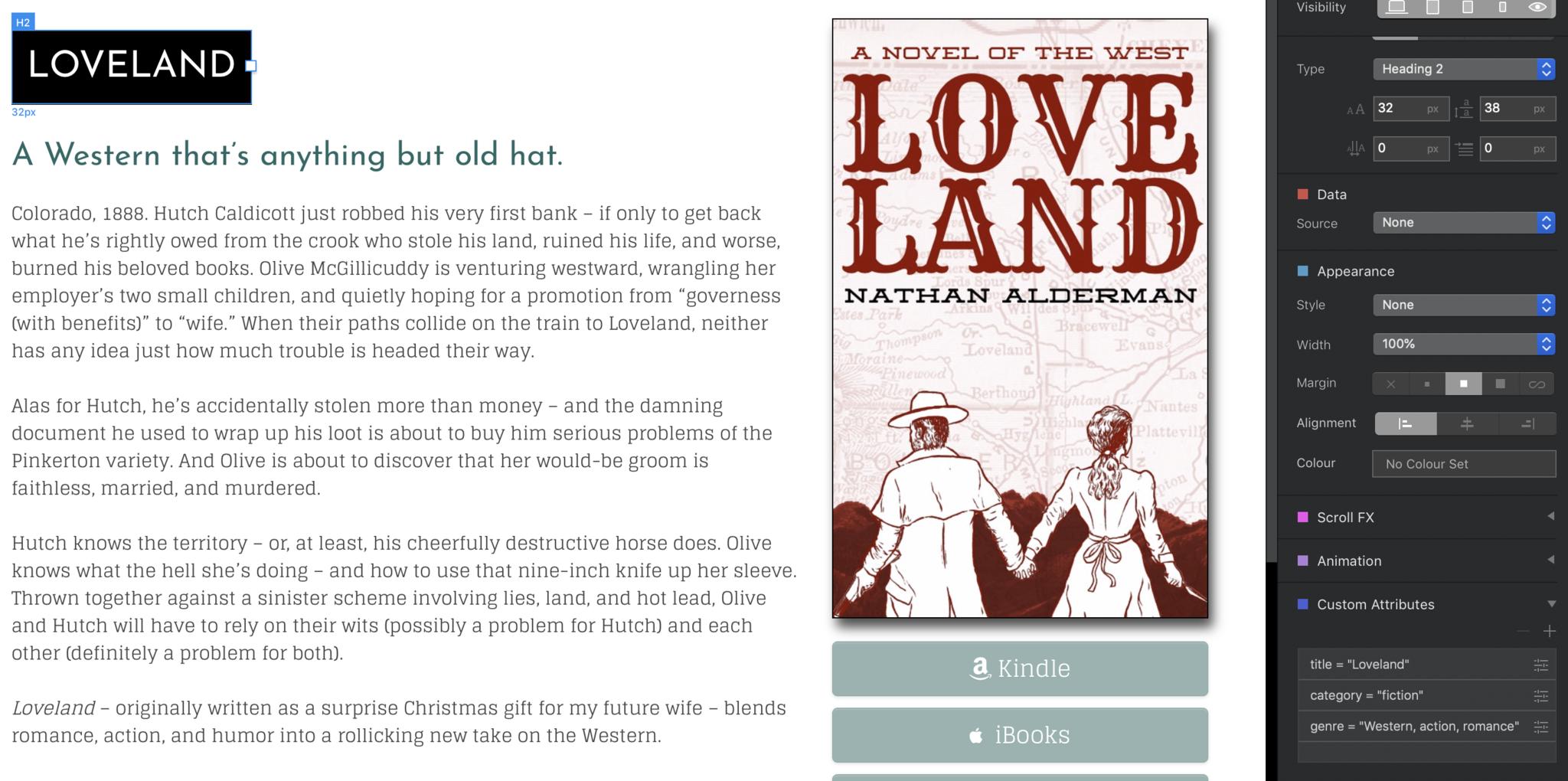
Blocs 3 now supports HTML5's custom data attributes, a way to build limited database-like information directly into your sites without, you know, an actual database. A dedicated section of the Inspector pane lets you quickly add such attributes to any selected element.
Blocs 3's preview mode has always worked pretty well at showing you how your creations will look in a browser, but now it can render any custom PHP or JavaScript code you've added to your pages, too. It even adds access to WebKit's developer inspector, should you wish to pore through the code line by line.
The new version also beefs up many capabilities of the class editor, including CSS opacity controls. And if you want to get creative, you can now compile and save your own custom brics and blocs with dedicated tools within the app.
Is Blocs 3 worth the money?
At $100, Blocs 3 follows its predecessors in making a pretty significant jump in price. Sites like SquareSpace and Wix offer similar site-building tools, plus hosting, for $11 or $12 a month. And Blocs doesn't include tools to build an online store, though at least one of the CMSes that works with the app has developed ways to do so through Blocs.
I'd still argue that the extra expense is worth it. With numerous other web hosting services going for as little as $2 per month, you can quickly recoup Blocs' up-front cost – especially if you want to build more than one site. And Blocs 3 really is a huge upgrade that makes an already useful program even more powerful and pleasant to use.

Nathan Alderman is an iMore contributor. He’s been using Apple computers since his first Apple IIe in 1985, and writing professionally about Macs and their software since 2005. During his 12 years freelancing for Macworld, he covered email clients, web browsers, web design programs, writing apps, and games, and he’s continued to follow those interests at iMore since 2017. An editor and writing coach in his full-time career, he spends his dwindling spare time writing fiction for fun, volunteering for democracy, and contributing to podcasts on The Incomparable Network. Nathan adores his wife and wrangles his alarmingly large children in bucolic Crozet, VA.
