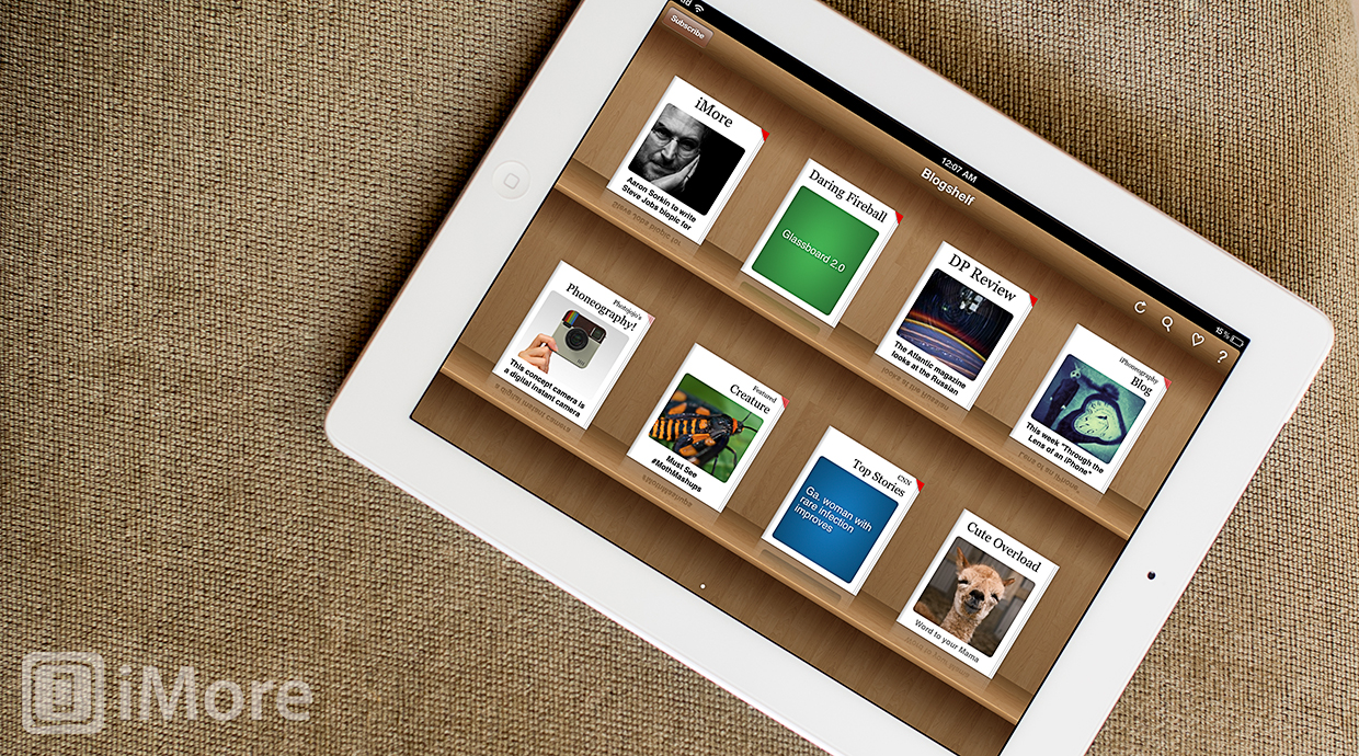
Blogshelf II is the successor to Bloglshelf, a uniques RSS and blog reader for the iPad. Imagine iBooks filled with blogs -- that's Blogshelf. It's a gorgeous and relaxing way to stay caught up with your favorite websites.
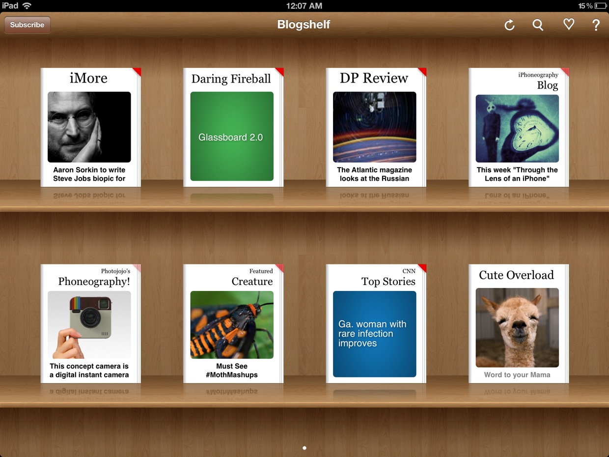
The main screen is a bookshelf, similar to iBooks, filled with all the blogs and websites you are following. To rearrange their placement on the shelf, simply hold your finger down on a blog to enter the edit mode.
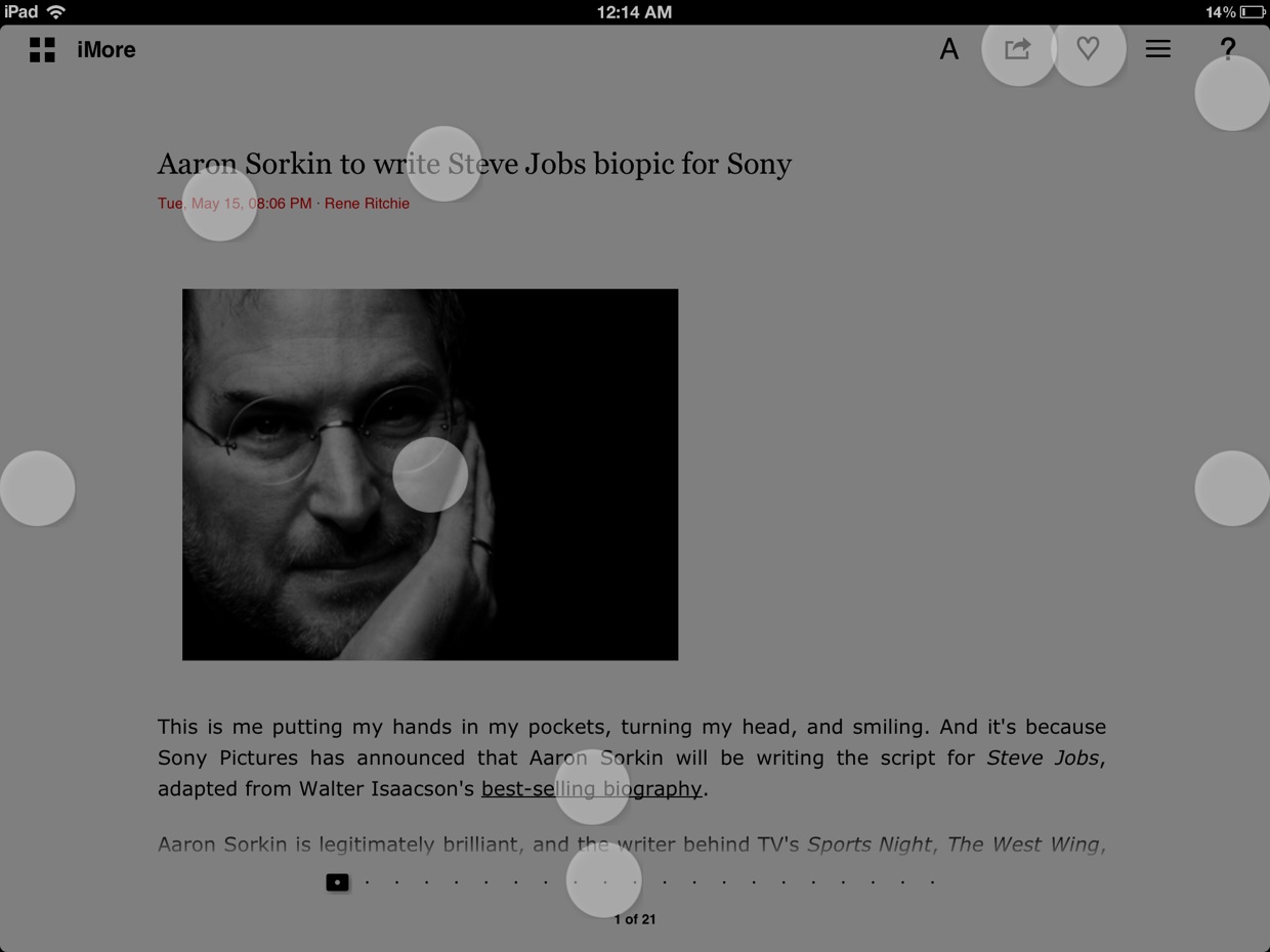
At the upper right hand corner of each screen of Blogshelf, there is a question mark that when tapped, fades the screen and adds white pulsating circles to important areas of the page. Tapping one will give you instructions and information about that region. I really like this implementation of help.
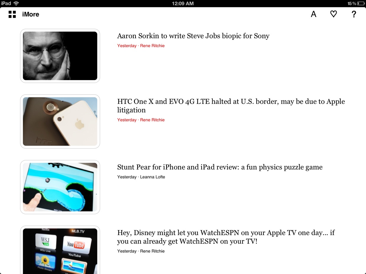
When viewing a blog, you'll see a clean list of its post, each displayed with a thumbnail of the first image of the story. Tapping the website's name will let you edit its settings, including cashing behavior, how often to update, the ability to disable thumbnails, and more.
When reading an article, the page is very clean with option to change the font type and size. You can scroll through the article by swiping up and down, and switch between articles why swiping left and right. I really like reading articles on Blogshelf, but I don't like how it handles photos. Here's an example of an article I wrote on iMore, yesterday.
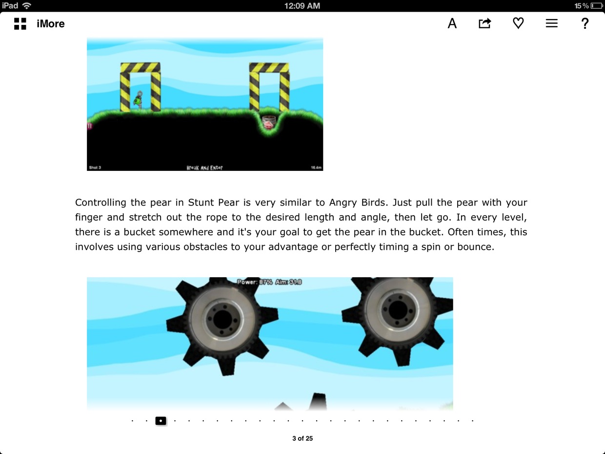
Although both of the photos shown were originally the same size, Blogshelf is showing them sized differently. At least when you tap them, thought, they become nice and big, like this.

One of the really neat features of Blogshelf is the that it's very easy to discover new blogs and websites by tapping Subscribe from the main blogshelf screen. Just like in iBooks, the bookshelf will flip around to reveal a subscription "store".
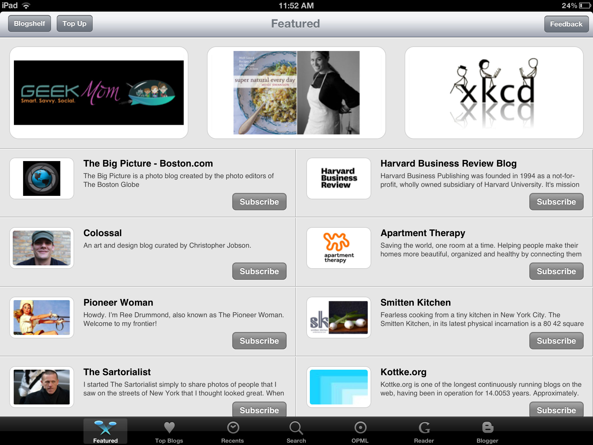
From here you can browse through featured blogs and top blogs by category. You can also search for a specific website and connect with Google Reader and Blogger to subscribe to blogs you've subscribed to on those services. (Tip: if you browse to the Apple category in the Top Blogs tab, you'll find iMore!)
Unfortunately, I must now tell you about another issues with photos. When looking closer at a blog that you may want to subscribe to, tapping on an article will bring up a popup that lets you scroll through the post. Often times, the photos will appear distorted, like this.
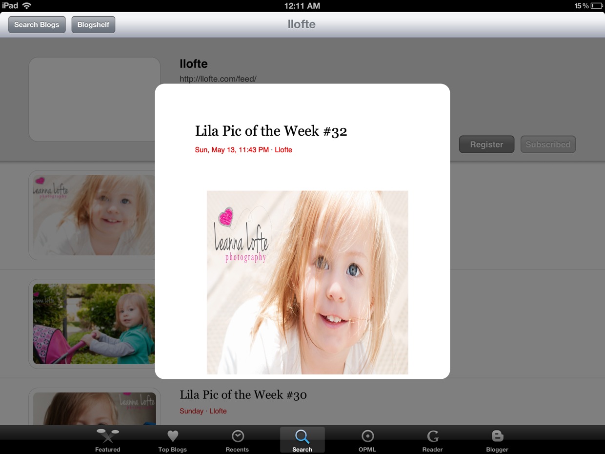
Although the picture issues are a little annoying, I trust that the developers can quickly fix these bugs.
The good
- Great way to discover websites
- Pretty
- Support for Google Reeder and Blogger
The bad
- Has issues with photos
The bottom line
There are lots of different RSS readers in the App Store, but I really like Blogshelf's approach -- it's relaxing. My absolute favorite feature of Blogshelf, however, is blog discovery. The blog "store" is really awesome and I've discovered some great websites because of it.
Free - Download now
Former app and photography editor at iMore, Leanna has since moved on to other endeavors. Mother, wife, mathamagician, even though she no longer writes for iMore you can still follow her on Twitter @llofte.
