The Blue and White G3: Part Power Mac, part archetype

For nearly 15 years, professionals with Macs had a very specific set of expectations when it came to their computers. They wanted the power of the best silicon Apple could offer, coupled with the ability to open their machines to add or change out components like RAM, hard drives and expansions cards.
These expectations were formed by the design of a single model: the "Blue and White" Power Macintosh G3.
Brains and brawn
First announced in 1997, the Power Macintosh G3 was already a beast, but the "next-generation" machine announced at Macworld 1999 shipped with much faster G3 processors than before, better graphics from ATI, faster RAM and more.
Steve Jobs took nearly 30 minutes of stage time outlining the new system's internal hardware, which wasn't unusual for the time.
From a technical perspective, the Blue and White PowerMac G3 was a major turning point in the pro line of computers from Apple. This PowerMac was the first machine from Apple to ship with FireWire, and the first pro machine from Apple to ship with USB. It left SCSI in the past, and shipped with just one ADB port.
In 1999, Apple was deep in the trenches of the Megahertz Wars with Intel, and was hellbent on showing the world that their G3 was faster than what was shipping in Wintel machines, despite the clock speeds. During the announcement of the product, Phil Schiller and Jobs showed that their slower-on-paper machine smoked the competition. HAL 9000 even interrupted the keynote to help make the point.
The new PowerMac G3 was about more than sheer power and advancing the hardware, though. The redesigned case (codenamed "Yosemite") is what cemented this machine's place in history.
Master your iPhone in minutes
iMore offers spot-on advice and guidance from our team of experts, with decades of Apple device experience to lean on. Learn more with iMore!
Form and function
1999 marked the end of the beige PowerMacs. The new case was stunning. The front and back panels were the same Bondi Blue as the iMac, but the sides were wrapped in translucent white plastic that looked like they could glow. It came with handles for easy moving.
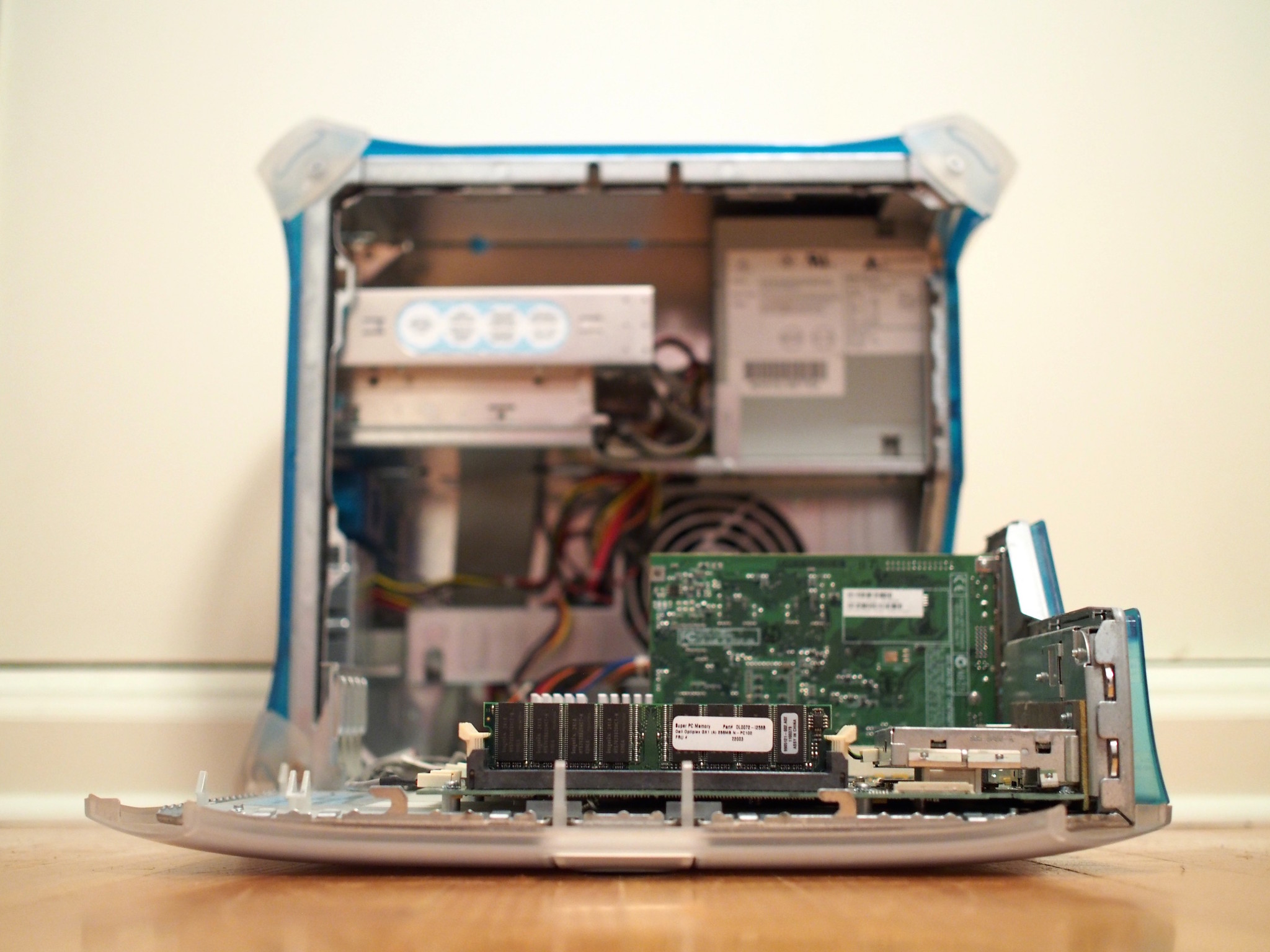
The real magic of the design, however, was on the side. With the pull of a simple tab, the side of the machine opened up to give access to the inside of the computer.
"We don't think design is just how it looks," Steve Jobs said during this keynote. "We think design is how it works."

Apple made a huge deal of the design, as highlighted by this ad, and it really was a genius move. Users could add drives easily. The RAM and cards slots — and the entire logic board — were mounted on the door itself. Pro users had never enjoyed such easy or clean access to their systems.
The design legacy
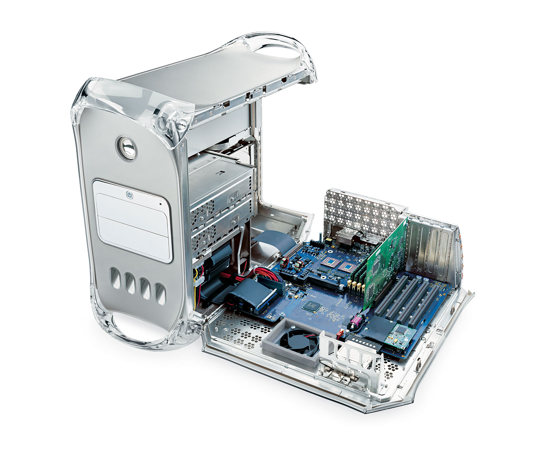
The basic template this machine created — a tower with handles and hinged door — stayed intact for years. This machine, the "Mirror Drive Door" G4 was shipping until 2004:

Image via Apple PR
The PowerMac G5 changed some of the design elements, but the concept remained. The handles were a little more square, and the door became a simple side panel that could be removed to expose the components in the machine. It wasn't until the 2013 Mac Pro that the design elements set forth by the Blue and White G3 finally fizzled out.
That's a heck of a run.
Stephen Hackett is the co-founder of the Relay FM podcast network. He's written about Apple for seven years at 512 Pixels, and has more vintage Macs than family members living in his Memphis, TN home.

