Calendars by Readdle is an alternative to the built-in Calendar apps on the iPhone and iPad provided by Apple. It features a gorgeous interface, intuitive controls, seamless syncing with Google and iOS calendars, and more. If you find yourself commonly frustrated with Apple's Calendar apps, you'll definitely want to consider Calendars by Readdle as a replacement.

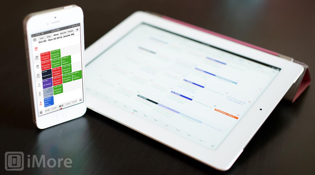
Calendars includes 5 different views: list, day, week, month, and tasks and all of the views can be used in both portrait and landscape orientation. The week view and day views are my favorite as they give a visual representation of what your days look like.
When using week view while in portrait orientation, each scheduled event is represented by a colored square with the time and title. If you have more than four events in a day, a small dot will appear at the end of that day's row indicating that you can scroll the individual row to see more. In landscape, the days become the columns and the rows represent time. At the bottom of the screen, you'll find intervals of days that you can scroll though, or you can simply swipe the screen to move forward and back between weeks. Want to move an event? Simply hold your finger on it and drag it to where you want it to be. If you want it on a different week, drag it to the edge of the screen and you'll be taken to the next week (similar to moving apps between pages of your home screen). Day and month views behave similarly.
The day view is very similar, only it breaks up the day into 24 rows, one fore each hour of the day.
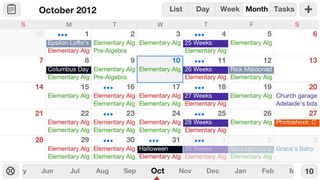
The month view moves away from blocks to represent events, and simply lists them out in the appropriate color for each day. In portrait orientation up to three events will be listed on each day (with an ellipsis to represent if there is more) and in landscape, only two events will be display for each day, but more of the letters of the titles of the events will be visible.
It doesn't matter what view you're in when it's time to add an event. You can either tap the plus sign in the upper righthand corner or simply hold your finger down in the place you want it added.
In the event creation/edit screen of Calendars, you can add all the typical information: name, calendar, time, reminder, location, repetitions, etc. However, what really sets Calendars apart is its special keyboards. For example, when you create event, you are immediately taken to the Title field and the keyboard pops up -- a keyboard with an extra row. The top row includes four reminder time options: 5 min, 15 min, 1 hour, and 1 day. This makes is really easy to quickly add an event without fiddling around with different options. Another custom keyboard is for selecting the event time; instead of scrolling through dates like many apps have you do, Calendars pops up a calendar that makes date selection really quick.
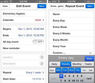
One of the disadvantages to Apple's built-in Calendar apps in iOS is that you have a limited number of choices when it comes to scheduling a repeated event. For example, If you wanted to add your math class that meets during the same time on Monday, Tuesday, and Wednesday, you can't. With Calendars by Readdle, though, you can!
The good
- Drag & Drop for events
- Day, Week, Month and List view
- Support for custom repeating events
- Special keyboards
- Sync with Google or iOS Calendar
- Manage your calendars online and offline
- Invite people
- Get SMS reminders
- Search events
- Universal for iPhone and iPad
The bad
- Swiping through month view on the iPhone is glitchy
The bottom line
Calendars is an excellent calendar app for the iPhone and iPad. It's beautiful, intuitive, and full-featured. My only complaint is that there isn't a Mac app available to complete the trio!
$6.99 - Download Now
Former app and photography editor at iMore, Leanna has since moved on to other endeavors. Mother, wife, mathamagician, even though she no longer writes for iMore you can still follow her on Twitter @llofte.
