Most of us listen to a podcast or two, or three or ten. Podcasts can be in either video or audio form. When you have a good queue of podcasts lined up, you have entertainment for hours on end, and they always provide useful news, interesting stories, or just downright fun chats between friends.
I've been listening to podcasts for years, and while Overcast remains my favorite app, Castro comes in a close second. The previous version of Castro gave us a UI overhaul and acted as a triage for our podcast subscriptions (it only features a queue and the inbox - no playlists).
Castro 3 just came out and is an even bigger improvement that brings it more inline with Overcast in terms of features.
- Trim Silence
- Chapter Support
- Mix to Mono
- A Redesigned Player Screen
- Per-Podcast Controls
- New Apple Watch App
- Castro Plus
Trim Silence

The biggest new feature in Castro is the brand new Trim Silence feature. This works much like Overcast's Smart Speed function, where unnecessary moments of silence get cut out, thus saving you time while not leaving any of the spoken content out.
In Overcast, I've saved dozens of hours with the Smart Speed feature, and I've had a hard time using any other podcast app that didn't have something similar.
After testing out Castro's Trim Silence, I believe that it's on par with Overcast, and a great addition to Castro. Voices still sound natural, and I definitely don't notice as many awkward silences in shows, as it's meant to be. You could also combine Trim Silence with a faster playback speed to save even more time, though voices do sound less natural the faster you go.
The only thing that Castro is missing is the little statistic telling you how much total time you've saved with Trim Silence. You can see how much you've saved on individual episodes, though, so at least there's that. I enjoy seeing the total in Overcast, as it solidifies the purpose of the feature with solid data. I hope that Castro adds it in the future.
Chapter Support

Another page that Castro took from other podcast apps, like Overcast, is full on chapter support. While not every podcast out there has chapters, there are a few of them that do, and it's usually a godsend.
Why is chapter support so important? Simply put, it gives listeners the option to skip over topics that don't interest them, or you can even jump past sponsored ad readings and other fluff segments. Having chapters also gives you a visual reference guide of what's covered in a particular episode, so you know how your time's going to get spent.
To view chapters, just tap on the ticker underneath the podcast art in the Now Playing screen. Castro does one up Overcast in terms of chapter support though, as it tells you the duration of each chapter, whereas Overcast merely tells you the start time of each chapter in relation to the entire episode. Another nice touch is that it shows how much time remains in a chapter that you're listening to right now.
To top it all off, Castro even displays chapter-specific artwork if the podcast implements it.
Mix to Mono

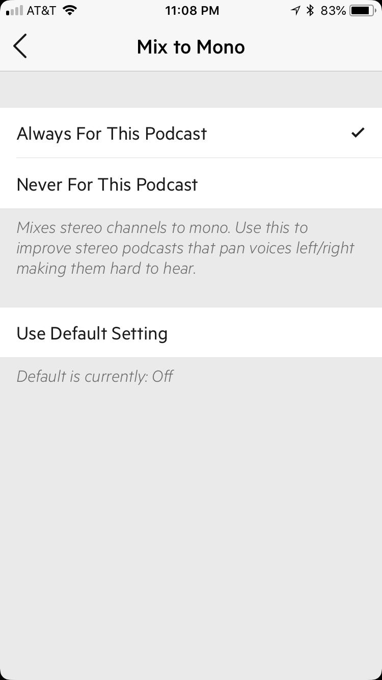
Personally, none of the podcasts that I listen to regularly use stereo channels. This is when podcasters pan voices in left and right channels, which makes it harder to hear certain voices if you don't have stereo sound output.
Fortunately, the new Mix to Mono feature fixes that for you automatically. When this is on, Castro mixes stereo channels into mono, making it easier for you to hear, regardless of what your audio output is.
Again, I don't listen to podcasts that use stereo sound settings, so this isn't a necessity for me. Overcast doesn't have this feature, and I managed to live just fine without it. But I can see how this is great for those who do listen to shows that use stereo sound.
The Mix to Mono feature works great with the Enhance Voices option, which is free for all Castro 2 users and also included in Castro Plus.
A Redesigned Player Screen

As someone who used Castro 2 previously, I must admit that the new Now Playing screen is an improvement, though it isn't without a new set of flaws.
For the most part, the design proves to be simple and informative without being overbearing. Podcast art gets displayed prominently in the center of the screen, with the episode name and chapter title (if supported) scrolling underneath the artwork. Under that are your playback buttons (back, play/pause, and forward), along with the audio scrubber at the bottom.
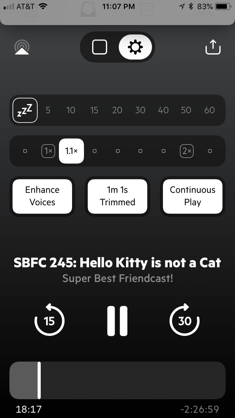
Swiping to the left on the playback screen reveals the options. You can set the snooze timer, playback speed, and toggle Enhance Voices, Trim Silence, and Continuous Play.
If you're looking for show notes, it's a little hidden away from the Now Playing screen. To access them, just swipe right on the podcast art. Alternatively, you could also go back to the queue or inbox and tap on the arrow button, but this requires more steps.
Overcast clearly handles this better, as show notes appear underneath chapters, and they're both just a swipe away in the now playing view. Honestly, it's just easier and much more streamlined. I hope to see Castro make show notes more accessible when you're playing the episode, rather than having you backtrack.
Per-Podcast Controls

For listeners who prefer to have specific settings for individual podcasts rather than a one-size-fits-all kind of blanket, then rejoice! For Castro 3 has answered your prayers.
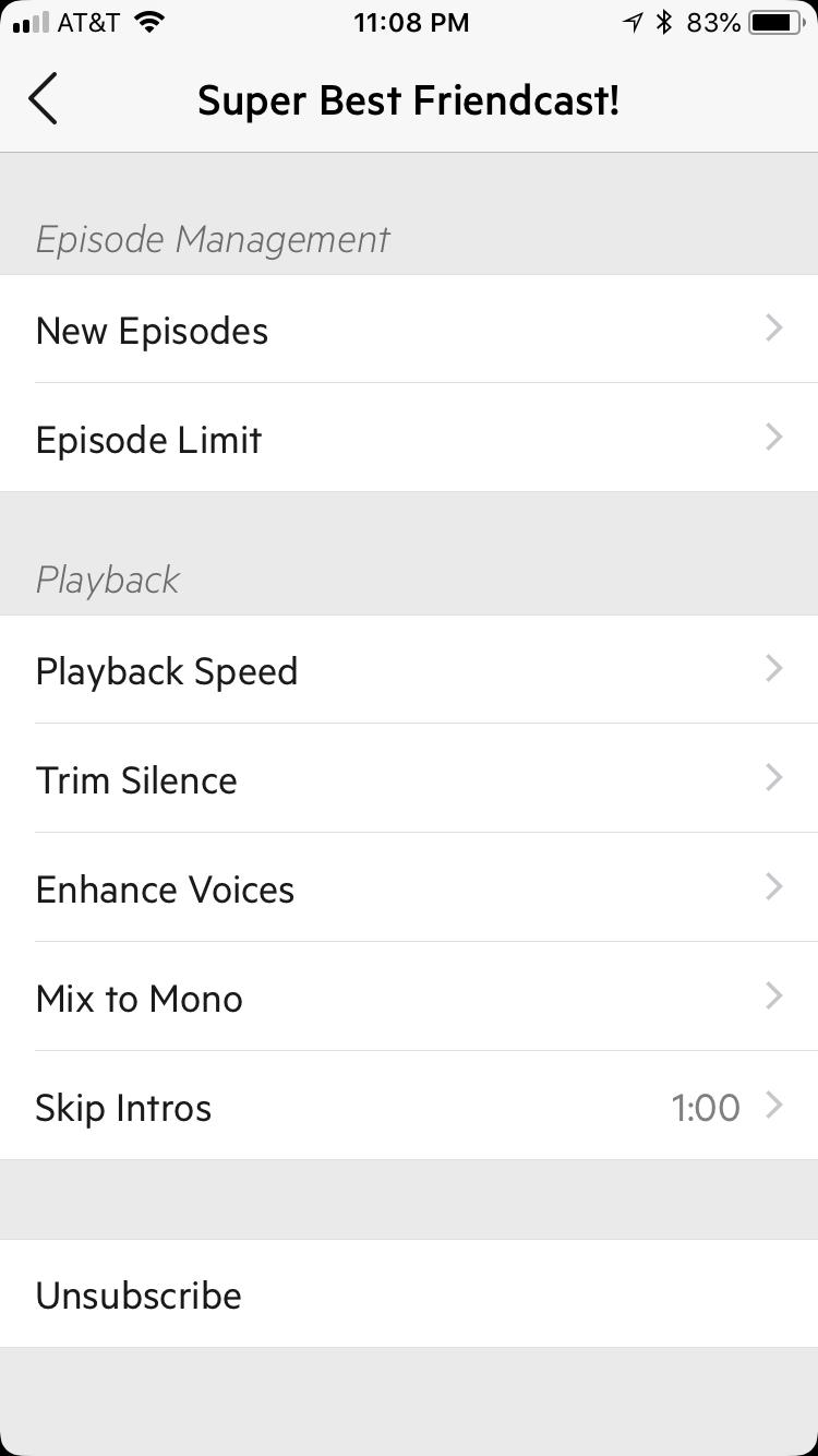
In Castro 3, you're able to adjust the settings for each podcast as you listen to them just by swiping to the left one more time after the playback options. Options per-podcast include how to handle new episodes as they're released, episode limits, and playback. The playback options include playback speed, trim silence, enhance voices, mix to mono, and skip intros.
I know some podcasts may have overly long intros, so I love having the option to skip intros, depending on the show. When you select "skip intros," you're given a dial to select the elapsed time in minutes and seconds. When you set this, new episodes of that show will automatically jump forward to that point, skipping anything that was before it.
While Overcast provides some basic settings for each podcast, Castro ups the ante with this new update. There are many more settings that you can toggle, and it just feels much more flexible overall. It's great for power-users who are particular about their podcasts and have settings that work best for individual shows.
New Apple Watch App

With Castro 3, users get a brand new companion Apple Watch app. This lets users start playing episodes without their phone, and it's incredibly easy to use.
If you're already listening to an episode, the Watch app shows the standard play/pause controls. Doing Force Touch on the screen unveils options for archiving or starring the episode playing. When you tap on "Up Next," your full queue shows up, and then you just tap on an episode you want to listen to. Easy peasy!
Unfortunately, much like Overcast, there is no offline listening on the Apple Watch, or even adjusting volume with the Digital Crown. This is due to limitations with WatchKit, unless Apple decides to change this in the future.
Castro Plus

Castro 3 brings about a change in the pricing structure as well. Previously, Castro was a premium app that had a cost of admission to enjoy the features.
Now, Castro 3 is free to download, so anyone can grab the app and give the unique triage system a try. If you bought Castro 2, you'll continue to get Enhance Voices and Dark Mode for free.
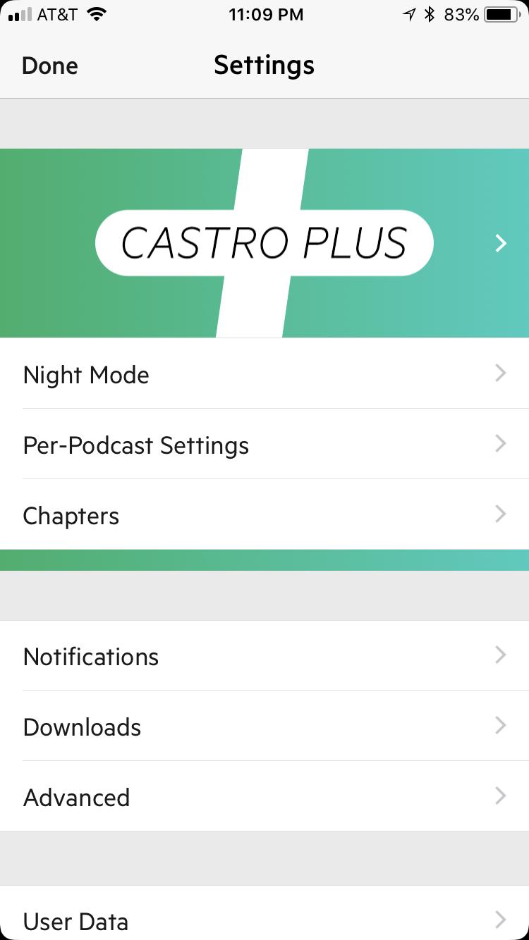
Castro Plus is a new subscription model that costs $2.99 a quarter or $8.99 a year. With Castro Plus comes Trim Silence, support for chapters, Mix to Mono, per-podcast controls, Enhance Voices, and Dark Mode.
The price of Castro Plus is a dollar less than Overcast Premium ($9.99 a year), and in my opinion, includes more features that make it worth it. The feature set is now very similar, so it mostly comes down to personal choice.
The Castro We Deserve
I've always enjoyed the aesthetic of Castro over Overcast but continued to use Overcast because of the feature set. Now that Castro 3 brings about a slew of powerful new features, it's a much harder choice to choose between the two. Each one has their own strengths and weaknesses, but the playing field is much more level now.
Christine Romero-Chan was formerly a Senior Editor for iMore. She has been writing about technology, specifically Apple, for over a decade at a variety of websites. She is currently part of the Digital Trends team, and has been using Apple’s smartphone since the original iPhone back in 2007. While her main speciality is the iPhone, she also covers Apple Watch, iPad, and Mac when needed. When she isn’t writing about Apple, Christine can often be found at Disneyland in Anaheim, California, as she is a passholder and obsessed with all things Disney, especially Star Wars. Christine also enjoys coffee, food, photography, mechanical keyboards, and spending as much time with her new daughter as possible.


