Coding custom multi-color map dots for the Transit App

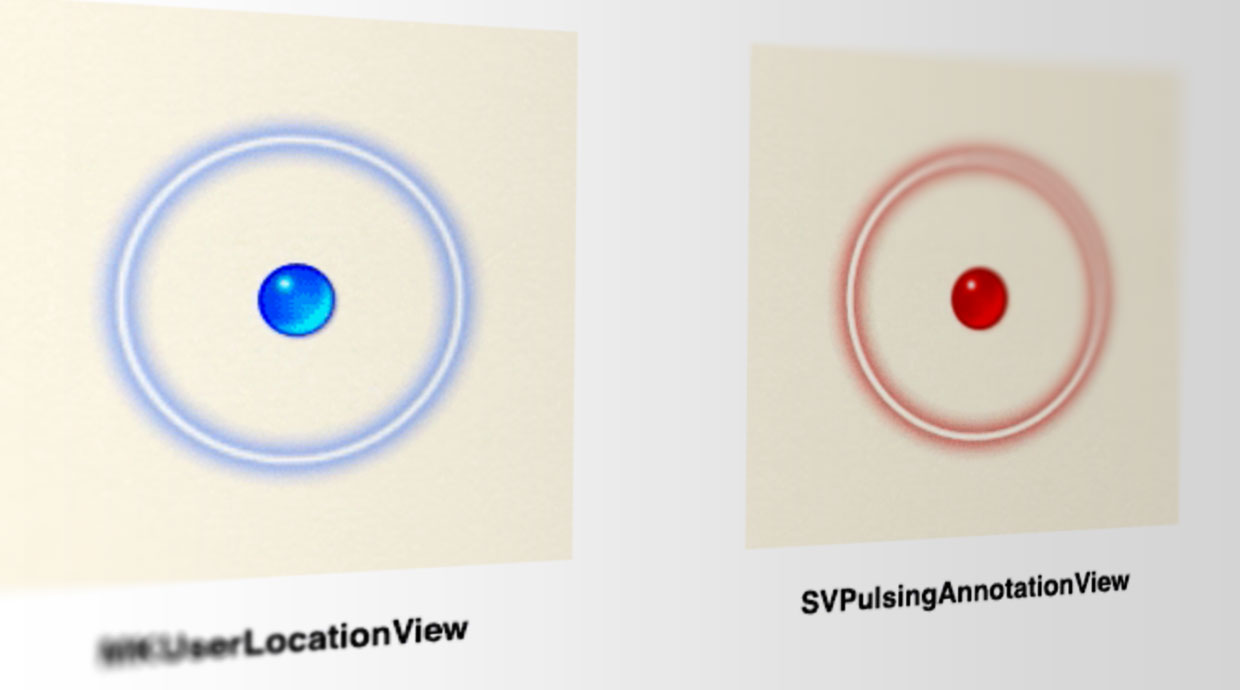
Sam Vermette of The Transit App wanted multi-colored versions of the little pulsating blue dot Apple uses to show your current location in maps, and Apple doesn't expose a public way to do that. So, he had to rebuild it from scratch. Or, in more technical terms, according to Vermette's blog:
Working on Transit’s next big release, we came across the need to be able to give MKUserLocationView (a.k.a. that pulsing blue dot indicating the user’s location) a custom color. Problem is, that annotation view is private, undocumented and, more importantly, made up of resource artworks, making it very rigid to any kind of visual customization. This called for yet another exciting journey of replicating a stock UI element.
Vermette details the process he went through, and the results he managed to achieve. It's a fascinating read not only for developers or designers working on custom controls, but for anyone interested in just what goes in to making even the smallest interface elements delightful.
Source: samvermette.com
Master your iPhone in minutes
iMore offers spot-on advice and guidance from our team of experts, with decades of Apple device experience to lean on. Learn more with iMore!

Rene Ritchie is one of the most respected Apple analysts in the business, reaching a combined audience of over 40 million readers a month. His YouTube channel, Vector, has over 90 thousand subscribers and 14 million views and his podcasts, including Debug, have been downloaded over 20 million times. He also regularly co-hosts MacBreak Weekly for the TWiT network and co-hosted CES Live! and Talk Mobile. Based in Montreal, Rene is a former director of product marketing, web developer, and graphic designer. He's authored several books and appeared on numerous television and radio segments to discuss Apple and the technology industry. When not working, he likes to cook, grapple, and spend time with his friends and family.
