Dear Apple: It would make me really happy if you made these two changes to Folders on iOS 8

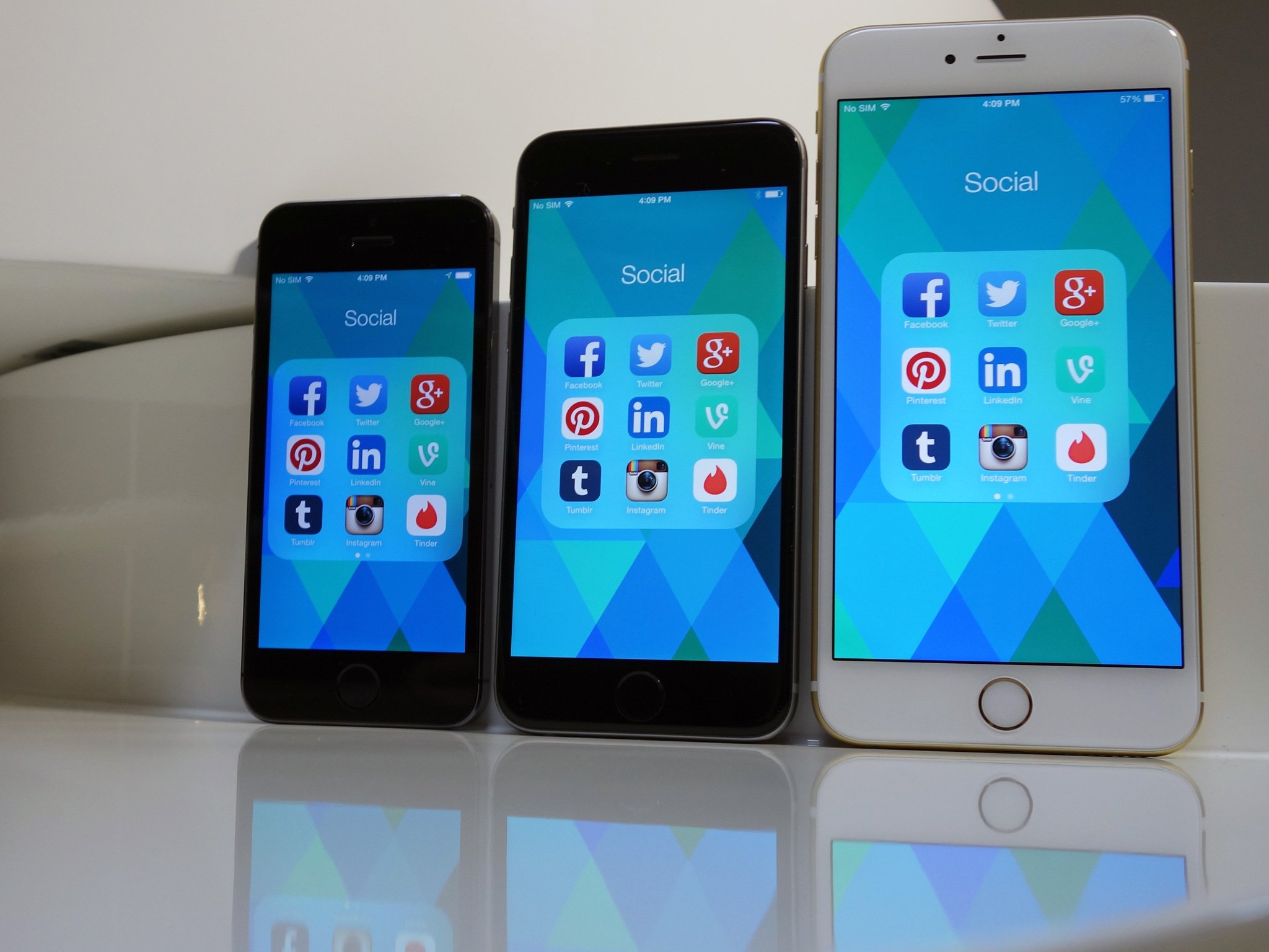
The iPhone 6 Plus would really benefit by giving folders reachability view by default and providing an option to view more than nine apps per page
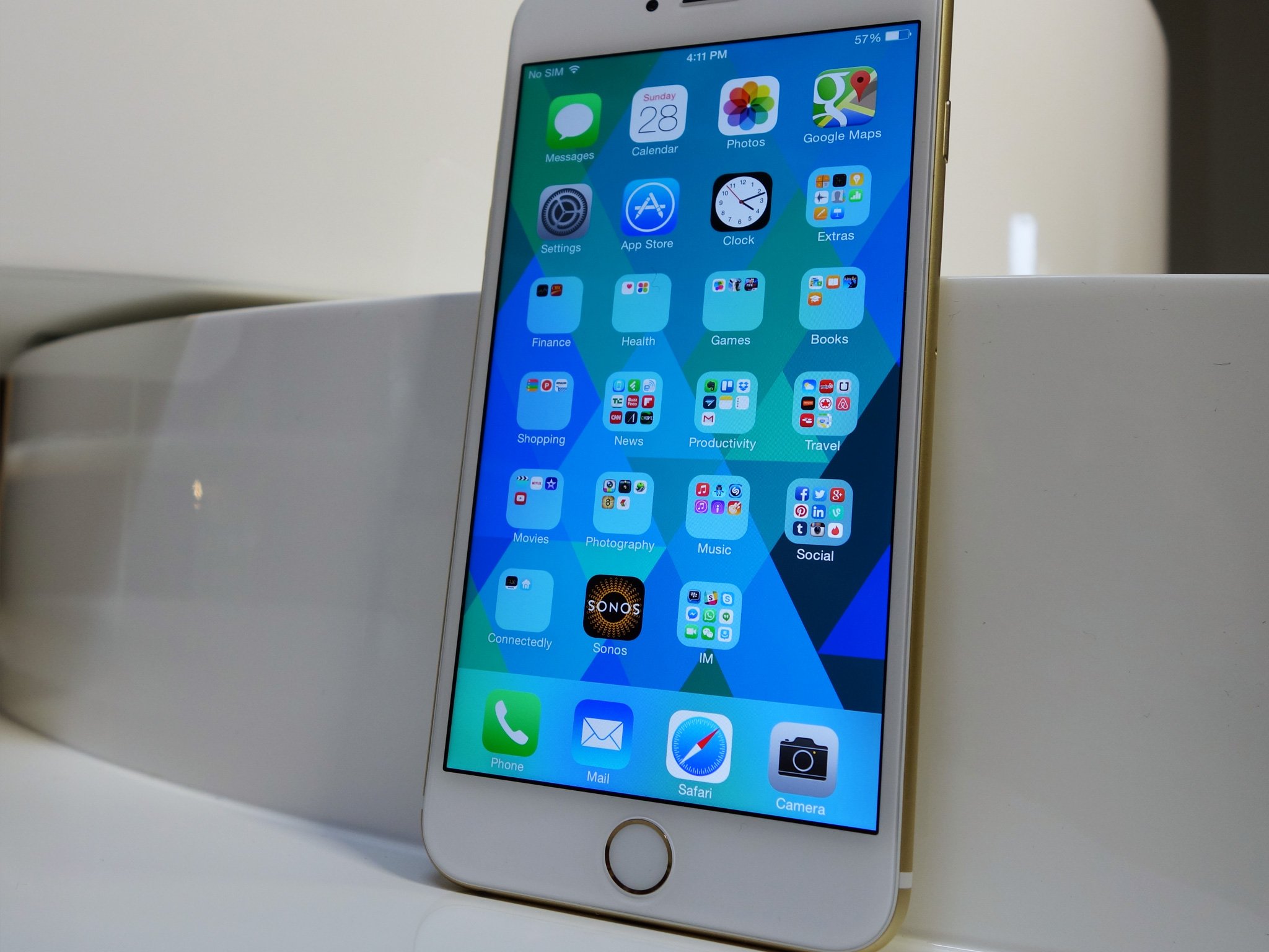
When it comes to arranging the application shortcuts on my phone's home screen, I'm a folders addict. I hate scrolling horizontally through pages and pages of apps. Occasionally I try and allow apps to spread out across more home screen panes, but eventually my OCD kicks in and I spend hours re-organizing everything until I'm down to fitting it all neatly on the default home screen view, with my most frequently-used apps at the bottom so they're easily within reach of my thumb. Accomplishing this typically means I need to use a lot of folders.
This isn't just an iPhone behavior for me. I seem to do the same thing whether I'm using an Android phone, BlackBerry or Windows Phone (though in the latter case I want to minimize vertical scrolling; thankfully Microsoft recently added support for Live Folders in Windows Phone 8.1 which has helped to further compress things). The power user and productivity monster in me needs to optimize the home screen layout so locating the apps I want to open is as efficient a process as possible, whether I'm holding the phone in one hand or two.

How Apple Ruined Folders For Me
In my opinion, Apple took a step backwards in iOS 7 when they reduced the number of viewable apps in a folder from 16 to nine. To give Apple credit, with this same update they did add pagination to folders — thus allowing a user to place up to 135 apps in a folder if he or she really wants to (15 pages x 9 apps per page). From my experience though, I've never found this functionality to be all that beneficial beyond serving as a graveyard of forgotten apps.
Once an app is on page 2 or more of a folder, I tend to forget I even have it installed. Out of sight, out of mind, right? And for apps I do remember and want to use that are tucked away deeper than the first page of a folder, I can typically get to them much faster by searching for the app name rather than swiping through page after page in a folder. Given the choice, I'd always prefer to have more apps viewable within the first page of a folder than less.
Unfortunately, despite the iPhone 6 and iPhone 6 Plus growing in size with their larger displays, for iOS 8 Apple has so far chosen to keep the number of viewable apps in a folder the same as in iOS 7. I know I'm not alone on thinking this is rather limiting.
.@reneritchie Apple still keeping nine visible icons in a folder feels a bit limiting on the new iPhones pic.twitter.com/1S7DzRfhN2.@reneritchie Apple still keeping nine visible icons in a folder feels a bit limiting on the new iPhones pic.twitter.com/1S7DzRfhN2— Marcus Adolfsson (@madolfsson) September 20, 2014September 20, 2014
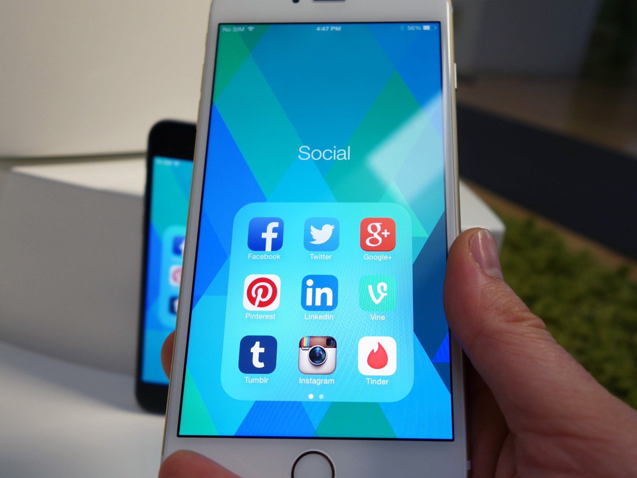
What makes the user experience even worse with the iPhone 6 and iPhone 6 Plus compared to the smaller iPhone 5, is given that the folder is vertically-centered on the now-larger iPhone 6 displays I have to use reachability mode nearly every time I open a folder when navigating my phone one-handed (especially the 6 Plus). It's an aggravating, almost comical experience, especially given that I'm a Folder junky and am tapping into folders regularly. For an often occurring situation such as opening a folder, having to use reachability on such a frequent basis seems like a band-aid solution, and not a very good one.

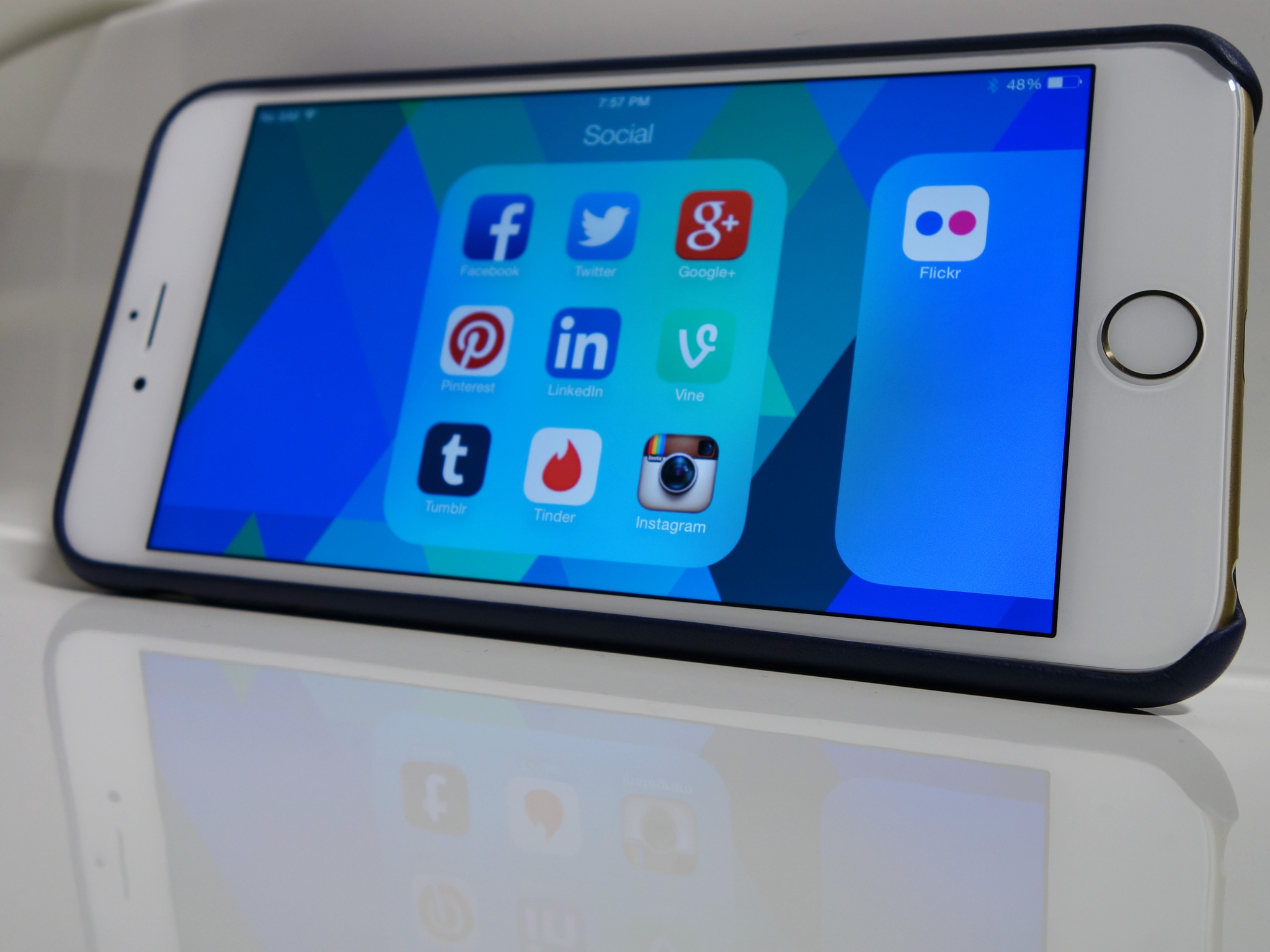
What I find perhaps even more frustrating is that Apple didn't completely overlook Folders on iOS 8. On the iPhone 6 Plus, if you hold the phone in landscape and navigate into a folder that has more than nine apps in it, you'll see a partial view of the second page of apps. It's a nice touch, but from my experience so far on the 6 Plus its one that I'll rarely use. When navigating the home screen, I am almost always using the phone in portrait.
Master your iPhone in minutes
iMore offers spot-on advice and guidance from our team of experts, with decades of Apple device experience to lean on. Learn more with iMore!
Had Apple overlooked Folders completely in iOS 8, I maybe wouldn't even have been prompted to write this opinion editorial. However, when I saw they made the decision to improve the landscape layout of Folders but not address the usability of Folders in portrait, I just had to say something.
How Apple Can Make Folders Better Again

From my perspective as a consumer and not one of guys or gals writing the code, the solution to my Folder woes seems very straight forward. Ideally, Apple should add a system setting for Folders where I can set preferences. One option should be to choose the vertical alignment of folders on the phone, either: middle (as it is today), top or bottom. We know bottom alignment is already baked into the OS, considering this is the view you get once you double tap the home button for reachability.
A second user preference I'd like to see on the Folders settings page would be an option for number of apps to display per page. Nine apps could remain the default, but an option to show 12 or even 15 apps would be awesome.
If Apple doesn't want to go the user-customization route, at a minimum I believe iPhone users would be better served by changing the default vertical alignment to be at the bottom of the screen and increasing the default number of apps to 12. The need to double tap to enable Reachability every time I open a folder would go away, and I'd actually have access to even more apps than there are today.
To me, it's a no-brainer that Apple do this. Agree? Disagree? Be sure to weigh in with your iOS Folder thoughts in the comments!

