Deconstructing Apple's October iPad and Mac event
On October 23, 2012, Apple held a special event to introduce their new Mac and iPad lineups. Unlike the previous month's iPhone 5 and iPod event, it wasn't bifurcated into effectively two different keynotes, nor was almost any time at all spent on software. Instead, one after another, product after product, spec updates, redesigns, and entirely new hardware was shown off on the California Theater stage. It was an unprecedented display of force projection. It was Apple firing everything. It was Tim Cook clearing his skies.
Yet at the same time, the pre-event hype seemed decidedly muted, at least compared to the iPhone 5 event in September. Was that simply because the iPhone remains the densest attentional gravity well in Apple's lineup? That the consistency and accuracy of rumors have begun to suppress the expectation of surprise, and hence, urgency of the event? That two events in such close proximity, even from Apple, simply can't maintain the intensity threshold of events more often spaced out across the year?
The state of Apple
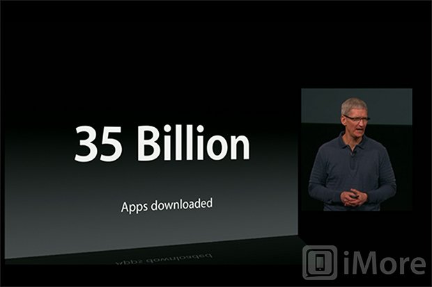
Apple's CEO traditionally comes out first to welcome the crowd and set the stage for the event that follows. That's Tim Cook's role. He gives the mission statement and the mission brief, and his status updates are filled with something all too rare in consumer electronics -- actual numbers. Not numbers of products shipped or ordered or merely hoped to be sold, or users of ancillary services co-opted or confounded into new services, or percentages of nebulous markets in vague regions. Cook's numbers are of actual things sold to and used by actual people. And, as usual, they were impressive.
The iPhone 5 sold 5 million units its first weekend. The iPad line has sold 100,000,000 tablets to date. There are now 200,000,000 devices running iOS 6. 700,000 App Store apps, over a third of which are iPad apps or have iPad optimized interfaces. And more.
Those numbers would be especially important later in the event.
iBooks 3

While giving out the numbers for iBooks, which included 1.5 million items in the library and 400,000,000 downloads, Tim Cook also paused long enough to introduce a new version of iBooks and show off some new features.
From the beginning we'd heard the iPad mini was about removing weight and cost as barriers of entry to iPad sales, and about taking the ebook fight to, as Ryan Block of GDGT aptly terms them, Amazon's Kindle line of consumer content appliances. Yet right up front the new version of iBooks was relegated to an en-passant by Tim Cook.
Master your iPhone in minutes
iMore offers spot-on advice and guidance from our team of experts, with decades of Apple device experience to lean on. Learn more with iMore!
In hindsight it should have been obvious. Apple could equal or eclipse the Kindle catalog through sheer force of deal-making, something they traditionally excel at. But the Kindle's strength is ubiquity -- it works on almost every platform, Apple and non-Apple alike. While Apple did make iTunes for Windows, they haven't made any iTunes apps for any other non-Apple devices. And because, unlike music, commercial ebooks are still bound by DRM (digital rights management), they can't be opened by generic ereaders either. When you buy Kindle books or iBooks, you're locked into that format, and the Kindle cage is simply much, much bigger.
Cook did announce additional language support yesterday, including Asian-languages like Chinese and Japanese (which looked gorgeous), bringing their total supported language count to 40. Amazon still seems stuck at 9, all of which require latin-based alphabets. Asia, and China in particular, are huge markets for Apple. That could make some difference going forward.
But for now, more content, in more places, on more devices, among other reasons, simply trumps whatever technical, interactive, and visual advantages iBooks has on iOS. Ultimately, the ability login, be it on a $69 Kindle or high end smartphone or tablet, have access to your entire ebook library, synced and ready to go, even in base text, is compelling, and is something Apple simply can't and won't match .
Given that, my expectation that Apple would make a direct run at Amazon in the ebook space was unrealistic. Given that, a broader focus on education at yesterday's event, which would have almost certainly required a broader focus on books and textbooks, was also unrealistic.
The ongoing lack of iBooks for Mac is disappointing, but a new version of iBooks keeps Apple's foot in the door, provides an amazing experience for those for whom experience matters more than Kindle's ubiquity, and the focus on languages grows Apple's advantages in international markets, especially asia.
The 13-inch MacBook Pro with Retina display
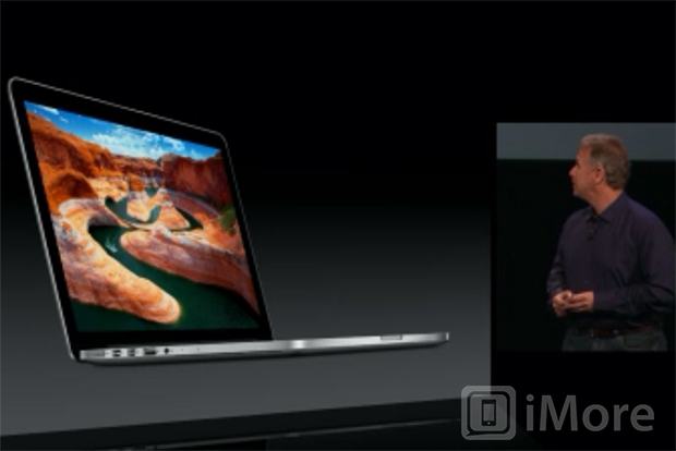
The 13-inch MacBook Pro with Retina display had been widely rumored prior to the event, but it also made the most sense for Apple when it comes to the Retina Mac line. The iMacs are too big to cost-effectively deploy Retina panels, and the MacBook Airs are too small to balance out battery life (for now).
The 13-inch MacBook Pro uses the same body design as the 15-inch MacBook Pro that debuted at WWDC 2012, but at a smaller size. That makes it the lightest, thinnest MacBook Pro ever (a recurring theme for Apple if ever there was one). Retina was also given the same, very technical, very spec-heavy pitch on the 13-inch machine as it was on the 15-inch. Phil Schiller even had the word "nit" (a measure of visible light intensity or brightness) up on a slide. That's because Retina is something that needs to be explained. More pixels that are tinier pixels that ultimately make all pixels all but disappear needs to be defined. It makes Retina sound impressive, and since Retina is the new 13-inch MacBook's main selling feature, it needs to sound impressive. So, specs. And nits.
What was interesting, however, is that Apple went Retina on the 13-inch MacBook Pro without adding a discrete GPU (graphics processing unit). Both the 15-inch and 13-inch MacBook Pros have Intel HD Graphics 4000 embedded GPUs. The 15-inch also has an NVIDIA GeForce GT 650M GPU and switches between them depending on the task. Since the 15-inch can feel maxed out, even with the discrete GPU, I assumed Apple would add a discrete GPU to 13-inch MacBook Pro as well to make things as performant as possible. Clearly, I assumed wrong.
Maybe the slightly smaller panel size -- 2560x1600 versus 2880x1800 -- is enough to make the embedded graphics work, or maybe the demands of the big boy chipset on the smaller MacBook Pro are simply untenable. The HD Graphics 4000 can support dual 2560x600 external display setups all on their own, but the ability to kick into that better chipset is an advantage I enjoy on a pro-level machine.
That's the traditional tradeoff, though. With the 15-inch you get the discrete graphics as well as options for quad-core Ivy Bridge processors and up to 16GB of RAM. With the 13-inch you get smaller and lighter. For a lot of people, those that don't live in Final Cut Pro X or other performance-bound apps, smaller and lighter will win.
For everyone who lusted after the Retina MacBook Pro, but for whom 15-inches was just too big and heavy to lug around, the 13-inch is what you've been waiting for. At least until the Retina Airs ship...
The Mac mini
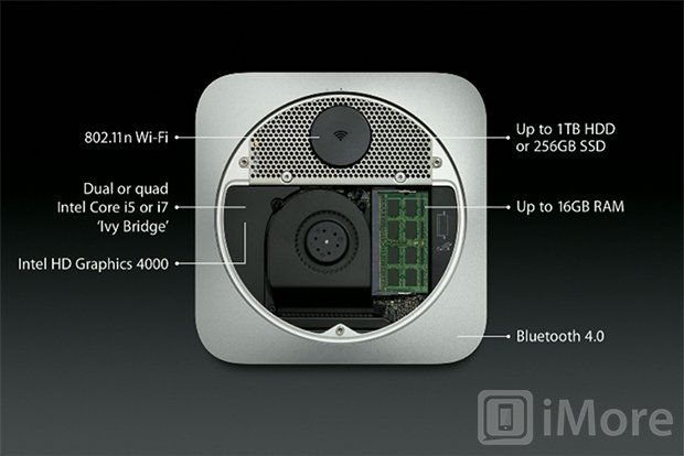
As expected, the Mac mini scored an update to the latest Intel Ivy Bridge processors and also an upgrade to USB 3. Despite Samsung and Google having totally ripped off the current Mac mini design for the ChromeBox, Apple didn't do anything to evolve the look.
So the Mac mini remains what it was, only better -- a good choice for multi-platform developers, home theater aficionados, and those who want a small but powerful OS X server box.
The iMac
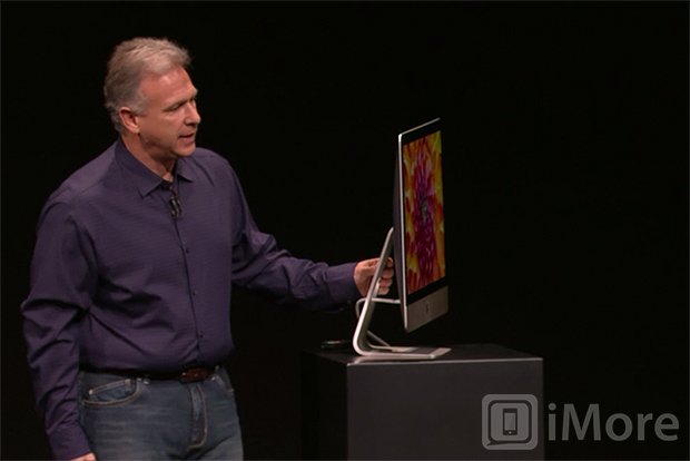
The new iMac wasn't a huge surprise, though the degree to which Apple sharpened its edges was certainly surprising. 5 mm. You could cut someone with that.
To achieve the new, almost absurdly thin profile, Apple jettisoned the optical drive, just like the MacBook Air and Retina MacBook pro before it. That was an aggressive choice for a desktop machine that really doesn't benefit from thinness and lightness the way portables do. Yet Apple is also the company that killed the floppy, and clearly Apple believes optical is the new (deceased) floppy.
Did Apple have to move the built-in optical drive to an external peripheral (the same one the MacBook Air has had as an option since launch), and move the SD card slot to the rear, and otherwise sacrifice the convenience of a segment of their user-base for what looks on the surface to be simply less surface?
Of course not, but this is what Apple does. Because of the way they build devices -- designing the way to design them, manufacturing the way to manufacture them -- they exist in the relative future. And now just as competitors have begun copying the iMac to embarrassing degrees, the way they copied the MacBook Air and Mac mini, Apple has already moved the design bar even further out. If you walk into a big box retailer, and if by chance Apple products aren't isolated in their own oasis-within-a-store, no clone will be mistaken for an iMac. At least not for a couple years again.
Oh, and the iMac got all new, Ivy Bridge-powered internals as well, along with Apple's new Fusion Drive which intelligently manages an SSD and HDD as a single logical unit, allowing for fast boots, app launches, and read/writes, but also voluminous storage. Given the ongoing lack of compelling upgrades to the Mac Pro, for anyone who doesn't need four drive bays and the other benefits that come with a tower, the new iMac could prove compelling enough to switch product lines for.
Personally, however, I'm waiting on the updated ThunderBolt Displays with laminated screens and USB 3, but those are likely several months out as all the 27-inch panels will first go to satisfying iMac demand.
iBooks Author
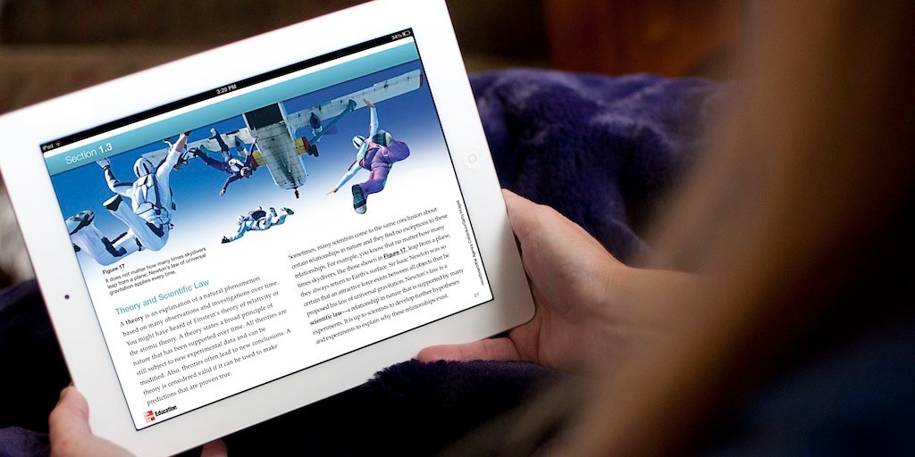
If Tim Cook introducing iBooks wasn't interesting enough, he also introduced an updated iBooks Author as part of the iPad overview. Apple held a special education event earlier in the year to announce textbooks for the iPad, and iBooks Author was the way to more easily generate those rich-media publications.
Tim Cook claimed at yesterday's event that 80% of the U.S. school core curriculum was now covered by iBooks textbooks, and that they're deployed at more than 2500 schools in the U.S. (Sadly, they're still not deployed to iPhone or iPod touch.) The new version of iBooks Author includes vertical templates, embedded fonts, rendered mathematical formulae, multitouch widgets, and am easier, better process for updating books. International textbook support, of course, can vary wildly.
Again, it isn't overly aggressive, but it's realistic.
The iPad 4
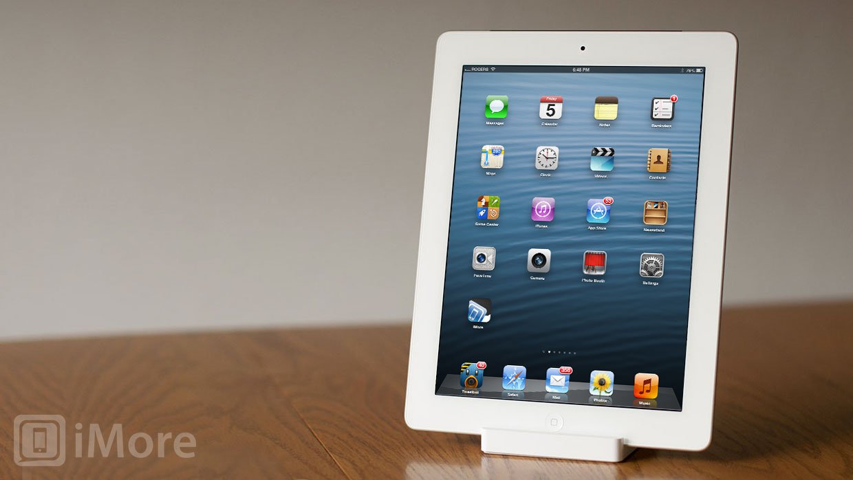
For a couple of years now Apple was rumored to have had next-generation iPads ready to launch before the holidays, but always held off until the same spring event that saw the original iPad introduced. Not so this year. While Apple has typically stayed close to 1 year cycles for iOS devices, the iPhone 4S and Apple TV 3 took approximately 16 months and 18 months respectively, and the iPod touch 5 took 24 months. Now the iPad 4 took only 7 months.
We'd heard about the refresh months ago, but what surprised me was that Apple actually came out and called the refreshed iPad 3 the "4th generation iPad". I figured they'd play it like the Verizon iPhone, where a new carrier let them roll out a fixed antenna design at the same time. In this case, the expanded LTE footprint of the new radio chip could have been used to roll out the Lightning adapter and new internals in a way that wouldn't make existing iPad 3 owners feel instantly obsoleted.
That was the whole advantage to calling it "the new iPad". Dropping the version numbers, and the ability to play "iPad 3S" cards, smoothed the way for new versions at any point in the product cycle. But with the jump from an Apple A5X to an Apple A6X system-on-a-chip, Apple was upfront enough to not only give the new iPad a new generation, but announce it as such.
Although it likely won't be perceived as such by iPad 3 owners, that's a remarkable amount of respect to give your customer base.
It's also no-win for Apple. When Apple waits, they aren't innovative fast enough and they're losing out to the competition. When Apple moves aggressively, they're "screwing" users. But Apple doesn't really care about competition or about either sentiment. Not really. They care about making better products, which is what the iPad 4 is. And no one who has an iPad 3 has to buy it.
Those for whom the iPad 3 was a poor compromise between screen density and performance, or for those whose LTE bands it simply didn't support, it'll be something finally worth buying or upgrading to.
The iPad mini
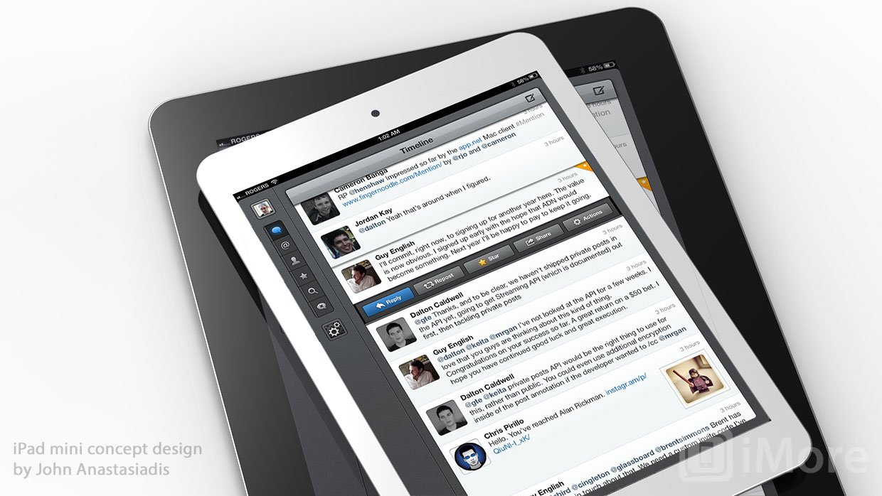
The iPad mini ended up being almost exactly as expected. The big surprise for me here was the lack of an 8GB SKU for under $300. Either that SKU never existed or it was dumped. My guess is it was dumped.
At $250 the iPad mini would have annihilated the small tablet market. At $329 there's a $200-$300 umbrella underneath it where other at-cost or content-subsidized tablets and appliances can breathe and get a foot in the door. Granted an 8GB iPad mini would have been a poor user experience (which is likely why it was, properly, killed), but it would have shut that door. Hard. (And gotten a lot of people into stores who may have then gone 16GB for $350 anyway.)
Instead, Phil Schiller spent some time comparing the iPad mini to the Nexus 7 (though without naming the Nexus 7). That seemed like Apple explaining why they deserved $80 more for the iPad mini than Google charges for a similar capacity tablet. In other words, bigger screen, better apps. It was an odd segment, and arguably they didn't need to make that case, but they chose to.
And kudos for making a better small tablet, not just a smaller one. (Though again, I'm sure many won't appreciate what went into that decision.)
As to the device itself, the only truly new device Apple unveiled yesterday, Jim Dalrymple of The Loop had, among other things, this to say:
The iPad mini can easily be held with one hand for reading. Menus and other onscreen items can be reached with that hand if they are close. Of course, you can’t expect to be able to navigate the mini’s screen with one hand, but you can touch and scroll.
John Gruber of Daring Fireball's quick take included:
Screen resolution-wise, it’s exactly what I expected for a 163 PPI display in 2012: noticeably nicer than the 133 PPI iPad 1/2, noticeably worse than the 266 PPI iPad 3/4. The iPad Mini display seems brighter and to have better contrast than the iPhone 3GS display, but unsurprisingly, rendered text looks exactly like it does on the 3GS.
It's basically got the iPod touch 5 casing and internals with a miniaturized (Apple says "concentrated") iPad-style 4:3 screen at 7.9- rather than 4-inches. In terms of both positioning and name, the iPad mini really is the iPod mini strategy. It's not for those who want a cheaper iPad. It's for those who want a more portable iPad, even if they have to compromise on some other factors, like screen density, to get it.
In addition to all the other iTunes content, however, the iPad mini runs iPad apps, which neither the iPhone nor iPod touch can do. Tim Cook pointed out there's over 250,000 of those now, which makes competing tablet apps little more than a rounding error.
That's what makes the iPad mini and iPad, and what makes it different from anything else currently on the market.
No iOS 6.x or OS X 10.8.x
Absent from the event was any time dedicated to new system-level features. There was nothing new in iOS to show off alongside the iPad mini, and nothing in Mountain Lion to show off alongside the new 13-inch MacBook Pro with Retina display. There was no Scott Forstall or Craig Federighi on stage at all. This was a hardware event with a couple of iBooks mentions, not a hardware and software event.
I guess we're waiting on spring and summer to see what's next for OS X and iOS.

Rene Ritchie is one of the most respected Apple analysts in the business, reaching a combined audience of over 40 million readers a month. His YouTube channel, Vector, has over 90 thousand subscribers and 14 million views and his podcasts, including Debug, have been downloaded over 20 million times. He also regularly co-hosts MacBreak Weekly for the TWiT network and co-hosted CES Live! and Talk Mobile. Based in Montreal, Rene is a former director of product marketing, web developer, and graphic designer. He's authored several books and appeared on numerous television and radio segments to discuss Apple and the technology industry. When not working, he likes to cook, grapple, and spend time with his friends and family.
