I grew up immersed in art books. My mother lectured on history of art and architecture and later taught art education. Some of my earliest memories involve seeing enormous books filled with everything from Michelangelo to Miro, and countless trips to museum and their gift shops, and all the books that inevitably followed us home. Our shelves were filled with them and our coffee table often overflowed.
One of the biggest purchases I made as a child were copies of the original Graffiti Design hardcovers of The Dark Knight Returns and The Watchmen. They were over a hundred dollars each and drained me of my savings at the time. I couldn't believe books could cost so much. But, as I poured over the art and behind-the-scenes material, every page felt worth it.
They, and the others I carefully added to my collection over the years, varied in price but each contained art I admired, stories that inspired me, and gave me something to hold that felt worthy of the material it contained. They're among the few physical books I still possess, the ones that fill my shelves and overflow my coffee table today.
Each one, in its own way, has educated and inspired me, taught me about process and craft, and given me insight into the passion and pain of creation.
That's the background and baggage I bring with me to Designed by Apple in California. A new, lavishly — ludicrously — produced photo book, it aims to celebrate and document the historic collaboration between the late Steve Jobs and Jony Ive, and the crushingly brilliant industrial design team they put together at Apple.

Eight years in the making, it includes 450 pictures spread across 300 pages, all shot by photographer Andrew Zuckerman. Available in both regular 10.2 x 12.8-inches or 'plus' sized 13 x 16.3-inches, it's got a price tag as big as its bindings — $199 and $299 respectively.
That the book exists at all, and at the price point it does, has generated just exactly the expected amount of internet angst you'd expect.
Some claim it as a signal that Jony Ive is closing a chapter of his career, perhaps to start the next one, at Apple or elsewhere. Others see it as a final farewell to the man who founded and returned to save Apple in impeccably printed form. Still others see it as yet another sign of hubris and avarice from a company increasingly disconnected from its core customer base.
So, which is it?
About this review
I've spent the last couple of weeks immersing myself in the larger version of Designed by Apple in California. My colleague, Serenity Caldwell, took a look at the smaller version (and took almost all the photos and the video for this review).
In an effort to provide greater context, I've also asked several prominent Apple accessory makers to share their thoughts on Designed by Apple in California for this review as well.
Production
Designed by Apple in California is packaged as impeccably as every Apple product. The opening is more of an unveiling, deliberately crafted to lead your through the process and set the stage for your initial experience and first impressions. In this case, there's a weight to it, especially the larger version, that almost feels like gravity. And when you unwrap it, you feel like you've just discovered some long-lost tome, or received some fabled manuscript. That or simply, "Oh my god, heavy! HEAVY!"
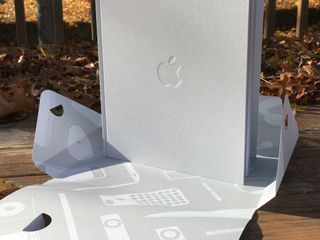
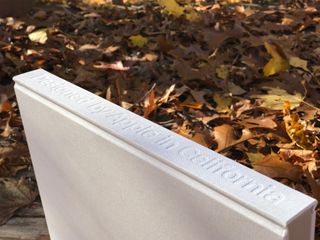
The cover is white but textured. It's so white and so textured that I was immediately afraid I'd somehow dirty or lint it up before I even looked at it. A couple weeks in, though, and it's fine. (Probably because I'm so paranoid about it.)
The front has an Apple logo deeply embossed. The spine, the title — Designed by Apple in California. And it crackles when you open it.
"I've never felt paper like this. I didn't know there was paper like this." That's what raced through my head as I began to leaf through its pages. German-milled and gilded with silver edging, because of course they are.
I can't swear to it, but the larger book feels like it has even heavier paper. Not so much that you want to reach for a spatula to help flip them, but enough that the ridiculousness of that thought made it into this review.
It's absolutely amazing paper, though. Crisp, substantial, not too tacky or too slick, and it makes the term "archival quality" sound insufficient. This, it feels like, was designed for Voyager.
Dan Provost, Studio Neat
"I am an absolute sucker for nice coffee table books, so Designed by Apple in California is right up my ally. If this were a book of just product photography, it would only be mildly interesting, but the deconstructed products and manufacturing tools elevate the book to something more insightful and educational to students of industrial design.
"I would have loved to see more commentary from design team members, or see more of the design process (sketches, early prototypes, etc), but when it comes to Apple being anything other than tight lipped, I'll take what I can get."
The ink is "low-ghost", which basically means the images in Designed by Apple in California appear exactly where and how Apple wanted them, without aberrations in the printing process creating "ghost" images in around them. The process itself is also done with eight-color separation.
Most printing is four-color: cyan, magenta, yellow, and black. Doubling that up provides for greater accuracy, for example by including orange or metallic inks. I'm not sure which colors exactly Apple ended up using, but the results are remarkable and durable. The photos look like the products and that's no likely to change or discolor with age.
I also don't know the resolution Apple used to print the pages but it's the equivalent of "Retina" to my eyes. Thanks to the inks and the density it doesn't so much look like a book as it does the products burned into two-dimensions.
It's an incredibly involved and intricate way to make a photo book but also exactly the way Apple would make a book. This is, after all, the team that bead blasts aluminium, chamfers edges, and painstakingly dyes and polishes phones until they're jet black.
Some of the photos are captioned at the top but not all of them. Unfortunately, the ones that are captioned are the more obvious ones.
Apple includes a separately printed insert tucked into the book that provides details on the products and a glossary of terms, but having the captions next to the photos wouldn't just be more consistent, it would be more useful.
When you see the deep reds, the silver sheens, the richness of the reproduced leathers, though, that's where your attention goes. Designed by Apple in California doesn't come off as incredibly high-end production for its own sake, but as incredibly high-end production in service of the content.
Brian Holmes, [Pad & Quill](/e?link=https%3A%2F%2Fwww.shareasale.com%2Fr.cfm%3Fb%3D695070%26m%3D54540%26u%3D885495%26afftrack%3DUUimUdUnU40329%26urllink%3Dhttp%253A%252F%252Fwww.padandquill.com%252F&token=4wUZdb69
"Good product art is both beautiful and functional. When you look at Designed by Apple in California, the images tell that story well.
"You can have something beautiful but if it does not perform well it's not memorable. Many of the pages in this book display products that evoke memories not only of beauty but of how well these designs performed in our daily lives."
Content
Opening Designed by Apple in California is like opening a time capsule. Not the Apple-branded router — an actual box containing relics from the past. Page after page, everything from the original Bondi Blue iMac from 1998 to the Apple Pencil is laid out before you, naked and raw.
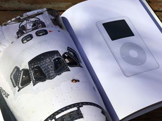
Many of the products, from Mac to iPod to iPhone to TV to iPad to Watch, and their accessories, are photographed against stark white, recreations of the product renders that have filled Apple marketing material over the years. Others are "behind the scenes" versions of the same — spilled out and laid even more bare, their parts and processes exposed for all to see.
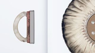
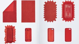
The book doesn't just show off things like the stages of a red iPhone case's creation, though. It shows off the objects used in creation. There are tools here, drills and things for which I know no name. There are wooden boards that contain the guts of what would one day become the Apple Watch.
There are designs that worked, like the original iPhone, and ones that didn't, like the buttonless iPod shuffle. There are designs that don't hold up well in retrospect, like the wide iPod nano, and ones that remain timeless, like the tower Mac Pro.
It's there that Designed by Apple in California shows the most profound trends in the company's design evolution — the move from desktop to mobile and computers to computing appliances.
Apple is both leading and following the market that way, since we're the ones voting with our purchases, but seeing that old "cheesegrator" makes me wish Apple could somehow figure out a way to give us the best of both.

Patrick O'Neil, [Olloclip](/e?link=https%3A%2F%2Fwww.anrdoezrs.net%2Flinks%2F100048246%2Ftype%2Fdlg%2Fsid%2FUUimUdUnU40329%2Fhttps%3A%2F%2Fwww.olloclip.com%2F&token=HdGXvJVn
"I am blown away by Apple's book "Designed by Apple in California". It's amazing to see the detailed design process used to create Apple's products. Have you ever had that feeling of not being able to breathe? That was my reaction as I flipped through every page of the book anticipating what was next.
"I think it was the perfect tribute to Steve Jobs. Thank you for sharing Jony Ive and Apple."
The style of the photography fits the greater body of "visual catalog" work we've seen over the years, and it absolutely fits with Apple's aesthetic.
I have mixed feelings about it, though. Even when you turn the page from a perfect original iPhone to see one worn like the Millennium Falcon, it comes off as oddly sterile, presented without any sense of the human who took it from there to here. For objects that have so influenced our world, seeing them so steadfastly removed from it is beautiful... but lonely.
Perhaps juxtaposing the product shots with more real-world shots would have made for a more meaningful balance.
Also, as a designer and someone with deep and abiding admiration for Apple's work, Designed by Apple in California comes off as too much photo and not enough book.
Interspering the pictures with stories from the design team, even just a few key moments that stood out and meant the most to them — the pivotal successes, failures, and gambles that lead to both — would have elevated Designed by Apple in California to something more.
We've gotten snippets of those kinds of stories here and there before, as part of interviews and profiles, accounts of how the teams avoided the wrong shade of dormitory orange and found precisely the right size of big and bigger. And they're not just delightful, they're inspiring.
Again, there's the product details insert that provides brief descriptions of materials and process. But while the work can and does speak for itself, the working demands a human voice.

Andrew Green, Twelve South
"What a great book. It is wonderful to see the world-shaping Apple industrial design language unfold and evolve page-to-page. It is impossible to appreciate the breadth of work without a retrospective like this collecting the artifacts all in one place.
"That said, I've never seen a retrospective released without also signaling a fundamental shift to the 'next' phase - whatever that may be. I can't help but feel like this is a bookend to one body of work, and perhaps the beginning of the story of another."
Conclusion
For some people, the very idea of Designed by Apple in California stinks. It comes off as the height of pretension and the sign of a growing disconnect between the company and their customers. $200 for a book of Mac and iPhone photos? Of objects on white backgrounds? The Visual Dictionary series manages that for $5 on clearance! How is this deserving of any amount of fuss, much less a ludicrously uptight and expensive book?

For those for whom Mac or iPhone are objects, and profound influences on how they've come to understand design and its role in the world around us, Designed by Apple in California is a treasure trove of exquisitely bound inspiration. Finally! All the products that shaped modern consumer electronic design and a glimpse of how they came to be! Take my money!
Those extremes show why Apple can't just release a book to release a book, not when their every action and inaction is litigated and dissected online with a fever of, well, the social web.
I do believe Apple and their executives tend to be plain spoken and can generally be taken at their word. Here, then, is how Apple's chief design officer, Sir Jonathan Ive, introduced Designed by Apple in California:
"The idea of genuinely trying to make something great for humanity was Steve's motivation from the beginning, and it remains both our ideal and our goal as Apple looks to the future."This archive is intended to be a gentle gathering of many of the products the team has designed over the years. We hope it brings some understanding to how and why they exist, while serving as a resource for students of all design disciplines."
That's the simple truth of Designed by Apple in California. It collects and catalogs the products willed into the world by Steve Jobs, Jony Ive, and the team they assembled in Cupertino. It's a collaboration that meant everything to those involved and one that changed both our collective culture and many of our lives. It made computing ever more personal, ever more beautiful, and ever more mainstream.
Not everyone may believe their work required a book, or if it did that Apple had to make that book themselves. Fine. Whatever. Enjoy your cynicism.
Even if only Jony Ive wanted Designed by Apple in California he's more than earned not the indulgence but the respect to make it so. And if he and Apple wanted to do it themselves rather than outsource it — to treat it with the seriousness they treat every product and push the boundaries of print and binding the way they have metal and plastic — they've certainly earned that right as well.
And what they've created with Designed by Apple in California is one of the most finely crafted books I've ever owned, filled with some of the most popular and pivotal products ever designed. It deserves to exist and I'm glad it does. The design world is better for it. Like the other tomes in my studio, I'll likely only refer back to it a few times a year. But when I do it will be with a smile up to my eyes.
If you know it's not for you, that's great, enjoy something else. If it's already on your shelf or at your workbench, I'd love to hear your impressions of it. If you're still on the back-painted fence, though, then check out one of the Apple locations where it's on display and let me know what you think.

Rene Ritchie is one of the most respected Apple analysts in the business, reaching a combined audience of over 40 million readers a month. His YouTube channel, Vector, has over 90 thousand subscribers and 14 million views and his podcasts, including Debug, have been downloaded over 20 million times. He also regularly co-hosts MacBreak Weekly for the TWiT network and co-hosted CES Live! and Talk Mobile. Based in Montreal, Rene is a former director of product marketing, web developer, and graphic designer. He's authored several books and appeared on numerous television and radio segments to discuss Apple and the technology industry. When not working, he likes to cook, grapple, and spend time with his friends and family.

