From the Editor's Desk: It's all about the aesthetic these days
After taking the last few weeks off, I must say, it's good to be back. And let me tell you — it was nice to be able to watch an Apple event like the rest of you, while my colleagues dominated with the Apple September event coverage! I haven't actually watched an Apple event like everyone else in like, ever, so it was a nice change. But I'm totally ready for the iPhone 12 event next month, that I can tell you.
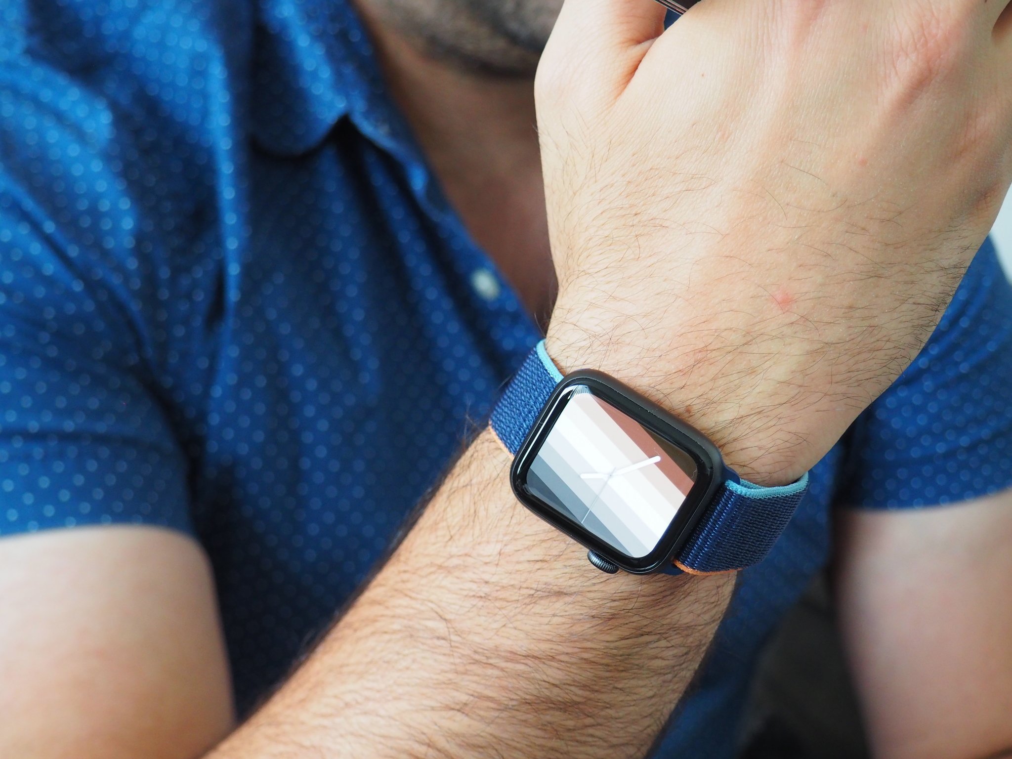
So while I was gone, Apple has released the new Apple Watch Series 6 and Apple Watch SE. Our own Luke Filipowicz has reviewed the Apple Watch SE, and I highly recommend giving it a look. The Apple Watch SE starts at only $279 and it offers an incredible amount of value for first-time Watch owners, or those who are upgrading from an older Apple Watch (Series 0, 1, 2, and 3 primarily).
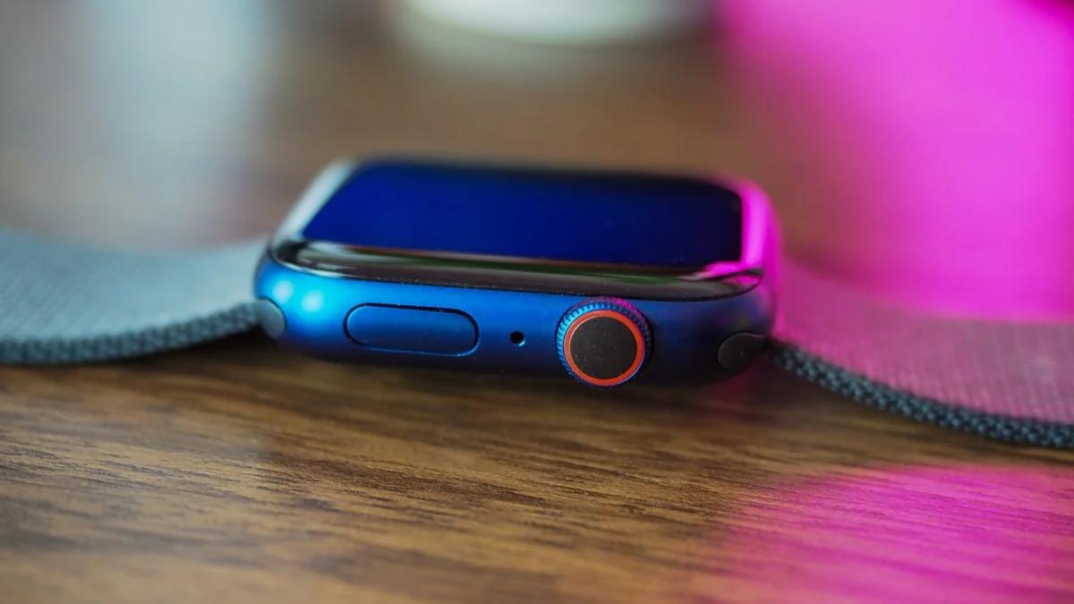
But if you want the latest and greatest, then the Apple Watch Series 6 is a great option, and it only starts at $399. Our own Lory Gil reviewed the Apple Watch Series 6 herself, and she highly recommends it. Since I have a titanium Apple Watch Series 5 Edition, I don't think the blood oxygen monitoring is significant enough to get me to upgrade, even though those new blue and red case colors look hot. Honestly, as a diabetic, I'm waiting for the day that an Apple Watch that will be able to tell me my blood glucose levels, because pricking my finger multiple times a day sucks.
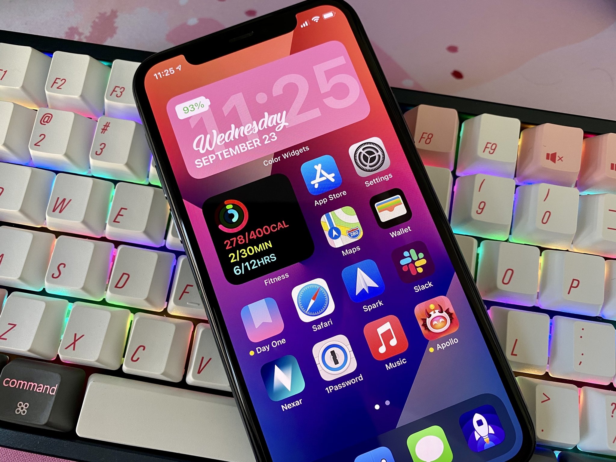
Apple also dropped iOS 14 and watchOS 7, which I have been loving. While my iPhone Home screen has largely remained unchanged for years, I'm especially loving the new widgets and App Library features. It's just as I said months ago — iOS 14 has reinvented the Home screen. I've hidden all of my app pages from page two and beyond, and made sure to toggle on the Setting so all new app downloads just go to the App Library, rather than clutter up my Home screen. I can keep all of my apps and still have a minimalistic Home screen setup — it's all I've ever wanted. And while it isn't for everyone, I've found a few new widgets that are practical on my Home screen, since they give me useful information at a glance.
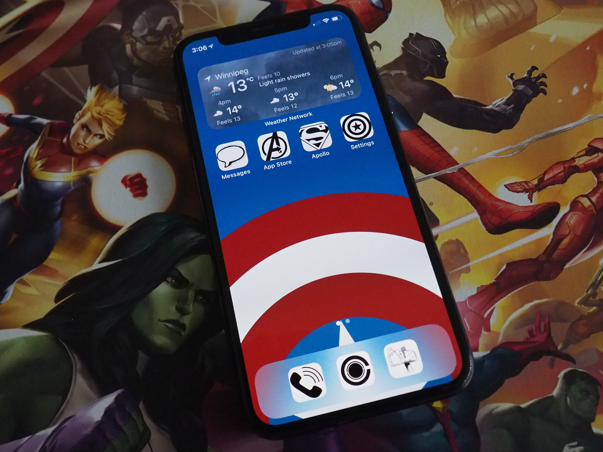
Now, thanks to the whole widgets thing, people have jumped aboard the "aesthetic AF" hype train and have begun to customize their Home screens with colorful, personalized widgets and app icons through Shortcuts. I'm not a big fan of this new trend, because while there are a few cool looking ones, a lot of them look a bit too garish, and it just highlights the limitations of customization on iOS. If you want a cool theme on your phone, you're going to want to change the icon for apps through Shortcuts, and right now, this means that Shortcuts has to open up before you get to your app. The process slows things down, and honestly, just doesn't seem worth it to me — and you can't even get notification badges on icons changed this way.
However, with customization being the hot new thing on iPhones, hopefully Apple takes notice and makes the entire process more streamlined in a future version of iOS. I would like to see something like an icon uploader for an app's settings, rather than having to go through Shortcuts every time. And hey, maybe we can get custom Apple Watch faces sooner rather than later?
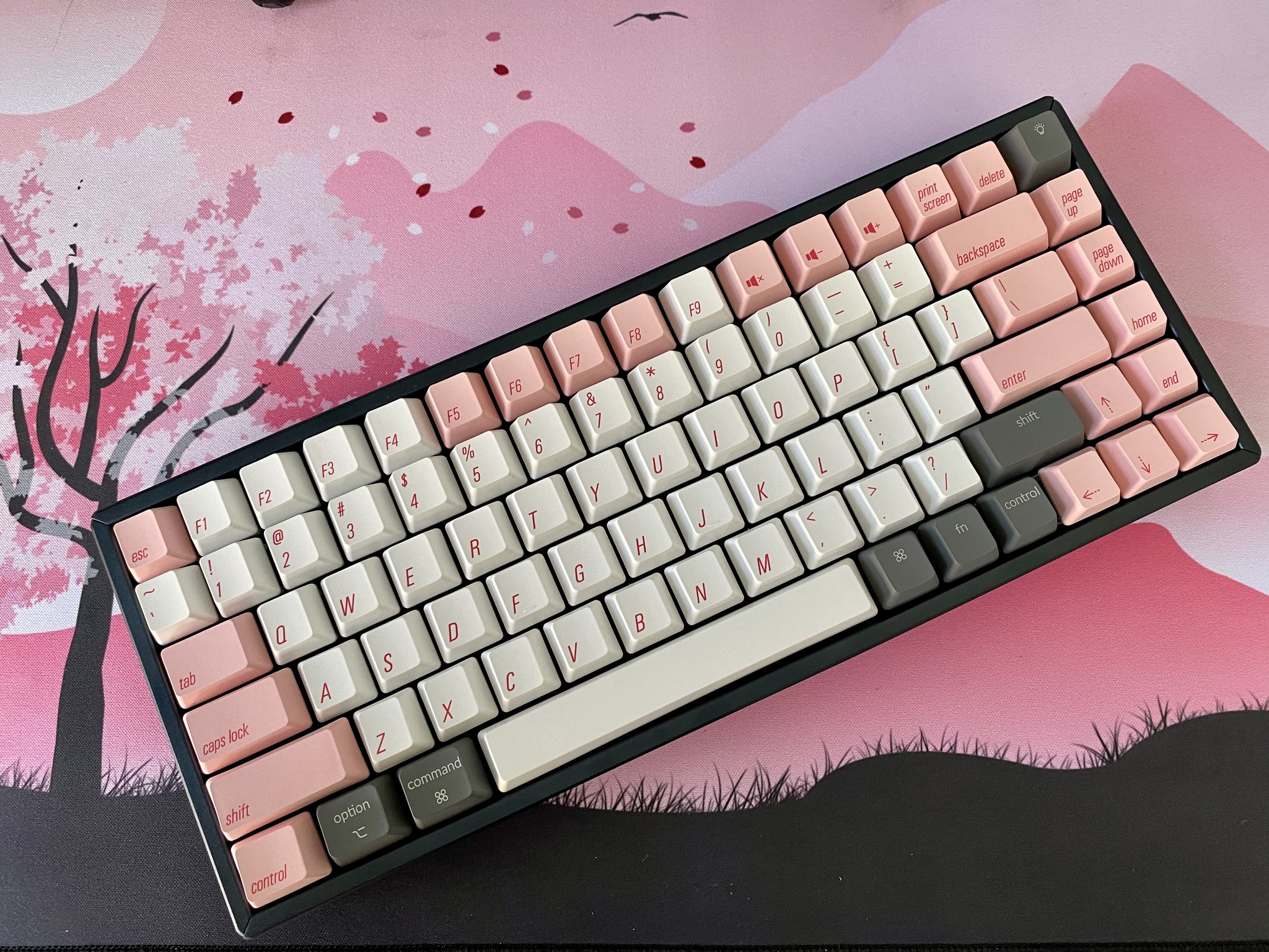
As I was on vacation, I did end up falling into the rabbit hole that is mechanical keyboards. In fact, I reviewed the Keychron K2 V2, which I love using, and it's my first mechanical board. I like to think of it my "gateway" keyboard, because I spent hours just looking at r/MechanicalKeyboards and admiring different boards and keycap sets (goodbye money, it was nice knowing you). Still, I think Keychron makes some nice quality keyboards, and they are a great introduction to mechanicals, especially for Mac users. Keychron boards also have Bluetooth wireless connectivity, which I have learned is hard to find in a mechanical keyboard.
Master your iPhone in minutes
iMore offers spot-on advice and guidance from our team of experts, with decades of Apple device experience to lean on. Learn more with iMore!
Anyways, just a few more weeks until the iPhone 12! And thanks to the latest leak with Silicone Case stickers, it looks like we will indeed be getting four iPhone 12 models: iPhone 12 mini, a regular iPhone 12, iPhone 12 Pro, and iPhone 12 Pro Max. I'm not that happy that the Pro model is no longer going to be 5.8-inches, but that's probably what I'll be going with.
Until next time!
- Christine Romero-Chan
Christine Romero-Chan was formerly a Senior Editor for iMore. She has been writing about technology, specifically Apple, for over a decade at a variety of websites. She is currently part of the Digital Trends team, and has been using Apple’s smartphone since the original iPhone back in 2007. While her main speciality is the iPhone, she also covers Apple Watch, iPad, and Mac when needed. When she isn’t writing about Apple, Christine can often be found at Disneyland in Anaheim, California, as she is a passholder and obsessed with all things Disney, especially Star Wars. Christine also enjoys coffee, food, photography, mechanical keyboards, and spending as much time with her new daughter as possible.

