Evernote 7.3 makes taking notes simpler, more colorful

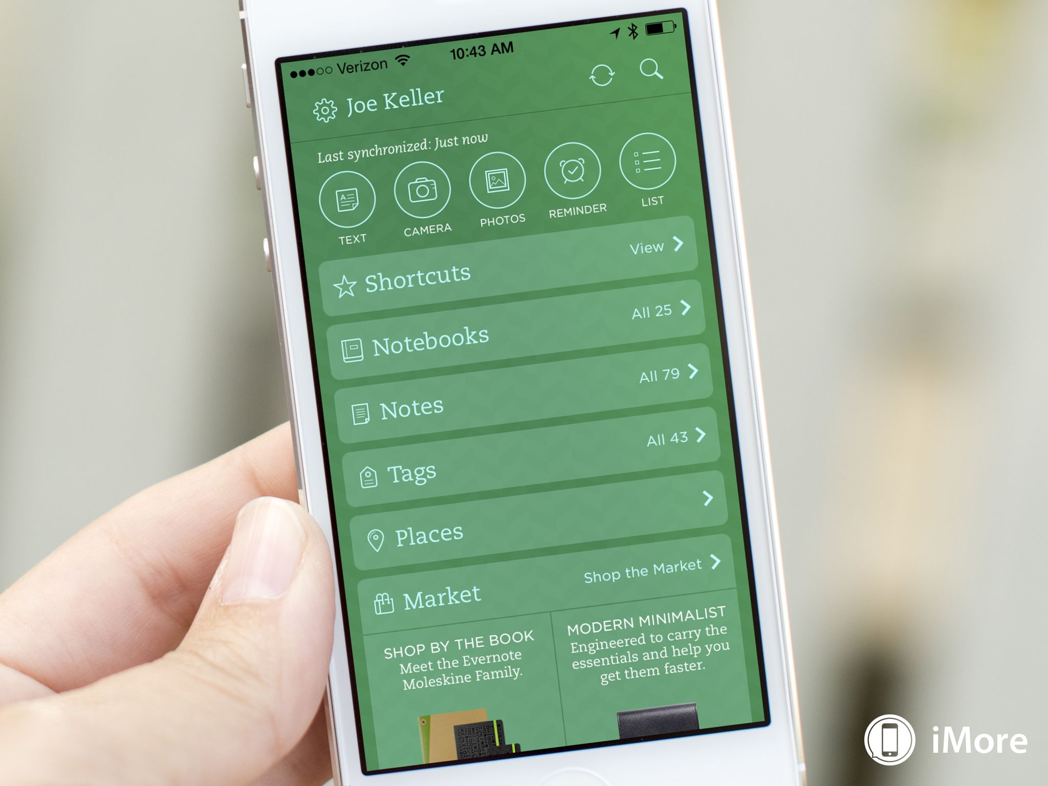
Evernote for iOS has been updated to version 7.3, making some changes to the user interface, as well as other improvements, all in an effort to make Evernote simpler and more responsive. You can customize the interface with some color and background options, as well as how the app displays your notes.
The biggest changes to experience are in Evernote's home screen. Quick Note, which generally favored text notes, from the bottom of the screen. Instead, Evernote has opted to place a row of buttons at the top of the screen, allowing you to quickly create notes of different types. Below this row are your sections. In addition to reordering, you can now show or hide details of each section, as well as add or remove them. Don't want to see the Market section? turn it off in the app's settings. Finally, you can now pick a theme for Evernote's home screen, either Classic green, Light, or Dark.
There are other improvements and fixes in Evernote 7.3. Business card scans can be saved to your contacts automatically. You can also set the quality of audio notes for either sound or file size. There are also syncing improvements, fixes to unseen card scans and corrupted audio notes, and several stability fixes.
You can download Evernote 7.3 from the App Store now.
- Free - Download Now
Master your iPhone in minutes
iMore offers spot-on advice and guidance from our team of experts, with decades of Apple device experience to lean on. Learn more with iMore!
Joseph Keller is the former Editor in Chief of iMore. An Apple user for almost 20 years, he spends his time learning the ins and outs of iOS and macOS, always finding ways of getting the most out of his iPhone, iPad, Apple Watch, and Mac.

