Google Maps 2.0 for iOS review: Now with Explore, traffic, and iPad support
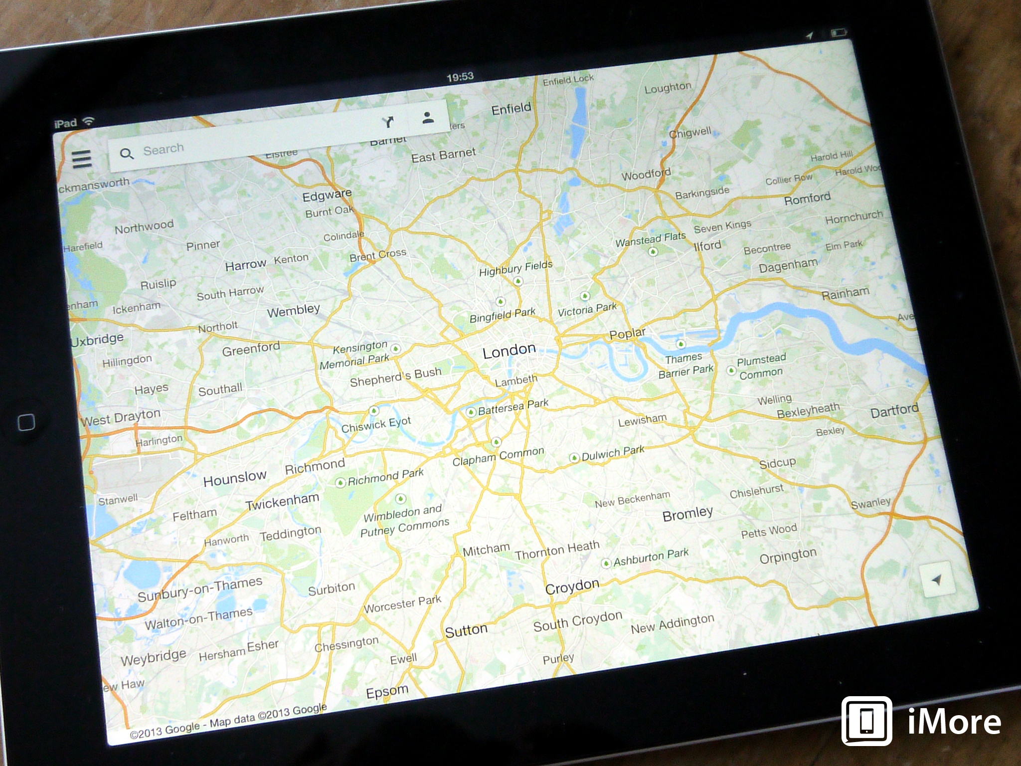
It's finally here; Google Maps has been updated with proper iPad support. OK, so it goes beyond just iPad support, it includes all the cool stuff Google talked about back at Google I/O in May. But, since we've all seen Google Maps on the iPhone before, this time out we're going to take a look at both the new stuff, and how it looks on the iPad.
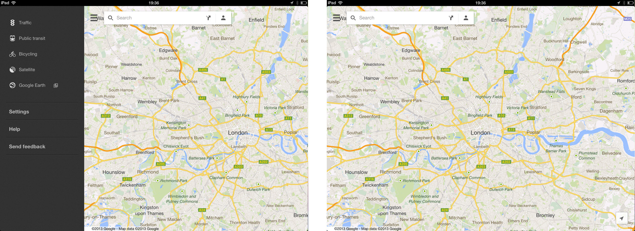
The tl;dr version on the iPad front is pretty simple. It looks identical to Google Maps on the iPhone, only on the bigger display. OK, so there's more to it than that, but essentially that's what we're looking at. That's a good thing too. Google Maps got its interface re-design underway first with the iOS version back in December 2012, so we're already pretty familiar with the overall look and feel. The main visual change is that the slide out menu with the different viewing options now pulls out from the left, and not the right as before. Otherwise the main view is just a map, and a search bar. As it should be.
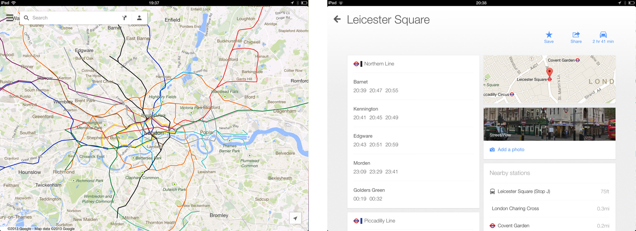
Public transit, routing and navigation work just the same as they do on the iPhone, but take advantage of the larger screen. So, your route information will overlay the map, which will also show a line representing visually the described route. Navigation is just navigation, but bigger. Also new to navigation is real-time traffic information, and live re-routing. I've not had chance to take it out and find some traffic yet, but early reports suggest it's pretty good, though one UK user told us that the traffic was shown on the wrong side of the road! Public transit information gets a real boost with the move to the iPad, as you get a really nice looking card based interface with all the relevant information about your stop or station.
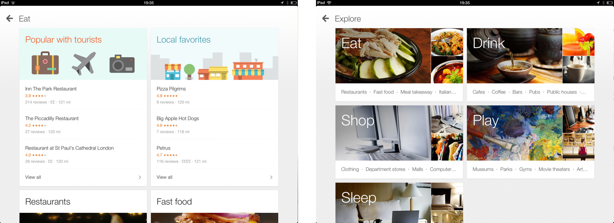
Explore is something new to Google Maps, and it's supposed to help you find great stuff around you. Initially it didn't show up for me, so if you don't see it, don't fret, it will show up. Eventually. When you tap the search bar, Explore shows up pretty much top of the list. You get categories for eat, drink, shop, play and sleep. Each one then breaks down into each categories, such as popular with tourists, local favorites and so on. It's actually pretty slick, and when you select a place, you then get to see the new Zagat infused information and reviews.
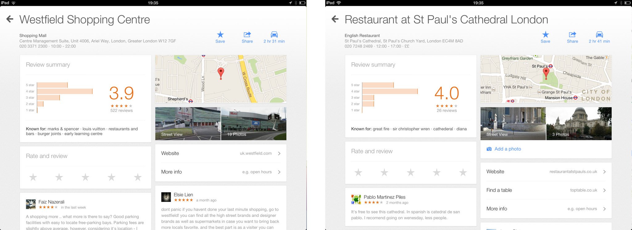
Reviews has the same card based interface as transit locations, with maps, photos and street view spliced in with a healthy dose of user reviews, along with the chance to write your own. Content from the Google owned Zagat is also built into the reviews area of Maps, but it'll probably be used like Tripadvisor; you always look for the one-star review.
Indoor mapping is also new to iOS in version 2.0, as is Google Offers integration. Indoor mapping works just like regular mapping, only for selected locations such as shopping malls, airports, public transport stations, all with walking directions and a floor picker where required. Indoor maps also ties in with the release of the updated Google Maps SDK for iOS, giving third-party developers the opportunity now to include them in their own apps.
Generally speaking then, Google Maps 2.0 is pretty impressive. Google has squeezed some good new content in there, as well as making it available now for the iPad. There are some negative points though that need to be addressed. First is performance; it's pretty janky at times. For example, opening the slide out menu on the iPad is nowhere near smooth, likewise with zooming in from time to time. Not counting for rendering, just the movement of zooming in is pretty bad at times. It's more jarring though that a simple slide out menu also suffers the same. Also, offline maps; at first glance there is no option to cache offline maps. Actually, there is, but it's not the most user-friendly experience, and we'll be covering that in a separate how-to post on the site.
Master your iPhone in minutes
iMore offers spot-on advice and guidance from our team of experts, with decades of Apple device experience to lean on. Learn more with iMore!
The good
- iPad compatible, finally!
- Explore is well done, and has plenty of content
- Reviews are nice to have in the same place as searching for a location
- Traffic information in navigation is welcome, and long overdue!
The bad
- Kinda, really janky at times
- Offline maps aren't obviously available, poorly executed
The bottom line
The new stuff is great, and some of it – traffic in navigation in particular – maybe long overdue, but still a welcome addition. Maps on iPad is great to have, and some of the design elements are excellent, just as we've come to expect from Google. But, it's janky to use at times which isn't good, and we've come to expect so much better from Google's iOS apps. If that gets fixed, and offline maps becomes more accessible and user-friendly, Google has a definite score.
- Free - Download Now

