Five ways Apple could improve iPhone X usability
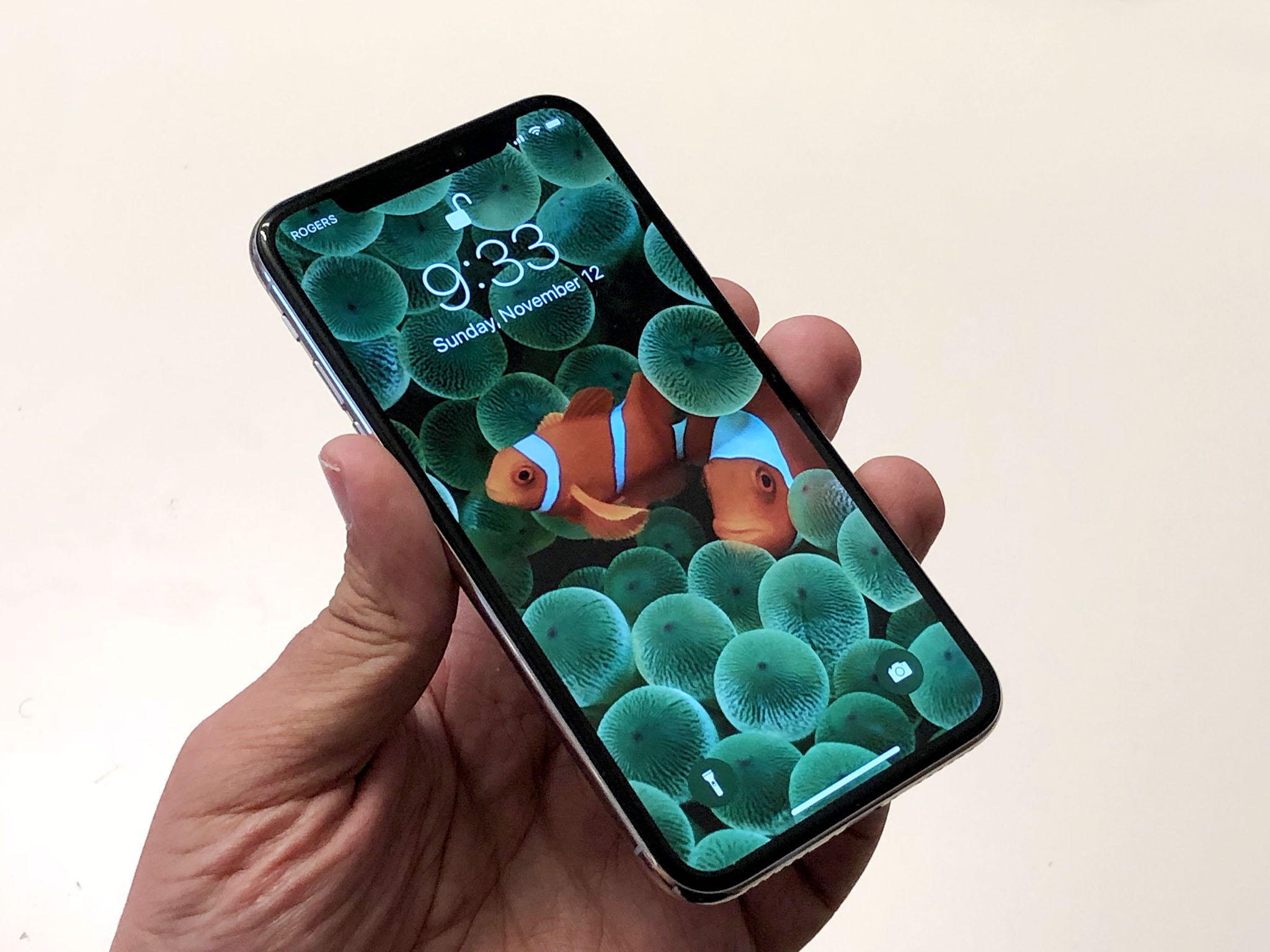
I stand by my claim that iPhone X is the best damn product Apple has ever made but that doesn't mean it can't and shouldn't get better. That includes how new features like Face ID, gesture navigation, Control Center access, and Lock screen buttons are currently implemented.
None of these will come as news or a surprise to Apple. Designers and engineers prototyped all of them and more for a long time before we ever got to see iPhone X. In some cases, there might be really good reasons for rejecting them. In others, the decisions may have been very, very close. Either way, Apple has changed and evolved its collective mind in the past, and they'll certainly do so again. Maybe. Hi.
But these are my pitches, taken from a lot of your questions and feedback, for tweaks minor and major Apple could make to improve iPhone X usability for all of us.
1. Rest Gaze to Open
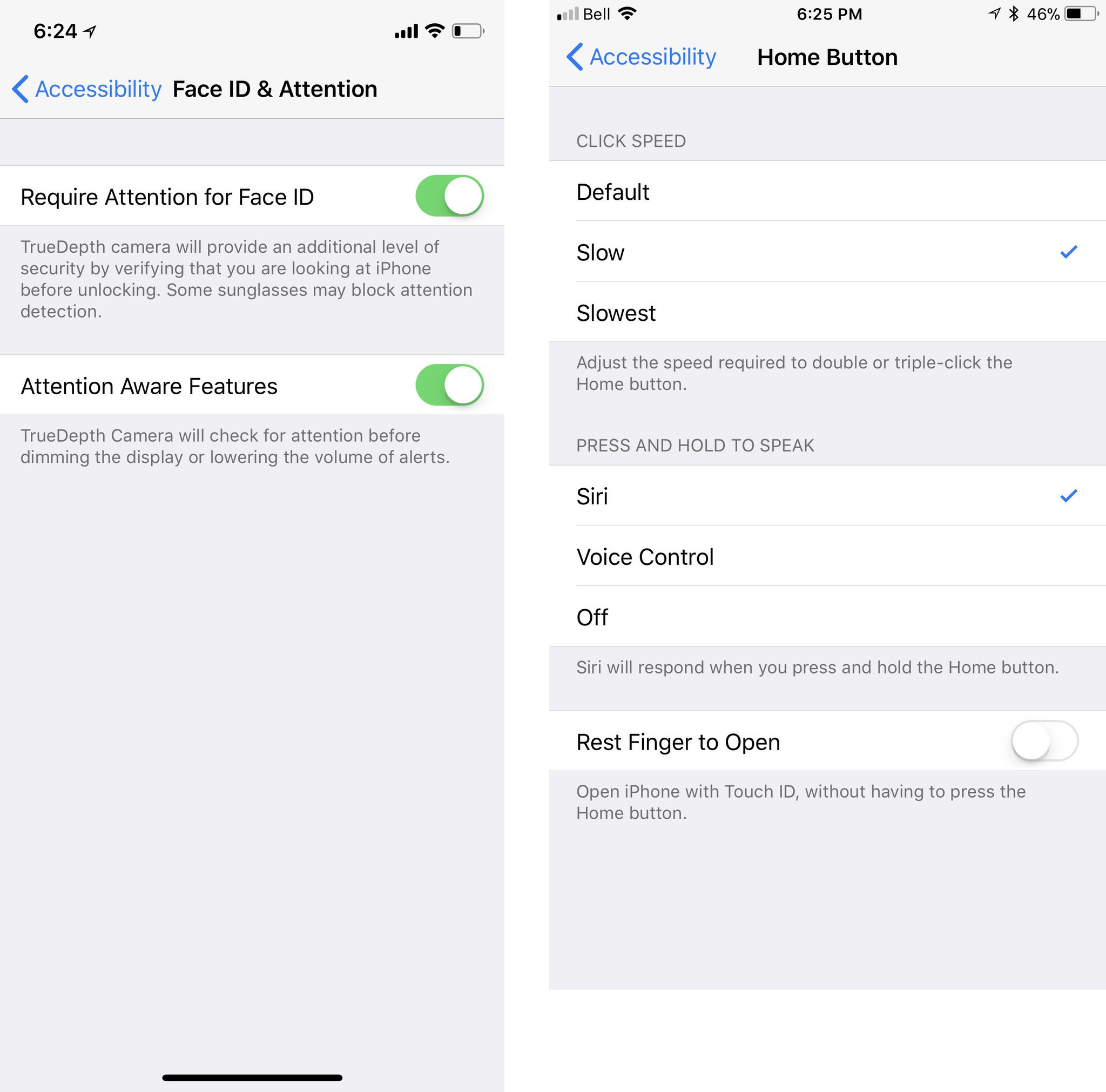
One of the most frequent questions I've gotten since the iPhone X event: "Is there a setting so I can skip swiping up to go Home?" As currently implemented, Face ID handles unlock, but you still have to swipe to open the Home screen.
Yes, swiping up protects against unintentional unlocks. Yes, swiping up harkens back to the original iPhone "swipe to unlock" gesture. Yes, swiping up prevents you blowing right through Lock screen notifications. But some people still want the option to simply look at their iPhone X and have Face ID not only unlock but open as well. Some for accessibility reasons. Others just for convenience.
Touch ID-equipped iPhones have just such a setting for "Rest Finger to Open", which eliminates the need to click the Home button to open. A "Rest Gaze to Open" would do the same for the Face ID-equipped iPhone X. It would let you get in with just one look.
Filed with Apple as feature request rdar://35494753.
Master your iPhone in minutes
iMore offers spot-on advice and guidance from our team of experts, with decades of Apple device experience to lean on. Learn more with iMore!
2. Hide Home Indicator
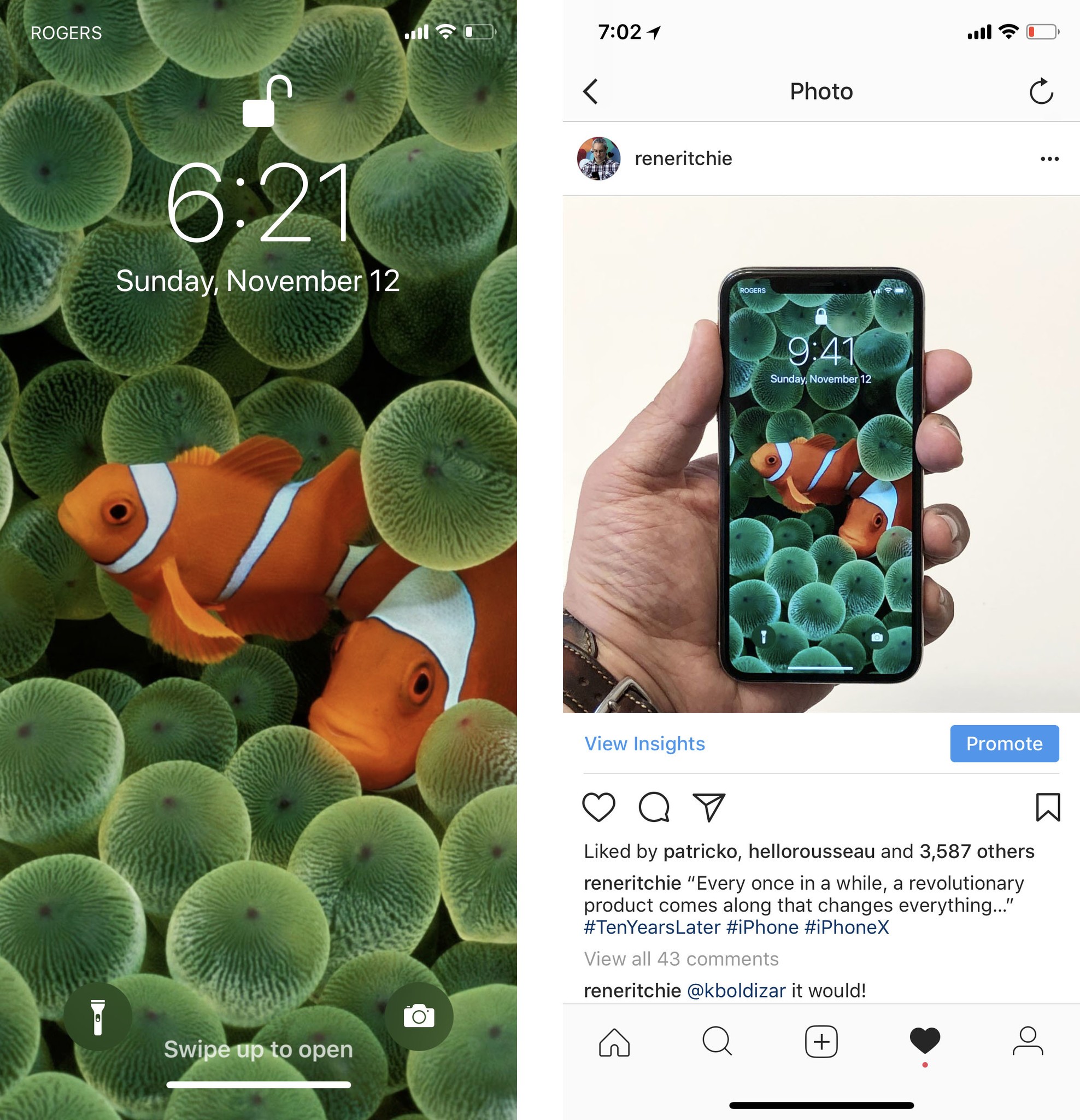
Probably the second most frequent question I've gotten is "can I hide the Home Indicator?" The Home Indicator is a bright white or pitch black line near the very bottom of the screen that replaces the Home button on iPhone X. It shows you where your finger should go to initiate the new navigation gestures, like swipe up to go Home or sideways to go back.
Apps can choose to hide the Home indicator after two seconds and media players can make it disappear while you're watching. In both cases, though, it'll come back as soon as you start poking around again. And, in neither case, can you the user choose to hide it.
A "Hide Home Indicator" toggle in Settings would let people who are already familiar with the gesture area, and for whom the Home Indicator is overly bright or otherwise annoying or distracting, turn it off permanently.
If that's too extreme, a "Fade Home Indicator" could set the transparency way, way down so it's not as constantly in-your-face.
Filed with Apple as feature request rdar://35494916.
3. Control Center in the Switcher
Since iOS 7 you've not only been able to swipe down from the top bezel to get Notification Center but swipe up from the to get Control Center as well. Until iPhone X.
Because swipe up has been taken over by the new Home and Multitasking gestures, Control Center has been forced to move in upstairs and live alongside Notification Center. It works, especially because the "horns" makes it easy to distinguish the two sides — Control Center is only accessible from the right. But it's much harder to access one-handed. I can reach it, but my thumb has to really reach for it. Those with smaller hands, not so much.
Apple seems to have seriously considered a second way to access Control Center: Through the Multitasking interface. Similar to iOS 11 on iPad, a swipe up would populate the left side of the interface with the standard content — in this case, the fast app card switcher interface — and the right side with Control Center. (A concept design by @marshalbock provides for an even legible, iPad-style treatment.)
It would make all the important toggles available right from the bottom of the screen and accessible to everyone regardless of thumb reach.
Filed with Apple as feature request rdar://35494975
This is also interesting pic.twitter.com/JdYDhZDkevThis is also interesting pic.twitter.com/JdYDhZDkev— Guilherme Rambo (@_inside) August 21, 2017August 21, 2017
4. Rotation Lock… except for media
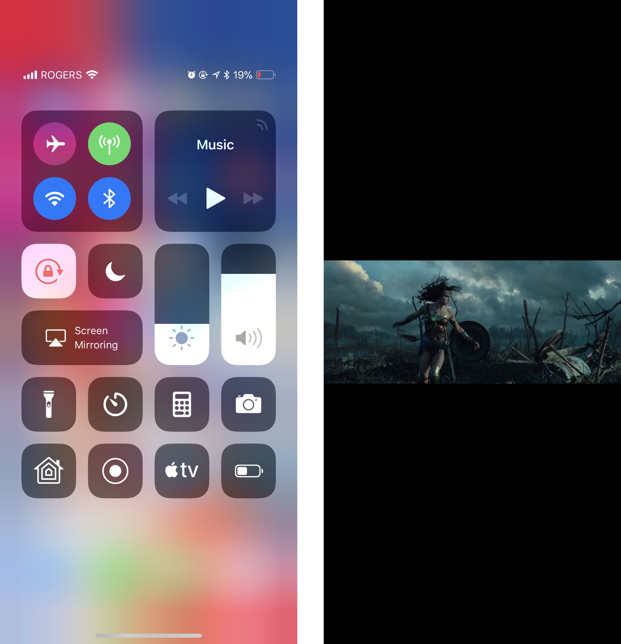
iPhone X has an iPhone Plus-sized screen crammed into a regular iPhone-sized body. But it doesn't have an iPhone Plus-classed body. Where iPhone Plus switches into an iPad-style "regular size class" layout in landscape mode, iPhone X stays iPhone-style "compact size class" layout.
Combined with the "horns", which are more noticeable in landscape than portrait, and it makes landscape mode on iPhone X a lot less valuable than it was on iPhone Plus, and orientation lock a lot more compelling. Except for apps with landscape media.
Some apps, like Netflix, override portrait lock for video and force landscape. Apple's apps, like Photos and TV, currently choose not to.
If there's really a pressing need to let people see massively pillar-boxed content on iPhone, Apple could solve for it in a similar way to location permission — by offering a toggle between three behavior states. Instead if "never", "in-app", and "always", Apple could offer "no lock", "lock except for media", and "lock always". Then, the Control Center switch could reflect off and whichever "on" state was previously selected.
But that's messy. Forcing landscape mode for landscape media, like Netflix does, is simpler and better.
Filed with Apple as feature request rdar://35494996.
5. Customizable Lock screen shortcuts
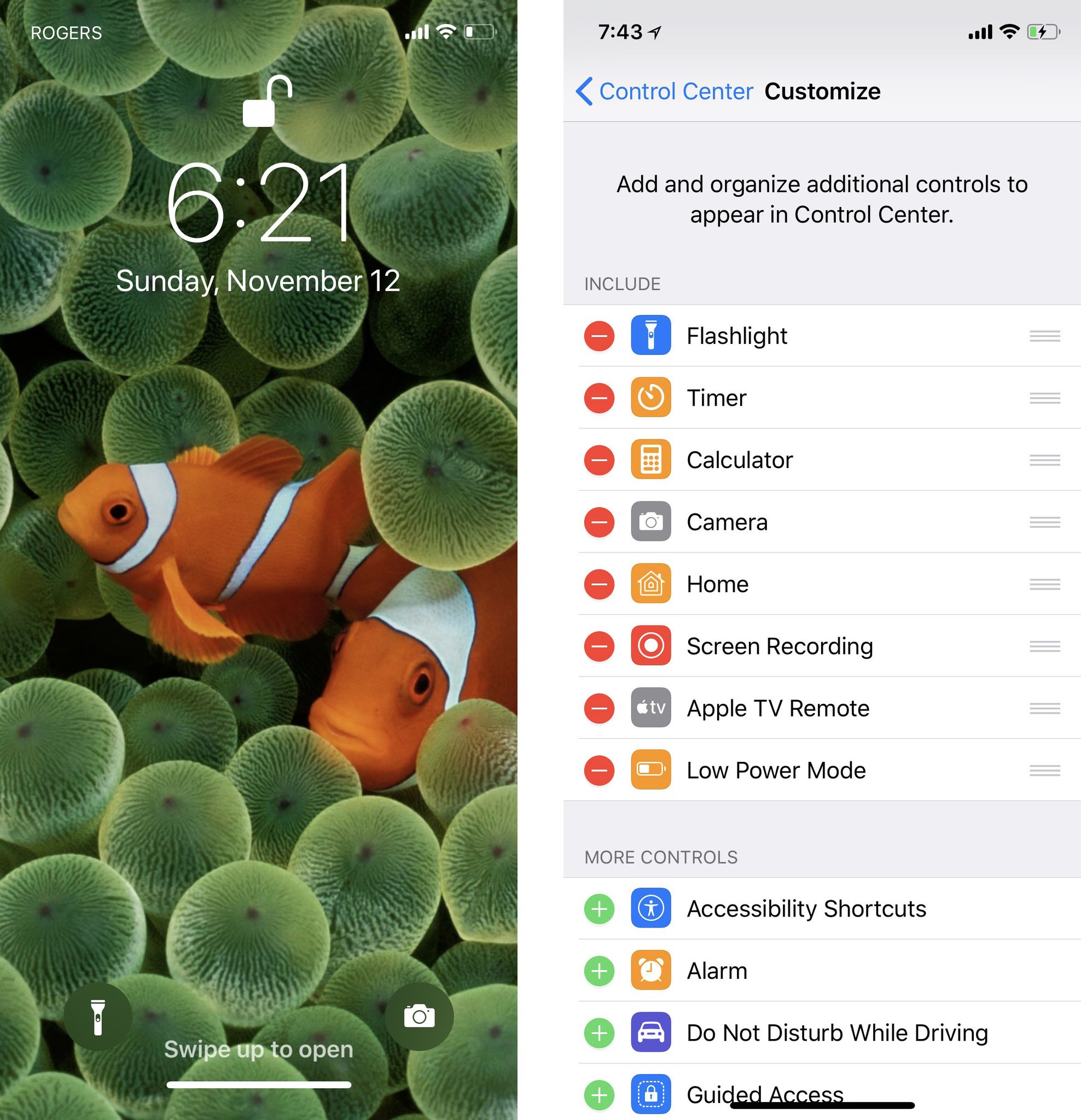
iPhone X has two shortcut buttons on the bottom corners of the Lock screen. On the left is Flashlight. On the right, Camera. They work terrifically well — one of the best feeling and animated implementations of 3D Touch yet. But what if you don't use the Flashlight much, and what if the sideways swipe from the Lock screen to access Camera is already muscle-memory for you?
With iOS 11, Apple capital-f-finally enabled basic customization for Control Center. It won't let you set shortcuts to Apple Store apps, but it will let you add, remove, and otherwise change up what's in and what's out of the easy access panel.
Don't want Flashlight but do want timers for cooking or stopwatches for work outs? Don't need Camera but do need Voice Memos or Apple TV remote? It'd be great if the Lock screen buttons offered a similar level of customization.
Filed with Apple as feature request rdar://35495093.
More most-wanted?
These five come from the questions I've been asked and the friction I've encountered most often. If you have higher or different priorities, I'd love to hear them.

Rene Ritchie is one of the most respected Apple analysts in the business, reaching a combined audience of over 40 million readers a month. His YouTube channel, Vector, has over 90 thousand subscribers and 14 million views and his podcasts, including Debug, have been downloaded over 20 million times. He also regularly co-hosts MacBreak Weekly for the TWiT network and co-hosted CES Live! and Talk Mobile. Based in Montreal, Rene is a former director of product marketing, web developer, and graphic designer. He's authored several books and appeared on numerous television and radio segments to discuss Apple and the technology industry. When not working, he likes to cook, grapple, and spend time with his friends and family.
