Smarttime Forum Review by msbaylor (see forum post for video highlight!) For more Forum Reviews, see the TiPb iPhone App Store Forum!
The SmartTime application is a simple yet complex to-do application.
When creating a task/event, you have multiple options, including color category (6 choices), duration, deadline.
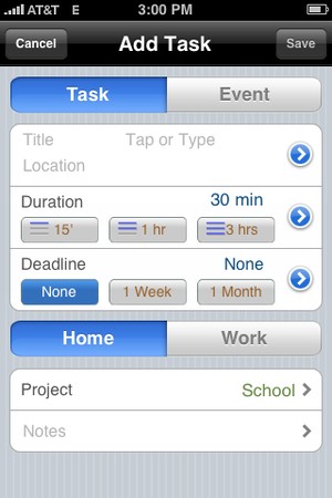
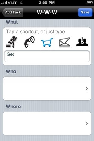
By tapping on the blue circles next to title, duration & deadline, you will be given more options for each correlating section. In the title/description section details (pic above), you have several shortcuts that enable quicker entry. You also have the ability to insert a location (Where), if you do this, when viewing the event, you can send it to the Maps App, and it will route you to your event, etc.
There are 3 different views - Smart, Calendar, & Focus.
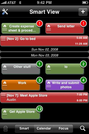
The smart focus view (my favorite) basically shows all your upcoming events & tasks in one view. The tasks are represented by a bar that is half the width of the screen, and events are the whole width of the screen. The color indicates a certain category that you can change to suite you. The circles indicate a deadline - if there is a red dot with an exclamation point, it means it is overdue. If there is a an orange circle with a '0' in it, it means it is due that day. If the circle is green and has a number in it, that means the task is due in that number of days.
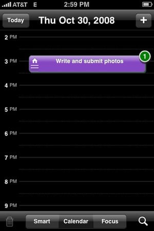
The Calendar view shows your events & tasks (if it has a deadline) in the corresponding day and time. The Calendar is quite easy to navigate. By swiping your singer across the screen you go from day-to-day, by moving your finger up and down you move through time (dun dun duuun... ;) ). One of the two problems I found is located in this view, it you have a large event that covers a large amount of time and you are trying to move the calendar around, if you antecedently touch the event and drag you finger around, the event will also drag (see example in the long video.) The other issue is, if you tap an item, you cannot change views. You have to tap 'defer' then cancel before you can change the view.
Master your iPhone in minutes
iMore offers spot-on advice and guidance from our team of experts, with decades of Apple device experience to lean on. Learn more with iMore!
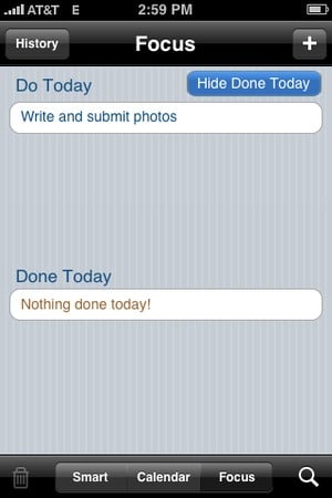
The focus view basically displays what you have due today and what you have already completed today. You also have the option in this view, to view the history of completed tasks.
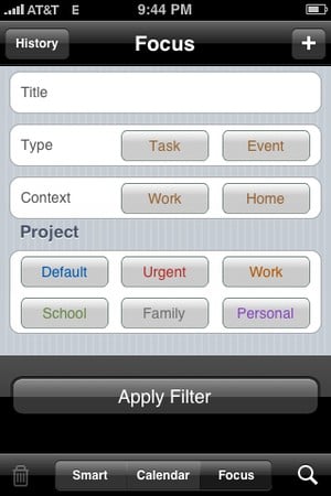
The small magnify glass in the bottom right-hand corner of the screen in any of the 3 views, by tapping on it, it allows you to apply a filter in order to find a certain task or event. This is fantastic if you have a bunch of to-dos and your looking only your urgent to-dos (I have mine color-coded red).
In the Smart & Calendar view, when you click on en event/task, you are given the option to mark it done, defer, copy the task/event, share event/task, or show in map app.
This is a very well done, and I don't see why it shouldn't be a paid application. The only reason I don't give this app a perfect 5 is because of the two issues I had that are explained above.
Pros:
- Complex, yet simple
- Color-coding categories
- Option of task or event
- Nice and easy UI
- FREE
Cons:
- Home & Work schedules can make things confusing when scheduling events/tasks (view video)
- Easy to accidentally move items around in calendar view.
- Can't change views once you have selected an item, unless you cancel out of a screen correlating to the event (see video)
Forum Review Rating

[Smartime is available from the iTunes App Store]

iMore.com is your source for all things Apple, and the IM Staff author represents our collective hivemind, for those occasions when the whole team speaks with one voice to bring you important updates about the site, editorial policies, awards, promotions and more.
The iMore team of Apple enthusiasts and experts shows you how to get the most out of your tech life by using Apple products and the apps, services, and devices they connect with to their fullest. iMore is a mainstay in the Apple community for good reason. Every single iMore writer and editor takes their job seriously, and we prioritize accuracy and editorial independence in everything we do, never receiving compensation for coverage and never pulling punches.
As well as our amazing group of regular contributors, the iMore staff team currently consists of: Gerald Lynch — Editor-in-Chief Stephen Warwick — News Editor Daryl Baxter — Features Editor John-Anthony Disotto — How To Editor Tammy Rogers — Senior Staff Writer James Bentley — Staff Writer
