Foursquare for iPhone has received a significant update and makeover making it easier than ever to share and catalog your experiences and find new places to go.
The new design features just three tabs: Friends, Explore, and You (it will actually be your name). At the top of all the tabs is a check-in button in the upper right corner, making it simple to check-in from any screen of the app.
The friends tab is like a news feed of your friends' activity on Foursquare. If your friend uploaded a photo, it will be displayed nice and big with the caption overlaid on the top. You also have the ability to add a comment and "like" each entry.
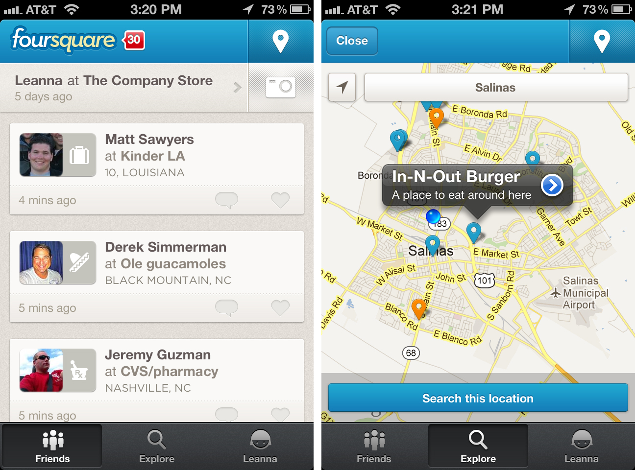
The Explore tab is where you go to discover the Top Picks of your area. It features a map of your location at the top with drop pins of the Top Picks. If you tap on the map, you can view it full screen and get a closer look at the locations to see user-submitted photos and comments and leave a tip of your own. You can also scroll around the map and specify the location of the map. Scrolling through the Explore tab will display all the Top Picks like a feed. Each entry has an image, a user-submitted comment, and shows all the avatars of your friends that have been there.
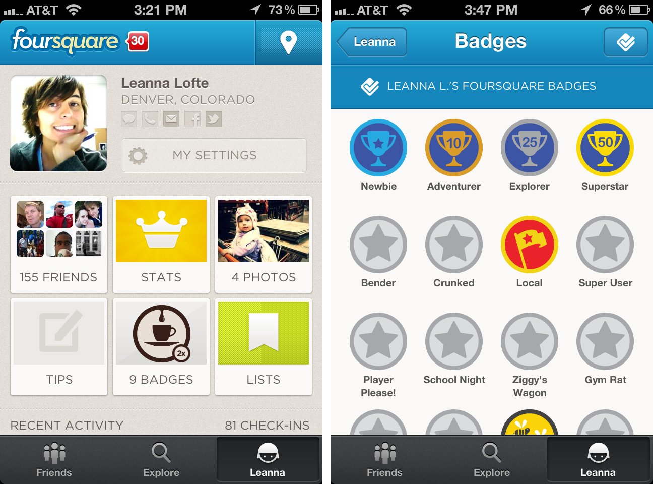
The You tab is where you can view your profile information including your friends, stats, photos, tips, badges, and lists. You can also scroll through and see all the places you've recently visited. This is also the tab where you can edit your settings, including notification settings.
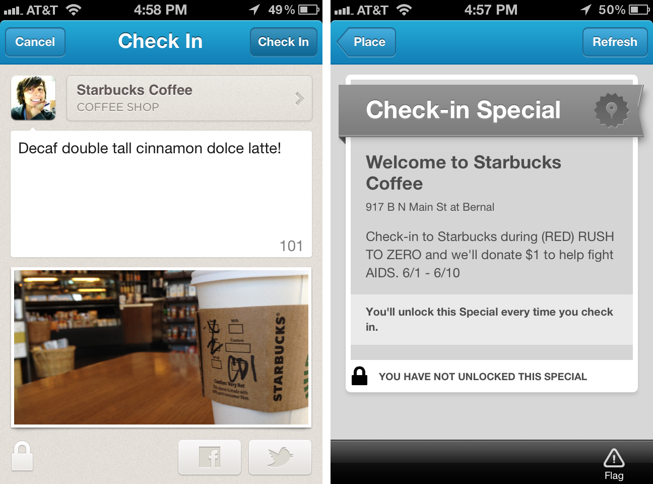
When you check-in to a location, you have the option to add a comment and image. You can also choose to post your check-in to Facebook and Twitter. Some locations you check-in to have specials. Some specials will benefit you by giving you some sort of deal on your purchase, and others promise to help a cause. For example, if you check-in to Starbucks from June 6-10, they'll donate $1 to help fight AIDS.
The good
- Great redesign
- Simplified to just three tabs
- Get deals when checking-in to some locations
- Share to Facebook and Twitter
The bad
- Still no iPad version
The bottom line
I'm a huge fan of the Foursquare and that's saying a lot since I hated the old Foursquare for iPhone app. This new version is much more simple, intuitive, and streamlined. Now if only they'd release an iPad version!
Free - Download Now
Former app and photography editor at iMore, Leanna has since moved on to other endeavors. Mother, wife, mathamagician, even though she no longer writes for iMore you can still follow her on Twitter @llofte.
