After what felt like an eternity for many users, Google has updated their social networking app Google+ to include native iPad support. It features a side-scrolling stream and lots of gestures to interact with content. The content on your stream is also styled based on popularity, type and orientation. The iPhone version of Google+ also now includes the ability to create and manage Google+ events.
The layout of Google+ on the iPad is very nice and displays content in squares. A little less than six square fit on the screen at a time and some content will take up two or four squares. Google+ determines this styling based on popularity, type, and orientation. I'm a fan of this styling as it adds some variety to my stream and is visually appealing.
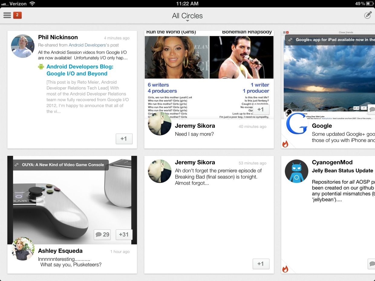
To scroll through your stream while in landscape, you actually scroll left and right, not up and down. This was strange at first, because I naturally wanted to scroll up and down, but the side-scrolling is actually superior when using Google+ in landscape orientation because of the way the boxes of content fit on the screen. When in portrait orientation, scrolling is the more traditional up and down. My only complaint about scrolling is that it's not very smooth. I always expect apps to have buttery smooth scrolling; unfortunately, Google+ doesn't provide such an experience.
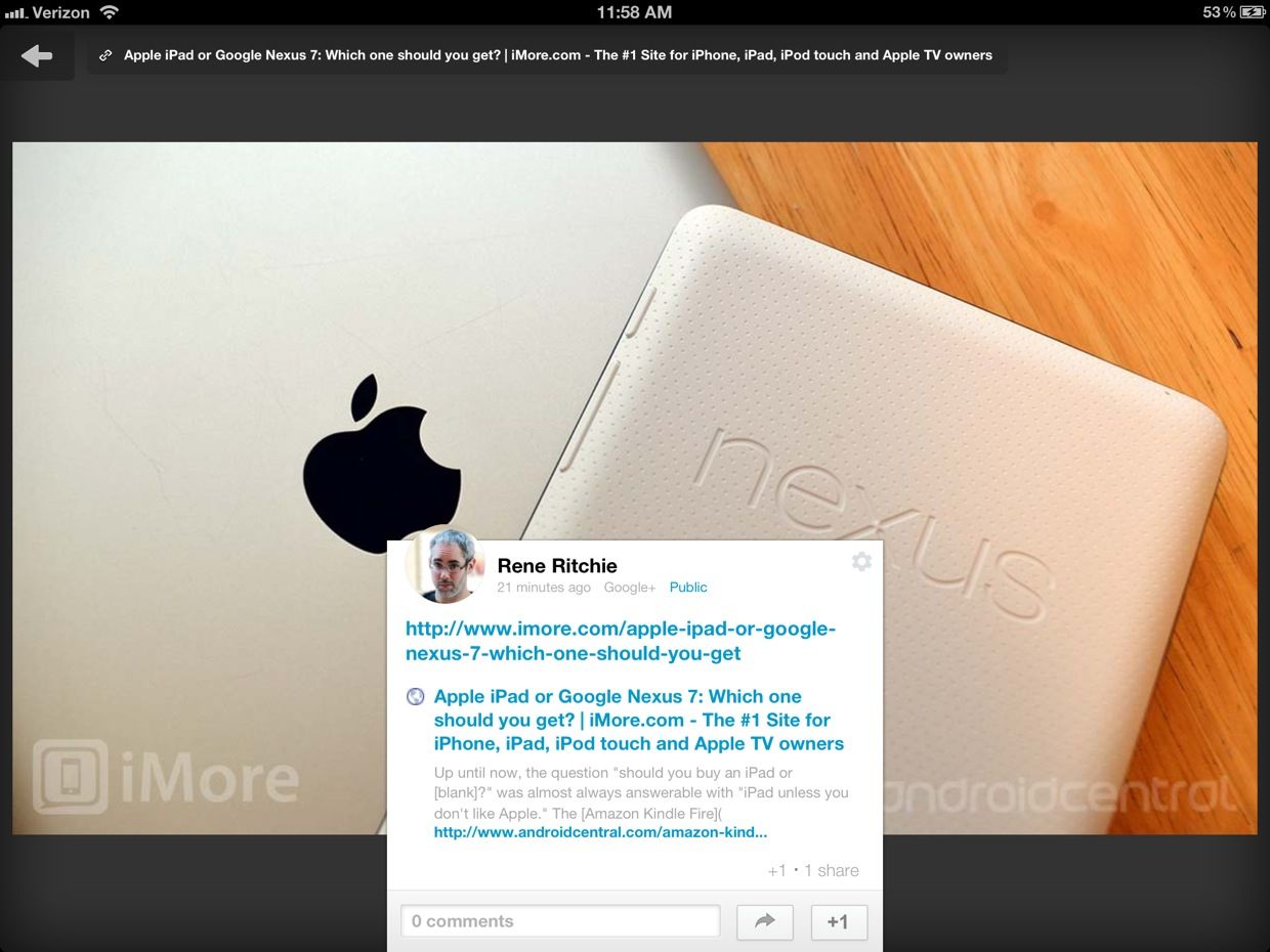
When you tap on content in your Google+ stream, the image will take over the background and the links and text from the content will appear in the center of the bottom of the screen. From here, you can reply, share, +1, or leave a comment. You can also scroll through all the comments left on the post. As you scroll, the popup will expand upwards over the photo in the background. I really like the implementation of photos in the background, but for small images that don't take up the entire screen, the little popup will cover too much of the photo.
You can also add +1 and add comments to posts in your stream by tapping the designated button on the content boxes.
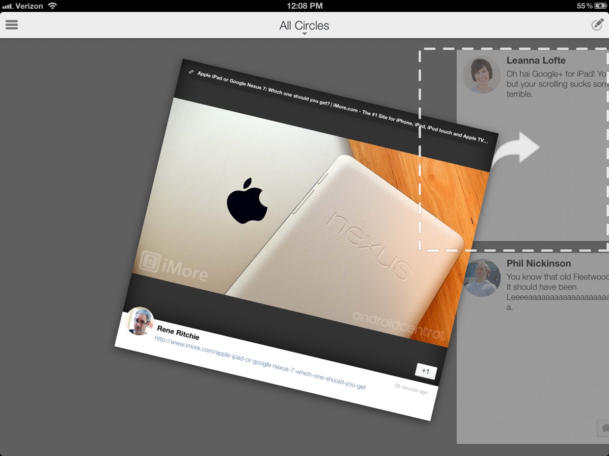
One of the really cool gestures of Google+ for iPad is how you share content from your stream. Simply "grab" the post with two fingers. The outline of a box will appear in the upper right corner indicating where to drag the content to. When you do, the outlined box will transform into a box where you can "share your thoughts" and indicates who originally shared the post.
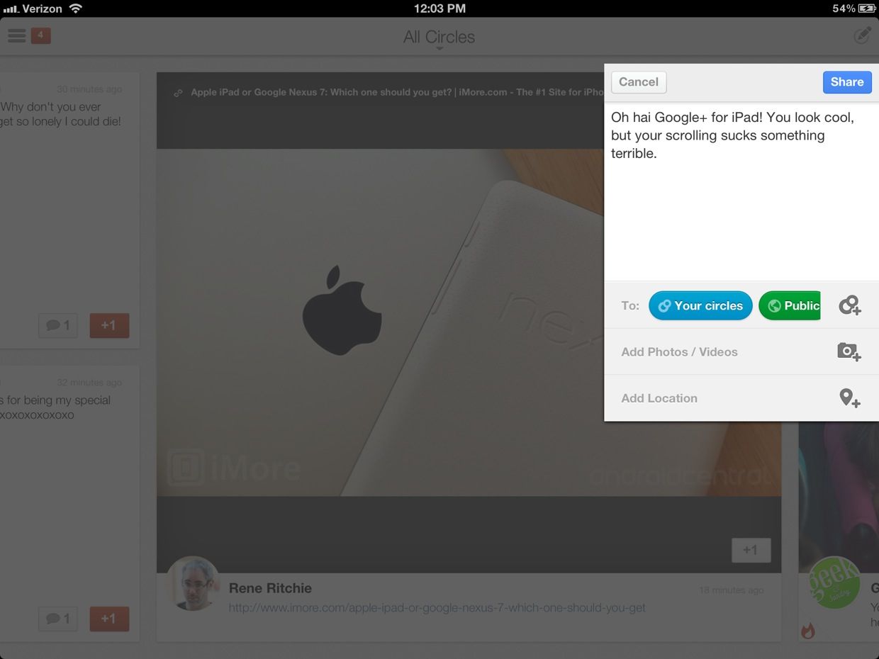
Sharing original content is very similar. Just tap the little pen icon in the upper right corner. Three little boxes will slide out from the right for adding a status/text, photo, or location.
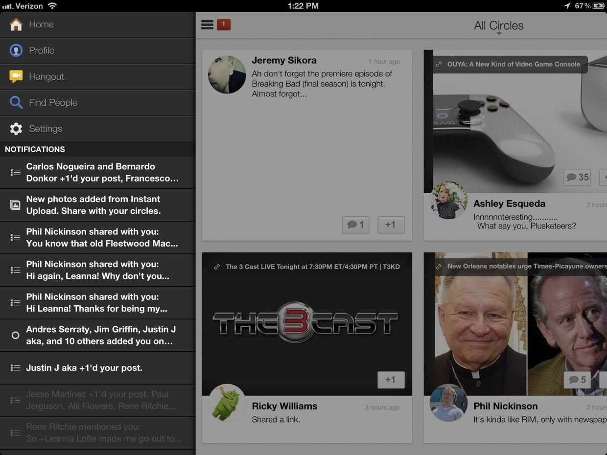
Tapping the icon in the upper left will slide out a column that displays your notifications as well as access to your Home, Profile, Hangout, Find People, and Settings pages.
The good
- Very nice design
- Pinch or tap to expand posts
- Use two fingers to drag a post from your stream to easily re-share it
- Start a Hangout from your iPad and stream it to your TV using AirPlay
The bad
- Scrolling could use a lot of work
The bottom line
Google is off to a great start with Google+ for iPad. It's gorgeous and features a lot of fun and helpful gestures. However, the scrolling is far from perfect and has a serious impact on the experience. Hopefully Google address that soon -- especially since I'm testing on a 3rd generation iPad. I don't even want to know what the experience is like on a 1st generation iPad.
Free - Download Now
Former app and photography editor at iMore, Leanna has since moved on to other endeavors. Mother, wife, mathamagician, even though she no longer writes for iMore you can still follow her on Twitter @llofte.
