How Apple could fix iPad multitasking in iPadOS 14 (iOS 14)
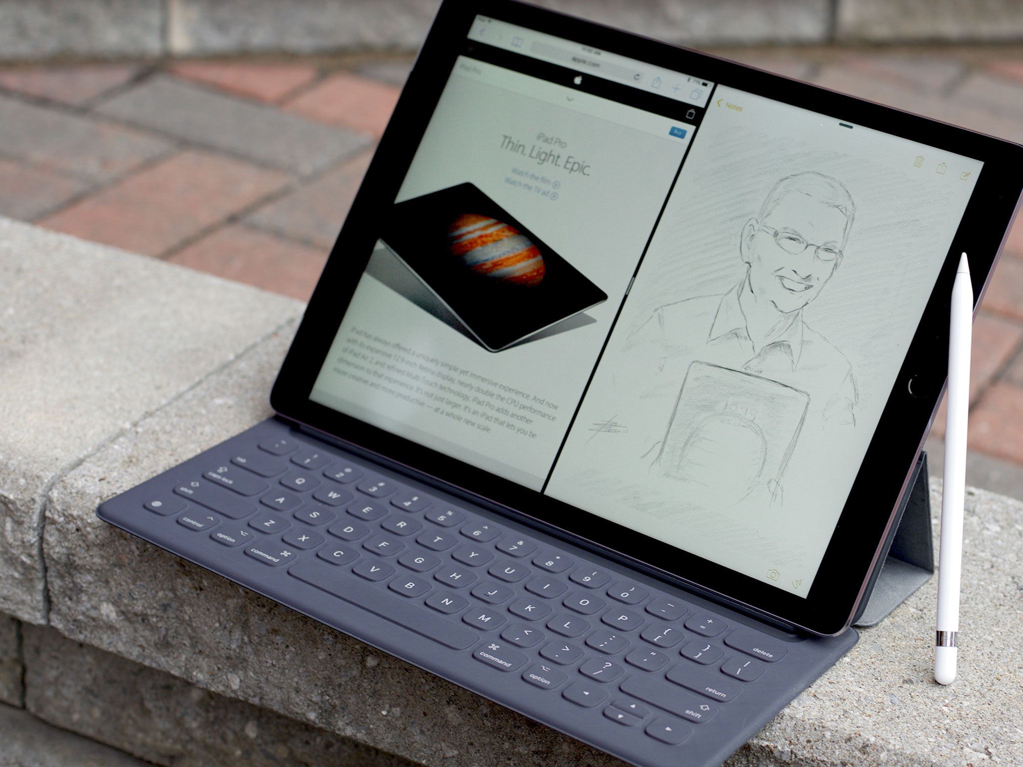
In my iPad Pro one year later review back in December, I said:
With iPadOS, we got a ton of new, long-time-coming features this year, including multi-windowing for every app. It works really well with a persistent, consistent anything-you-can-drag-you-can-drop-into-its-own-window mechanic.I still find the execution of those mechanics — the getting in and out — totally gesture overloaded. I still trip all over myself all the time, between having to swipe twice for the dock and miss-triggering the drag gestures to get apps off the dock versus into windows, and it all just really needs something that doesn't cause so many collisions so always.I'm clumsy, yes, but the software should take that into consideration. I don't know what the solution is, maybe separating the set up from the usage states would work?
Since this week marked the 10 year anniversary of the iPad, it brought up a lot of praise and a lot of criticism from a lot of people, and the multi-window multitasking interactions were chief among them.
So, what can be done about them?
The Problem
The iPad wasn't just a new category of device that deserved to exist between the phone and the laptop, it was a new category of device that found itself trapped between old traditional and future computing.
If Steve Jobs' Apple had a singular mission it was to make computing ever-more accessible to the mainstream. From the Apple II to the Mac to the iMac, the iPad was supposed be the next step — a computer so accessible even those for whom the Mac was unapproachable, alienating, and inscrutable were supposed to be able to pick up an iPad, tap their way into apps, and simple, easily, get done all the email, web surfacing, game playing, book reading, photo, and other major tasks they needed to get done.
When people talk about the iPad and its potential, this is what is so often forgotten. That accessibility, that inclusivity, was the iPad's potential. It's why Steve Jobs called it the most important product of his life.
Traditional computer users already had their tools, their Macs. The iPad was for the other 80% of humanity for whom those tools were just too much. For whom the tyranny of never mind the command line, but the mouse and pointer, hierarchical file system, windows that could get lost under other windows, task managers, and all the other overhead that had accumulated as computers dragged themselves out of the primordial ooze of academia and enterprise and into the homes of regular humans.
Master your iPhone in minutes
iMore offers spot-on advice and guidance from our team of experts, with decades of Apple device experience to lean on. Learn more with iMore!
But, when Steve Jobs introduced the iPad, the design, the custom silicon, it appealed to the traditional computer users as well. They wanted it. But they also really wanted it to be a traditional computer. Either a touch screen Mac — why didn't Apple just make that? — or an iPad in name only that worked indistinguishably from a Mac.
Remember, Steve Jobs and Scott Forstall rejected even AirDrop as being too complicated twice in a row before Federighi took over and shipped it, and now it's one of the most popular and stickiest features across Apple's platforms.
Because there's disagreement about this stuff inside Apple as well. They argue about the same stuff we do, and as passionately as we do.
Sure, the primacy of the iPhone, its constant need to gobble up the vast majority of attention and resources, held back the iPads evolution. But so did the conflict over what precisely that evolution should be.
Some believed that iPad should stay essentially as Steve Jobs had introduced it. Simple. Accessible. Better at those key tasks, not worse for the copying either phone or laptop tasks.
Others believed the iPad needed not just evolution but revolution. That it should serve the needs of both mainstream and traditional computer users.
And there's no absolute right answer. Compelling arguments exist for both perspectives.
Also remember, Apple wasn't out in front with the command line on the Apple II. That was a computing staple at the time. Apple didn't pioneer the mouse and pointer either. Xerox had it already. Apple made its version with what's now called the classic Mac OS, and then remade it over a decade later with OS X — now macOS.
With tablet-scale multi-touch, Apple is very much pioneering, very much out in front. That no one else has nailed it either shows just how big a problem it still is. And that's by no means an excuse. That's a challenge.
One thing Apple rejected outright was just copying and pasting features over from the Mac. That would have made many of the very loud, very vocal 20% of traditional computer users very happy, but it would have been detrimental not just to the 80% of the mainstream that found the iPad liberating to the point of being transformative, it would have been a horrible waste of an opportunity to shed decades of baggage and reimagine computing for the modern era.
Eventually, some decisions were made, and we started to get things like the iPad Pro, the Apple Pencil, the Smart Keyboard, multi-window apps, drag-and-drop, and most recently, drag-to-window.
But many of the implementations aren't anywhere nearly ideal. Too complex for the mainstream, too limiting for the traditional computer users. They just end up frustrating everyone and freeing no one.
There's a keyboard so you can type like you would on a laptop but no way to move the cursor so you have to keep taking your hands off the keyboard. There's gesture-based windowing but the gestures are so overloaded there's no way to discover them without confusion or use them without collision.
Now, I think the functionality is aces. It's just the current implementation that's, like I said, less than ideal.
The solution
So, I'm always conflicted about this. When I used to work in IT, I learned early on that telling someone a solution you think you want is never as productive as telling them a problem you have. Because they quite possibly can come up with a far better solution to your problem than you could have ever imagined.
But, when I worked as a designer, I found it less helpful to offer criticism without also trying to understand and solve the same problem space. So, I'm going to steal a page from Dave Wiskus' Here's The Bad Version and offer up my solution for multi-window multitasking on the iPad in hopes people way smarter than me can come up with a much, much better version.
The problem with gestures is that there are very few simple, intuitive ones. So, if you try to use the same ones for too many things, people get confused and trip all over them. If you try to use complex gestures, it becomes like spell-casting, and they're hard to remember and get right.
So, I'm sticking with simple. Simpler, in fact.
Single and double finger gestures, things like tapping and swiping and pinching, just remain the way they are today, as a way to navigate and interact within an app.
Three-finger gestures, though — technically three or more since dexterity goes down as finger count goes up — become the providence of the system.
So, to launch a full-screen app, you tap on its icon. Then, to go into multi-window, you three-or-more-finger pinch to make the first app moveable, and drag it to the left or right of the screen to dock it, half-size, on that side of the screen. As soon as you start dragging, the interface shows you a bounding box for where the window will end up being docked, so you have both a preview and a target.
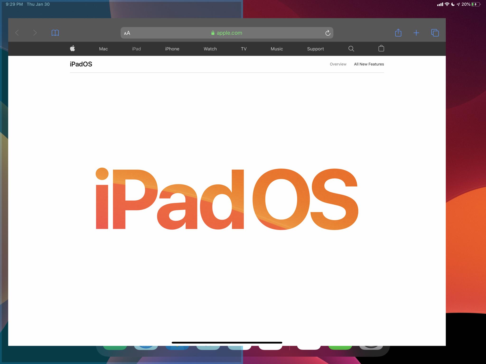
At the risk of making it too complex, if you keep dragging towards the edge of the screen, instead of going into side-by-side mode, the app instead gets added to the top of the slide-over stack instead. Again with a bounding box for preview and targeting.
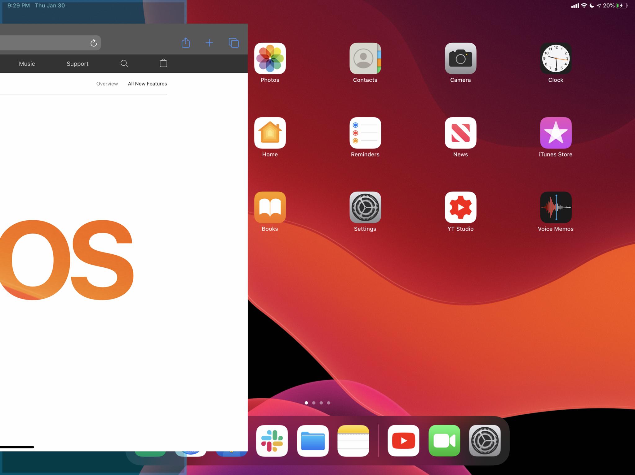
Once you've docked the first app, the other side shows a compact version of the Home screen. Hey, SpringBoard can and should enjoy size classes too.
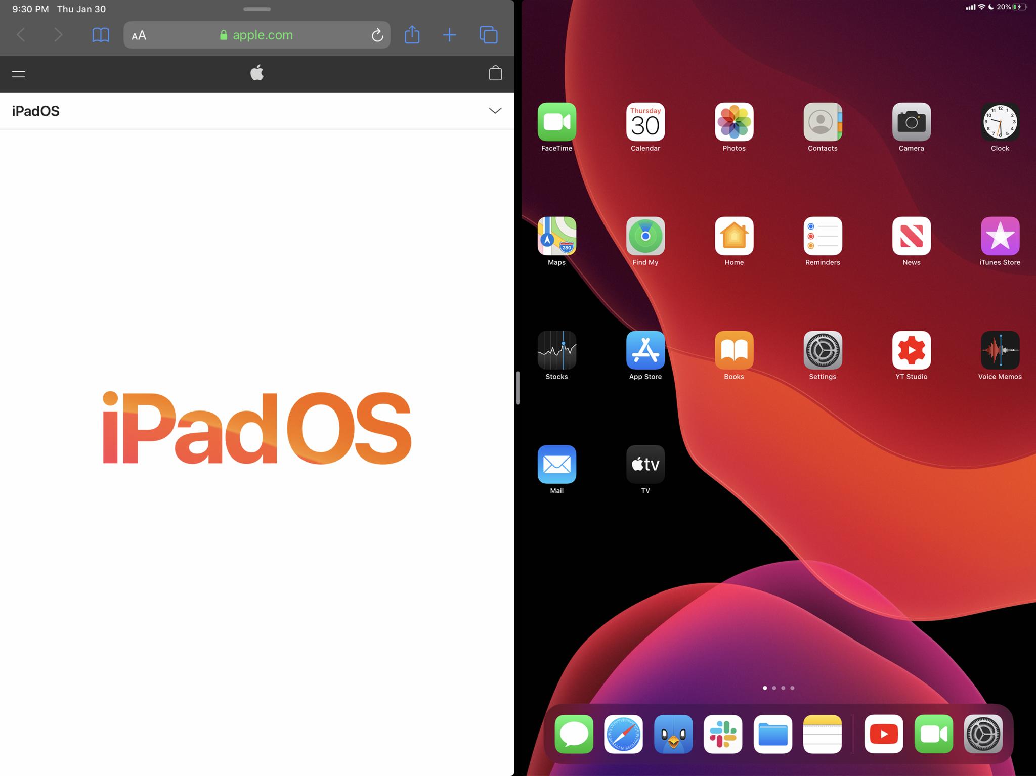
Tap the second app, and it fills the other half the screen.
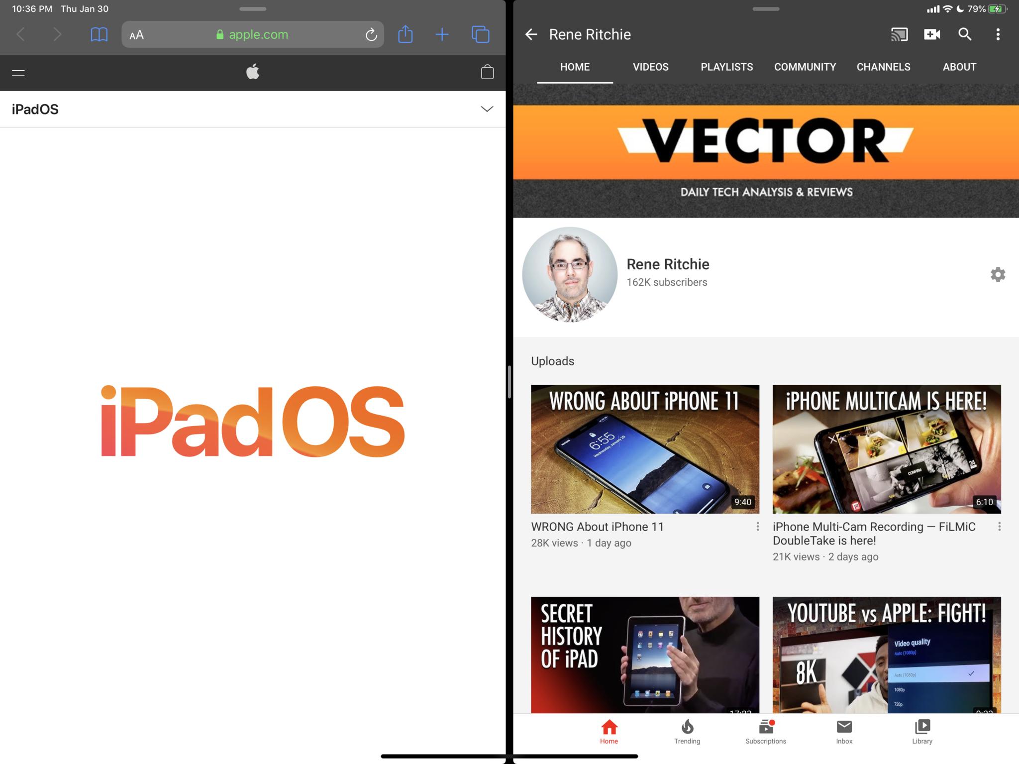
At any time, you can three-or-more finger pinch to make either app on either side moveable again, to either switch sides or to push into a slide over app.
And if you pinch completely down on one side or the other, that app on that side closes and you get the compact Home screen again so you can choose another app for side-by-side. Otherwise, you can three-or-more finger pinch and zoom the one app to fill the full screen, or close it as well to go back to the full home screen.
Also, when in side-by-side mode, whichever side you were last touching or typing into is colored and highlight to show it's the active side, so you're never, not ever confused about where things are going to happen.
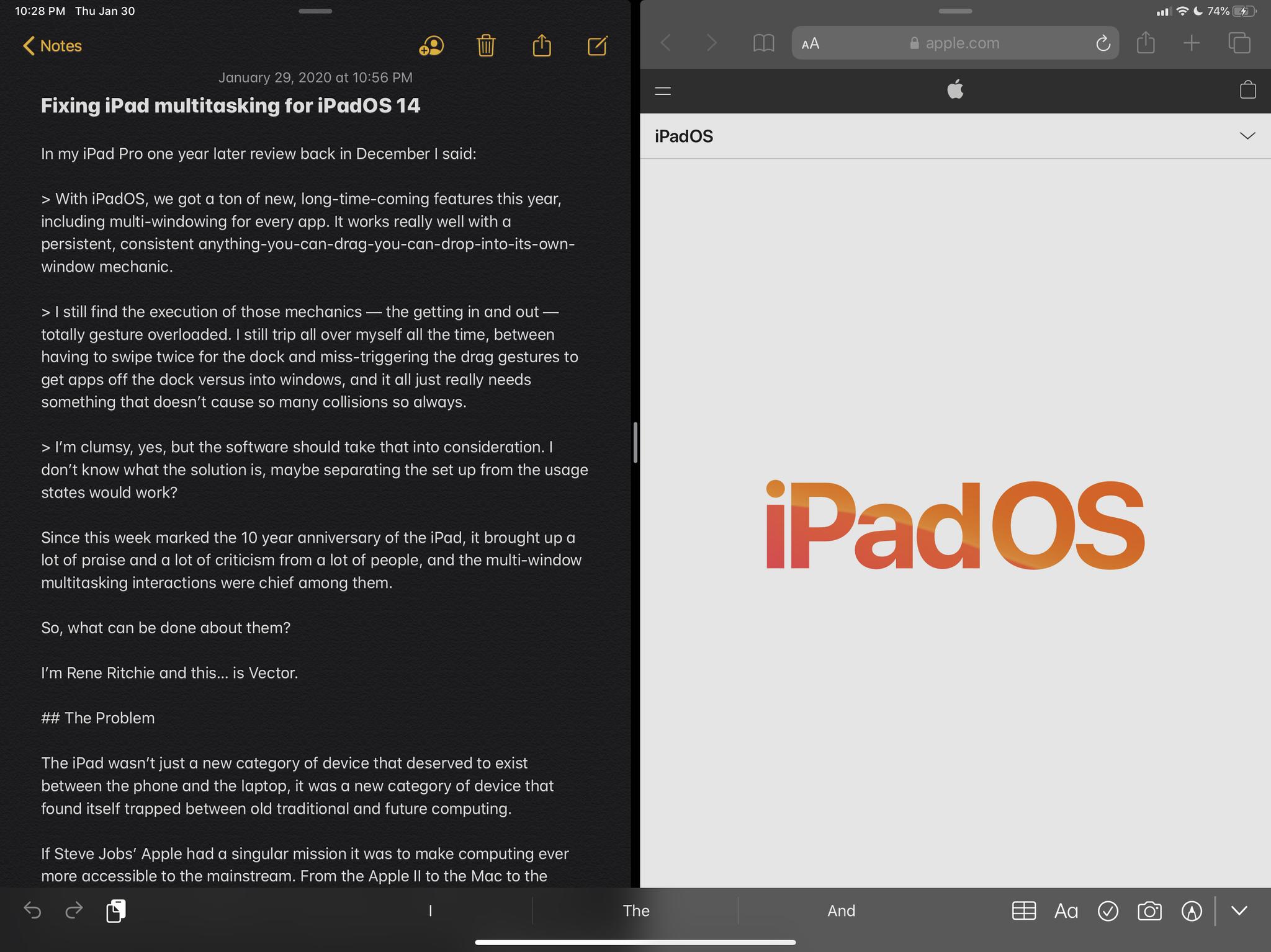
You can still drag individual elements out of one window to make or take over another, because that conforms with the rule of single or double finger gestures affecting what's in an app.
To de-overload the current Dock gestures, though, it takes a three-or-more finger swipe up, anywhere on the screen, to bring it up, and tapping on an app or a three-or-more finger swipe down, anywhere on the screen, to hide it again.
Same but in reverse for the workspace manager. Four finger swipe swipe down gives you an exposé view, and tapping on a workspace or a four finger swipe down makes it exposé it away.
I know three-or-more finger gestures might sound like a lot. Apple actually introduced 4-finger multitasking gestures for the iPad back in iOS 4.3 but they were disabled by default.
I remember watching some indie designers using them for a demo at WWDC the next year though, and navigating in a fluid and natural way beyond anything I'd ever seen before. Not all of them are so indie any more, and I'd really love to see that fluidity, that naturalness, become the norm for iPad multi-window multitasking.

Rene Ritchie is one of the most respected Apple analysts in the business, reaching a combined audience of over 40 million readers a month. His YouTube channel, Vector, has over 90 thousand subscribers and 14 million views and his podcasts, including Debug, have been downloaded over 20 million times. He also regularly co-hosts MacBreak Weekly for the TWiT network and co-hosted CES Live! and Talk Mobile. Based in Montreal, Rene is a former director of product marketing, web developer, and graphic designer. He's authored several books and appeared on numerous television and radio segments to discuss Apple and the technology industry. When not working, he likes to cook, grapple, and spend time with his friends and family.
