Blocs 3 for Mac: Beginner's guide
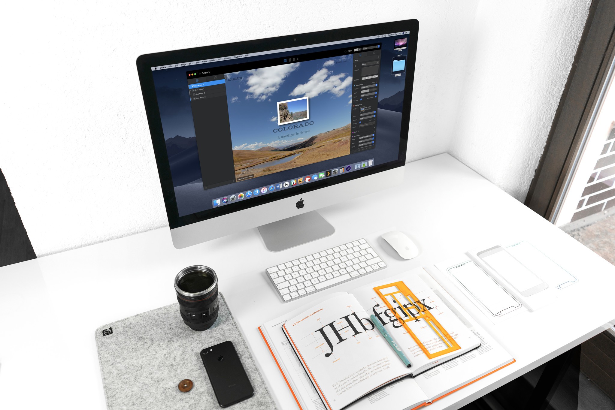
Blocs 3 strives to make assembling a website as easy as possible, even for folks who've never learned a lick of HTML or CSS. But despite its noble efforts, the program's bells and whistles can get a little intimidating the first time you fire it up. Here's a basic guide to help you quickly build a site that looks great on desktops, phones, and every screen in between.
1. Assemble your materials
Before you even open Blocs, it'll help to gather all the images and other files you're planning to use in your site. They'll be easier to add to Blocs' Asset Manager from one central location. And since Blocs doesn't make copies of anything you add to the program, if you move them on your hard drive while you're working on your site, Blocs won't be able to find them. Keeping everything you need in one spot will make everything else easier.
2. Create a new site
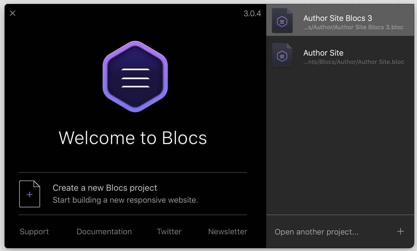
Fire up Blocs, and select "Create a new Blocs project" from the welcome screen. You'll be invited to choose a page template, and unless you've already saved your own or downloaded some third-party ones, a blank page will be your only choice. Before anything else, go to File > Save As… to give your project a name.
3. Start adding and editing Blocs
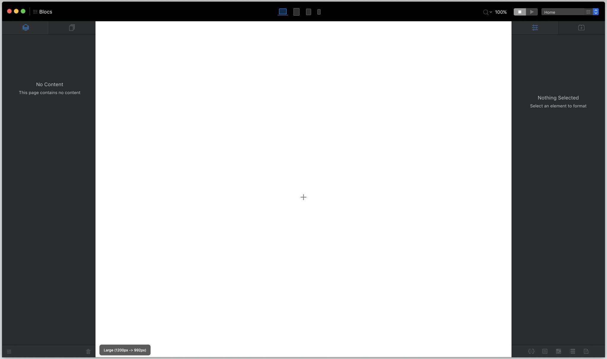
Ah, the sheer terror of a blank canvas. Conquer it by clicking on the little + sign in the middle of that intimidating expanse of white.
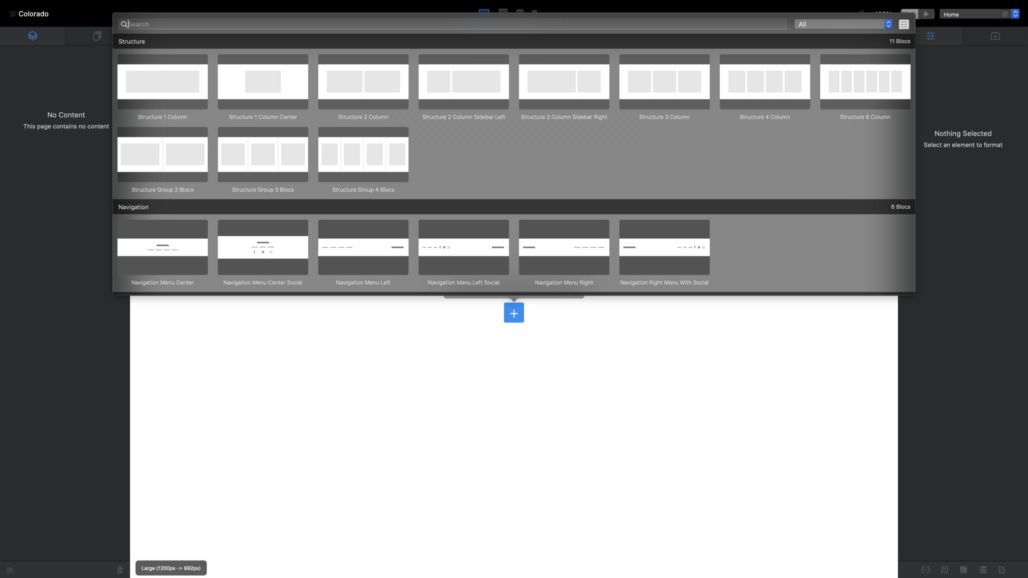
The Blocs bar appears. Blocs provide the basic structure for your page. They can be as simple as sets of empty columns, or as complex as a screen-filling "hero" image with text overlaid. Let's go with the latter. Scroll down to the "hero" category and select a hero Bloc that works for you.
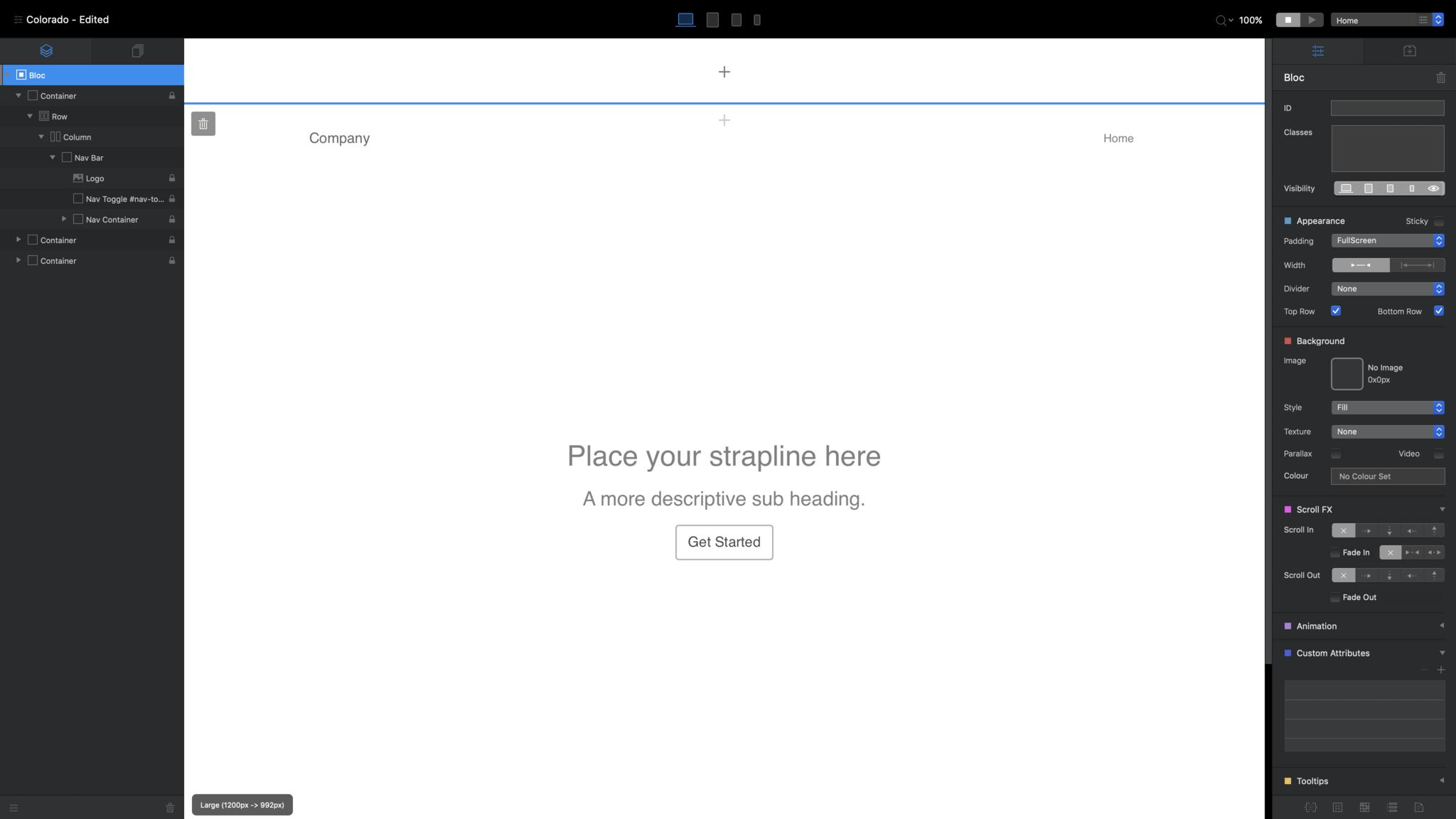
Note the section marked off with a blue line at the top of the canvas. That's a static header area, and there's a footer area like it at the bottom. Anything you add here, like a navigation bar, will appear on every page of your site. Use the + sign in the middle to add Blocs to this section, just like you did with your hero Bloc. If you add nothing here, it simply won't appear in your finished site.
So, your first page: Not much to write home about yet, is it? But it will be. Everything you see is an HTML element that you can edit, change, or style however you wish. Double-click on any text to edit it. (… Except for the navigation links in the upper right, which take their names from the pages you'll create later.) The blue bar that appears above the text includes basic formatting options. The tiny brick-with-a-plus-sign icon below it summons the Bric bar, which we'll discuss later.
Master your iPhone in minutes
iMore offers spot-on advice and guidance from our team of experts, with decades of Apple device experience to lean on. Learn more with iMore!
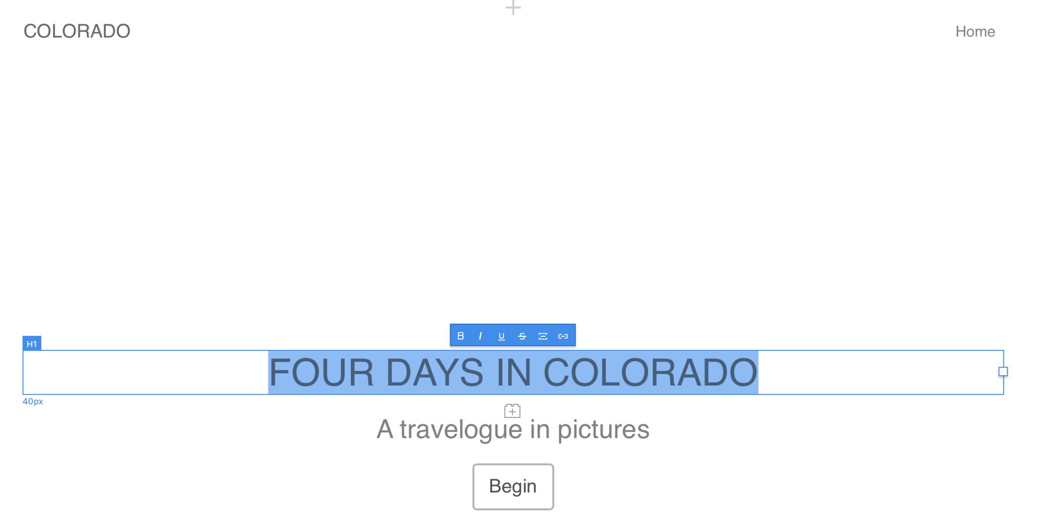
Unless you're creating a gallery of polar bears in snowstorms, or you're super into minimalism, you probably don't want blank white backdrops to greet your site's visitors. To change that, you'll need assets.
4. Stock up the Asset Manager
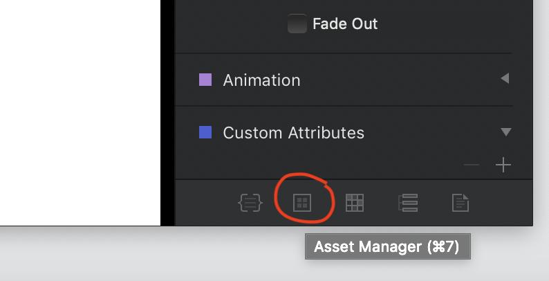
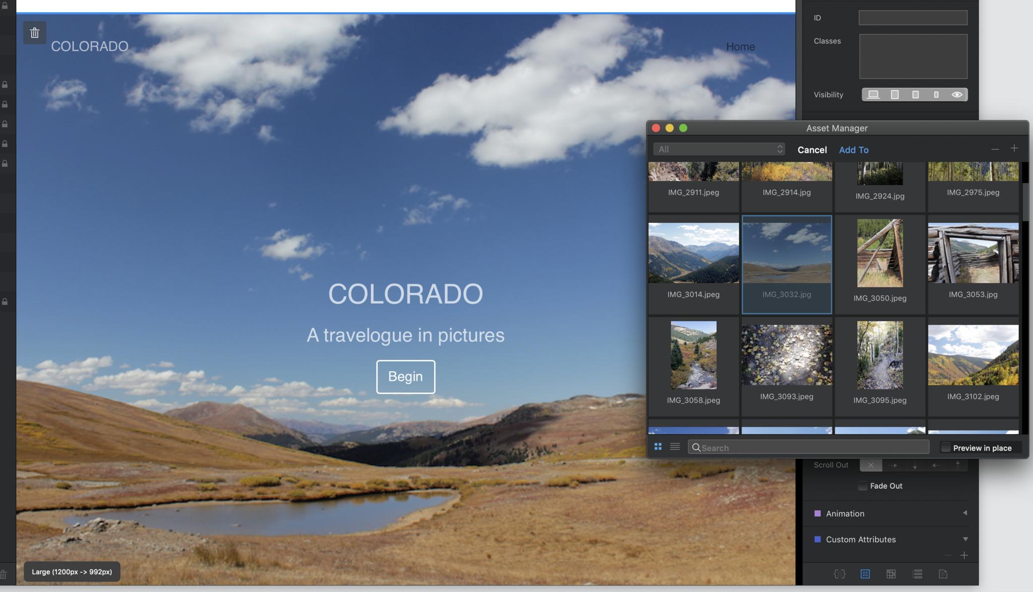
Look for the button highlighted above in the lower right corner of the Blocs window (or just hit cmd-7) to open the Asset Manager.
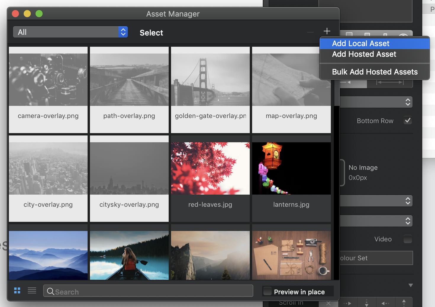
Blocs includes a few stock photos to get you started, but to make this project truly personal, you'll need to add your own images. Click the plus sign in the upper right corner, select "Add Local Asset," and use the resulting Finder window to navigate to and select all the assets you previously rounded up in Step 1.
Note that Blocs will reject any images larger than 3MB – they're too big for general Web use. So you'll want to make sure all your JPEGs and PNGs are whittled down to a reasonable file size.
The Asset Manager's good for more than photos, too. It can house PDFs, Word documents, and just about any other kind of file you might want to include or offer on your site.
Once you've got your assets all lined up, drag a picture from the Asset Manager to the background of your hero Bloc to bask in its majesty. Don't like it? You can drag any other image in from the Asset Manager to take its place.
5. Keep building
Move your cursor down to the bottom of the hero Bloc. You'll see a + sign that gains a gray background as your cursor approaches, turning bright blue when you roll over it. Clicking this opens the Blocs bar again to add a new Bloc below the selected one. (You'll find a similar icon at the top of each Bloc, too.)
Let's mosey down to the Structure section and add a row of four columns:
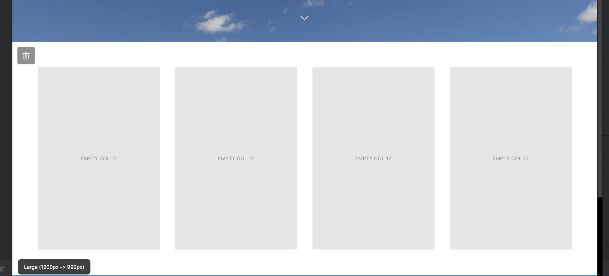
Once they're in place, you may want to adjust how they're placed relative to other Blocs. Look for the Appearance palette in the Inspector pane at right.
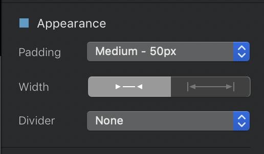
Padding controls how much blank space goes between the top and the bottom of your Bloc, with a variety of preset options to choose from. Width changes whether your bloc has a little padding on the right or left, or extends the full width of the screen. And Divider lets you add a solid, dotted, or dashed line at the top and bottom of the Bloc to set it apart.
Keep adding Blocs until you're satisfied with the basic structure of your site, and if you want, don't forget to add a few footer Blocs in the global footer area at the very bottom of the canvas, separated from the rest of the canvas by a solid blue line.
6. Put some meat on those bones
You've got your page's skeleton in place. Now you need to flesh it out. Go back up to that four-column row you placed just beneath the hero Bloc, and drag images from the Asset Manager to fill each column.
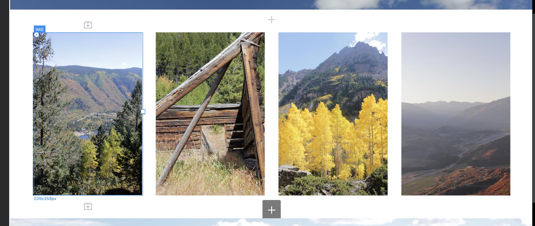
See those little Lego-block icons with the + sign inside them above and below the selected IMG Bric? Clicking them will open the Brics bar to let you add a new page element – a header, text, another image, etc. – above or below the selected Bric. You can also drop Brics onto the canvas by switching from the Inspector pane to the Brics pane using the icons at the top of the rightmost column on the screen:
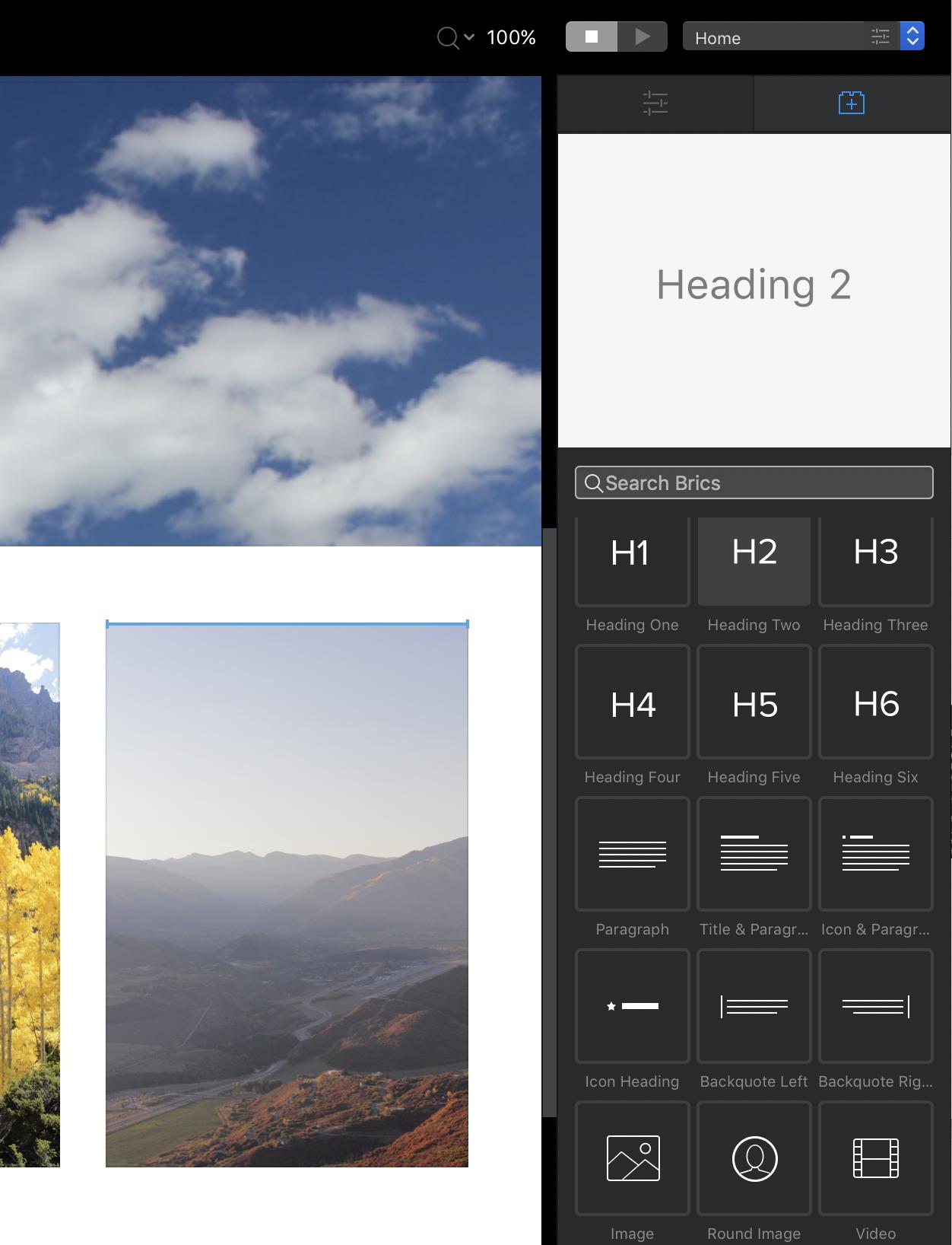
Dropping Brics onto the page this way can be a little less precise — you may need trial and error to get your Bric right where you want it – but you do get a live preview of how each Bric will look on the page, which you won't get from the pop-up Brics bar.
Let's add H2 Brics below each photo to give them captions, then double-click each one to edit its text:
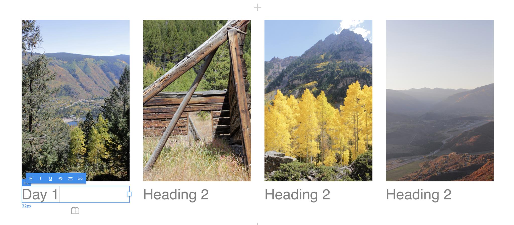
You can adjust each individual H2 Bric's font, alignment, and size using the Text Settings palette in the Inspector pane. These same controls work for nearly any Bric that contains text.
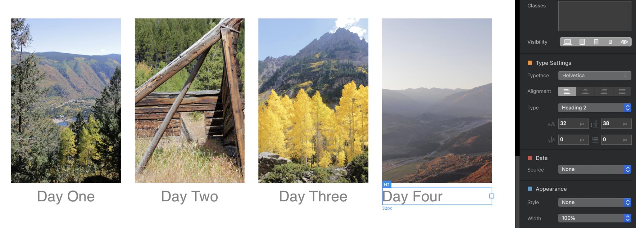
Now for a bit of razzle-dazzle. If you want to imitate Apple's product pages, and have page elements fade into and/or move onto the page as the reader scrolls down, use the super-simple ScrollFX controls in the Inspector pane. Select any item, then select whether and from which direction it scrolls in and out, and whether it fades in and out.

7. Style your site
Look, we love Helvetica as much as the next font nerd, but it doesn't always pop off the page. And individually adding Text Settings for every single Bric on your page sounds super boring. We'll delve into Blocs's full CSS powers shortly, but for now, let's quickly add global fonts and basic text formatting to all of these H2 Brics, plus the navigation bars, headers, and other text throughout our site.
Look for the slider bars icon next to your project's name in the upper left corner of the screen.
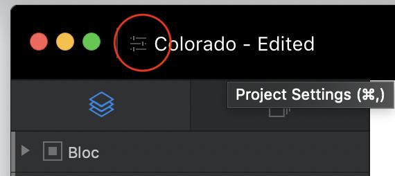
Clicking this button, or (as you can see from the tooltip above) hitting cmd-,, will open the Project Settings window. There are a lot of advanced settings here, but with one exception – setting a common background color for every page on your site, which you can do under the slider bars icon at the top left below – everything you need for now falls under the T icon, for text.
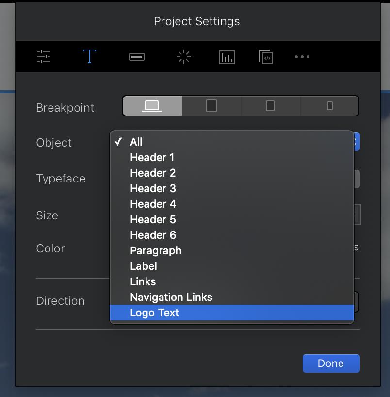
The Breakpoint buttons here control how the different elements will be styled at large (desktop computer), medium (tablet), small (big phone), and extra-small (tiny phone) screen sizes. Anything you set at a larger breakpoint will flow down to all the smaller ones unless you specify differently.
Use the Object pulldown to select which site element you want to style. This comes in particularly handy for the Logo Text and especially the Navigation Links, which aren't easy to format otherwise. Once you've chosen an object, the Typeface, Size, and Color options are fairly self-explanatory, while the Direction buttons control whether your text flows left-to-right or right-to-left, in case you're building a site in Arabic, Japanese, or other written languages that employ the latter approach.
8. Class things up
Global styles work great for your site's broad strokes, but you can do so much more to make individual aspects of each page stand out.
That hero Bloc looks pretty good, but what if we added another image on top of that background for a little contrast? Madness? Perhaps, but Blocs can still make it happen.
Select the main header in your hero Bloc, and use the Brics bar button above it to add an image, then fill the blank space with a picture from your Asset Manager:
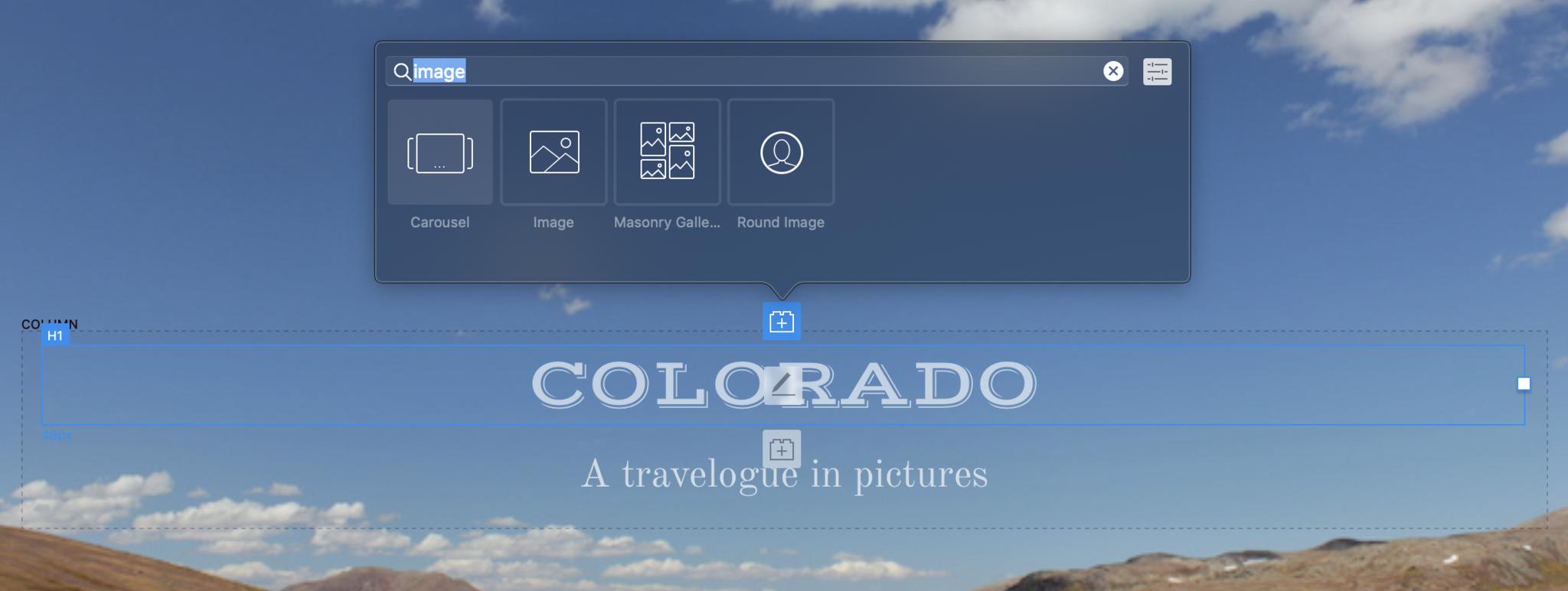
The result is, uh, perhaps a tad large. But that's okay. We can fix this.
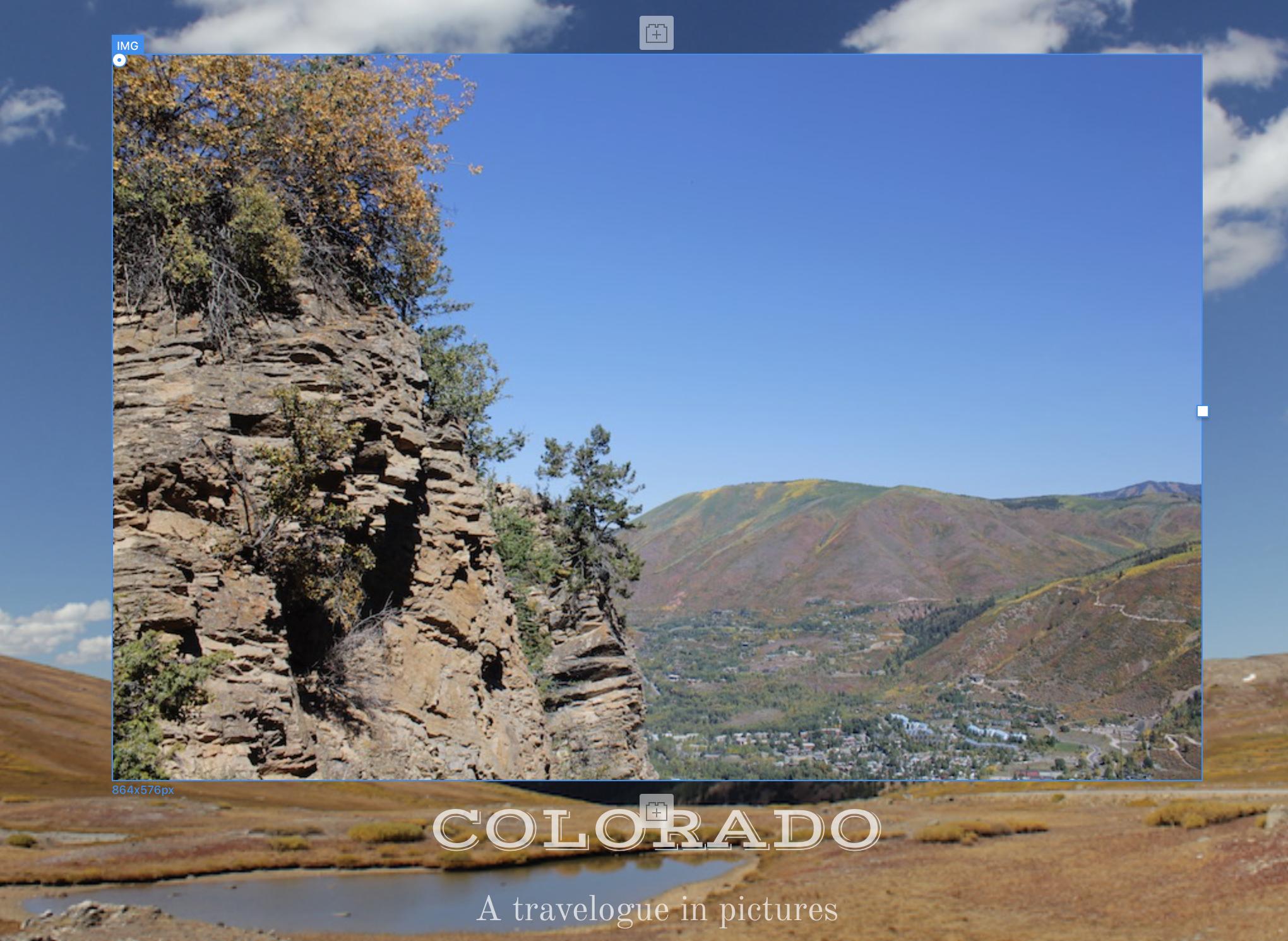
See that white square on the right of the selected image? Click and drag it to the left to shrink the image to a more reasonable size. You've just used Blocs 3's powerful new Freehand technology, which – long story short – lets you move, resize, and adjust individual objects on the fly without angering the mighty HTML and CSS gods. (Holding Shift while an object is selected brings up controls on all four sides to control the distance by which it's offset from other objects on the page.)

That looks much more reasonable, but still a little plain. Let's make this picture look like an old-fashioned photo print, with a thick white border and a drop shadow. To start, we'll need to give this IMG object a custom class.
At the top of the Inspector pane, you'll see a Classes box. Click inside it and start typing the name of your new class – "snapshot," in this case. (The Classes box remembers all the custom classes you've already created and will try to autofill the names of existing ones as you type, which can save you time in a project with lots of custom classes.) Hit return when you're done typing; you'll see the name of your class surrounded by a gray bubble, with a little X icon to remove that class from the object if you wish.
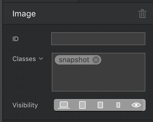
Double-click the new class name to open the Class Editor. You'll see the class's name at the top, alongside a pulldown menu to set different styles for normal, active, and hover states of each item. This works especially well for links, but can also apply to any object on your page.
The options below that will depend on which of the four icons you select:
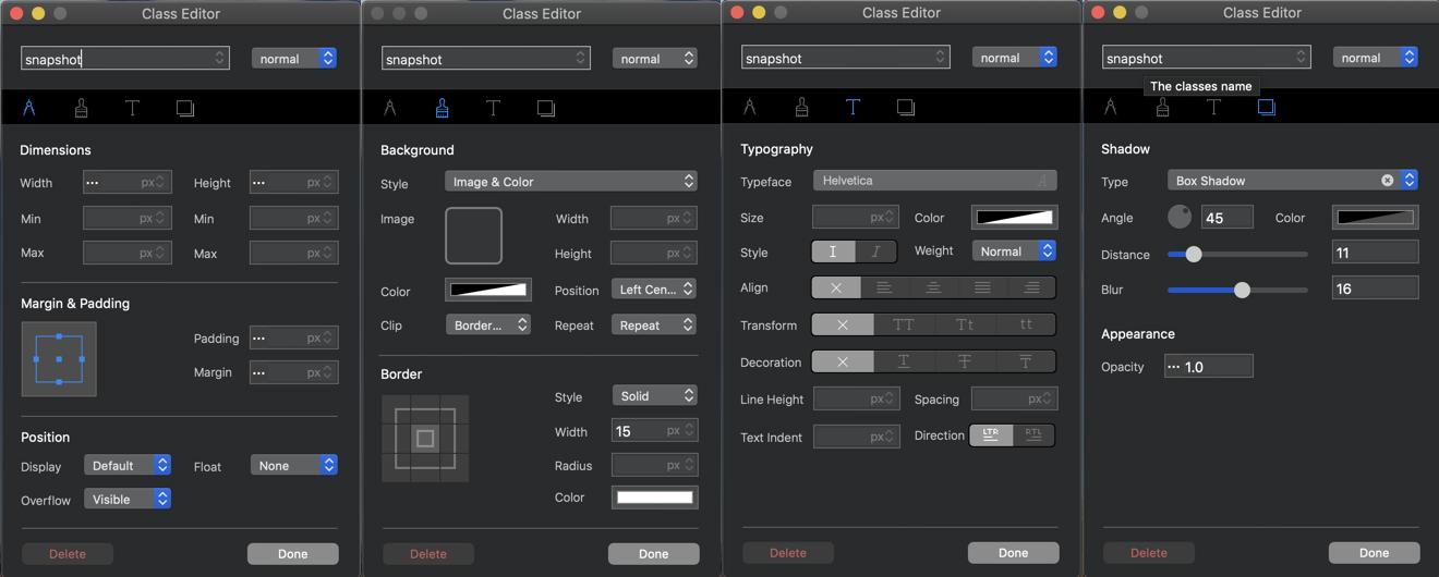
The compass controls your object's dimensions and placement on the page, including its width, height, margin (empty space beyond the edges of the object), and padding (empty space within the edges of the object). The paintbrush controls color and appearance, including an object's background image and color, and the width, style, and color of any border around it. The letter T controls typography, setting font, size, and other format attributes. And the shadowboxes control the object's drop shadow and opacity.
You can play around with any of these controls and see the results on the canvas in real time. And when you open the class editor at different breakpoints, you can adjust settings for that class for the specified breakpoint. For example, you can make a class's text blue, bold, and bigger on smaller screens for easier legibility, but black, smaller, and italicized on a desktop monitor.
We'll use these controls to give the selected photo a thick, square-edged white border, and a nice-looking drop shadow:
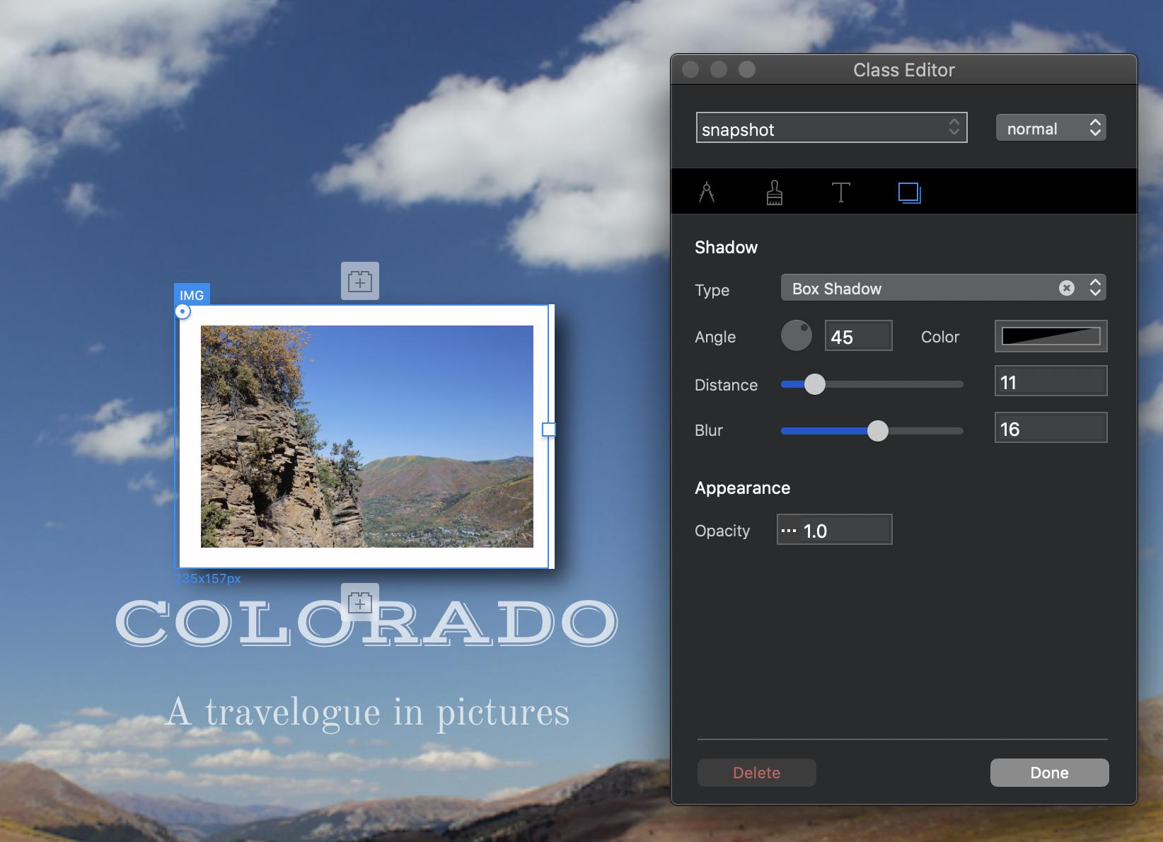
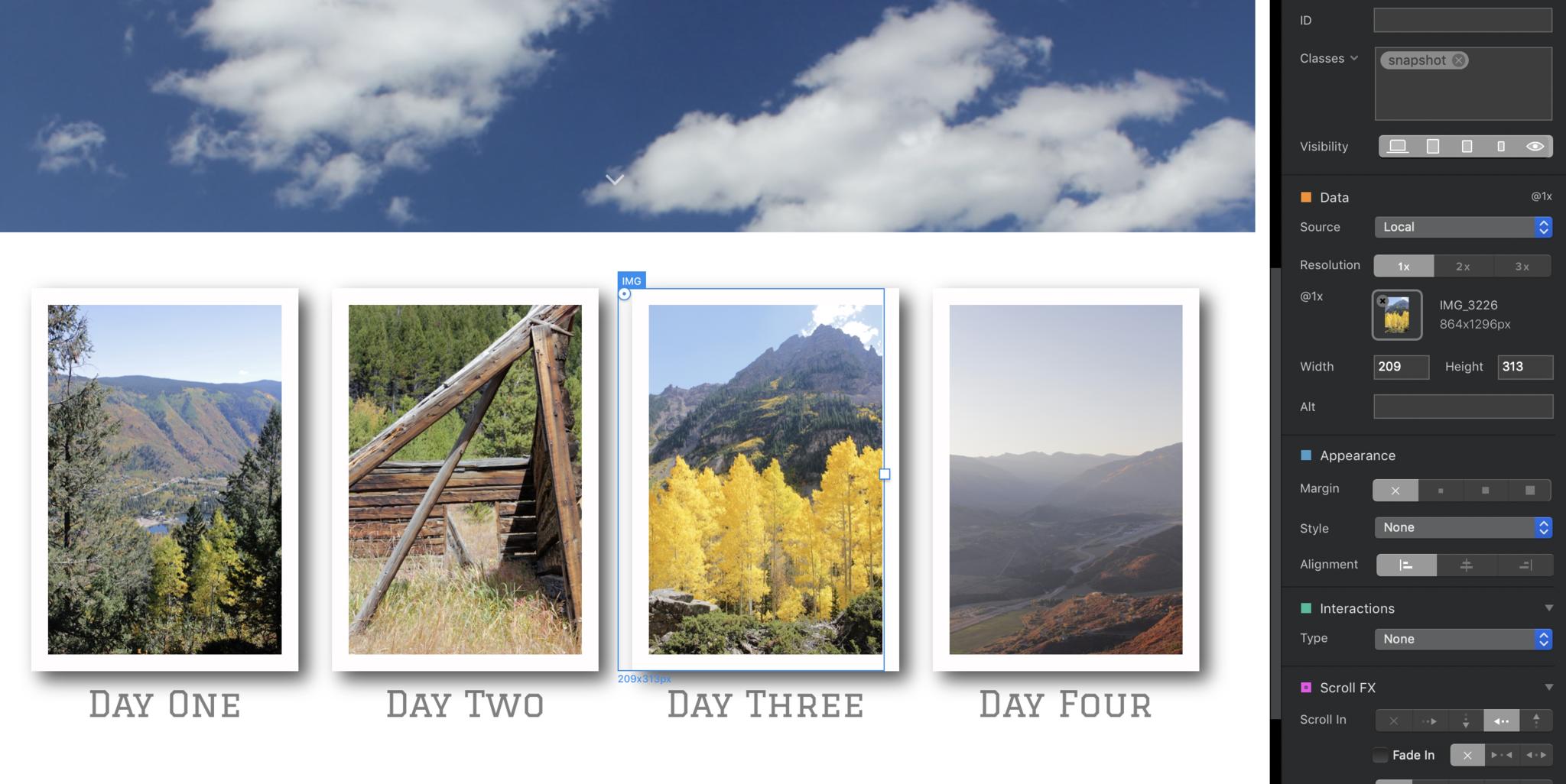
Looks good! In fact, it looks so good that we should add that look to other photos on our page. Once you've saved style information in a custom class, you can attach that class to other objects to give them the same properties. Just select the object, go to the Classes box in the Inspector pane, and start typing the name of the class until it pops up in a bubble below the classes box. Then click on the class name you want, and it'll be applied to that object, too:
9. Create more pages
Unless you're going ultra-minimalist, one page probably isn't enough for your site. Let's add more. If you like the basic layout you've come up with for your home page, head up to the menubar and select Page > Add to Template Library to make it a new template for future pages. If not, you can start fresh with a blank page.
Add new pages by selecting the page stack icon at the top of the lefthand pane onscreen:
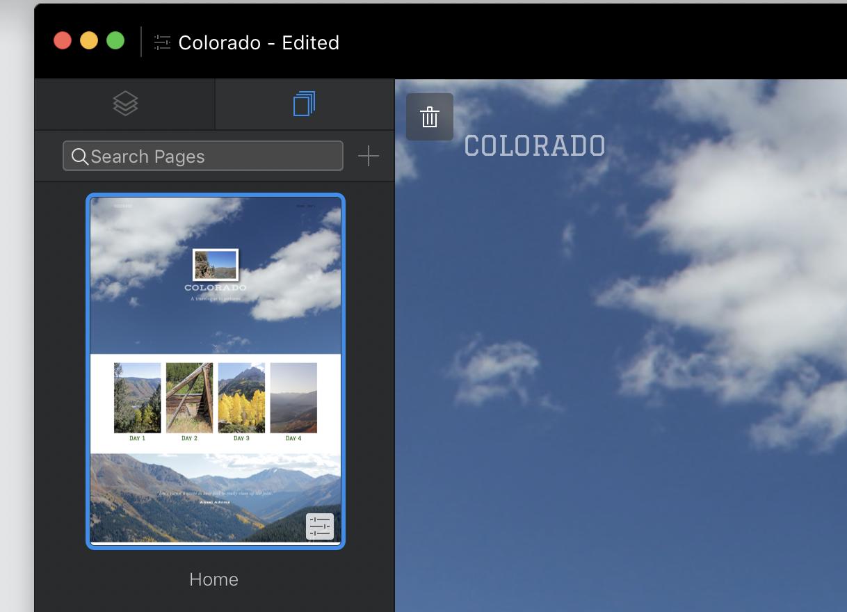
Then choose a template for your new page and give it a name. Note the options to turn on or off the top and bottom global areas, and to have the page appear (or not) in the main navigation menu.:
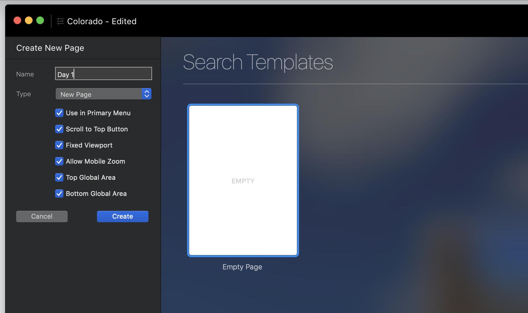
From there, keep adding Blocs, Brics, and new pages until you're satisfied with your site.
10. Let's get small
You know how your pages will look on a desktop site – but what about smaller screens? Blocs endeavors to build pages that shrink gracefully, but it can't guarantee that. Preview your pages at different breakpoints to make sure nothing goes awry when your site loads on mobile devices.
You can see your site at various breakpoints with the buttons at the top center of the screen:
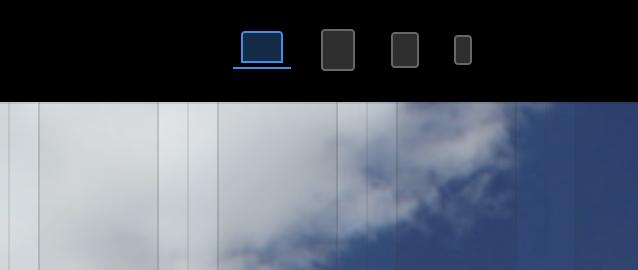
Remember that you can adjust the size and other aspects of any item for any particular breakpoint. Text too big for super-tiny phone screens? Shrink it down by selecting the offending text and resizing it in Type Settings (or using Freehand), without worrying that it'll look weird and small at larger sizes.
For an even better look at how your pages will appear in the browser, enter Preview Mode with Ctrl-V or the triangular "play" icon button at the top of the screen. The square "stop" button takes you back to edit mode, and you can switch between any page and any breakpoint within Preview Mode.
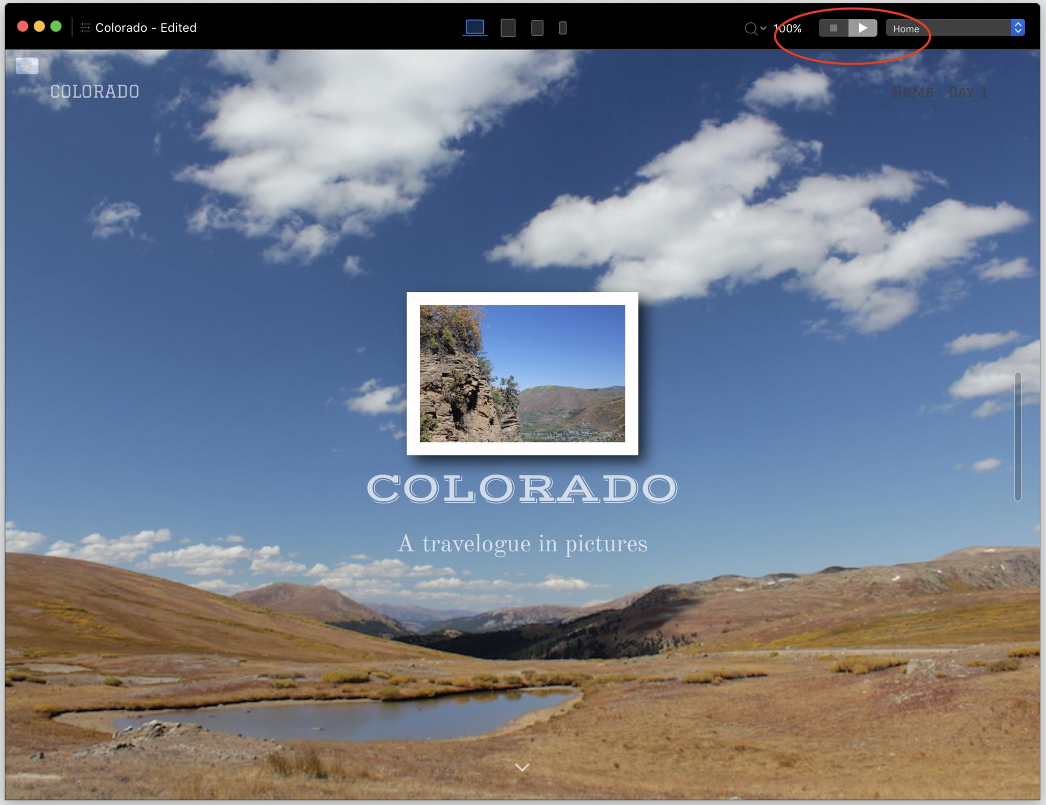
11. Set your site free
Blocs 3 doesn't include built-in tools to send your site to your web server of choice; you'll need a separate FTP client to do that. But Blocs will bundle all your files and images into one tidy, ready-to-upload package.
Export your site by selecting File > Export > Quick Export or hitting cmd-E. Choose where on your hard drive to save the files, and in a few seconds, Blocs will have packed up your site for speedy delivery to the Web.
All the coolness, none of the coding
There's a beauty, even a poetry, to coding by hand. HTML and CSS are among the easiest programming languages to learn, even if you're the type of person whose brain starts hurting at the mere phrase "programming language." And as much as we like Blocs, a text editor is way, way cheaper – like, free cheaper in many cases – than the $100 you'll spend on it.
That said, if you just want to build a great-looking, mobile-friendly site in a single app, without hours of study and even more hours of trial and error, you can't beat Blocs. And if you've mastered the basics and want to see what else you can do, keep reading for a look at Blocs 3's more advanced features.

Nathan Alderman is an iMore contributor. He’s been using Apple computers since his first Apple IIe in 1985, and writing professionally about Macs and their software since 2005. During his 12 years freelancing for Macworld, he covered email clients, web browsers, web design programs, writing apps, and games, and he’s continued to follow those interests at iMore since 2017. An editor and writing coach in his full-time career, he spends his dwindling spare time writing fiction for fun, volunteering for democracy, and contributing to podcasts on The Incomparable Network. Nathan adores his wife and wrangles his alarmingly large children in bucolic Crozet, VA.
