How to increase the legibility of your iPhone and iPad
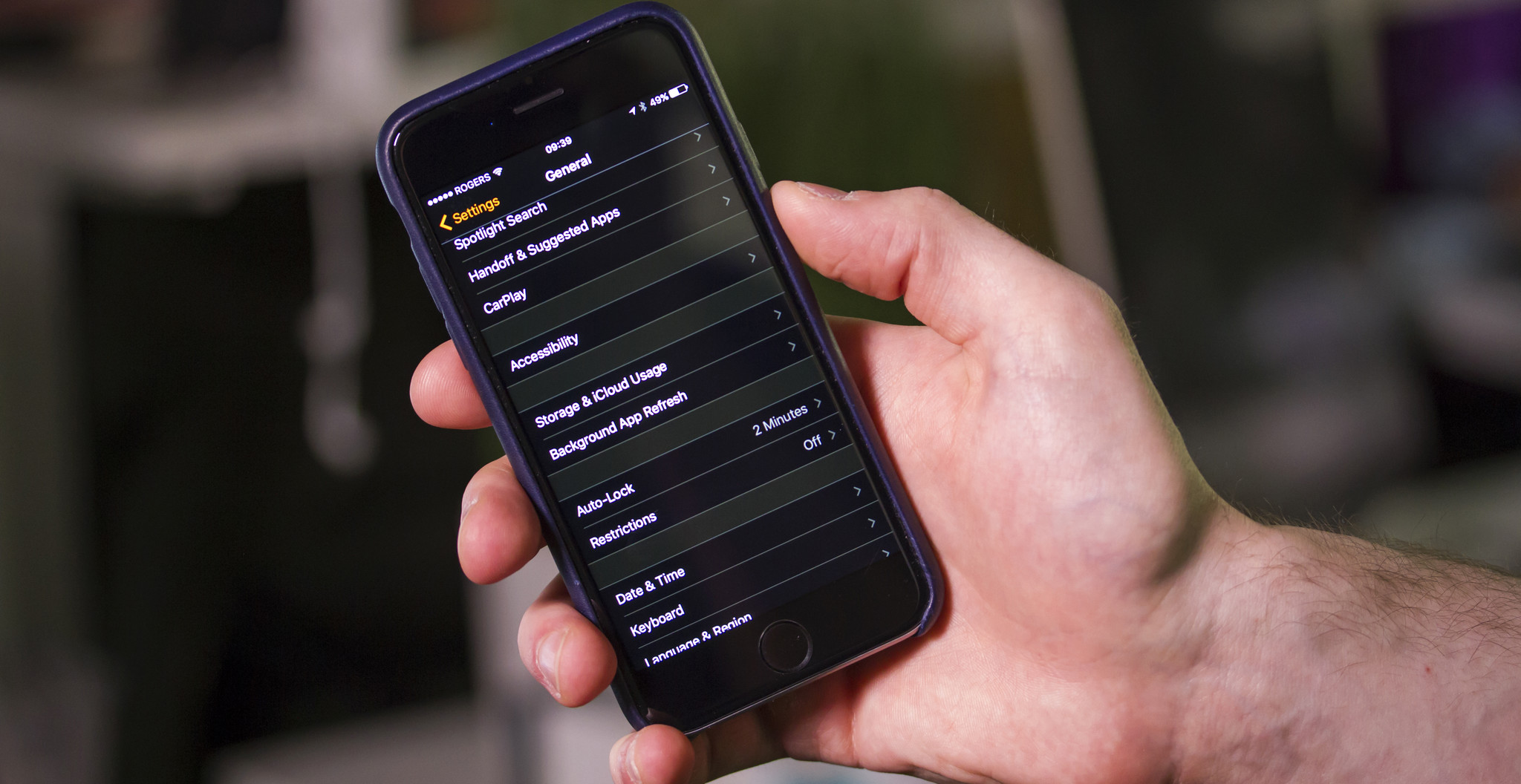
Large and bold text is an Accessibility feature that helps increase legibility by using the iOS dynamic type engine to make fonts bigger and/or heavier and generally easier to read.
For people with low vision, making text larger can magnify words without also magnifying interface elements. For people who need more contrast, making text bold can turn thin, hard-to-see lines into thicker, easier-to-see lines. Applying large or bold text in iOS will make text larger and bolder in all of Apple's apps, and in any App Store apps that support the dynamic type framework.
If you want to make things a little easier on your eyes, try adjusting some of the accessibility features on your iPhone or iPad.
- How to turn on large text on iPhone and iPad
- How to turn on bold text on iPhone and iPad
- How to enable button shapes on iPhone and iPad
- How to increase contrast on iPhone and iPad
- How to reduce motion blur on iPhone and iPad
- How to enable on/off button labels for better visual accessibility on iPhone and iPad
How to turn on large text on iPhone and iPad
- Launch the Settings app on your iPhone or iPad.
- Tap on General.
- Tap on Accessibility.
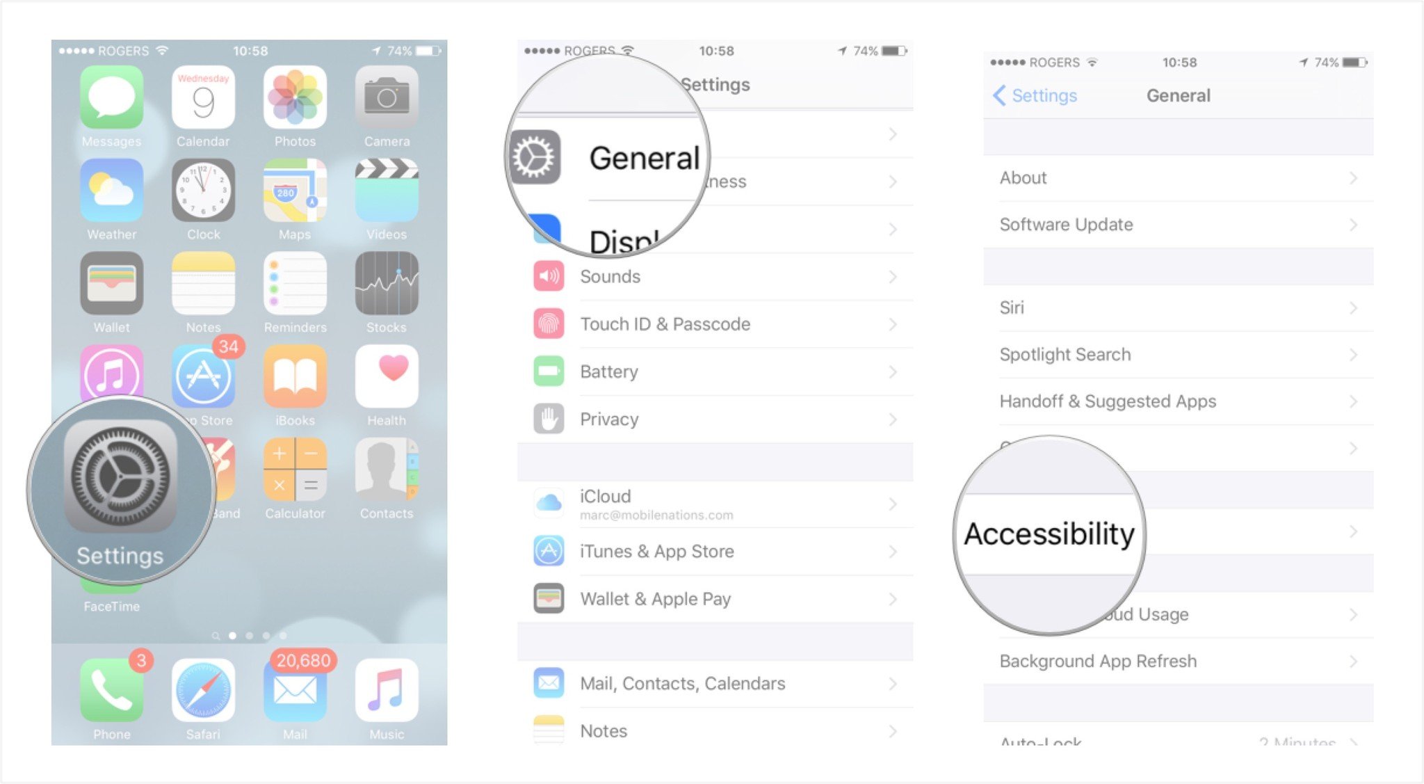
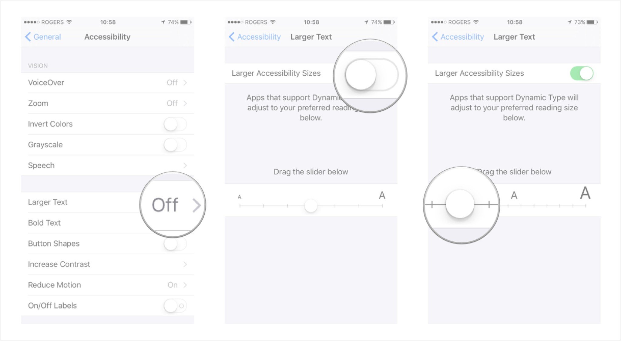
- Tap on Larger Text option.
- Turn on the option for Larger Accessibility Sizes.
- Drag the text size slider from left to right in order to adjust the text to the size you'd like.
How to turn on bold text on iPhone and iPad
- Launch the Settings app on your iPhone or iPad.
- Tap on General.
- Tap on Accessibility.
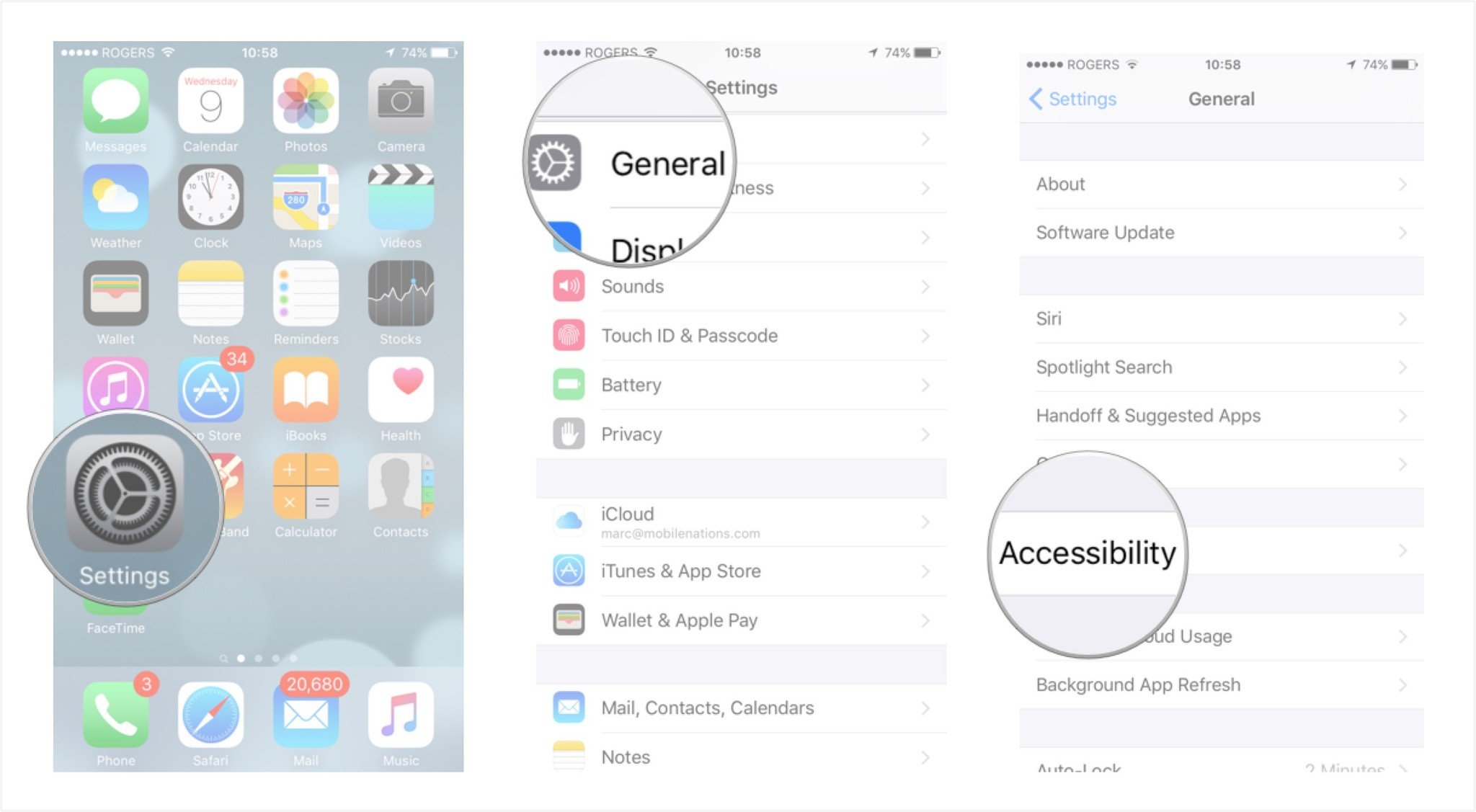
- Toggle the Bold Text slider on by moving it to the right.
- Tap on Continue to restart your device and save these changes.
Once your iPhone or iPad reboots, you should notice that the text is bolder than it was before and not nearly as thin. For those with visual impairments, this should make text much easier to read. Just keep in mind that not all third party apps will support bold text. However, all built-in apps and many App Store apps do.
How to enable button shapes on iPhone and iPad
Button shapes is an Accessibility feature that re-creates the outlines found around tappable interface elements in previous versions of iOS.
While the new "naked" style button — plain text that more closely resembles a web link than a traditional faux-3D button treatment — maintains the same tap target size, it does make it harder to know exactly where that target is and where it ends. For anyone with hand-eye coordination impairment, button shapes can help increase accuracy and reduce frustration.
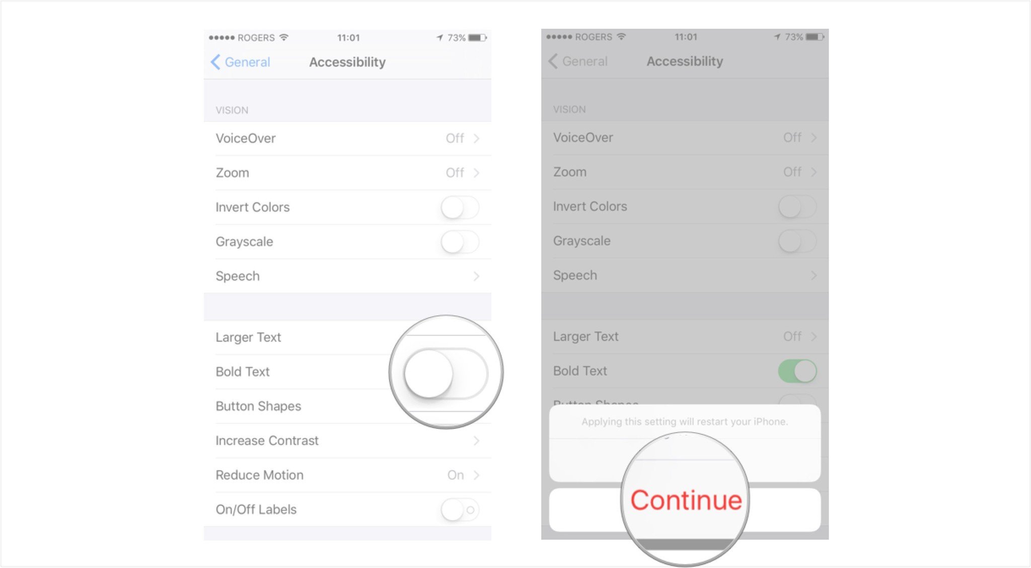
- Launch the Settings app on your iPhone or iPad.
- Tap on General.
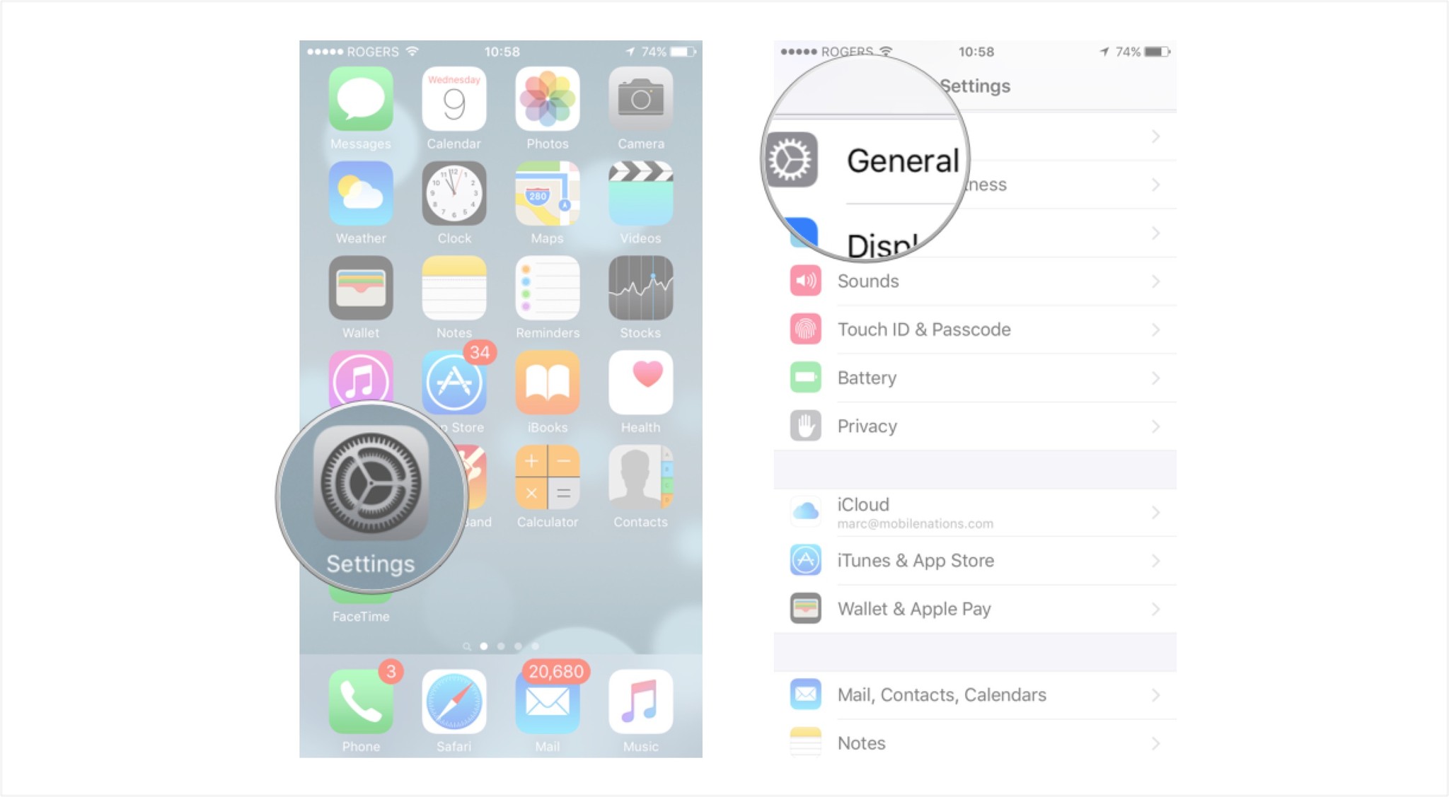
- Tap on Accessibility.
- Toggle the Button Shapes slider on by moving it to the right.
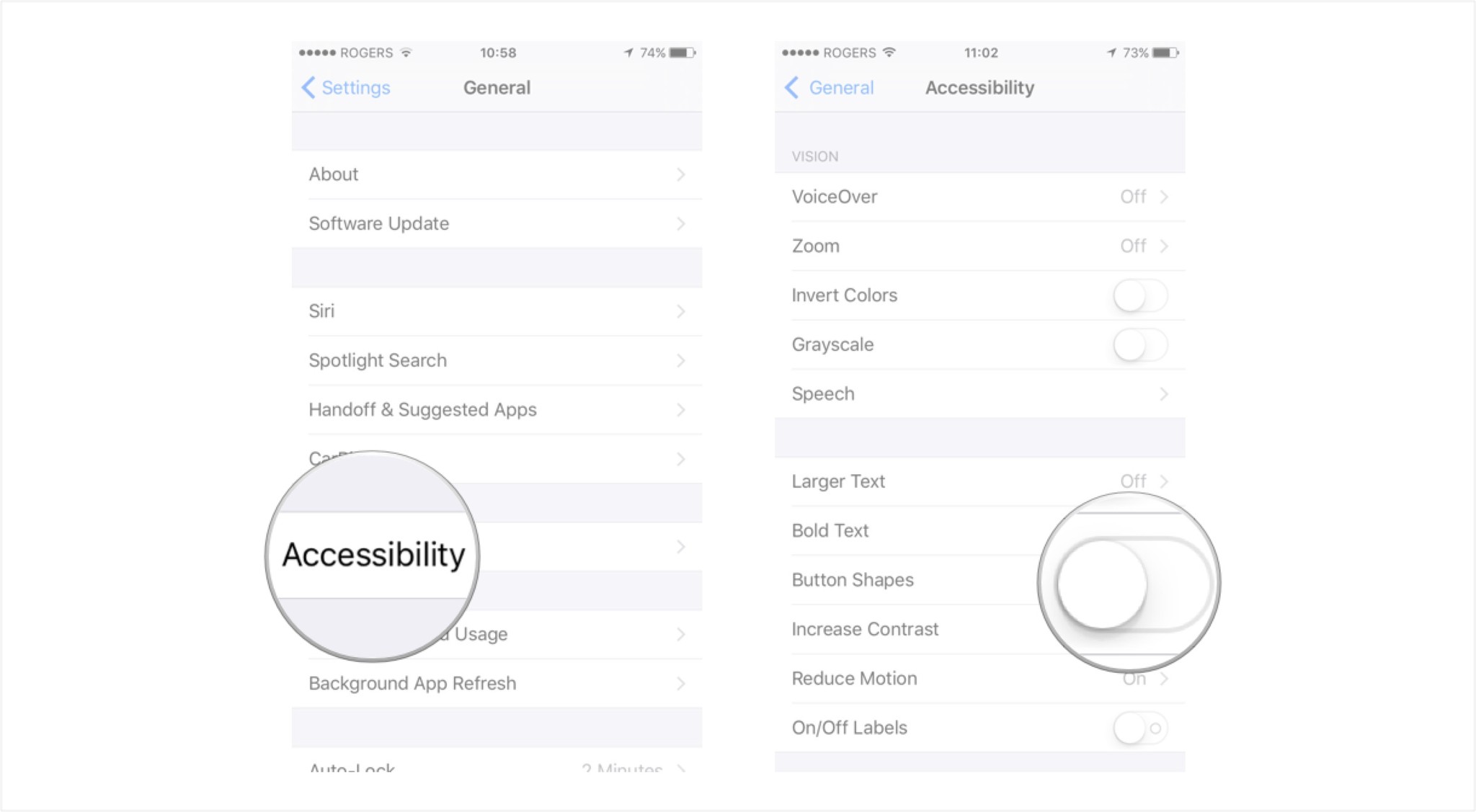
That's it! You should instantly notice that interactive menu items now are highlighted gray. Actionable items such as send buttons and menus will also display an underline indicating that you can tap on certain options to perform an action. Button shapes and underlines should work for all built-in apps and some third party apps, but be aware that not all of them will.
Master your iPhone in minutes
iMore offers spot-on advice and guidance from our team of experts, with decades of Apple device experience to lean on. Learn more with iMore!
How to increase contrast on iPhone and iPad
Increase contrast is an Accessibility feature that makes it easier to make out text and interface elements iPhone and iPad. While one of the modern design tenants at Apple is depth, achieved by layers of transparency and blur, for some people with visual impairments, it results mainly in noise and distraction. With increase contrast the transparency becomes solid and the blue becomes sharp, making everything clearer and easier to read, tap, and understand.
- Launch the Settings app on your iPhone or iPad.
- Tap on General.
- Tap on Accessibility.
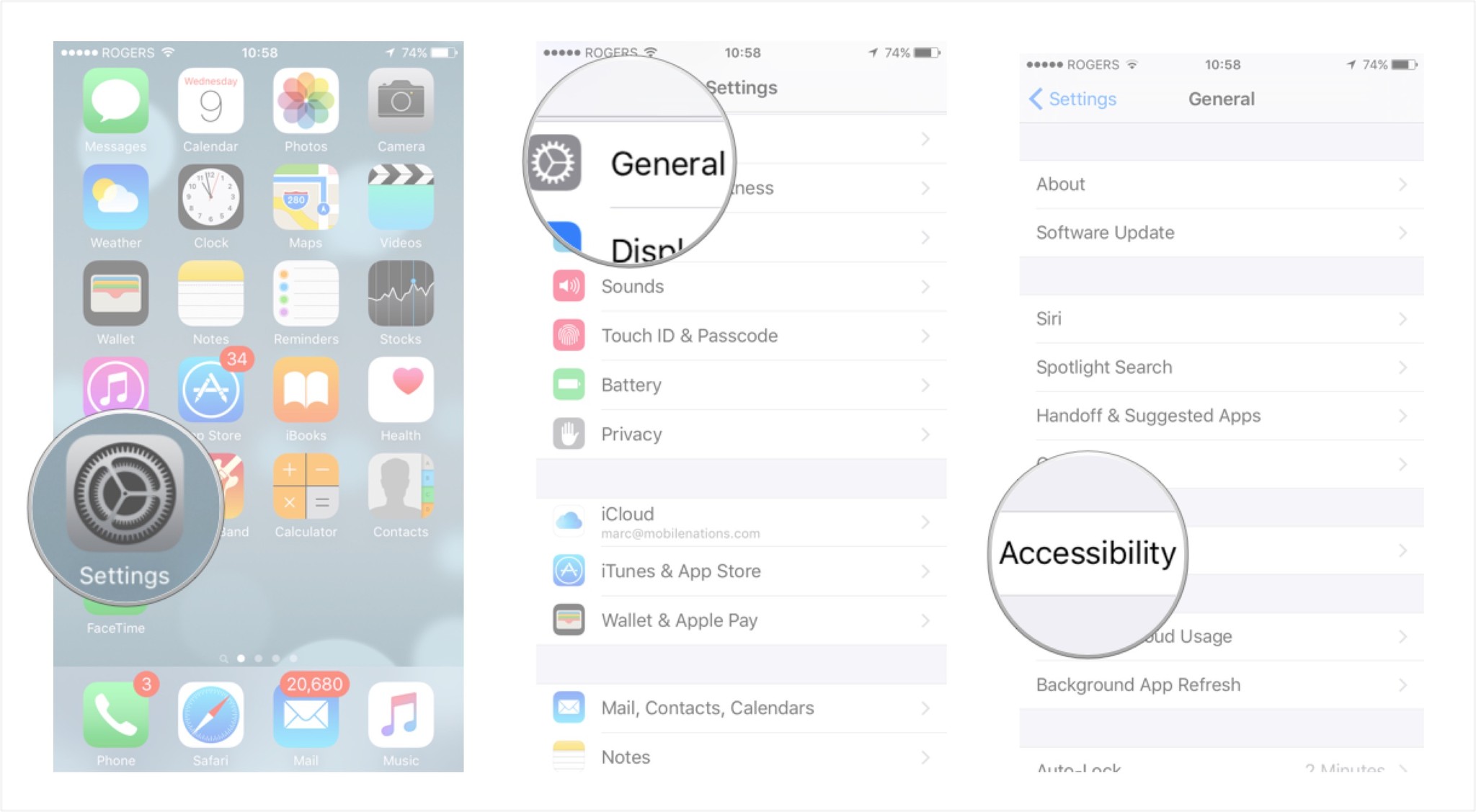
- Tap on the arrow next to Increase Contrast.
- Toggle the corresponding slider to the action you wish to perform by moving it to the right.
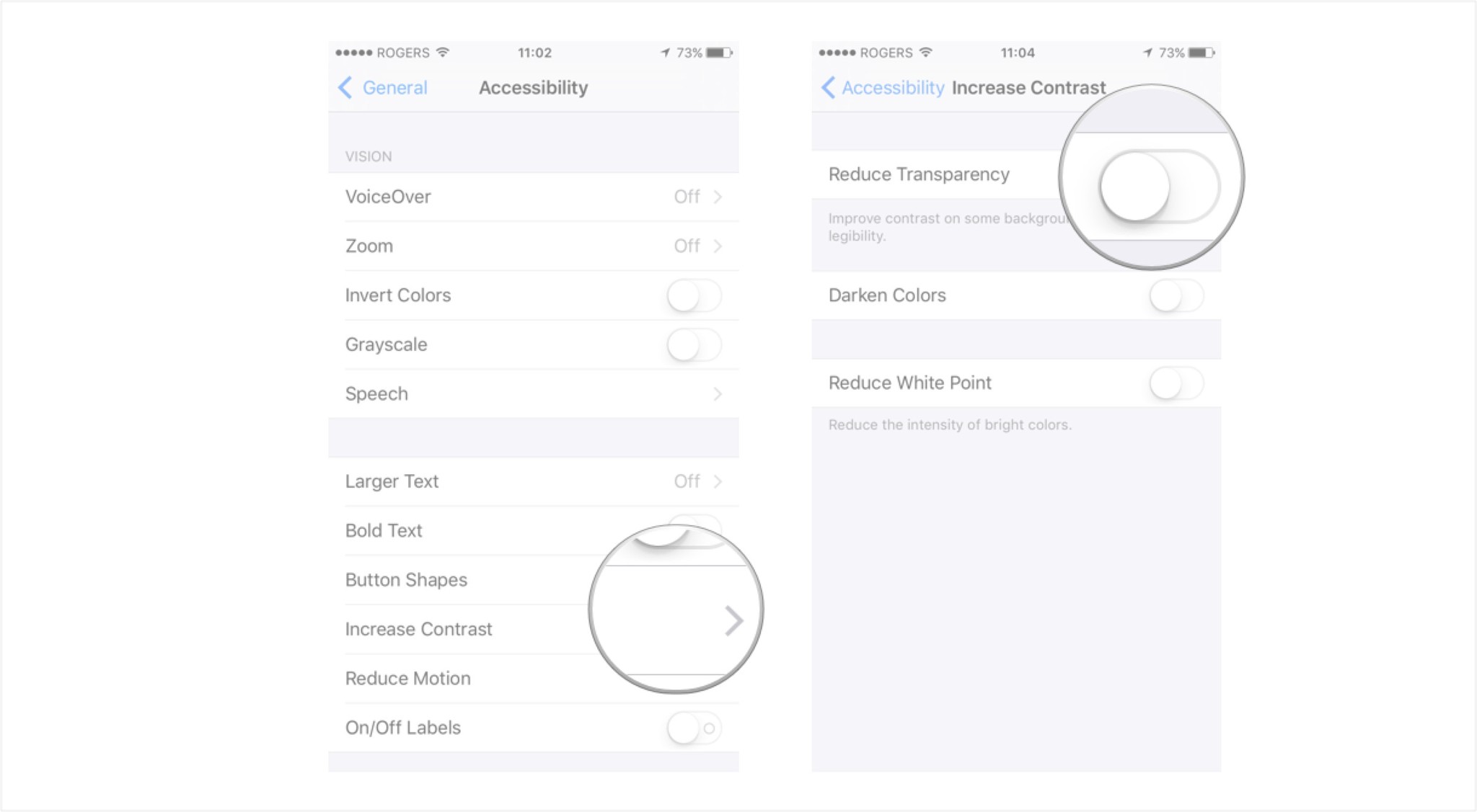
Below is a description of what each function does. Take a look at the pairs of screen shots as well. The first shot is the default device setting, the second shows the accessibility contrast adjustment.
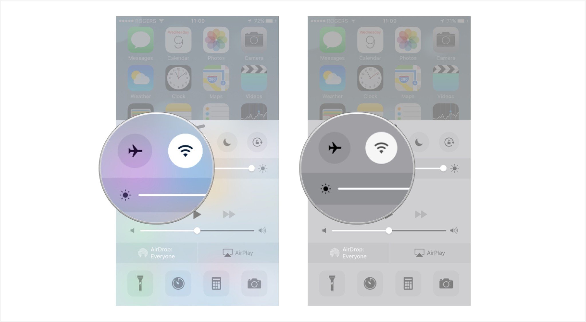
Reduce Transparency - As you can see in the screenshots below, reducing the transparency will add a solid background to the dock on every Home screen along with making Control Center, popups, and keyboards much less transparent.
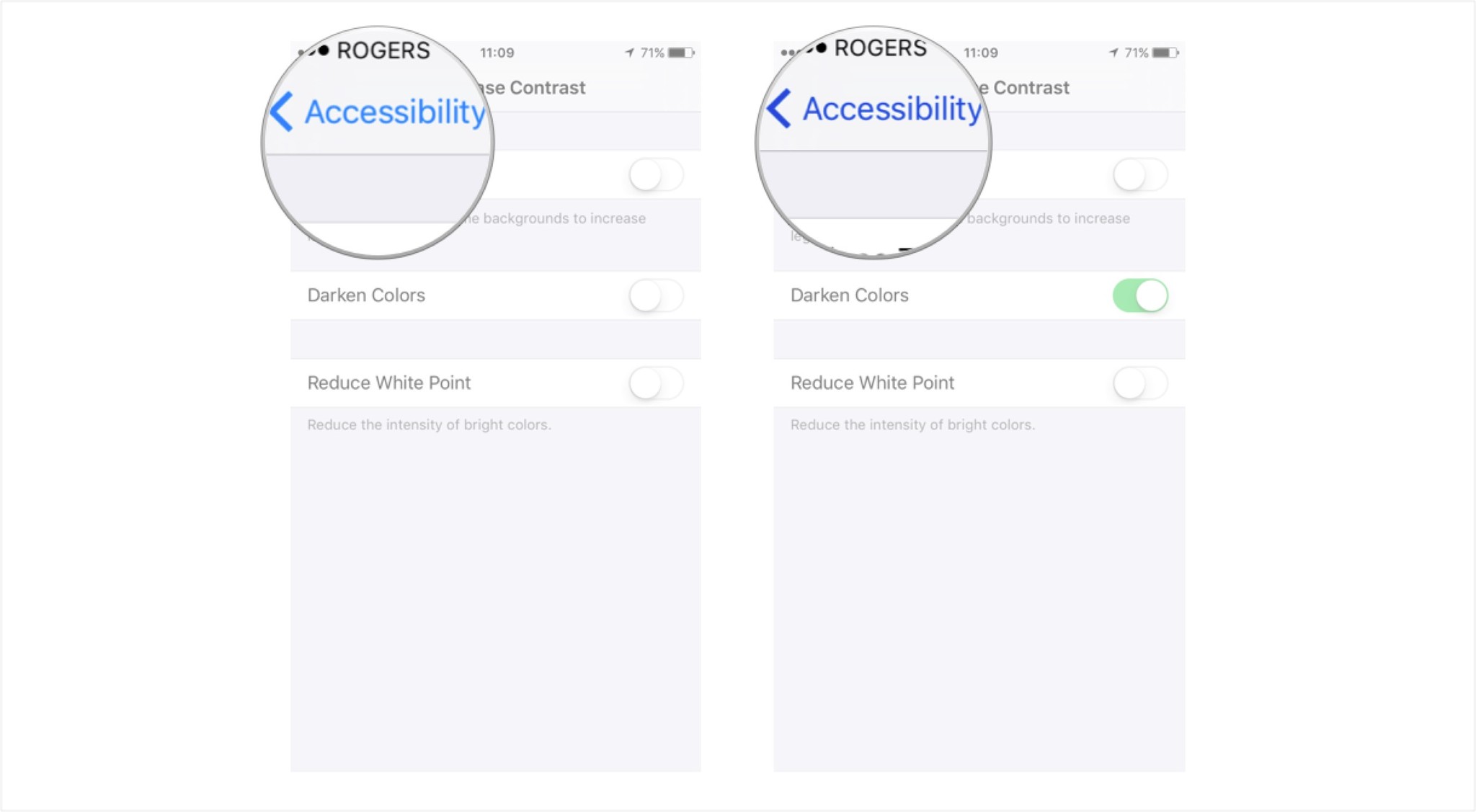
Darken Colors - Darkening colors will make menus and tabs darker which may make them stand out more so you can read them easier. In the screenshots below, you can tell that the menu buttons are a darker shade of blue when the Darken Colors option is turned on.
Reduce White Point - Reducing the white point will make whites across iOS much less harsh. Simply toggling the switch on and off should give you a pretty good idea of whether or not you prefer the brighter whites or the toned down versions. Note: This is something that doesn't show up very well in the images below, but it's noticeable when looking at an actual device screen.
Do you use any of these options on your iPhone or iPad to make iOS easier on your eyes? Are there any other options you'd like to see Apple add in future versions of iOS? Be sure to let me know in the comments!
How to reduce motion blur on iPhone and iPad
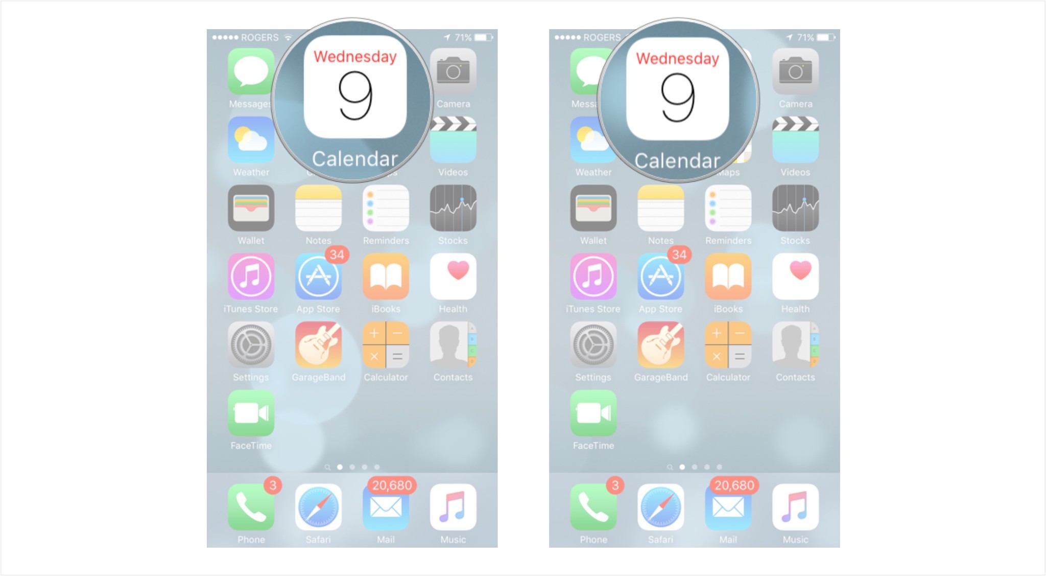
Reduce motion is an Accessibility feature that settles down and smooths out the zooms, pans, shifts, parallax, and other dynamic elements on the iPhone and iPad. Although current versions of iOS are built on a physics and particle engine that help give make them look more alive, for people who suffer from vertigo or other versions of motion sickness, the movements results not in delight but in nausea. With reduce motion most of that goes away. Zooms become fades, parallax becomes static, and bounces settle themselves down.
- Launch the Settings app from the Home screen of your iPhone or iPad.
- Now tap on General.
- Tap on Accessibility.

- Tap on the Reduce Motion arrow.
- Toggle the Reduce Motion slider on by moving it to the right.
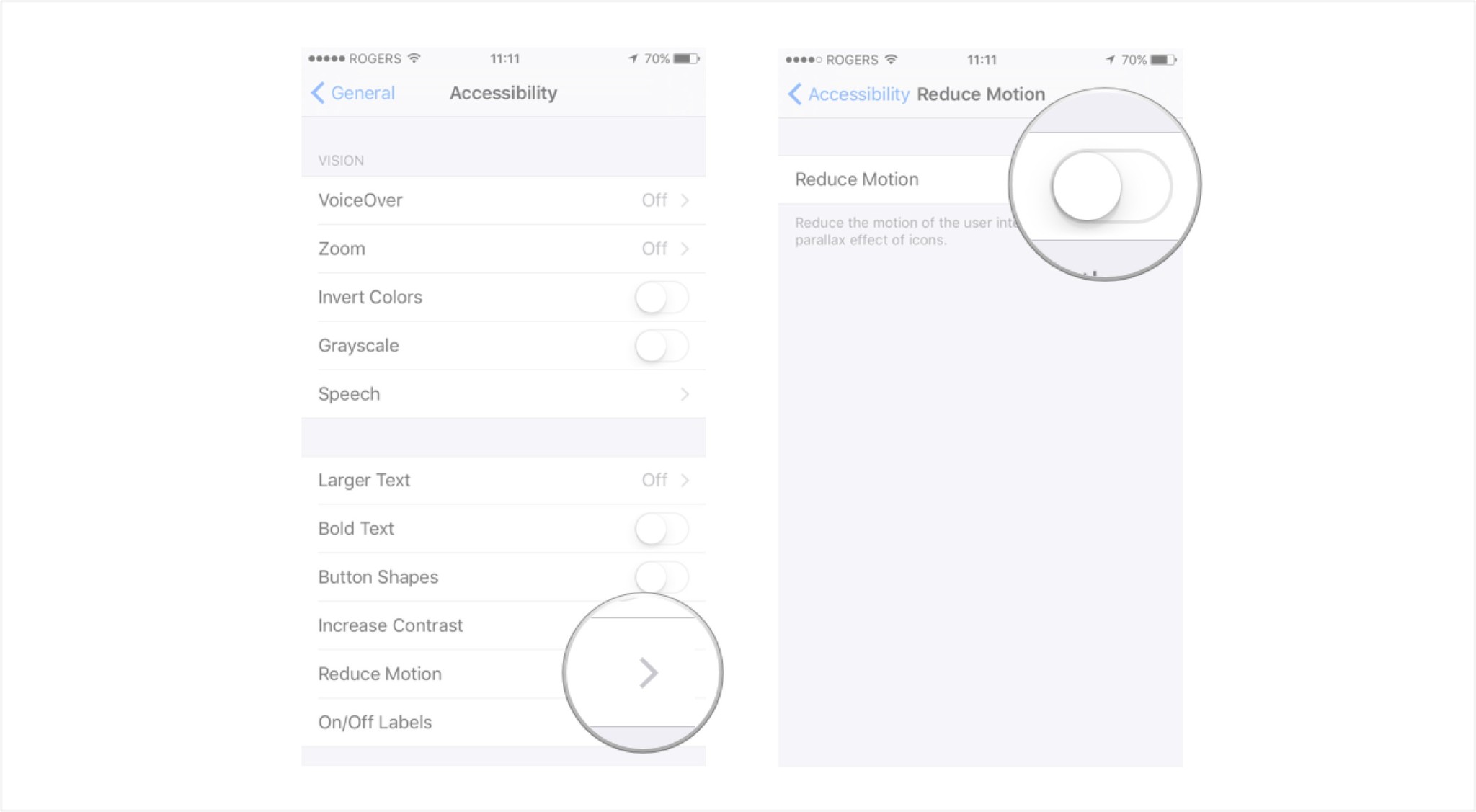
That's all there is to it. Not only does iOS not have movable backgrounds anymore, transitions are also sped up to simply fade in and out. This results in much snappier response times when jumping into apps and back out.
How to enable on/off button labels for better visual accessibility on iPhone and iPad
On/off button labels are an Accessibility feature that adds a more visible 1 and 0 digit to the standard white/green toggles modes on iPhone and iPad switches. While older versions of iOS clearly labeled toggles with "on" and "off" to help describe their state, that feature went away in current versions. Adding the text back with on/off labels can help those who are color blind or have visual impairments, or those who simply want more information to more easily discern the state of a toggle at a glance.
- Launch the Settings app on your iPhone or iPad.
- Tap on General.
- Tap on Accessibility.

- Toggle the On/Off Labels switch by moving it to the right to turn it on.
- Toggle On/Off Labels switch by moving it to the left to turn it off..

That's it. You should now see visual on and off representations on each toggle switch throughout iOS. If you ever decide you don't want them, just hop back into the Settings app and disable them again.
Accessibility options can make your phone or tablet a little easier to use. With a few adjustments, you can improve the readability and visibility of the things displayed on your device. Customizing your phone or tablet is simple once you're familiar with your accessibility
"Siri, write a really funny bio for me to use for Mobile Nations" "Okay, Drew, here's your really funny bio: How-to writer, fiddle player, retro gamer."
