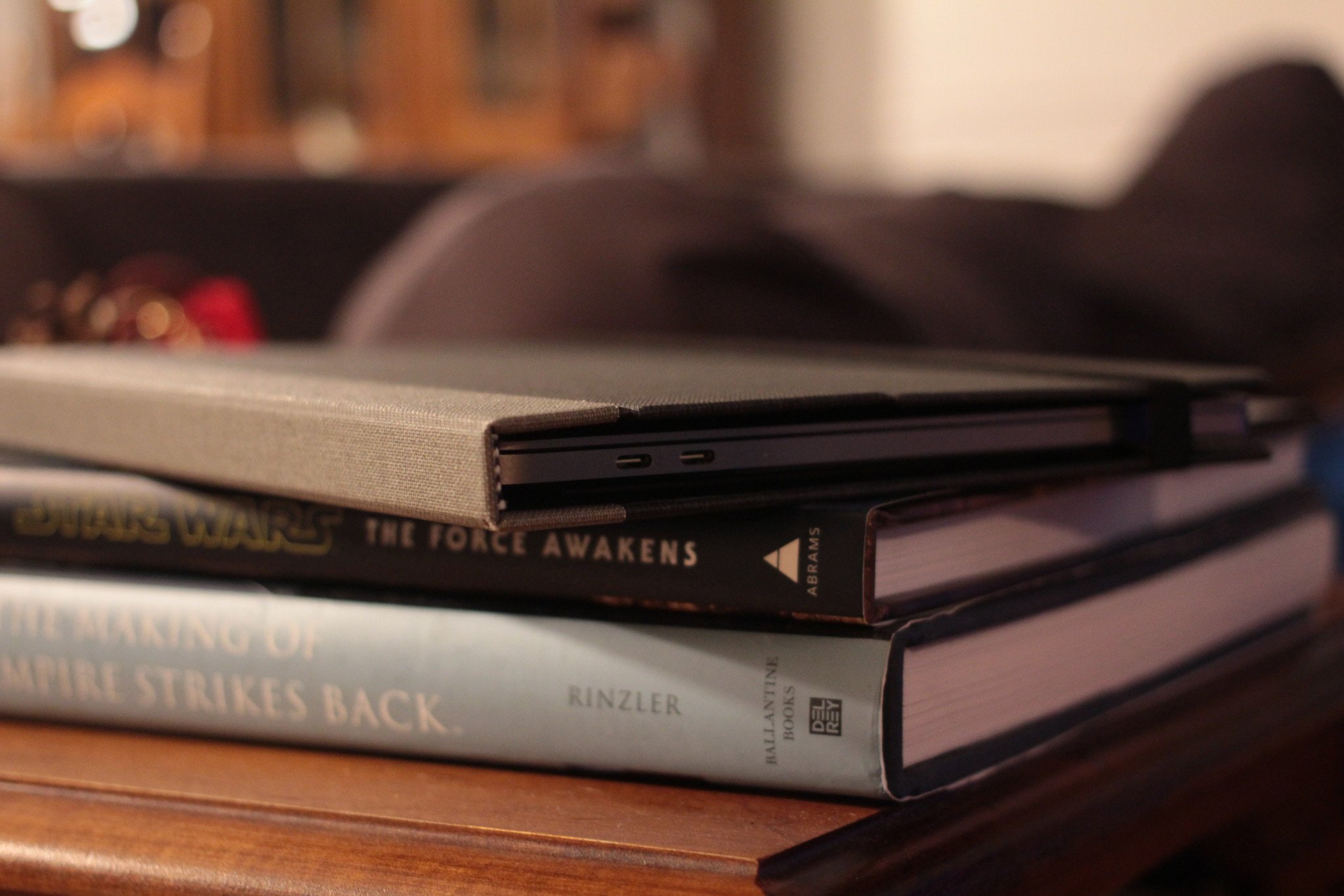
As a child, my two great loves were books and technology. I'd spend hours reading Anne of Green Gables or The High King, then hop over to my dad's Mac Plus and spend the next 90 minutes engrossed in a HyperCard stack. Funny, then, that the idea of mashing these two together seemed so odd.
I'm speaking, of course, of Pad & Quill's new Cartella Slim case for the new MacBook Pro: The linen-bound shell reminds me of an old Shel Silverstein classic, but it wasn't designed to hold reams of paper with witty poems and line art; instead, you use 3M adhesive mounting tape to attach it to the base and screen of your MacBook Pro.
Yeah, I have to admit: I wasn't thrilled about the idea. I've always been the type to use my laptops caseless and fancy free, preferring to showcase Apple's top-tier build quality over tacky stickers or plastic shells.
When I got the case for review, I wasn't even convinced I'd want stick it on my laptop at all, worrying about sticky residue from the 3M stickers. I longed for Pad & Quill's bamboo frames of cases past — despite the fact that those frames added needless extra weight to the laptop and often felt clunky to insert and remove.
Though I was skeptical of the Cartella's looks from its product photos, once I put it on my Mac and started working, I forgot it was even there.
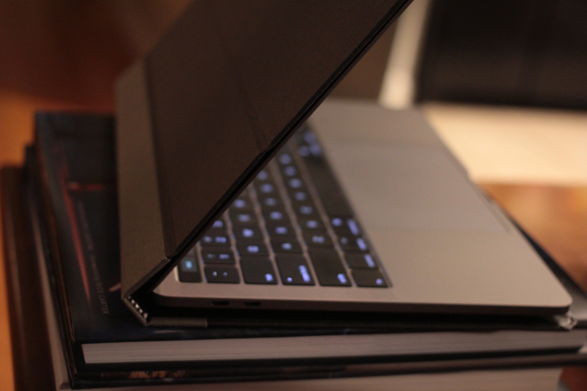
But ultimately, the sleek look of the Cartella's charcoal case (and promise of residue-free sticker removal) bade me open up that book and slip my MacBook inside. The actual placement was less stressful than I imagined; just four lengthy strips hold the case in place, two for the top case and two for the bottom, and it was quick work to align and press my bottom case and top case against the bindings.
I do rather wish there were some sort of outline along the inside of the case for proper placement — though I was neurotic enough to place it with an equal border the first time, I imagine it might be tricky to line up if you're not used to applying cases to laptops.
Once attached, the 3M stickers do their duty: The laptop stayed steadfast against the Cartella's inner binding no matter how I shook it (over a bed covered with pillows, mind you — I'm not insane). They're also laid out smartly so that the MacBook still has room for its high-powered fans to breathe and vent air — no exploding computers for this girl, thank you.
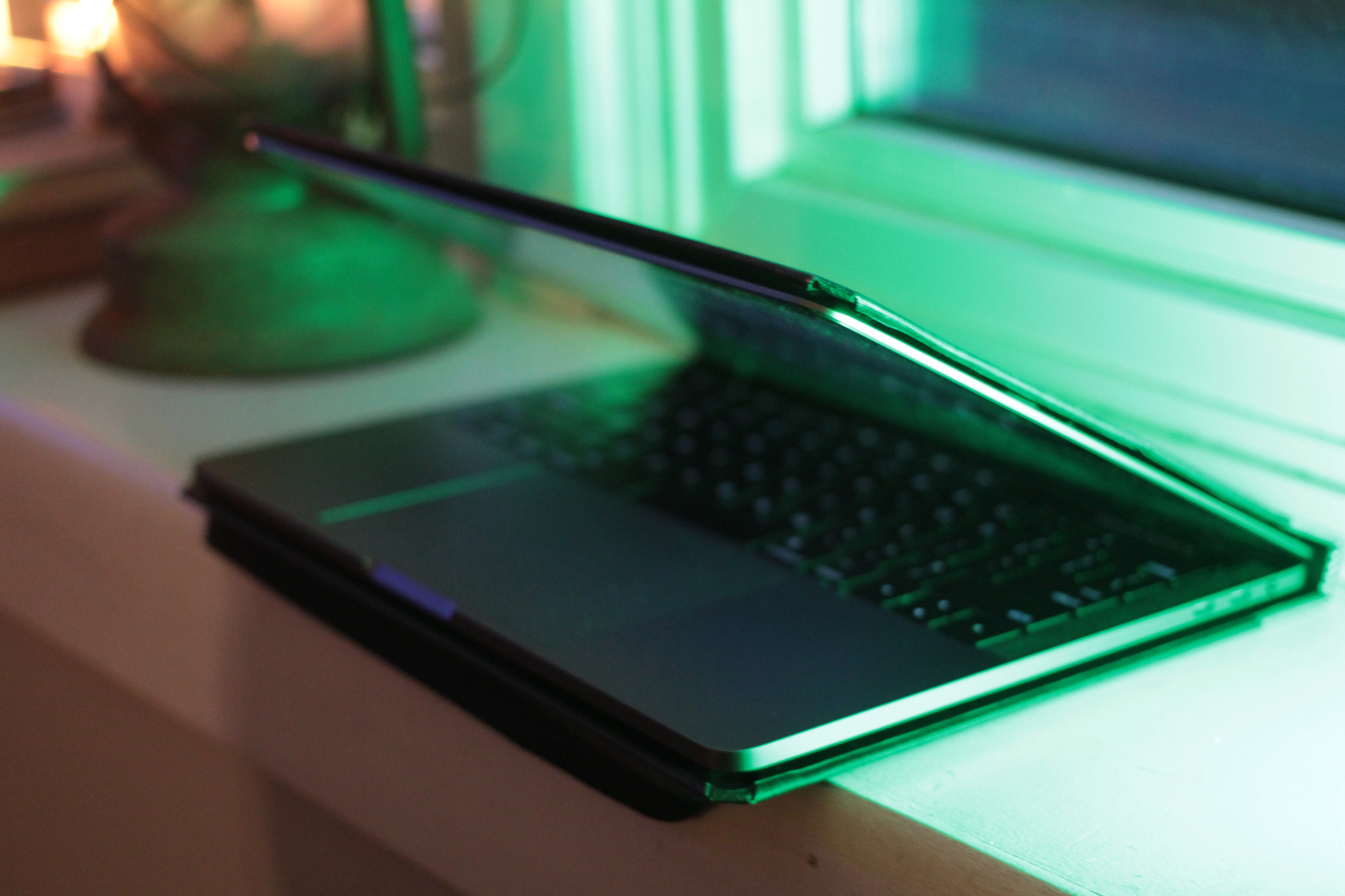
Though I was skeptical of the Cartella's looks from its product photos, once I put it on my Mac and started working, I forgot it was even there. The lack of bamboo tray keeps the laptop feeling truly like a laptop, while the thin shell provides a slightly reinforced surface for lap typers but doesn't get in the way or noticeably increase the laptop's bulk.
From the rear, the case's minimalistic "book" styling makes it look more like a thin skin for a tablet convertible than a heavy cover; when I asked my unknowing fiancé what the thing I pulled out of my bag and set up was, he described it as "looking at some sort of laptop — maybe an iPad or Surface?", but had no idea it was a Mac until I flipped it around to show him the keys.
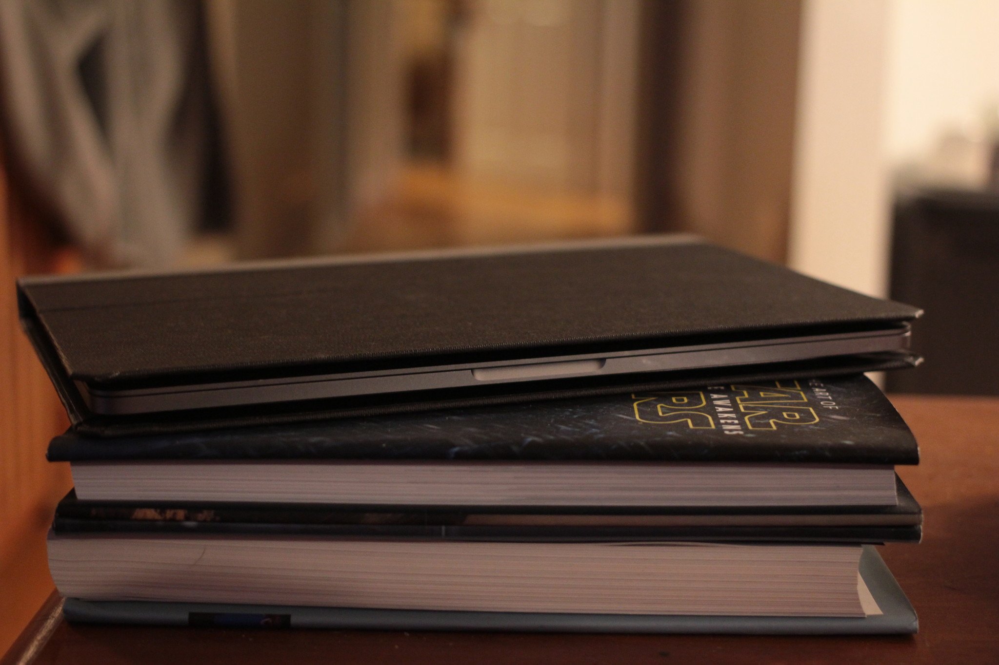
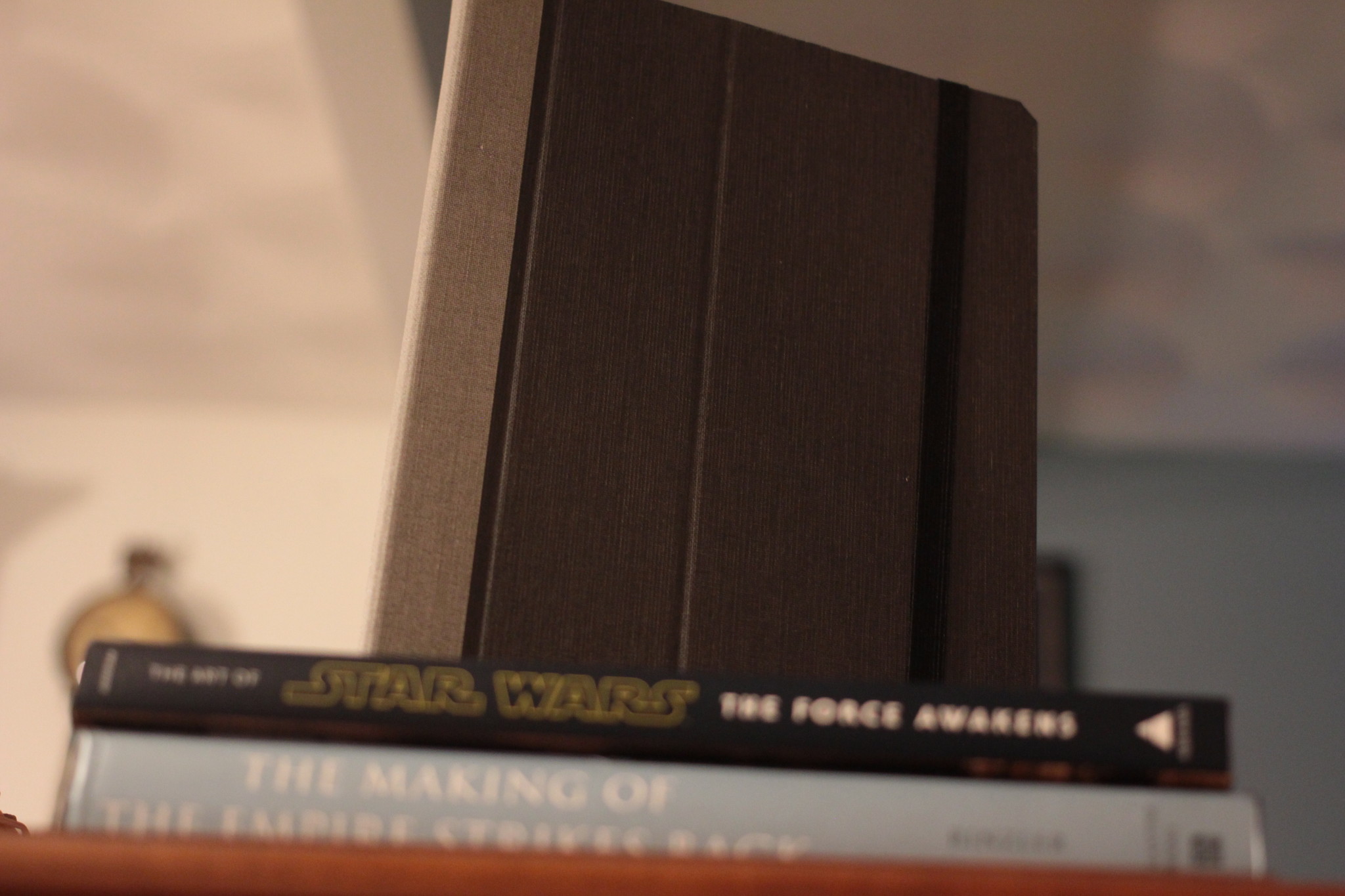
When shut, the case really does make my Mac look like a classy 13-inch hardcover notebook. I've left it on top of our coffee table books several times this past week, and have even had to do a few double-takes when looking for my computer. (Nothing like forgetting you've encased your laptop in a hardcover shell.)

There's even an Moleskine-like stretch band to further secure your laptop within the case, though the 3M tape is strong enough that I've never considered using the elastic for more than decoration.
While I may not need my laptop to resemble a hardcover in the safety of my own home, traveling is another matter. Unless you've plugged it in, the lip of the Cartella makes it difficult to tell that this "book", when closed, is any kind of computer — let alone a Mac. If you regularly fly in crowded airports and worry about your laptop being snatched from your bag, a case like this is certainly one way to go about protecting yourself.
Bottom line
The more time I spend with the Cartella Slim, the more I genuinely enjoy having the cover on my laptop.
Those who want to show off their Mac cred will never enjoy a case like this, but for students and others who want to protect their computer's outer shell and keep it looking classy when closed, it's a really lovely effort from the folks at Pad & Quill.
Serenity was formerly the Managing Editor at iMore, and now works for Apple. She's been talking, writing about, and tinkering with Apple products since she was old enough to double-click. In her spare time, she sketches, sings, and in her secret superhero life, plays roller derby. Follow her on Twitter @settern.
