How to reduce the transparency of keyboards, menus, and more in iOS 7.1
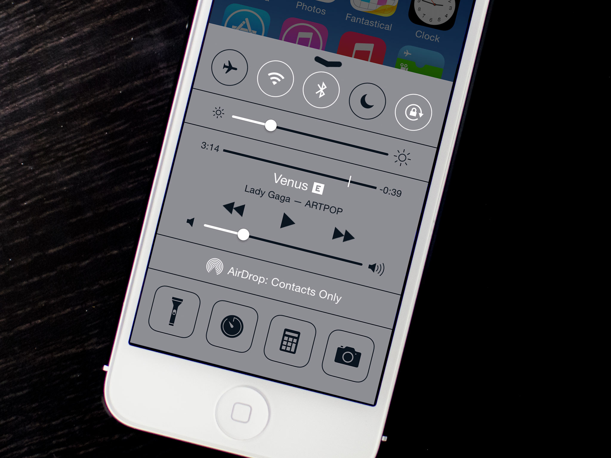
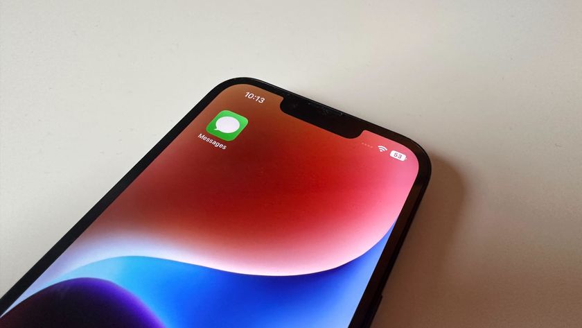
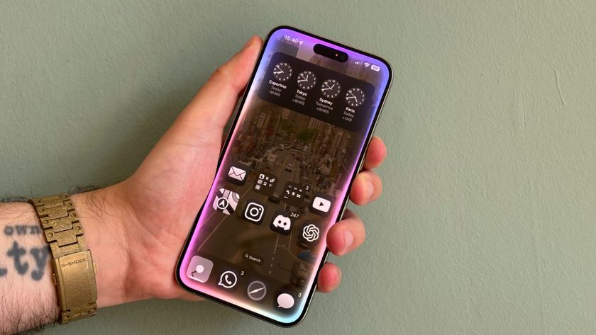
One of iOS 7's signature features is "depth" and by that Apple means transparent layers with gaussian blur filters beneath them. While that might look fancy it can also be distracting for some people and, for those with visual impairment, it can be downright confusing and hard to use. Luckily, iOS 7.1 has added the ability to reduce transparency and render everything from the Dock to the keyboard to Control Center and Notification Center nice and opaque.
How to reduce transparency in iOS 7.1 for better visibility in menus, keyboards, and more
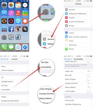
- Launch the Settings app on your iPhone or iPad running iOS 7.1 or higher.
- Tap on General.
- In the next menu tap on Accessibility.
- Now tap on Increase Contrast.
- Turn On the option for Reduce Transparency.

Once you've tried it out, let me know what you think. Do you prefer the transparency in iOS 7 or does turning it off make the experience less distracting?
Master your iPhone in minutes
iMore offers spot-on advice and guidance from our team of experts, with decades of Apple device experience to lean on. Learn more with iMore!
iMore senior editor from 2011 to 2015.


