HTC learns in 2013 what Apple knew back in 2007: Widgets aren't widely used

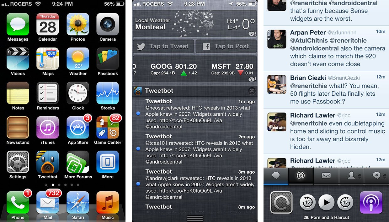
For years there's been angst over iOS' lack of Home screen widgets. Nokia/Symbian/Meego/etc. has had them for what's probably been decades. Android has had them for years. Even Apple had widgets on OS X going back to Dashboard in OS X Tiger in 2005. iOS on the other hand has eschewed them completely until 2010/2011, and even then restricted them to the fast app switcher, Notification Center and Siri. That Apple had Dashboard should show they, as a company, didn't have an aversion to widgets, they just avoided them on the iOS Home screen. And a post on the HTC Blog today by their head of design, Drew Bamford may give some context as to why:
During our research [into customer experience], a few consistent patterns emerged:
- Most people don’t differentiate between apps and widgets.
- Widgets aren’t widely used – weather, clock and music are the most used and after that, fewer than 10% of customers use any other widgets.
- Most of you don’t modify your home screens much. In fact, after the first month of use, approximately 80% of you don’t change your home screens any more.
Of those widely used widgets, iOS has a persistent clock on the status bar, a weather widget in Notification Center, and a music/media widget in the fast app switcher. In a nod to glance-ability, it also flips the dates on the Calendar icon, and adds counter badges to other icons.

And that's it. That's all. In iOS, the Home screen feels deliberately left barren, with the intent to drive you into apps. It's a launcher in the most literal sense of the term.
Of course, there are stats showing a lack of web browsing, among other things, on the Android platform, so this could just be part-and-parcel with a large percentage of the user base using Android simply as another dumb phone, to make calls and maybe check Facebook. HTC doesn't really break down who the 10%ers are are relative to the rest.
For me, I remain of a mind that widgets are just old tech. Pull data. I'm too lazy to go to a Home screen (or a fast app switcher, for that matter) to try and find data. I've never used them on any of my Android devices, and I'm not interested in them on iOS. They're inefficient. What I want is the opposite of widgets. I want data pushed to me where I am. Google Now gets some of that right, as do active notifications from webOS going back to 2009 and Android going back to 2012.
I've never understood why people wanted Apple to skate to where the widget puck was. I'd much rather they once again try to leap ahead and figure out more in-app (in-everywhere) data delivery methods.
Master your iPhone in minutes
iMore offers spot-on advice and guidance from our team of experts, with decades of Apple device experience to lean on. Learn more with iMore!
HTC just learned something now, in 2013, that I think Dashboard had already taught Apple on by 2007. Widgets are what was. Now they all need to figure out what's next.
Source: HTC via Android Central

Rene Ritchie is one of the most respected Apple analysts in the business, reaching a combined audience of over 40 million readers a month. His YouTube channel, Vector, has over 90 thousand subscribers and 14 million views and his podcasts, including Debug, have been downloaded over 20 million times. He also regularly co-hosts MacBreak Weekly for the TWiT network and co-hosted CES Live! and Talk Mobile. Based in Montreal, Rene is a former director of product marketing, web developer, and graphic designer. He's authored several books and appeared on numerous television and radio segments to discuss Apple and the technology industry. When not working, he likes to cook, grapple, and spend time with his friends and family.
