I'm giving the baby iPad Pro another chance

Since early Spring, I've been without a Mac laptop. As a result, my 12.9-inch iPad Pro has become — for better and worse — my main laptop computer.
There's a lot to like about having an iPad as your primary work machine. My photo editing workflow is faster, for one, and I love the lack of visual noise that comes with writing on an iPad. But it's far from perfect. My keyboard case makes the iPad weighty and awkward-looking, and activities like podcasting are all but impossible without extra devices and apps.
In short: While I've found many sweet spots for iPad productivity, I miss having a Mac. The lack of major iPad updates coming to iOS 10 — Swift Playgrounds aside — has only cemented that feeling.
But I like the flexibility of having an iPad. After the Pencil, I can't go back to sketching or image correcting on a Wacom, and editing quick 4K video is still much faster on my iPad than my one-year-old iMac.
So I'm not willing to give up an iPad, I need a Mac, and the 12.9-inch iPad is just too big to dual-carry alongside a new laptop. That means that when I get a new MacBook Pro, my baby Pro needs to come out of living room retirement and become one-half a daily driver.
To ease myself into the process, I've been forcing myself to get used to the baby Pro. It's (surprisingly) working.
Small is strange
In portrait, the 9.7-inch iPad feels like plenty of screen real estate. In landscape and with Split View enabled, my first thought was "CRAMPED."
Master your iPhone in minutes
iMore offers spot-on advice and guidance from our team of experts, with decades of Apple device experience to lean on. Learn more with iMore!
It's not surprising: Split View on a 9.7-inch iPad is the equivalent of two fatter iPhone Plus screens, while the 12.9-inch model offers two slightly-smaller-than-normal 9.7-inch iPad-in-portrait views. I'm losing a quarter of the space, and I feel it.
Mostly, I notice it when doubling up Safari alongside 1Writer or another notes app. In Split View on the baby Pro, Safari renders as a large mobile screen, not a small desktop screen, and unfortunately, many websites still look stretched and awkward in that view. It's a little trippy on the eyes.
But as I keep reminding myself, I'm not using the baby Pro to do the jobs I'd do on my 12.9-inch iPad. It's going to be a supplemental device alongside a Mac laptop. That means a lot less Split View, and a lot more single-screen tasks. And when viewing apps full screen, the 9.7-inch screen is a lot more tenable.
In addition, the more time I've spent with the baby Pro, the more I've gotten used to those smaller screens — after a few weeks with the 9.7-inch, going back to the 12.9 felt almost like too much screen real estate. It reminds me a lot of my switch between the 15-inch MacBook Pro and the 11-inch MacBook Air: I was horrified at the screen real estate of the latter for about a week, then refused to use anything else because of the weight and portability. The baby iPad transition has been much the same
Adjusting to the intricacies of the Smart Keyboard — and reveling in the new Logitech Create
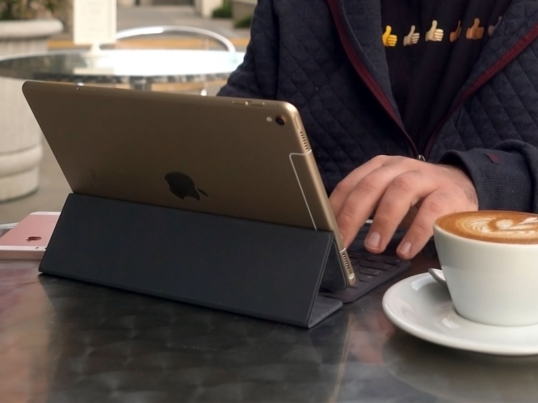
So far, I've been using the baby Pro largely for writing. I wrote the entirety of my watchOS 3 preview on it, and I'm writing this article, too. It's surprisingly comfortable to do so, though the Smart Keyboard is a necessary accessory, especially with the smaller screen real estate for the virtual keyboard.
I'll be the first to admit: I don't like this keyboard nearly as much as the Logitech Create. It has some benefits, to be sure; it's not nearly as heavy to tote around, and the material is flexible enough that I can tilt the iPad to a better screen angle than the Create's — which had a tendency to give me migraines if I worked from my lap too often.
I do find myself missing the function row. I used the brightness and volume toggles daily, and the Lock and Home buttons allowed me to trigger Siri or take screenshots without ever lifting my hands from the keyboard. The Smart Keyboard's texture also leaves something to be desired, though I'm hoping that will wear down a bit as I use it more. And while it has a better viewing angle than the Create, a fixed angle is never going to be the best for working at long periods of time. Everyone's desks, laps, and necks are different.
Once I got over my initial gripes, however, I found writing on the baby Pro quite pleasant. I'm nearly as fast on the Smart keyboard as I am on my iMac's Magic Keyboard or the Logitech Create, and though I get a little bounce on the iPad's screen while writing on an unsteady surface (laps, cars, couches), it's manageable.
More than manageable is Logitech's 9.7-inch Create case: I've only been using it for a short time, but it's already replaced my Smart Keyboard for all things typing. The viewing angle is better than its big sibling, and best of all: It has a sleeve for my Apple Pencil, and an artist's drawing angle. Winning.
Of course, distraction-free writing is what really sells working on this tiny iPad. I was able to bring the baby Pro to my fiancé's roller derby practice and write on the benches with nothing but the tablet, Smart Keyboard, and glorious Bose QC35s blocking out exterior noise.
Draw time
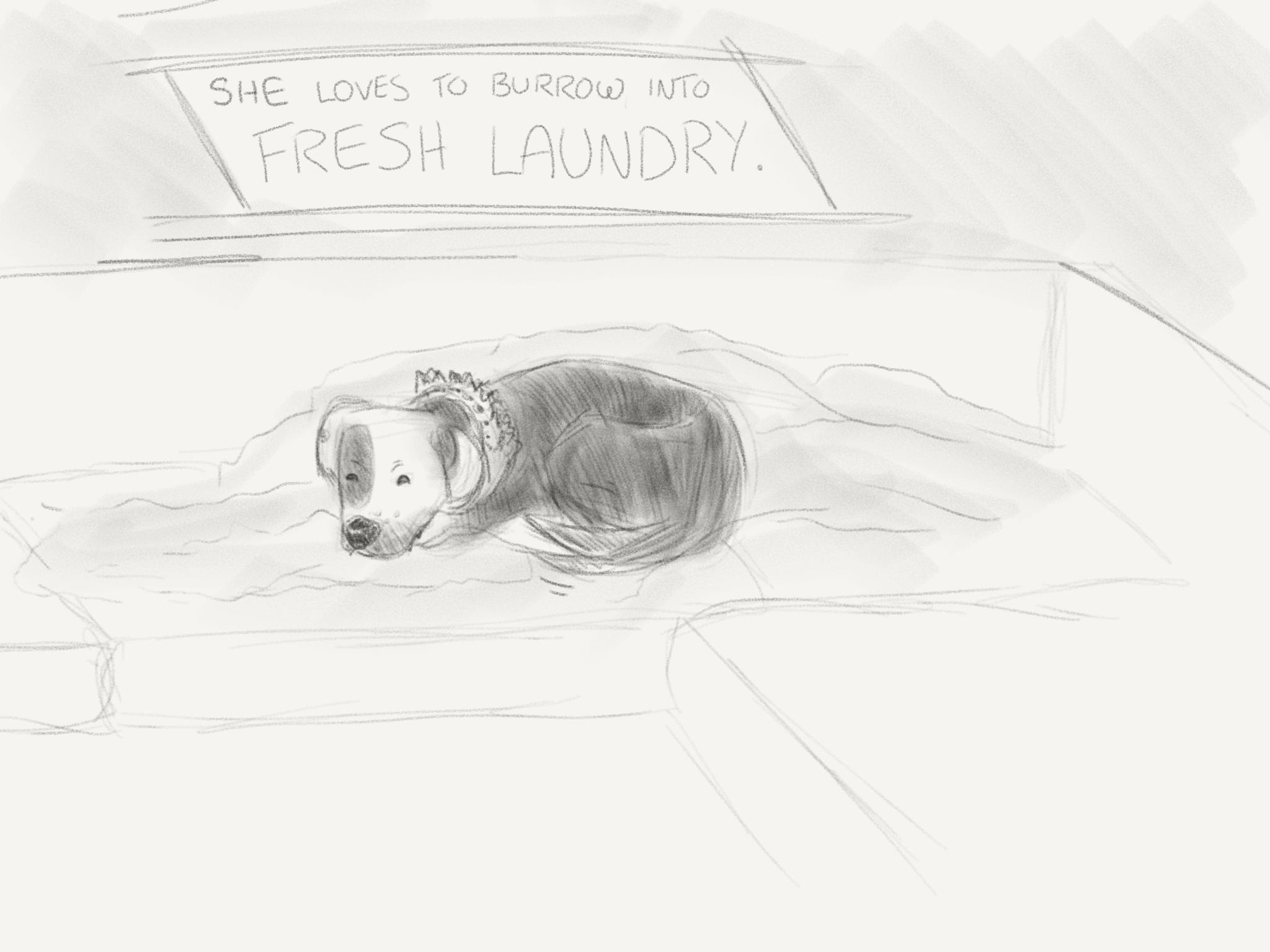
As an artist's tablet, the baby Pro is the perfect size for a digital sketchbook. It's small enough to hold in one arm while sketching or writing, and the True Tone screen actually makes it a little better at outdoor drawing than the 12.9-inch. (Not by much — this is still an LED screen we're talking about — but it's enough in most situations.)
I thought I'd miss the extra screen real estate when drawing, but instead, I just spend more time zoomed on the digital canvas. The display is still large enough that my palm isn't falling off the side of the iPad while I'm sketching, and there's no discomfort drawing with the Apple Pencil or other third-party styluses.

All the apps I regularly draw inside work well on the baby Pro's screen, including feature-heavy programs like iFontMaker.
My tiny iPad future
I don't think I'll ever use the baby Pro as a full-time work machine — the screen size is just too small for me to enjoy doing so comfortably. But as a writing and sketching tablet that can pinch-hit for my laptop, I'm liking it more and more.
Serenity was formerly the Managing Editor at iMore, and now works for Apple. She's been talking, writing about, and tinkering with Apple products since she was old enough to double-click. In her spare time, she sketches, sings, and in her secret superhero life, plays roller derby. Follow her on Twitter @settern.


