iMore and Mobile Nations podcasts: Behind the scenes 2.0!
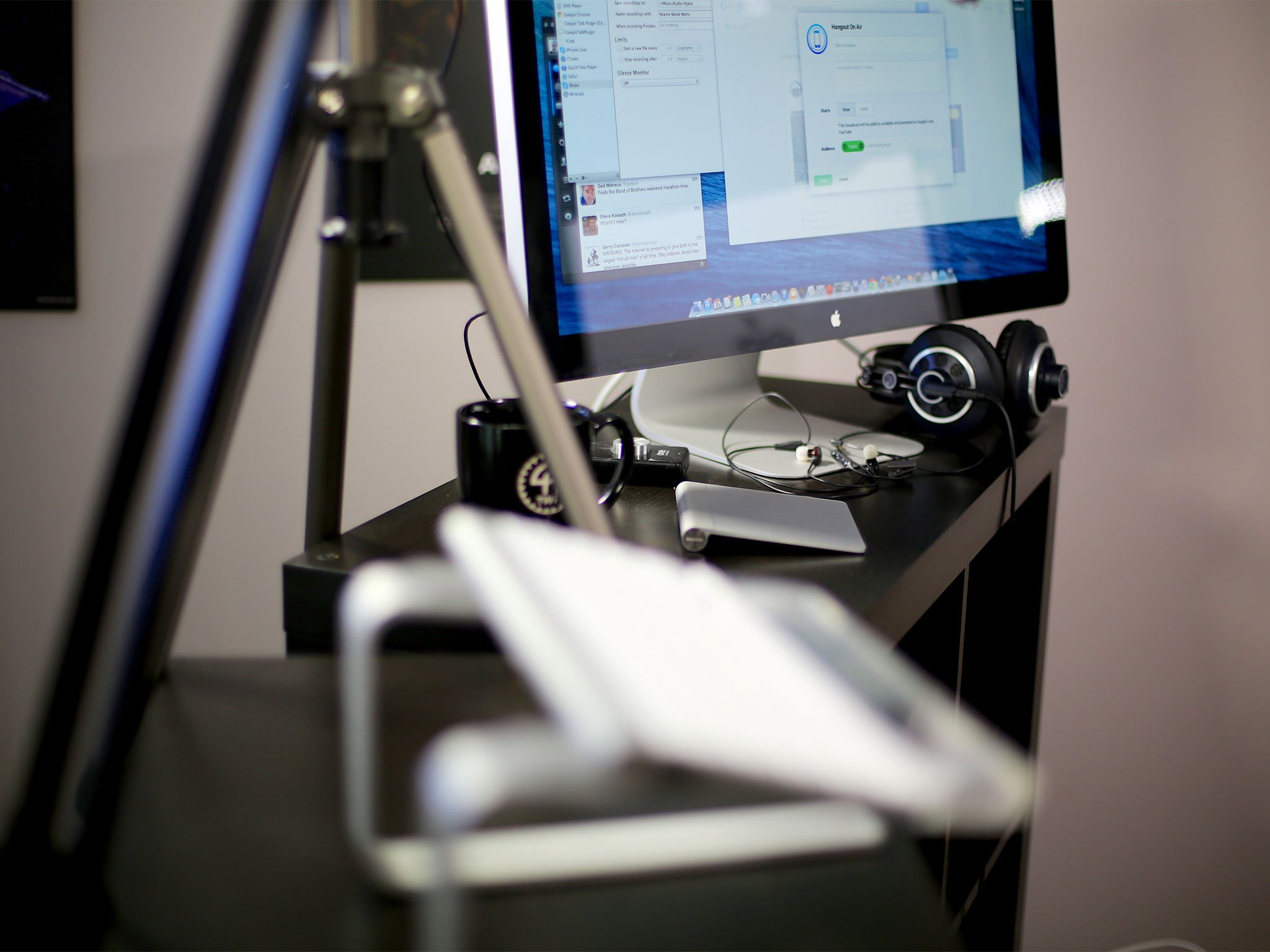
About 5 months ago, in response to a ton of questions about how we handle podcasting here at iMore and Mobile Nations, I took everyone on a virtual tour of my studio. Well, I've made some changes since then. Some things have moved and some new things have been added. So, what's where now and why?
Last time the setup changed was because we switched from Skype and WireCast to Google Hangouts for video podcasts. That was for both simplicity — I no longer needed a mix-minus setup — and security — we no longer lost entire shows when a single app crashed. This time the changes were for productivity and aesthetic reasons. I needed to make better, more comfortable use of the odd 10x20 foot studio space so I could both work better and it would look better on camera. A lot of that had to do with improving the lighting.
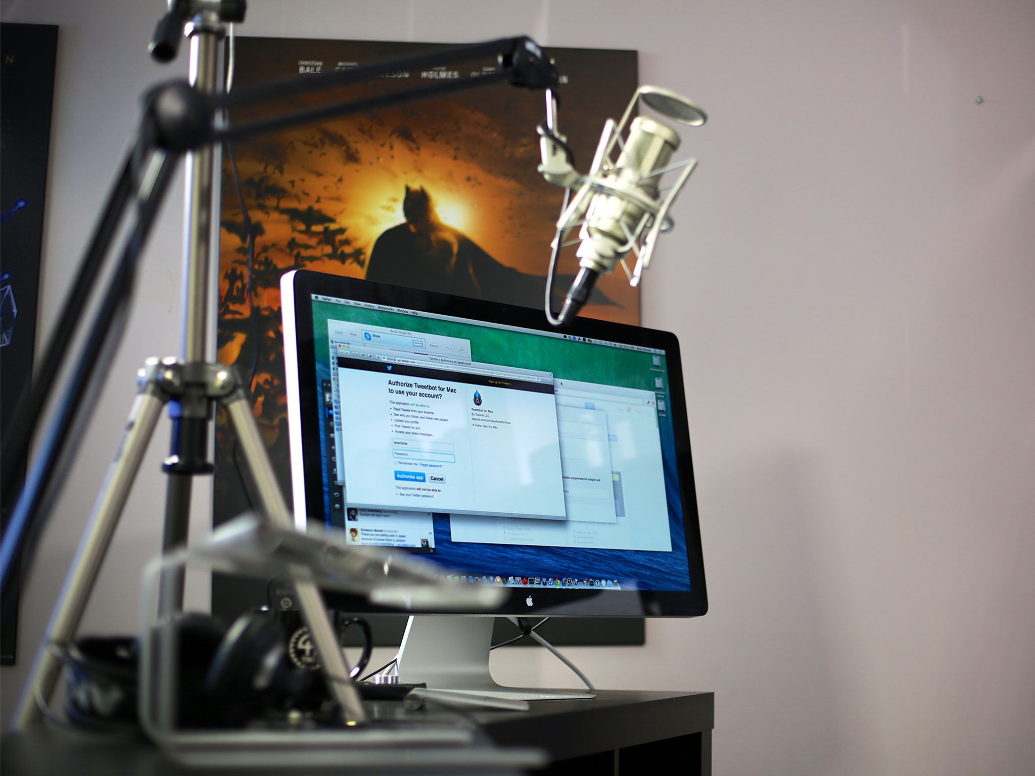
If you're primarily interested in the mics, headsets, cameras, computers, and interfaces I use, that hasn't changed. Check them all out in the previous walk through. If you're interested in the lights and set dressing, keep reading.
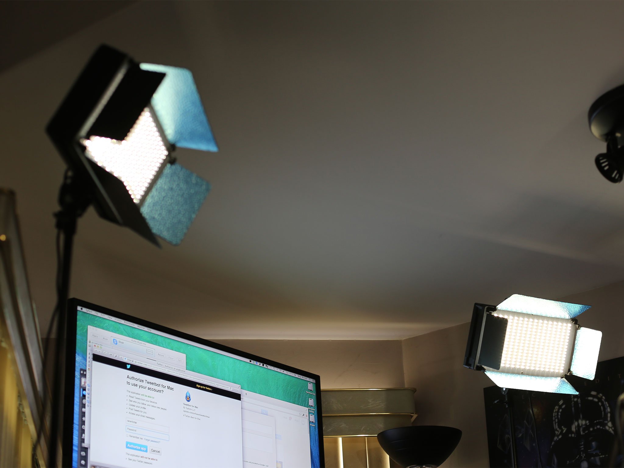
I'm using two bi-color 500 LEDs as primary lighting. They were recommended to me by John P. of Geek Beat because bi-color means they can be adjusted specifically adjusted to match or correct the lighting in the room to result in something not too yellow, not too blue, but just about right. For my current setup, they're mounted on tripods (sold separately).
For my standing desk/counter I"m using two Ikea Expedit 2x2 units. Ikea discontinued Expedit earlier this year and replaced it with Kallax, which has thinner tops and bottoms and will reportedly save on wood/material costs. I don't know if the change in thickness will affect how it feels as a desk, but the Kalax 2x2 units look otherwise similar. I have them on caster sets for the extra mobility and height.
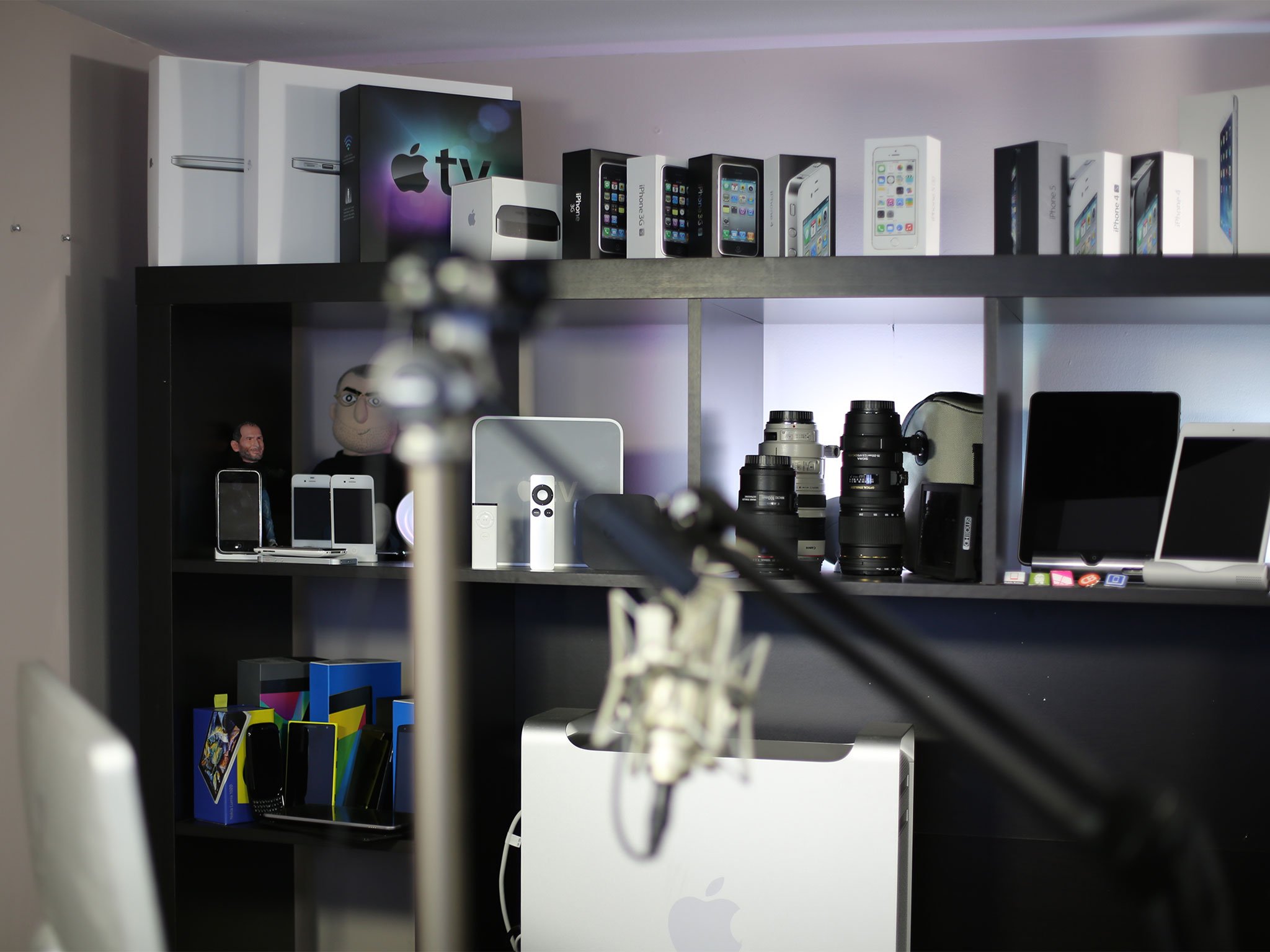
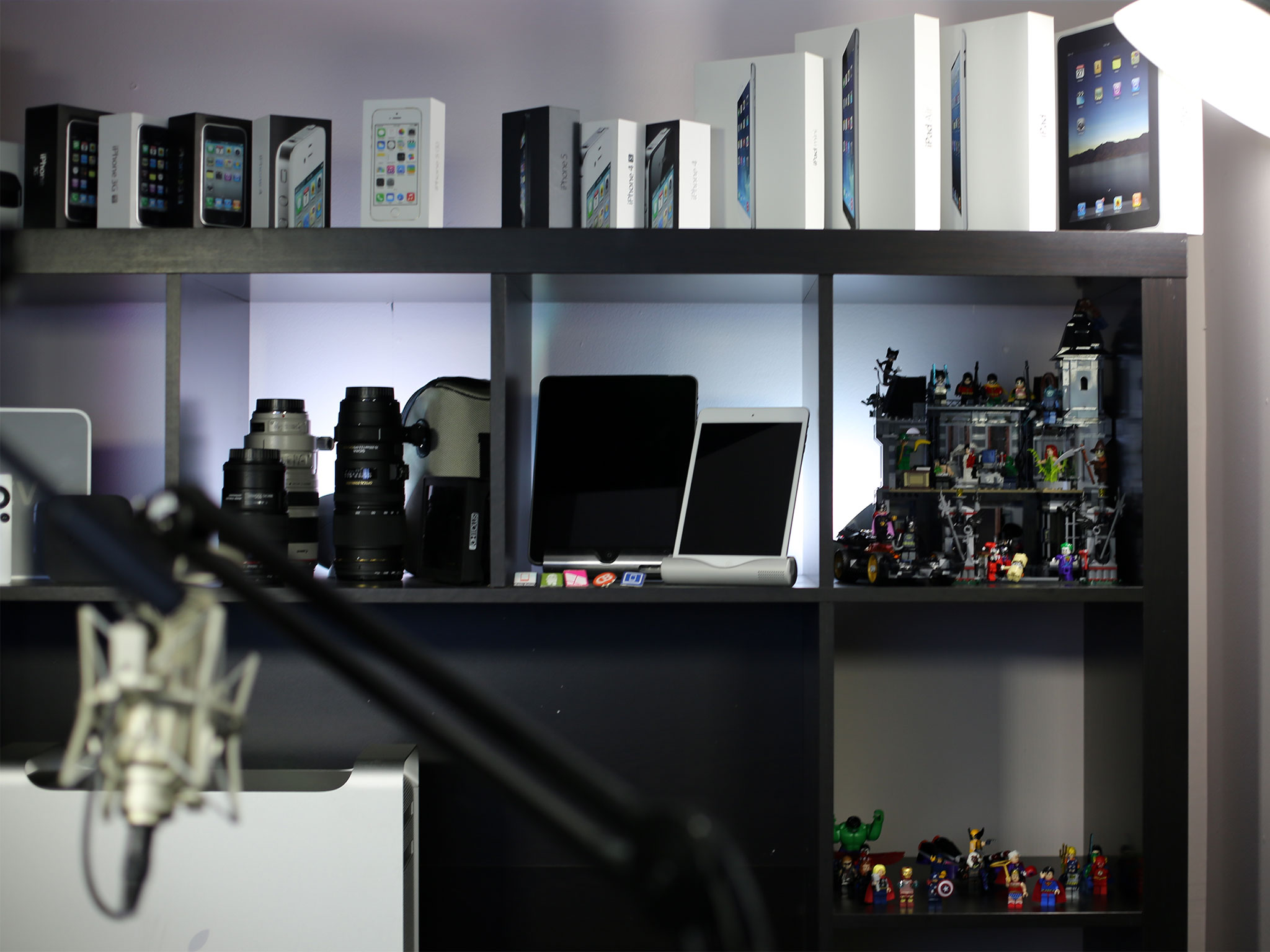
The shelving unit behind me is an older Expedit living room model with space for a small TV in the middle. I haven't seen a Kallax version yet, but the Kallax 4x4 unit looks roughly similar in size. I was originally going to try and mount the Samsung TV I'd been using onto the shelves so I can change up the background but I haven't figured out how to do that effectively yet. So, I've filled the shelves with what I hope are interesting visuals, including iOS product boxes, old iPhones and iPads, old smartphones from other vendors, a couple of Steve Jobs toys, and a Lego Batman Arkham Asylum model.
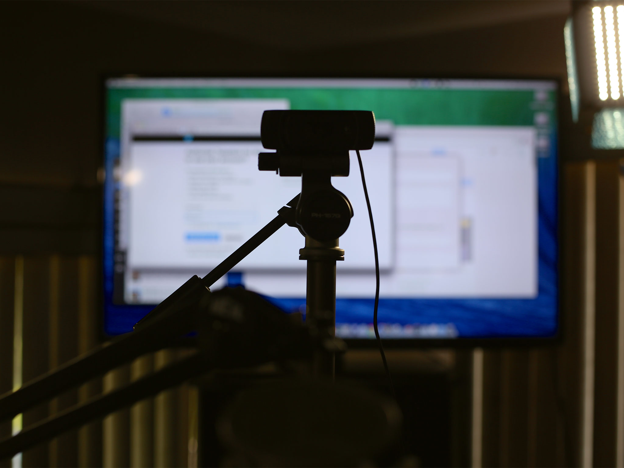
I still have a lot more work to do. Right now I'm staring through the camera at the LED TV, which mirrors the Apple LED display, and that causes eye strain. I want to get a proper stand to set the Apple LED display on, and place the camera on top of that. I'm also thinking about switching the location or mounting for the Heil microphone to something more discreet. And I'd still love to get some kind of video display back behind me.
Master your iPhone in minutes
iMore offers spot-on advice and guidance from our team of experts, with decades of Apple device experience to lean on. Learn more with iMore!
I also have shelves that need filling, so I'm looking into what other kinds of great gadgets or geeky fun stuff I can put there. If anyone has any ideas on further improving the studio, or on more great set decorations, let me know!
Rene Ritchie is one of the most respected Apple analysts in the business, reaching a combined audience of over 40 million readers a month. His YouTube channel, Vector, has over 90 thousand subscribers and 14 million views and his podcasts, including Debug, have been downloaded over 20 million times. He also regularly co-hosts MacBreak Weekly for the TWiT network and co-hosted CES Live! and Talk Mobile. Based in Montreal, Rene is a former director of product marketing, web developer, and graphic designer. He's authored several books and appeared on numerous television and radio segments to discuss Apple and the technology industry. When not working, he likes to cook, grapple, and spend time with his friends and family.
