Inbox Cube for iPhone makes email visual, helps you spend less time looking for attachments and files

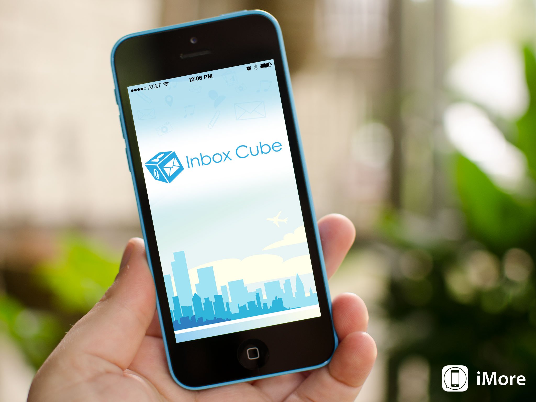
Inbox Cube is a new email client for iPhone that aims to make email more of a visual experience than a plain text one. While you have classic email views that show the inboxes we've all grown accustomed to, you can also view and sort all your attachments and files to find what you need by looking, not reading.
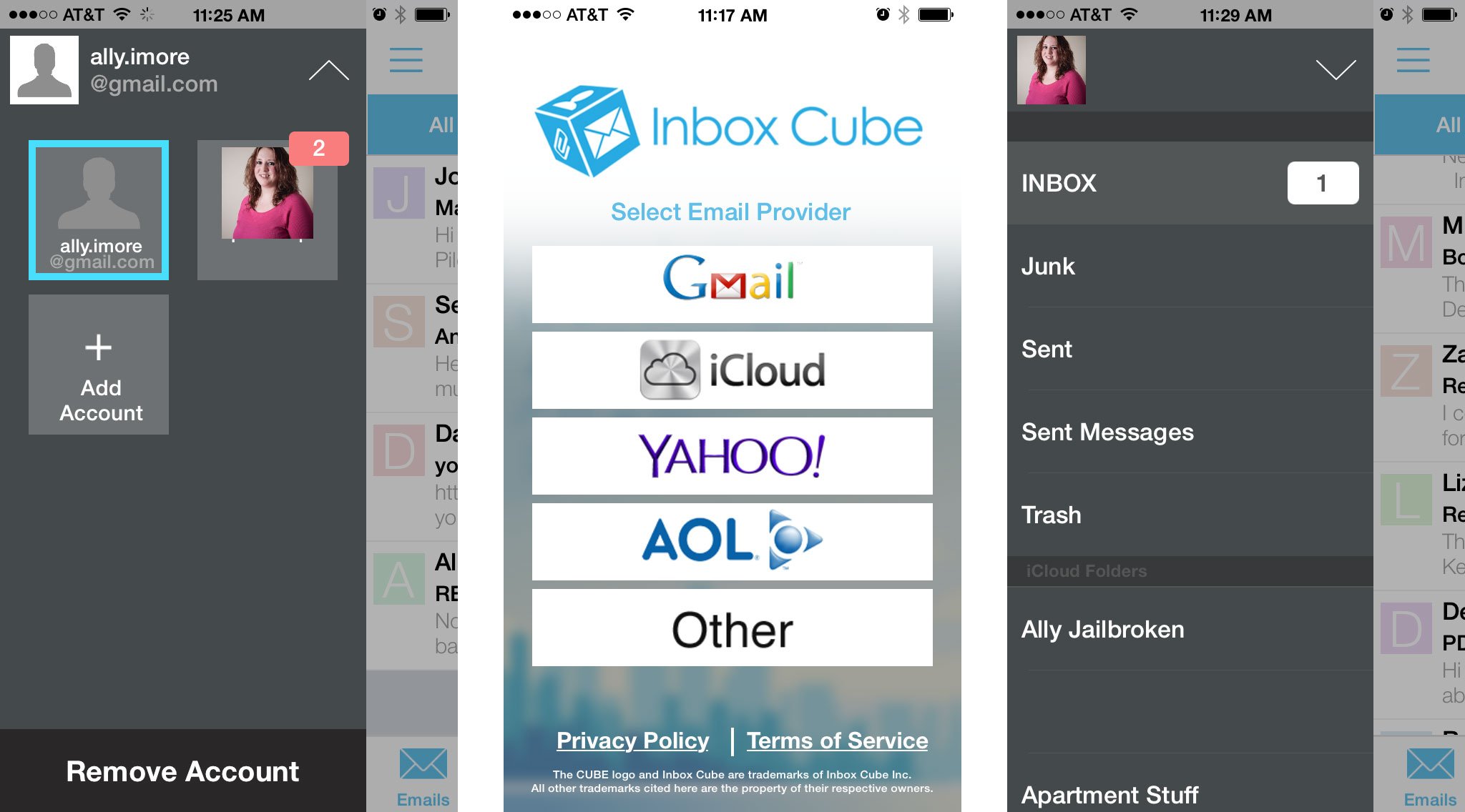
As of now, Inbox Cube supports Gmail, iCloud, Yahoo and AOL mail. Once you've configured your email accounts, you're taken to the main email view of Inbox Cube. This view is the traditional email inbox that we've all become accustomed to. The other views are the ones that make Inbox Cube unique from other mail clients.

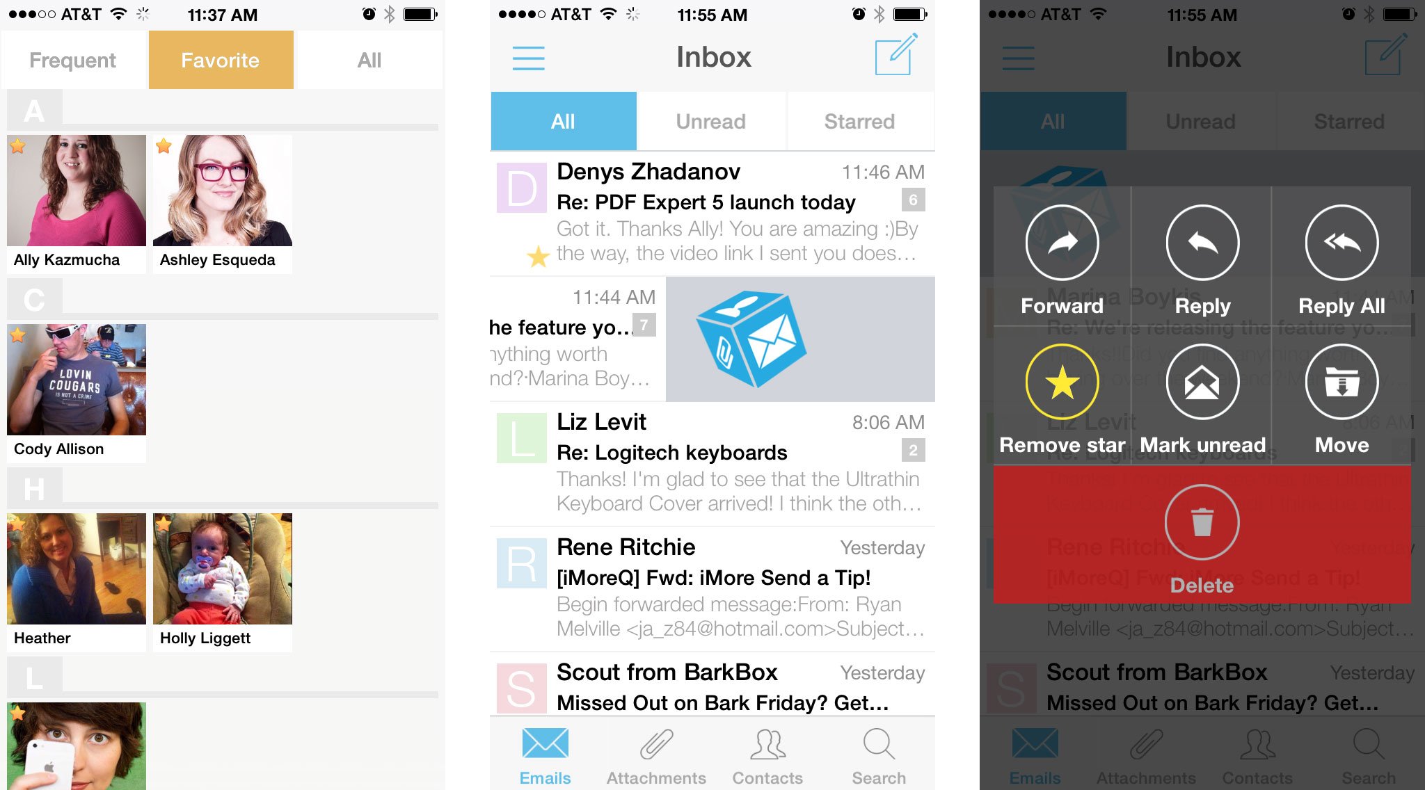
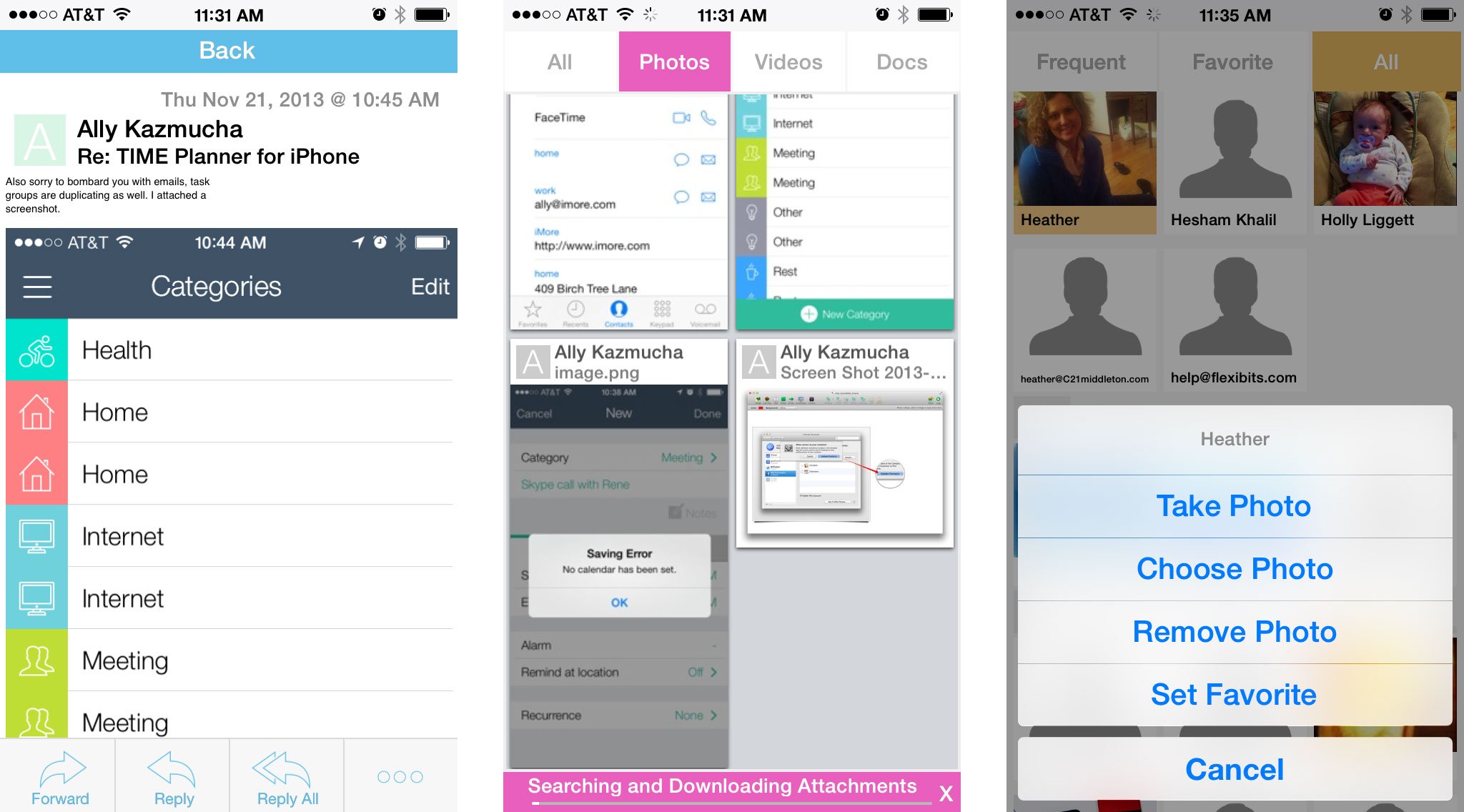
The main two are attachments and contacts. Attachments feeds in all attachments in image form. You can sort them by type at the top in order to narrow results. The contacts tab smartly picks out who you contact via email the most. You can also view all contacts or add contacts to your favorites within Inbox Cube. To add a favorite, just hold your finger down on a contact to bring up the menu.

When it comes to the attachments section of Inbox Cube, the first time you search, it can take a significant amount of time to find and load all your attachments so I'd highly suggest doing it over a WiFi network. I'm an email hoarder and pretty much archive almost everything instead of throwing it away. If it isn't in archive, it's filed away in a folder somewhere. If you've got less of an issue saving emails, Inbox Cube won't take as long to load and sort all your attachments.

To interact with mail in the traditional view of Inbox Cube, slide your finger to the left over any message to bring up the action menu. Here you can reply, forward, start, delete, or move the message to any folder of your choosing. The one thing I can't get used to with Inbox Cube is that there isn't a unified inbox and for some people that manage a lot of inboxes, that could be a deal breaker.
The good
- Interface is great and easy to navigate throughout
- Attachments view is extremely useful for finding files quickly
- Native push notifications
- Smart contacts section makes it easy to pick out the people you email most
The bad
- No unified inbox
- The favorite contacts section is a little awkward, I would personally just prefer rows with three contacts each in alphabetical order and the current layout makes me feel like I'm scrolling more than I should need to
- Loading attachments initially can take quite a long time
The bottom line
If you send and receive a lot of attachments, Inbox Cube can help you find them fast, no matter where they're filed away. Inbox Cube may not be a complete email powerhouse but it's definitely a different experience than what most of us are used to, and for some, that could be a refreshing change. No unified inbox support could be a deal breaker for those that have a lot of accounts to manage though.
If you happen to check out Inbox Cube, let us know your thoughts in the comments!
Master your iPhone in minutes
iMore offers spot-on advice and guidance from our team of experts, with decades of Apple device experience to lean on. Learn more with iMore!
- Free - Download Now
iMore senior editor from 2011 to 2015.

