Inevitable
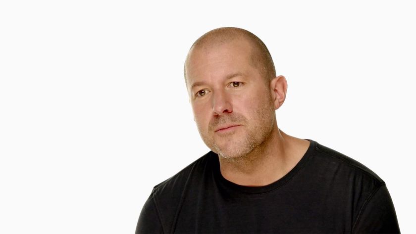
Good design is inevitable. It's determined. It's relentless. Each iteration builds on the one before, becoming better and better each time. The work of Jonathan Ive, Apple Senior Vice President of Industrial Design, is a near-perfect example of this. So is the iPhone 5.
Ive said as much in an interview with the Telegraph back in May:
“We try to develop products that seem somehow inevitable. That leave you with the sense that that’s the only possible solution that makes sense,” he explains. “Our products are tools and we don’t want design to get in the way. We’re trying to bring simplicity and clarity, we’re trying to order the products.“I think subconsciously people are remarkably discerning. I think that they can sense care.”
You can not like the iPhone 5 design as a matter of personal taste. You can wish it were otherwise, or that Apple had chosen to go in a different direction. If you're "disappointed" in the iPhone 5 however, if you think it's too similar to previous iPhones, if you think Apple isn't innovating "any more", you're wrong. I'm not a "fanboy" and you're not a "troll" or a "hater". You're just wrong.
Back in 2005 Apple had a phone prototype called Purple. It was a flat, rounded rectangle with a big screen on the front and a metal plate on the back. It was, perhaps, their platonic ideal. Their form phone. And they couldn't make it. Not back then. They lacked the mobile engineering experience of an established player like Nokia, and they lacked the technologies and manufacturing processeses they themselves would later develop.
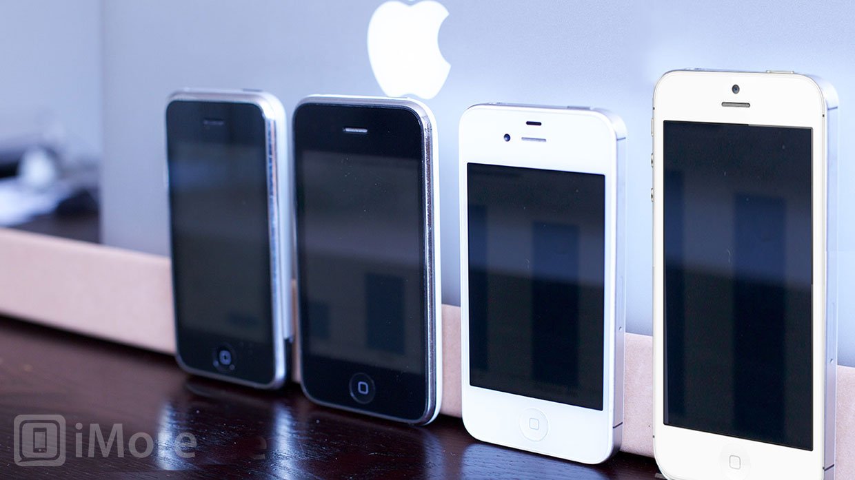
So Ive and Apple were forced to do what all great designers do. They were forced to compromise. And we got the original iPhone with its bloated sides and a big plastic band breaking its aluminium back. For the iPhone 3G and iPhone 3GS, the metal back was removed completely, and plastic, bloated as the sides, took its place.
With the iPhone 4 and iPhone 4S, Ive and Apple were finally able to engineer their Purple phone. Flat. Solid. Stainless steel. But glass on the back and still not metal, and with an exposed antenna array that took a generation to get right.
Now we have the iPhone 5. Another step closer to Purple, the stainless steel sides are replaced by aluminium and the metal plate on the back has finally returned, albeit not completely. Another set of compromises demanded they keep radio-friendly glass on the top and bottom, and Apple's choice in a wider screen has forced them to abandon their golden ratio.
Master your iPhone in minutes
iMore offers spot-on advice and guidance from our team of experts, with decades of Apple device experience to lean on. Learn more with iMore!
Jony Ive has many times said his goal is nothing less than making a better product. Phil Schiller said as much yesterday as well -- they started with the idea of an iPhone that was 20% or more thinner and lighter than an iPhone 4S without sacrificing any battery life, camera optics, or screen quality. And they did it while improving all of those things, and adding a faster radio as well.
Lost amongst the angst and howls of those for whom design is an appearance thing -- for whom ever more giant, creaky, plastic phones that are gray one year and blue the next, that are thin on one end and humped on the other, that sacrifice pixel quality for size, and consistency and cohesiveness for feature creep, are innovation -- is the leap forward Ive and Apple are taking here.
The leap from iPhone 4S to iPhone 5 is no less significant or impressive than the leap from the original MacBook Pro to the Unibody. In both cases, the end result bore familiarity of form, but was lightyears ahead in terms of process and results.
The iPhone 5 is an almost entirely new, entirely redesigned phone. Watch this video, particularly the part at the end about how the iPhone 5 is produced.
That Ive and Apple could do this and still make it look so similar is a testament to their talent and the integrity of their vision.
Jony Ive and Apple have made a better phone. It's profoundly thinner, lighter, and stronger, with a faster radio, better battery life and camera optics, and more screen than ever before.
They've made a better iPhone.
They had to. It was inevitable.

Rene Ritchie is one of the most respected Apple analysts in the business, reaching a combined audience of over 40 million readers a month. His YouTube channel, Vector, has over 90 thousand subscribers and 14 million views and his podcasts, including Debug, have been downloaded over 20 million times. He also regularly co-hosts MacBreak Weekly for the TWiT network and co-hosted CES Live! and Talk Mobile. Based in Montreal, Rene is a former director of product marketing, web developer, and graphic designer. He's authored several books and appeared on numerous television and radio segments to discuss Apple and the technology industry. When not working, he likes to cook, grapple, and spend time with his friends and family.

