On iOS 11 design

Back in 2013, Apple used iOS 7 to begin a major redesign of not just all the company's human interfaces, but the complete philosophy behind those interfaces. The photo-illustrative, metaphorical interfaces of the past, rich in texture and affordance were set aside for more digitally authentic, physically playful look. The training wheels were off. The Retina-natives were in control.
Then, last year, iOS 10 brought a big, bold, beautiful evolution. Rumor has it a designer working on the services apps — Apple Music, Maps, Home — came up with it. The goal was to better orient people, especially in apps with a lot of content.
Back in the old days of iOS, you could step out of a bar near dawn and still realize you were in Messages contacts rather than Find My Friends contacts or Game Center contacts, for example, simply based on the texture. Sounds silly, but it could mean the difference between texting a friend for help and pinging them with a challenge.
But how do you solve that, and other problems, across the entire operating system? Enter iOS 11.
Way-finding
Airports are great at way-finding. Every day, the large, easy-to-read, optimally placed signs help first-time and seasoned travelers alike get to their gates. Some airports do it far better and more elegantly than others, of course, as do some metros/subways, highways, and other directional alert systems, but that's the job they were designed to solve.

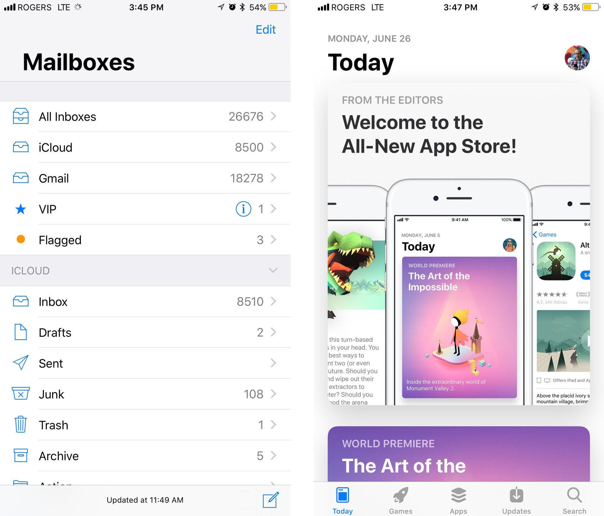
So too the new, large titles in iOS 11, which have now spread to other apps like Mail and Photos. They let you know right up front where you are. Unlike the heavy textures of the past, however, they shrink down and get out of your way after you've discovered what you need.
They're not used — nor recommended — everywhere, especially not where they would compete with rather than contrast against the content. But where they are used, they work extremely well. Especially when augmented by the new typographical hierarchies.
Master your iPhone in minutes
iMore offers spot-on advice and guidance from our team of experts, with decades of Apple device experience to lean on. Learn more with iMore!
Position, size, weight, and color
Where iOS 7 introduced extremely light fonts, iOS 11 is getting heavy. Sometimes maybe too heavy. (We're still in beta, however, so just as Apple made iOS 7 a little less light as time went on, the company can still make iOS 11's fonts a little less heavy.)
The core idea is terrific, though. Instead of just size or color to distinguish informational levels, Apple is now using and recommending a mix of position, size, weight, and color.
In general, headers are on top, bigger, bolder, and darker and supporting text is underneath, smaller, thinner, and lighter. It results in faster wayfinding and much higher legibility, with a better content balance.
App Store
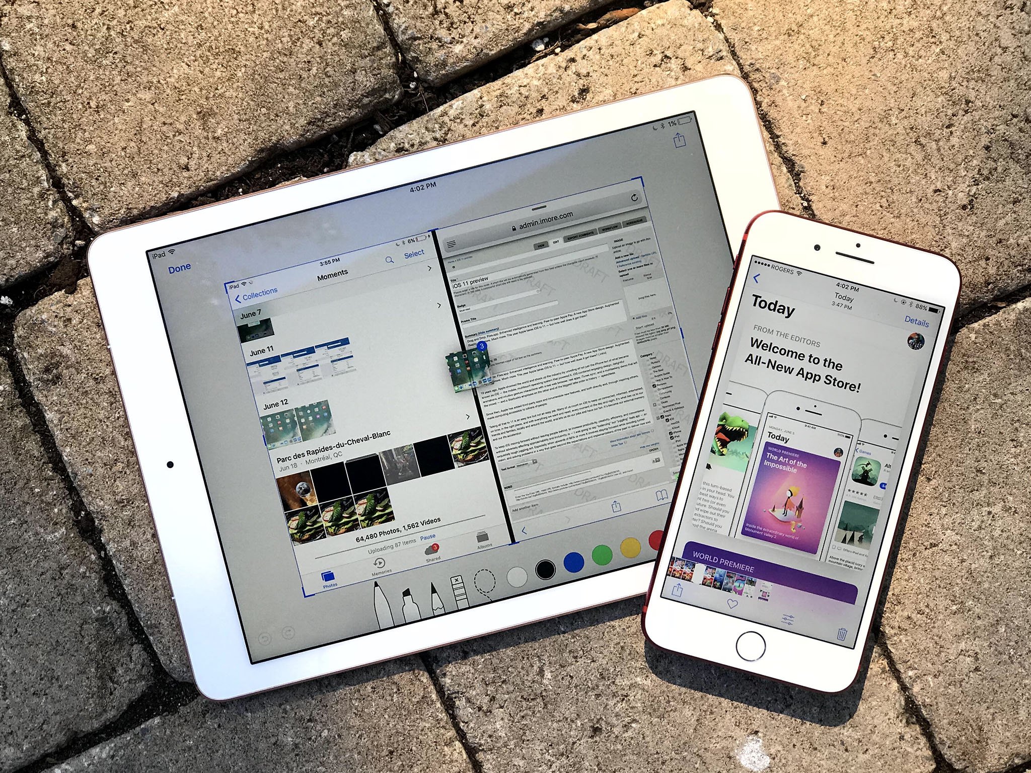
Nowhere are the benefits and high craft of this new design spin more evident than in the new App Store. The Today view is crisp and clear and more importantly — fun. You instantly know where you are and where you can go next.
Agreed! The App Store is now my go-to app when trying to figure out how something should look/work on iOS 11. https://t.co/yV0Ksrbt0yAgreed! The App Store is now my go-to app when trying to figure out how something should look/work on iOS 11. https://t.co/yV0Ksrbt0y— David Barnard (@drbarnard) August 2, 2017August 2, 2017
Read that whole thread.
Remarkably, the App Store's Update tab currently highlights the biggest weakness of the new design: With a lack of content to contrast against and expanded content hints, it feels bitsy and more difficult to read and navigate.
Glyphs, filled.
Where iOS 7 took its need for digital authenticity and relish for Retina too far, iOS 11 shows how confident everyone has become with touch-first interfaces. There are still gaussian blurs aplenty, but by no longer racing away from the affordances of the past, the best of old and new are now coming together for everyone's benefit.
Buttons, once stripped of everything but raw text, now have some shape and substance back. Glyphs, once the thinnest of outlines, are now heavier, thicker, and filled in.
It makes the entire interface not just more legible but more comfortable.
More to come
iOS 11 is in developer and public beta right now and will be released as a free update for everyone later this fall.

Rene Ritchie is one of the most respected Apple analysts in the business, reaching a combined audience of over 40 million readers a month. His YouTube channel, Vector, has over 90 thousand subscribers and 14 million views and his podcasts, including Debug, have been downloaded over 20 million times. He also regularly co-hosts MacBreak Weekly for the TWiT network and co-hosted CES Live! and Talk Mobile. Based in Montreal, Rene is a former director of product marketing, web developer, and graphic designer. He's authored several books and appeared on numerous television and radio segments to discuss Apple and the technology industry. When not working, he likes to cook, grapple, and spend time with his friends and family.

