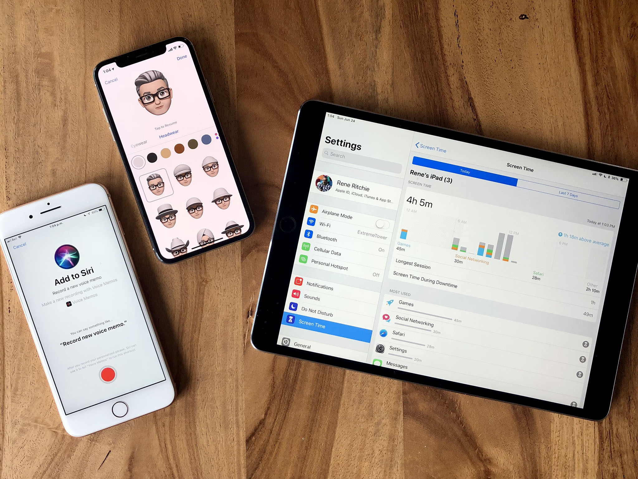
Smartphones and mobile operating systems were originally designed to converge the past. They replaced our phones, personal digital assistants, portable video and music players, gaming handhelds, and GPS units into one, small, always-connected package. And it was good.
Now, smartphones and mobile operating systems are in a race for the future — not just to define it but to predict it. Surfaces can now read our fingerprints. Microphones can understand what we say. Cameras, who we are and what we're doing. Machines can also learn to anticipate what we'll do and want and when. Consequently, our devices have gone from reactively recording and retrieving only the information we've given them to trying to "know" us and proactively provide us with a range of information and services right before we realize we need them.
At the same time, we live in an era where the largest internet companies in the world have told us our privacy is effectively dead — and are now being forced to admit how they're the ones who actively abused it to death.
This is the world into which Apple is bringing iOS 12 for iPhone and iPad, which combines audacious new intelligence and assistance with fierce new protections for privacy and security.
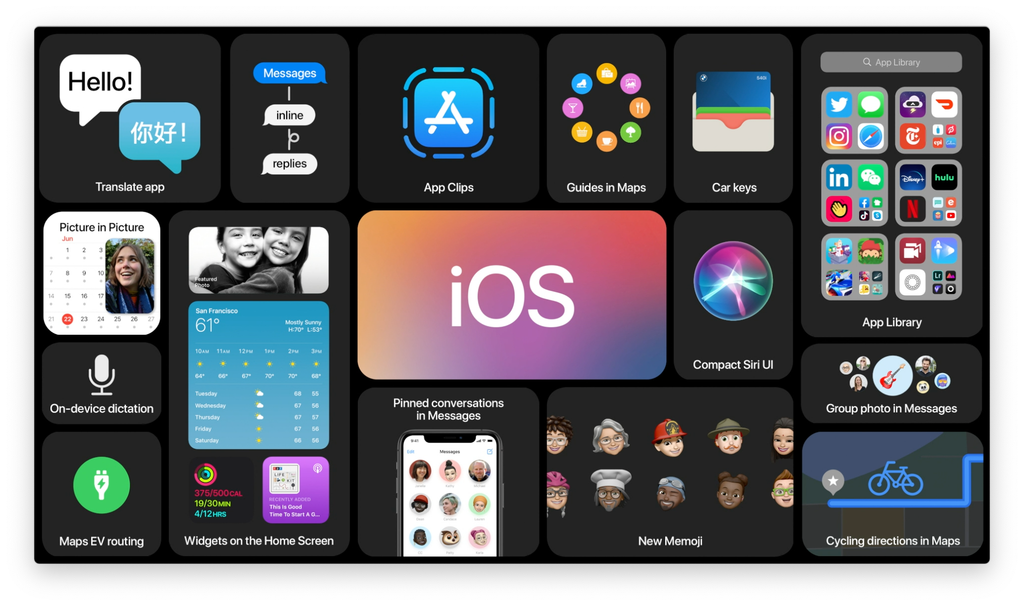
It also contains foundational performance enhancements designed to make iOS software age as well as iPhone and iPad hardware; a giant leap forward in persistent, multi-person AR; proactive suggestions and voice-trigger-able workflows not just for core features but for any action in any app; much-needed improvements to notifications and the do-not-disturb system; full-on self and parental controls; fun new features for Messages like Memoji which put you not just into the emoji but into a new AR world.
That might seem like a lot of random pieces. But I'm willing to bet they're all part of the same puzzle. One that, as it comes together, will reveal that iOS 12's main purpose was shoring up and rounding out the interfaces, features, and devices we have today so we're ready for the ones coming tomorrow.
Again, no pressure.
iOS 12 Compatibility
iOS 12 supports all the same devices as iOS 11 did, which means all the 64-bit iOS devices on the market going back to 2013.
- iPhone X
- iPhone 8
- iPhone 8 Plus
- iPhone 7
- iPhone 7 Plus
- iPhone SE
- iPhone 6s
- iPhone 6s Plus
- iPhone 6
- iPhone 6 Plus
- iPhone 5s
- iPad Pro 10.5-inches
- iPad Pro 9.7-inches
- iPad Pro 12.9-inches
- iPad Air 2
- iPad Air
- iPad mini 4
- iPad mini 3
- iPad mini 2
- iPod touch 6
iOS 12 Automatic Updates
I've been using iOS 12 on my main phone, every day, since Apple released the first beta right after the WWDC keynote on June 4, 2018. That's not something I recommend for anyone who doesn't write reviews like this for a living, but I feel it's imperative to really get to know all the new bits before they ship.
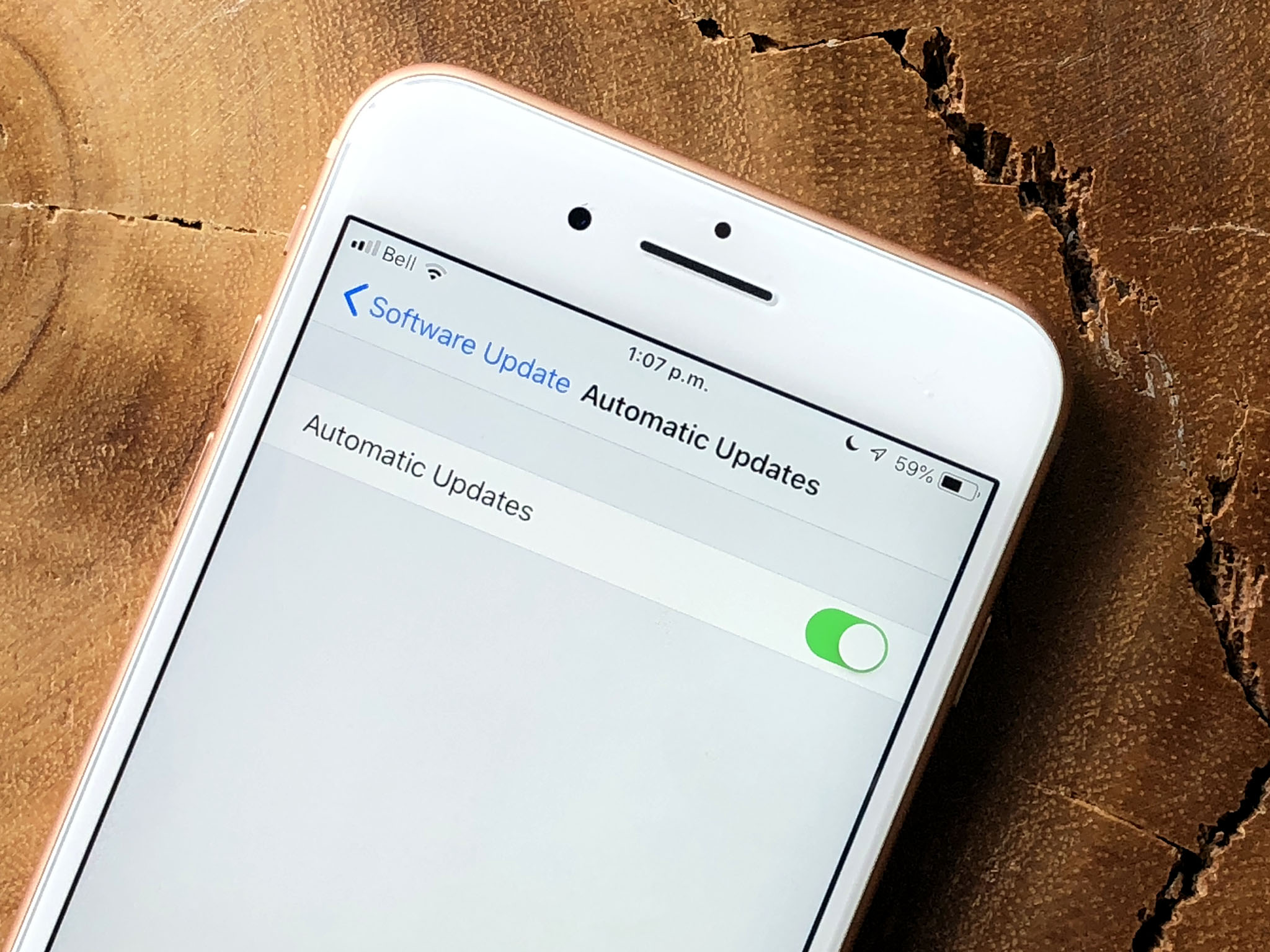
Once you're on iOS 12, you'll have the option to enable Automatic Software Updates. That way, just like Automatic App Updates have done for years now, you won't have to worry about manually updating your iPhone or iPad anymore. Whenever they become available, software updates, beta and release, will simply download and install themselves overnight.
How to download and install iOS 12 on your iPhone or iPad
iOS 12 and iPad
Last year, given all the iPad-centric features, I made it a point to single out how much iPhone was getting as well. This year, given how much focus there's been on iPhone, I want to make sure to do the same for iPad.
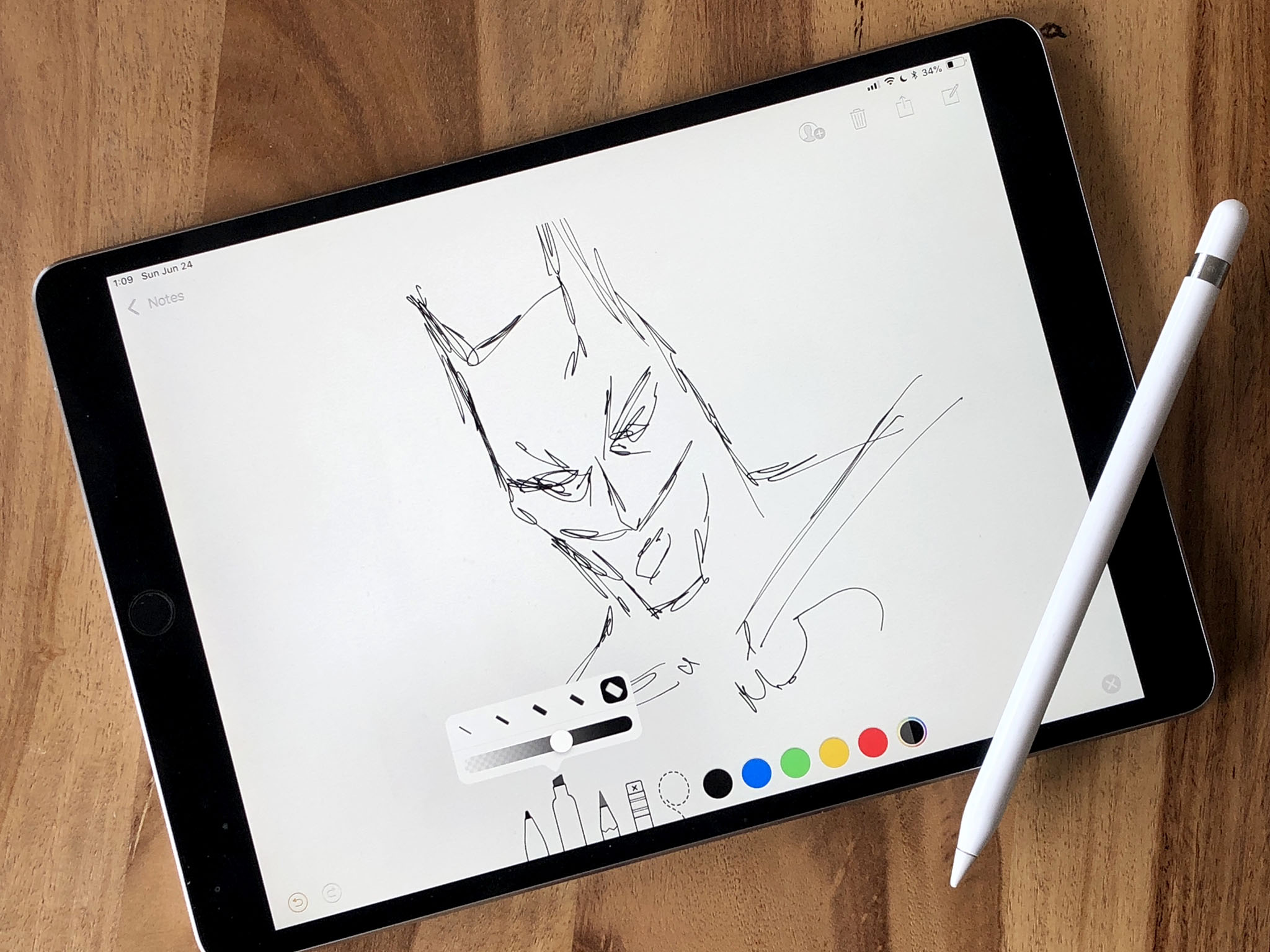
There aren't many iPad-only features in iOS 12, although there is a new ink picker for Apple pencil that can toggle line width, opacity, and color. But there are a lot of new-for-iPad features and updates that have been customized for iPad.
The status bar layout and gesture navigation have been brought over from iPhone X. It's a little odd to see Apple introduce iPhone X-style interface before introducing iPhone X-style hardware. But, make of that what you will. Last year's gestures are fully replaced by the new ones, but the four-finger swipes and pinches introduced way back in iOS 4 remain. Make of that also what you will.
If you're not a fan of using the two-finger touch-and-hold on the virtual keyboard to trigger trackpad mode, good news: You can now do it with just a one finger touch-and-hold on the virtual space bar key.
Performance improvements make older iPads launch faster and scroll smoother and Siri Shortcuts take pro workflows to the next level. ARKit 2.0 and FaceTime AR calls really take advantage of the big screen, and Screen Time to make sure you — and especially your kids — aren't overdoing it on that big screen.
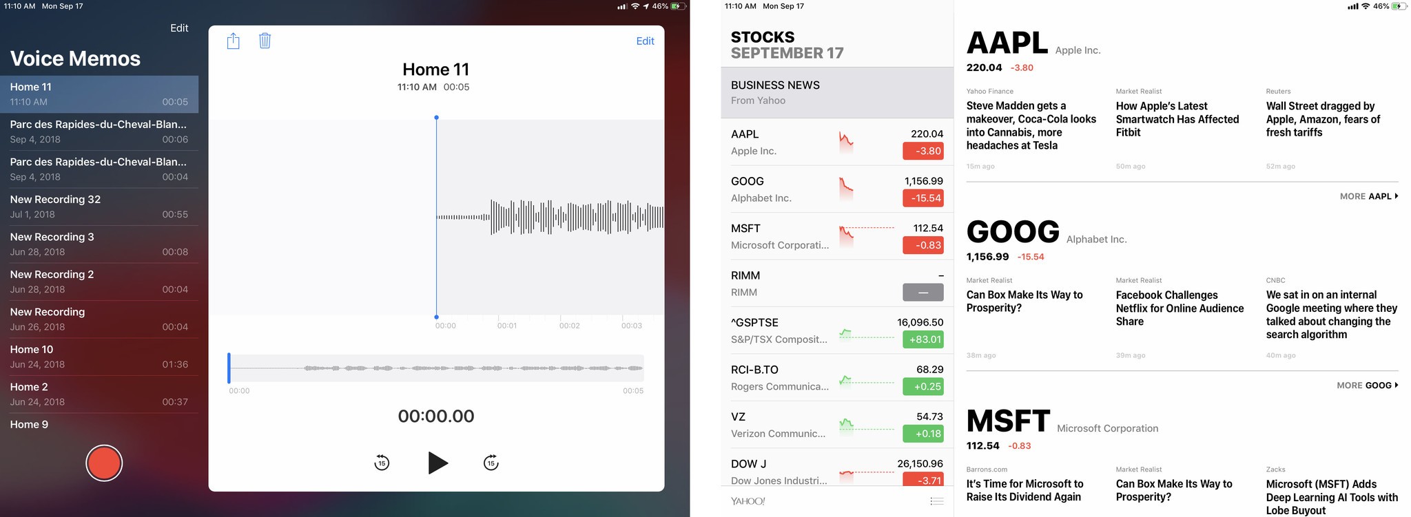
Apple's Stocks and Voice Memos have finally made the leap to iPad, though Weather and Calculator still have not. Both the new designs and the redesigns, like the News app, feature sidebars that take advantage of iPad's split view interface to make finding specific content a breeze. Likewise, though not unique to iPad, the new camera import interface is especially useful on iPad.
It might not feel as all-about-iPad as iOS 9 did with Split View or iOS 11 did with drag-and-drop, but including the above and everything below, iPad owners are still in for a very good year.
iOS 12 Performance
Apple has had a performance team for a long time who, as part of their jobs, have been required to carry older devices running upcoming operating systems. Engineers have often carried older devices as well to help ensure performance. But, every year is a crunch and, when something isn't a specific focus, you do the best you can and then you move on. This year, though, performance wasn't just a specific focus — it was the headline feature.
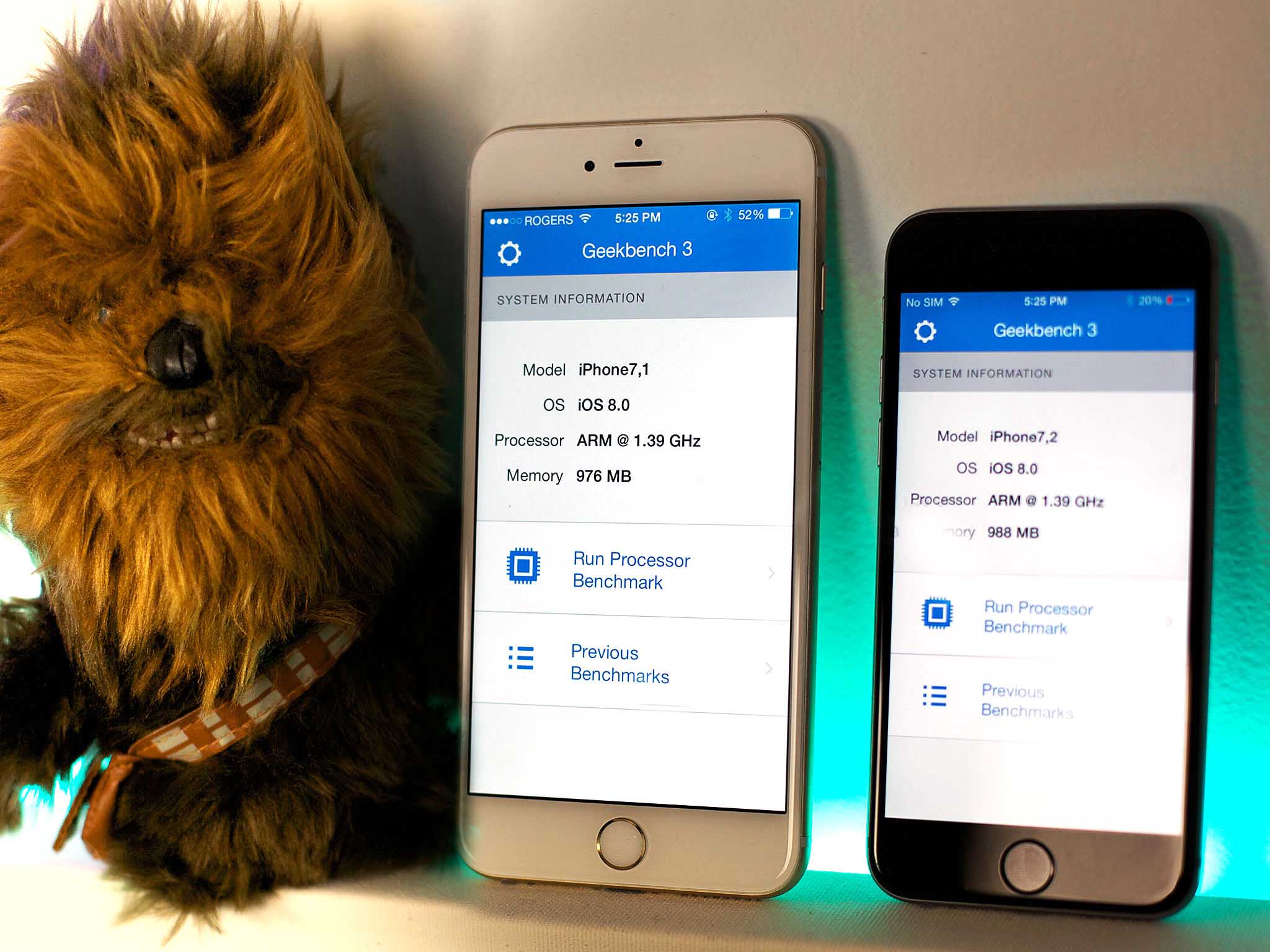
The goal of iOS 12 was to make iPhone and iPad faster and more responsive not just on current generation, 2017 hardware, but on up to five generations going back to 2013.
While competitors still struggle to get the latest version onto a single-digit percentage of devices on the market, and many competing devices are lucky if they ever see any updates at all, let alone a year, two, or three down the line, Apple is moving from leading the industry to lapping it.
It also makes Apple's software a better fit for its hardware, which typically stays active for generations — not just years after it was bought, but through successive owners, as it's sold or handed down.
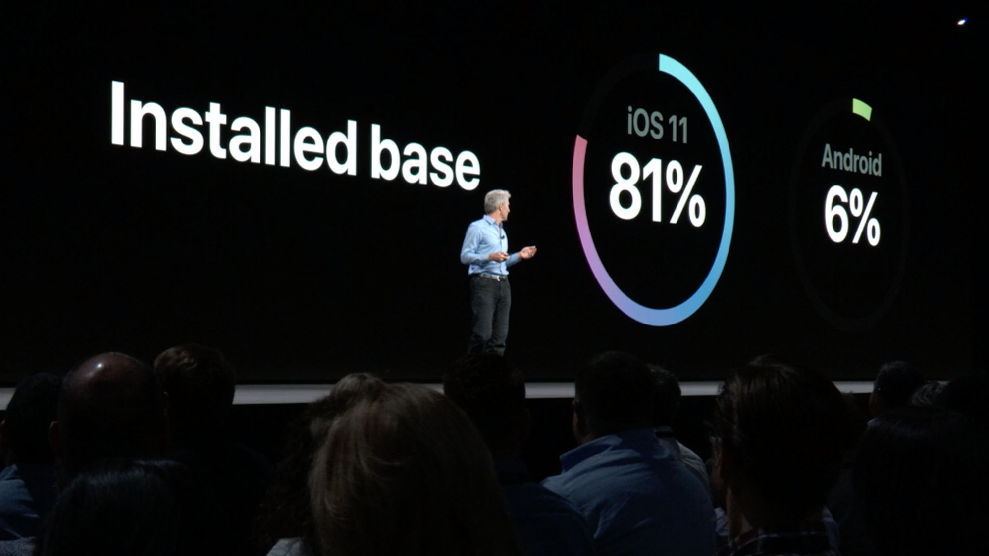
It might seem like a poor business decision on Apple's part. After all, people happy with their old devices aren't as likely to upgrade to new ones. I think Apple sees it as an investment, though. People happy with their old devices are more likely to buy from Apple again when they finally do decide to upgrade to a new one. They're also more likely to convince friends and family, some of whom have creaky, cracking, nearly un-chargeable, almost always un-updatable, devices from other vendors to upgrade to Apple next as well.
It's an optimistic model, but when it's both the best thing and the right thing to do, you do it.
The only question is: Why did it take Apple so long to do it? Part of the answer is no doubt the controversy surrounding #iPhoneSlow, which reached a head following Apple's decision to gate performance to preserve battery life and prevent unexpected shutdowns. The other part is resources. Apple literally took the best and the brightest engineers, the ones who make the underpinnings of the system and in any other year would be leading the charge to push out new features, and had them spend their time improving the performance of the existing frameworks or technologies instead.
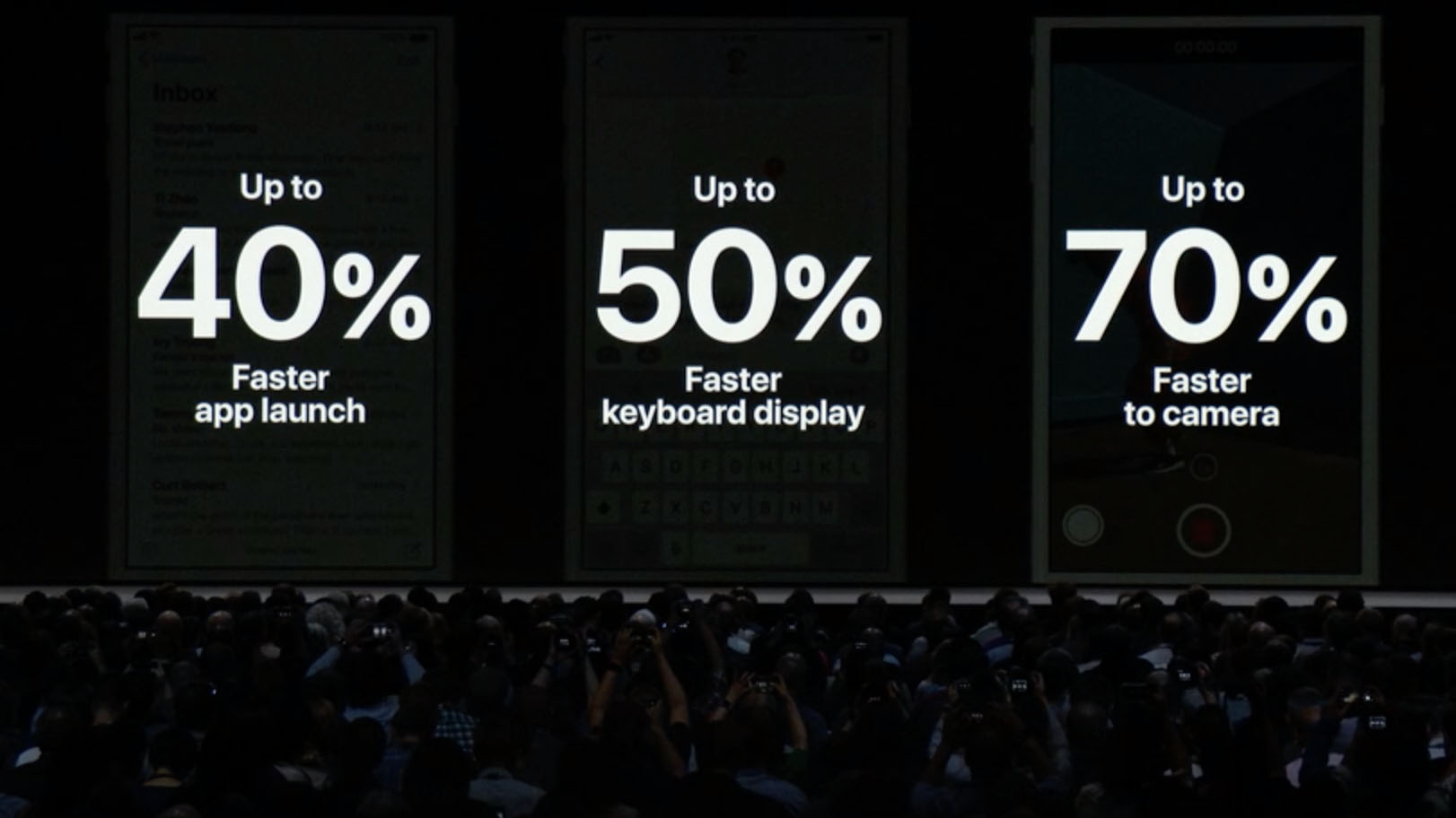
Apple gave its numbers at the keynote: Apps launch up to 40% faster. The keyboard launches up to 50% faster and remains more responsive. The camera launches up to 70% faster. The share sheet launches up to 100% faster — even when an older device is already under load.
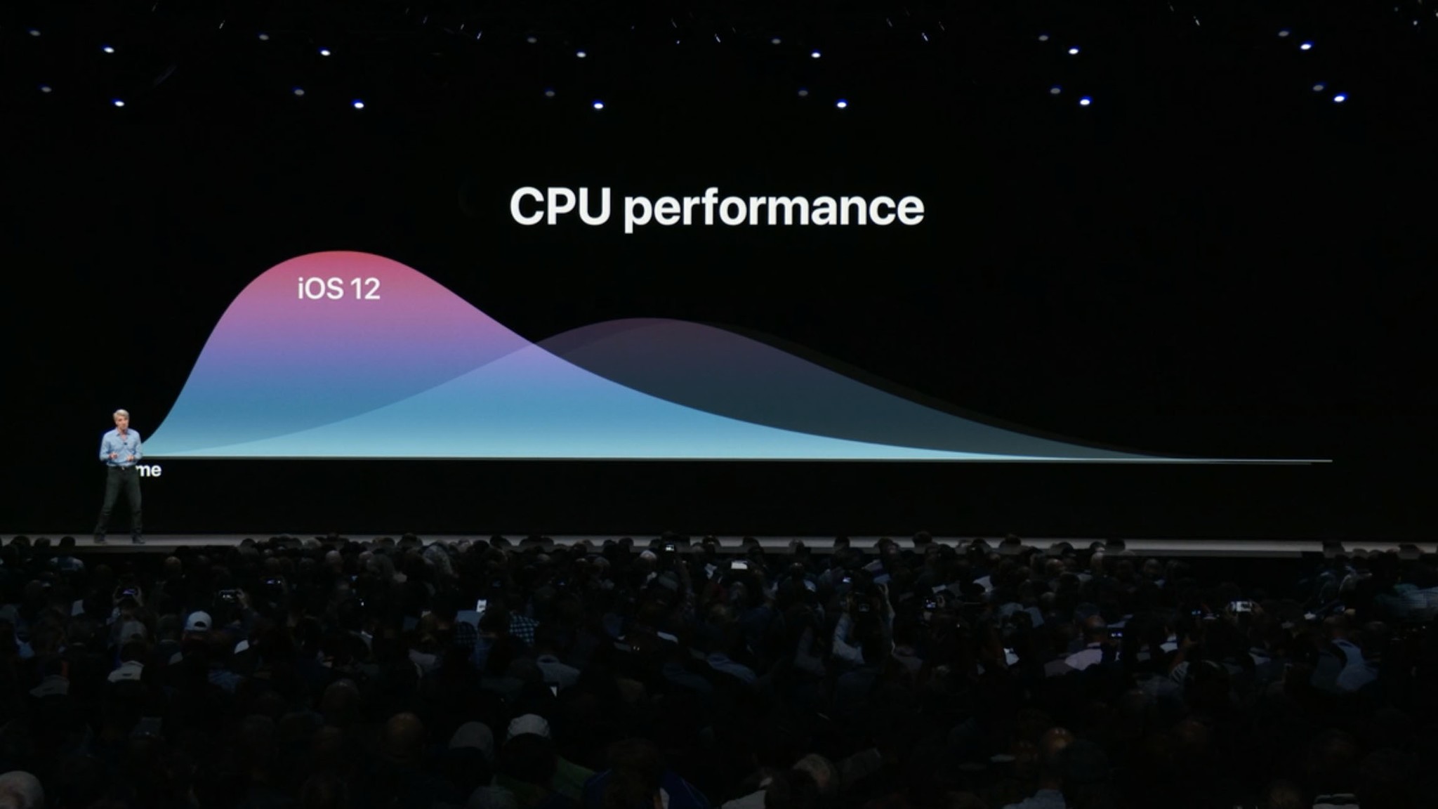
Achieving that kind of performance enhancement starts with the silicon. Because Apple designs its chipsets in-house, it can build and optimize for exactly what it needs. That includes changing the normal, slow processor ramp up to an almost immediate one. (Think going from something that graphs like a gentle, symmetrical hill to something that looks like the front end of a crashing wave.)
This, for example, helped solve a weird situation where a device under no load would drop frames but, when under slight load, it would not (because, in the latter case, it was already ramped up). And it was done by passing information about what scrolling was happening and when acceleration will be needed from the interface frameworks to the CPU controller. That way, the silicon knows what's about to happen and what's needed to make it happen smoothly.
On the software side, Apple worked to improve scrolling (UITableView, UICollectionView, and similar custom views). On most devices, which operate at 60Hz, there's 16 milliseconds to set up, fill, and draw content into the cells that make up a view before frames start to drop and scrolling is affected. On a 120Hz iPad Pro, just 8 milliseconds.
iOS 10 began to address this with a prefetch API, which could work in the background to prepare views and prevent work having to be done on-demand when resources could already be strained. With iOS 12, Apple removed some edge cases which caused problems like drawing the same frame twice (which is indistinguishable from a dropped frame). In general, iOS 12 is also more intelligent about how it schedules prefetches, avoiding concurrency and handling them serially instead.
Auto Layout, the foundation for size classes, affects all of Apple's multi-size and, for iPad, multi-window displays. It's also been significantly improved in iOS 12. Independent sibling views, for example, used to scale linearly. Now, they scale slight sub-linearly. Dependent sibling views in iOS 11 scaled exponentially. Now, they scale linearly. Same with nested views.
Apple also addressed memory, which directly relates to performance. Previously, when apps made a large memory request, the system had to go find that memory from somewhere — likely other apps. That delayed the current app but also undermined the other apps. (If you later went back to one, it would likely have to reload either partially or completely, which takes time.)
iOS 12 helps address this, for example, with new techniques like Automatic Backing Stores. That means an app can draw a full fidelity Portrait Mode image if it needs to, but if it's only drawing a low fidelity line-art image, it can drop from 64-bits down to 8-bits to significantly reduce the demands on memory.
Apple is also deprecating the old UIWebView API for the more modern WKWebview, which works on both iOS and macOS, and runs in its own process, so even if it crashes, it doesn't take the app down with it.
All of this to say the performance fixes go deep. Even on most of the betas, you could feel significant improvements at the system level. Now that we're at release, it should get even better because some of the changes also required developers to adopt the new performance best practices. Fingers crossed they all have and we're about to hit the highway for real.
iOS 12 ARKit 2
One day, Augmented Reality (AR) will live in our glasses and contact lenses. Then in the photons hacked on their way to our visual receptors, if not embedded right into our brains. For now, it lives inside our iPhones and iPads. And Apple seems to want to make sure it goes as fast and as far with the technology on our current devices so it's as mature as possible by the time we get to whatever comes next. And that suits me just fine.
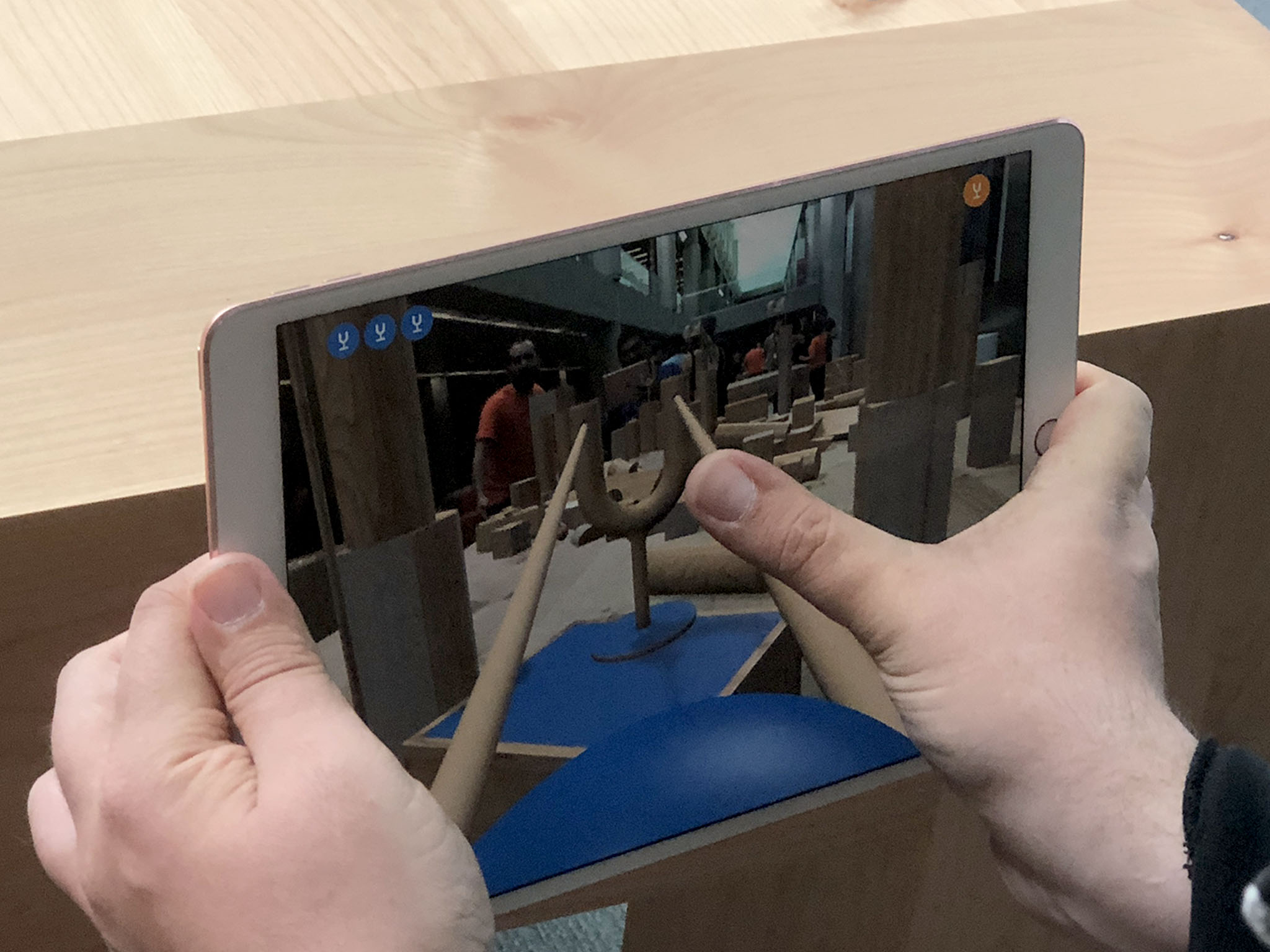
But, rewind, ARKit: It's Apple's framework for tracking the position and orientation of devices relative to the world around them (and, by extension, you), and the movement and expressions of human faces.
It can also understand scenes. Where ARKit 1.0, introduced just one short year ago this month, could handle single-user experiences and horizontal surfaces and lighting conditions. Then, it can render non-real 3D objects — using SpriteKit, SceneKit, or Metal templates — that feel like they belong in that world. (It also enjoys support from both the Unreal and Unity gaming engines.)
ARKKit 1.5, which shipped earlier this year, included support for things like vertical and irregular surfaces, continuous autofocus, and relocalization so apps could resume from background.
Now, ARKit 2.0 includes 4:3 video formats (think iPad); 2D image tracking and 3D object detection, so a photo can drag an augmentation with it, and a real-world model can come alive through AR; environment textures and mapping to make the augmented look more real; persistent experiences, so you can put that model away at home today, take it back out at school tomorrow, and continue right where you left off; improved face tracking, specifically for winking, gaze, and tongue — yes, tongue — movement; and… wait for it… multi-user experiences.
There's a ton of cool tech here, including a new, standardized format for AR called USDZ. It's better, I've been told, to think of it as an export/import format than strictly a file format. The USD part was worked on at Pixar for a while, since it's core to what they do, but Apple added the Z part, which took all the assets and opinions and bundled them up to make them easily transportable. So easily, in fact, you can tap on a web link and launch straight into an AR experience.
It's a big deal, both now as AR is beginning to go mainstream, and for the future, as we'll all benefit from speaking the same format language. Pixar, Apple, and Adobe will get support in the tools that are used to create the experiences, and we'll get compatible experiences created by the best and brightest, both in the studios, the big companies, and out in the world.
The mesh for face tracking, by itself, looks totally sci-fi. Apple renders it with lighting that estimates intensity, direction, and ambient color temperature, but also provides spherical harmonic coefficients — yeah, I had to look it up, too — for apps that need them. It basically makes rendered augmentations look like they fit into the real world around them.
Some find the new gaze-tracking creepy and the tongue detection a tad on the excessive side. I haven't explored the former enough to form an educated opinion on it, though I'll be doing just that before the fall. The latter is just plain fun, though. (It's also binary for now, so tongue in or out, no elaborate gymnastics just yet.)
Map saving and loading is what enables persistence and multi-person experiences. Instead of generating and then throwing away the 3D world map, ARKit now provides it to developers, complete with simple anchors and support for custom anchors, to keep and share.
For multi-user, because the world map represents a single, real-world coordinate system, one person can initiate the experience and then share it with one or more other people. And each of them share the same AR space from their own physical perspective. It does this by being not only faster to initialize in iOS 12, but through faster and more robust tracking and plane detection.
The experience is shared locally through multi-peer Bluetooth and Wi-Fi networking, which means you're not relying on the cloud, which is great for performance and privacy. You can use the internet when you want to, not because you have to.
There's also a fiendishly clever system for reflection mapping. While building the world map, ARKit also uses computer vision to build out a cube or other map representation based on scene texture. Machine learning is used to fill in any holes and create the "hallucination" of a complete map — as long as you don't look too closely. Reflection probes then detect objects and apply that texture when and as appropriate.
I had the chance to try the LEGO ARKit experience at WWDC and it was a ton of fun. It uses the 3D object detection, which means the object needs to be both built in the real world and scanned into the digital one first. Those objects need to be textured, rigid, and non-reflective, at least for now.
The real-world LEGO building sat on a table but, with an iPad, I could crack it wide open, drop the Joker in, and watch as he promptly set it on fire. Then, another person I was playing with could call up The Batman, get him into the chopper, and rescue the clowns (?!) while a third positioned a firetruck to put the blaze out. I've built LEGO for years, including a pretty great Arkham Asylum set, and I'd like nothing more than to bring it to life with my godkids for a few hours every week.
I also played a bunch of the SwiftShot game, which is a code sample for ARKit. You have three catapults. Your opponent has three catapults. Last catapult standing wins. What made it so much fun, especially the tournament on the last day of WWDC, was that multiple people could join in and watch and, when that happens, it starts to blur the lines between augmented and reality.
It's not just all fun and games, either. Shared experiences are going to be transformative in everything from education, where a teacher can lead a classroom through augmented discoveries, to enterprise, where teams can collaborate on prototyping, production, repair, and iteration.
About the only thing I'm missing is all this AR goodness being integrated into Apple's Maps app. Hopefully, the Maps-side data for that isn't too far away.
And yeah, we're all still semi-awkwardly holding up our phones and tablets to do all this – for now. But, again, at some point in the near future we won't be. And Apple will have all this technology — and apps will have all of this content and these services — for us when that time comes.
Clever fruit company.
Measure.app
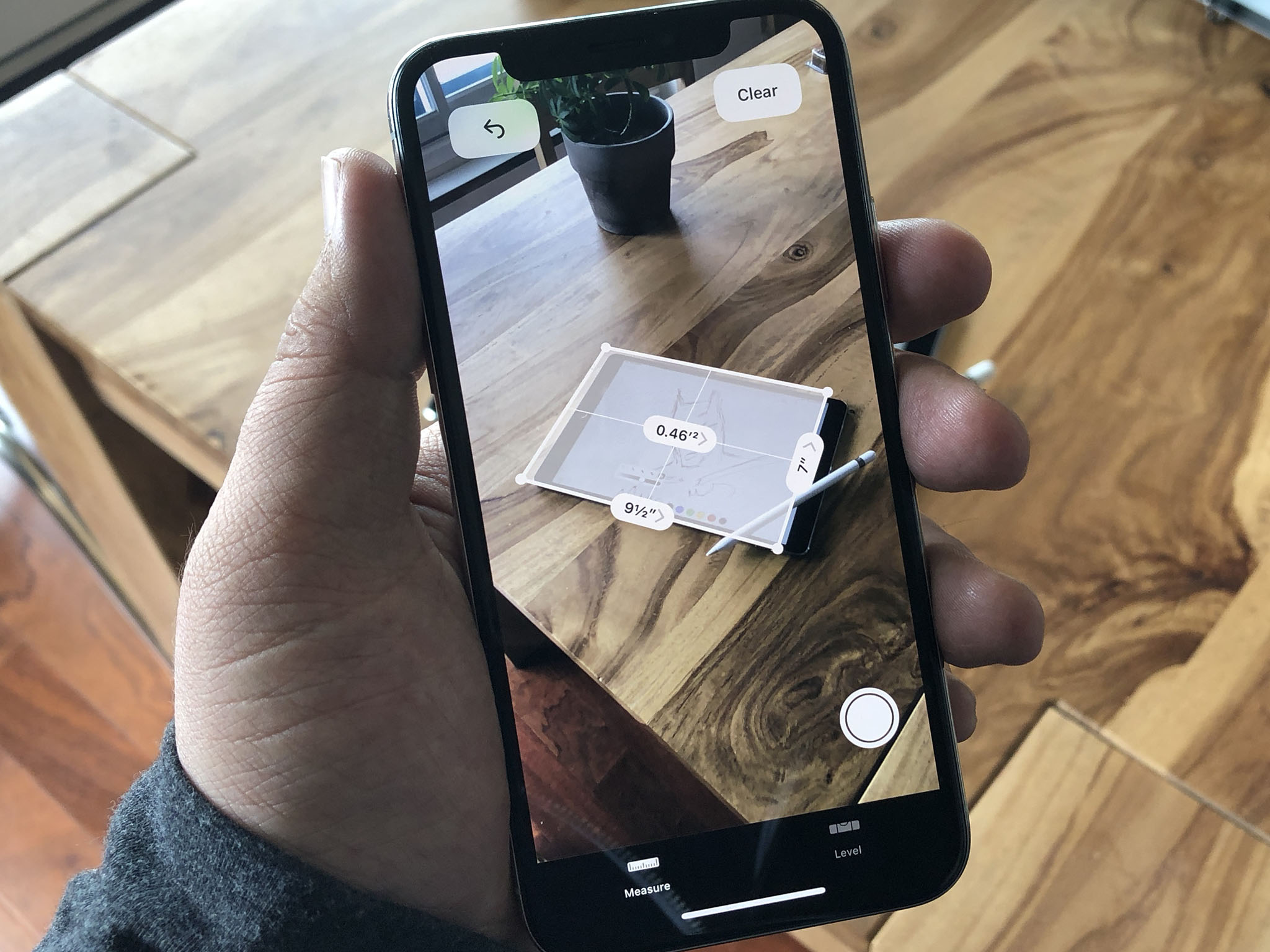
Part showcase, part utility, Apple is shipping a new Measure app in iOS 12. With it, you can use ARKit to automatically detect and measure objects, including tables, walls, artwork, shelves, and anything else that's rectangular in shape. All you have to do is draw a line with your finger and you'll get the metrics.
iOS 12 Camera & Photos
Portrait Lighting is now officially out of beta. It uses Apple's new and improved segmentation masking to better separate subject from background and, with the TrueDepth camera on the front of iPhone X and the upcoming iPhones XS, XS Max, and XR, reduce the previous blurriness around edges.
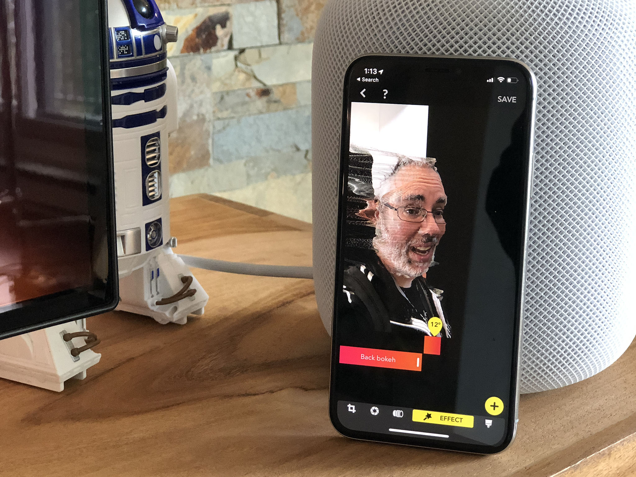
If you load the depth data into an app capable of displaying it, you'll also see it's significantly better. Where TrueDepth under iOS 11 looked … bumpy, TrueDepth under iOS 12 looks like a 3D model. This is why, yes, you do need real depth data from your camera system.
Apple is also providing the new segmentation system to developers so they can uses the mattes in their own apps.
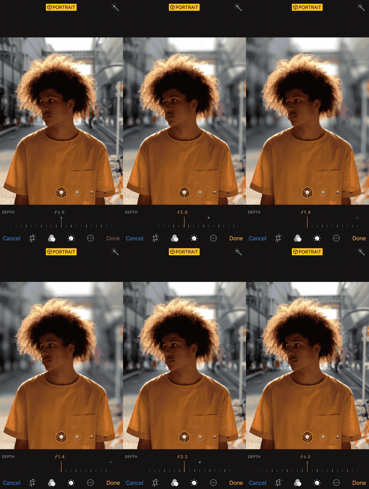
On the upcoming iPhones XS, XS Max, and XR, Apple is delivering an all-new depth effect based on careful study of high-end cameras and lenses. It looks terrific but even better than how it looks it how it works: You can now tune the depth in post, taking it from a simulated f/1.4 all the way down to f/16. That way you get just exactly the bokeh you want, and you can keep changing it at any time.
Importing photos from other cameras and onto iPhone and iPad has also been improved. It's easier to tell which photos, if any, you've already imported. You can choose now where you want to import them, either into an existing or new album. There's a large preview mode so you can scrutinize your photos in more detail before choosing to import them. And, once you start an import, you can switch to other apps and leave it importing in the background. (You can even edit RAW photos on iPhone 7 or later or iPad Pro.)
Photos holds digital representations of all the moments you care about, be they pictures or videos of your kids, screen captures of glorious or terrible moments, even your favorite animated memes. All of it. Historically, though, Photos has held them more like a vault than like a library. It's been incredibly easy to get stuff into it but very difficult to get stuff back out.
Apple began to fix that a couple of years ago with computer-vision-assisted search. Instead of just knowing something was a picture, computer vision let Apple know what was in the picture. Mostly. Even though Apple kicked it off with thousands of category types, it still felt limited. You couldn't even search for Apple's own devices …
With iOS 12, Photo Search gets better. It's still not great, which is super frustrating because search — including complex and sloppy search — feel like problems that were solved decades ago. Granted, all the machine learning stuff is new and, meritoriously, Apple's doing it on-device and not sucking it up into the cloud to power its own projects — which for some other companies seems to include training surveillance and even drone systems for government agencies and the military. But that's not the part that feels like the limitation here. It's still the search.
Photos offers search suggestions now, which are fine. I'm not the target market for that feature but I think, given the popularity of Memories, it'll be a big hit with those who use Photos as a way to go back and relive their favorite moments.
It's also got a far more robust query system, including the ability to search not just for categories but for places, business names, and — really cool — over four million real world events by time and place, things like sports games, concerts, and more. That way, you can find your photos from the playoffs.
The way Photos handles search itself, though, just feels incredibly broken to me, and it's because of the refinements mechanism.
See, Apple wants you to type in one thing, like "Cupertino", then get that result, then type in something to refine it, like "2017".
But I just want to type "Cupertino 2017" without having to interrupt myself and do the manual parsing. That's Apple's job. I should just be able to type without a second thought and Photos should slice and dice it up as needed to give me the answer.
Instead, if I type "Cupertino 2017", I get no answer. Then, I have to go back and delete the 2016, send off the "Cupertino" query, then refine it with "2017", and I just want to quit the app already. Especially when I try to further refine it with "Coffee" — hey, the Bitter + Sweet is real, y'all — and it goes back to not giving me in answer. (It does say indexing and there may still have been an issue with the beta, so hopefully that part will still pan out.)
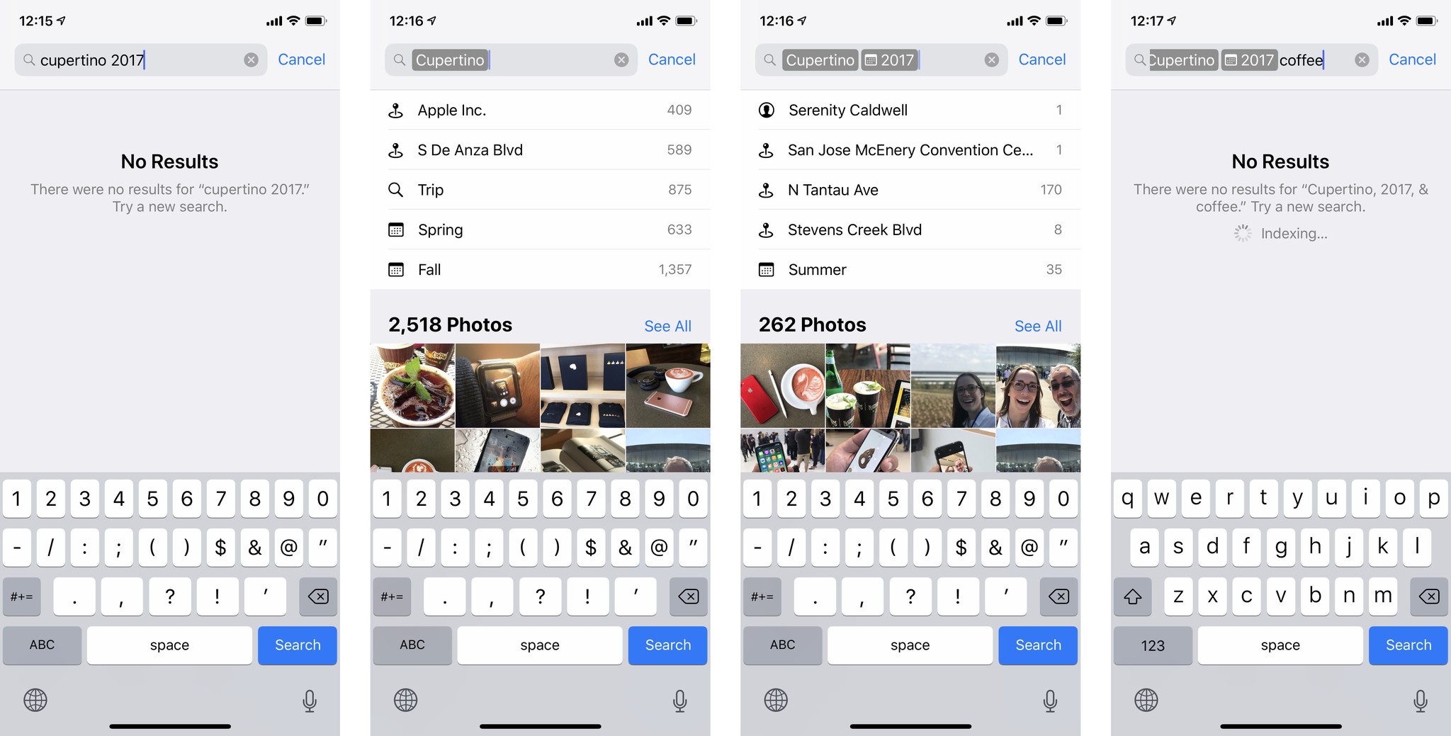
First, no answer is a terrible user experience. It makes you feel like you did something wrong. Systems should always do everything possible to avoid returning no answer, including trying to get you the answer it thinks you want regardless of what you typed.
Second, this implementation is particularly bad because what I'm asking for is a perfectly conventional query — and something that currently returns results under iOS 11.x.
I was hoping Apple would fix this before iOS 12 came out of beta and went into release, but no such luck. It tarnishes what should otherwise be a huge leap forward in Photos functionality. (Even if I still can't search for "phone"… but searching for "tablet" brings up both tablets and phones. Baby steps!)
My other huge frustration with iOS 12 is how long it takes photos and screenshots to show up in Photos. For screenshots I can work around it by using the Instant Markup interface... sometimes. (It often AirDrops smaller, uglier-named versions of the screens.) If I dismiss it and then go to my album, I still have to wait, sometimes a long time, for it to show up. Photos there's just nothing to do but wait. Everything about the iPhone camera system is so stupefyingly fast, it's a shame iOS 12 has slammed on the breaks right in the middle.
Hopefully, that'll be fixed soon as well.
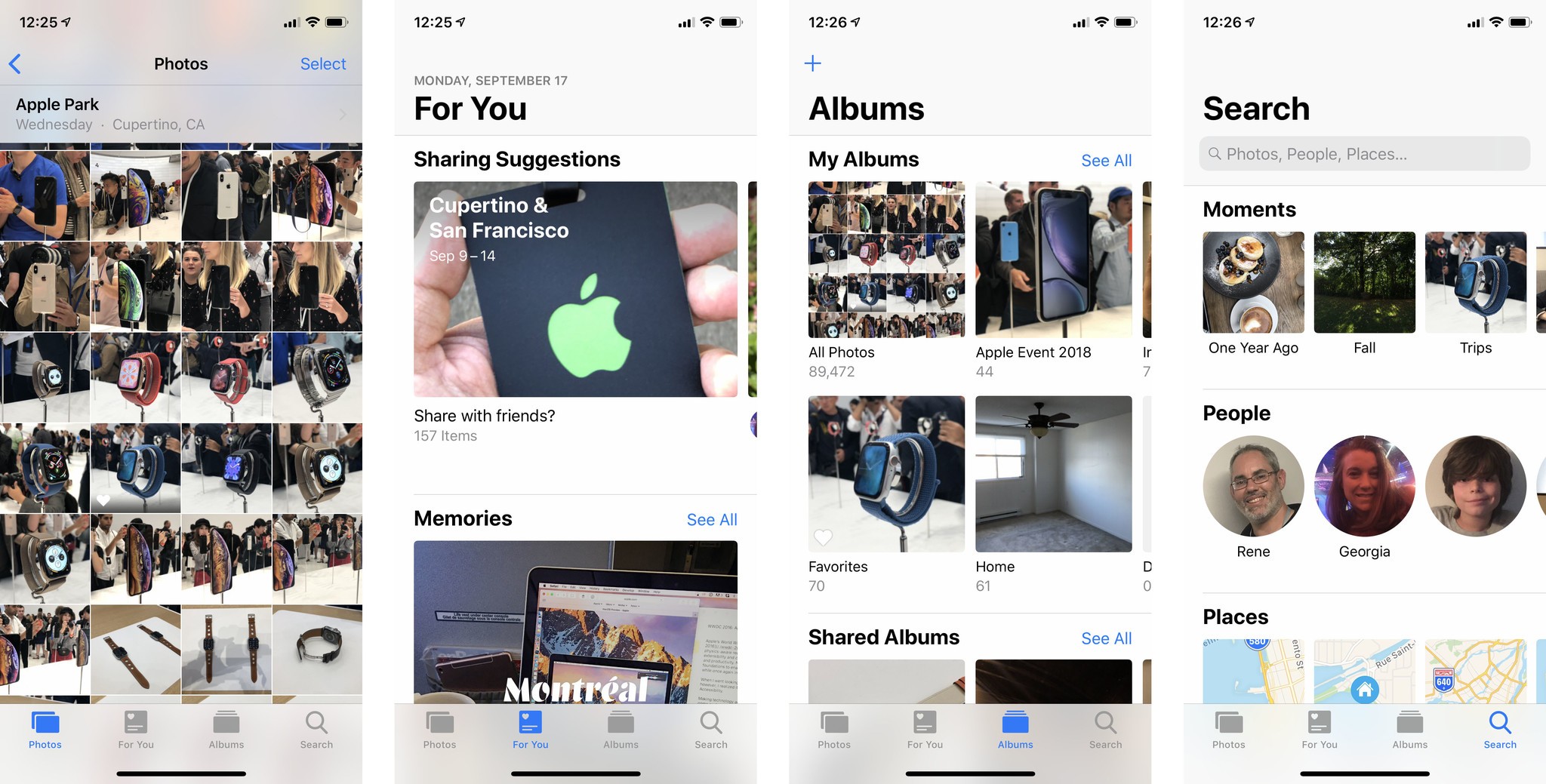
There's a new For You tab, which I like. Again, it's not how I use Photos, because I'm apparently more robot than person, but it's consistent with Apple Music and — I was going to say Apple News, but iOS 12 ditches the For You tab there in favor of Today. Consistency is a user benefit so it's weird timing. I'm also hoping Apple can standardize around Today for everything. It loses a little on the personal feels but gains immediacy … and a nice cross over with everything from Apple Retail to the new App Store.
Suggested sharing, which is something Apple piloted in the Clips app a couple of years ago, is especially good. Because, if you let it, Faces can know who's in a picture, Photos can surface it when and as appropriate and prompt you to send it to them. Even better, thanks to things like event detection, if you send photos to someone else also running iOS 12, it can prompt them to share related photos from their library back to you.
It's like Memories Tennis, and I think it'll be super popular.
Effects for Live Photos, like loop, bounce, and long exposure will also be suggested for photos the system thinks will suit them.
I also like the improved informational density on the albums view, which replaces what was previously a wall of thumbnails with only the most important thumbnails, and then a text list of media types. Not only does it make scrolling faster, it makes visually parsing the different sections much faster.
iOS 12 Siri & Shortcuts
Some still assume Siri is only a voice-based assistant. And it is. It's even getting 40 new language pairs for Siri translation in iOS 12, along with the ability to turn on the flashlight, play Find my iPhone alerts, answer questions about celebrities, food, and motorsports, and search for your photo memories and even passwords.
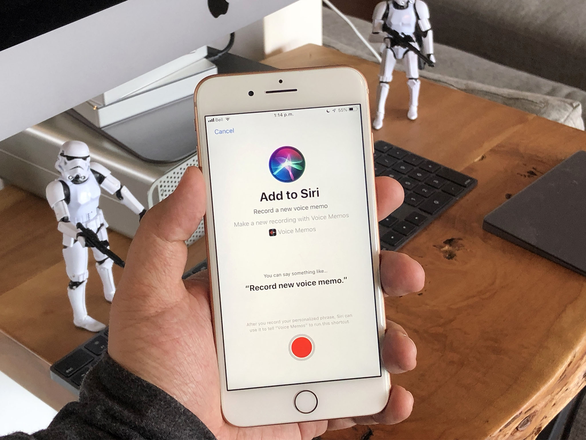
Since iOS 9, though, Siri has also been a text-based assistant. That's when the name Siri also began to be used for proactive, intelligent, search and suggestions.
Then, when Apple announced Siri Shortcuts, some assumed it was only a power-user feature that would let nerds assign voice triggers to actions and automations. While that's true, it's only half the story. In addition to the power-user aspect, there's an equally important — potentially even more important — aspect to Siri Shortcuts that's all about the mainstream.
But what Apple announced were two separate yet interconnected services:
- Proactive prompting for mainstream users that'll gently lead them into greater convenience they never knew they needed.
- Voice trigger-able automation for nerds that'll let them do much of what they've always wanted.
And, of the two, I think the first will not only be super easy to get started with — it'll be transformative.
For years we've been slowly, inexorably transitioning from pull to push interface.
Pull interface is what most of us are familiar with going back to the early days of computing: If you want to do something, you go find the feature or app that lets you do it, then the action within that feature or app, and only then can you do it — after spelunking through the operating system and app stack, and hunting it down. It imposes both temporal and cognitive load and it's part of what's made traditional computing confusing and even off-putting to large swaths of people.
Push interface is the opposite: Instead of you drilling down to find what you want, what you want comes and finds you. Notifications are a rudimentary example. Instead of launching a messages app, finding a conversation thread, and checking to see if there's anything you need to reply to, the notification comes and tells you there's something new to reply to. Actionable notifications were another step forward. Instead of hitting a notification and going to an app, you could act right in the notification.
But notifications are only driven by simple, event-based triggers. Someone sends you a message. An alarm or reminder goes off. A sports score or news happens. They're reactive.
What Apple did with Siri was an attempt to become proactive. It could suggest apps and even actions within apps based on signals like time, location, and past behavior.
Wake your iPhone and you might see it offer to play you your workout mix, if that's usually how you start your day. Or swipe to the minus one Home screen and see directions to the dinner you'd reserved along with traffic information to help you pick your departure time.
It was useful but it was extremely limited.
What Apple's done with iOS 12 and Siri Shortcuts is to start removing those limitations.
Not with automation. Again, that's for the power users. But with suggestions. Those are for the mainstream.
Developers can tap into the Continuity-derived user activity to make locations available within their apps. And they can use a new Intents API to let the system know, more expansively, the actions available in the app.
Once that's done, Siri keeps track of what you do with them and when you do it, and tries to guess when you'll do it next. Then, instead of you having to go find the app and dig down into the function you want, it presents it to you right before it thinks you'll want it, and right where you already are in the operating system.
For example, if you always order pizza before the game on Sunday, instead of having to go to the pizza app, pick your favorite, and place your order, it'll have a banner waiting for you right on your Lock screen ready with your favorite order.
If you always text your child to say you're on your way home from work, instead of having to go to messages, find the conversation with your child in the list, and tap to start a new message, a banner will be waiting for you, ready and able to send that message with a single tap.
Sure, if you want to, you can add a voice trigger to any shortcut. "Pizza time!" or "Homeward bound" could let you initiate those actions any time you want. It effectively lets you add Skills-like functionality without having to navigate an endless list of Skills you wouldn't ever want or need. (Downloading an app indicates you're interested in Skill-like functionality related to that app, effectively giving you a much more manageable, relevant list from which to choose.)
And that's really cool. It's sci-fi. But it's still pull-based interface.
It's the new engine that will help mainstream users discover shortcuts, at the right time, in the right context, that's powerful. That's push-based. And they couldn't be easier to discover and get started with.
Since I've been testing iOS 12, my Lock screen has offered to put my phone into Do Not Disturb when a Wallet pass, Open Table, and even simply iMessage indicated I might be having dinner or breakfast.
It hasn't offered to let me order my usual Philz Mint Mojito, because I don't have the Shortcuts enabled version of that app — yet! — but it has offered me directions to Philz after I used Maps for walking directions the first couple days of the conference.
Now that iOS 12 has shipped, iOS 12 apps with Siri Shortcuts will begin to hit the store in number. A week from now, two weeks from now, we'll all wonder how we ever lived without them before.
Combined with Lock screen, there will be a ton of Shortcuts suggested for a ton of users, and the same hundreds of millions of people who learned to download apps, and all the initial overhead that's involved, will learn how to take advantage of Shortcuts.
And we'll be another step closer to the next big revolution in human interface.
Voice Memos
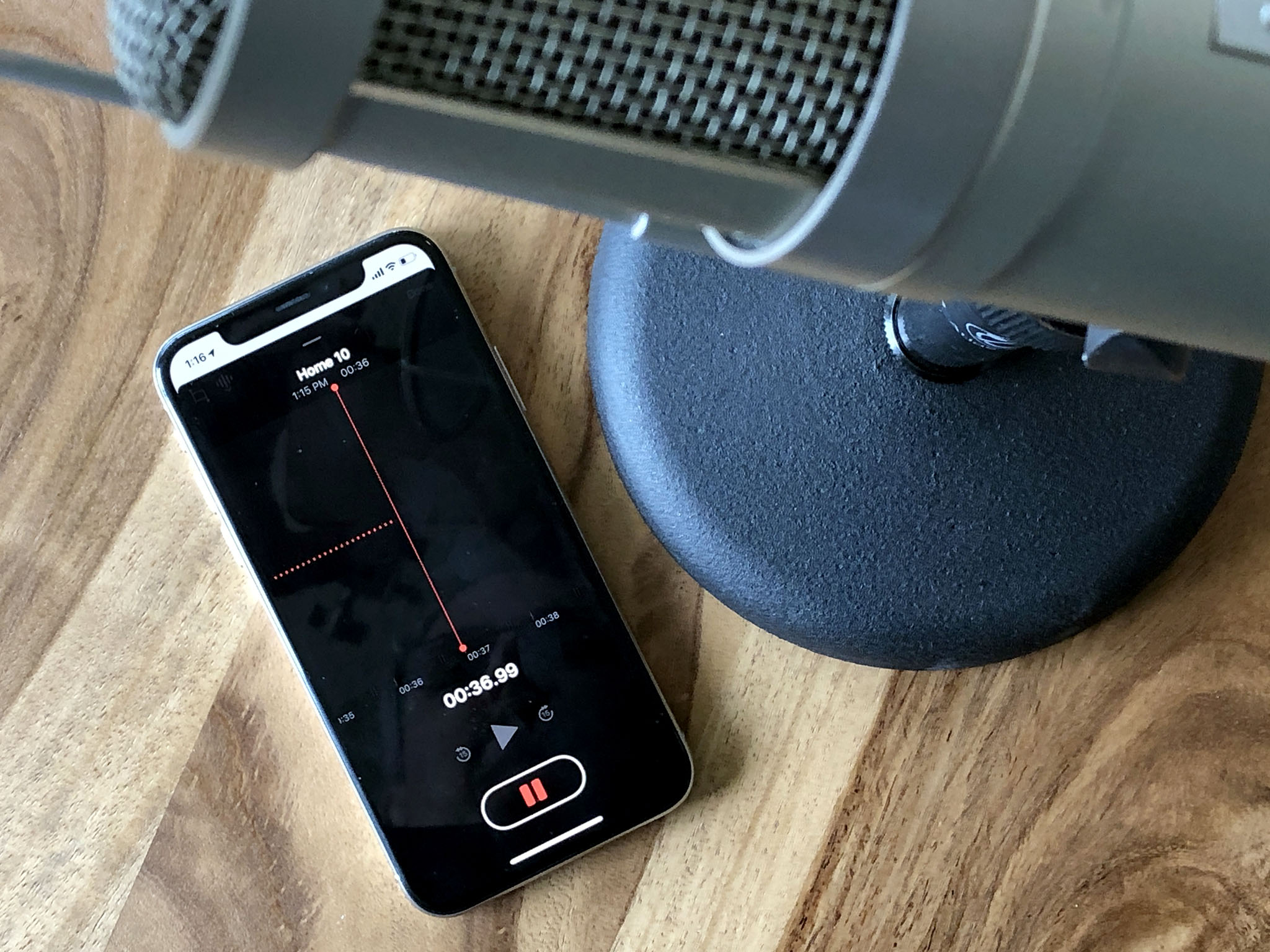
Apple's Voice Memos app, introduced in iOS 3 (iPhone OS 3) has gotten its first major update in … forever? (Not including the de-photorealistic flattening it received as part of the overall iOS 7 redesign.)
Saving is automatic now — no more modal pop-up step to get in your way — and new memos simply default to location-based naming. You can play, pause, skip 15 sec. back or forth, trash, and even edit, duplicate, and share, right from the voice memo list.
The record screen — which is in Dark Mode! — starts small but you can pull it up like Now Playing in Music. There, you can trim and even insert into the recording. Nifty! (You can also control playback on your Apple Watch via Now Playing.)
Best of all is iCloud sync. So, now all your Voice Memos are on all your devices.
I've been asked to use Voice Memos to record my end of national radio interviews and have used it for podcasts while traveling, so it's great to see it finally getting some love.
iOS 12 Apple News
Apple News, the app, has gotten a reorg. For You has been renamed Today, which matches the Today tab on App Store. The timing is odd given Photos for iOS 12 has just gotten a For You section and Music still has a For You section. I'd love to see some consistency here. (Much as I'd still love to see some consistency in heart icons across Apple's apps, and what they mean in terms of liking vs. favoriting.)
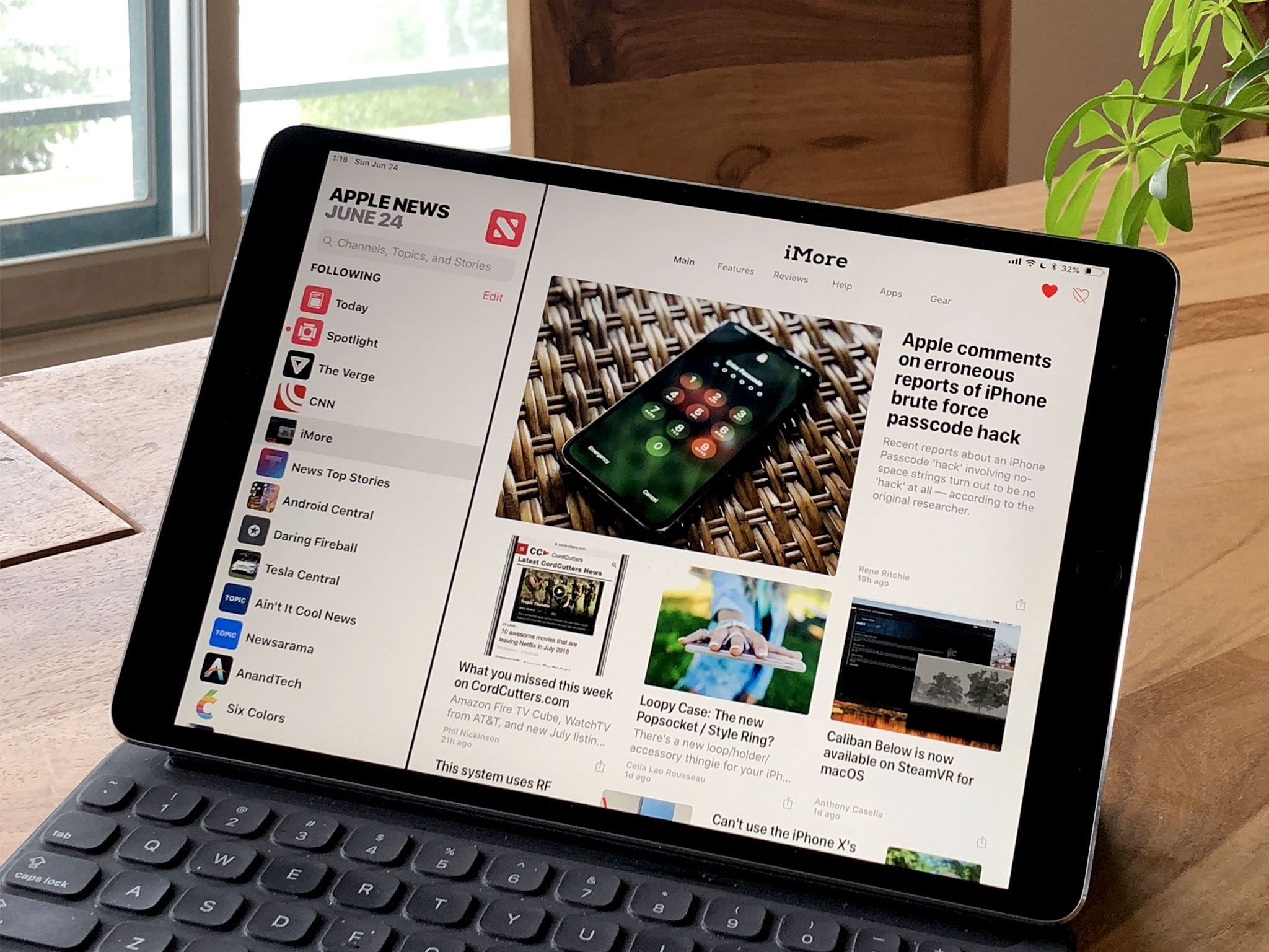
There's no subscription magazine service yet, but there is a new browse tab that replaces the previous Following, Search, and Saved tabs, combining them all into a single, one stop shop for everything you want to find. It should help with both discovery and channel selection. On iPad, in wider views, it shows up as a persistent sidebar making skimming even easier.
I miss having a dedicated Search tab, which other apps like Photos and App Store still offer. And, again, it breaks consistency. I do think there's some value in experimentation but I'm not sure this one will pay off. We'll see. Right now the whole tab bar just looks … sparse.
Apple News, the service, remains terrific. I'd argue it's one of Apple's best. It combines human curation on top of algorithms to provide a more thoughtful, more broad-based, and dare I say more responsible and trustworthy news feed than any of the big internet companies have so far managed.
But here's the thing: Apple News is still only available in the original three launch countries: the U.S., U.K., and Australia. AND IT'S BEEN OVER THREE YEARS.
Contrast that to Apple Music, which launched in 100 countries and is in well over a hundred today.
Also contrast it to Google News, which launched just last month in 127 countries, and Microsoft News, which launched just last week and while I couldn't find a country count, it seems numerous.
News has never been more important nor as ailing. Apple's approach to it is optimistic and almost laudable. Yet, for the vast majority of its customers, the service doesn't even exist.
Let's hope, as Apple integrates Texture and builds out editorial, it can start executing on News internationally and soon.
Books
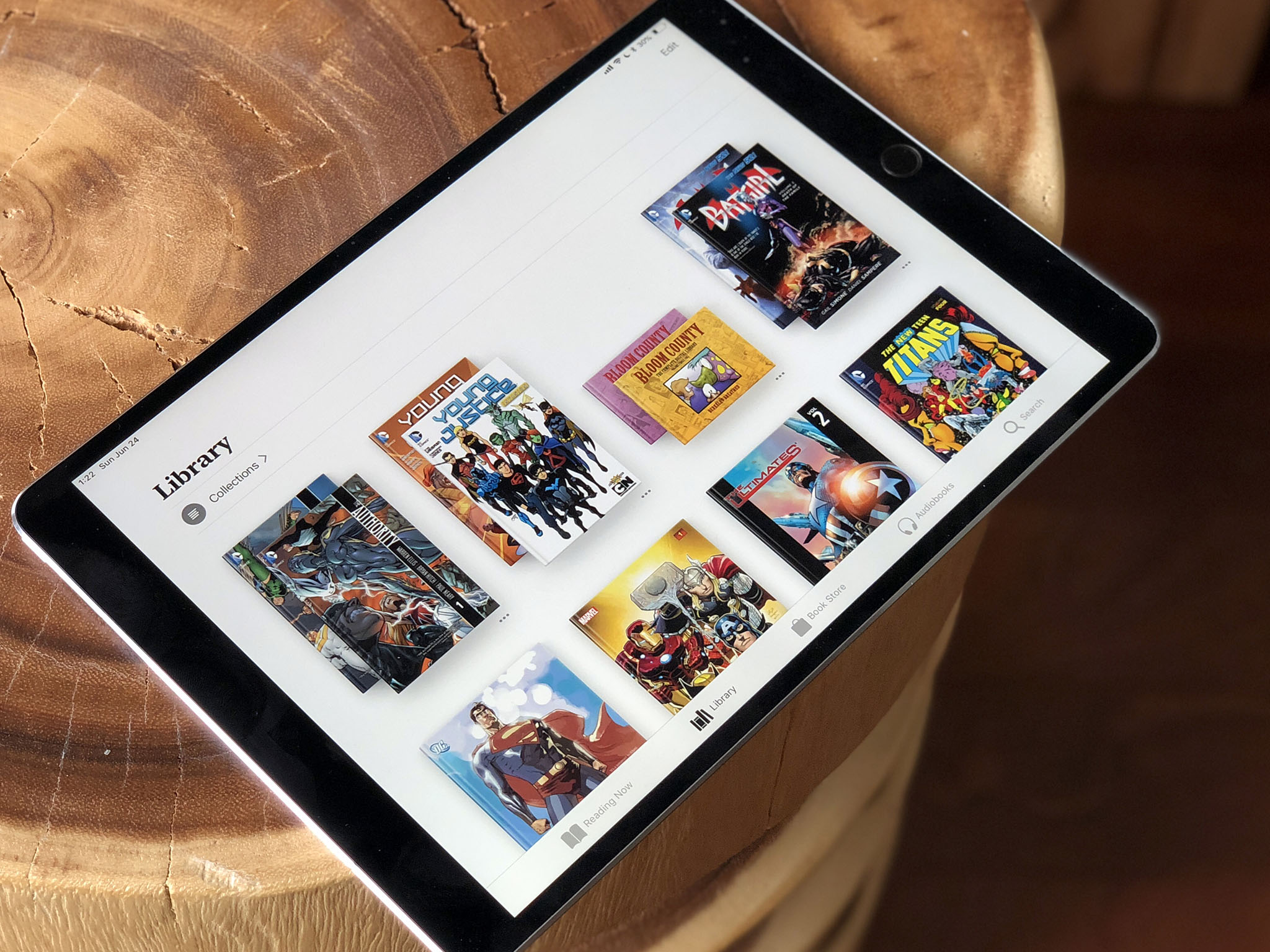
Apple Books — née iBooks — has been completely redesigned for iOS 12. Similar to last year's App Store redesign, the goal was to make it easier to discover new ebooks and audiobooks, organize and read your existing books, and return to what you were last reading.
My former colleague, Serenity Caldwell, put together an excellent preview just after WWDC:
What's new with Books in iOS 12
iOS 12 Screen Time
"Listen, and understand: Screen Time is on iOS 12. It can't be bargained with. It can't be reasoned with. It doesn't feel pity, or remorse, or fear. And it absolutely will not stop, ever, until you are off your iPad." — Kyle Reese, if he were around and dealing with baby John Connor.
Seriously, though, the topic of "screen addiction" has been getting a lot of attention this year. That much of that attention has been driven by opportunism and sensationalism doesn't discount the real need by real people for tools that better let them manage the time and attention they — and more importantly, their kids — spend using their devices.
It's true, previous generations spent hours in front of the television, the radio, and books, and never needed tools to manage that time. But those products lacked the ability to provide such tools.
And yes, no tool is a replacement for self-discipline and active parenting, but these types of tools can be used as supplements to both of those things. In other words, if you have trouble saying "no" to yourself or your child, iOS will have no such trouble.
Screen Time is actually joined by a few new features in iOS 12 that have been designed to put you in control of how you spend your time and attention.
Do Not Disturb (DND), if you use the Bedtime integration, will automatically suppress notifications at night so that, if you wake up before the morning and decide to check the time, you're not tempted to tap right into Messages or Twitter or Facebook and never get back to sleep. Likewise, when you do wake up in the morning, you won't be overwhelmed with all of your notifications all at once. Instead, you'll just see the weather until you unlock and indicate you're ready — if not always willing! — to start your day.
If you manually enable Do Not Disturb from Control Center, 3D Touch lets you set it to end automatically after an hour, until the evening or morning, until you change locations or, if you're in the middle of an event like a meeting, until the event ends. (Siri will also proactively suggest DND along with end points when it thinks you'll find it useful, like if it detects a movie pass in your Wallet or a dinner reservation in your Calendar.)
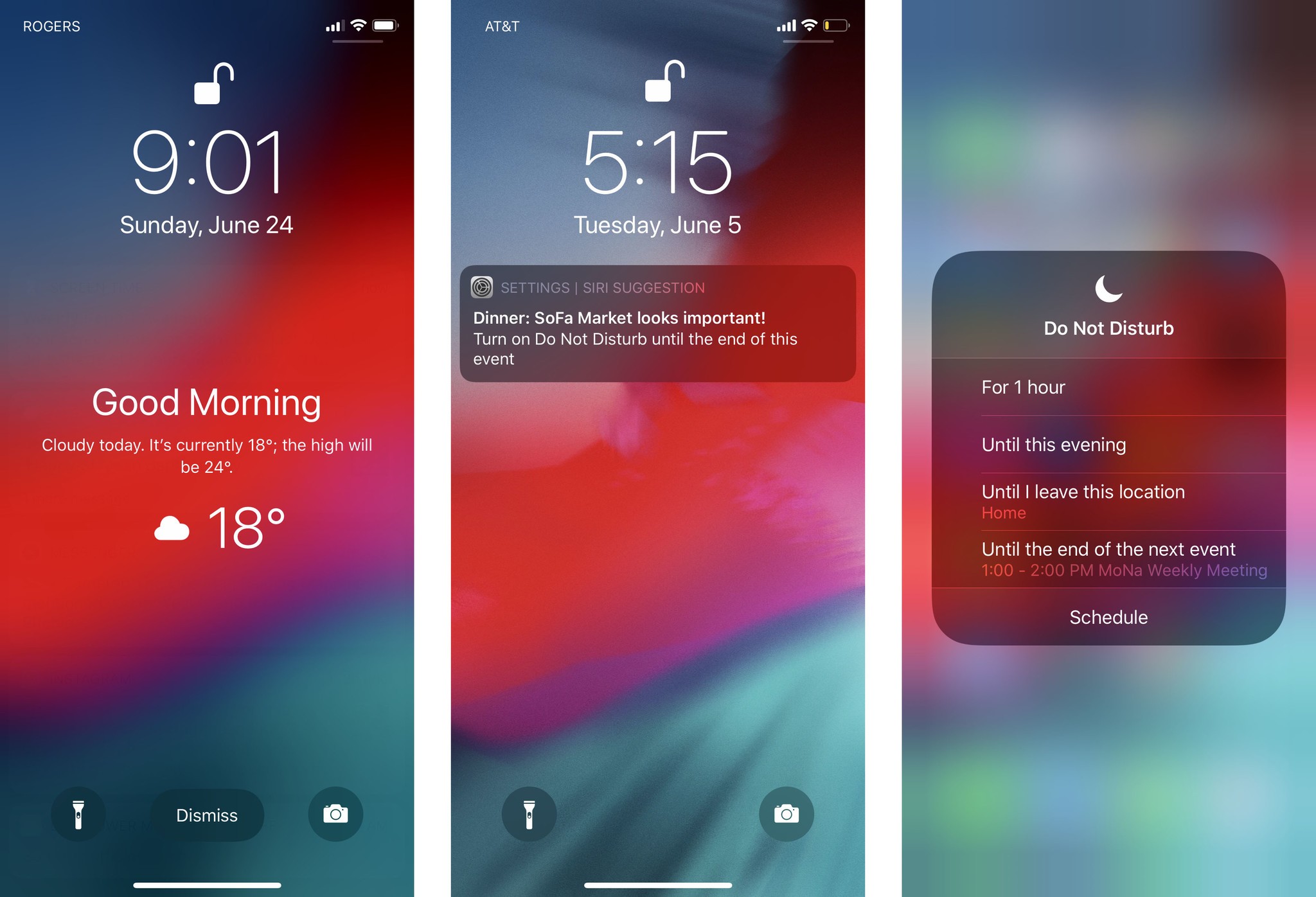
There's also a provision for Critical Alerts, which include healthcare, public safety, and personal security apps, and will let them — with your explicit approval — blast through any DND setting and even the ringer switch set to mute and play a sound to help make sure they get your attention. Apps have to apply for a special entitlement to use Critical Alerts, and need to present a special permission request for you to approve, so the chances of them being abused are very, very low.
But, if your blood sugar is low or your alarm system is triggered, and you have your device with you, you will know about it.
As someone who has turned on DND to work or film and forgotten to turn it off, I really appreciate these settings. People can feel anxiety when cut off the same way they do when turned on, so just knowing you don't have to worry about forgetting to change states makes using DND so much more compelling.
This is coupled with Instant Tuning for notifications. With it, you can adjust the alerts you get right from the alert itself. For example, you can set a notification to deliver quietly or turn it off entirely.
It's another example of push interface, surfacing functionality where and when needed. You can even tap to go to straight from the notification to Settings if you want to set custom options.
Now, it does create two classes of notifications:
- Prominent notifications are the ones we're all used to. They light up and stick to your Lock screen, beep and/or buzz your phone, banner the top of your screen, badge your icons, and get collected up in Notification Center.
- Quiet notifications, by contrast, skip the lock screen, never beep or buzz, and don't banner or badge. But, they still get collected up in Notification Center.
If you choose to turn off rather than just quiet notification, you're presented with a confirmation sheet. That's partly to prevent accidental turn offs, partly to provide developers with a way to offer you alternatives. For example, a Twitter client might offer a Configure button that lets you choose to turn on or off different types of notifications or notifications from different people.
In other words, it basically deep links into in-app Settings for better customization. Apple is also providing a deep link from the system Settings to in-app settings, if available, as well.
Now, there is a potential downside. Because you can now manage notifications from within notifications, Apple is being more lenient about when and how apps can send you notifications. It's called "provisional authorization" and it's intended to be a way for apps to let you test out their notifications rather than forcing you to grant or refuse permission right up front, with no context or experience around what type of notification you'll be getting.
It's opt-in for developers. If they opt-in, you'll no longer get the notification permission pop up when you first set up an app. But, there's a price — any notifications they send will be delivered quietly by default.
If and when you see one of these provisionally authorized notifications in Notification Center and expand it, it will also give you Keep and Turn Off buttons, and a Configure (in-app) button, if available, right up front. The hope is, at that point, you'll know enough to make a more informed choice.
I'm not sure how I feel about all this yet because I'm not getting any of these notifications yet. Will they prove helpful or annoying? Now that iOS 12 has shipped, they're going to start coming in, and I'll have more and better data to help me make up my mind.
You can access Instant Tuning either by swiping the notification and tapping on Manage, or by opening the rich notification and tapping on the More (•••) button. Siri can also suggest muting or turning off notifications for apps it notices you're no longer using.
It's terrific. But it's also about damn time.
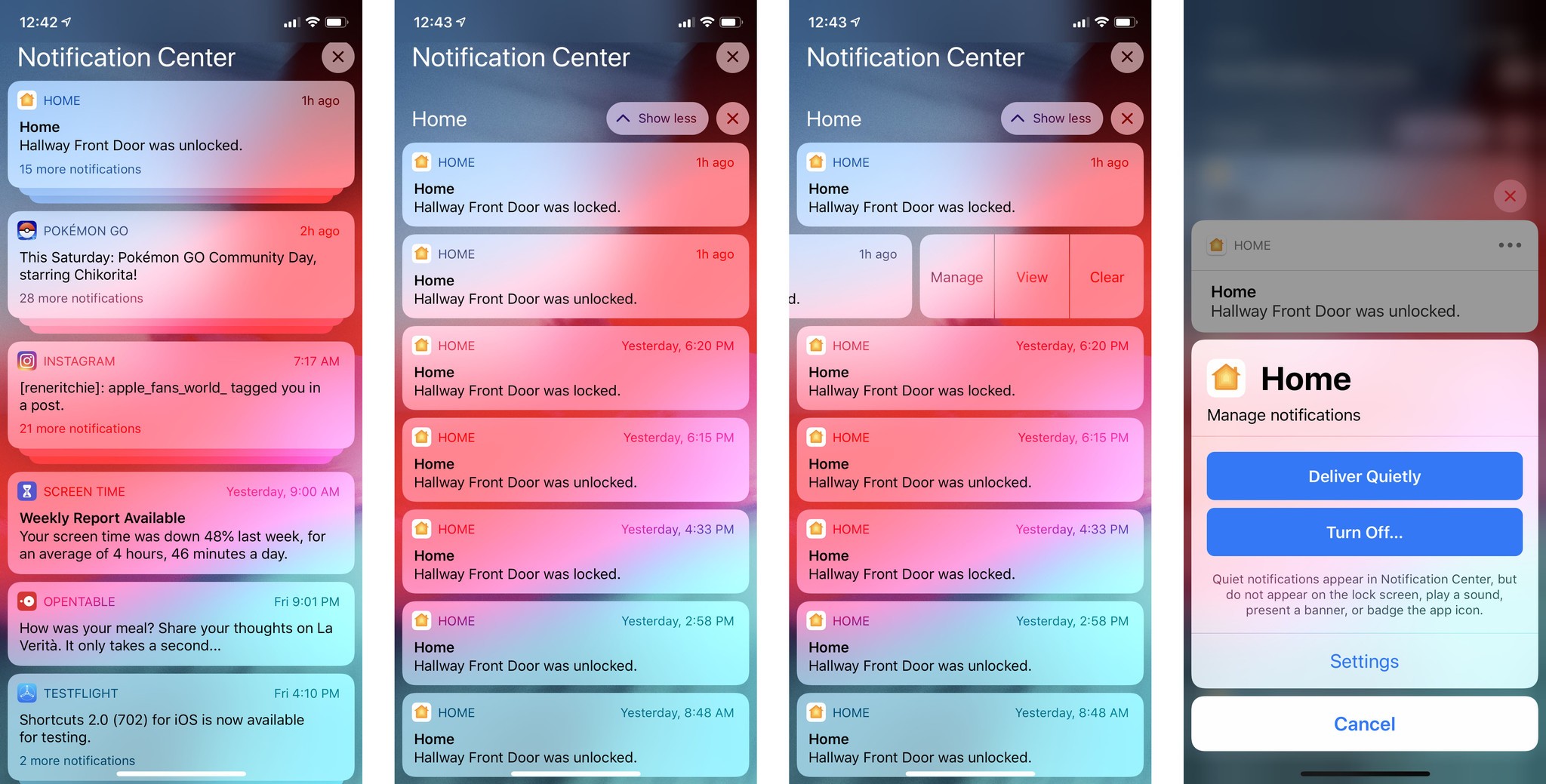
Speaking of which, notifications are no longer presented as single items in a reverse chronological list. Now, they're automatically grouped, both on the Lock screen and in Notification center.
By default, notifications are grouped by app using the bundle ID. Get a new notification from an app and it goes right to the top of that apps stack. (Groups are now presented in reverse chronological order based on the most recent app to receive a notification.)
Developers can also use the existing thread identifier property to set up custom groups. Messages, for example, aren't all jumbled together. Instead, each conversation gets its own group.
Also by default, each group contains a summary at the bottom right indicating how many individual notifications are in the group. But, developers can override the default text if there's more pertinent information they want to provide.
You triage notifications a group at a time, which is a great compromise between one at a time and the scorched earth that is 3D Touch Clear All.
If you don't like groups or threads, you still get the final say. You can go into Settings > Notifications > find the app or apps you want to change, and switch from Automatic (grouping) to By App (no sub-grouping), or Off (old-style, no grouping at all.)
Tap on a group and it expands out to show you each individual notification. In the expanded state, you can clear all the notifications or act on any single notification you want.
Interactive notifications are also being improved. Building on the notification content extensions included with iOS 10, iOS 12 now lets apps dynamically update or even remove options as context changes. So, for example, if you already liked a friend's video through the notification, and then you open the notification again, you won't still find that Like button staring at you, making you wonder if you really smashed it hard enough the first time. Instead, it could present you with an Unlike button (shudder).
Rich notifications can also now receive direct interactions. So, for example, instead of having to hang a Like button beneath the video notification, developers could integrate a thumbs up icon right into the notification itself.
Because this adds complexity — some people might be used to jabbing a notification to open the app, for example — developers can now also create custom buttons and triggers to open the app or dismiss (but not clear) the notification.
To continue with the same example, tapping the video could open the video app, or tapping the Thumbs Up icon could like it and dismiss the notification.
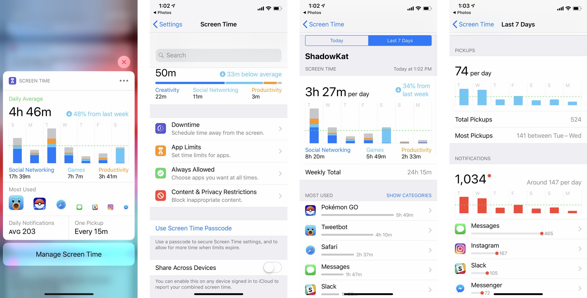
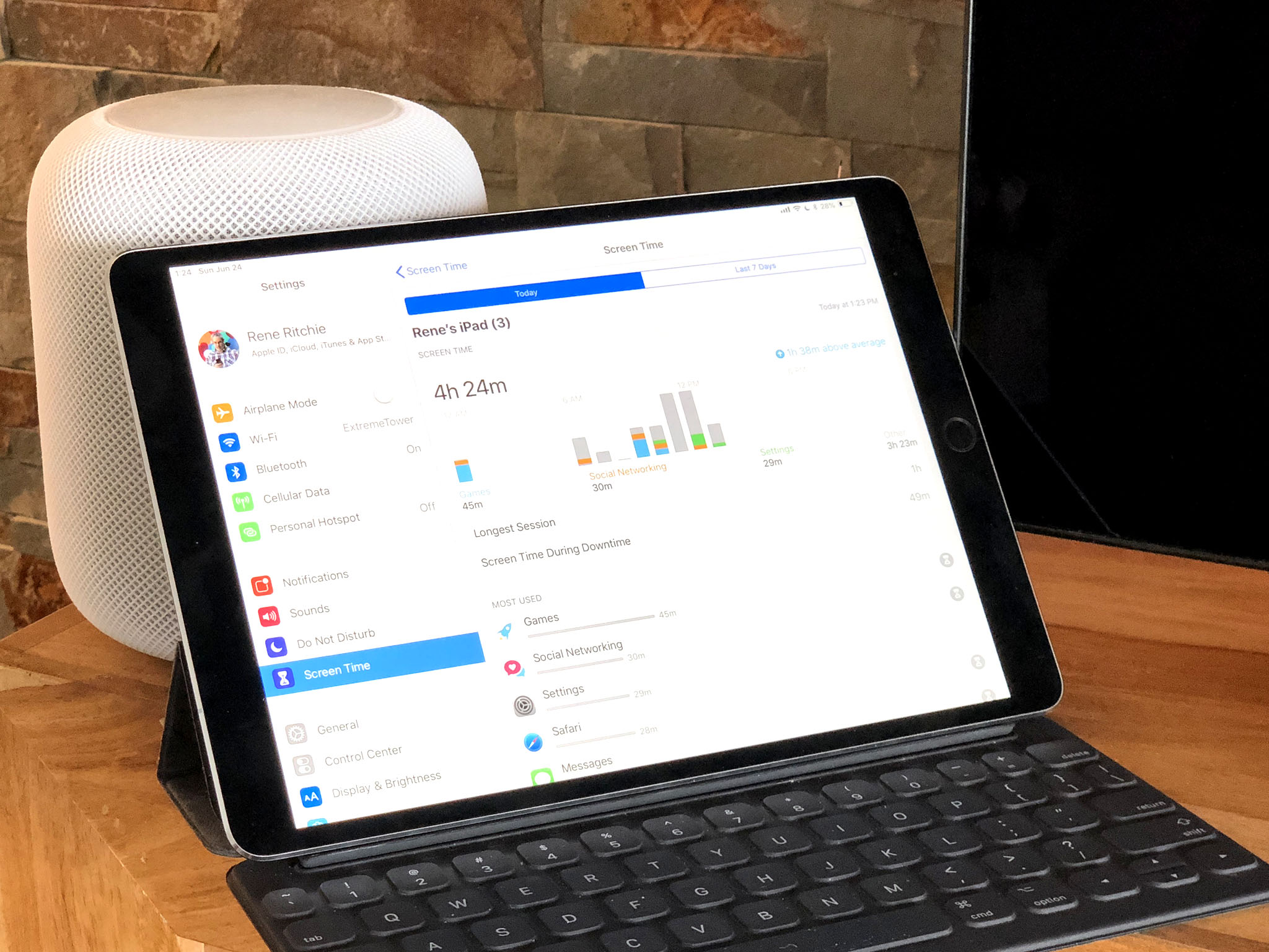
Screen Time proper is all new. It lives in Settings and was designed to provide you with a dashboard that shows how you spend your time on your Apple devices. In other words, it's not here to screen shame you. It's here to screen inform you.
It shows the time you're spending on your device and how you're spending it during the week, during the day, and even throughout the day. There's a big graph, which helps to visualize it, and you can tap into it to get more detailed information.
It's also broken down by categories like social networking, entertainment, and productivity, and will highlight time you might want to be especially careful about — like after bedtime when you should be sleeping, not correcting everyone who is wrong on the internet … !
You can see how your current usage relates to your average usage, and you can also see per-app usage, how often you're picking up your device, and what apps you're going to first when you unlock your device.
Also, you can see how many notifications you're getting, including an hourly average, and which apps are sending those notifications and how many.
You'll also get a weekly summary pushed to you as a notification, so if you forget (or "forget") to check it out, it'll come to you.
If you're not happy with the amount of time you're spending in one or more apps, you can set up App Limits. It's useful not just for people who can't control themselves but for people who lose track of time, especially in apps like social networks and games that are designed as attention traps using the same type of psychology perfected in casinos over the last few decades. Yeah, please do shudder.
Tap on any app in your report and set any amount of time, on any or all days, you want. You'll then get a notification telling you when you're almost at your limit and an intercept sheet when you've reached it. You can choose to dismiss the intercept and ignore the limit if you want to, but you'll only be cheating yourself.
If you own multiple Apple devices, like an iPhone and an iPad, App Limits will also sync between them so you can't just switch devices to stop the clock.
If you're a parent, you can set up your children's devices to send you their Screen Time reports as well. Also, instead of App Limits, you can set up App Allowances that sets the amount of time they can watch videos or play games. Kids can even send you a request for more time — which kinds of defeats the purpose of the machine being the big bad.
You can set up Downtime, which blocks almost all usage, and/or you can limit time by app category or individual app. You can also white list apps like Phone, so they can always call home in case of an emergency.
And, of course, Restrictions (Parental Controls) are still there, albeit jostled around a little, so you can turn off specific functionality and content types as you see fit.
It's all tied into the existing Family Sharing infrastructure, so you can manage what your child does on their device(s) through what is sent back to you on your device(s).
So far, every new beta — and there have been so many betas this year, has wiped screen time and sometimes turned it off without my realizing it. My testing has also completely thrown off the results, as I've spent more time in some apps than I would if I was just using my phone as a normal human. So, like much of iOS 12, I'm going to have to spend some extra time seeing how everything really works in the release version.
I am worried that I'll spend so much time in Screen Time that Screen Time will show up in Screen Time, but ultimately information is good. I like that Apple is providing all this insight and functionality without pandering to attention seekers or infantilizing users.
Did we worry about page addiction when kids spent all day reading books? Should a carpenter be told how much time they spend with their saws and chisels? Or, is it less about what we're doing with technology and more about what we might be missing out on beyond technology?
I believe nature and life tends towards balance. So, if Screen Time helps people achieve that for themselves and their families, more power to it — and us.
iOS 12 Messages & FaceTime
New Animoji! This is not a drill! New— Sorry. Yeah, Animoji are a gimmick but they're an important one. First, they not only provide a real-world example of what face detection in ARKit can do, but they harness the appeal of emoji to provide a gateway into augmented reality itself.
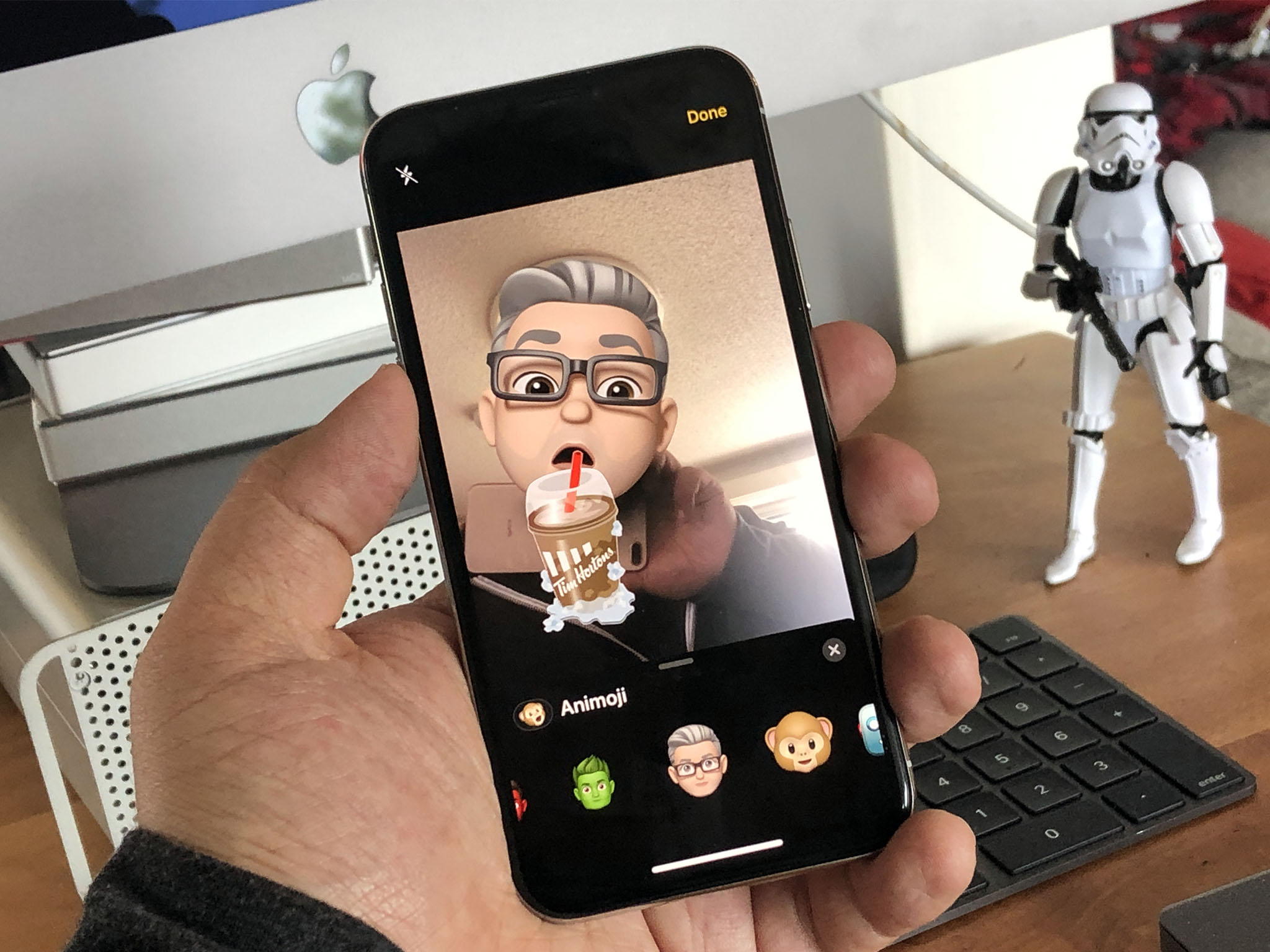
Like many Apple projects, they started small. At iPhone X launch, only a few Animoji were made available. More came in the spring, though, and now Ghost, Koala, Tiger, and even T-Rex are joining them.
All with support for ARKit 2's better eye tracking and tongue detection, of course.
But Apple isn't stopping with Animoji. With iOS 12, we're also getting Memoji. That means we can all build our very own Animoji and, better still, multiple Animoji.
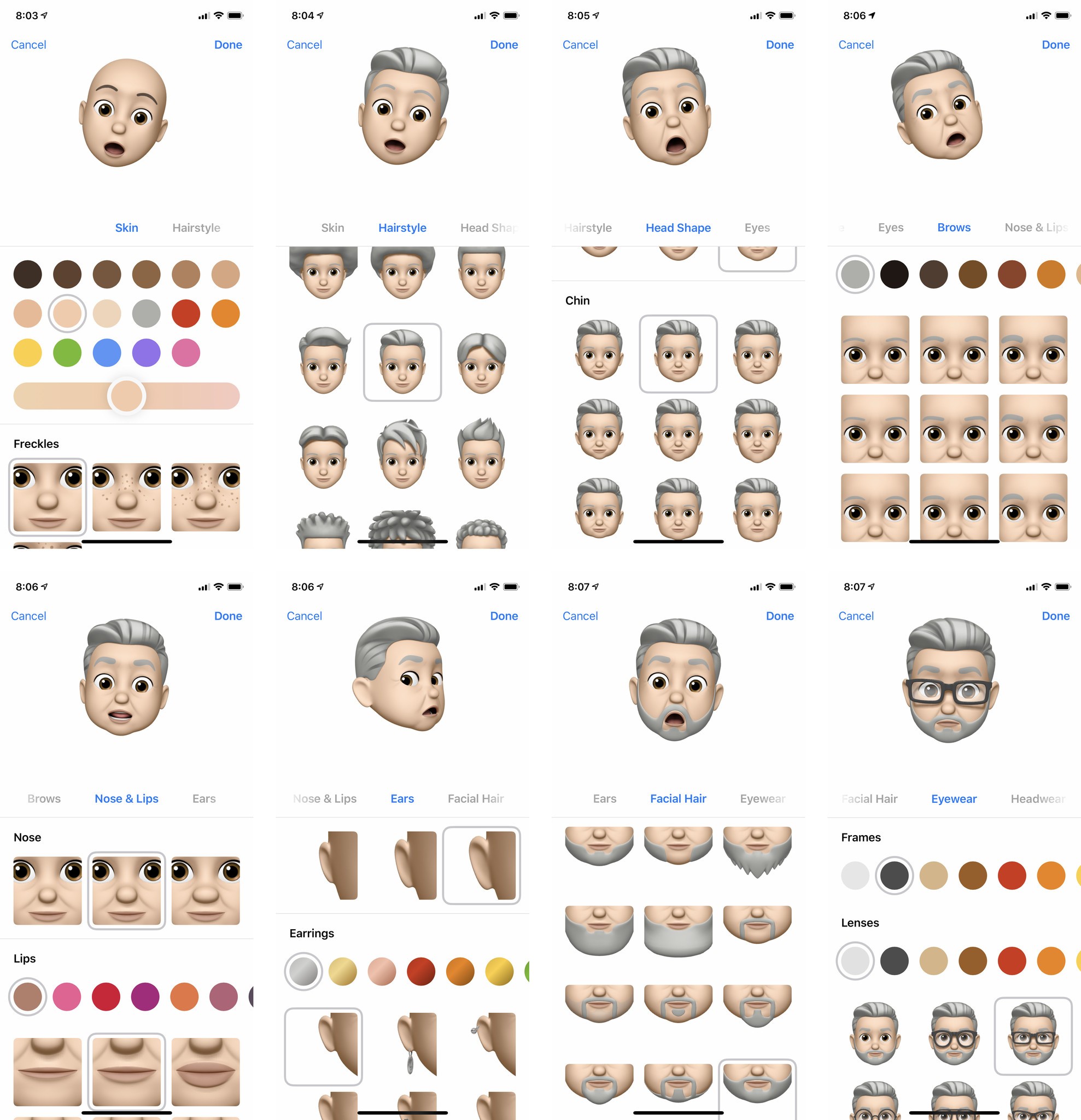
You start off with a blank slate … er, face. Gender neutral, devoid of hair, freckles, or distinguishing features of any kind.

You start customizing your Memoji by choosing a skin tone. All the standard emoji tones are there, but so are all the colors of the rainbow and even gray. You can also choose freckles here, with four options from none to a face near-full.
The point is, you can make your Memoji as you are, as you see yourself, as anything you can imagine being. It can be literal but it can also be limitless.
Next is hairstyle, which includes main color, cut and style, and highlight color. All the same color options are available here and there are a bunch of great cuts and styles, though nothing overly long. The physics are also amazing, especially on longer hair.
Head Shape lets you choose your age which, honestly, really only varies from looking like a 3-year-old to looking like a 7-year-old. (Though it fits with the cartoon emoji style, I'd love to see more wrinkled options.)
Chins give you some cheek and jowl options, but nothing cleft. Superman and I are both shook by this.
Eyes can also be any one of the natural or rainbow colors, and in any one of nine shapes. Eyelashes have nine level of thickness, from born-with-it to maybe-Maybelline, and eyebrows a whole screen of options.
You can choose from three nose types, from button narrow to button wide, and nine lip types — with the usual color range here as well.
Ears also have three options, from flat to slightly stand-out, and there are a dozen earring options … though sadly nothing for AirPods.
More importantly, there aren't any accessibility options yet. No hearing aids, no accommodations for people with different colors per eye, lack of eyebrows, birthmarks, maybe even scars? It's an Animoji system, so we can debate how far it should go, but I do think it should go arther than it does now.
You can customize sideburns from clean to Elvis and mustache and beard through a wide range of combinations, including the Mr. T. (No Dalrymple, alas, but I assume Jim — and ZZ Top — have already filed bug reports.)
Eyewear includes options for frame and lens color (though not as many as other sections) and a dozen styles. Headwear has everything from turban to top hat, pith helmet to pillbox.
Once you've made a Memoji, you can duplicate it and make variants. For example, with sunglasses or hats, or with your hair up or down.
You can use your Memoji(s) just like any Animoji, either recording now-up-to-30-second animated clips with sound or sending them as still images or stickers.
But you can also use them — and standard Animoji — in the new, embedded Camera. (I'm going to call it the AR Camera even though Apple isn't — at least not yet.)
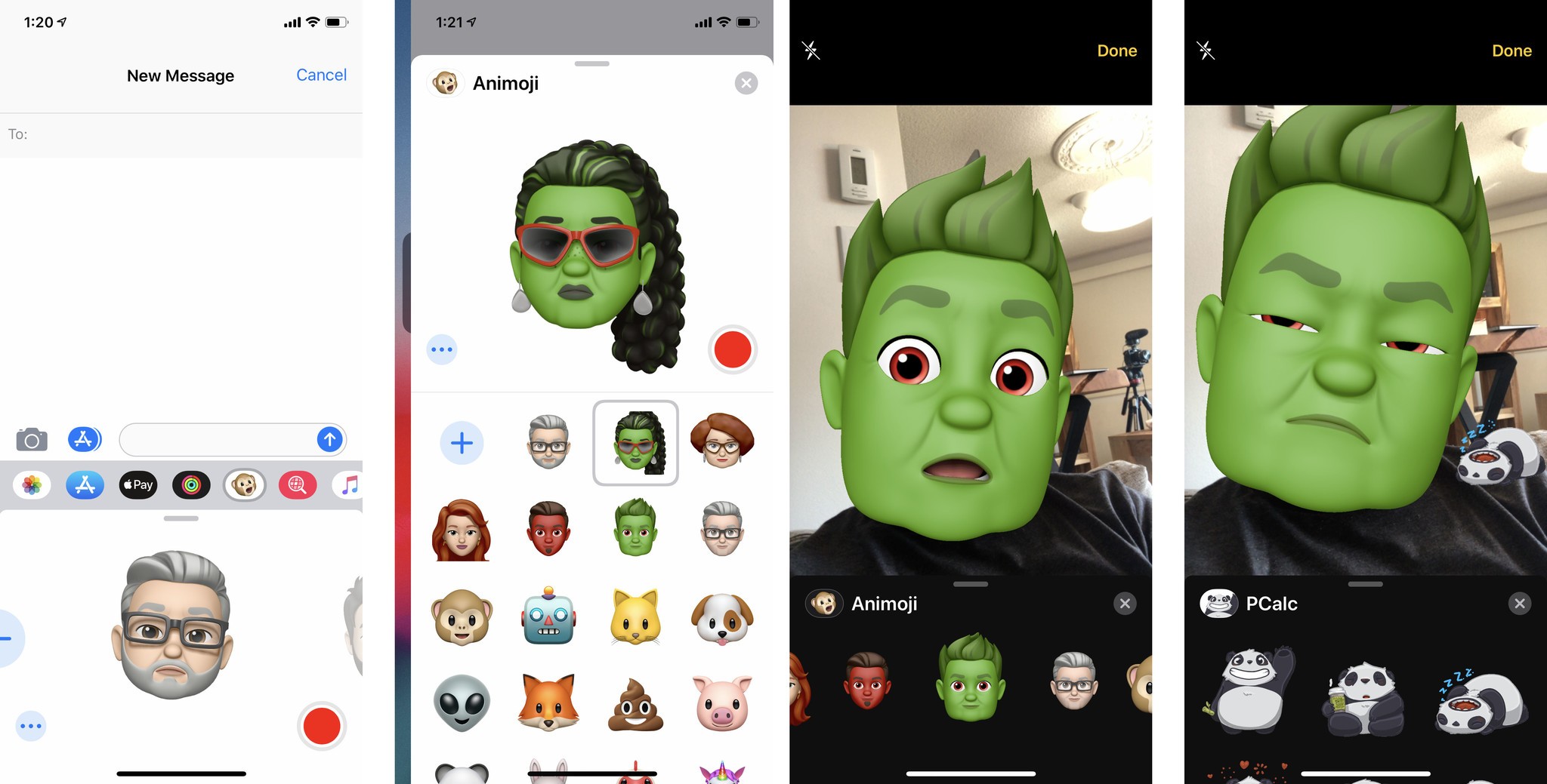
Tap the Camera button, tap the Effects button, and you get a front-facing "selfie" view that gives you access to dynamic versions of Messages apps. There are filters that look like something out of the Clips app, including Comic Book, Comic Mono, Ink, Watercolor, Watercolor Mono, Vivid, Vivid Warm, Vivid Cool, Dramatic, Dramatic Warm, Dramatic Cool, Silvertone, and Noire.
All your iMessage stickers show up here as well and, thanks to ARKit, you can stick them not just into the real-time camera view, but too whatever objects it can detect in the scene.
There's even a new Apple-supplied Shapes sticker pack that includes stars, hearts, squiggles, arrows and more.
Gussy a shot up any way you want, including with your favorite 'moji, and hit send.
Sure, it only works with the front-facing TrueDepth camera on iPhone X now, but more and more devices will be getting that camera. And maybe on more than just the front. (That's also why I think the main Camera app doesn't have this feature yet — Apple's waiting for the fall when it might just go both ways.)
Because the Camera button takes you directly to the AR Camera now, Photos has been demoted to a button in the app strip. Right now, I hate that. I keep hitting the Camera button out of habit and there's no elegant way to press on — no "mercy, Photos please!" button in the Camera — so you have to back out. Awkwardly. Over and over again.
Maybe new habits will save me or Apple will take pity on me and figure out something better. We'll all have to wait and see.
FaceTime gets the new AR Camera as well and you can use all the same features and effects. It's especially great in FaceTime because if you're caught unexpectedly, you can just slap a filter or 'moji onto your mug without having to worry about what you really look like at the time.
It's even better with FaceTime Group calls... or it would be if FaceTime Group Calls had been ready to ship. Unfortunately, that feature is taking longer than Apple expected and so it's being pushed back to a future update later this year.
That's fine. I've waited eight years for it, I can wait another couple of months. Especially given how great it's worked in the few controlled demos I've tried. They were even better than I dared hope or dream.
I'll update this review when FaceTime Group calls ships.
Because this is Apple, even with the new features, both Messages and FaceTime remain end-to-end encrypted, keeping them private and secure.
iOS 12 Privacy & Security
Security requires a degree of convenience. If security is too inconvenient, people stop using it. Touch ID and Face ID are examples of this but there are many more. Apple's been actively working to make security more convenient for years and iOS 12 continues that tradition.
Face ID on iPhone X, and on the upcoming iPhones XS, XS Max, and XR will now let you retry failed scan attempts simply by repeating the swipe up gesture. It's much better than the current version where it immediately and unforgivingly dumps you into Passcode after a single failed attempt.
You can also register an alternate appearance for Face ID now. No, it won't let you add a second person to Face ID. What it will do is, if you work or socialize with an appearance that's significantly different, store that version as well to let Face ID cover you to a greater agree. Performers, cosplayers, people who wear safety equipment on the job, people transitioning, people with prosthetics. It's not something everyone will need but it is something that will benefit some people enormously.
Touch ID also gets integrated into the iCloud Keychain AutoFill system, like Face ID was at launch. It means, if you have an older iPhone, you can now hand it to someone to make an emergency call or to look up something at a conference without worrying that you're giving them your logins and credit cards at the same time.
Combined with new strong, unique password generation for Safari and in apps, it makes iCloud Keychain a first-class password manager for anyone needing basic functionality. And today, that's everyone.
If you get sent an SMS security token as part of a login attempt, the QuickType Keyboard will now suggest that for AutoFill as well. That saves you having to test your memory or jump back and forth between Messages and the web or an app. I'm not a huge fan of SMS-based security tokens, because people have socially engineered them or used them while in possession of a device, but for most people, it makes what can be a cumbersome process more manageable.
To that end, Apple has also added "Hey Siri, show me my passwords" so you can go straight to your account list. You can even ask for specific passwords, for example, "Hey, Siri, show me my Instagram password".
Re-used passwords are flagged in the account list and there's a link to the web or app so you can replace them with new, strong, unique passwords too. Fabulous.
You can also share your passwords between nearby devices, including Apple TV, which is so much more convenient.
For people who already use or need a more advanced password manager, Apple is providing a Password Manager API to integrate them into AutoFill as well, so you can inject your 1Password, Dashlane, LastPass, etc. credentials right into any website or app as well, no Share Sheet required. I can't overstate how great — and important — this is.
Proactively, iOS 12 also includes new and improved Intelligent Tracking Prevention. Previously, ITP used machine learning to try and prevent cross-site tracking. Now, it can also block the share, like, and comment buttons that social networks like Facebook and Twitter use to track you across the web.
ITP will also try to prevent "fingerprinting" — where companies try to track you based on the configuration of your device — by presenting a simplified, much harder to track configuration. It also removes support for legacy plugins that could be used for tracking.
iOS 12 Accessibility
Everything from ARKit Face Tracking, which smart developers have used to make the Mac navigable by head turning and mouth clicking, to Siri Shortcuts for triggering actions and workflows are, at their core, major accessibility features.
But they're not the only new accessibility features – Apple is also bringing Live Listening to AirPods.
Previously available to hearing aids, Live Listening lets you add a button to Control Center that, when tapped, turns on your iPhone microphone and streams any audio it picks up to your AirPods.
So, you can turn it on, put your iPhone down next to the TV, or the lecture stand, or the baby crib, and take your seat or do your housework, and hear everything you might otherwise have missed.
It's not the same as real hearing aids but it's also not as expensive, especially if you're already using AirPods.
iOS 12 Miscellany
There are a ton of smaller but important new features in iOS 12 that deserve some attention. You can throw away app cards on iPhone X without having to touch, hold, and bring up the kill buttons any more. Of course, you still shouldn't force quit apps... unless like Facebook, Snapchat, or Pokémon Go, their resource use means they have it coming.
Battery Health, introduced in iOS 11.3, now shows Screen Time-style charts so you can get the gist at a glance but tap into a bar for more detailed information any time you want.
Wallet has support for Student ID cards. Educational Institutions have to add support for them, but if and when they do, students can use their iPhones or Apple Watches to tap into libraries, gyms, cafeterias, dorms, labs, vending machines, events and more.
It uses NFC and other Apple Pay-like technologies, and would be super useful for businesses as well as schools, so here's hoping Apple expands the feature over time. (Rumor has it Apple Park was the first deployment.)
CarPlay now supports third-party Maps, including Google Maps and Waze, which should make a lot of people happy.
There are new dictionaries for Arabic and English, Hindi and English, and Hebrew and English, and a new English thesaurus for synonyms and antonyms.
iOS 12 Conclusion
Apple calls iOS 12 not just the most advance but the most personal mobile operating system in the world. For those for whom "personal" is synonymous with customizable, it doesn't ring true. For those for whom "personal" is synonymous with private, it resonates loud and clear.
There's a lot I'd still like to see from Apple, from small details like rotation lock for everything but photos and video, to rounding out foundational technologies with handoff for media and the ability to change default apps, to re-revolutions like a new Home screen experience and far deeper and more personal, though still private, context for Siri.
Maybe that'll come tomorrow with iOS 13. Today, iOS 12 is the biggest sign yet that Apple is starting to think beyond multitouch interfaces by finally opening voice to all apps, and beyond current devices by pushing augmented reality so far, so fast.
But, in the meantime, there are still performance improvements for past devices and better security and privacy, and a ton more fun, for the here and now.

Rene Ritchie is one of the most respected Apple analysts in the business, reaching a combined audience of over 40 million readers a month. His YouTube channel, Vector, has over 90 thousand subscribers and 14 million views and his podcasts, including Debug, have been downloaded over 20 million times. He also regularly co-hosts MacBreak Weekly for the TWiT network and co-hosted CES Live! and Talk Mobile. Based in Montreal, Rene is a former director of product marketing, web developer, and graphic designer. He's authored several books and appeared on numerous television and radio segments to discuss Apple and the technology industry. When not working, he likes to cook, grapple, and spend time with his friends and family.
