I'd love lock screen complications in iOS 12

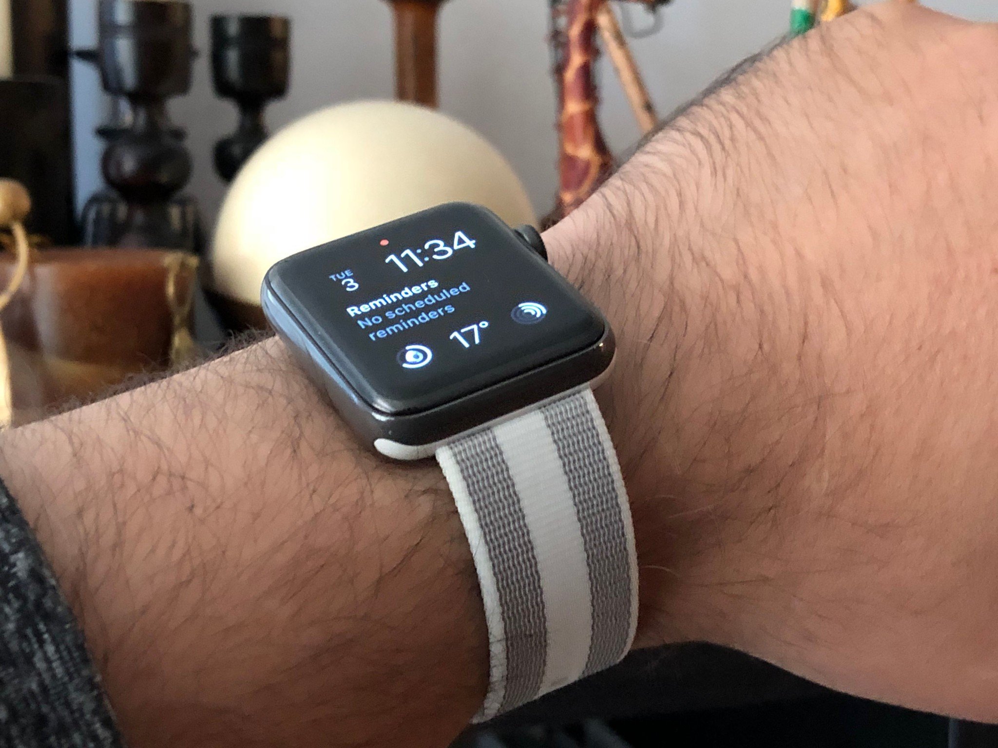
One of the best things about Apple Watch is how the watch face makes so much data so immediately glanceable. That's thanks to the watchOS take on "complications", They're hyper-dense and provide immediate access to a wealth of information. I've become so dependent on complications that, if I'm ever not wearing my Apple Watch, I inevitably find myself staring at my wrist trying to figure out where they've all gone.
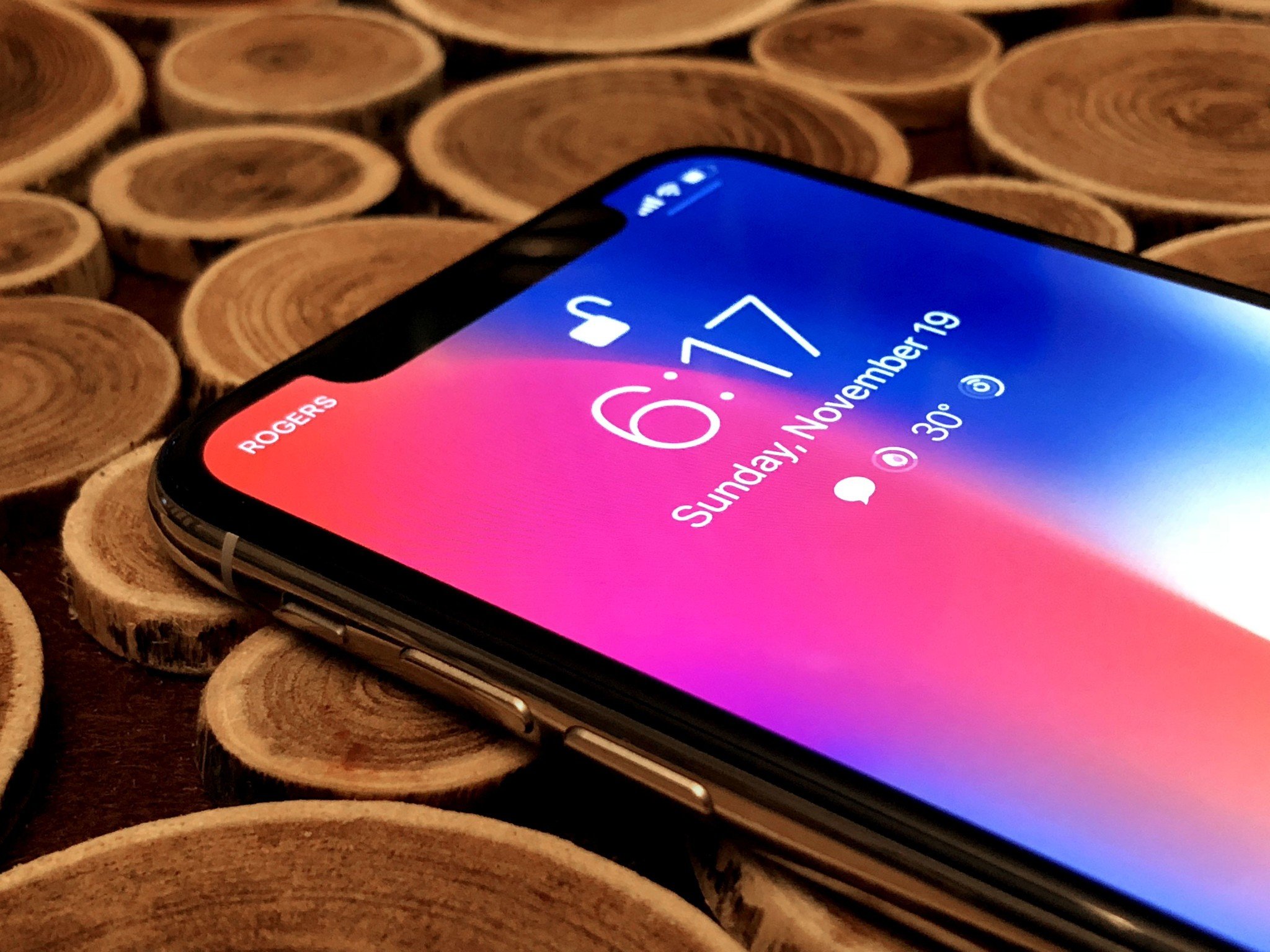
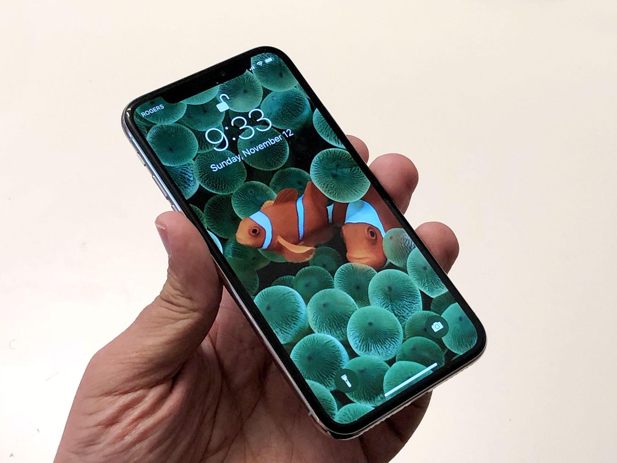
I've tried using my iPhone's Lock screen to fill the same need but it just can't do it. It can provide notifications when they come in, but not persistent information when I want it. For that, I'd need Lock screen complications. And I'm hoping for them in iOS 12.
It's complicated
"Complications" refer to any feature on a watch beyond showing the time in hours and minutes. Apple Watch takes advantage of the transition from analog and digital to computational to show more and different types of complications. Almost subconsciously, I'd gotten used to subtly turning my arm and remaining passively, constantly aware of the weather, my activity progress, my calendar, and more.

iPhone has had widgets for a while now but you have to swipe to see them. And widgets are different in kind from complications anyway. Complications are available the instant the screen lights up, no swipe needed. They're also small, so you can really take them in at a glance, and discreet, so they help better maintain privacy.
That's why I'd love to keep the widget sheet, by all means, but also have complications available right on the Lock screen.
Security, privacy — launch-ability
Having complications on the Lock screen would be great for security and privacy. Widgets are currently binary — they're either on or off. You can't filter out ones that might have more personal information and keep them off when you're locked but on when you're open. If you choose to have them viewable, even with Touch ID or Face ID, anyone who picks up your iPhone and starts swiping across can see them.
Notifications are similar. You can turn off previews, or make them Face ID awareness dependant on iPhone X, but as long as they're on they leak some information.
Master your iPhone in minutes
iMore offers spot-on advice and guidance from our team of experts, with decades of Apple device experience to lean on. Learn more with iMore!
With complications, you could have more options. For example, if notifications on the lock screen aren't private enough for you but you're okay with simple quantities, a complication could show you how many VIP mail or text messages are waiting for you. That way you can easily see that there's something important to check, but you can't see the senders unless and until you unlock your iPhone.
The lock screen could also use complications as a way to launch a wider variety of apps: With a tap you could instantly be in Mail or Messages to check your communications, or in Calendar or Weather for more information about your upcoming appointment or the temperature later in the day. You could even perform simple actions like starting a Timer or Stopwatch.
You'd have to Touch ID or Passcode in, which would make them slightly less than instant. But with Face ID, it would feel instant. Look, tap, in the app.
Many of the same complications that currently exist on the Apple Watch could be translated over, but there'd also be an opportunity to do something uniquely iPhone. They would take some careful thought and planning, of course: The way notifications take over the lock screen would have to be considered, or even reconsidered, for complications not to get covered over or otherwise lost.
Always on

iPhone X has an OLED display and, thanks to its new touch layer, tap-to-wake. That would make complications even more convenient. Just reach over, tap the screen, glance at your complications, and move on. But OLED also offers the opportunity to take things to another level: always on.
Because of OLED's low power characteristics, complications could be left on, in a mid-to-dark gray, all the time. That way, any time you glanced at your Lock screen, you'd be able to see a notification count and take in all the glanceable date, time, weather, and other information you need.
It would come at a cost — everything in mobile is paid for with battery life. But the tradeoff could be worth it.
iOS 12
iOS 12 is already being planned out by Apple. By now, the tentpole features have probably been penciled in and are being sketched out. But that doesn't mean it's too late. That's why I'm writing this. To cast my vote for complications on the Lock screen. And if you agree, let me know!
This feature request has been filed with Apple as rdar://35638751.

Rene Ritchie is one of the most respected Apple analysts in the business, reaching a combined audience of over 40 million readers a month. His YouTube channel, Vector, has over 90 thousand subscribers and 14 million views and his podcasts, including Debug, have been downloaded over 20 million times. He also regularly co-hosts MacBreak Weekly for the TWiT network and co-hosted CES Live! and Talk Mobile. Based in Montreal, Rene is a former director of product marketing, web developer, and graphic designer. He's authored several books and appeared on numerous television and radio segments to discuss Apple and the technology industry. When not working, he likes to cook, grapple, and spend time with his friends and family.

