iOS 13 and beyond: The future of iPhone and iPad
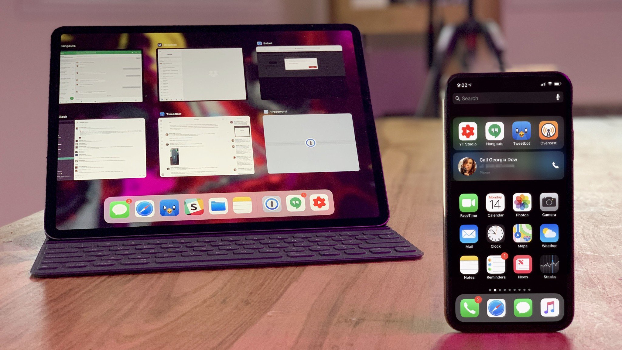
iOS is no longer the simple, mainstream operating system Steve Jobs first showed off in January of 2007 with the original iPhone.
But, it's also not yet the sophisticated, pro-centric operating system geeks have been lusting for since Steve Jobs first showed it off again in January of 2010 on the original iPad.
Some want to keep iOS simple and accessible, like an appliance. Others want to turn it into the Mac.
Both are wrong. And myopic. There's a third path, one that lets iOS continue with its mainstream mission but also take it to the next level in a way that brings everyone forward.
Pause
Once upon a time, rumor has it, a faction within Apple thought iOS 6 was all the operating system iPhone or iPad would ever need. That the object permanence of icon grids was the only way to Home screen, the escape hatch of the Home button the only way to eliminate in-app anxiety, photo-realistic shelves and pool tables the only way to provide context and affordance, and features like AirDrop… just too damn complicated and confusing to ever ship.
This thinking was rooted in a genuine desire to keep iPhone and iPad accessible to everyone, not just the existing computing elites. But you can't give fire to the masses and not let them barbecue.
That was the fatal flaw that not only held iOS back but that let Android become compelling faster, sooner, than might otherwise have been the case.
Master your iPhone in minutes
iMore offers spot-on advice and guidance from our team of experts, with decades of Apple device experience to lean on. Learn more with iMore!
Rewind
Now, there continues to be a point-of-view that the best and easiest way to evolve iOS is simply to turn it into the Mac. Port the Finder to surface the file system, add the menubar so more features can be accessed, enable a pointer so that we can plug in a mouse or trackpad, or just let me dual-boot into macOS already.
This thinking is rooted in how much Mac users love iPhone and iPad hardware and want that hardware to let them not only do what the Mac does, but the way they're used to the Mac doing it. And if you're nodding your head along to all of this, I feel you, because I'm nodding mine as well. But that's a faster horse in what's about to become an age of starships.
That, the cliche of demanding existing solutions we think we need rather than stating problems we have, ones that could and should be solved in new and novel ways, is the fatal flaws that kept Windows from dominating the modern age of mobile.
Fast Forward
Apple has made major foundational changes to iOS before. Multitasking both original and improved, Continuity and especially Extensibility, Apple File System and Swift, multi-window and drag-and-drop, Proactivity and Shortcuts. All based on what came before but also re-imagined on what had to come next. That's the third path.
The one that lets iOS be iOS, not the Mac, certainly not Chrome or Android. But forces it forward into the future, where it can stand fully on its own and no one thinks they need a Mac except for workflow or performance scaling, or Android, except for reasons of personal preference.
Here's what I think Apple needs to do to take iOS to that next level. What, why, and, yeah, breaking my own rules, some ideas as to how.
Lock Screen Complications
Apple Watch provides rich, on-demand information, through complications. With them, not just the time, day and date, but everything from the temperature to your next appointment, stock prices to your current activity level are instantly, glance-ably available. And so are the apps behind them, both the ones made by Apple and many from the App Store.
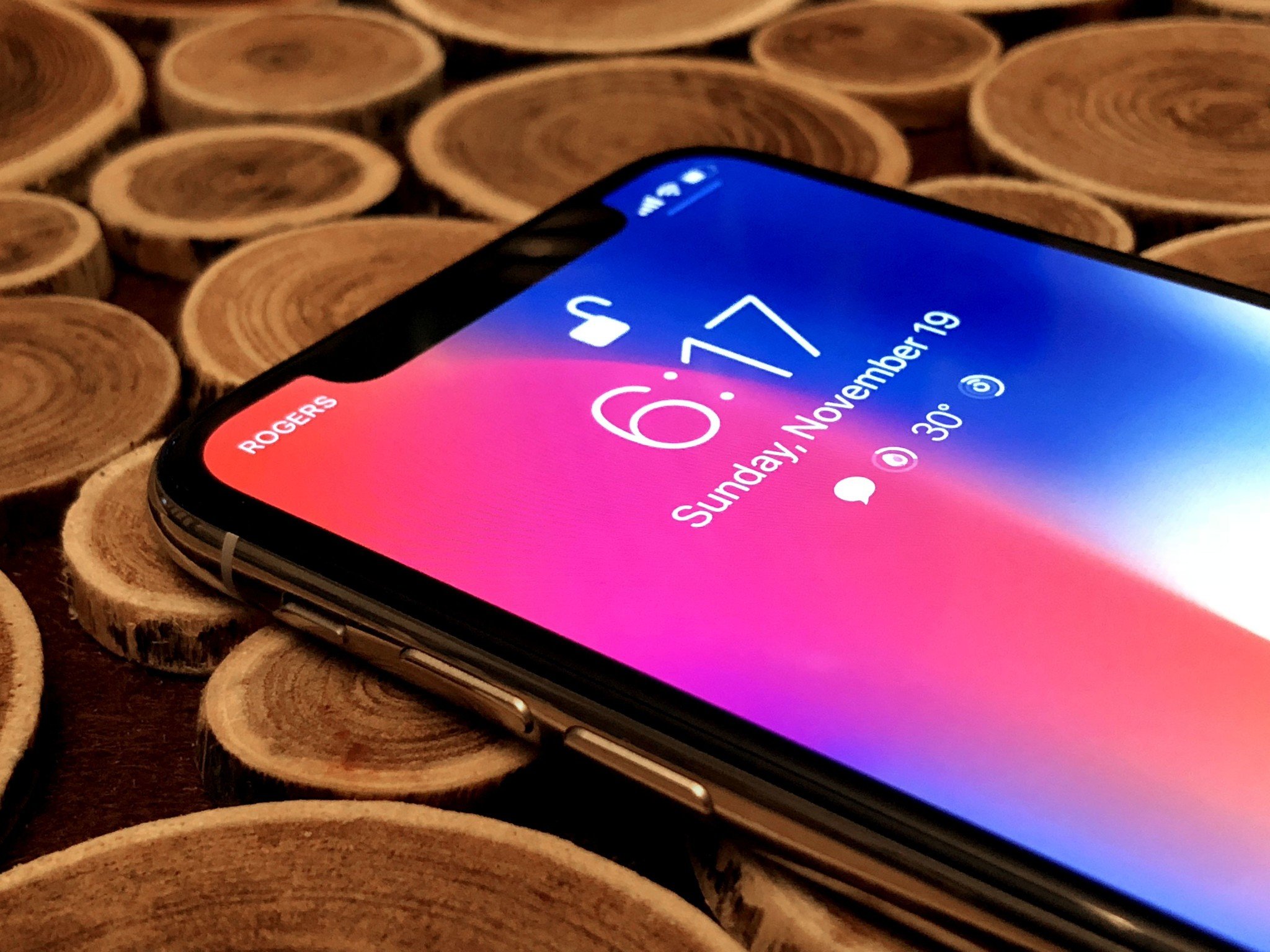
A variety of Android phones do this as well. Some persistently through always-on displays.
Unlike notifications, which bring event-based information to you as it happens, complications are just always there, chill, hanging out, available whenever you want them. And that makes for a huge improvement in convenience.
iPhone currently has time, day and date for information, and flashlight and camera for actions. But a full-on complication system would enable everything Apple Watch and Android has. In the age of machine learning, maybe more.
And, thanks to technologies like Face ID and Attention, which can drastically limit glanceable data until you are recognized as you, it could be enabled in a privacy and security first fashion.
GuestBoard / App Privacy
If I hand my iPhone to a stranger who needs to make an emergency call, or my iPad to a colleague at a trade show who needs to look up something on the web, I'm also handing them access to my personal photos, contacts, health data, appointments, search and location history, and more.
macOS has had a guest mode for a while, which limits strangers to a Safari shell. iOS, despite rumors the idea has been tossed around before, does not.
GuestBoard, which would sit between the logged-out PreBoard and logged-in SpringBoard, would do something similar for iPhone and iPhone — allow for emergency calls or looking something up in a browser shell, without granting access to anything else.
Per-app authentication, or toggling on Face ID, Touch ID, or Passcode in Settings for any app, the way you can currently toggle on notifications, would take it even further — allowing you to hand over a device without allowing access to all your personal, private data.
I know there's some concern about how Passcode gets surfaced there, which is why Secure Notes are so limited and quirky right now, but for a company as focused on security and privacy as Apple, figuring out that level of security and privacy should be a priority.
New Home Screen
Everyone wants a new Home screen but very few seem to have concrete ideas about what it should be. The existing Home screen was always meant to be a portal, not a destination. You never use the Home screen, you simply tap on one of the icons, which is always right where you've become habituated to finding it, and then you're gone and into the apps.
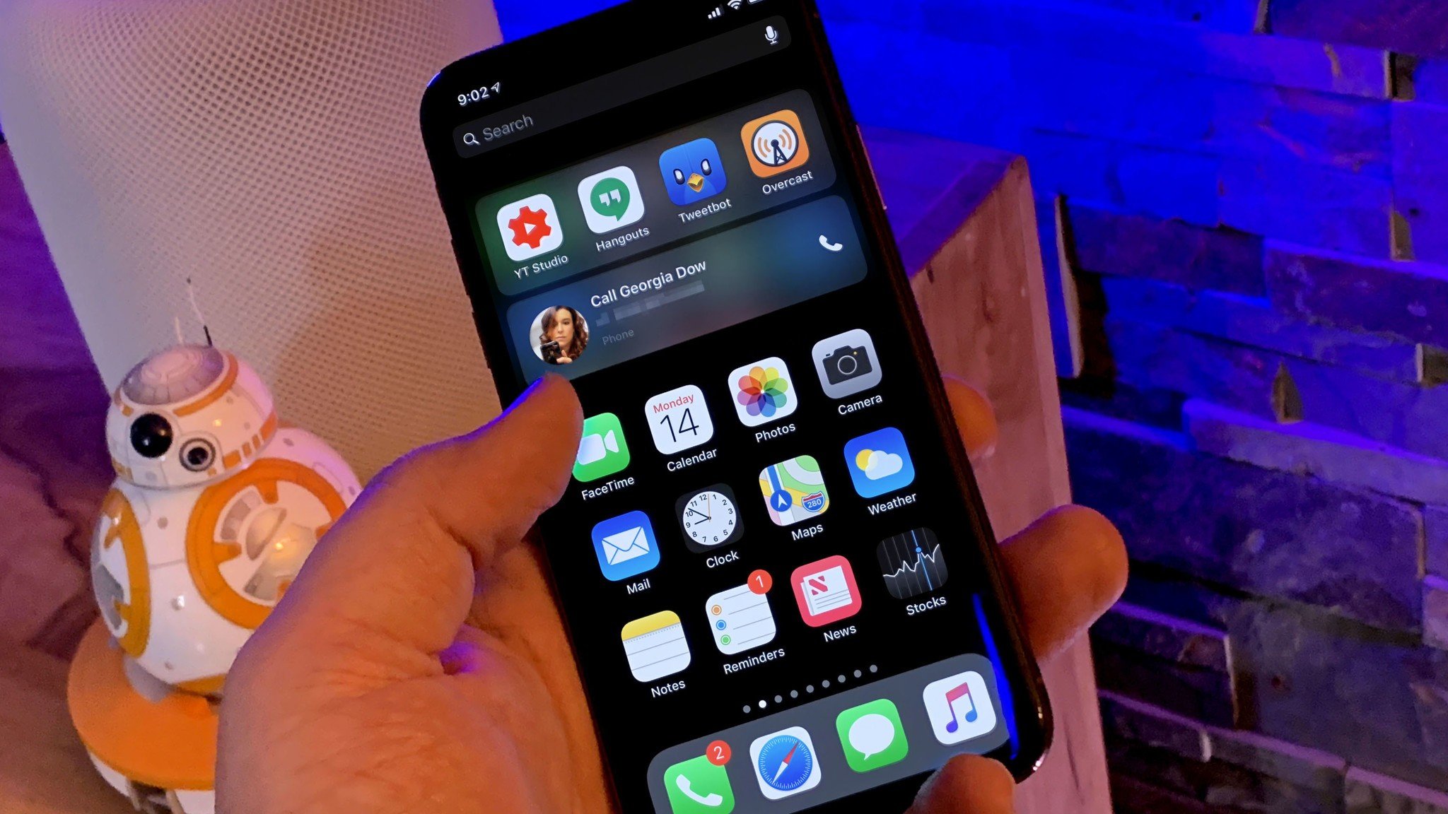
That's why widgets are on the Today view, not clogging up the portal but only ever one swipe in or out from the Lock screen, Home screen, or while using any app.
As apps grew beyond a single screen or average cognitive load, Apple added Spotlight search and Suggested apps. But those were also hidden a swipe away, even though they weren't clogs at all but the opposite — accelerators.
One day Siri and other assistants will let us call down arbitrary functionality when and as needed, even if we don't have apps installed. That future's been clear since Apple launched extensibility and started breaking down binary app blobs in iOS 8.
For now, something that grades from the relevance of recommended apps on top to the permanence of the Dock on the bottom, or vice versa when the ML game gets real tight, and on iPad maybe emphasizes workspaces, mission-control-style over apps, would be a good start.
ThemeKit + FontKit
Everyone wants dark mode until they get it. I'm joking, of course. Dark mode all the things. But really, no. Dark mode is a binary solution to a multi-modal problem. Better than letting you switch between night and day, which you can already kinda do with smart invert, is creating a robust framework so the system and third party apps can either recognize your global preferences or easily let you set things up on a per-app basis.
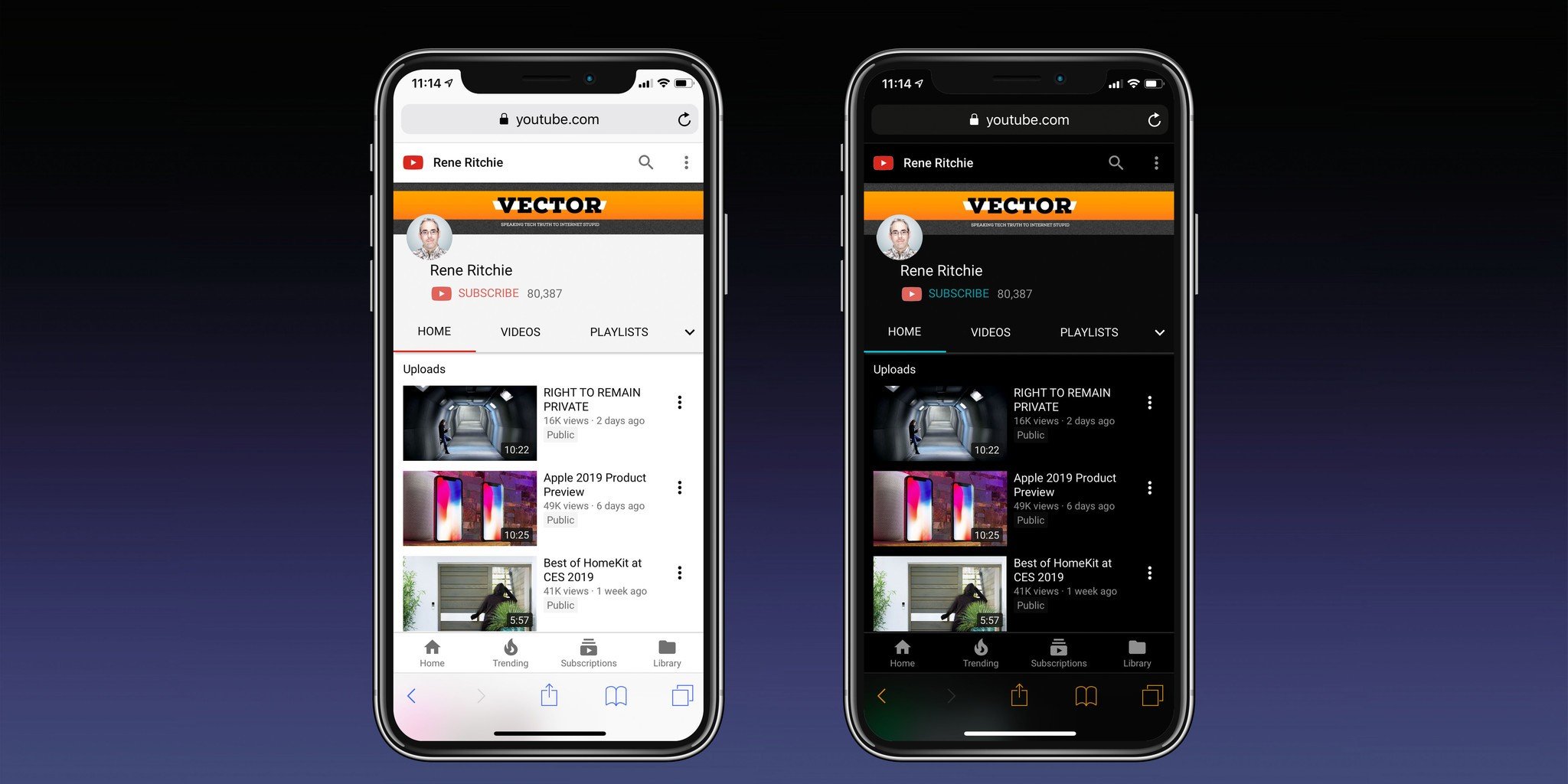
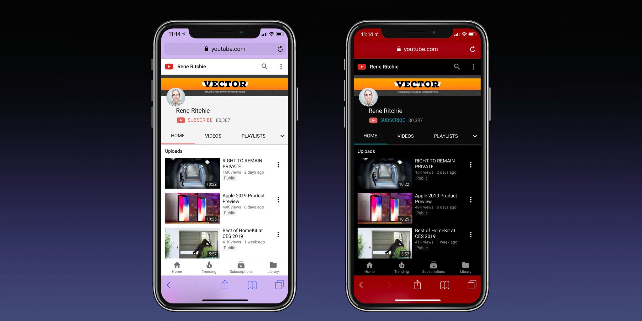
I'm taking about a ThemeKit where, instead of UIKit going from blueish gray to charcoal to bright white, from pin stripes to linen to flat, it can support a range of choices, somewhat like CSS allows on websites.
That way you can have bright modes and dark modes, but also colorful modes, chill modes, and hot modes. And they could apply to any app that uses the default controllers, but also let any app implement and offer its own themes in a standardized, consistent, classy way.
Same with fonts. Adobe Photoshop is about to ship for iOS without any system-wide support for typefaces. They'll pull their own TypeKit stuff down from the cloud, no doubt, but that only starts to solve the problem for them, not for us.
FontKit. System level and system wide. From the company that prided itself on the Macs beautiful faces and type handling at launch, what could be more natural?
SiriOS
I've said numerous times already that I think siriOS is the future and will ultimately solve a lot of the other problems I'm delineating here. But not all of them. We'll still need visual, even tactile interfaces as part of and alongside our assistants.
And yeah, Siri still has a ton of problems that Apple needs to solve, but I've covered those so much already, I'll just move on...
Default apps
If you use anything but the built-in iOS apps, you effectively become a second-class iOS citizen. Install Outlook or Chrome or Fantastical or Google Maps, and tapping on external links will still take you to the built-in apps.
Apple does let you set default ways to message or call contacts, and internet giants like Google have hacked ways to move between their own apps, but none of that is as simple or smooth as proper default apps.
Now, there's a lot to consider here, including how embedded mail and web views work inside other apps, and how Siri sends emails or searches the web. Apple has solved for some of that in some apps, for example, Calendar and Contacts, by creating universal databases all other apps can write to and read from. But that won't work for every app.
I know some people think Apple will never allow default apps to be changed on iOS because they don't think they can compete with apps by the likes of Google. But Google makes great services, not great apps.
Some people are going to need to use things like Outlook for work, others will prefer Fantastical for functionality or taste, but having to compete for default status will only force Apple to make their own apps better and faster. And to use everything from machine learning to take away all the drudge work and heavy lifting, to privacy that prevents your data from being abused by Big Internet so, beyond any lock in, it becomes a real win. For everyone.
Multi-Window for iPhone
Apple introduced multi-window for iPad in iOS 9. But, while iPhone got the foundations of drag-and-drop in iOS 11 — seriously, test it out sometime with Home screen icons — it still doesn't offer you the ability to interact with more than one app at the same time.
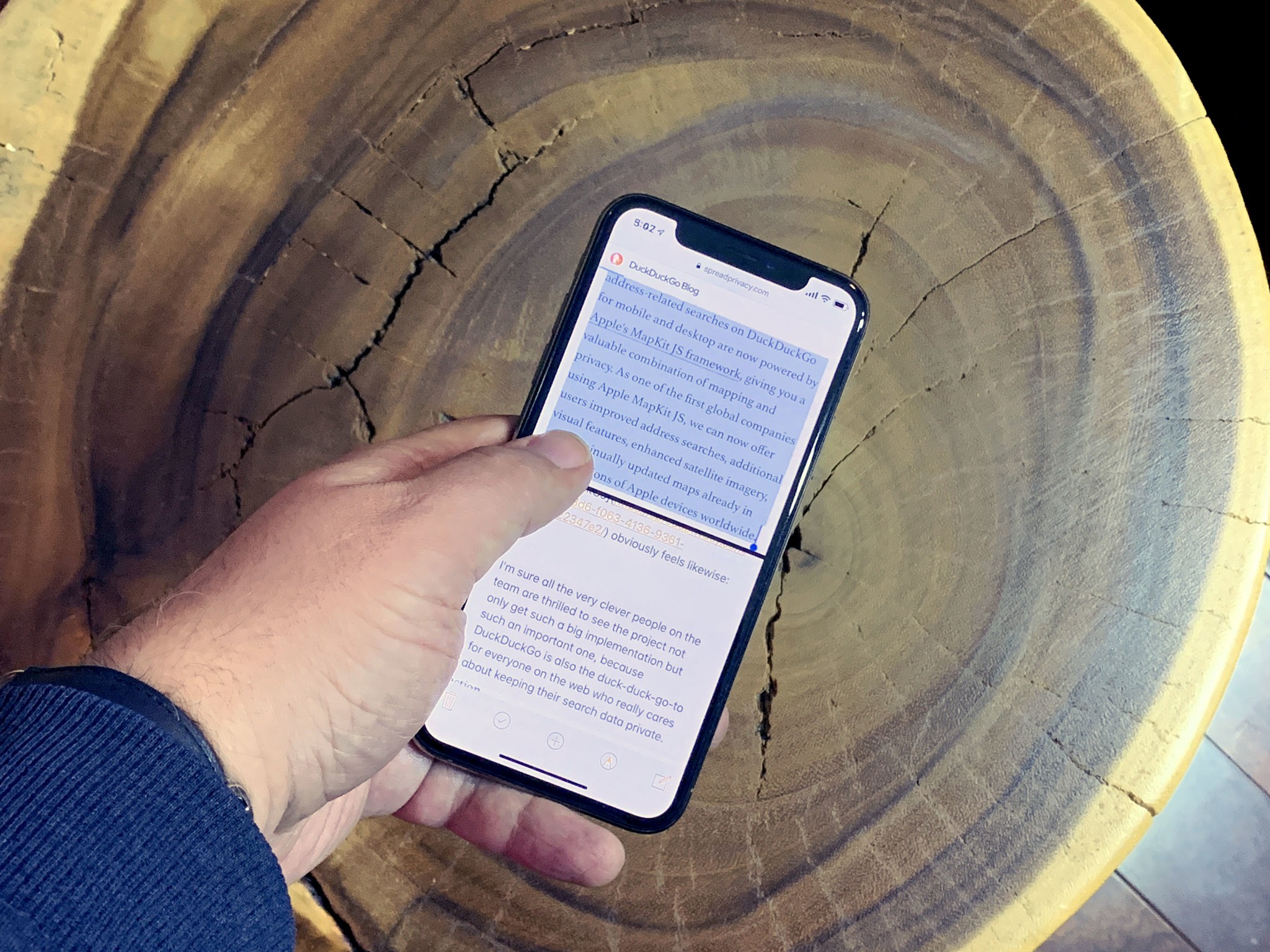
Not side by side or multi-layers like the big iPad screen allows, but at least picture-in-picture for media, and two apps stacked top and bottom when useful.
I've said this before, but human brains aren't great at context switching. We too easily lose our train of thought. Having two apps available at the same time, and being able to drag and drop and copy or just reference between them doesn't just double productivity. It force multiplies it.
Especially if in-app navigation is overhauled to not just bring basic controls closer to the bottom where they're easier to reach on ever-growing phones, but where they're more easily hidden or collapsed when you're in a split-screen experience.
External navigation
It's funny. Everyone wants a touch screen Mac, but they also want a mouse or trackpad on iPad so they don't have to touch the screen. Whether you choose to see that as people being capricious and contradictory, or as options being important and context being king probably reveals a lot about how you see the future of these products.
Apple, famously, didn't include arrow keys on the original Mac. But they did on the optional keypad accessory. And they certainly did on later keyboards. Still, the story goes that by not having arrow keys, it forced people to try and then master something new — the mouse. Rather than sticking to something old.
People have had years of multitouch experience now, we've tried it. We've mastered it. So adding support for pointers and arrows doesn't take anything away. It only adds something: efficiency.
Again, humans aren't great at context switching. So, if you're using an external keyboard, it's simply more efficient to keep your hands there and use arrow keys and a trackpad to navigate. In other words, if you're using your iPad like a MacBook, it's most efficient to use it like a MacBook.
The concept of a pointer would need to be added to iOS, beyond the cursor, beyond FocusUI on AppleTV, but, hey, if Apple ever intends to ship an ARM-based, iOS fronted iBook, it'd probably need that anyway.
External device support
Switching iPad Pro to USB-C opened it up to all sorts of external accessories, from displays to keyboards and more. But not all of them. External storage, for example, doesn't "just work". You can't plug it in and have the Files app recognize it. You have to find a specific app that supports it.
Adding external storage support to Files is an obvious solution but not complete one. And porting over Finder is just as incomplete and worse, regressive.
There will always be more and new accessories and waiting for iOS updates to add support for them just doesn't scale. Unless and until iOS becomes a service that simply streams update bits all the time, like Chrome. But, if that's even on the horizon, it's not on this planet's horizon. At least not yet.
Instead, something like driver extensions, where vendors could bundle drivers into a safe, secure, privacy-respecting app that could persist and work at the system level, could scale infinitely.
And not just in a way that serves tech media and its echo chamber of complaints, but in a way that serves artists and craftspeople and scientists and technicians. And, ultimately, serves iPhone and iPad by allowing it to grow even beyond Apple.
Play
Now, I focused on big, architectural, potentially transformative new features here. A couple weeks ago, I mentioned other stuff, like Night Vision and Pencil support for iPhone. Over the years I've also mentioned AR Maps, Contact-level VIP, Xcode for iPad, turning iCloud Photos into a privacy-first Instagram replacement, and the list goes on and on.
We might see some of this in iOS 13, but that started getting roughed out back when iOS 12 shipped and has long since been tightened down for the WWDC beta in June.
That's why this isn't about now. It's about next. The near-future but the future none-the-less. And getting iOS ready for it.

Rene Ritchie is one of the most respected Apple analysts in the business, reaching a combined audience of over 40 million readers a month. His YouTube channel, Vector, has over 90 thousand subscribers and 14 million views and his podcasts, including Debug, have been downloaded over 20 million times. He also regularly co-hosts MacBreak Weekly for the TWiT network and co-hosted CES Live! and Talk Mobile. Based in Montreal, Rene is a former director of product marketing, web developer, and graphic designer. He's authored several books and appeared on numerous television and radio segments to discuss Apple and the technology industry. When not working, he likes to cook, grapple, and spend time with his friends and family.
