The iOS 14 public beta is just going live now so if you're interested in test-driving Apple's next-generation software for the iPhone, strap yourself in. Because here's everything you really need to know.
iOS 14: Beta means beta
To get on any or all of Apple's software testing programs, go to beta.apple.com and sign up.
Just remember that beta means beta, so put it on a secondary iPhone or iPod touch, nothing you absolutely need to depend on for your daily life or livelihood.
It's been really solid so far, way more like iOS 12 than iOS 13, but you never know what'll happen from one beta update to the next, and remember, developers can't update for iOS 14 in the App Store until it goes into general release this fall, so if anything doesn't work, it's on you, not them.
In other words, make a backup before you go beta in case you want or need to revert to iOS 13.
iOS 14: Compatibility
iOS 14 basically runs on all the same iPhones that iOS 13 ran on. That means every iPhone from the 2015 iPhone 6s and 2016 original iPhone SE on up. Also, the current generation iPod touch 7.
iOS 14: Widgets
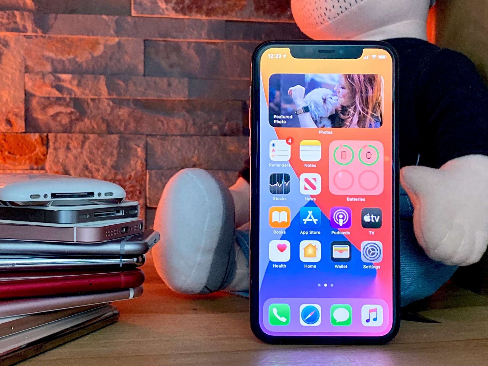
For almost a decade and a half, the Home screen has been an uninterrupted grid of tiny app icons. But now, Apple has gone and punched widget-sized holes through the whole thing.
Small, medium, and large-sized widget holes to be precise.
You can still swipe in the minus-one Homepage to see all the widgets but now, on the iPhone, touch and hold on any widget you like, and you can drag it right onto the Home screen.
It's still Apple, so you still can't drop them anywhere you like, the grid just makes more room for them on the sides or as full rows.
You can also go into jiggly mode. Yes, jiggly mode, that's what Steve called them at the beginning, it's what Craig calls them now, don't worry about it.
Because the icons now give you options, the fastest way to jiggly is touch and hold an empty area of the screen.
Then tap the plus button at the top left, pull up the Widget Gallery to see all the different versions of all the different widgets, and drag and drop any of them as well.
Now, if you have an Apple Watch and these new widgets look a lot like those old complications to you, that's because you're incredibly observant — and that's precisely what they are.
Apple bought over their killer design language, information density, and glanceability, and have just made them the standard across all the platforms.
But, because they come from complications, much of the previous iOS widget interactivity is gone.
Because this is beta, we only have Apple's new-fangled widgets to work with for now. But, old-style widgets still work, and should keep working for about another year or so.
For the new-style widgets, apps push updates to them, which then get shown in chronological order. Whatever's being shown can then deep link back into the app. Small widgets have a single deep link but the medium and large widgets can have separate deep links for each section.
So, a small podcast widget could link you back to your now playing screen where a big one could offer you the current and next three show pages up.
It's super power-efficient but at the cost of that old-style interactivity.
And… I don't know if that's philosophical, because Apple has always seen the Home screen as a portal, not a destination, or practical, because it'll take time to add that functionality to the previous watch-only system, but we'll have to wait and see.
But if you want your interactive widgets back, drop a like below.
To save space and prevent you having to pick favorites, you can drop multiple same-sized widgets one on top of the other to form a stack, then swipe through them on your Home page. You can hold down to remove or reorder widgets any way you want.
There's even a Smart Stack widget that cycles between them intelligently for you, based on time, location, previous behavior, and priorities set by the app — for example, if you have a meeting coming up, Calendar can say oh me, me, me! And jump to the top of the stack.
Now, I've never used widgets much on Android, and I don't know if I'm going to use them much on the iPhone either. Except…
Except for the Siri Suggested apps widget. It disappears right onto your Home screen, just looks like a set of normal old Home screen apps, but uses the same intelligence to predict which apps you'll want to use next. Things like time of day, location, previous behavior, and a whole lot more.
And if you ever see an app you never want to see, you can tap and hold and banish it… until you next re-add the widget.
I've dropped two of them on my Home screen, they don't duplicate, but they do almost always have the app I'm looking for, even if it takes me a second longer to zero in on it.
I don't know how many non-nerds will use widgets, even find them, because historically those numbers just haven't been high, but as a nerd, I'm super happy they're here.
And like with Control Center, Notification Center, and bunch of other more advanced, more capable systems Apple's added over the years, I'm even super happier they're completely out of the way for anybody who has absolutely no interest in them.
Because functional complexity through interface depth is exactly how you mature an operating system for existing, more niche users without making it impenetrable to new, more casual users.
Let me know your current favorites and the ones you're waiting on most in the comments below.
iOS 14: Default apps
If you had default apps on your iOS 14 bingo card, go ahead and circle in… but only a little.
Because, you'll soon be able to set whatever email client you want, including Gmail and Outlook, and whatever web browser you want, including Chrome and Edge, as your default.
Why only mail and browsers? Those are the ones Apple got the most requests for, but that just means you have to keep asking for things like Maps, Music, and Calendar as well.
Why only soon? Because developers have to update their apps with a flag that says they're available for default mail or browser status, and Apple wants to make sure they're real. Like, Google and Microsoft, no problem. Some scammer app that just wants to steal your messages, take over your Amazon affiliate cookies, spam you with ads, or redirect you to phishing sites — well those better all be squashed and hard.
I value Apple's commitment to privacy so I'll be sticking with Mail and Safari, but I love that Apple can't rest on default status anymore and now has to fight for every user, which will hopefully make all apps better for everyone.
Let me know what, if anything, you'll be changing yours to, and which default apps you want next in the comments.
iOS 14: App Library
Confession: My home screens are graveyards where apps are so very often downloaded and left to die. Sometimes I'll search for them later if I need them. Other times I'll do a fresh install just to blast them all clean and start over.
But, with iOS 14, Apple is using the same kind of Siri suggested smarts to impose, I'll say it again, a little Marie Kondo-style organization on all of our apps.
I never really used the far more basic app drawer on Android either. I just tend to use search for whatever I can't immediately find.
Which, by the way, is getting better in iOS 14. In addition to knowledge Search — essentially type-to-Siri — you can now search inside apps, and use search to quick launch apps. Basically, it's what's been on the Mac for a few years now and it's great to finally see it on the iPhone as well.
But when it comes to the App Library, it's the implementation, not the idea that matters, so…
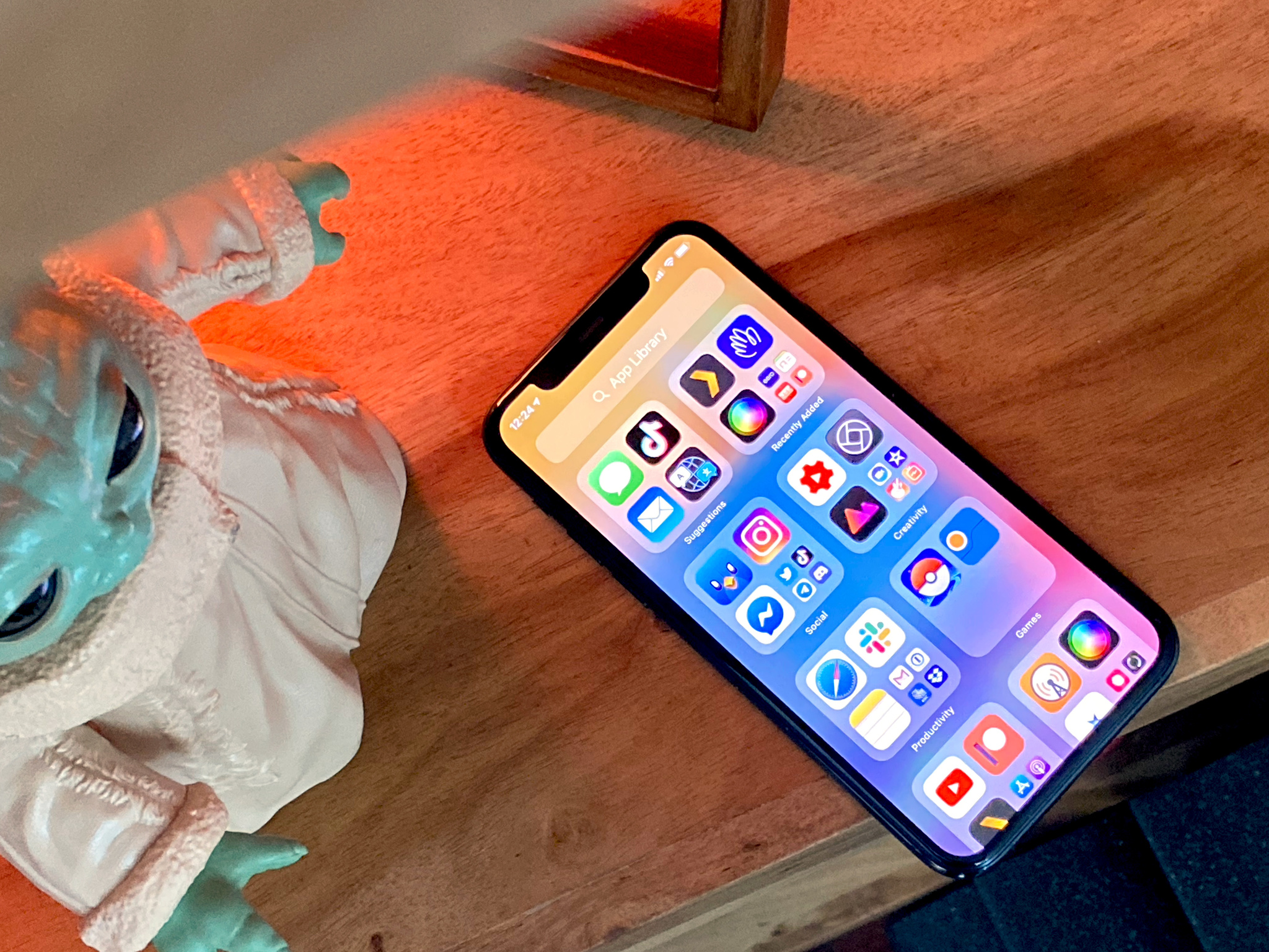
The App Library sits all the way to the right in the Home screen stack. But, now you can hide all those intermediate graveyard-like Home screen pages if you want to. Just go into jiggly mode, tap the little navigation dots above the dock, and uncheck any screens you no longer want seen.
Then, it can be as few swipes from Home screen prime as you want it to be.
And for any pages left, just tap and hold those dots and slide your finger back and forth to super scrub them.
The library looks like giant folders with full sizes apps in them… with a regular-sized folder with tiny apps in them. Basically apps all the way down.
Tap on a regular-sized app and you go straight into that app. Tap a tiny app and you open the folder.
Tap an hold an app and you're in a special delete-only version of jiggly mode.
It's… a bit much but you get the hang of it quick.
The first app group is suggested, which works just like the Siri suggested apps widget. The next is recently added, which is great if you, like me, download stuff, get distracted, forget what you downloaded, realize it didn't go at the absolute end of all apps but rather whatever slot was free on some screen in between and then spend forever too long trying to find it.
The rest of the groups are categorized based on the apps inside… and often not that well. I'm guessing it pulls from the categories developers add to their apps but the results don't always make sense. So, here's hoping Apple requires and honors a primary category, gets smarter about sorting, or — here's an idea — let us change the labels or hold on an app and choose wrong category, wrong category, bad AI, bad! And help train it to be better.
The system is smart though in that it can reorder the categories themselves and the apps they surface as it learns more about when and how you use them. And that part it does really, really well.
There's also a search box on top but, unlike the regular search, if you tap into it you now get a full, alphabetic list of all your apps, like watchOS got previously.
I don't know that I'll ever use it, but my inner bring-order-to-the-galaxy-ier loves knowing its there.
iOS 14: App Clips
Ever since Apple introduced extensibility in iOS 8, basically breaking apart binary app blobs into discrete sets of functionality that could be surfaced in other apps, even on other devices like Apple Watch or CarPlay, I've been waiting for the apps themselves to be downloadable in anything other than binary blob form.
You know, so I didn't have to figure out what they're called, find them, wait for them to install, set up an account, set up a payment system, do just a ton of overhead just to get something quick done.
And App Clips may … just may … finally, be what I've been waiting for.
Developers spin them out of their main apps and they have to be really small so they're really fast. You can grab them from the web or from inside Maps, or IRL from an NFC tap, QR code, or a new hybrid Apple code. Even from Messages if someone shared one to you.
Then you just tap the card, sign in with Apple, use Apple Pay, and you're done. You can even go to the App Library to use them again or download the full app.
Or, at least you can once apps update to include them when iOS 14 goes live this fall. And, situations where they'll be most valuable, like travel, becomes possible for all of us again.
But, all the fingers crossed this idea takes off because even though this is still on a screen, we're going to need tech like this for the augmented reality future.
iOS 14: Compact UI
Ok. Remember when you were about to tap something and a call would come in, and it was too late to peel off, and you'd tap the hang-up button before you could stop yourself?
Well, that's been fixed. Or, at least, mitigated.
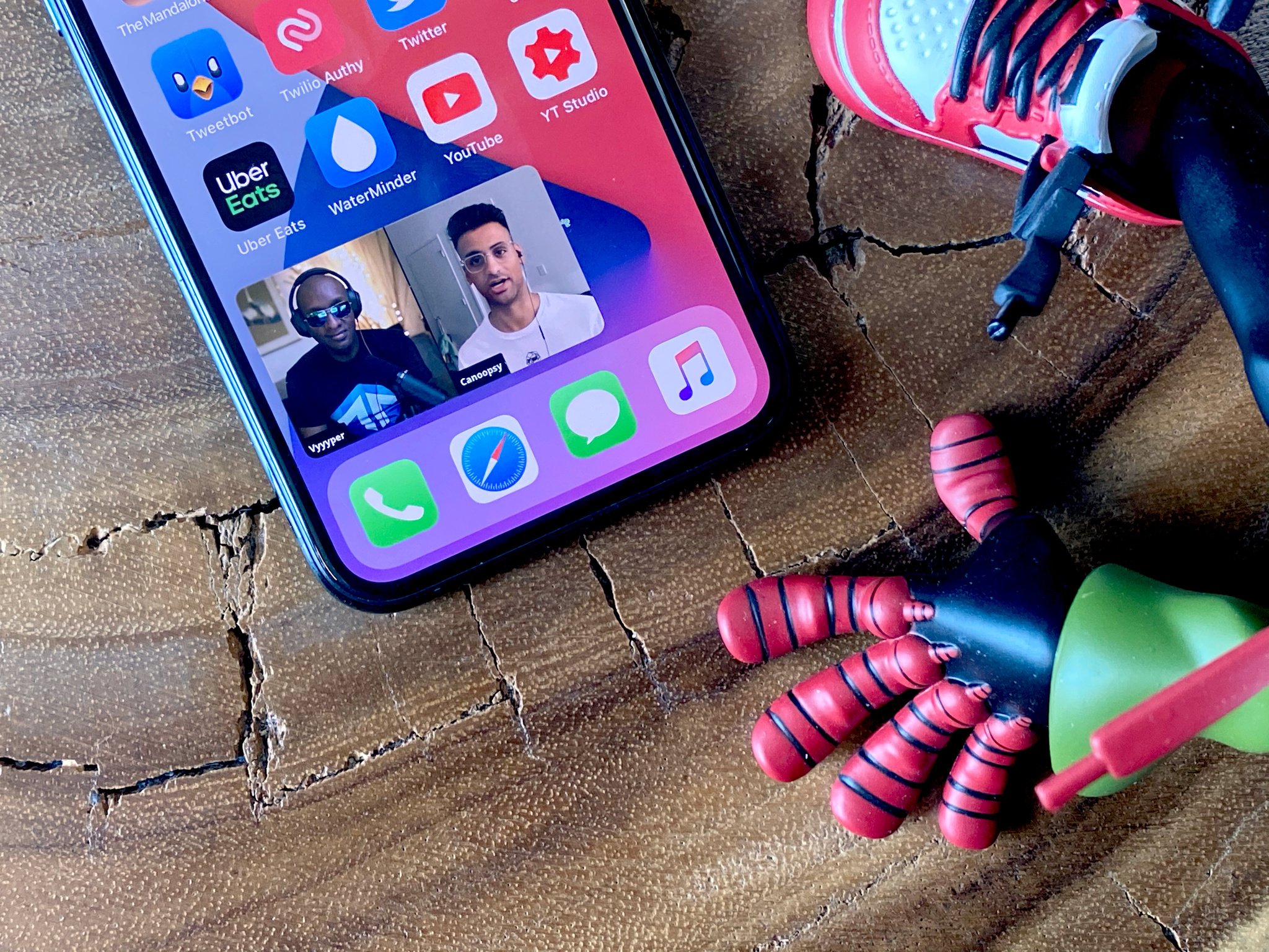
Now, when a phone or FaceTime call comes in, instead of a full-screen takeover, you get a fairly standard banner notification. Same with apps like Skype, come iOS 14 release this fall.
Swipe it up and away to get rid of it or pull it down to get the classic full-screen interface and options like messaging we all know and sometimes use.
Same with Siri. Now it's a swirling powerball of assistant might that bursts up on top of the Dock and gives you results in very similar banner-sized overlays.
The ball looks kind weird though, sitting on top of the Dock, so I'm hoping Apple tweaks it to just blank out the bar and settle better into the middle of it.
Likewise, you can see the screen beneath Siri now but still can't interact with it, but because you can see it, you think you can, but if you do, it just obliterates the Siri result, and you have to start over, yes, like an animal… and animal muttering "can you not".
Flicking away the notifications would be more consistent but may get annoying, and a pinning option may be the best or worst of both worlds.
Maybe let me grab a result I really need to persist and drop it as a widget if I want to refer back to it again? I legit don't know.
Picture in Picture on the iPhone works mostly like it has on iPad for the last many years. Go to a video in Safari or any app that eventually supports it, make the video full screen, exit the app, and then it goes picture in picture.
You can move it between the corners, pinch to make it bigger or smaller, hide it off to the side or bring it back, and tap the button to return to the host app.
You can even use it with FaceTime so you can leave the app to do something else without it showing a big PAUSE button and ratting you out to everyone else on the call.
Which is great. But I'm also hoping we get a button in the default media controller that lets us tap to P-I-P any time we want as well. It'd be the same amount of steps, but less cognitive load if you're thinking P-I-P to begin with.
Either way, I love that it's finally on the iPhone, even if I loathe that the YouTube app will likely never add support for it.
iOS 14: Messages
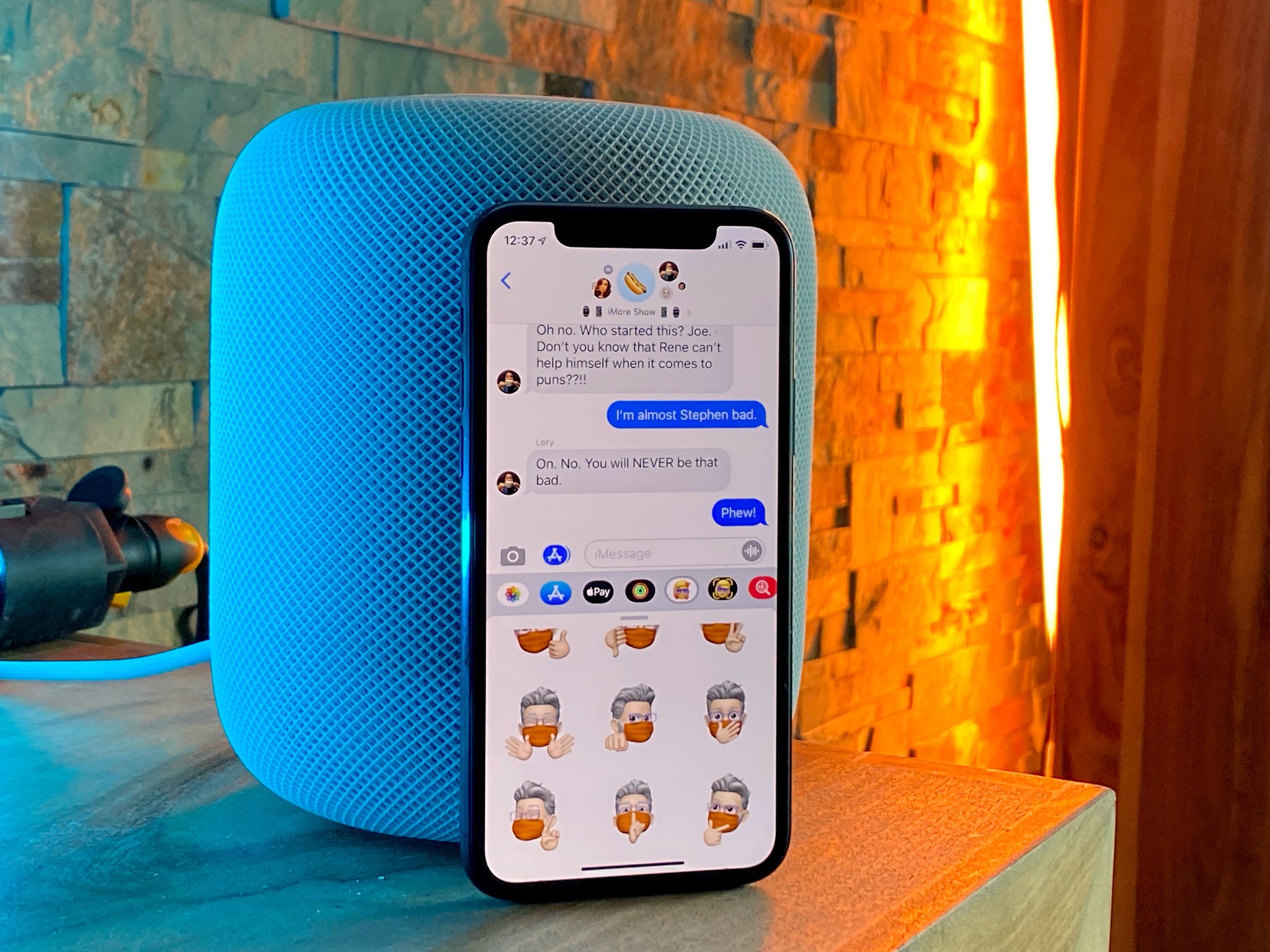
If you've ever had to scroll, scroll, scroll, past parents and carrier spam and work groups and Charles Boyle to try and find that important but infrequent message thread, then Pinned conversations in iOS 14 are for you, and really all of us.
Just swipe left to right to pin. Tap and hold to unpin.
You can pin up to 9 conversations at the top of the messages stack, like chat heads frozen in time and space, and they'll sync to your iPad and Mac, if you have one or both, so you can not only find those convos fast, fast, fast but see recent messages, emoji reactions, even typing indicators.
For group messages, you can set a group photo to make them easier to tell apart, so you don't accidentally send something to your PTA group meant for your meme group even if a few people overlap.
You can now mention someone, with our without an @ symbol first. Just type their name, tap their face, and they'll be notified, even if they turned general group alerts off an only left say my name alerts on.
You can also reply in-line to older or specific messages. Just tap and hold on the message you want to thread and choose reply. It's super useful if a conversation is mutating rapidly or you just want to add something later. The interface is a bit confusing to me still and everyone not on the beta will still see it in chronological order, so I've found it helpful to keep over-adding context at least for now.
Speaking of which, Memoji have gotten 10 new hairstyles, and while Apple would never say this, I've found many of them are just perfect for all the new, longer shelter-in-place hair many of us have been rocking lately.
Also, 18 new headwear options, including bicycle helmet, old timy-whimy aviator goggles, and even a chef's hat which is just chef's kiss.
There are 9 age levels now, from baby to gamma and gampa, 3 new Memoji stickers — hug, gasp, and fist bump, and masks for those of us with empathy and sense enough to want to emphasize just how important to our collective health and economy wearing them are.
There's also a new Emoji picker which finally, oh so finally, has search box, like macOS has enjoyed for a good long while now. It makes it super easier, yes, barely an inconvenience now to find your less recently, less frequently used emoji. Especially as the amount of emoji continues to soar each year.
It even persists your favs above the regular keyboard if you want to spam hearts or prayers or peace or whichever fingers you personally prefer.
It's so emoji extra.
iOS 14: Camera
Camera is getting faster. Up to 90% on shots, hitting up to 4 frames per second. Portrait mode is 15% faster shot-to-shot as well. You can also choose to prioritize speed over processing if that's what you want.
QuickTake video is now supported on iPhone XR, iPhone XS, and iPhone XS Max, so everyone can get in on the instant TikTok action. And all iPhone models now get quick toggles for video resolution and frame rate. Just tap the readout to toggle the setting.
Night mode on iPhone 11 will help you stay steadier or let you cancel out faster. And you can choose to capture mirrored selfies, if the difference between preview and photo always threw you.
Also, QuickTake can now be set to volume down so you get back burst mode on volume up.
In photos, you can now filter your collection by favorites, edited, videos, and photos, and sort any album from oldest to newest or vice versa.
You can also add captions to photos to better describe them for others or better recall the important details for yourself, search for the captions, and they'll sync across your devices.
iOS 14: Maps
New maps, already rolled out across the U.S., is coming to the U.K., Ireland, and Canada this year. And Maps is adding cycling directions in New York, San Francisco, Los Angeles, and a number of cities in China including Beijing and Shanghai.
You'll get several options for the routes, including the fastest, but also easier ones if there's less elevation or stairs to navigate, or bike lanes that might be safer.
If you have an electric vehicle, you can enter the type and maps will add compatible charging stops along your routes. And, if your city uses congestion zones, Maps can route you around them. Also, it'll let you know if you're approaching speed or red light cameras and where they're located.
If and when traveling becomes a thing again, new guides chock full of local attractions can help you choose which city you want to go to and which restaurants and sights you want to visit when you get there.
Also, if you're walking in a city where the building are blocking GPS, you know when the blue circle covers a three block radius and no matter which way you go it's just always the wrong way? Well, you can now use the camera to scan those buildings around you and reverse-look-around a far more precise location.
As much as I never want to be the person scanning skylines as passers by tourist shame-me like I'm unfolding an old-school paper map, I've so needed this in New York and San Fransisco.
iOS 14: Translate
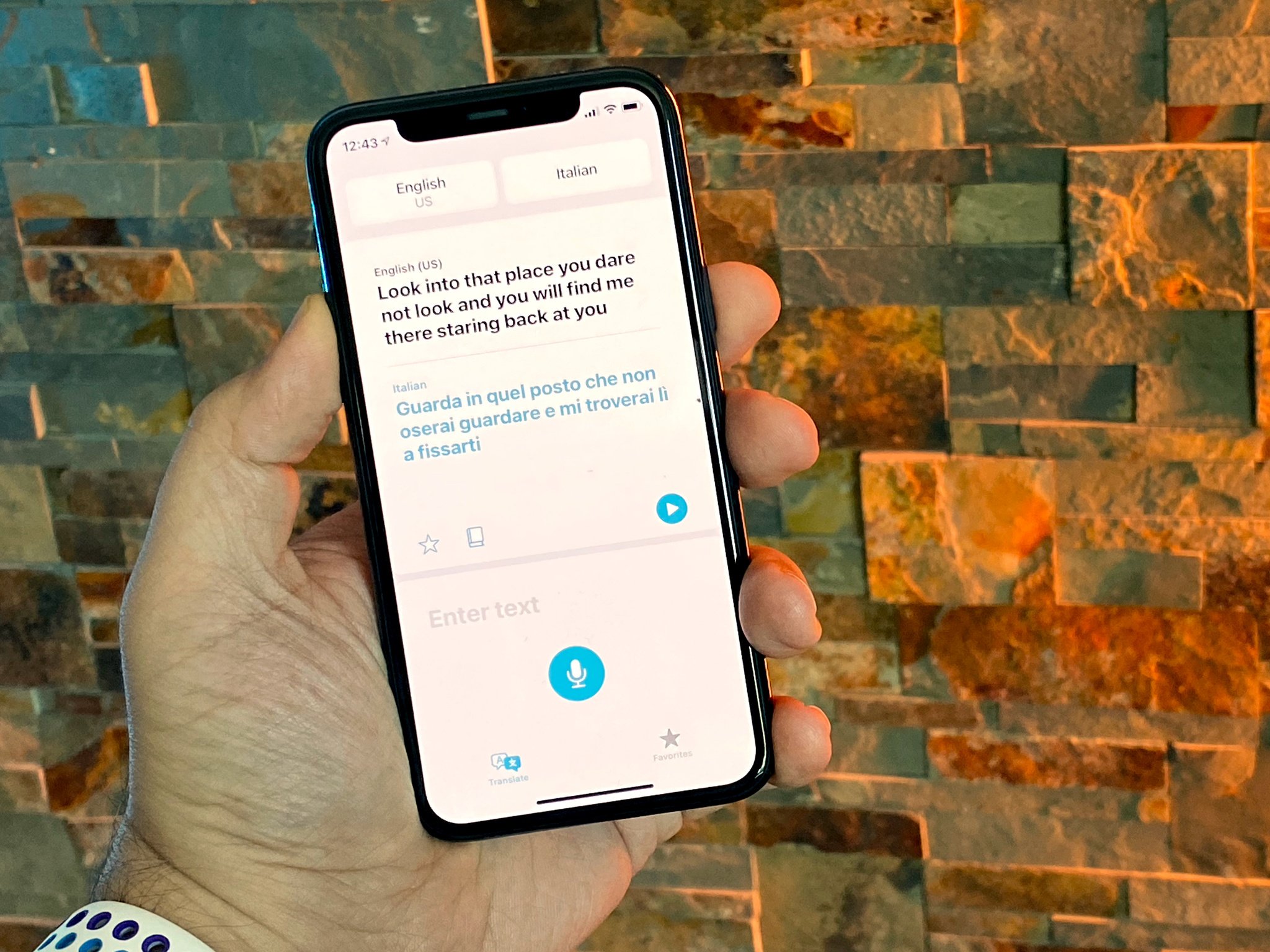
Last year we got a new Measure app to show off the improvements in ARKit. This year we're getting a new Translate app to take advantage of some of the new Siri improvements.
You can choose your language, the language you want translated, even download the language if you want or need everything done on-device. For privacy sure but also if you're not sure about your internet connection.
You can dictate what you want translated, type it in as text, save favorite phrases to refer back to them in a pinch, even get dictionary definitions if you want or need them.
You can also just rotate to landscape to get a big honking text sign to better get the attention of whomever you're trying to talk to.
And, if you want to start a conversation, you can rotate your iPhone landscape, watch the screen split, tap the mic and start playing Pong between your language and theirs. It'll even try to auto-detect the language to keep up with who's saying what.
It's nowhere nearly a Babel Fish or everything-but-Klingon-Universal Translator but I love that Google and now Apple are pushing us closer to that sci-fi future.
iOS 14: Accessibility
Accessibility always gets some of the coolest, most cutting edge features because the team's driving goal is to make the iPhone easier to use for everyone.
This year, that includes double and triple tap shortcuts on any iPhone with Face ID — and the new tap-to-wake accelerometer feature that came with it.
Just go into Settings > accessibility > Touch and pick things launch control center or Notification Center. It takes a second to work but saves you several seconds and taps you'd otherwise have to use over and over again.
Let me know what you're setting it to in the comments.
If FaceTime detects sign language, it'll make the person using it more prominent so everyone can make out the signs more easily.
Headphone accommodations let you customize exactly the audio experience you want, amplifying soft sounds, adjusting frequencies, even making a personal profile.
There's also VoiceOver recognition, where machine learning recognizes elements on the screen even if apps or web sites haven't done their jobs and labeled them appropriately, or if a bug has come up that interferes with it.
It'll also do similar for images, explaining every element in a photo it can identify, as well as reading any text it can make out. It's… terrific.
I just love this stuff and this team.
iOS 14: Privacy
Apple's been talking about Privacy by Design for years. It basically means every feature is created with privacy in mind each step along the way, not just bolted on badly at the end.
But, it's also come to mean new and creative ways to name and shame… I mean disclose and force consent… the apps and services that aren't doing everything they can for our privacy. Even Apple's own.
This year that includes tracking control, so just like an app has to ask permission to use your location in the real world, when you launch it, it now has to ask your permission to cookie you and track you as you move around the online world as well.
And, honestly, I can't imagine any advertiser who's proud of their business model and not trying desperately to hide it from us would object to this in any way at all.
For location, you can also choose to give only an approximate location instead of a precise one, so an app only sees the neighborhood you're in, not the room.
Take that, Tim Hortons.
For copy and paste access, iOS will now tell you if and when an app is reading your clipboard. So, if you copy a private photo or message, then switch apps, that other app can't just suck it up as well. If you're using iCloud Clipboard to paste from another device, it'll tell you that too.
And just like last year when Bluetooth disclosure caught a bunch of apps trying to use beacons to get around location permissions, this year apps like TikTok and LinkedIn have already been caught reading our clipboards without our consent. Meaning, without us choosing to paste anything.
More like this please.
If anything is using the mic, including Siri after it activates, you'll see an orange dot in the status bar. Green if anything is using the RGB camera.
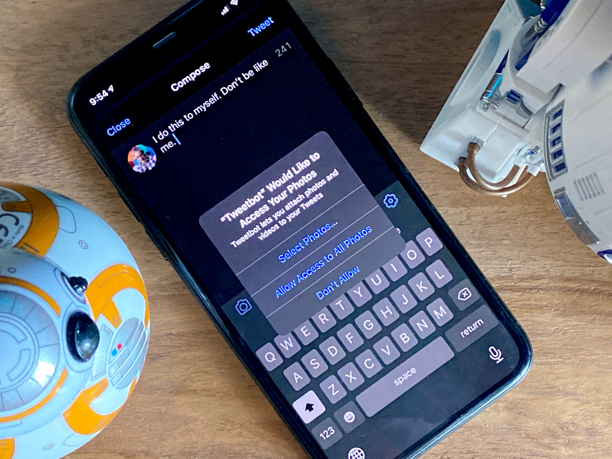
The photo library is also getting limited access. Before you had to choose basically between yes and no. Now you can choose to only allow select photos at select times. You're in control.
Just like nutrition labels on foods, apps now have to provide privacy information on the App Store, so you can see what they're collecting, where it's going, and get details on how it's being used.
And if an app starts supporting Sign in with Apple, you can now switch from your old login to that system to better protect your privacy going forward.
iOS 14: To be continued...
iOS 14 is packing not just a ton of new smarts but a huge amount of potential. It's still in beta, though, so things can and will change before it ships this fall. So, lots more to come. In the meantime, let me know your favorite new features in the comments below!

Rene Ritchie is one of the most respected Apple analysts in the business, reaching a combined audience of over 40 million readers a month. His YouTube channel, Vector, has over 90 thousand subscribers and 14 million views and his podcasts, including Debug, have been downloaded over 20 million times. He also regularly co-hosts MacBreak Weekly for the TWiT network and co-hosted CES Live! and Talk Mobile. Based in Montreal, Rene is a former director of product marketing, web developer, and graphic designer. He's authored several books and appeared on numerous television and radio segments to discuss Apple and the technology industry. When not working, he likes to cook, grapple, and spend time with his friends and family.
