After months of excitement from WWDC 2020, iOS 14 has finally arrived for everyone. Within days after the public release, iOS 14 has become well-known for making your iPhone "aesthetic AF" with all kinds of customizations. But there is plenty more to love about iOS 14 — it has plenty of UI improvements, which breathe new life into iOS, and completely change how I use my iPhone.
○ Home screen widgets and App Library
○ Home screen customization through Shortcuts
○ Automations in the Shortcuts app
○ Messages improvements like pinned threads, inline replies, and mentions
○ New Compact UI
○ App Tracking Transparency and other privacy features
○ Built-in Translate app
iOS 14: Availability
Apple launched iOS 14 on Sept 16, 2020. If you have not yet updated to iOS 14, now is a perfect time to do so, because iOS 15 is just around the corner and pretty much enhances what iOS 14 brought to the table. Now, before you can get iOS 14 on your iPhone, you need to be sure that you have a device that can run it in the first place. Fortunately, if your favorite iPhone was previously on iOS 13, then you should be good to go. Here is the full device compatibility list:
- iPhone 12 Pro Max
- iPhone 12 Pro
- iPhone 12
- iPhone 12 mini
- iPhone SE (2020)
- iPhone 11
- iPhone 11 Pro
- iPhone 11 Pro Max
- iPhone XS
- iPhone XS Max
- iPhone XR
- iPhone X
- iPhone 8
- iPhone 8 Plus
- iPhone 7
- iPhone 7 Plus
- iPhone 6s
- iPhone 6s Plus
- iPhone SE (2016)
- iPod touch (7th generation)
iOS 14: What's new
iOS 14 is one of Apple's biggest changes to iOS in several years. This is a substantial update that brings in new ways for users to customize their iOS experience to suit their own personal tastes and preferences, and it brings about several much anticipated new features.
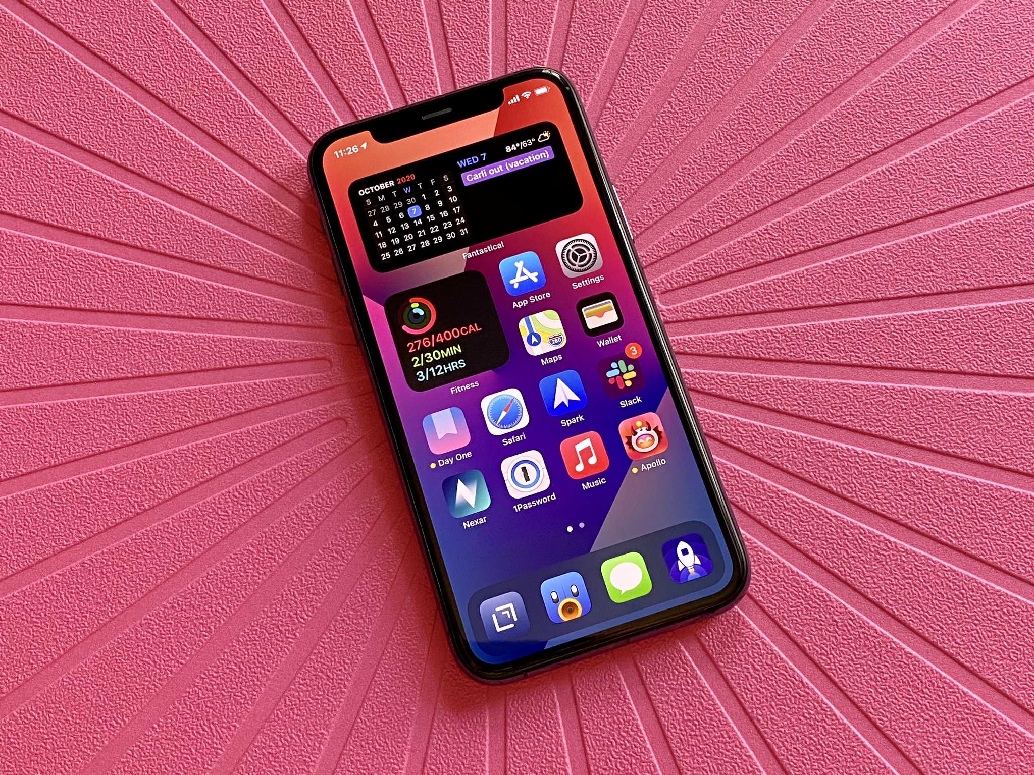
The biggest change comes in the form of the Home screen, as we can now add widgets anywhere on the Home screen. These widgets may not be interactive (those are only contained in the Today view), but they can display all kinds of useful information at-a-glance, or they can be used to transform your Home screen into something that is just more aesthetically pleasing. We also have the new App Library, allowing us to get rid of Home screen pages entirely if we so choose, and just relying on the App Library to organize and sort our apps automatically for us.
There are plenty of other quality of life improvements in iOS 14 too, including a new Compact UI, letting us use Shortcuts to create custom icons for unique themed Home screen setups, and more. Messages got a big overhaul with pinned messages, inline replies, and even mentions in group chats. There are also plenty of other changes that just make the overall iOS experience better than ever before.
iOS 14: First things to do
Once you have downloaded iOS 14 on your iPhone, one of the first things you need to try out is try adding some widgets to your iPhone Home screen. Most apps that you download these days will have some kind of Home screen widget, which can display very useful information at-a-glance, right on your Home screen. These will always be visible, and you can even stack multiple widgets on top of each other and swipe through them. There are even Siri Suggestions that can display certain widgets at opportune times throughout the day, depending on your usage habits.
If you want to take the Home screen customization a step further, make sure to check out our guide on customizing your app icons with the Shortcuts app. There are many themed icon packs out there, and changing your app icons this way lets you personalize your Home screen even more without the need to jailbreak. You can even use some of Home screen widget customization apps to make your setup really stand out from the boring stock options.
There are a ton of new changes in existing native apps in iOS 14 too. So make sure to check out how to use the new mentions and inline replies, how to use App Tracking Transparency (prevent apps from tracking you), and all of our other great how-to guides.
iOS 14: The Home screen
The most significant changes that iOS 14 brings involve the Home screen. For years, the Home screen remained unchanged — it was merely a grid of icons for your apps. At some point, you could organize them into folders instead of having dozens or hundreds of apps just scattered around in disarray. But it was still largely the same: a grid of squares. You couldn't see information at-a-glance on the Home screen unless you swiped to the left for the Today View.
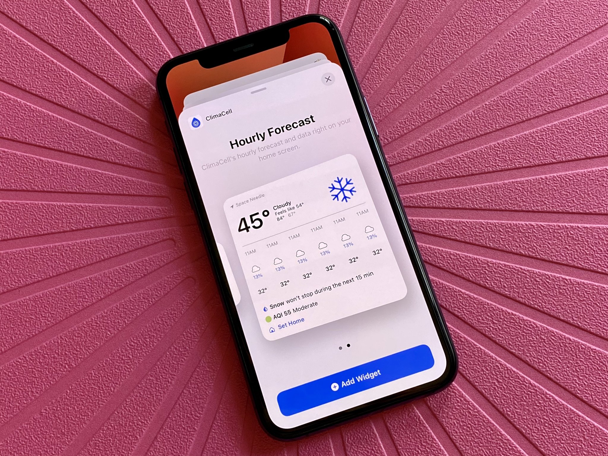
But that has all changed with iOS 14. Now you can add widgets right on your Home screen, which can be there just for aesthetics, or it can display useful information that you want to know. The widgets come in different sizes: small, medium, or large, and, depending on the app, the information can be general or specific. In fact, you can create an entire page on your Home screen that is nothing but widgets, without an app icon in sight. Unfortunately, these new widgets are not interactive, as tapping on them just launches the app. But if you still have any old widgets that are interactive, they can continue to live on in the Today view (i.e., PCalc).
Widgets are also allowing users to customize their Home screen aesthetic, thanks to apps like Widgetsmith. With these apps, users can create custom widgets with different colors, fonts, background images, and data to display on the Home screen. When paired with custom app icons through Shortcuts, it has opened up the floodgates to personalization on iOS like never before.
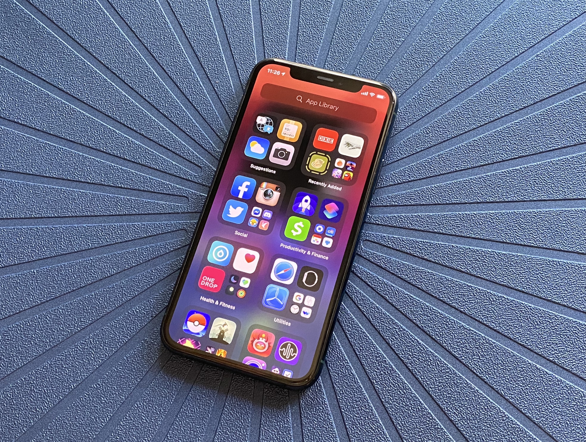
Another big change with iOS 14 is the App Library. The App Library allows you to view all of your apps, as Apple automatically organizes them. You can also view all of your installed apps as a list with a search feature to help you find exactly what you're looking for.
The App Library is a great feature if you have a ton of apps and are tired of manually organizing everything into folders. In fact, there is a setting that you can enable for all app downloads from that point forward to only appear in the App Library and never go on your Home Screen. This was one of the first things I did since I download many apps, and my Home screen pages were a huge mess that I was tired of dealing with.
I have noticed that Apple has a weird way of organizing my apps into categories, though, and it does take some time to get used to. For example, I usually had a "Productive" folder and another for "Finance," but Apple seems to have grouped these two together. The same goes for "Shopping" and "Food."
Despite the learning curve, I've been using App Library exclusively for everything that is not on my first two Home screen pages, and it works well for my needs. However, I noticed that it seems like the categories "shift" around, as iOS bumps up the categories you use more frequently. While I appreciate Apple trying to make things easier, as someone who prefers to go by muscle memory, I wish there was a way to make the categories stay in place.
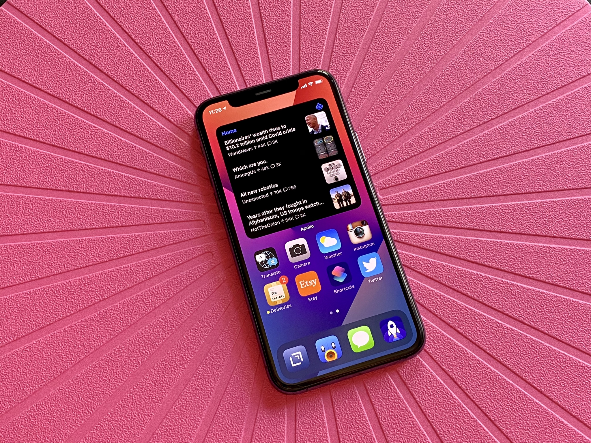
As I've downloaded hundreds of apps over the years, my iPhone was super cluttered beyond the first two pages. In fact, I think I had almost 10 pages of apps at some point before I tried to put things into appropriate folders. Sometimes it got annoying to find the app that I was looking for, so I end up using Spotlight Search to get what I need anyway. But with App Library, I figured I no longer need the rest of my Home screen pages either, and thankfully iOS 14 lets you edit those as well.
As you enter "jiggle mode" on the Home screen, tap on the page indicator at the bottom, and you'll be able to select what Home screen pages to show or hide. For some, this means that you can create a Home screen dedicated to just apps and widgets for work and another for personal and hide the Work page when you don't need it (i.e., weekends). The biggest issue with this is that the process can't be automated — you'll have to manually do this every time you want to hide or show a page.
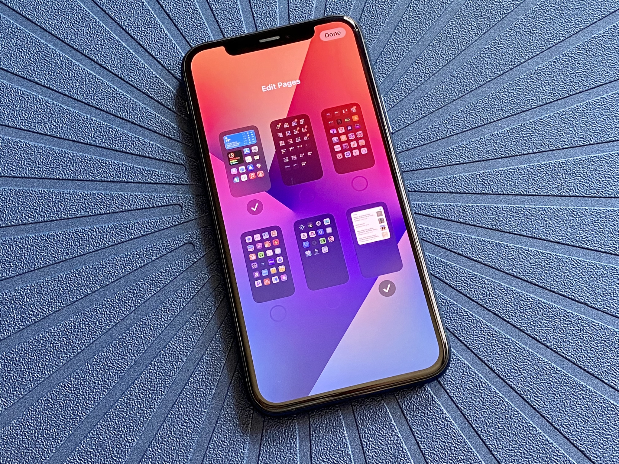
I decided to go even further with the Edit Pages feature on the Home screen. I've always seen the Home screen of others, where they had just a single page or two on their Home screen, and I loved the minimalism. But because I'm always testing out new apps and games, minimalism was impossible with dozens, even hundreds of apps. But with iOS 14, I can finally achieve Home screen bliss just by hiding all of my Home screen pages except for two. And it works wonderfully for my needs.
My current setup involves a Smart Stack of medium widgets at the top of my Home screen: Batteries, two Fantastical widgets, Google, Things, and Carrot Weather, with Smart Rotate on. Underneath, I have a small Smart Stack with Fitness and Healthview, and the rest of that page are the apps that I use most often. My second page consists of a large Apollo widget containing my Home feed and the Siri App Suggestions. I often find myself swiping the Smart Stacks on the first page because the Smart Rotate feature doesn't seem to show what I want most of the time. But the Siri App Suggestions on my page two has been excellent and pretty accurate — that's proper Machine Learning at work.
I wish that the new widgets in iOS 14 were interactive because that would increase productivity. However, for now, my current set up works incredibly well for my needs. iOS 14 has revamped my iPhone Home screen, and hopefully, these changes will find a place on iPadOS in the future.
iOS 14: Shortcuts and Automations
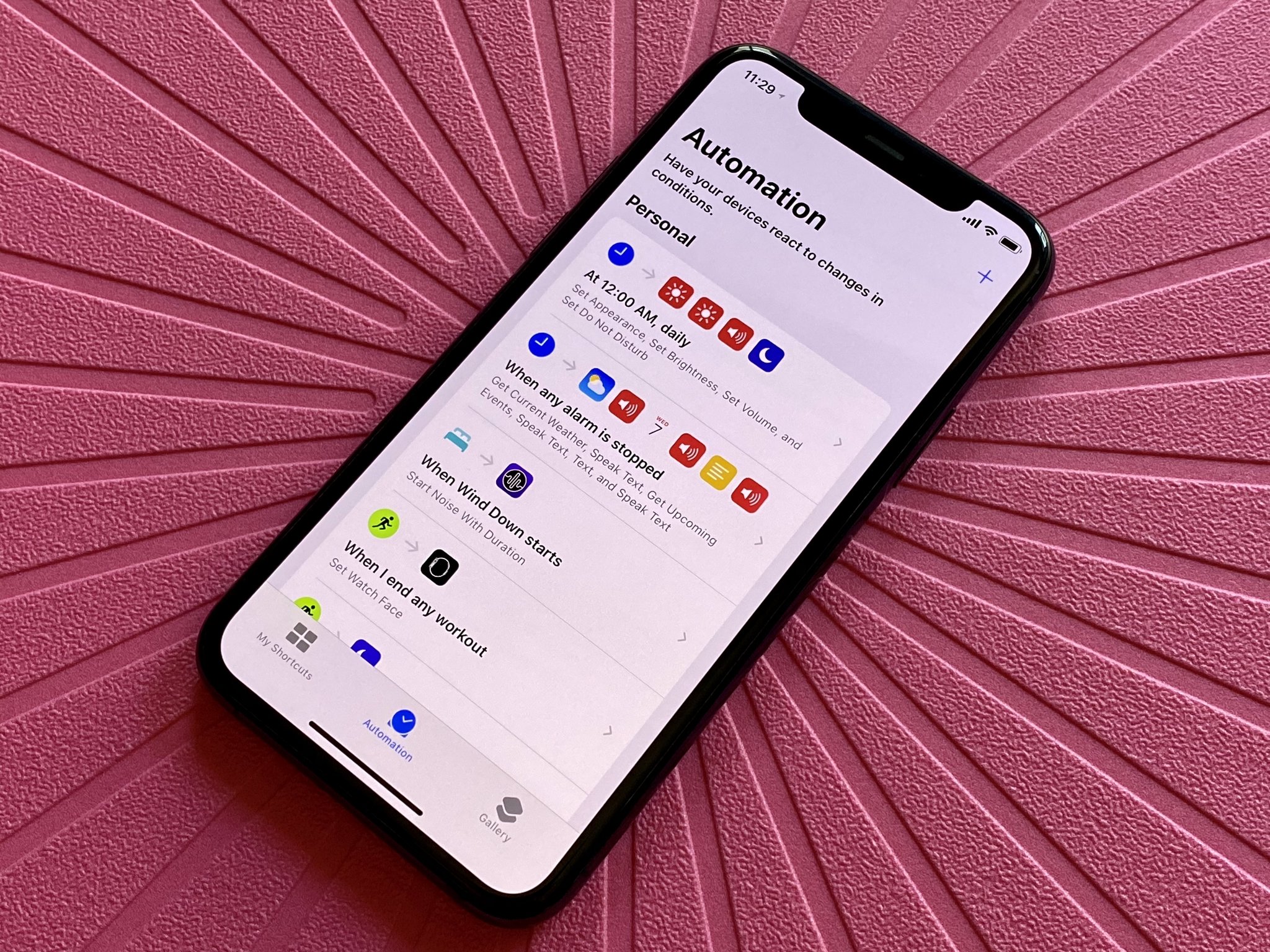
While Shortcuts has been around for a while now, I didn't make much use of it compared to others. However, iOS 14 brought some substantial changes to the Shortcuts app that make it one of my new favorite apps, and that's because of the new way that Automations work.
Automations were available in iOS 13, but they weren't genuinely automated, as you would have to tap a notification to make the automation run. In iOS 14, the process is now fully automated for the most part, and there are some brand new triggers for creating automations that I'm absolutely loving. Plus, some other changes are worth noting.
First, your shortcuts can now be organized into folders. Before iOS 14, I had a good handful of shortcuts that I've downloaded from the gallery or other users, and they were all over the place. Shortcuts for things like getting directions home, sending ETA, calculating a tip, stitching together screenshots, downloading files, and more — they were all just there in Shortcuts, without any way to organize them neatly. But now I can finally categorize them properly, bringing in some semblance of order to a once chaotic world. It's easier to put your shortcuts into folders on the iPad, but on the iPhone, it's just a matter of selecting what you want to move, then choosing or creating the folder you want to move them into.
Now, Automations is where the real meat is at with Shortcuts in iOS 14. Since you no longer have to confirm an automation to run before it goes to work, I've made so much more use of the feature, especially the battery and charging related ones. With Automations, I no longer have to remember to do something before doing it, and it's wonderful.
Currently, I have automations set up to enable Do Not Disturb mode when I run specific apps, start a workout, and turn it off when I end the workout. I also have another automation when my Wind Down starts, so the Dark Noise app automatically plays my favorite sound to help me drift off to sleep. And with the new battery triggers, I have one set to put my iPhone into Low Power Mode when my battery is below 30%, and then to take it off Low Power Mode when I plug it in.
At the moment, these are the automation triggers available in iOS 14: Time of Day, Alarm, Sleep, Arrive, Leave, Before I Commute, CarPlay, Email, Message, Apple Watch Workout, Wi-Fi, Bluetooth, NFC, App, Airplane Mode, Do Not Disturb, Low Power Mode, Battery Level, and Charger. I know that time-based ones are not new, but you no longer need to confirm them before they run. Other new ones are Sleep, Email, Message, Low Power, Battery, and Charger.
Honestly, the most useful ones that everyone should create an automation for are all of the battery-related ones (Low Power Mode, Battery, and Charger). That's because these help you stop worrying about your battery woes and automates the process for you.
However, even though Shortcuts and automations have gotten a boost with iOS 14, it's still not perfect. I would love to see a way to automate being able to change device wallpapers for Light/Dark Mode (not possible right now), showing or hiding Home screen pages (i.e., work and fun screens for the weekend), and location-based automations still require confirmations before they can run, which defeats the point. Still, what iOS 14 brings is a step in the right direction, and I am excited to see what iOS 15 brings.
I have also noticed that sometimes my automations don't actually go off, even though it is supposed to. I haven't figured out a solution or why it's happening, but it's another thorn in my side with automations. But when they work, they're super convenient.
iOS 14: Compact UI
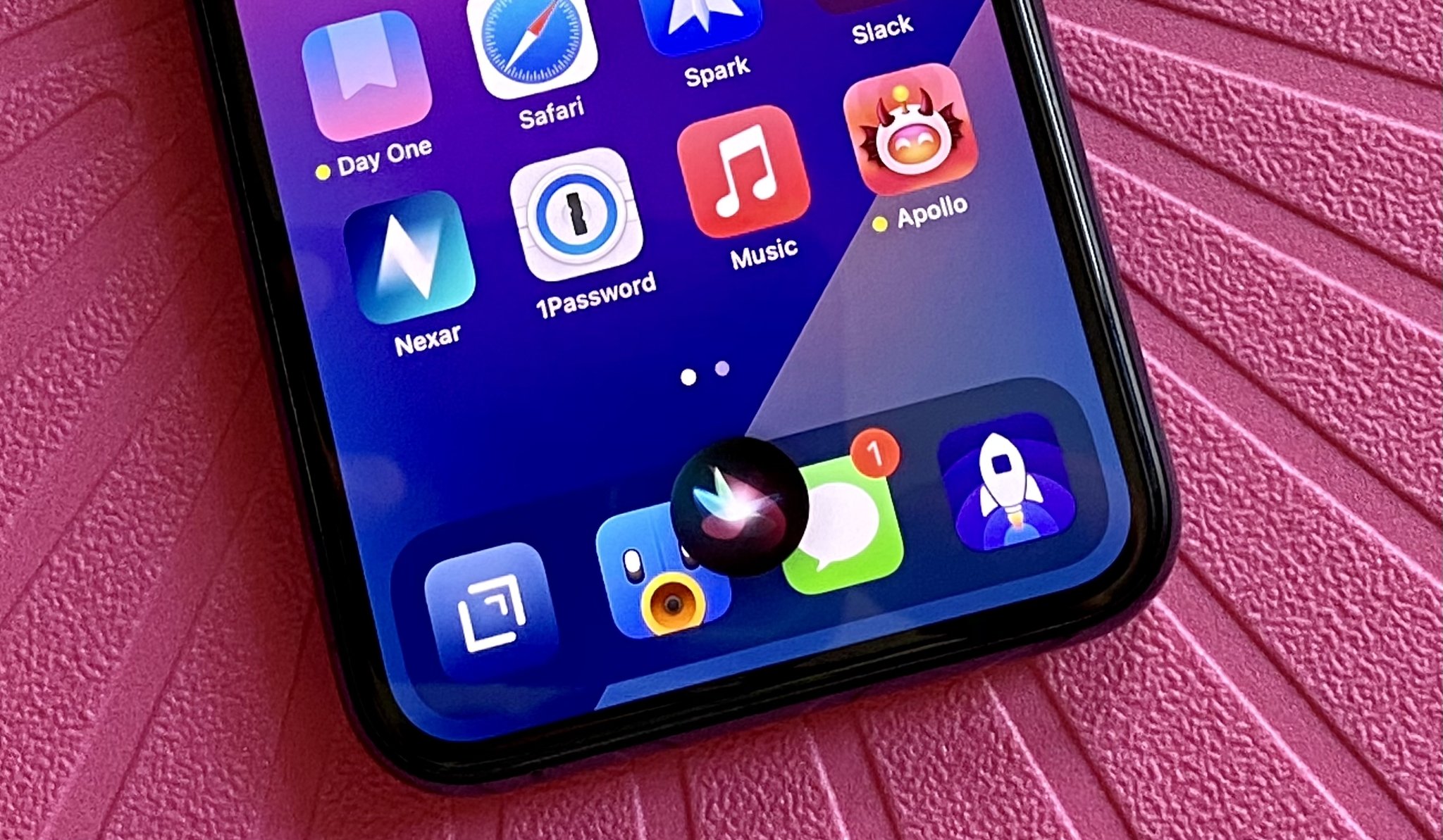
One of the UI changes that iOS 14 brings is the new, appropriately-named, Compact UI. Compact UI means that certain interface elements will now take up only the space they need when you use them. This includes incoming phone calls, VOIP calls, FaceTime, and Siri.
For example, when you get a phone call, it will now show up as a banner at the top of your iPhone, instead of taking over your entire screen. This allows you to continue what you were doing while deciding if you want to answer or decline the call. And even if you do pick up, it will remain as the banner at the top with a button for changing audio output and ending the call. And if you need to, you can always expand the Compact UI into the full-screen call interface.
Siri also makes use of the new Compact UI. Previously, if you ever used Siri, she would take up the entire screen as she listened and does your command. Now, with Compact UI, Siri will only show up at the bottom of the screen, and any results Siri provides also appear in their own notification-style banner.
As a lifelong iOS user, one of the things that always bothered me was how things like incoming calls took up the entire screen. I'm super happy to see that it has been rectified in iOS 14, and it looks sleek and feels natural, no longer just a super intrusive takeover of the entire device. Really though, it's a little surprising that it took Apple 14 years to bring this much-needed change, but it's a good sign that they're listening, even if a little slow to take action.
iOS 14: Messages
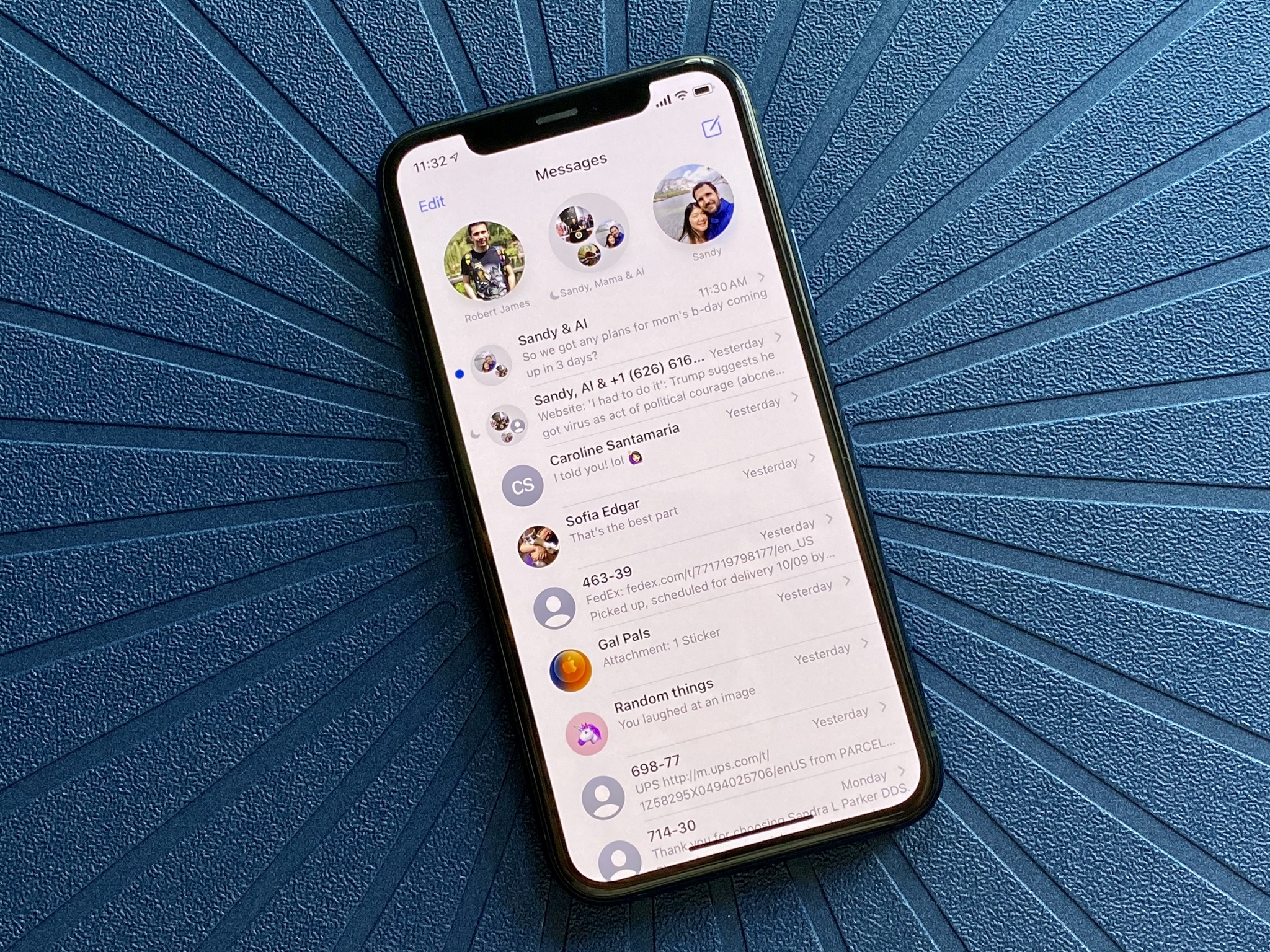
Messages has received some noticeable improvements in iOS 14, mostly for group messaging. But even if you don't partake in non-stop group chats with other iMessage users, there's still a lot to enjoy with the new changes.
First off, pinned messages. For years, I have wanted a way to pin some of the more critical threads in my Messages app to the top to prevent them from becoming lost in the chaos. These important conversations include chats with my immediate family, when bills are due between roommates, and other threads that I need to refer back to regularly. iOS 14 finally adds the ability to pin up to nine conversations, and they will show up at the top of Messages in a grid-like manner. Whenever there's a new message in a pinned conversation, you'll see a snippet of the message in a bubble, so you never miss a beat.
The only thing is that the contact photos for pinned messages are a little on the larger side, so if you have nine of them, they'll be taking up most of the screen. I was hoping that Apple allowed us to change the size of the contact photos for pinned messages, but there is currently no way to change it — I would prefer a smaller icon.
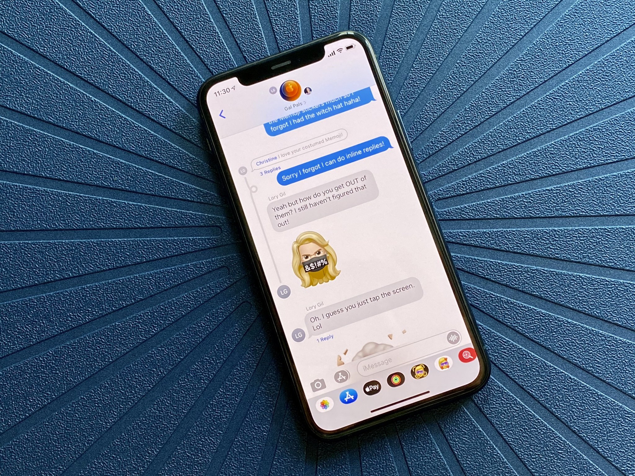
The most significant changes, though, are with group messages, making it easier to manage with larger groups. You can now set an image or emoji to use with a group chat, along with changing the name as you could before. Inline replies are now possible, letting you respond directly to a specific message in a group chat, making it easier for everyone to keep track of what's happening. And with mentions, you can now type in a contact name (within the group chat), tap it when it turns gray, and you can then select their avatar. The name turns blue after you do this, which indicates that you've mentioned a specific person.
If you are like me and don't necessarily want a notification for every incoming message for group chats, then just set Do Not Disturb. With iOS 14, the new mentions feature lets you get notified whenever you have a specific mention, ensuring that you don't miss something important if someone mentions you specifically.
I absolutely love the new features in the iOS 14 Messages app, but I still can't help but feel hampered when I can't use these new features with non-iPhone users. The majority of my group chats involve my immediate family members, who don't all use an iPhone. So while the new features are great, it still highlights the limitations of the Messages app when it comes to SMS. Honestly, I hope that Apple considers adding in Rich Communication Services (RCS) to iMessage sometime in the future, so that we can finally put aside all of our differences and just enjoy group iMessage features together.
iOS 14: Safari and Privacy
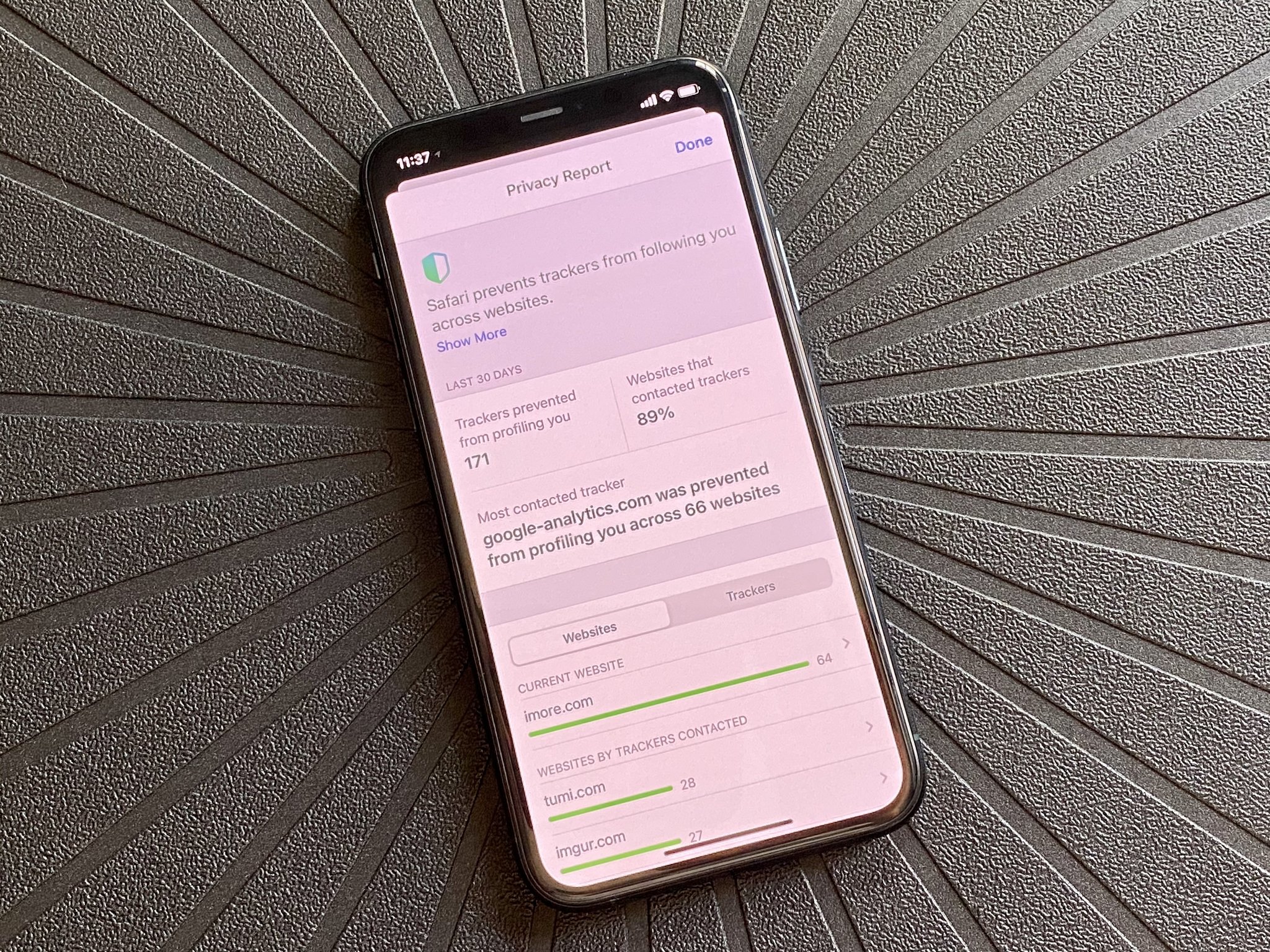
Privacy is one of Apple's foundations, and there are numerous improvements to protect our data with iOS 14. From Safari to third-party apps, Apple wants to make sure that your information is as private as it can possibly be.
Location data is one of the biggest areas of concern. In iOS 14, if you choose to give an app permission to your location, you can choose, on a per-app basis, whether that app knows your general or precise location. With this new setting, it's all that stands between you and an app knowing that you're in the general vicinity of Los Angeles or your precise home address. Some apps will undoubtedly need your exact location, so you'll want to make sure those are kept on, like Uber or Lyft. But for everything else, a general location should be fine, or none — it's up to you.
Safari also has robust improvements to how it deals with privacy on the web. The new Privacy Report feature allows you to see, at a glance, what trackers are on a website, and how many Safari has automatically blocked for you with its built-in capabilities.
For those who use Apple's Keychain for passwords, there is now native password monitoring, so you should be notified if one of your passwords has been compromised in a data breach. In order to do this safely, without compromising your data, Apple has its own encrypted techniques that check your passwords against known breaches in a safe and secure way. This prevents Apple, as well as other third-parties, from actually getting your password as it is being checked.
I actually prefer to use 1Password for my passwords, personally, but it's nice to see Apple emphasizing the importance of strong passwords and making sure people are informed when their data may be at risk.
Other privacy-focused improvements include a new App Privacy section in the App Store, indicators in the top right of your screen that let you know when the microphone (orange) or camera (green) is used by an app, and more. When it comes to my data, I appreciate that Apple is trying to protect my information, rather than sell it to the highest bidder.
Finally, Safari now has a built-in translation feature, so you don't need to rely on third-party apps or services. When you're on a site in a foreign language, the top should say, "Translation available." If that's the case, tap on the "AA" button in the search bar, then select "Translate into English" (or whichever your preferred language is). The entire webpage that you're looking at will be translated. This is yet another feature that I've wanted for a while because it would be annoying having to search for an app that would do it. I don't often go to pages that require translation, but when I do, it's nice to know that I don't need to take any extra steps to translate it now.
iOS 14: Translate
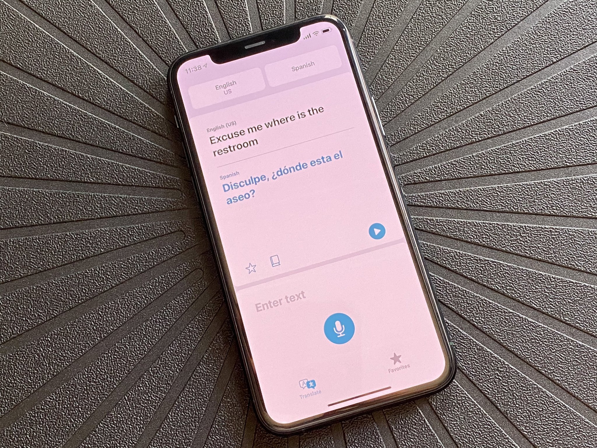
While a lot of us aren't traveling as much these days, Apple's new Translate app in iOS 14 is incredibly handy to have, especially for those who often travel abroad. With Translate, users don't need to download a separate third-party app for on-the-fly translation because it's now built-in and uses Siri as the backbone for all translations. At the moment, Translate supports 12 languages: Arabic, Chinese (Mainland), English UK, English US, French, German, Italian, Japanese, Korean, Portuguese, Russian, and Spanish.
Using the Translate app is a simple affair. Users just select the language that they want to translate in, then either speak or type in the phrase that needs translating. The translation will show up underneath, allowing you to show the other person what you are trying to say or have it spoken aloud.
If you rotate your phone into landscape mode, you can carry out a real-time conversation with translations. Translate can detect what language is being spoken intelligently and translates in real-time, making it possible to have a fluid conversation with someone who speaks another language. And if you choose to speak, you only need to tap the microphone button once — no need to hold it down. There is even a full-screen mode in landscape that displays the translated text in a large size, making it easy for the other party to see if they are further away.
Translate allows you to save Favorite phrases, which is convenient for those common phrases you may ask while in a new locale. If you want to add a Favorite phrase, tap on the star underneath the translation. You can then access all of your saved phrases in the Favorites section.
For the most part, the Translate app works well. I haven't had an opportunity to use it in a real-world application yet, but I am grateful that it's available if I need it. However, people are saying that the translations may not be 100% accurate or precise, but honestly, it's better than nothing at all, so I'll take it, especially since I don't need a separate download.
Even though Translate includes some of the more common languages, I hope Apple continues to add more in the future, including different dialects. For example, the Chinese language only seems to have China Mainland right now, which I believe is Mandarin. My family speaks both Cantonese and Shanghainese, not Mandarin, so having more dialects is a must.
iOS 14: Health
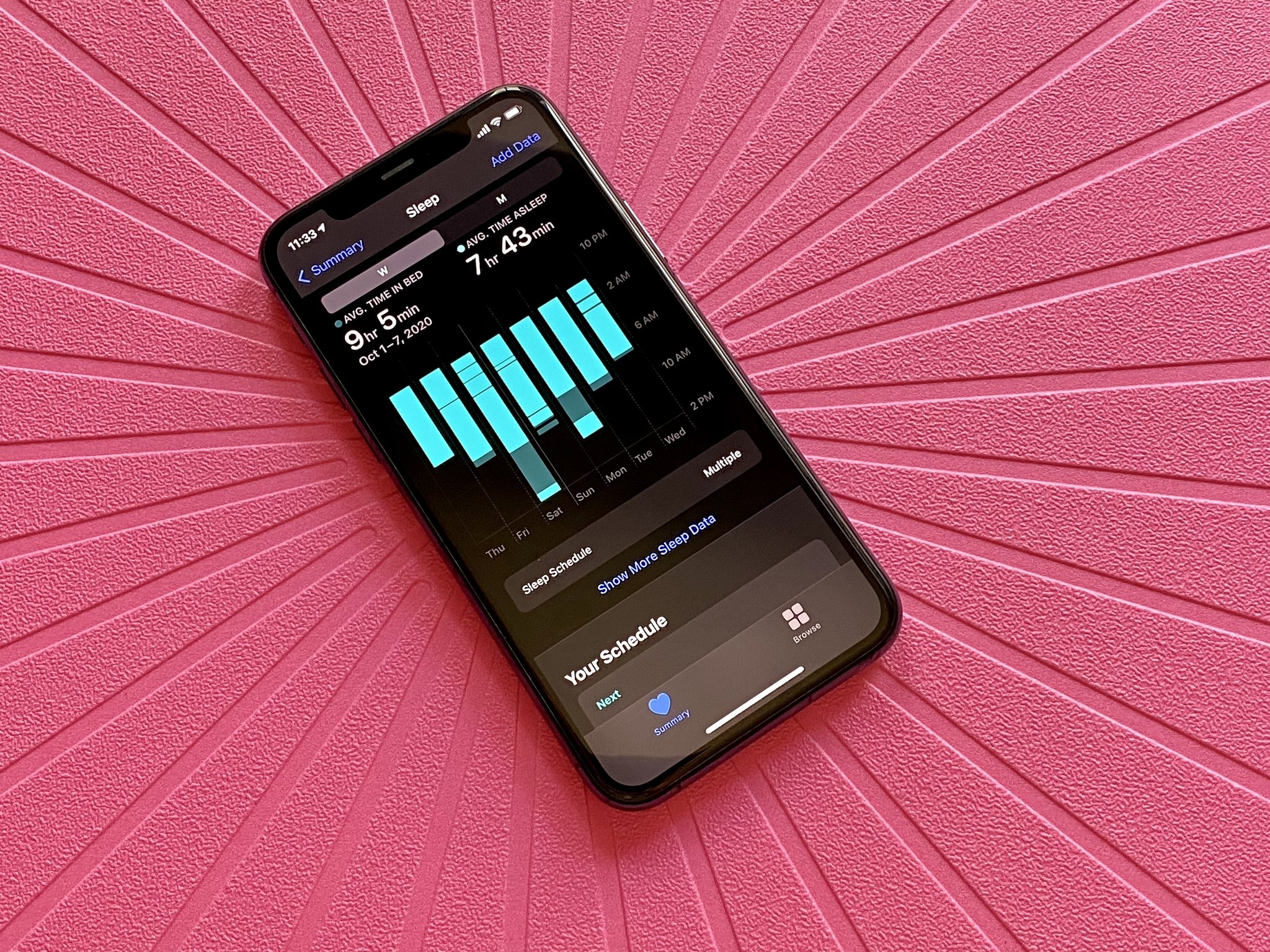
For the most part, the Health app in iOS 14 is pretty much the same as it was before, but there is a new feature that goes along nicely with sleep tracking in watchOS 7: Sleep Schedule and Wind Down.
Before the Apple Watch came along, I was using Fitbits to track my daily activity and sleep. So when I moved to the Apple Watch, I was disappointed that I couldn't use it to track my sleep every night, but eventually, I got over it. Still, I had wished for sleep tracking to one day come to the Apple Watch, and we finally have it with watchOS 7. Ever since I put watchOS 7 on my Series 5, I've been using it to track my sleep, though it required some changes in my Apple Watch charging habits (I'm used to it now). And with the new Sleep Schedule with Wind Down feature in iOS 14's Health app, managing bedtime has never been easier.
Now, while I have a pretty lax schedule compared to other people, I prefer to get up at a set time every day. However, there are some days where I need to be up earlier than I'd like. I never really used the Bedtime feature before, but I appreciate Sleep Schedule offering a lot of flexibility. It's just a little funny that you can only edit your Sleep Schedule in the Health app, rather than with all of your other alarms in the Clock app.
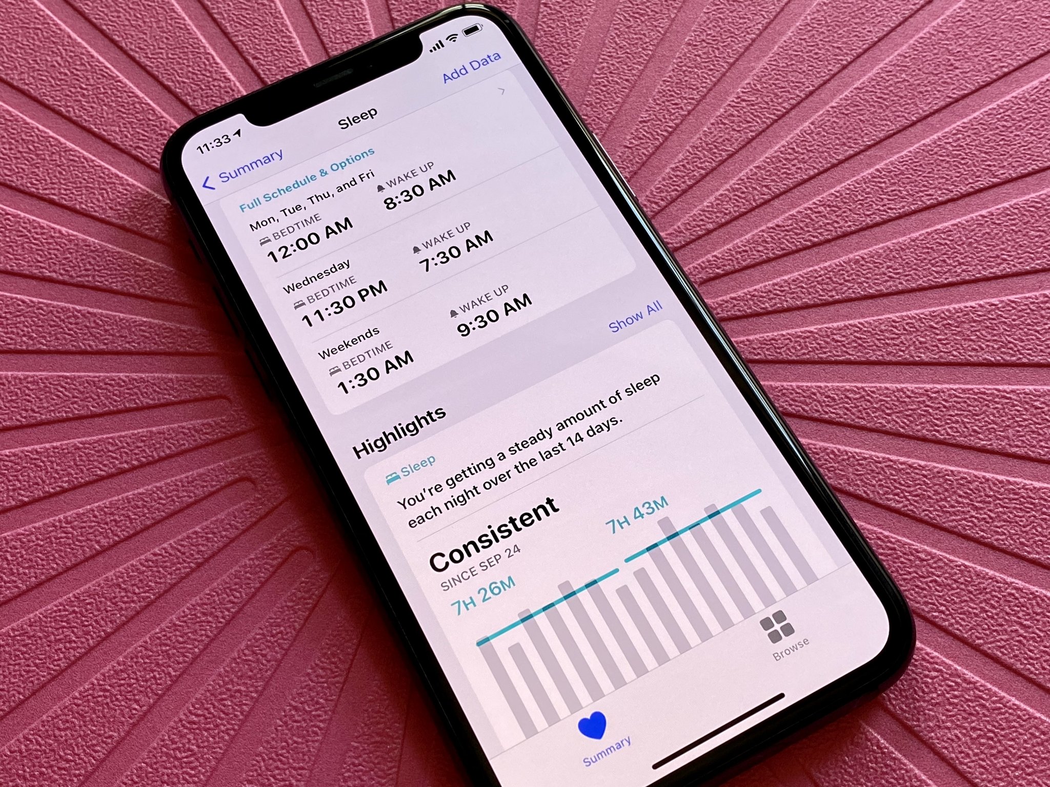
With Sleep Schedule, you can create several different schedules, depending on what you need during the week. Currently, I have a schedule set up for Monday, Tuesday, Thursday, and Fridays, with another one specifically for Wednesdays, when I have to get up earlier for work meetings, and a different schedule for weekends, when I can wake up later. I pretty much have all of my bases covered for the week, but if something comes up, Sleep Schedule allows you to make changes to the Next Wake Up Only.
Before you make a regular Sleep Schedule, though, you should make sure that you've correctly set up your Sleep Goal for every night. I have my goal set to eight hours right now, and while I don't always meet it every night, it's a good motivator. This can be changed at any time if you require it.
When you have a sleep goal and sleep schedules set up, the new Wind Down feature kicks in. Wind Down will kick in before your bedtime starts, and the time it happens depends on the time you set. With Wind Down, the goal is to do activities that will help you get ready for sleep. You can use Wind Down to turn on Home scenes with your HomeKit lights and appliances, use an app for relaxing soundscapes, or even do some meditation before bed.
I have my Wind Down set to 30 minutes before my Sleep Schedule, and it has been helping me sleep better every night (as long as I don't have too much caffeine in the evening). I have an Automation in Shortcuts set up to start the Dark Noise app with a duration timer, and so far so good. Even if the automation somehow fails to run (it's happened a few times), I tend only to launch Dark Nose myself when Wind Down begins.
Before these new features in the iOS 14 Health app, I would pretty much stay up for hours after lying in bed. But Sleep Schedule and Wind Down with watchOS 7 have been reinforcing better sleeping habits for me, and I've definitely been feeling it in the mornings by being more energized and ready to go.
One thing I think is lacking with the sleep data in the Health app is information. From what I'm seeing, it will only tell me my time asleep, and the time I'm just in bed, along with the averages over the week and month. I'm a little let down that the sleep tracking with Apple Watch and iOS 14 does not track things like light, deep, and REM sleep, as third-party apps do. It seems that if you prefer more in-depth sleep data, apps like AutoSleep aren't out of the arena just yet.
iOS 14 also added more features to help users better understand hearing health, though it's not exclusively in the Health app. Instead, you can access the new Hearing control in Control Center, which gives you real-time headphone audio-level measurements. This new control lets you see how loud your headphone audio is in decibels (dB) — anything below 80 is "OK," but repeated and prolonged exposure to anything above that is considered "loud" and can lead to permanent hearing damage later down the road.
I tend to keep my headphones at a reasonable level, but I think it's great that Apple is trying to bring more awareness to hearing health. It certainly is something that many us may take for granted (I certainly had in my high school days), and being able to monitor dB levels in real-time is fantastic. Of course, the real-time measurements are more accurate with AirPods, but it does work with pretty much any headphone that you connect to your iPhone.
iOS 14: Maps
On the surface, Maps doesn't have anything that looks drastically different from previous iterations. However, it is essential to note that Maps does feature brand new in-house data that is now expanded throughout the entire U.S. This means better precision, accuracy, and reliability.
I haven't had a chance to really put the new Maps to the test because, well, I haven't exactly gone anywhere in the past several months that required turn-by-turn directions. However, while many have chosen Google Maps over Apple Maps in the past, I have stuck with Apple Maps, and it works out well enough for me. Your mileage may vary here, though, but I would recommend giving Apple Maps a second chance with the improved map data if you previously ditched it for something else.
As far as iOS 14 features go, Maps does have some new additions, though a few of them don't apply to me. With iOS 14 Maps, Apple has added cycling directions, EV routing, Guides, and speed and red light camera warnings.
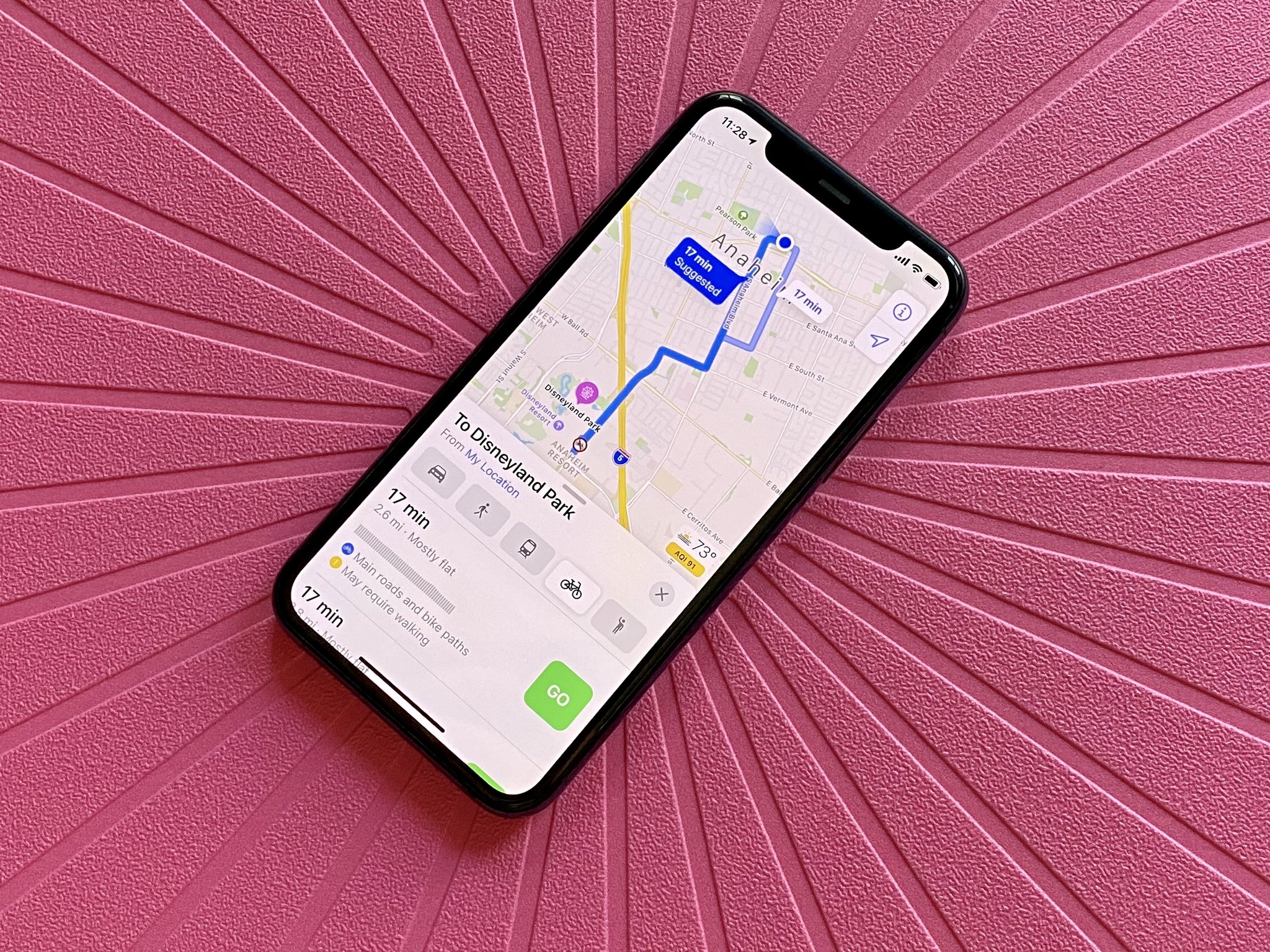
With the new cycling directions, Apple Maps will tell you if there are bike paths along the route, whether there would be any walking involved, any elevation levels and amount of climbing involved, and more details. You can also tell Maps to avoid things like hills and busy roads. All of this information is useful, and if I were a cyclist, I would definitely appreciate having it. It's important to note that these are also suggested routes, so if you know of alternative ways to get around on a bike, you could take shortcuts and have the directions reroute as needed. But for anyone who is using a bike to get somewhere new, these directions can help them get around without having to rely on another app.
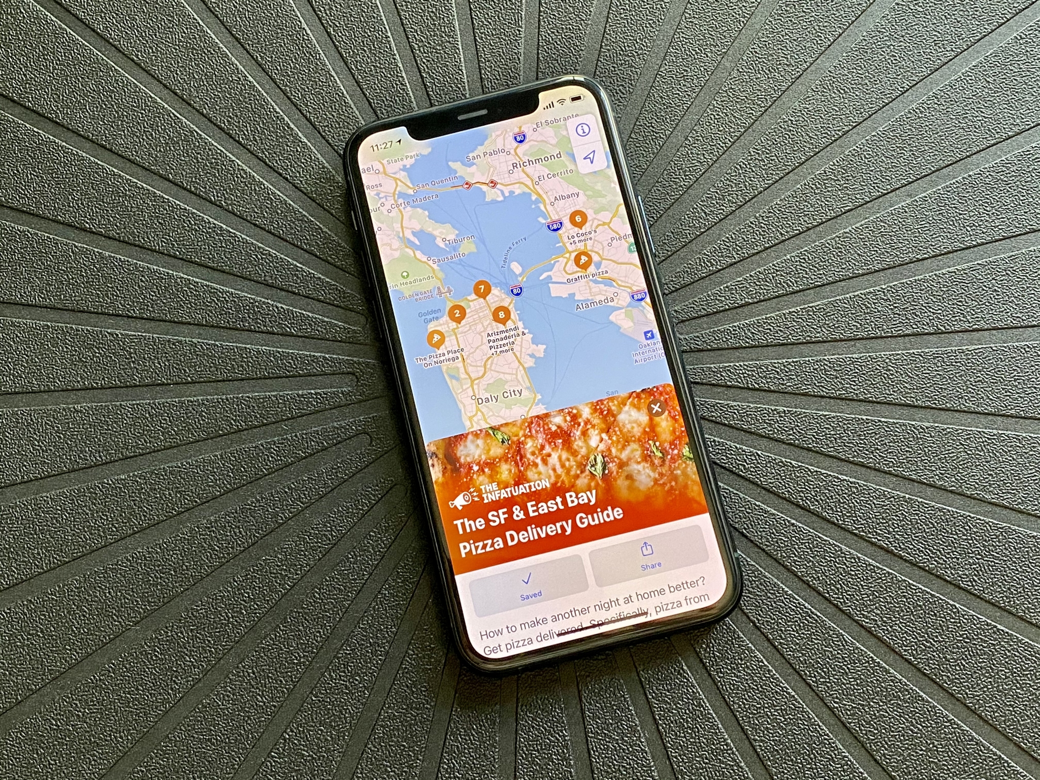
Guides are a feature that I was looking forward to when Apple announced at WWDC, but the current iteration leaves a lot to be desired. With Guides, Apple is working with other brands like Zagat, Lonely Planet, and more to produce travel guides for major cities, and it's integrated directly into Maps like Yelp. You can save Guides as Favorites for quick access, and they'll be updated automatically whenever there is new information.
Right now, though, Guides is only available in four cities: Los Angeles, San Francisco, New York, and London. Apple does say that more supported cities are coming, and for Guides to be successful, it needs more supported cities. So far, I've saved a few guides for San Francisco for my next trip there (who knows when that's going to be, though), but honestly, I was hoping for more with Guides. For example, I would have loved to have an easier way to upload or download user-created guides, which would help with finding "hidden gems" in my local area. Perhaps a future version of iOS could have something like this.
Speed and red light camera warnings are a nice addition for Maps, though I haven't seen it at work since my area does not have any major ones I know about. But since this is why many people use Waze, it's nice to have it integrated into the native Maps. And EV routing, which doesn't apply to me, is great to have for those who do have an EV.
Apple Maps has come a long way since it split with Google data from a few years ago. It's still far from perfect, but having all of these refinements and new additions make Maps a completely different app from when it was first released.
iOS 14: App Store and App Clips
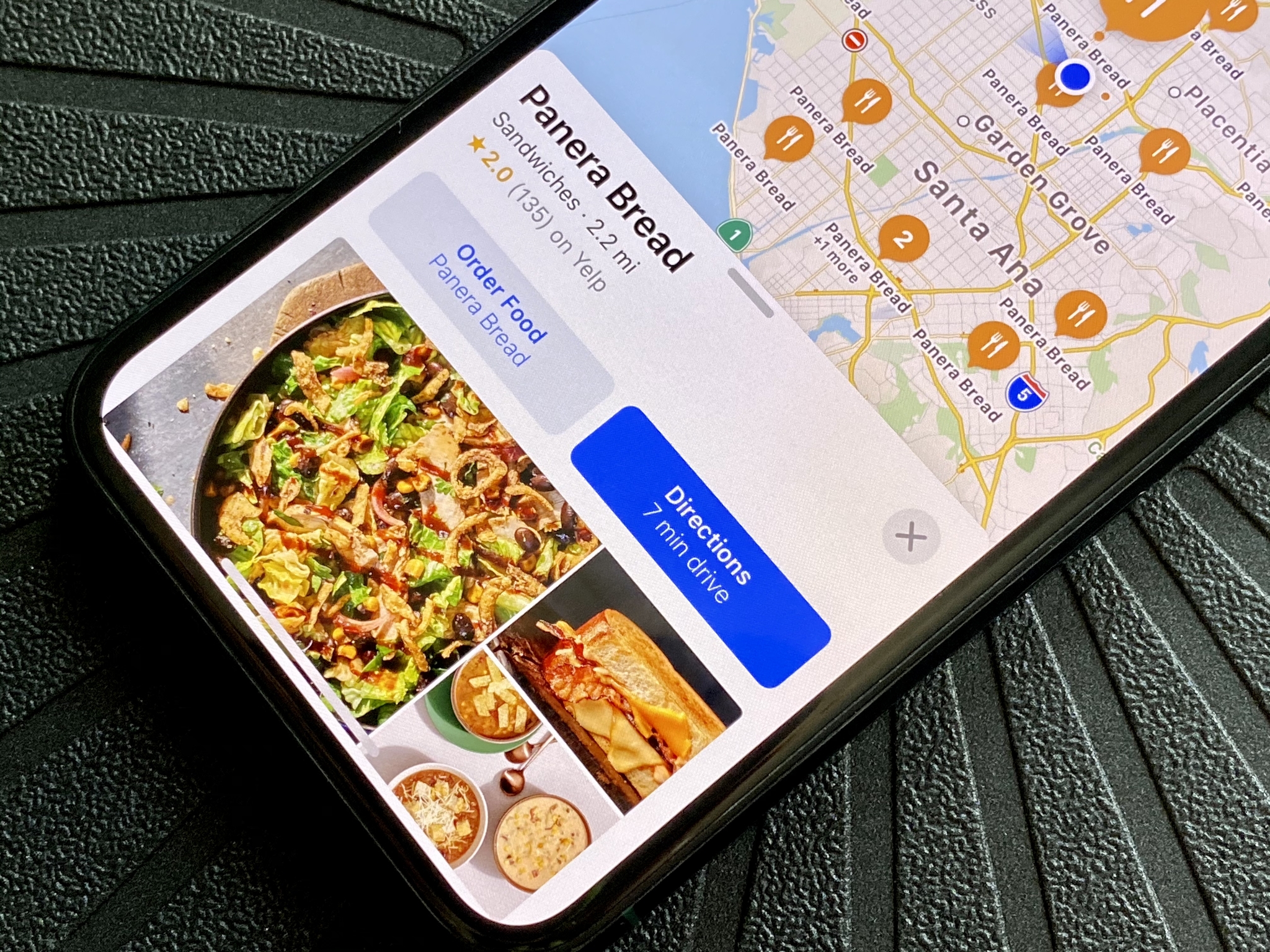
The new App Clips feature is integrated with the App Store on iOS 14, and its goal is to help you complete tasks or even try an app out without having to download it. Since this is brand new, it is a little hard to find apps that have an App Clip available right now, but they are out there. You can access App Clips through the App Store and other apps in iOS 14, such as Maps, websites, and even Messages. Physical ways to access App Clips involve NFC tags and QR codes.
So far, I haven't personally come across many apps that have App Clips, but a good example is Panera Bread. If you search "Panera" in Maps, you should see an "Order Food" option. Tap it, and it launches the Panera Bread App Clip, where you can place an order for pickup, without having to create an account, sign in, and enter payment information, since App Clips can work directly with Apple Pay.
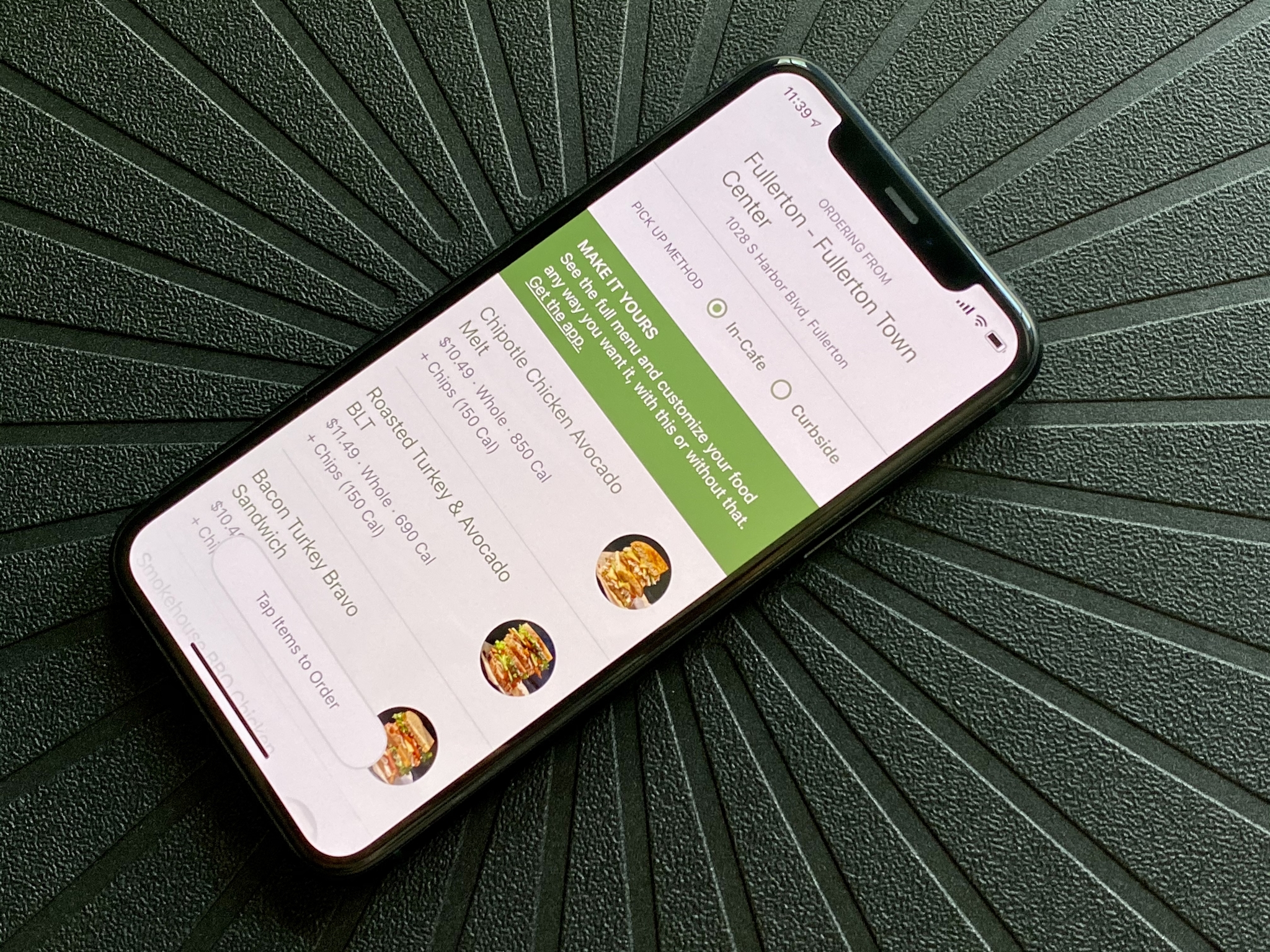
App Clips will always be less than 10MB in size, and you'll be able to find them in App Library with a dashed border around the icon to separate them from your regular, full apps. It doesn't look like there is a way to delete them after you're done, though, so at least they're negligibly small in size.
Even though this feature depends entirely on businesses and developers who want to use it, I think App Clips is fantastic. There have been numerous times when I want to order food from a restaurant, but I would need to use the businesses' mobile app to do so. Or I just want to try an app out before committing to a purchase, but there was no way to do this without buying the app first. I no longer need to worry about adding another app to my infinitely growing collection of apps — this is something that I have wanted for a long time, and I'm glad to see Apple implementing it now.
Again, it's still early, so App Clips aren't as prolific as they could be, but I expect that to change in due time. I'm sure we could all appreciate not having to download yet another app just to get some food or pay for a parking meter.
iOS 14: Should you wait?
Right now is the perfect time to update to iOS 14 if you haven't done so already. It's packed with a ton of fantastic new features, like Home screen widgets, App Library, the ability to customize app icons, inline replies and mentions in Messages, and more. Even if you aren't into the customization thing or widgets, the Compact UI that doesn't block out the center of your screen is worth updating alone. And Sleep Tracking in Health, App Tracking Transparency, having a built-in Translate app, among many other new features, is just icing on the cake.
With iOS 15 just around the corner, it's a good time to get your best iPhone up to speed. Since iOS 15 is more about refining iOS 14, updating now would get you adjusted to most of the changes.
iOS 14: The bottom line
iOS 14 is definitely one of the most substantial iOS updates Apple has released so far. While there are plenty of big changes, it seems that the one getting the most attention is definitely Home screen widgets. There are plenty of people out there who are customizing their iPhone aesthetic with widgets and custom icons through Shortcuts, and hopefully, Apple takes notice and makes the experience seamless in the future.
But combined with the other great features like automations, built-in translation, pinned conversations and group message improvements, Sleep Schedules and Wind Down, App Clips, iOS 14 has breathed fresh new life into how I use my iPhone.
Christine Romero-Chan was formerly a Senior Editor for iMore. She has been writing about technology, specifically Apple, for over a decade at a variety of websites. She is currently part of the Digital Trends team, and has been using Apple’s smartphone since the original iPhone back in 2007. While her main speciality is the iPhone, she also covers Apple Watch, iPad, and Mac when needed. When she isn’t writing about Apple, Christine can often be found at Disneyland in Anaheim, California, as she is a passholder and obsessed with all things Disney, especially Star Wars. Christine also enjoys coffee, food, photography, mechanical keyboards, and spending as much time with her new daughter as possible.
